Tag Archives: teaching

How to pose questions for voting card concept tests (post 2/3)

Different ways of posing questions for concept tests are being presented here

Concept tests using voting cards have been presented in this post. Here, I want to talk about different types of questions that one could imagine using for this method.

1) Classical multiple choice

In the classical multiple choice version, for each question four different answers are given, only one of which is correct. This is the tried and tested method that is often pretty boring.
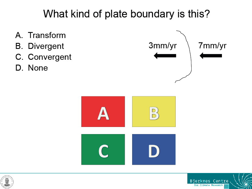
An example slide for a question with one correct answer

However, even this kind of question can lead to good discussions, for example when it is introducing a new concept rather than just testing an old one. In this case, we had talked about different kinds of plate boundaries during the lecture, but not about the frame of reference in which the movement of plates is described. So what seemed to be a really confusing question at first was used to initiate a discussion that went into a lot more depth than either the textbook or the lecture, simply because students kept asking questions.

2) Several correct answers

A twist on the classical multiple choice is a question for which more than one correct answer are given without explicitly mentioning that fact in the question. In a way, this is tricking the students a bit, because they are used to there being only one correct answer. For that reason they are used to not even reading all the answers if they have come across one that they know is correct. Giving several correct answers is a good way of initiating a discussion in class if different people chose different answers and are sure that their answers are correct. Students who have already gained some experience with the method often have the confidence to speak up during the “voting” and say they think that more than one answer is correct.

3) No correct answer

This is a bit mean, I know. But again, the point of doing these concept tests is not that the students name one correct answer, but that they have thought about a concept enough to be able to answer questions about the topic correctly, and sometimes that includes having the confidence to say that all answers are wrong. And it seems to be very satisfying to students when they can argue that none of the answers that the instructor suggested were correct! Even better when they can propose a correct answer themselves.

4) Problems that aren’t well posed

This is my favorite type of question that usually leads to the best discussions. Not only do students have to figure out that the question isn’t well posed, but additionally we can now discuss which information is missing in order to answer the question. Then we can answer the questions for different sets of variables.
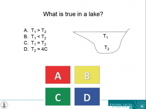
ABCD_lake

One example slide for a problem that isn’t well posed – each of the answers could be correct under certain conditions, but we do not have enough information to answer the question.

For example for the question in the figure above, each of the answers could be correct during certain times of the year. During summer, the temperature near the surface is likely to be higher than that near the bottom of the lake (A). During winter, the opposite is likely the case (B). During short times of the year it is even possible that the temperature of the lake is homogeneous (C). And, since the density maximum of fresh water occurs at 4degC, the bottom temperature of a lake is often, but not inevitably, 4degC (D). If students can discuss this, chances are pretty high that they have understood the density maximum in freshwater and its influence on the temperature stratification in lakes.

5) Answers that are correct but don’t match the question.

This is a tricky one. If the answers are correct in themselves but don’t match the question, it sometimes takes a lot of discussing until everybody agrees that it doesn’t matter how correct a statement is in itself; if it isn’t addressing the point in question, it is not a valid answer. This can now be used to find valid answers to the question, or valid questions to the provided answers, or both.

This is post no 2 in a series of 3. Post no 1 introduced the method to the readers of this blog, post no 3 is about how to introduce the methods to the students you are working with.
On how ice freezes from salt water

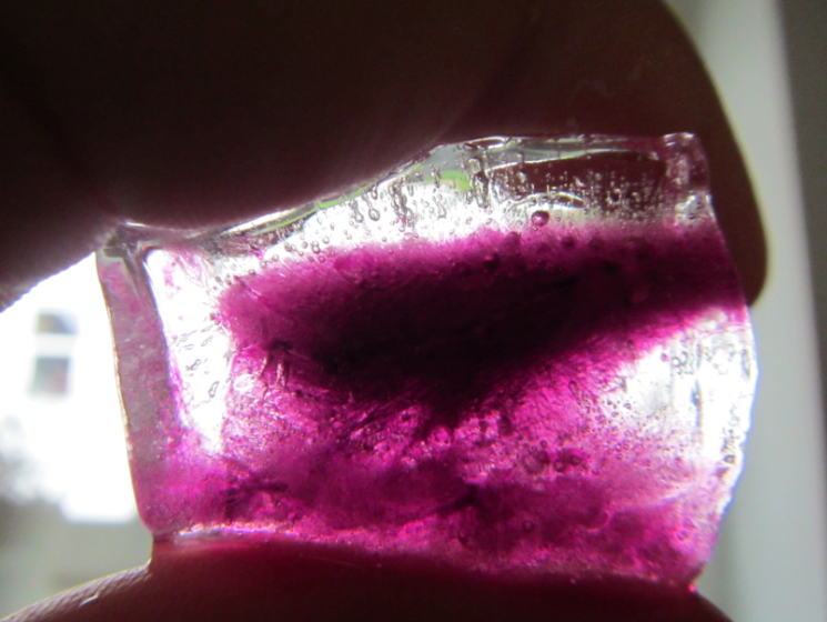
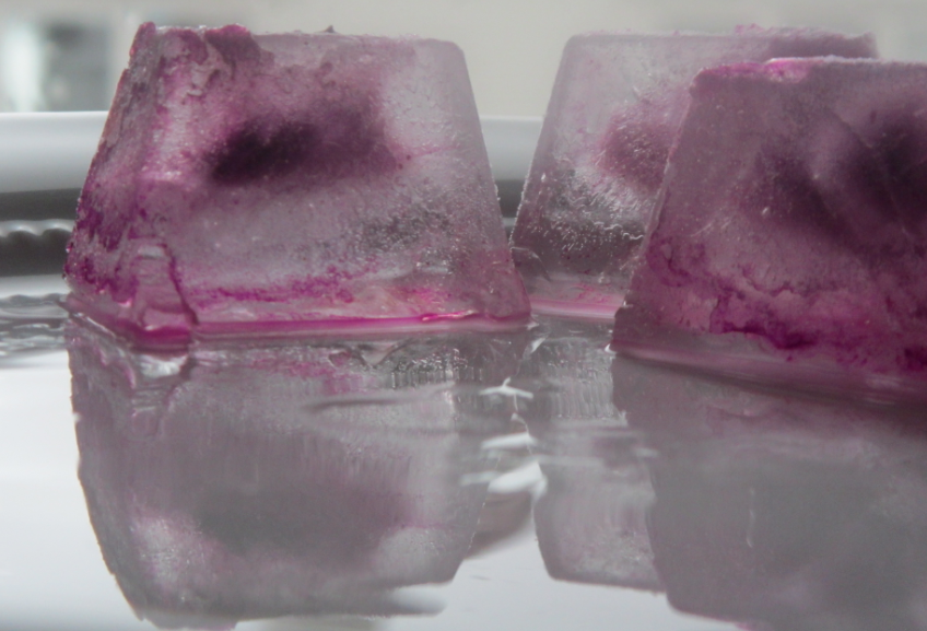
I’ve been wondering how to best show how sea ice freezes for quite a while. Not just that it freezes, but how brine is rejected. By comparing the structure of fresh water and salt water ice, one can get an idea of how that is happening (and I’ll write a post on that after we have done this experiment in class). But I accidentally stumbled upon a great visualization when preparing dyed ice cubes for the melting ice cube experiment (see this post) when all my ice cubes came out like this:

Ice cubes made from colored water.

Instead of being nicely homogeneously colored, the color had concentrated in the middle of the ice cubes! And since the dye acts in similar ways to salt in the ocean (after all, it IS a salt dissolved in water, even though not the same as in sea water), this is a great analogy. It is even more visible when the ice cubes have started to melt and the surface has become smooth:

The dye has frozen out of most of the ice and been concentrated in the middle of the ice cube.

Clearly, when forming, the ice crystals have been rejecting the dye! In the ocean, due to cooling happening from above, ice would freeze downward from the surface, under the influence of gravity the brine channels would be vertical, and brine would be released in the water underneath. In my freezer, however, cooling is happening from all sides at once. There is a tendency for the dye to be rejected towards the bottom of the ice cube tray under gravity, but as ice starts forming from all sides, the dye becomes trapped and concentrated in the middle of the forming ice cube. Can you see the little brine channel leading to the blob of color in the middle?

I must say, when I first took the ice cubes out of the freezer I was pretty annoyed because they weren’t homogeneously colored. But now I appreciate the beauty of the structure in the ice, and you can bet I’ll try this again with bigger ice cubes!

Ice cubes melting in salt water and freshwater (post 1/4)

Experiment to visualize the effects of density differences on ocean circulation.

This is the first post in a series on one of my favorite in-class experiments; I have so much to say about it that we’ll have to break it up into several posts.

Post 1 (this post) will present one setup of the experiment, but no explanations yet.

Post 2 will present how I use this experiment in GEOF130, including explanations.

Post 3 will discuss how this experiment can be used in many different setups  and

Post 4 will discuss different purposes this experiment can be used in (seriously – you can use it for anything! almost…).

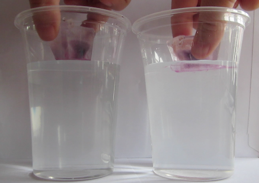
So, let’s get to the experiment. First, ice cubes are inserted into two cups, one filled with fresh water at room temperature, the other one filled with salt water at room temperature. In this case, the ice cubes are dyed with food coloring and you will quickly see why:

Ice cubes are added to cups filled with water at room temperature: fresh water on the left, salt water on the right.

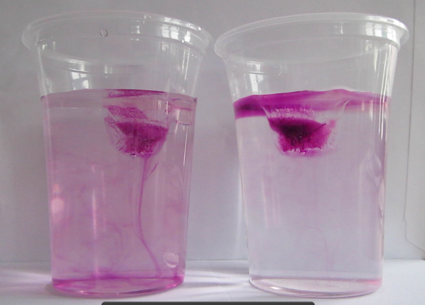
As the ice cubes start to melt, we can see the dyed melt water behaving very differently in fresh water and salt water. In fresh water, it quickly sinks to the bottom of the cup, whereas in salt water it forms a layer at the surface.

Melt water from the ice cube is sinking towards the bottom in the cup containing fresh water (on the left), but it is staying near the surface in the cup containing salt water (on the right).

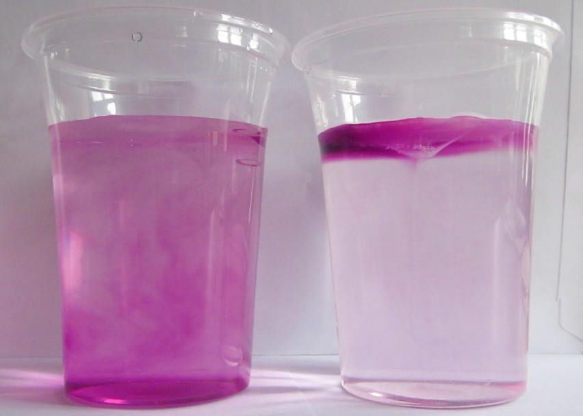
After approximately 10 minutes, the ice cube in freshwater has melted completely, whereas in salt water there are still remains of the ice cube.

After 10 minutes, the ice cube in the fresh water cup has melted completely (left), whereas the one in the salt water cup is not gone completely yet (right).

Why should one of the ice cubes melt so much faster than the other one, even though both cups contained water at the same (room) temperature? Many of you will know the answer to this, and others will be able to deduce it from the different colors of the water in the cups, but the rest of you will have to wait for an explanation until the next post on this topic – we will be doing this experiment in class on Tuesday and I can’t spoil the fun for the students by posting the answer today already! But if you want to watch a movie of the whole experiment: Here it is!

(Yes, this really is how I spend my rainy Sunday mornings, and I love it!)

– I first saw this experiment at the 2012 Ocean Sciences meeting when Bob Chen of COSEE introduced it in a workshop “understanding how people learn”. COSEE has several instructions for this experiment online, for example here and here. My take on it in the “on the Cutting Edge – Professional Development for Geoscience Faculty” collection here.

A, B, C or D?

Voting cards. A low-tech concept test tool, enhancing student engagement and participation. (Post 1/3)

Voting cards are a tool that I learned about from Al Trujillo at the workshop “teaching oceanography” in San Francisco in 2013. Basically, voting cards are a low-tech clicker version: A sheet of paper is divided into four quarters, each quarter in a different color and marked with big letters A, B, C and D (pdf here). The sheet is folded such that only one quarter is visible at a time.

A question is posed and four answers are suggested. The students are now asked to vote by holding up the folded sheet close to their chest so that the instructor sees which of the answers they chose, whereas their peers don’t.

Voting cards are sheets of paper with four different colors for the four quarters, each marked with a big A, B, C or D.

This method is great because it forces each individual student to decide on an answer instead of just trying to be as invisible as possible and hope that the instructor will not address them individually. Considering different possible answers and deciding on which one seems most plausible is important step in the learning process. Even if a student chose a wrong answer, remembering the correct answer will be easier if they learn it in the context of having made a commitment to one answer which then turns out wrong, rather than having not considered the different options in enough detail to decide on one. “I thought A made sense because of X. But then we discussed it and it turns out that because of Y and Z, C is the correct answer” is so much more memorable than “I didn’t care and it turned out it was D”. Since the answers are only visible to the instructor and not to the other students, the barrier of voting is a lot lower because potentially embarrassing situations are being avoided. It is, however, also much harder to just observe the peers’ votes and then follow the majority vote.

In addition to helping students learn, this method is also beneficial to the instructor. The instructor sees the distribution of answers with one glance and rather than guessing how many students actually understand what I was talking about, I can now make an informed choice of the next step. Should I have students discuss with their neighbor to find an agreement and then ask the class to vote again? Elaborate more on the concept before asking students to discuss among themselves? Ask individual students to explain why they chose the answer they chose? Knowing how much students understood is very helpful in choosing the right method moving forward with your teaching. And even without staring directly at specific students, it is easy to observe from the corner of the eye whether students have trouble deciding for an answer or whether they make a quick decision and stick to it.

I have been using this method in this year’s GEOF130 lecture, and in a recent Continue. Stop. Start. feedback that I asked my students to fill in, every single student (who handed back the form, but that’s a topic for a different post) mentioned how the “A, B, C, D questions” or “quizzes” (which I both interpret as meaning the voting cards) help them learn and that I should definitely continue using them.

This post is number 1 of 3 on the topic of voting cards. Post no 2 will give examples of different types questions/answers that work well with this methods (for example always having only one correct answer might not be the most efficient strategy to foster discussions), and how to use them to maximize benefit for your teaching. Post no 3 will focus on introducing voting cards as a new method with least resistance by focussing on benefits to student learning and reassuring them on how the instructor will handle the information gained from seeing everybody vote.

Forskningsdagene are almost upon us

Preparations for experiments to be shown at the science fair “forskningsdagene” are under preparation.

Forskningsdagene, a cooperation between research institutes and schools, science centers and other educational places, will take place next month in Bergen. This year’s topic is ocean and water, and many interesting activities are being planned.

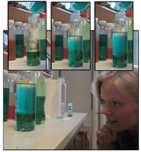
Today Kjersti, Martin and I met up to test which dyes and liquids are best suited for internal wave experiments. Since the target group on at least one of the days are school kids, conventional substances (like potassium permanganate as dye or white spirit as one of the liquids) might not be the best option. Instead, we went for food coloring and vegetable oils.

Oil_and_water

One of our tests – a four layer system with water (green), vegetable oil (turquoise), white spirit and air.

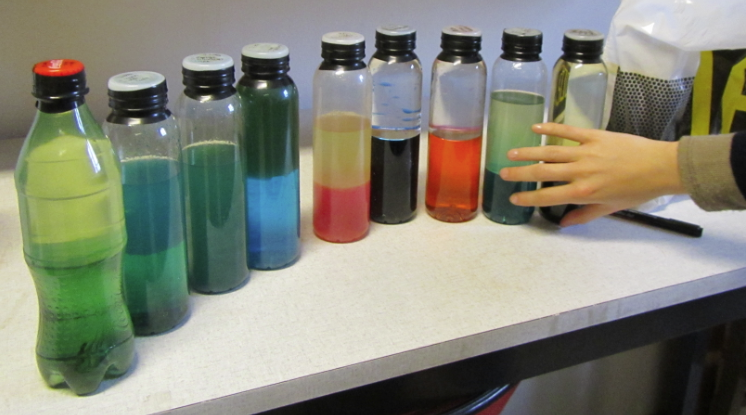
In the end, we came up with many different options and decided that we should probably bring all the bottles so people can play with them, too.  And we should found a company that sells these bottles as nerdy paper weights. I have had one on my desk for a year now and I’m still playing with it, as is pretty much everybody who comes to my office.

IMG_4506

Our selection of different combination of colors and water and oils for internal wave experiments.

But of course the best option wasn’t mentioned until afterwards: Oil and balsamic vinegar! Thanks, Jenny!

Continue. Stop. Start.

Quick feedback tool for your teaching, giving you concrete examples of what students would like you to continue, start or stop

This is another great tool to get feedback on your classes. In contrast to the “fun” vs “learning” graph which gives you a cloud of “generally people seem to be happy and to have learned something”, this tool gives you much more concrete ideas of what you should continue, stop and start doing. Basically what you do is this: You hand out sheets of paper with the three columns and ask students to give you as many details as possible for each.

“Continue” is where students list everything that you do during your lectures that helps them learn and understand and that they think you should continue doing. Here students (of classes I teach! Obviously all these examples are highly dependent on the course) typically list things like that you are giving good presentations, ask whether they have questions, are available for questions outside of the lecture, are approachable, do fun experiments, let them discuss in class, that kind of thing.

“Stop” are things that hinder students learning (or sometimes things that they find annoying, like homework or being asked to present something in class, but usually students are pretty good about realizing that, even though annoying, those things might actually be helpful). Here students might list if you have an annoying habit, or if you always say things like “as everybody knows, …” when they don’t actually know but are now too shy to say so. Students will also give you feedback on techniques that you like using but they don’t think are appropriate for their level/group, or anything else they think is counterproductive.

“Start” are suggestions what you might want to add to your repertoire. I have recently been asked to give a quick overview over next lesson’s topics at the end of the lecture which makes perfect sense! But again, depending what you do in your course already you might be asked to start very different things.

In addition to help you teach better, this feedback is also really important for students, because it makes them reflect about how they learn as an individual and how their learning might be improved. And if they realize that they aren’t getting what they need from the instructor, at least they know now what they need and can go find it somewhere else if the instructor doesn’t change his/her teaching to meet that need.

When designing the questionnaire for this, you could also make very broad suggestions of topics that might be mentioned if you feel like that might spark students’ ideas (like for example, presentations, textbooks, assignments, activities, social interactions, methods, discussions, quizzes, …) but be aware that giving these examples means that you are more likely to get feedback on the suggested topics and less likely that students will bring up topics that you yourself had not considered.

On “fun” vs “learning”

Quick feedback tool, giving you an impression of the students’ perception of fun vs learning of a specific part of your course.

Getting feedback on your teaching and their learning from a group of students is very hard. There are tons of elaborate methods out there, but there is one very simple tool that I find gives me a quick overview: The “fun” vs “learning” graph.

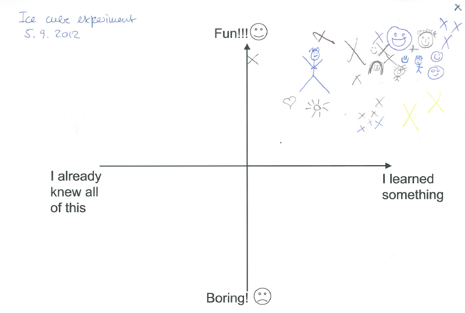
This particular example is from last year’s GEOF130 “introduction to oceanography”, when we did the first in-class experiment (which I will do with this year’s class next week, so stay tuned!). Since the group was quite big for an oceanography class at my university (36 students) and I wanted to get a better feel of how each of them perceived their learning through experiments than what I would have gotten by just observing and asking a couple of questions, I asked them to anonymously put a cross on the graph where they feel they were located in the “fun” vs “learning” space after this experiment. And this is the result:

fun_vs_learning

A “fun” vs “learning” graph filled in by students of the GEOF130 course in 2012 in response to an experiment that they conducted in pairs during a lecture.

Of course this is not a sufficient tool to evaluate a whole semester or course, but I can really recommend it for a quick overview!

Sea surface height and ocean depth

A hands-on activity in which students use real data to find similarities in the sea surface height and the ocean depth along satellite tracks.

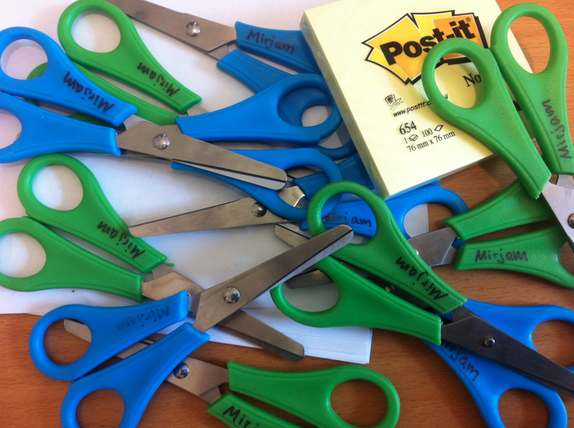
In yesterday’s GEOF130 class, we explored how the sea surface height and the ocean depth are related. All we needed: Sticky notes, scissors and this work sheet (as always – leave a comment if you want more details!).

PostIts

When I went and bought the scissors, the lady asked me if I was a kindergarden teacher. I said no, I teach at the university. And that was the end of that conversation…

Heat capacity of air and water

Hands-on activity to better understand the concept and consequences of heat capacity. Also a great party trick.

Imagine you take a balloon. Any kind of normal balloon. You blow it up. You hold it over a candle flame. What do you think will happen?

Yes – it will burst pretty instantly.

Now imagine you are taking a new balloon. You fill it with water (or, in our case, you fill it about half with water and half with air). You hold it over the flame. What will happen now?

You wait.

And wait.

And wait.

IMG_4469

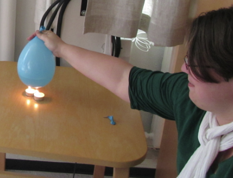
Balloon, filled with water, being heated above a candle. Note the remnants of the previous balloon (the one that was just filled with air) on the table.

You even take a second candle.

You wait some more.

What happens? Nothing.

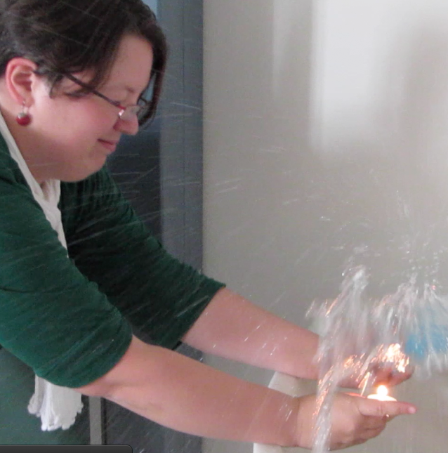
And why not? Because water has a much higher heat capacity than air. Meaning you have to put a lot of energy into a small volume of water to warm it up, about 4 times more than you would have to add to a similar volume of air. So the balloon does not get hot quickly, hence the plastic doesn’t get weakened enough for the balloon to burst. In fact, it did not only not get hot quickly, it did not get hot enough at all within the attention span of a typical student or instructor. So, because my students asked nicely, I decided to demonstrate what happens when the balloon is half filled with water, but the flame is directed to an area of the balloon that is not in direct contact with the water. If you can’t imagine what happens, check it out here (if you CAN imagine what happens, I’m sure you will check it out, too…).

MVI_4473

And even more on density

My favorite experiment. Quick and easy and very impressive way to illustrate the influence of temperature on water densities.

Today in the “introduction to oceanography” (GEOF130) we conducted my favorite experiment ever:

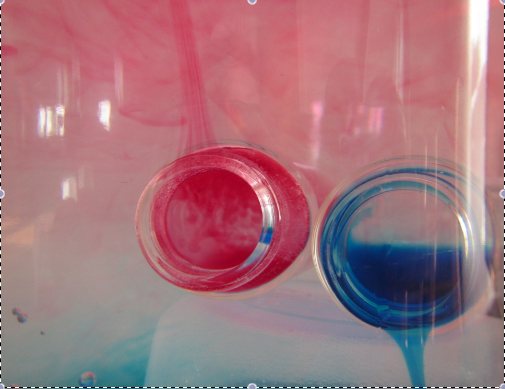
Cold water in one of the small bottles is dyed blue, hot water in the other small bottle is dyed red. Both are inserted in a jar filled with lukewarm water (movie below). Isn’t this beautiful? And you just wait until we add salt into the equation (and the water) next week!