Tag Archives: CMM31

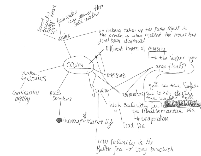
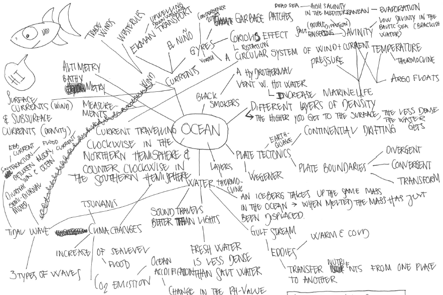
Fictitious forces (4/5): Coriolis – how not to teach it

Some demonstrations are really not as clever as we thought they might be.

We have talked about how to teach aspects of the Coriolis force recently, and just to spice it up: here is one thing that I tried that totally didn’t work out.

The idea was to have one student slowly and steadily turn a balloon around its axis to mirror the Earth’s spin, and another one drawing on the balloon with a sharpie.

The context was a class where many students didn’t have any physics background, and we wanted to understand atmospheric circulation, and why trade winds don’t blow straight north-south (or south-north on the Southern Hemisphere). And I still think that this demonstration kind of works for this specific purpose.

IMG_5092

The problem though: If you have a balloon and a sharpie, drawing one single trajectory and going “oh, I got it! So that is why the trade winds have a velocity component to the west!” (like I naively had imagined) is NOT what happens.

What happens instead is that students will draw tons of trajectories. And not only the ones that, even in this overly simplified system, show what I wanted them to see. Nope. They will also draw following a constant latitude, and then be confused as to why Coriolis force doesn’t seem to be acting. Or draw south-to-north on the Northern Hemisphere, and be confused why things are being deflected to the left. (And don’t get me wrong: this is good! They should start exploring. And they should be finding the limitations of demonstrations!)

IMG_5093Now. All of those issues that come up are things you can talk about and that can be explained. But I’m wondering whether this demo didn’t cause more harm than good, since the impression that might have stuck in the end is that Coriolis deflection only works under very specific circumstances, but most of the time it does not.

So this is not a demonstration I would recommend!


Concept maps II

A couple of pointers on how to use concept maps in class.

I recently presented concept maps as a tool both here and in a workshop I co-taught. And I  was pleasantly surprised by how many people said that they were considering employing this tool in their class! So for those of you who might want to use it – here are some more pointers of how I used it. But beware – there is a whole body of literature on this method out there – these are only my own experiences!

So. Firstly – for concept maps to work in class you will have to introduce them the first time round you are using them. What I did was to start drawing a concept maps on the board, and have students tell me what else to add to it and how. I used “roses” as my example, with the question of how roses and people interact.

The way it developed was that students named different parts of roses (stems, petals, thorns, …) and that roses can both hurt people (with their thorns) and make people happy (because of the way they look, because of what they symbolize, because of the context they are presented in, …), that roses use up CO2 and produce O2 which is relevant for us, that roses need soil, that they might need fertilizer, that they become soil again when they die. As you can see, even this very simple example can already produce quite a complex concept map. And it gave me the chance to point out all the different features I wanted the students to include, but without me actually having to give away concepts and connections that I thought were important for the topic they were later working on.

Another very important point: Bring sheets of paper. There will already be enough resistance against trying this (and any) new method – don’t give the students the chance to boycott it because they don’t have anything to write on!

And most importantly – enjoy. It is really amazing to see concept maps develop over time, and it is even more amazing to see how students enjoy seeing their progress mapped out by their maps.

Concept maps

Drawing concept maps at the beginning, the middle and the end of the course.

Using concept maps in teaching is something that I first tried last year in both the GEOF130 and CMM31 courses. The idea is that coming in, students typically don’t have a very good overview over the topics and concepts that are going to be covered in an introductory oceanography class, but that that will hopefully change over the course of the course.

The reason for trying to use concept maps in teaching was twofold.

Firstly, I wanted students to see how they gradually learned more and more about oceanography, and how they started to see connections between concepts that initially did not seem related.

Secondly, I am a big concept- or mind-map drawer whenever I need to study complex topics. For every big examination at university, be it in physics or ship-building or oceanography, I have drawn concept maps (even though at the time I didn’t know they were called that, and I was using them intuitively to organize my thoughts, rather than purposefully using them as a method). So why not try if it helps students study, too?

So how did it work in practice? Students were asked to draw concept maps during the first lecture, during a lecture some time half-way through the course, and at the end of the course. I collected and scanned the concept maps (out of my own curiosity) but students always had access to them and were encouraged to work on them any time they wanted to. Concept maps got impressively complex fairly quickly, and students reported that the maps helped them both to see their progress and to organize their thoughts.

For one of the courses, I used the concept maps as basis for the oral examination in the end (which was a lot more time-intensive to prepare on my part than I had imagined, and I wouldn’t do that again) and for part of the grade. For that, I had written down a list of concepts that I thought they should definitely have learned in my course, and a list of connection between concepts that I thought were crucial, and I just counted them and ticked them off on a list. Again, this was a lot of work and I am not sure if I would do it again. Not because it was so much work, but because I am not sure if by grading basically whether students went through the table of contents of the textbook and made sure all the headings were included in the map, I am encouraging just that and nothing more (although I actually don’t think this is what happened in either of the courses, but still, thinking of constructive alignment, basically naming concepts is not a learning outcome I want from my class).

So in conclusion, I would definitely use concept maps in teaching again (Isn’t it impressive to see the maps develop?), but not as a tool for evaluation.

P.S.: A big THANK YOU! to the student whose concept maps I am showing here (and who wishes to remain anonymous, but kindly agreed to let me use them as an example).

Oceanographic concepts and language (part 3)

What level of proficiency do you need to communicate about science?

This post is not strictly about oceanography, but I started thinking about it in the context of a class I taught recently, where I was teaching in a foreign language to me and most of the students.

After one of the classes, a student came to me to thank me that had I continued explaining concepts, even though some of the (native speaker) students thought that that was ridiculous and everybody should know what certain terms meant (posted about here).

And one thing this student and I noted when discussing in a language that was foreign to both of us was that even though our grammar might be not perfect and our vocabulary not as large as that of native speakers, we had a sensitivity for other speakers that many of the native speakers lacked. For example, we discovered that it comes natural to us to speak about “football” to speakers of British English, when we would say “soccer” to speakers of American English. Or that we are aware that trousers and pants might or might not mean the same thing, depending on who you are talking to. And I remember distinctly how on a British ship, sitting at a table with American scientists, I explained that when the stewart asked if we wanted “pudding” we could well end up getting cake, because in the context then what he meant was “dessert”.

When you are a non-native speaker, you get used to listening very carefully in order to understand what is going on around you. In my first months in Norway, for example, I happily watched Swedish TV and would understand as much there as on Norwegian TV. I would recognize words, grammar rules that had been discussed in language class, even phrases. Yet many of my Norwegian friends say they find it hard to understand Swedish.  But on the other hand I remember that I found it much easier to communicate in English when in Vienna than to adapt to their German dialect.

Sports-analogies are another example that is typically very language-dependent. I know by now what “pitching an idea” means, but not because I know pitching from a sports context, but because I have heard that phrase used often enough so it stuck. Same for this teaching assistant who helped with my class who I overheard shouting “mud pit!” when he wanted students to remember something about molecular diffusion (or heat?) – the picture I made up in my head is that of players huddling together in a muddy playing field, but I still don’t know what exactly he was referring to (and I’m sure neither do half of the students of that class).

Now, I am not saying that native speakers of any language are necessarily unaware of those peculiarities. But what I am saying is this: If you are a native speaker, and you are communicating with non-native speakers, try to be aware of how you are communicating your ideas, and be sensitive to whether you are understood. And listen carefully to what your students are saying and don’t just assume that non-native speakers can’t possibly have anything interesting to say. And if you are the teacher who taught the class before I taught the class with the student mentioned above, and you told them that their English was not good enough because they didn’t speak (note: not because they didn’t understand, but because they didn’t speak!) your dialect: Learn their language, or any kind of foreign-to-you language, and then we can talk again.

And on this slightly rant-y note, I’ll leave you for now. I will be back in the new year on Mondays, Wednesdays and Fridays. I have tons of ideas for more posts (you have no idea how many experiments my family will have to endure over the next couple of days! And I have about 30 hands-on experiment posts in various draft stages written already), and if you end up desperately waiting for new content here, how about you try some of my (or other) experiments and let me know how it went? Have fun playing!

Oceanographic concepts and language (part 1)

About teaching in a language that is a foreign language for both your students and yourself.

Most of my teaching so far has happened in English to mainly non-native English speakers with the occasional native speaker thrown in. One thing that I realized recently was that concepts that are definitely not common knowledge at home in Germany and that are described by technical terms in German, are absolute household terms in other language.

Let’s for example think about density.

In German, or Norwegian for that matter, “Dichte” or “tetthet” is not a concept that is used in everyday language very much, and that therefore needs to be explained in introductions to oceanography, and that typically is rather difficult to understand for the students. I usually introduce density both by talking about mass per volume, and then by showing experiments to visualize what differences in density can look like, for example by showing that soda cans with the exact same volume can still sink or swim depending on what’s inside.

In English however, people have an intuitive understanding of what density is – a measure of compactness. A densely populated area is an area where many people live close together. If a lecture is very dense, there is a lot of content for the amount of time you attend. A low-density floppy disk will not be able to contain as much information as a high-density one. So having this background, not a lot of transfer is needed to be able to talk about the density of water.

I am usually pretty aware that I am teaching in a language that is foreign to both the students and to me, and I try to compensate for that by explaining what I perceive as technical terms. But recently I had a native English speaker in one of my classes, and that person got really upset because I spent so much time on what that person thought was trivial. So I guess language awareness needs to go both ways – not only being aware of what kind of vocabulary students of certain nationalities probably won’t be familiar with, but also being aware of the vocabulary that I learned as technical terms and that are not perceived as technical terms by students of other nationalities.

Dear readers, have you come across this? What other terms can you think of that we should be aware of?

Mediterranean outflow

Students demonstrating the mediterranean outflow in a tank.

As reported earlier, students had to conduct experiments and present their results as part of CMM31. Niklas chose to demonstrate the mediterranean outflow – warm and salty water leaving the Mediterranean and sinking to a couple of kilometer’s depth in the Atlantic Ocean.

Since I happened to be around, they allowed me to document the experiments and blog about it, but there is a great description, including a movie, to be uploaded on the webpages of the University Centre of the Westfjords.

When the guys were done with the experiment, I couldn’t help but suggest to tip the tank so that the densest water would spill back into “the Mediterranean”. Check out the movie below if you fancy playing!

Rogue waves in a bath tub

Trying to create rogue waves in the bath tub of the infamous “red house”.

As a part of their projects, students in the CMM31 in Isafjördur course had to conduct an experiment, document and interpret it. One of the students, Silvia, chose to create rogue waves in the bath tub of the “red house”, one of the student houses, and I was invited to participate and eat delicious cupcakes.

Since rogue waves can have devastating effects on ships they encounter, clearly we had to have a ship. None were to be found, so we had to make our own.

Since most studies of rogue waves in wave tanks had a hard time actually producing the waves (and a bathtub might not be the most ideal setup) we did not have high hopes that our experiment would be successful. And we did not manage to produce rogue waves in the strict sense – but we managed to avoid major spillage of the tub and still sink a couple of the paper boats, so at least we were getting some results.

Great to see students do experiments on a Sunday afternoon!

Hydrothermal springs

Hydrothermal springs that you can visit without a deep-sea submersible.

When teaching about hydrothermal springs, I usually use a video a friend of mine took of hydrothermal vents on the mid-Atlantic ridge on the WHOI submersible Alvin. But being on Iceland now, there is much better material available which students can even go and experience themselves.

In the Blue Lagoon close to Reykjavik.

I am too chicken to take my camera under water in the Blue Lagoon to film the hot springs, but there are other hot springs all over Iceland that are less scary, for example this one that my friend Astrid found in the middle of a meadow.

MVI_4960b

View from the top into the hot spring – do you see the bubbles breaking the surface?

And here I even dared take my camera under water.

View of the hot spring under water – that’s where the bubbles come from!

Granted, this is not quite as impressive as a black smoker or the Blue Lagoon. But the water in the whole little lake was warmer than about 40 degrees Celsius, and the hot spring is sitting randomly in a field. That’s hand-on geothermal heating for you!

On drawing on the board by hand in real time

Drawing by hand on the board in real time rather than projecting a finished schematic?

It is funny. During my undergrad, LCD projectors were just starting to arrive at the university. Many of the classes I attended during my first years used overhead projectors and hand-written slides, or sometimes printed slides if someone wanted to show really fancy things like figures from a paper. Occasionally people would draw or write on the slides during class, and every room that I have ever been taught in during that time did have several blackboards that were used quite frequently.

These days, however, things are differently. At my mom’s school, many classrooms don’t even have blackboards (or whiteboards) any more, but instead they have a fancy screen that they can show things on and draw on (with a limited number of colors, I think 3?). Many rooms at universities are similarly not equipped with boards any more, and most lectures that I have either seen or heard people talk about over the last couple of years exclusively use LCD projectors that people hook up to their personal laptops.

On the one hand, that is a great development – it is so much easier to show all kinds of different graphics and also to find and display information on the internet in real time. On the other hand, though, it has become much more difficult to talk students through graphics slowly enough that they can draw with you as you are talking and at the same time understand what they are drawing.

Sketch of the mechanisms causing westward intensification of subtropical gyres – here the “before” stage where the symmetrical gyre would spin up since the wind is inputting more vorticity that is being taken out by other mechanisms.

The other day, I was teaching about westward intensification in subtropical gyres. For that, I wanted to use the schematics above and below, showing how vorticity input from the wind is balanced by change in  vorticity through change in latitude as well as through friction with the boundary. I had that schematic in my powerpoint presentation, even broken down into small pieces that would be added sequentially, but at last minute decided to draw it on the whiteboard instead.

Sketch of the mechanisms causing westward intensification of subtropical gyres – here the “after” stage – the vorticity input by wind is balanced by energy lost through friction with the western boundary in an asymmetrical gyre. Voila -your western boundary current!

And I am convinced that that was a good decision. Firstly, drawing helped me mention every detail of the schematic, since I was talking about what I was drawing while drawing it. When just clicking through slides it happens much more easily that things get forgotten or skipped. Secondly, since I had to draw and talk at the same time, the figure only appeared slowly enough on the board that the students could follow every step and copy the drawing at the same time. And lastly, the students saw that it is actually possible to draw the whole schematic from memory, and not just by having learned it by heart, but by telling the story and drawing what I was talking about.

Does that mean that I will draw every schematic I use in class? Certainly not. But what it does mean is that I found it helpful to remember how useful it is to draw occasionally, especially to demonstrate how I want students to be able to talk about content: By constructing a picture from scratch, slowly building and adding on to it, until the whole theory is completed.

Why do we get an Ekman spiral?

Visualizing an Ekman spiral using a deck of cards.

To state this right upfront: this post will not explain why the surface layer is moving at a 45 degree angle to the wind direction, and if anyone has a great idea for a simple demo for that please let me know! It will also not explain why the layers are turning further and further the deeper down you go. But what I am trying to do today is give an intuitive understanding for why all the theoretical layers in the water column turn in response to the surface layer and hence why an Ekman spiral develops if we accept that the surface layer is turning relative to the wind direction.

Demonstrating the formation of an Ekman spiral using a deck of cards.

You will need a deck of cards. Bonus points if they are “salmon fly” cards like mine (seriously – who could walk past a deck of cards with salmon flies on them? Plus I needed a deck of cards because I was already in Iceland when I realized I wanted to show this demo).

All you do now is put the stack in front of you. Put your hand on the top card, twist gently while applying a little bit of pressure. Voila – your Ekman spiral develops! It is turning the wrong way round, but the main point is that the twist is being transferred downwards from layer to layer and not only the top layer twisting while the other layers stay motionless.

And because people seem to always like movies: