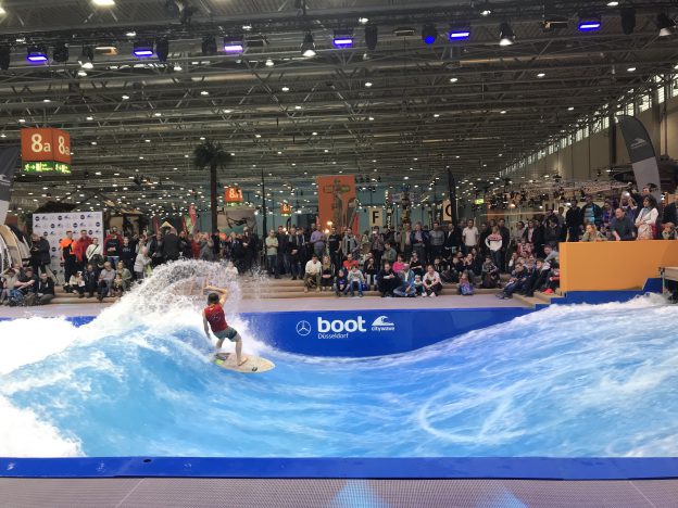
It seems insane that back in January I voluntarily spent time at the “Boot”, a water sports trade show in Düsseldorf with over 250.000 visitors. I was there doing ocean scicomm (check out my Instagram for more information on that), but one of my highlights was definitely THE WAVE.
The wave is an artificial standing wave in a flume that wave surfing and SUPing and all kinds of other water sports can be done on, which looks fun. But even more fascinating — to me — is the wave itself (even though, as you see in the picture above, the wave surfing was quite impressive, too!).
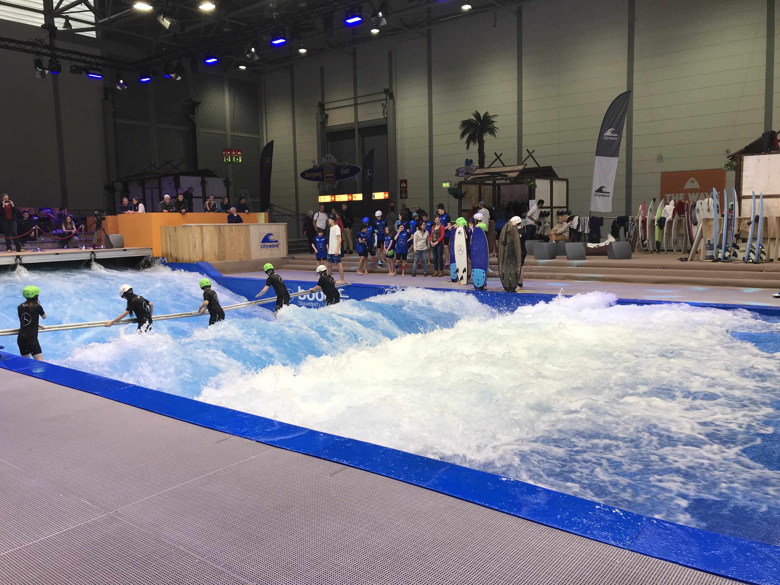
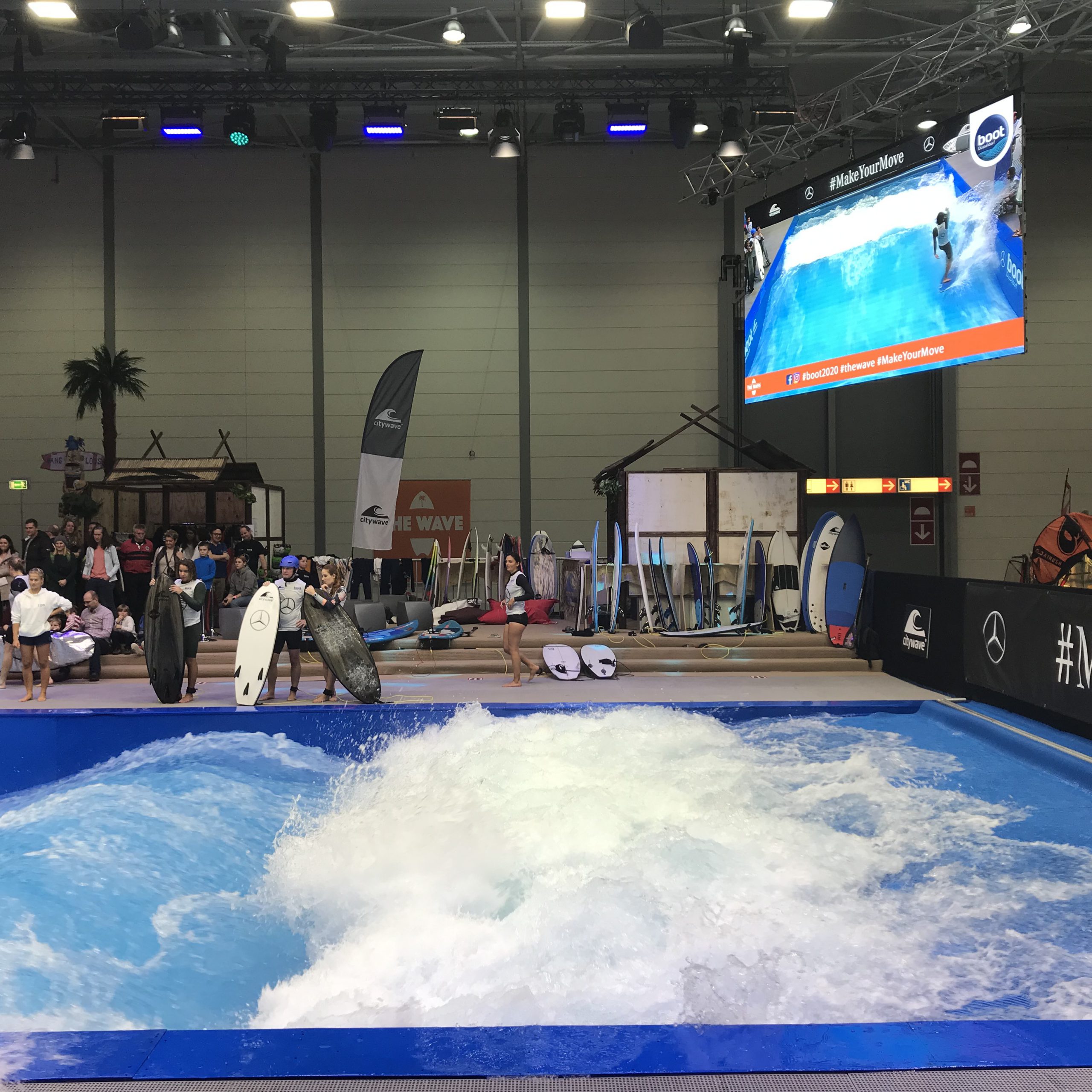
Below, you see some early career wave surfers learning to surf the wave, and you see how it’s set up: A lot of water is pumped very quickly through a flume with a topography that shapes a wave form in the current.
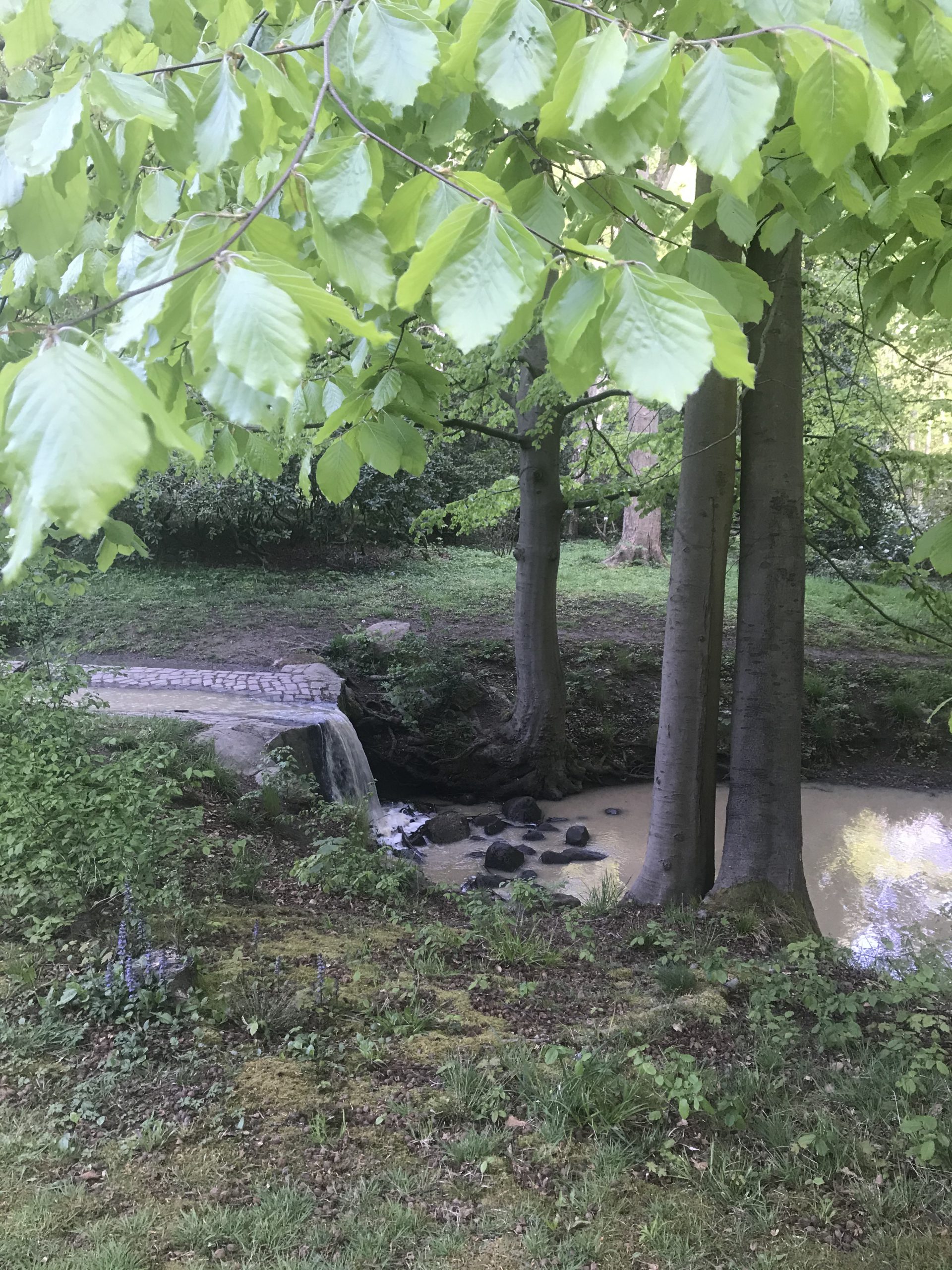
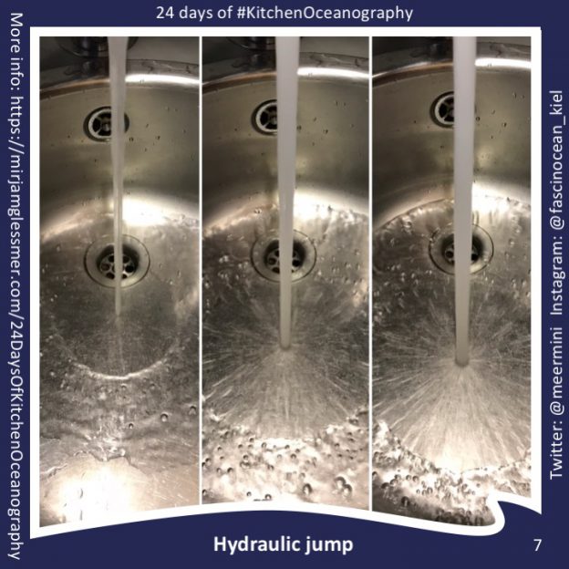
But the best part, to me, is the hydraulic jump at the very end of the flume, where the wave actually breaks back upstream, locked in place, and thus quickly looses most of its energy before the water is pumped back through the loop.
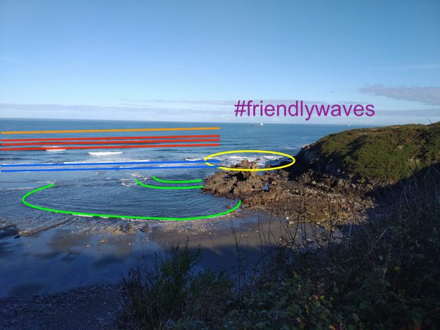
And that’s what I really want to show you in this blog post: That standing waves break in the upstream direction (which I find super counter-intuitive). It’s kinda like the stunt where people run up a wall and then do a backflip: The current runs up a slope and gets slowed down and bunched up into a wave which gets so steep that it starts plunging back down onto itself, but is at the same time washed up the slope in an eternal loop (well, eternal or until they switch off the flume ;-))
So here we have it: The perfect example of a standing wave, showing its weird upstream-breaking behaviour! (and anyway: if it was breaking downstream, it would just be flushed away with the current anyway…)