Category Archives: Uncategorized

A touristy post about my trip to Heligoland

I recently went on a trip to Heligoland, Germany’s only island that is far away from the mainland (70 km in this case). It was a great trip, and I know you’ll be reading about it for some weeks to come :-)

Today, we’ll just do the touristy parts, though, and get into the oceanography later.

The trip started out super awesome. I went on a ferry and got the chance to see ships being greeted by Wilkomm Höft, the Ship Welcome Station, by dipping the Hamburg flag and playing the national anthem. I’ve seen this before, but only from land (this is a place that I love going to for birthdays, mine and other people’s). Sitting on a ship and being bid farewell this way is really touching! I loved it and got a little teary-eyed.

2016-04-27 09.41.47

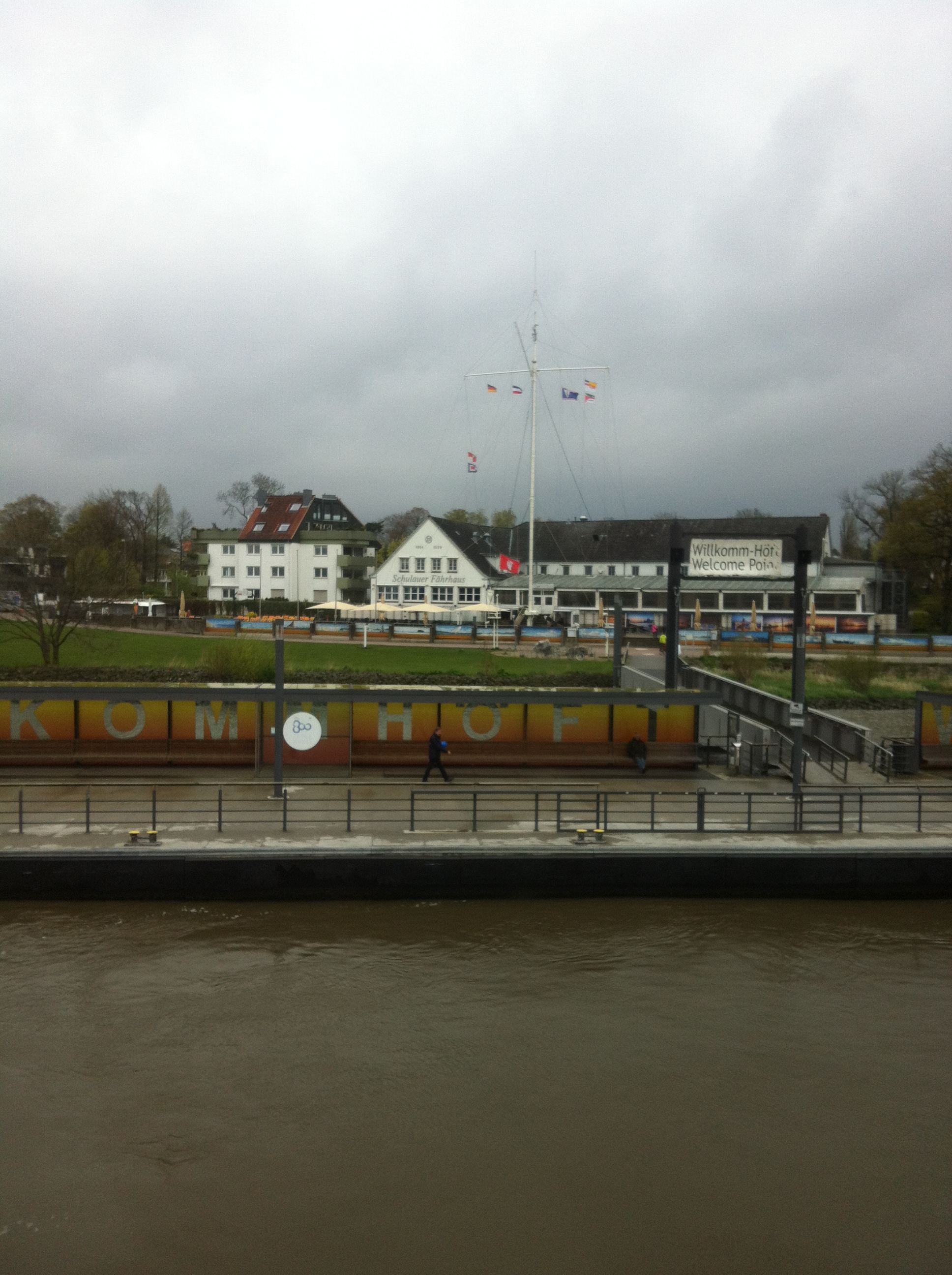
Being bid farewell (by dipping the Hamburg flag and playing music) at Wilkomm Höft in Wedel on the Elbe river.

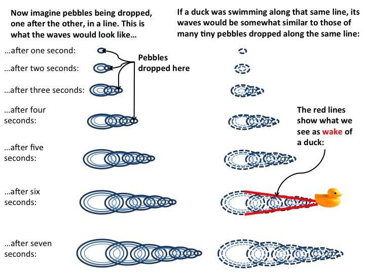
The ferry itself is a high speed catamaran, which, as you might have guessed, produces an amazing wake.

IMG_4439

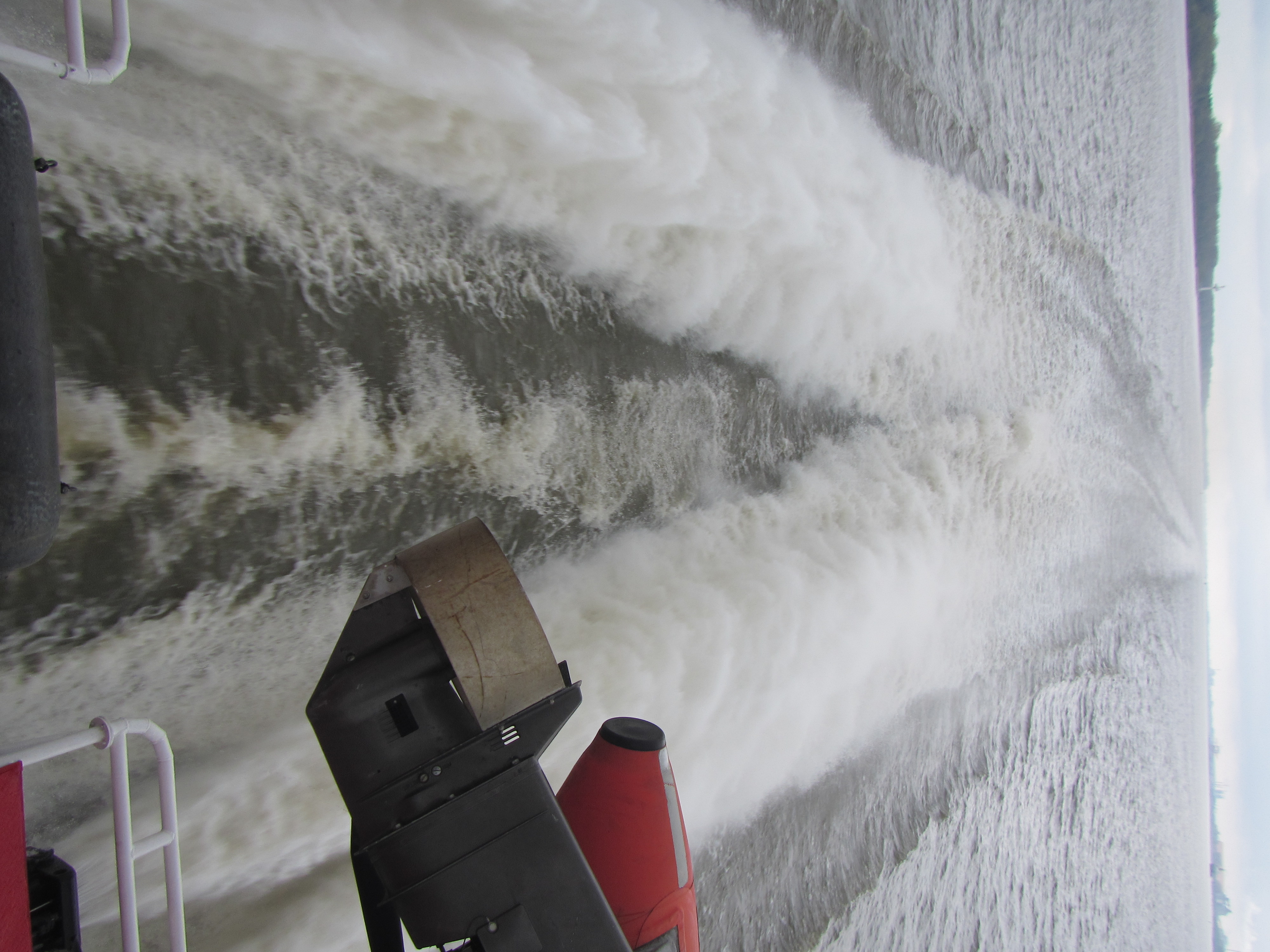
Wake of the Halunder Jet, the high-speed ferry going from Hamburg to Heligoland.

Unfortunately, the ship is set up such that the rescue boats obscure the view of the wake a little. How inconsiderate ;-) Please ignore the outboard engine…

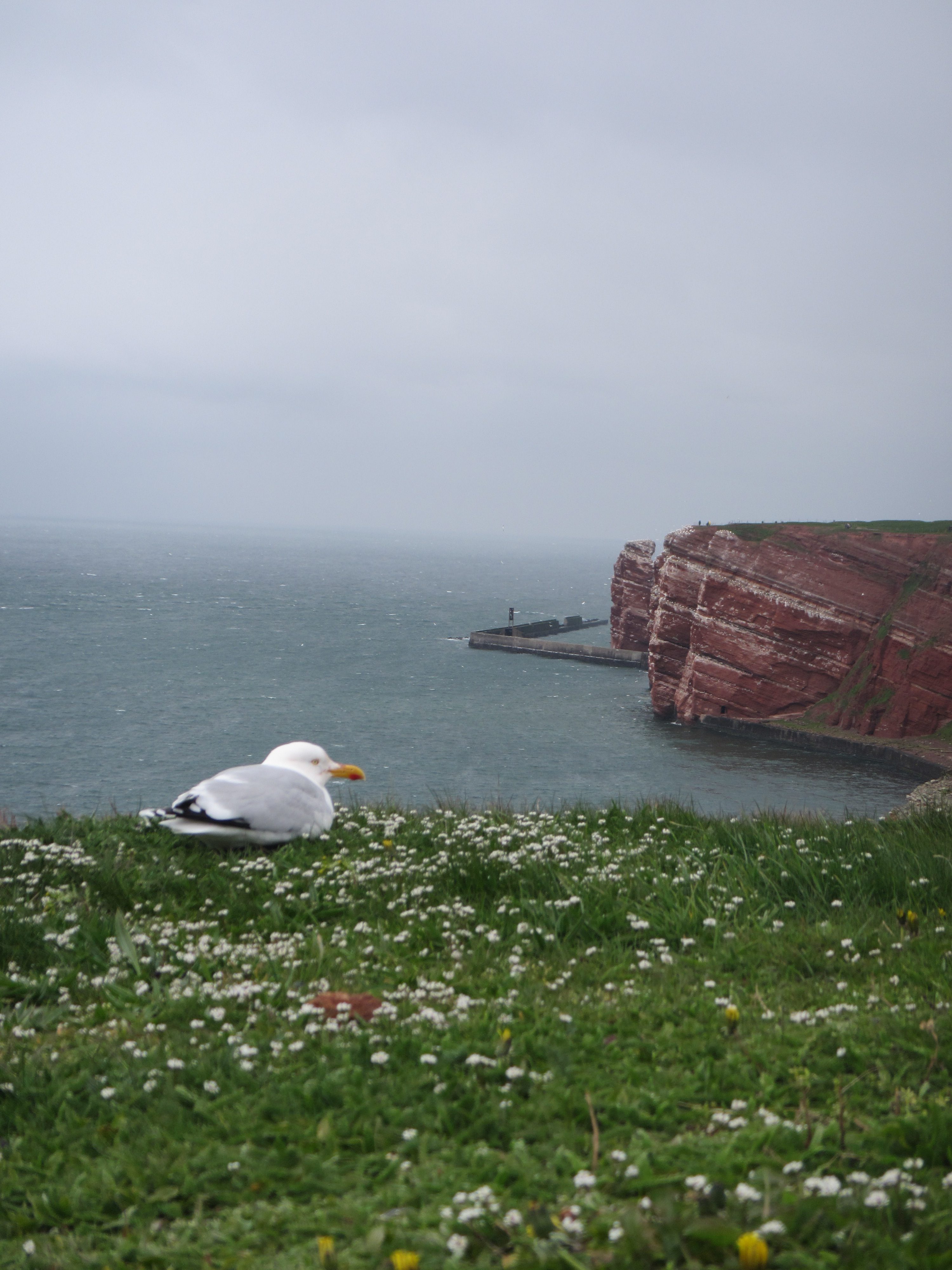
On Heligoland itself, there are the famous red cliffs, and tons of birds. Let me just show you a few:

Heligoland

Heligoland

The best-known part of Heligoland is the Lange Anna — a red rock called “long Anna”. You see it on the picture below. What I liked most about it — besides the beauty of the rock and the birds, obviously — was the wave breaker build there to protect the coast, and what it did to the waves.

IMG_4509

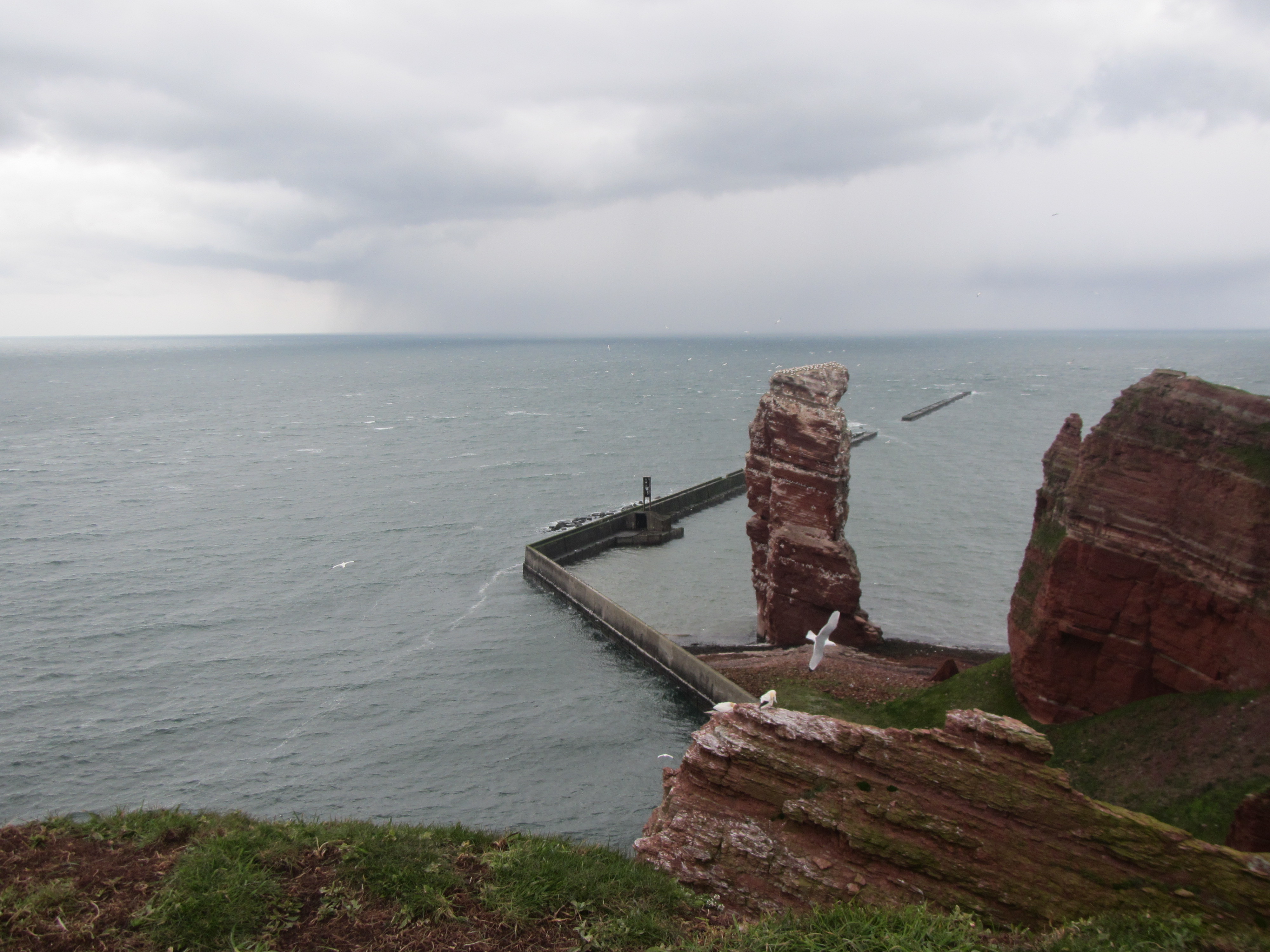
“Lange Anna”, the famous red rock on Heligoland in the German Bight

Zooming in on the wave breaker’s edge, there is clearly very strong winds coming around that corner:

IMG_4515

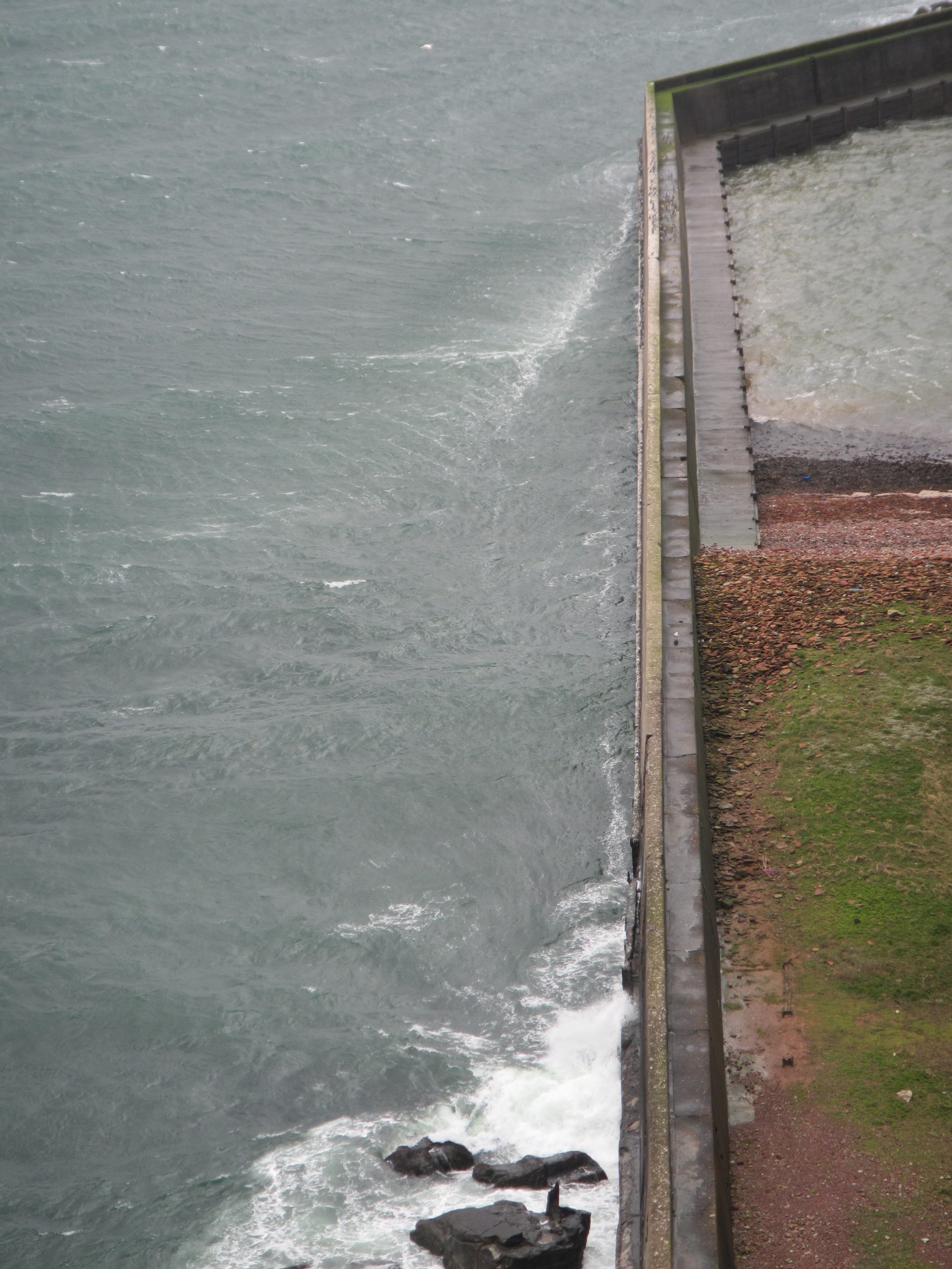
To be fair, it was a super windy day.

They also have a very nice beach on Heligoland, where you can see the bending of waves due to changes in topography that we talked about before.

IMG_4535

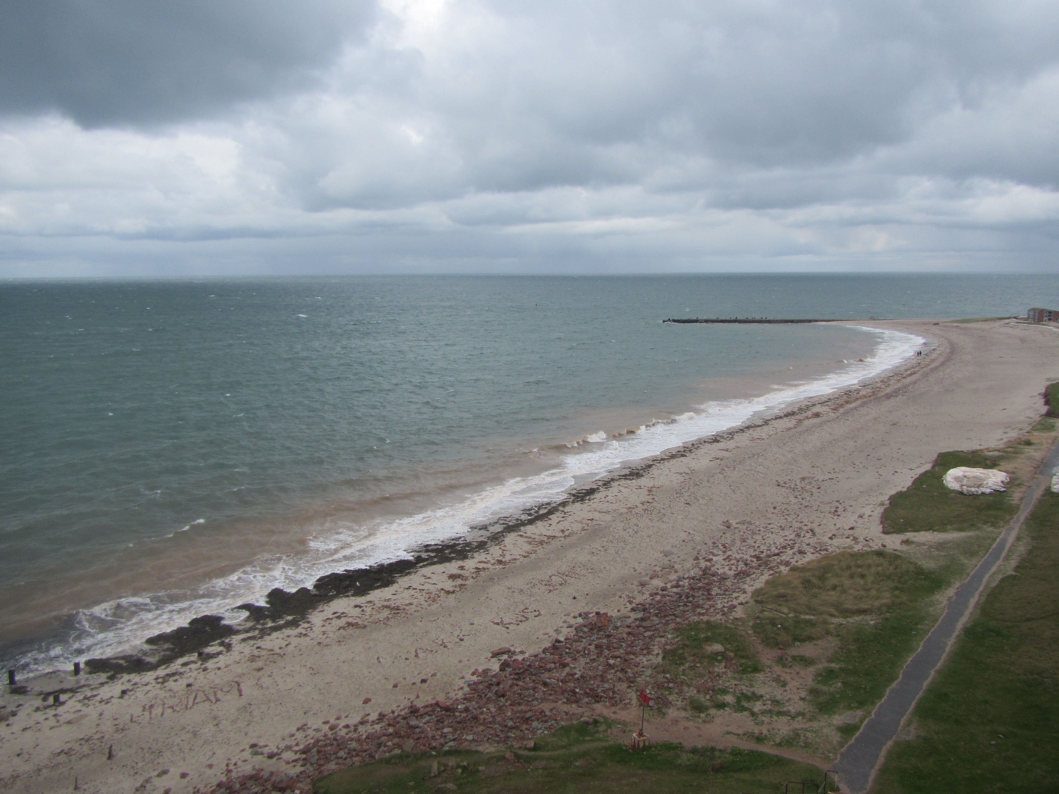
And if you look over to the second island, you can very nicely compare and contrast the upwind and downwind coasts of islands:

See how there are lots of breaking waves (well, you probably only see the foam) on the upwind coast of the island in the back of the image, and how there are absolutely no waves in the lee of the sea wall in the foreground of that picture?

IMG_4567

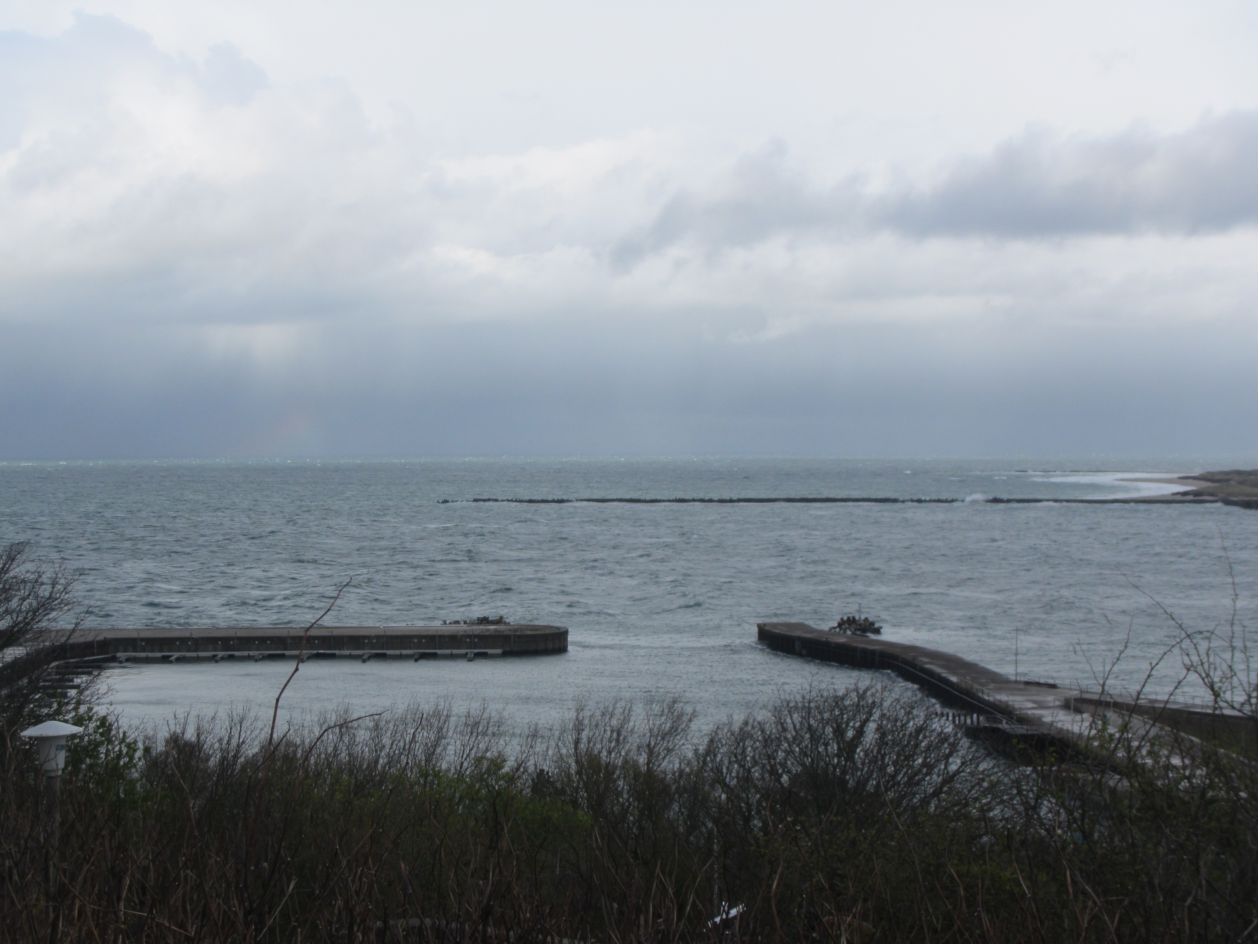
Btw, the downwind side of that same second island looks also a lot calmer as it is sheltered by the island itself:

IMG_4571

Unfortunately, I couldn’t take a picture of the whole island at once, I really need to upgrade my camera… But can you spot the rainbow above?

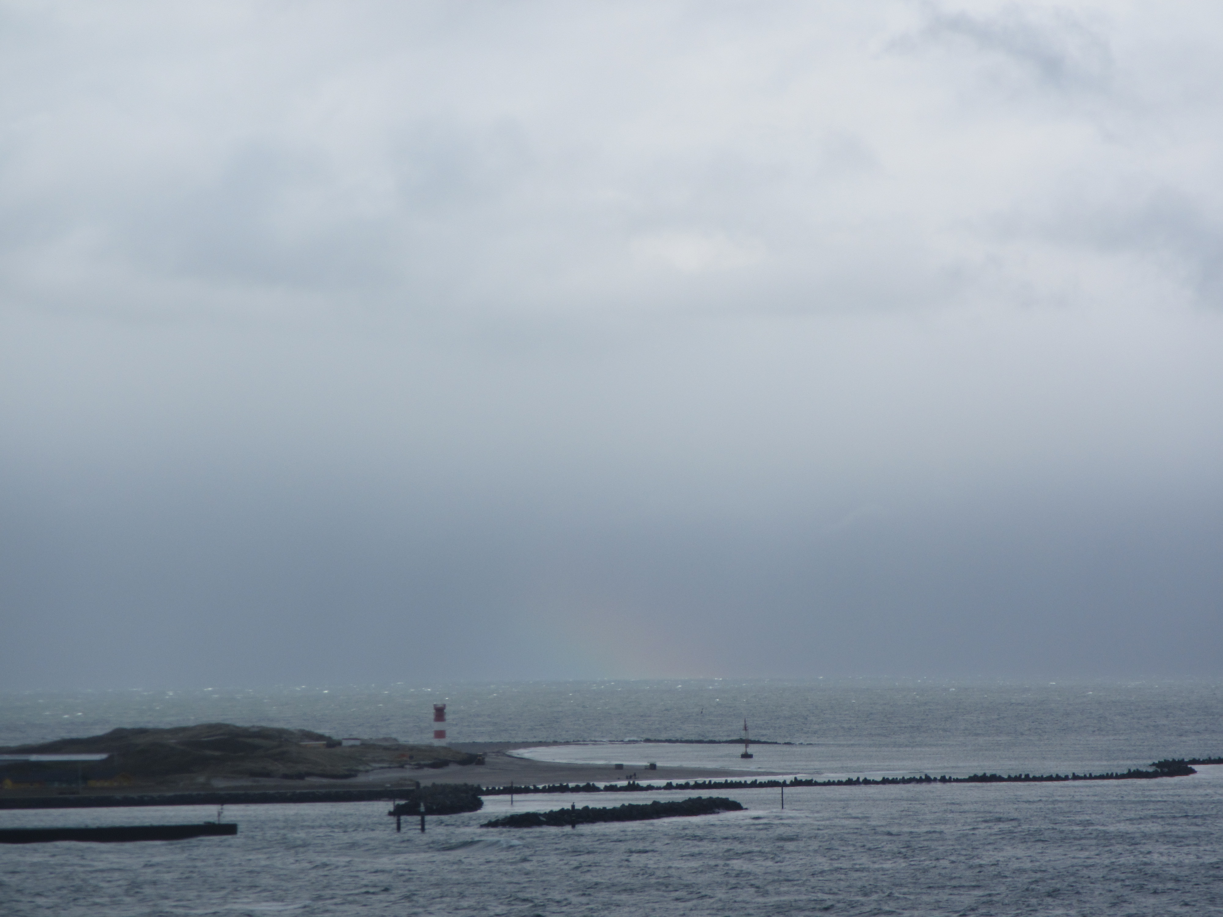
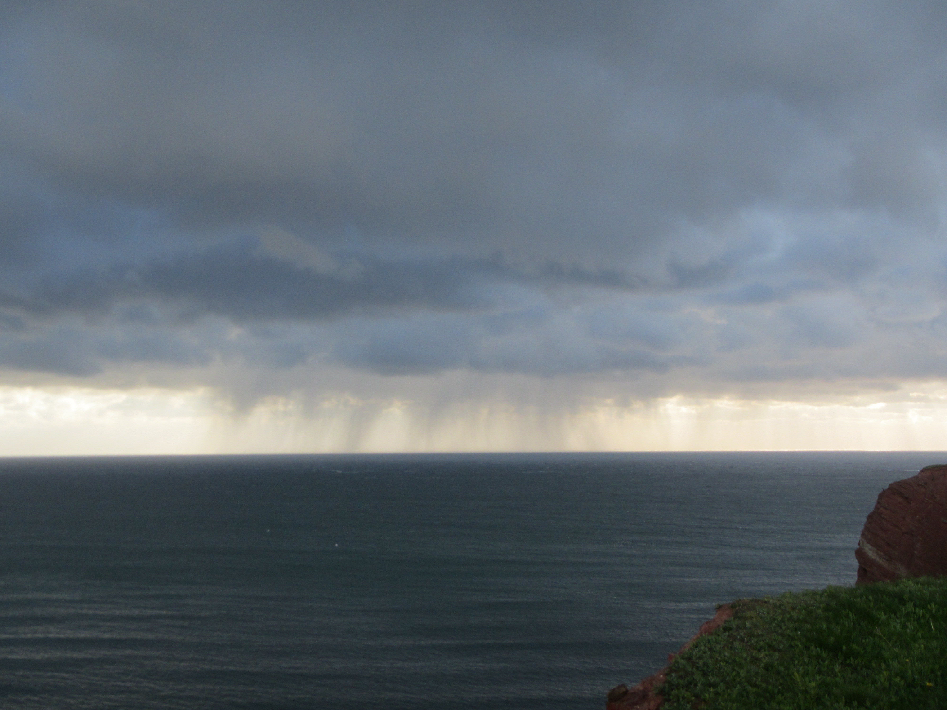
Also there is some more, pretty spectacular weather to be seen:

IMG_4585

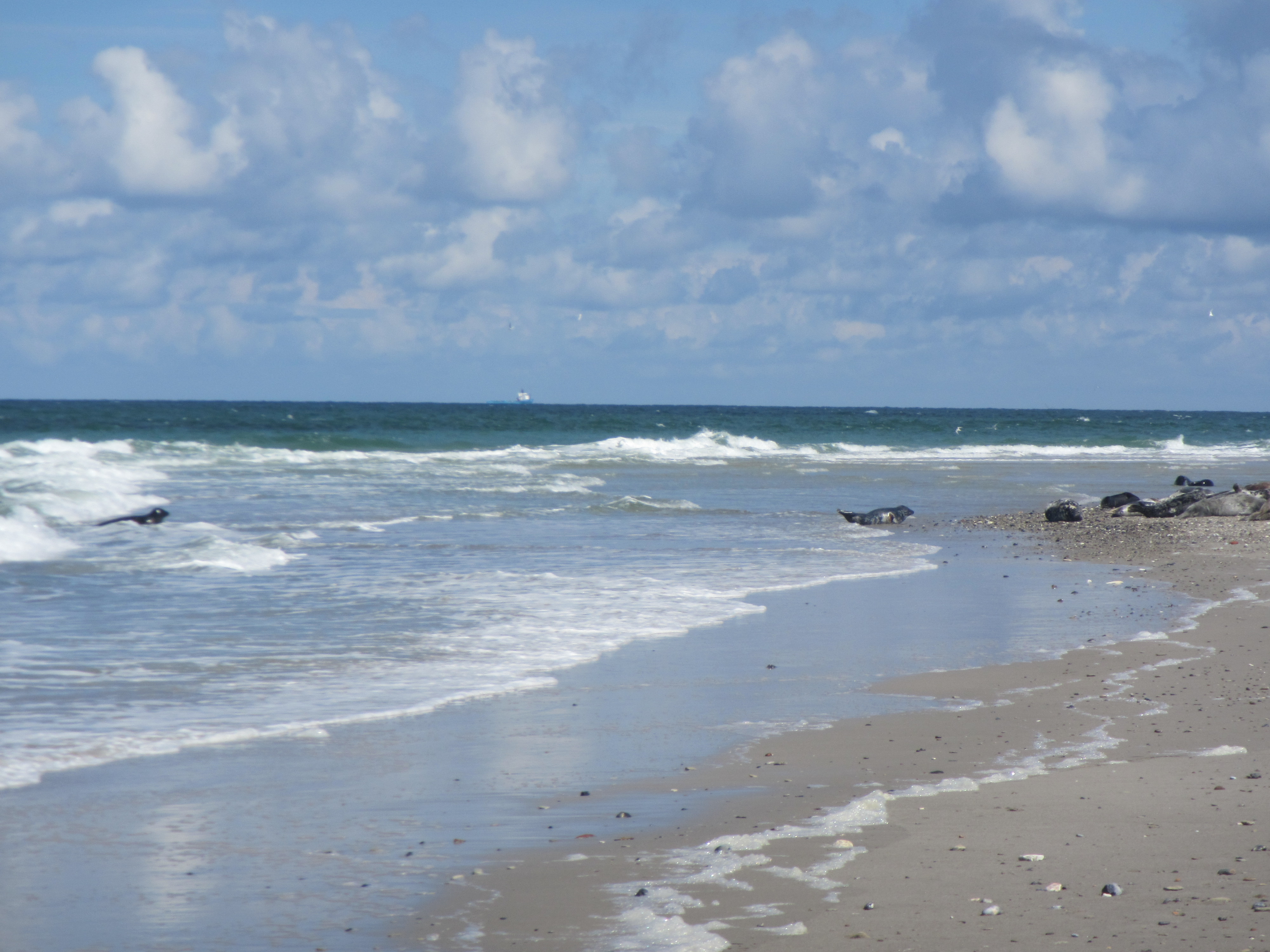
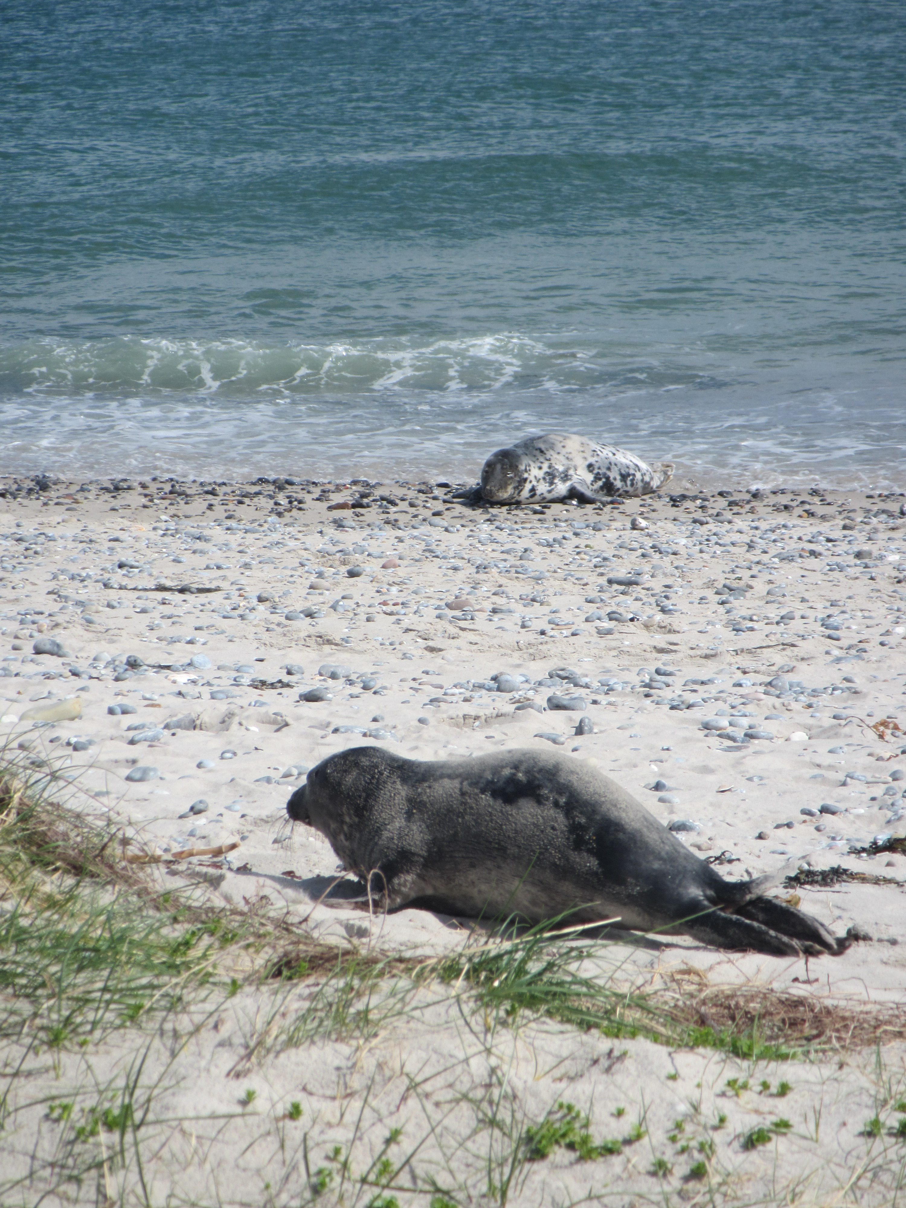
If you go over to the other island, there are TONS of seals. Like several hundred, right on the beach! Obviously, I only have pictures of seals when there are also nice waves happening at the same time :-)
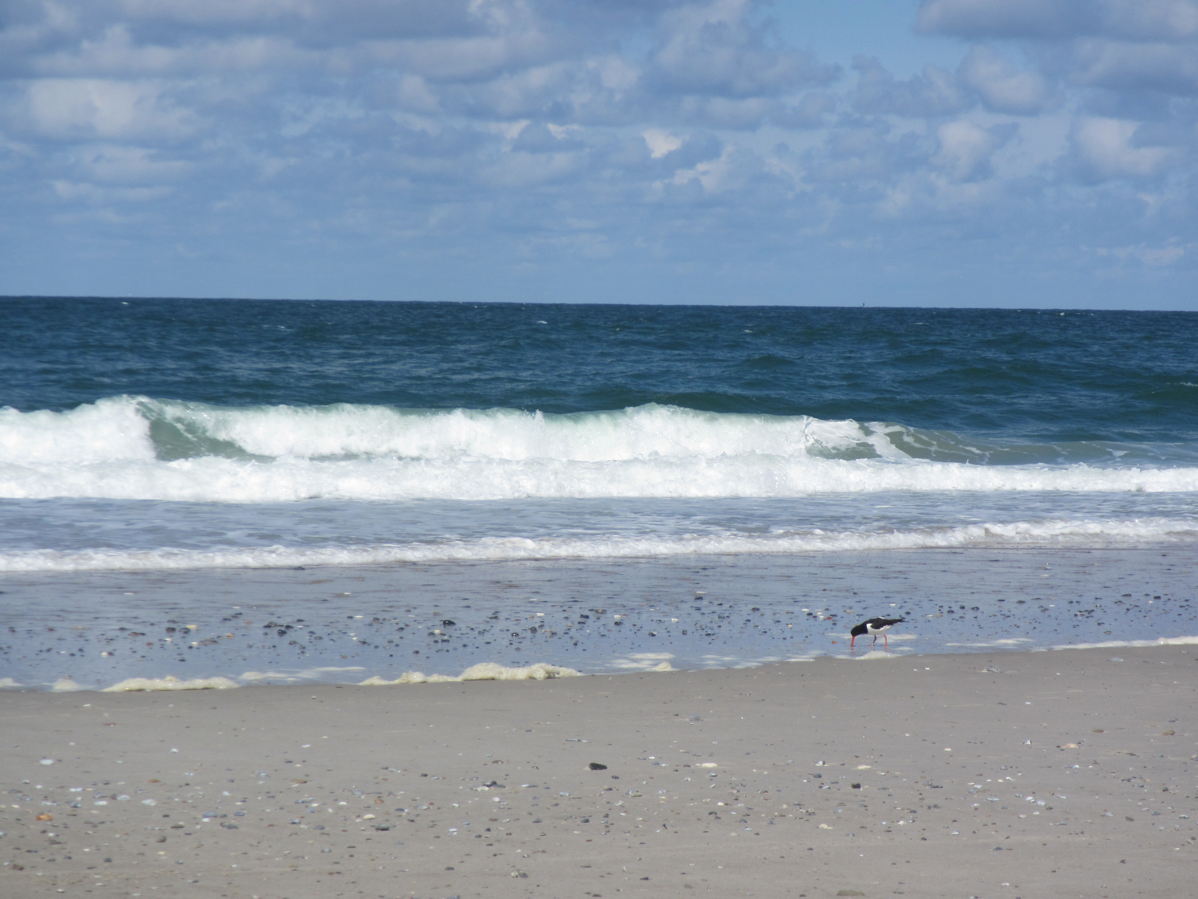
IMG_4677

Oh, and birds.

IMG_4693

And more seals! This one is cute, I have to admit…

IMG_4703

Oh, and I was lucky (lucky means bold enough to ask!) enough to hitch a ride on the local research vessel, Aade. Below, they just finish a plankton trawl. We weren’t allowed out on deck because the weather was so rough…

IMG_4735

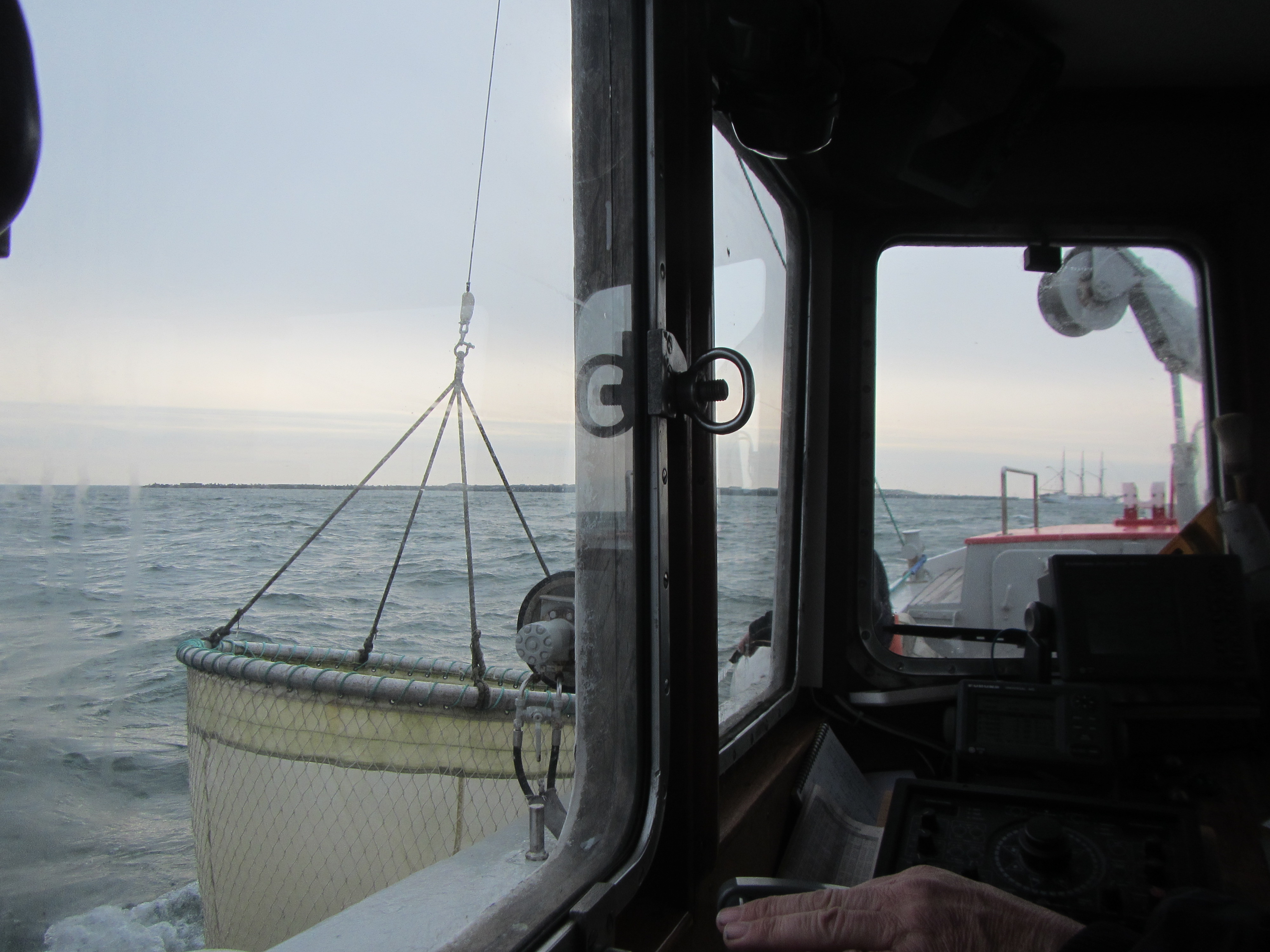
What looks like a calm and serene morning really wasn’t one. It was super windy and wavy! Good thing I don’t get sea sick.

IMG_4745

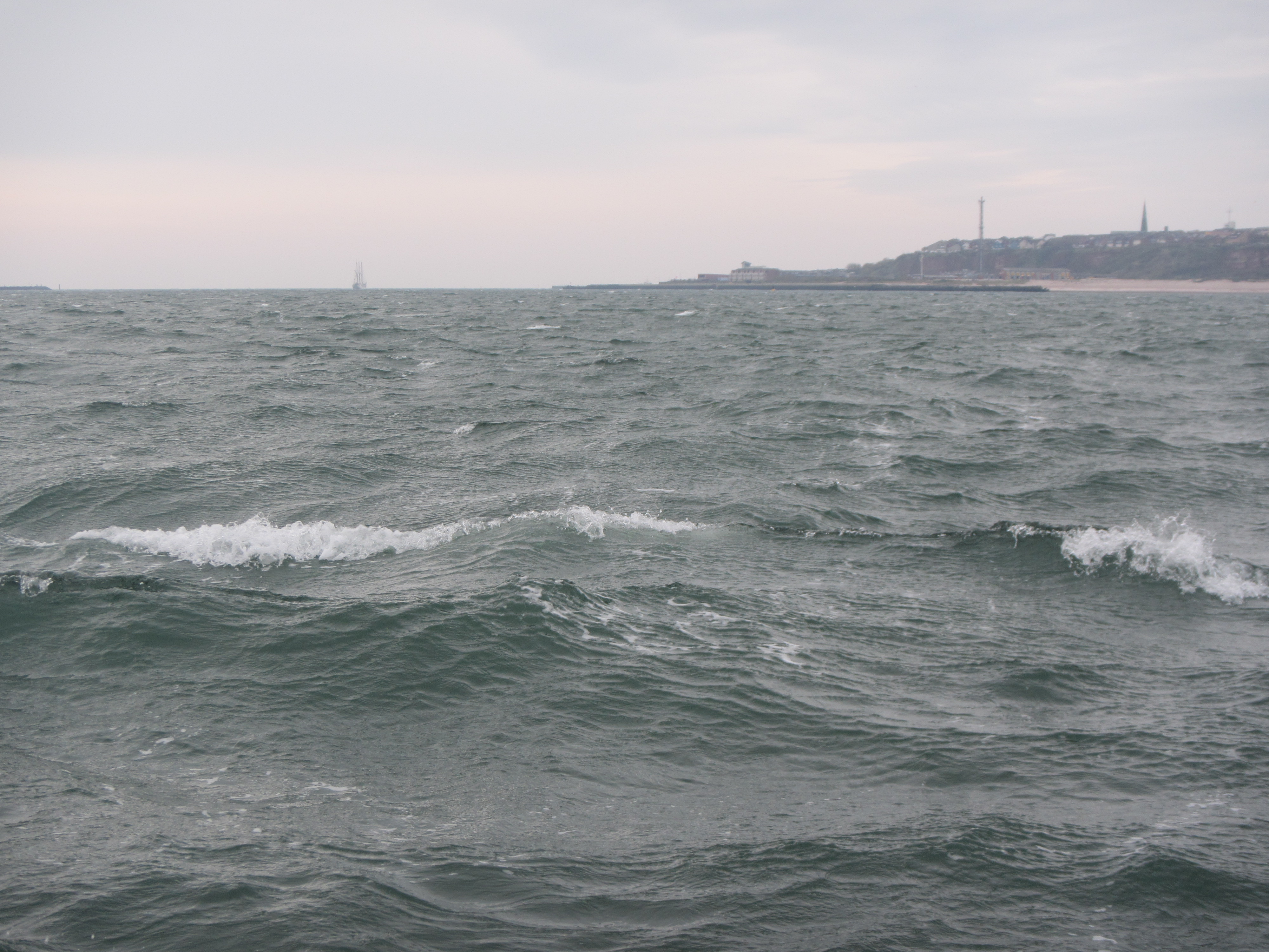
It turns out it’s super difficult to take pictures of waves that look as impressive as the waves are in reality. I really need to learn how to do that! But even if you don’t see the size of the waves, at least you get a different look at “lange Anna” below.

IMG_4762

And these are white caps on the “open” sea, not waves breaking on a shore.

IMG_4776

And for a nice comparison: The Aade (the research vessel I was on) and the catamaran that took me home later that night.

IMG_4797

Anyway, it was a great trip!

Home-Made Geophysical “Globes”

Today I am excited to share with you a guest post about a super cool tool for geoscience teaching and outreach that I will definitely be using in the future (if only to decorate my office until I get the chance to teach again):

Home-Made Geophysical “Globes”

By Barry A. Klinger

makeocta
The Earth is a sphere which is best represented by a globe, but there are many interesting geophysical features which are not available on a globe. Try going to a bookstore and asking for a globe showing sea surface temperature! To remedy this gap, I have written software to create SectorGlobes: polyhedral approximations to a globe, such as the ones shown below.

ontable2

Polyhedral approximations to a globe with geoscience properties on them. Photo: Barry A. Klinger

The front-right SectorGlobe shows annual average surface wind (ERA interim reanalysis). In this image you can see the trade winds in the Pacific blowing towards the west and converging on the Inter-Tropical Convergence Zone just to the north of the equator (the dashed red line intersecting South America on the right). The front-left SectorGlobe shows a more esoteric oceanic quantity: sea surface height, represented by the colored contours (AVISO 2004-2008 average). The sea surface height only varies by a meter or so over most of the globe, but because flow tends to be along the contours of constant height, the contours give streamlines of surface currents. In the picture you can see a good part of the North Pacific Subtropical Gyre. Just off the coast of Asia the streamlines are very close together, indicating a jet called the Kuroshio Current. The SectorGlobes in the rear show (left) sea floor and land topography and (right) sea surface temperature on a particular day (December 15 2005 from AVHRR).

All these quantities can be projected on to a virtual sphere and displayed on a videoscreen, but having a physical object that you can keep on your desk, pick up, and examine while holding in your hand can be more convenient and have more impact. I have brought these globes to classes of high school, college, and graduate students; just having an object to pass around from student to student can wake people up in the middle of a relatively abstract lecture. Students can also be encouraged to make their own – constructing them is an interesting exercise in geometry, especially for high school students.

topogocta0b
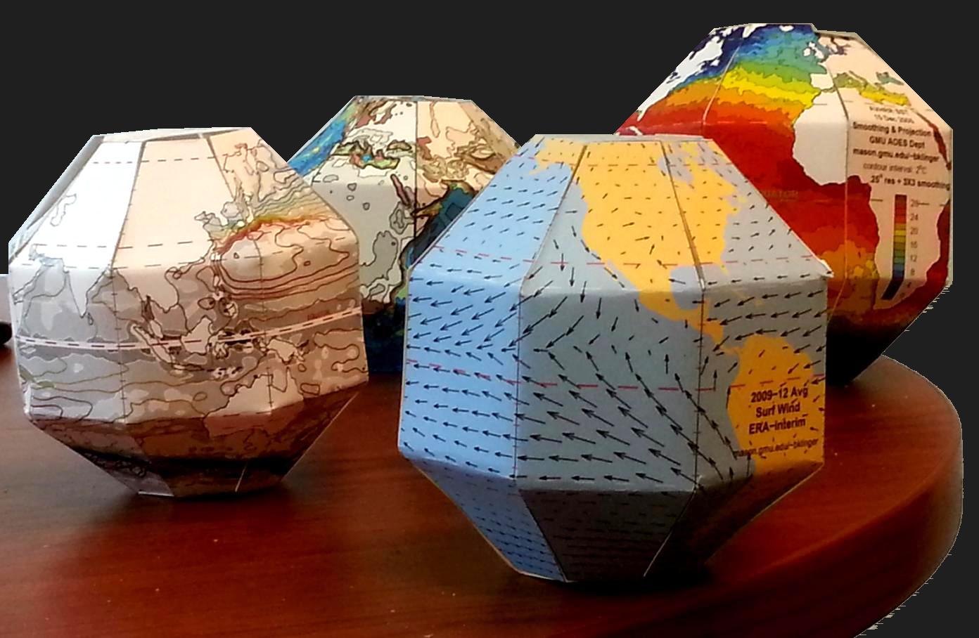
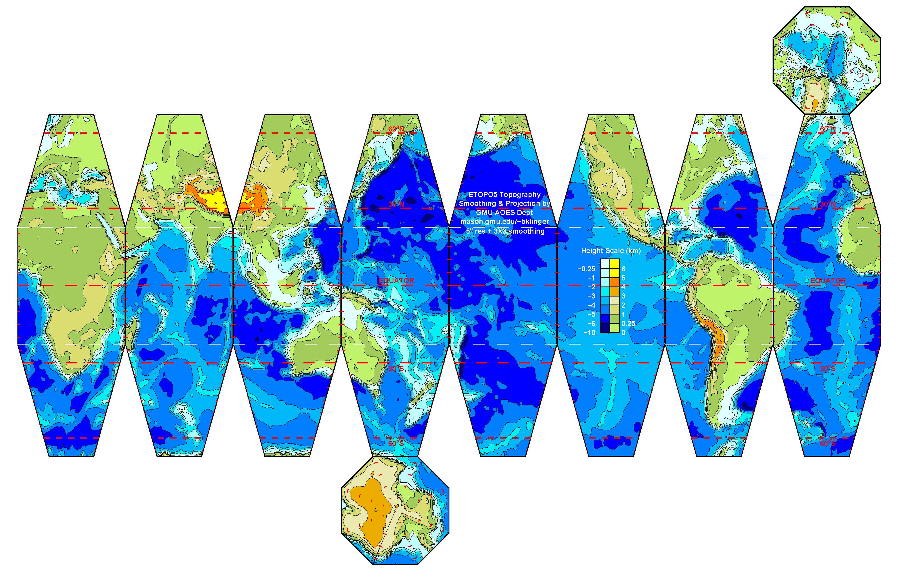
Once a map is projected on to a flat image, like the one above, and printed out, I can create a SectorGlobe after about 20 minutes of cutting and pasting (with actual scissors and tape, not Microsoft Office products!). The sectors also have to be folded along the white lines. It is rather entertaining seeing the object snap into the correct shape as the last few edges are connected.

My SectorGlobes web pages include some sample SectorGlobes for printing as well as instructions and Matlab scripts for creating new SectorGlobes. Please contact me (bklinger@gmu.edu) if you have used any of the resources there, if you have any questions, or if you have any new ideas about how to use the SectorGlobes or new fields to display with them.

Why moist air is lighter than dry air.

Why is moist air lighter than dry air? This seems pretty counter-intuitive at first, but then really isn’t.

I promised to do a post on why moist air is lighter than dry air a long time ago, and wrote it about a year and a half ago (!), but never published it. So here we go now!

First, we need to assume that air is an ideal gas. In that case, the number of molecules in a given volume depends only on the pressure and temperature of the gas. This is given in the ideal gas law:

PV=NkT

with P the pressure, V the volume, N Avogadro’s number = 6.0221 x 10²³ /mol, k the Bolzman constant 1.38066 x 10⁻²³ J/K and T the absolute temperature.

Is the assumption that air is an ideal gas a good one? Despite my sister’s insistence, I am not going to write a post on how I dyed all molecules in a volume of air and counted them (very funny, ha ha). So experimentally confirming N or k isn’t going to happen. But we can qualitatively show that if the number of gas molecules increases and the temperature stays the same, pressure and/or volume have to increase. We can also show that if we change the volume, this will affect pressure and temperature. All of those experiments might happen in a future post, they are all pretty standard and not very exciting.

Assuming that the ideal gas law holds for air, this means that since the number of molecules per volume is constant, the density depends on the mass of the molecules inside the volume.

Air contains a lot of N2 and O2. N’s atomic unit mass is 14, O’s is 16. N2 and O2 hence are heavy molecules with N2 weighing 28 and O2 32 atomic units. Water vapor are water molecules, and the atomic weight of H2O is 16+1+1 = 18. Each water vapor molecule is hence a lot lighter than any N2 or O2 molecule, and since the total number of molecules per volume at a given temperature and pressure is constant, the more H2O molecules replace N2 or O2 molecules, the moister – and lighter – the air gets.

If waves spread equally in all directions, then how come we see linear wakes?

If waves spread equally in each direction along the water’s surface, then how come ships (or ducks) have wakes that are just those long lines of waves and not circular at all?
So. Kids are typically familiar with what it looks like when you throw stuff in the water (for proof see below: my godchild on a “Tour de Ruhr” where I learned tons of stuff about mining in Germany. I had no idea that stuff was so interesting! Anyway, I digress. Obviously you had to throw stuff in the water when the reflections are this awesome!)
IMG_4137
But then wakes are seemingly behaving in a very different way. For a nice example of a wake, see the movie below. In that movie, you are looking backward from a boat at its starboard wake. The boat has been sailing straight ahead for a bit after turning to the starboard side (and you will see the resulting curve in the wave in the movie).
Even though slightly curved due to the ship’s change in heading, that wave clearly doesn’t look like a ring around the boat (from where I found the video on my phone I think it must have been a touristy boat in Bergen that I went on with my friend Leela).
So. Good question, isn’t it? Why does the wave look straight? Now don’t tell me it has something to do with interference and stuff, because I need to explain it to a young kid.
I have attempted an explanation, but I am really not sure if it works. What do you think? Check it out and let me know!
The image below shows a sketch of what it looks like if you throw a pebble into the water (or the pattern a raindrop would make). Ideally, we would only see one ring, but since a secondary drop is typically thrown into the air (and sometimes a tertiary) let’s work with three concentrical rings of waves so that the pattern looks as much as possible like what the kid would be likely to observe. The fading colors indicate that the second and third ring have a smaller amplitude than the first one (whose amplitude should be decreasing as time goes on, but let’s not get too technical here…).
Stein
So now how to go from the pebble to the wake? Continuous pebble drops!
From this we have the bow wave and the choppy water inside those two rays of waves. Of course, there we would also have turbulence due to the ship’s propeller or the duck’s feet etc, but maybe this is enough for now?
Except to add that those kind of waves are shock waves (the source of the waves traveling faster than wave speed) — in 3D and in air, the same physics would lead to sonic boom! :-)

The importance of playing in outreach activities.

Some time ago, I wrote two blog posts on the importance of playing in outreach activities for the EGU’s blog’s “educational corner” GeoEd. Both have now been published, check them out! Here is the link on EGU’s website (here) and in case that ever stops working, it is also available on my own website (here – including a lot of bonus materials that didn’t make the cut over at EGU)

What do you think? What makes for the best outreach activities?

Judging at a youth science competition. Or: Colourful bubbles!!!

Last week my colleague Uta and I had the pleasure to act as a judges in the largest German youth science competition, “Jugend forscht“. Jugend forscht has been around for a long time, and I’ve been familiar with it for quite some time, too: My sister participated a couple of times when she was a teenager, and my mom was the instructor for many many projects over the years. But this was my first direct exposure, and it was so much fun! For a collection of pictures, assembled in a fun movie by TUHH staff, check this out!

Participants, aged between 15 and 21, choose their own topic to do research on. They work on the project, write a short thesis, and then present their work at a science fair. The projects are judged by volunteers with a background in the respective topics of the projects. I got to be the judge on five projects: four in physics and one in Arbeitswelt (and I have no idea how one would call that in English – Wiki suggests “work environment” but I don’t know that one would understand what that is supposed to mean if one didn’t understand the German). And three out of my five projects were actually from the young version of Jugend forscht: “Schüler experimentieren”, where participants can enter as early as fourth grade.

2016-02-20 12.36.13

Participants being handed their certificates for their first price! Hamburg University of Technology, February 20, 2016

There were so many great, innovative projects around! But my personal favourite was Lina and Lia’s project: Producing coloured bubbles! The two of them were bored with the white bubbles in their baths and set out to figure out how to make colourful bubbles. Not an easy task, seeing that the colour is actually only in the water/soap mix, not inside the bubbles themselves! But they did brilliantly and even came up with methods to make the foam last longer.

But of course there was this nagging thought in the back of my mind: What if I could make bubbles with colour INSIDE? How would one do that?

Here is my idea. At least grey bubbles should be easy enough to produce: Blow out a candle so that it produces smoke. Blow the smoke through the ring of a soap bubble maker into the bubble. The smoke should stay visible inside the bubble! Right? I think the challenge is that whatever colors the air needs to stay suspended inside the bubble, so any pulverized color won’t be helping as it would just stick to the walls of the bubble. What do you think, any great ideas? Best picture of bubbles with colors inside wins a fantastic price! :-)

Anyway. Congratulations to all participants — you did a great job!

P.S.: Obviously, the above could be achieved much more easily. One could just ask a smoker to exhale into soap bubbles! But we don’t want to encourage anybody to use this as a pretense to smoke, not even for science’s sake… ;-)

Producing a MOOC about the ocean

I’ve recently been lucky enough to be involved in the production of the MOOC “One Planet — One Ocean: From Science to Solutions” by the excellence cluster “Future Ocean” in Kiel. Well, only in one chapter, and also there only in the after-production, but it was still interesting enough (I learned so much, and it was great fun!) to warrant one of the highly competitive time slots on my blog :-)

By the time I got involved in the production, all the lectures for my part had already been filmed (read more about the filming part here), transcribed, and a “rough cut” had been uploaded on a video sharing platform. A “rough cut” it pretty much a first draft: The producers had cut down the footage they had to about 10 minutes per video, and had added graphics and animations. My task was now to carefully look through the rough cuts and evaluate whether the graphics were suitable for their purpose in the movie, and where necessary to suggest alternatives. Also, if there were redundancies or other bits that could be cut, I was to suggest those, since with people’s typical attention span, the shorter the movie, the better. For a while, I was also to suggest placing and content of slides to break up the videos and summarise previously made points, but this idea was dropped during the process.

So what did my feedback actually look like? Below is a screenshot of the kind of document I sent in. In the left column are text snippets from the transcript of what the narrator of these lectures, Martin Visbeck, is saying, combined with the time from the rough cut. And on the right are my suggestions. As you can see, there are a lot of links to pictures and a couple of sketches.

Screen Shot 2016-01-13 at 07.25.35

My feedback on the rough cuts. Left column are text snippets from the transcript, middle column are times from the rough cut, and right column are my suggestions.

Sketches like the one below, for example:

2015-12-12 17.05.17

Sketch of part of an animation that I suggested. Since Martin was talking about the individual parts of the North Atlantic gyre (Gulf stream (1), North Atlantic current (2), Canary current (3) and North Equatorial countercurrent (4)), before talking about gyres in the other ocean basins (South Atlantic (5), North Pacific (6), South Pacific (7), Indian Ocean (8)) I thought this, plus asking the individual arrows appear whenever Martin mentioned them by name, might be enough to clarify what I wanted to see. Turns out it was not.

But it turned out that sketches weren’t good enough to communicate my very specific ideas (duh! quelle surprise!), so I went and made a slide show in Power Point to show what I wanted. Click through the slide show below to get an idea of about half the animation steps (I couldn’t be bothered to screen-shoot every single step, also I thought no reader of my blog would actually want to look at all of them in the end anyway ;-))

[Best_Wordpress_Gallery id=”1″ gal_title=”Slides MOOC suggestions”]

(The map I am showing in the slides above and the movie below is taken from here with permission: http://www.freeworldmaps.net/outline/maps/world-map-outline.gif)

I had assumed that the slides above would be precise enough an instruction for the animator to translate into an actual animation, but funnily enough — they were not. Which is probably not surprising, seeing how many times I have drawn that kind of sketches before, and that they probably saw them for the first time. So I went and did this:

What you see above is movie of the slides, including the text the speaker on the video is saying, read by me. And if you want to see the final product, check it out as soon as the MOOC goes live, I will keep you posted!

So what did I learn from the whole experience? A lot!

For one: communicating with people who don’t have the same oceanography background that everybody on the Kiel-end and I have, about how to actually show the concepts. Seeing my sketches transformed into animations was fascinating, especially in those cases where the animation showed pretty much exactly what I had sketched, and I realized that what I had sketched actually didn’t fully describe what I had had in mind. Which I didn’t realize before, because everybody I talked with about my sketches had seen a similar way of describing those phenomena before, so my sketches appeared to be perfectly clear. I never before realized how very specific every description has to be when someone from a different background has to reproduce your ideas! Talk about the expert blindspot problem…

Then, that if I were to ever be involved in a MOOC production, I would first write out exactly what is supposed to be said, then bring together the visuals I want, and only then film the whole thing. Finding graphics and animations is a lot more difficult if you have to match them to the color scale the speaker is talking about after the fact ;-)

And then just by writing this blog post, I — for the first time ever! — included a gallery to one of my posts. I’ve been meaning to do this for a while, but never got round to it. How do you like it?

Oh, and my involvement with the MOOC didn’t end there: I also get to develop activities and tests connected to the physical oceanography part of the MOOC! More about that in a later post.

For now I just want to thank Martin, Avan, Georgia and Hala for the great experience!

A vision for open door classrooms

A vision for open door classrooms. Or maybe a reality in some places already? At the very least something to aspire to!

While browsing the materials connected to the #MOOCMOOC, I got a bit side-tracked and came across a slide show by Jesse Stommel on Open Door Classrooms. That slide show brought up a lot of points that resonated with me, for example “We need to recognize that the best learning happens not inside courses, but between them”. SO TRUE!

There are several tips on how to adapt content for an Open Door Classroom, one of which I particularly like: “Realize that content is not actually a marker of expertise. From the first moments of a course, relinquish (some, but perhaps not all) authority and model uncertainty. Say directly that the course will focus less on the expertise of a teacher and more on the growing expertise of students.”.  And the next one: “Student-generated content is the stuff of learning. And it can’t be populated into a learning management system in advance of the students’ arrival to the course”. And the next one, and the one after that, and then the one after that. Check it out below!

I found this slide show so very inspiring. I am currently “protecting” this blog by the strictest creative commons licence, CC BY-NC-ND. When I chose that license, I was thinking that if anyone wanted to use any of the materials I present here and modify them for their own purposes, all they needed to do was get in touch with me to get my permission, which I have no reason of withholding. By not using a more open license, I was hoping to have people contact me, thus providing opportunities for discussion, potential cooperation and definitely interesting contacts. But now, inspired by the slide show above, I am wondering whether I shouldn’t have used a less restrictive licence to begin with. People who want to talk to me would still do that, and everybody else, who might do great things with my materials, is now prohibited from using them and thus I am keeping my thoughts from being developed further by others.

I am still a little reluctant about changing the license, because I do put a lot of time into this blog and I really wish people got in touch with me if they liked and wanted to use my work, but I feel like my stand on this might be changing right now. So if you see my license change, you know why: Because of that slide show!

For the best hands-on outreach experiences, just provide opportunities for playing!

For the best hands-on outreach experiences, just provide opportunities for playing!

Have you seen my blog post over at GeoEd on four steps to designing and implementing hands-on outreach activities? Go check it out! And at the end of this month I’ll walk you through those four steps using one of my favourite experiments as an example! Stay tuned (and read GeoEd) :-)