This is neither “oceanography” nor “teaching”, but so much “adventure” that these pictures still deserve their spot on “Adventures in oceanography and teaching”. I did a tour into two (non-active ;-)) volcanoes and it was AMAZING!

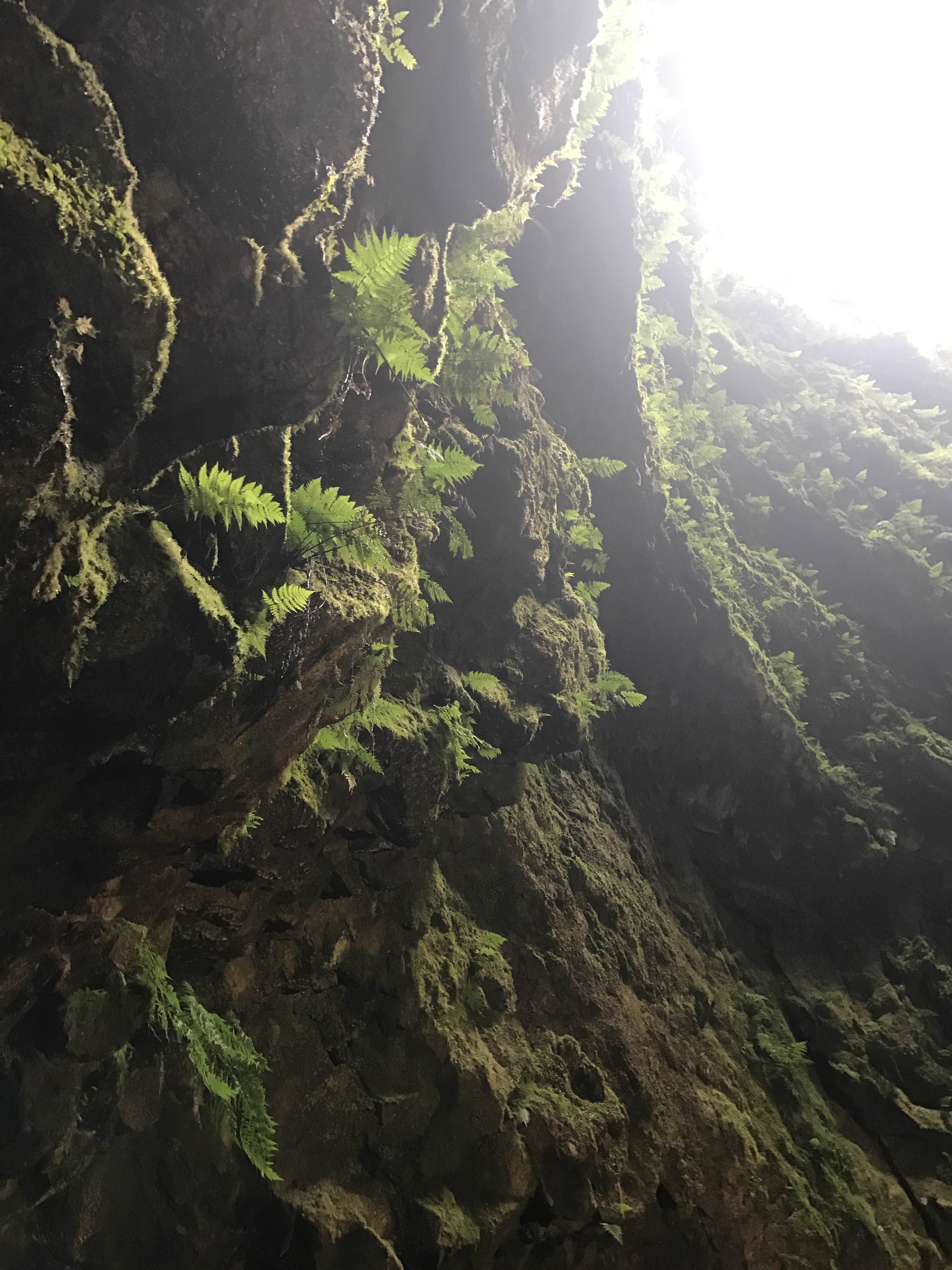
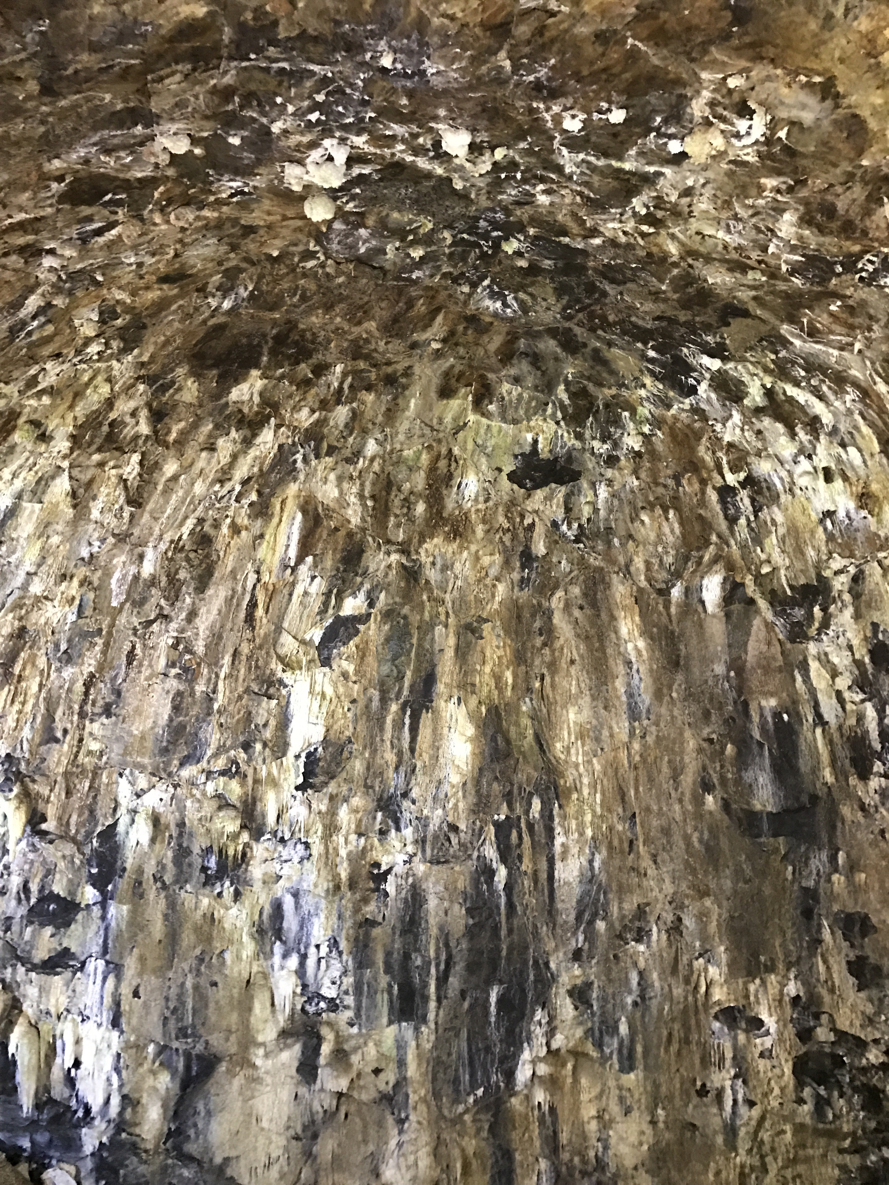
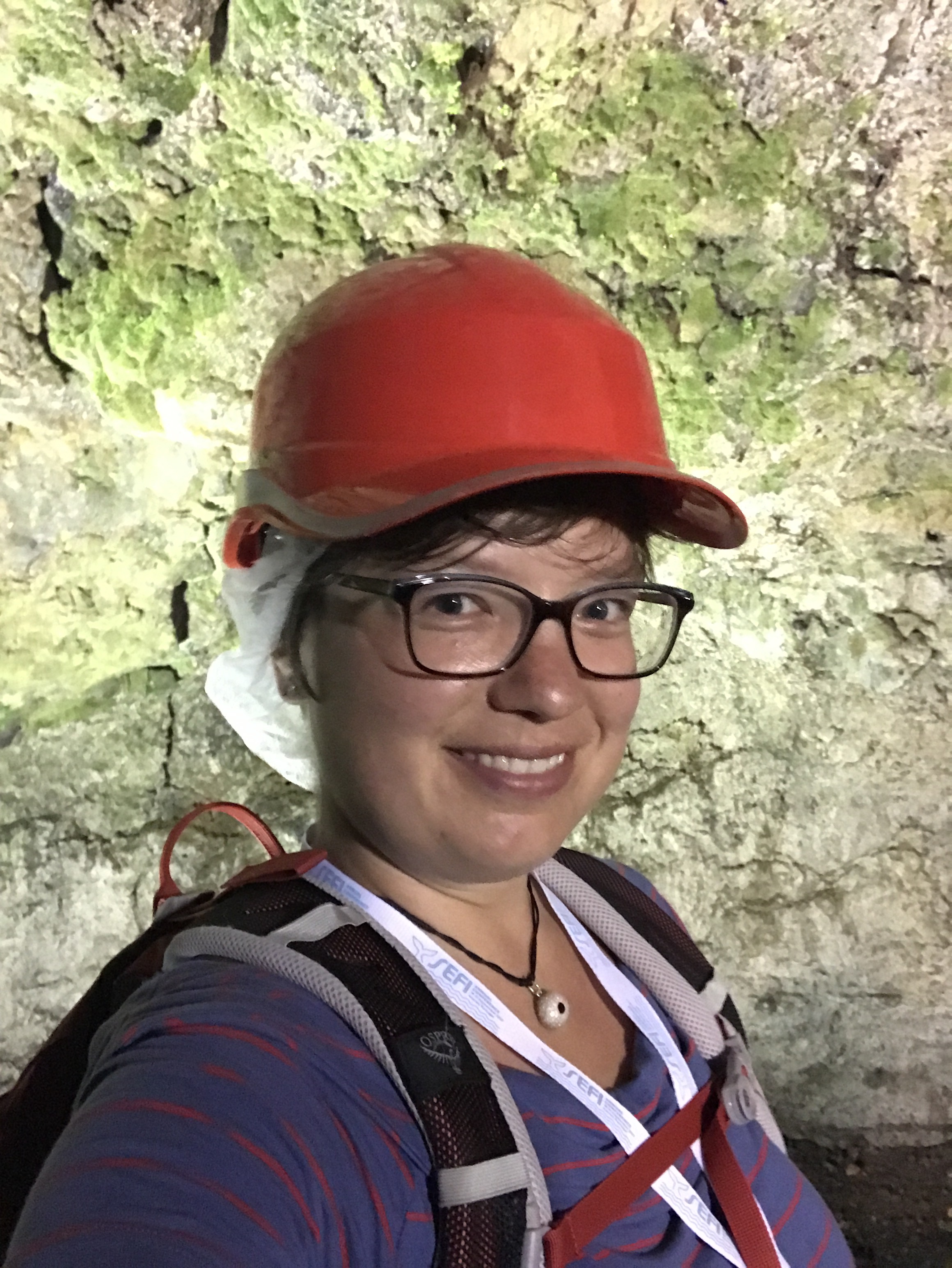
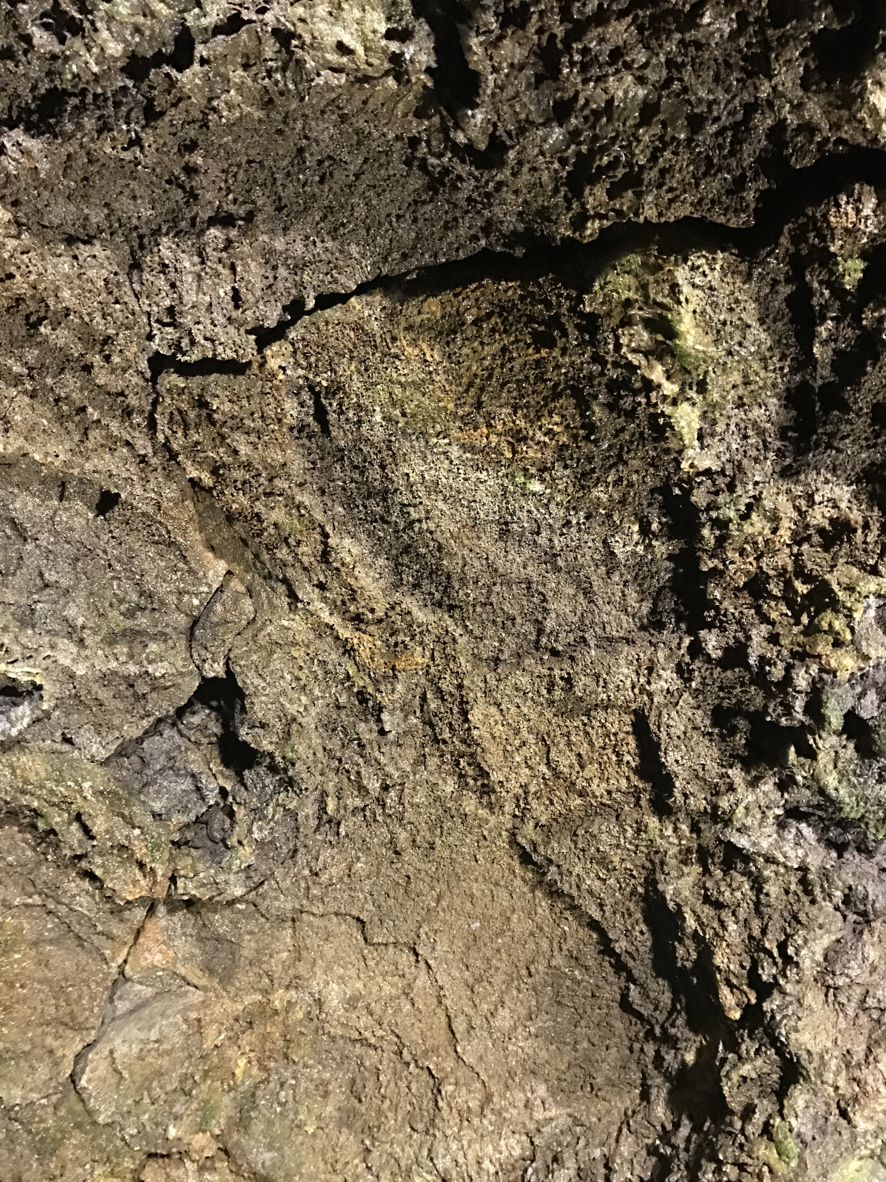

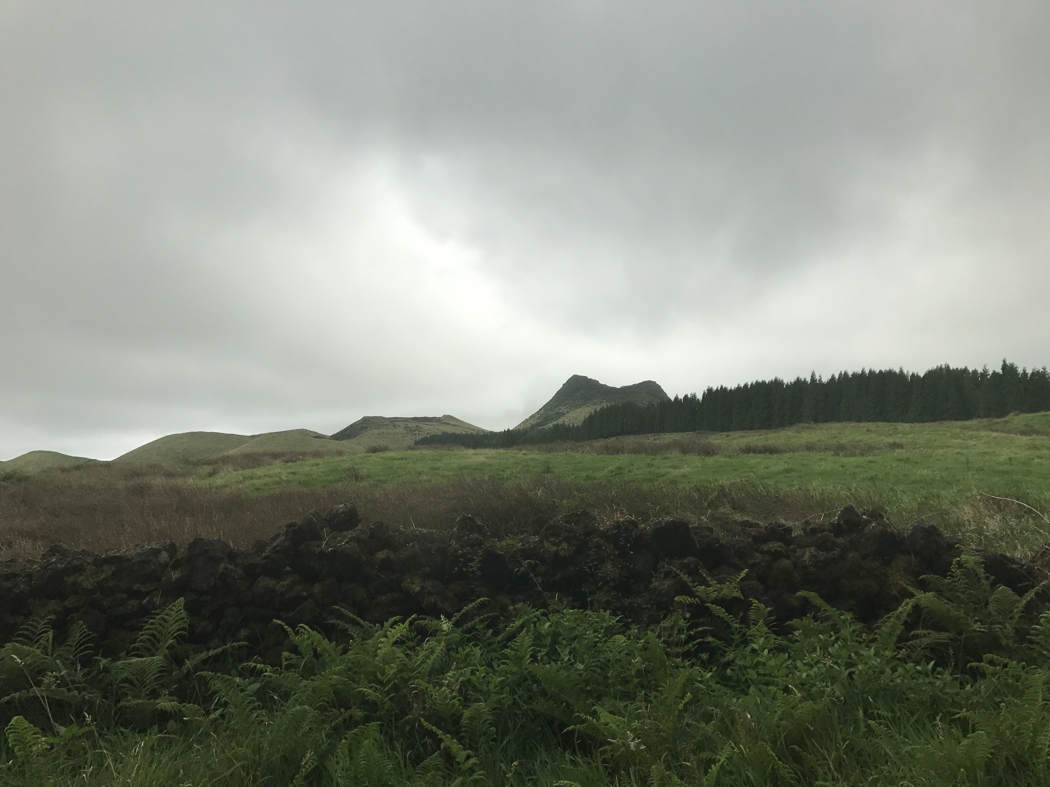

This is neither “oceanography” nor “teaching”, but so much “adventure” that these pictures still deserve their spot on “Adventures in oceanography and teaching”. I did a tour into two (non-active ;-)) volcanoes and it was AMAZING!
Remember we did an expedition learning course in Kiel bight a while ago? I wish I had known about Google Earth Engine then already. Even without signing up (which I will do as soon as time permits) you have access to their timelapse: a global composite of satellite images, which results in a cloud-free 32-year video of the Earth’s surface. And the best feature: It’s zoomable! So you can look at your favourite beach (or any region of the world you are most interested in — disappearing rain forests? Growing cities? Shrinking glaciers? (Careful — there is some weird aliasing of the seasonal signal in there)).
For me, it’s obviously coast lines. And especially the beaches of Kiel bight: You see sand moving around and the beach shape changing to what we see today. What a great motivational intro for any course on coastal dynamics!
So super excited about finding this tool that I had to share immediately :-)
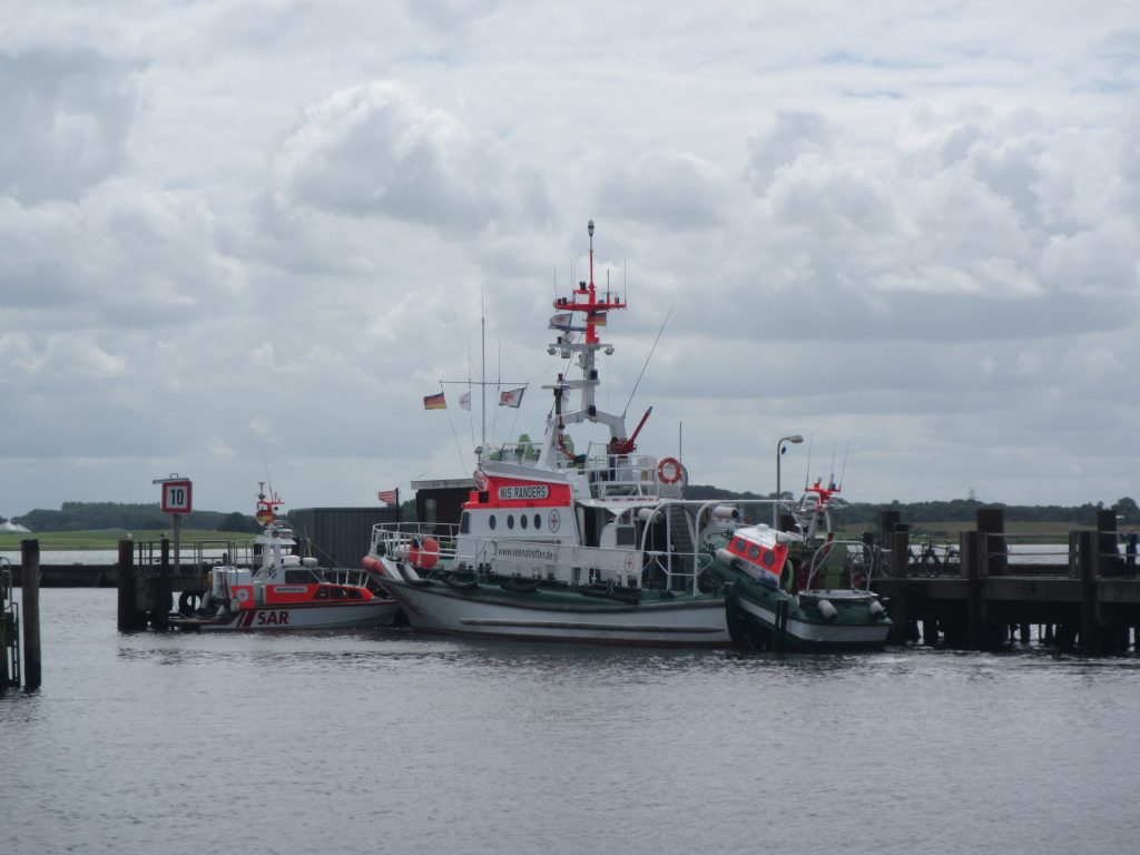
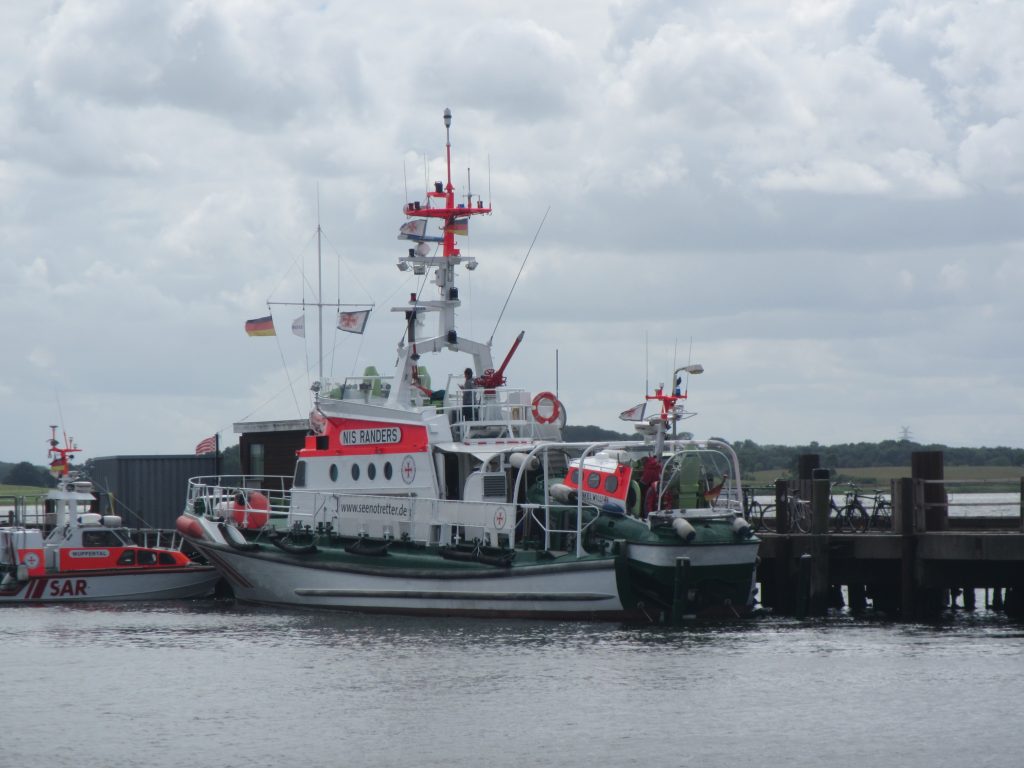
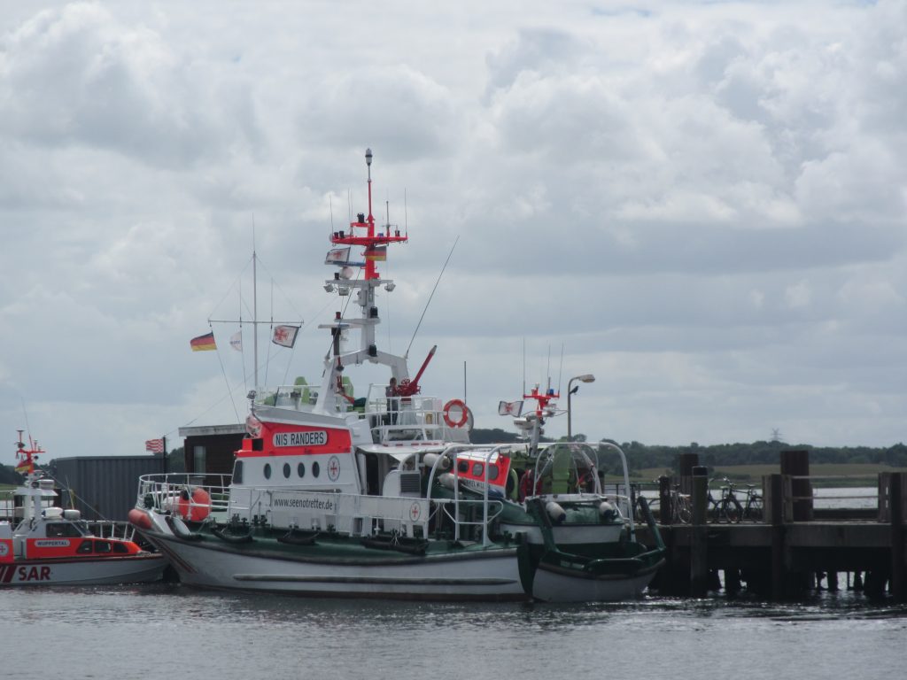
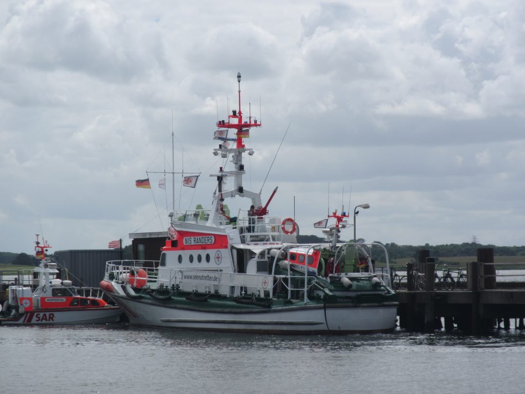
Absolutely fascinating to watch: The German Maritime Search and Rescue Service’s tug driving up on one of their larger vessels. Good thing I volunteered to watch all our equipment at the Port of Maasholm when we were driving back from the teacher training at Lotseninsel and everybody else was on a later boat… ;-)
I only realized too late what was going on, so I didn’t get a movie, but the small boat sped up and just drove up the stern of the other boat. So cool!

You may or may not have noticed that my usually very regular blogging has been sporadic at best for a while, and that currently I am blogging a lot more again. Do you want to know why?
On a recent flight to Copenhagen (actually, to Bergen, but that’s another story) I happened to sit with a great view of one of the plane’s propellers. And it struck me how asymmetrical the dark areas caused by the moving propeller above and below the axis looked!
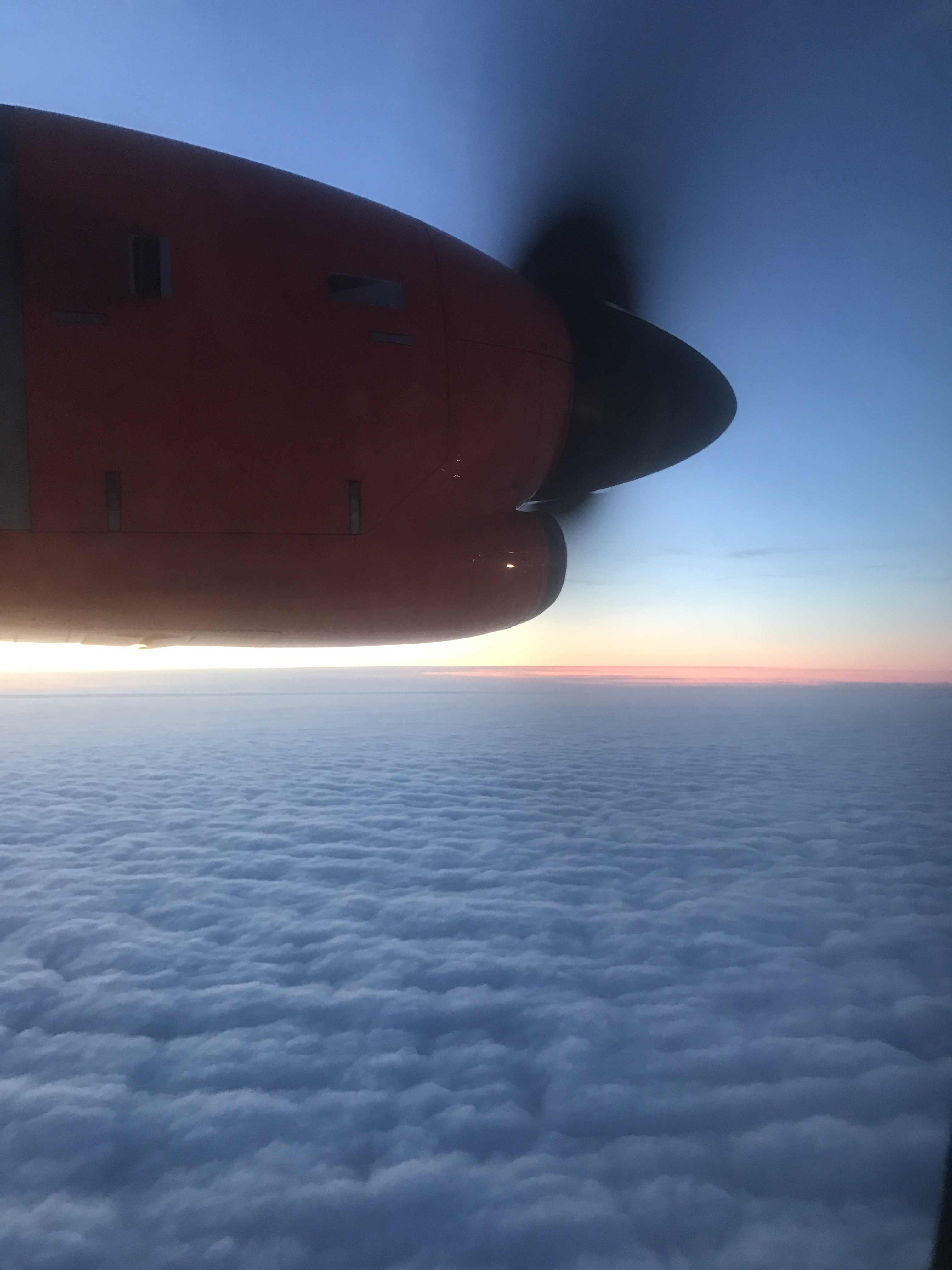 I guessed the explanation would have to be that the propellers were asymmetric in some way, too. Kept me entertained until I saw this:
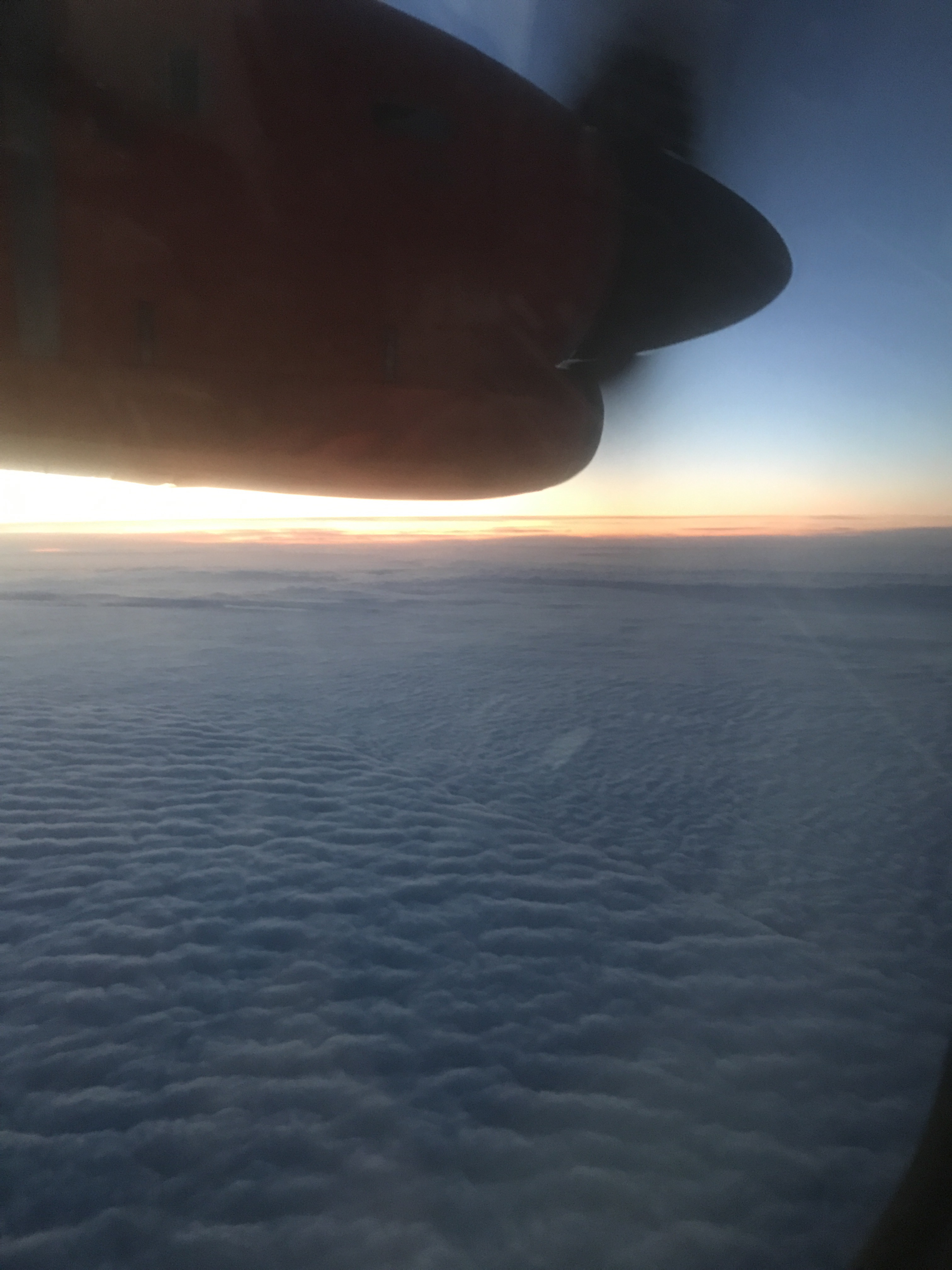
What could have happened there? Why would there be a seam between completely different patterns of clouds?
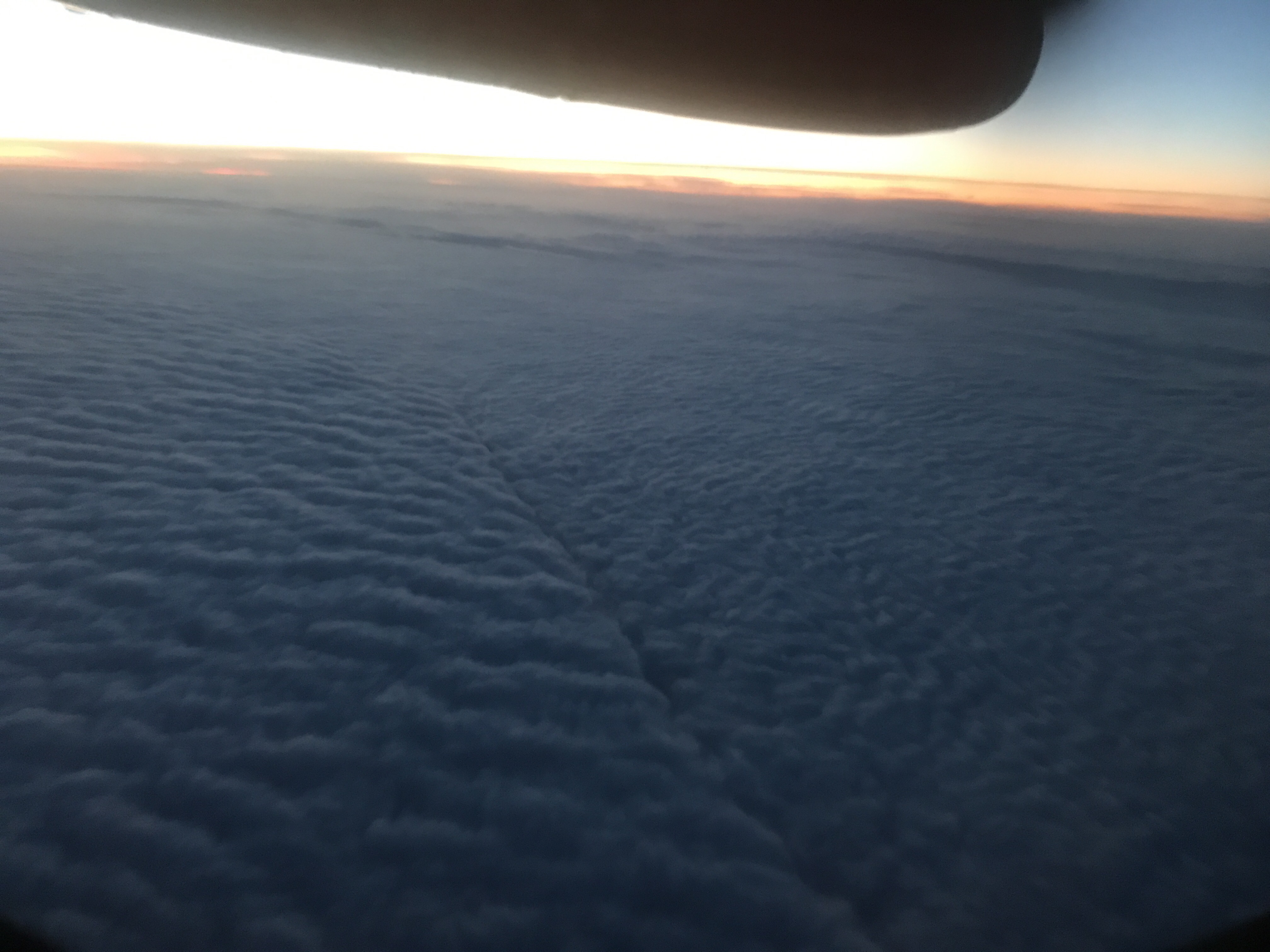
I guess there is no reason there shouldn’t be, especially since the cloud / no cloud border is often quite sharp, too. But still, pretty intriguing!
But then a pretty approach to Cph:
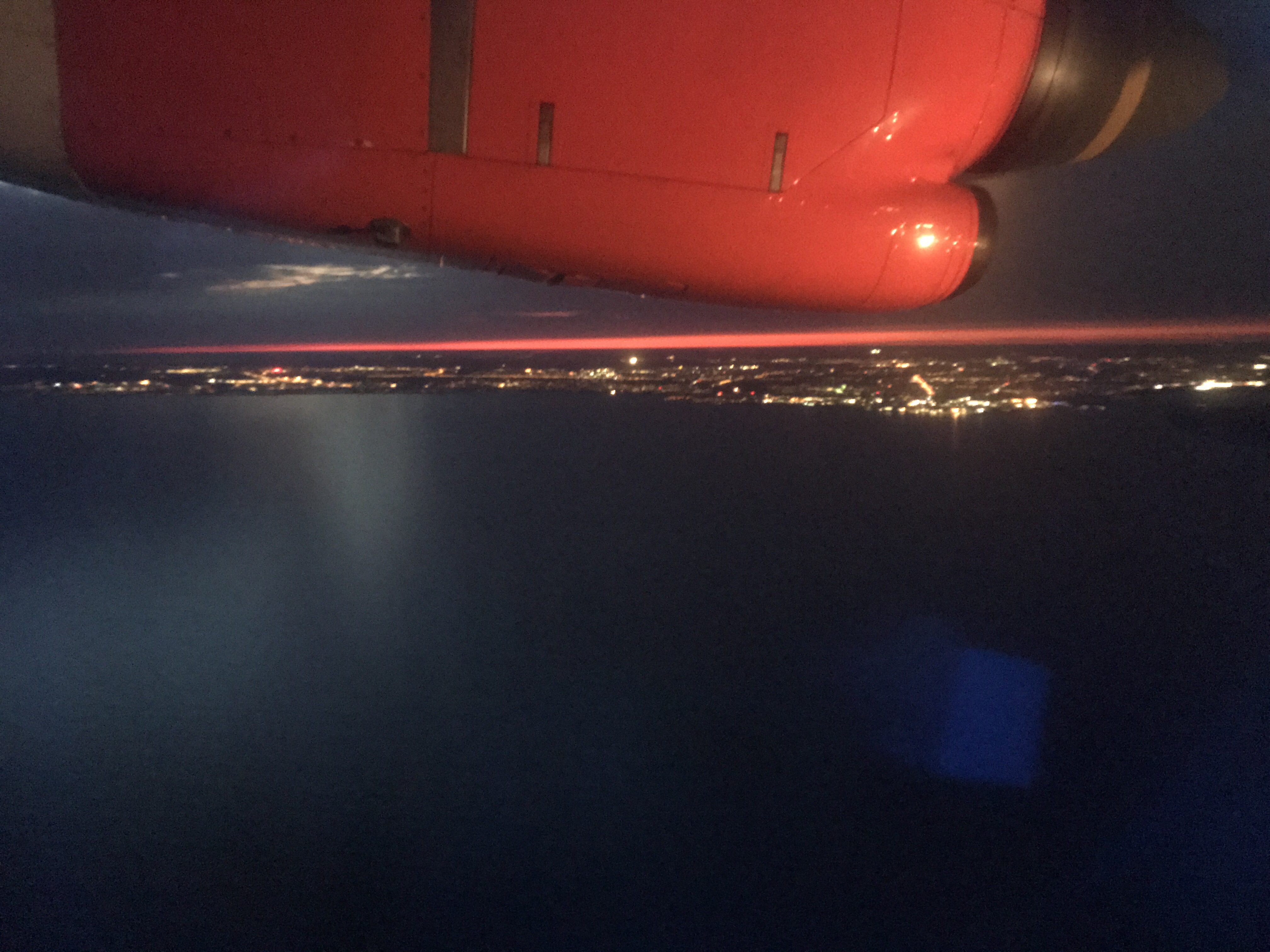
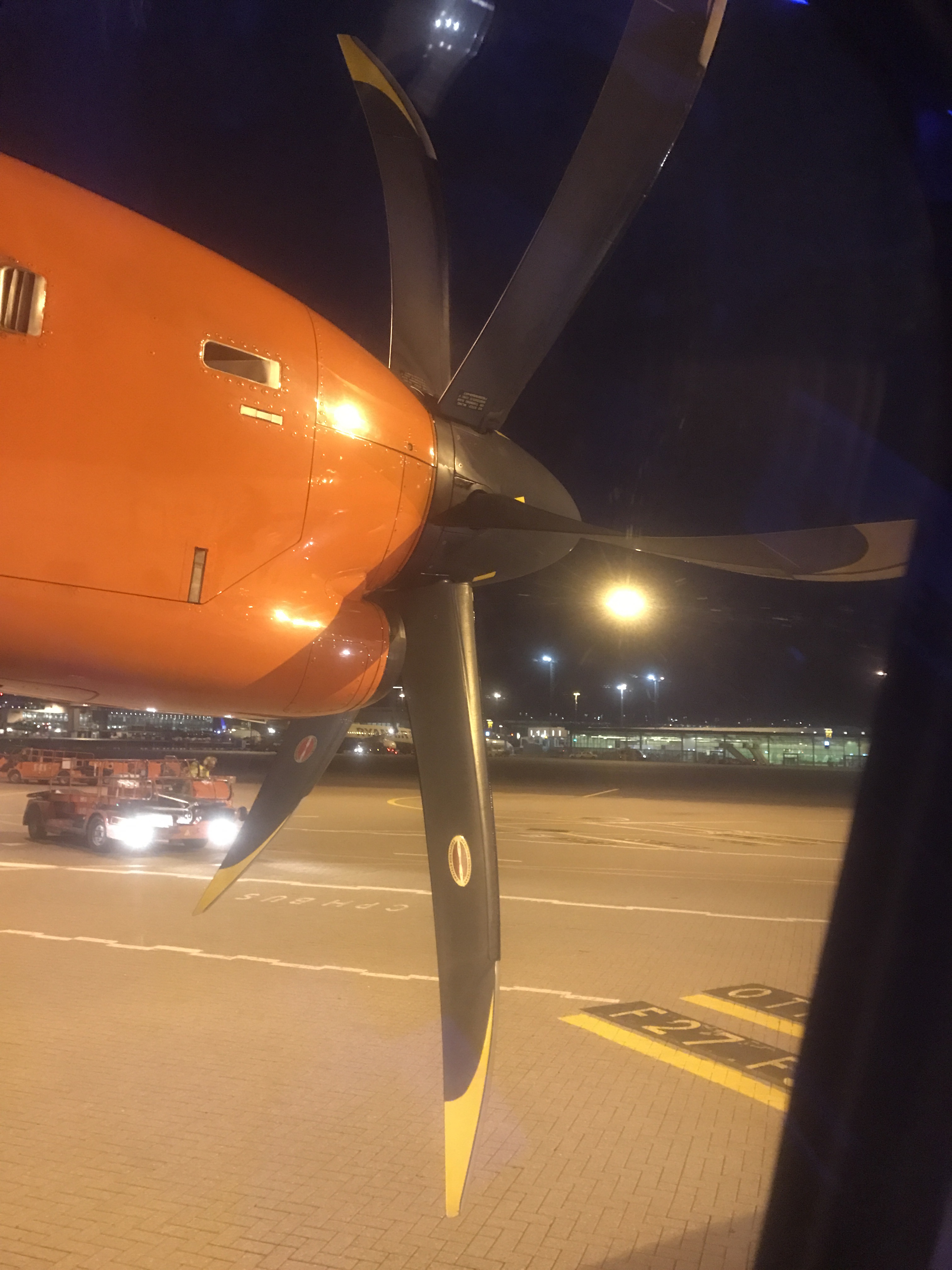
And finally: a good view of the propellers. Ha!
And now that I am writing this I am wondering. What’s the difference between asymmetric and asymmetrical? Googling has to wait, I have a plane to catch…
Wow, three years ago on this day I started this blog, and this blog post is post no 477. Can you believe that!
And even though I had planned to take the summer off blogging, you see how that worked out — I just had so many pictures that I wanted to share that I didn’t blog for a total of three weeks or so, and then in one day wrote and scheduled bi-weekly posts from early August way into September. When I’m back from my cruise, it’ll be with more actual content, I promise!
So today, here is a picture of a fountain in Sheffield, where I went to a great engineering education conference in summer.

I like the “infinity pool” look of it, even though there is no ocean behind it, and I find it really fascinating how the spouts seem to be in completely different places than where the water actually comes out when you look through the glass from the side. Isn’t physics just awesome?

P.S.: CONGRATULATIONS A&I!!! :-)
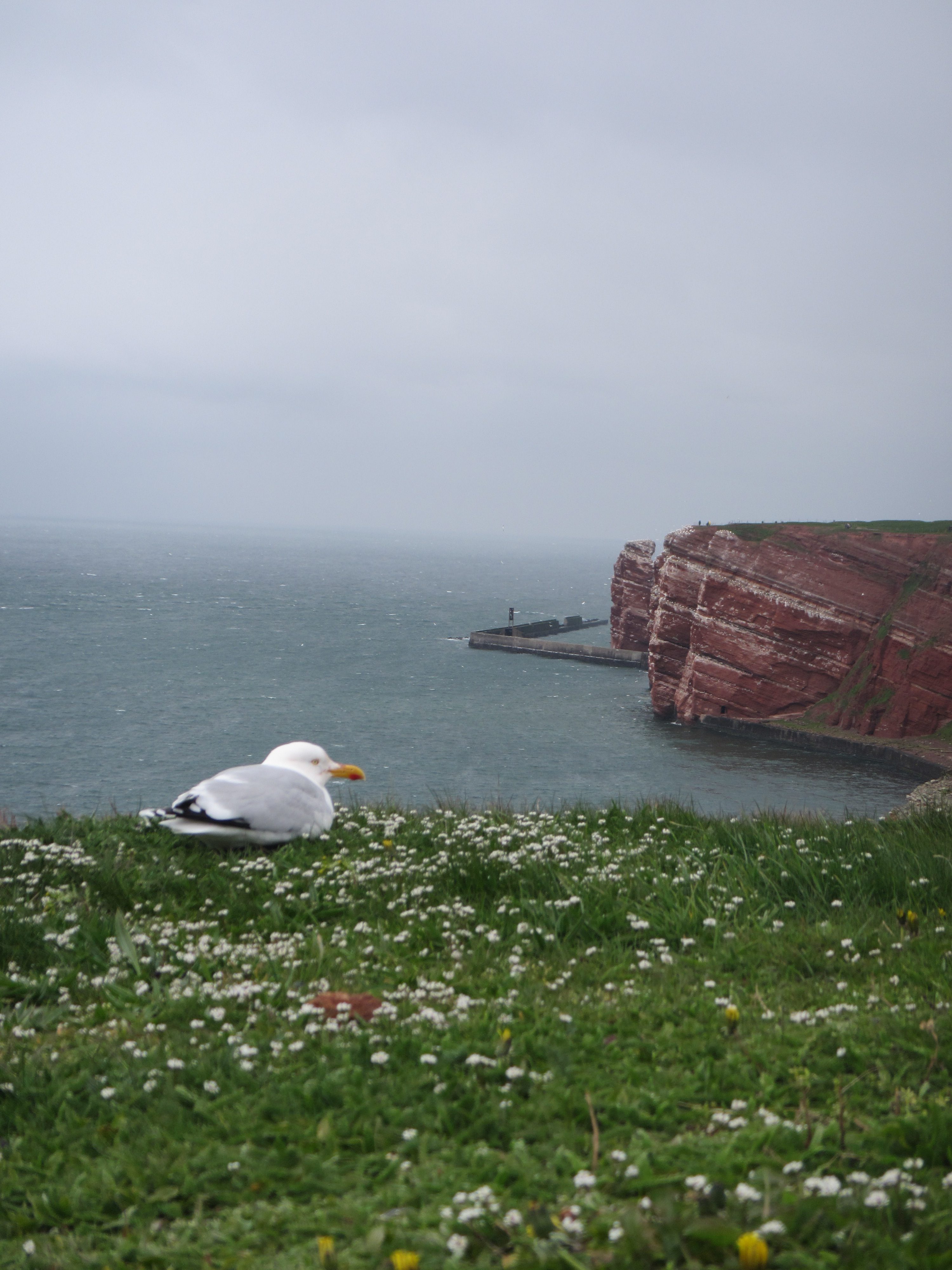
I recently went on a trip to Heligoland, Germany’s only island that is far away from the mainland (70 km in this case). It was a great trip, and I know you’ll be reading about it for some weeks to come :-)
Today, we’ll just do the touristy parts, though, and get into the oceanography later.
The trip started out super awesome. I went on a ferry and got the chance to see ships being greeted by Wilkomm Höft, the Ship Welcome Station, by dipping the Hamburg flag and playing the national anthem. I’ve seen this before, but only from land (this is a place that I love going to for birthdays, mine and other people’s). Sitting on a ship and being bid farewell this way is really touching! I loved it and got a little teary-eyed.
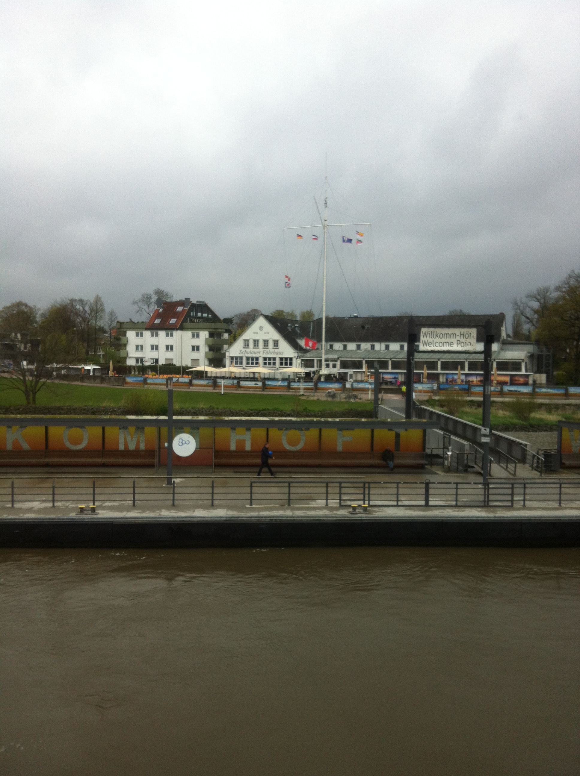
Being bid farewell (by dipping the Hamburg flag and playing music) at Wilkomm Höft in Wedel on the Elbe river.
The ferry itself is a high speed catamaran, which, as you might have guessed, produces an amazing wake.
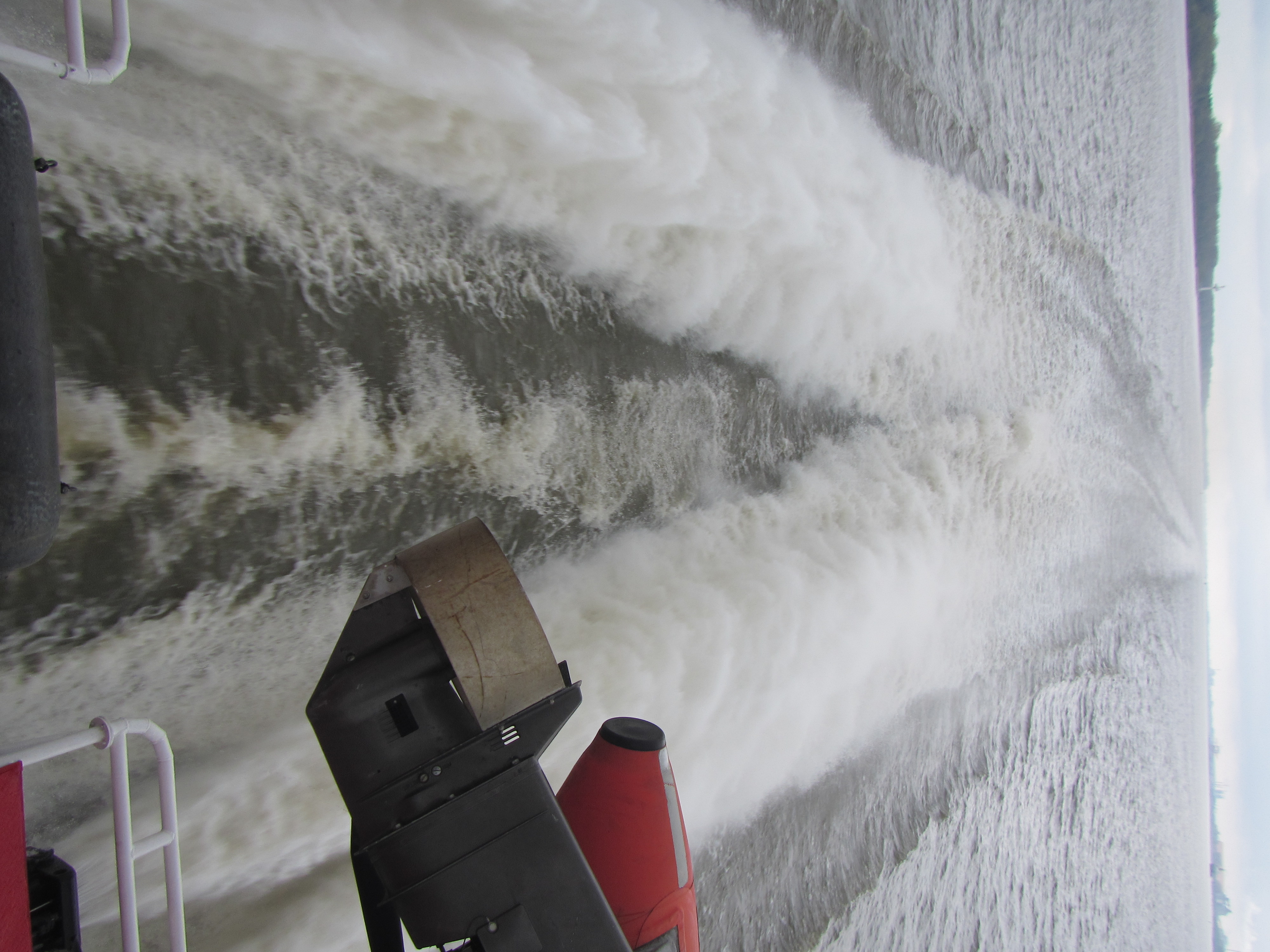
Wake of the Halunder Jet, the high-speed ferry going from Hamburg to Heligoland.
Unfortunately, the ship is set up such that the rescue boats obscure the view of the wake a little. How inconsiderate ;-) Please ignore the outboard engine…
On Heligoland itself, there are the famous red cliffs, and tons of birds. Let me just show you a few:
Heligoland
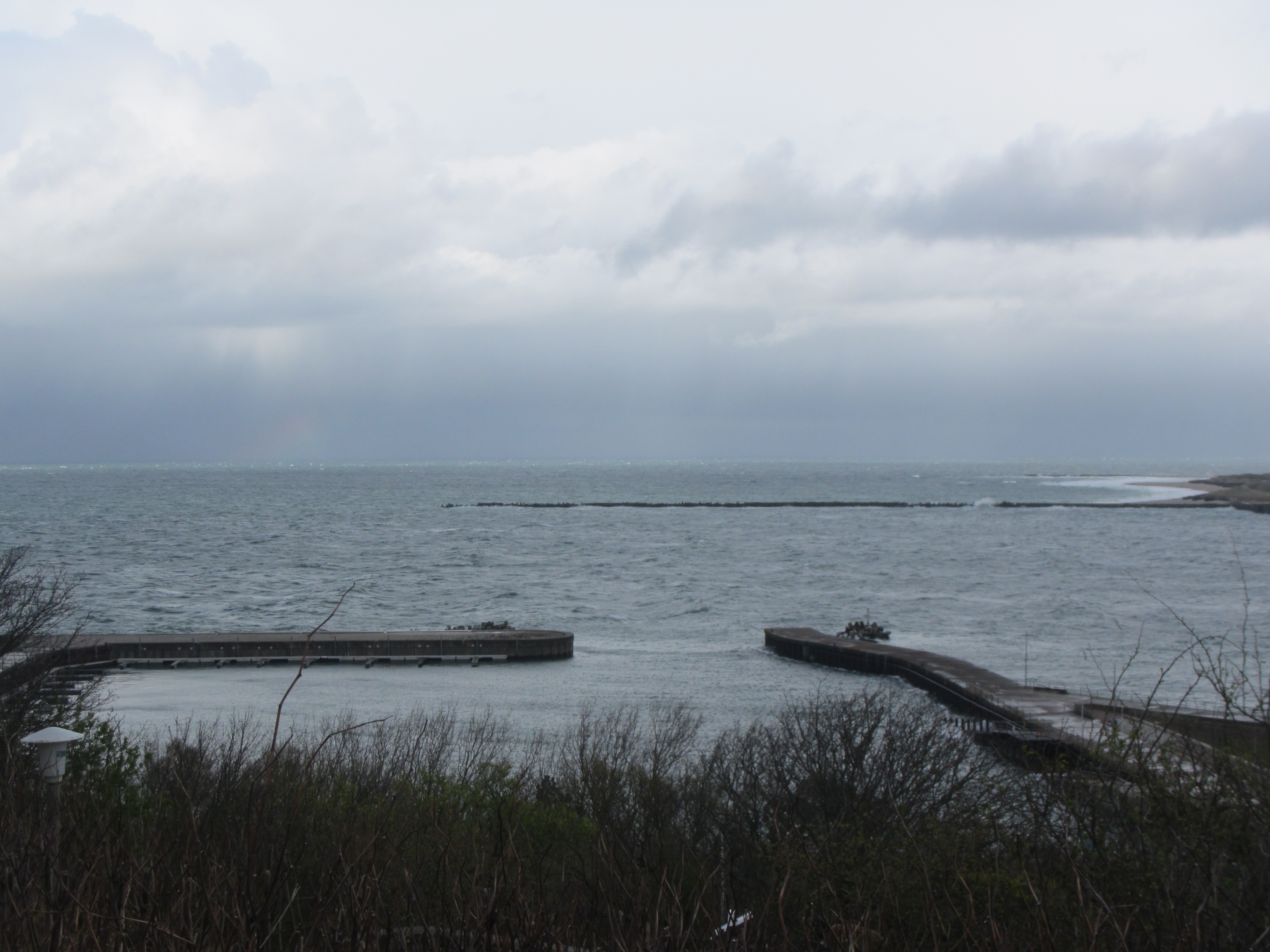
The best-known part of Heligoland is the Lange Anna — a red rock called “long Anna”. You see it on the picture below. What I liked most about it — besides the beauty of the rock and the birds, obviously — was the wave breaker build there to protect the coast, and what it did to the waves.
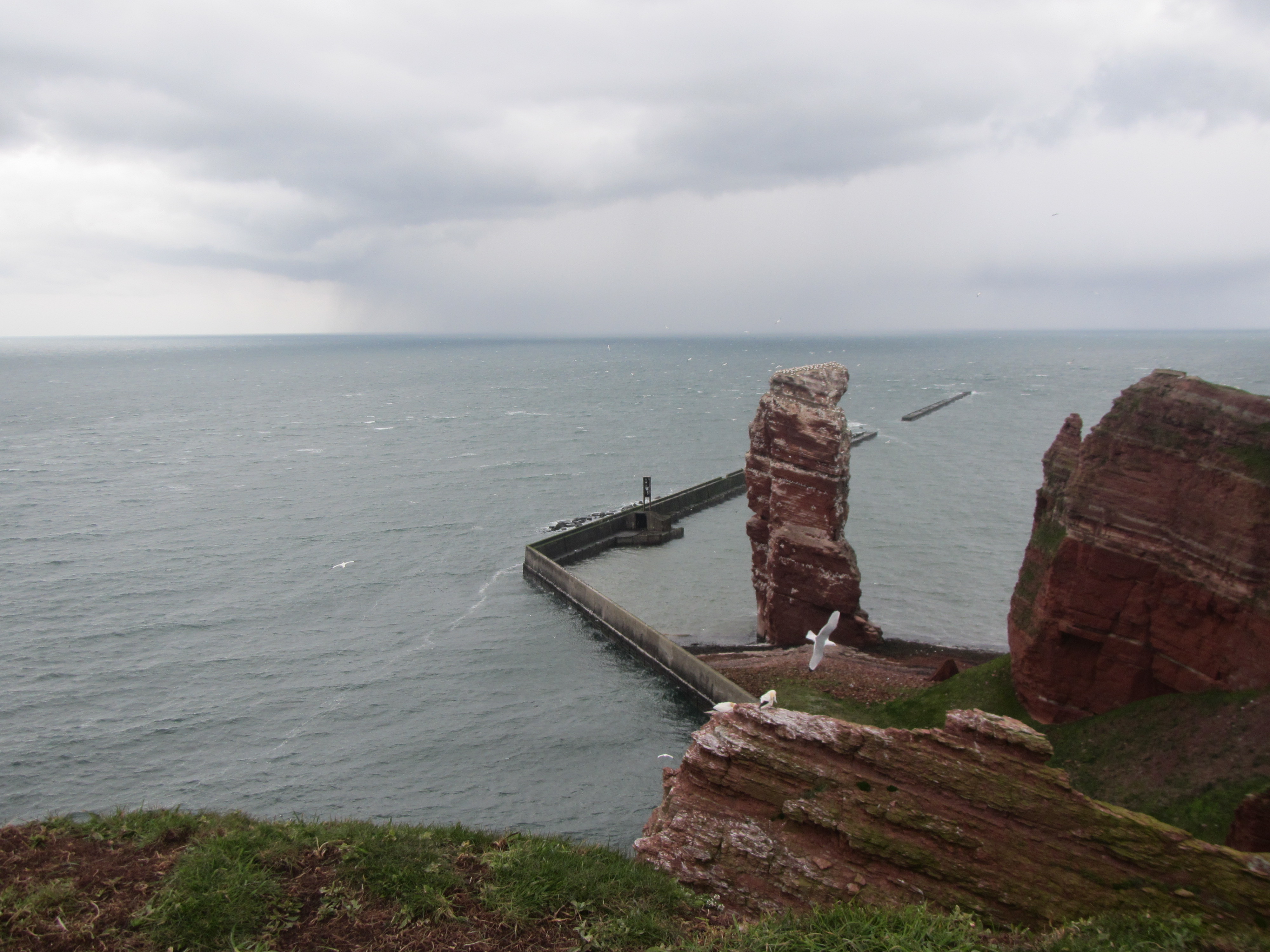
“Lange Anna”, the famous red rock on Heligoland in the German Bight
Zooming in on the wave breaker’s edge, there is clearly very strong winds coming around that corner:
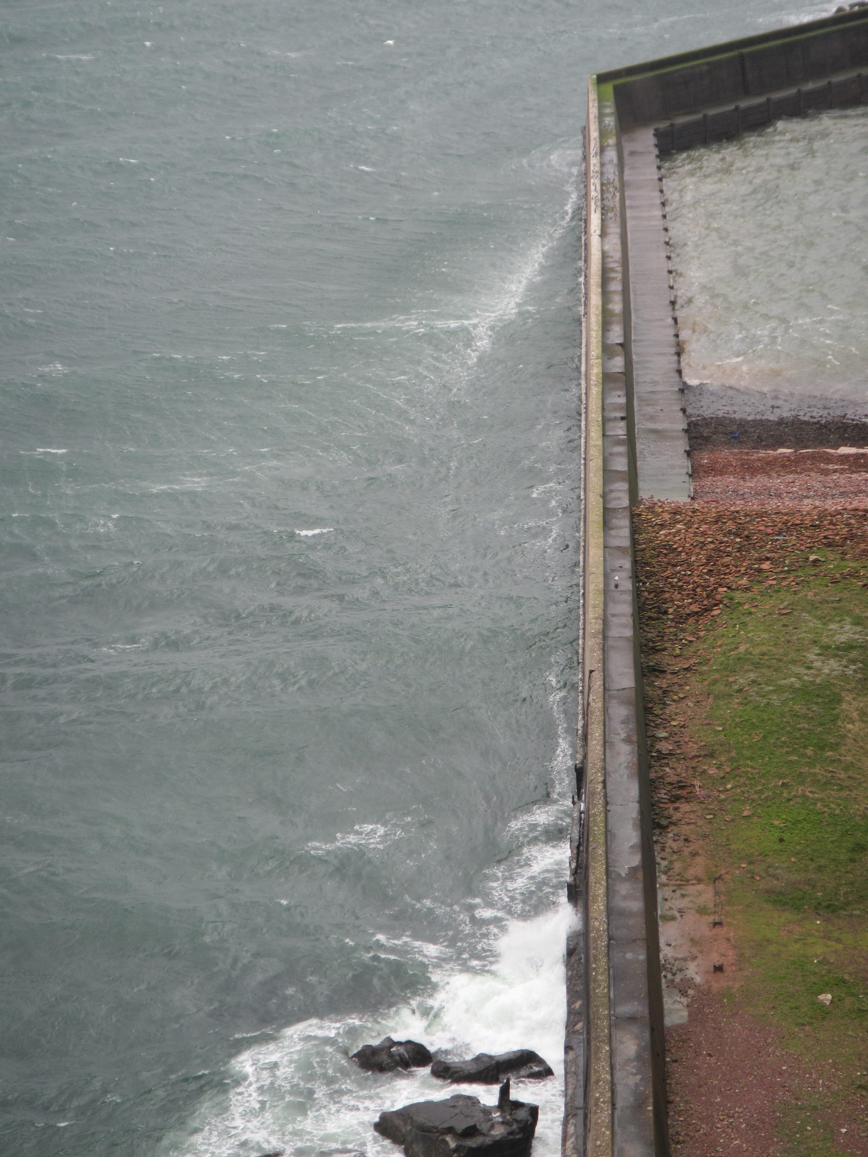
To be fair, it was a super windy day.
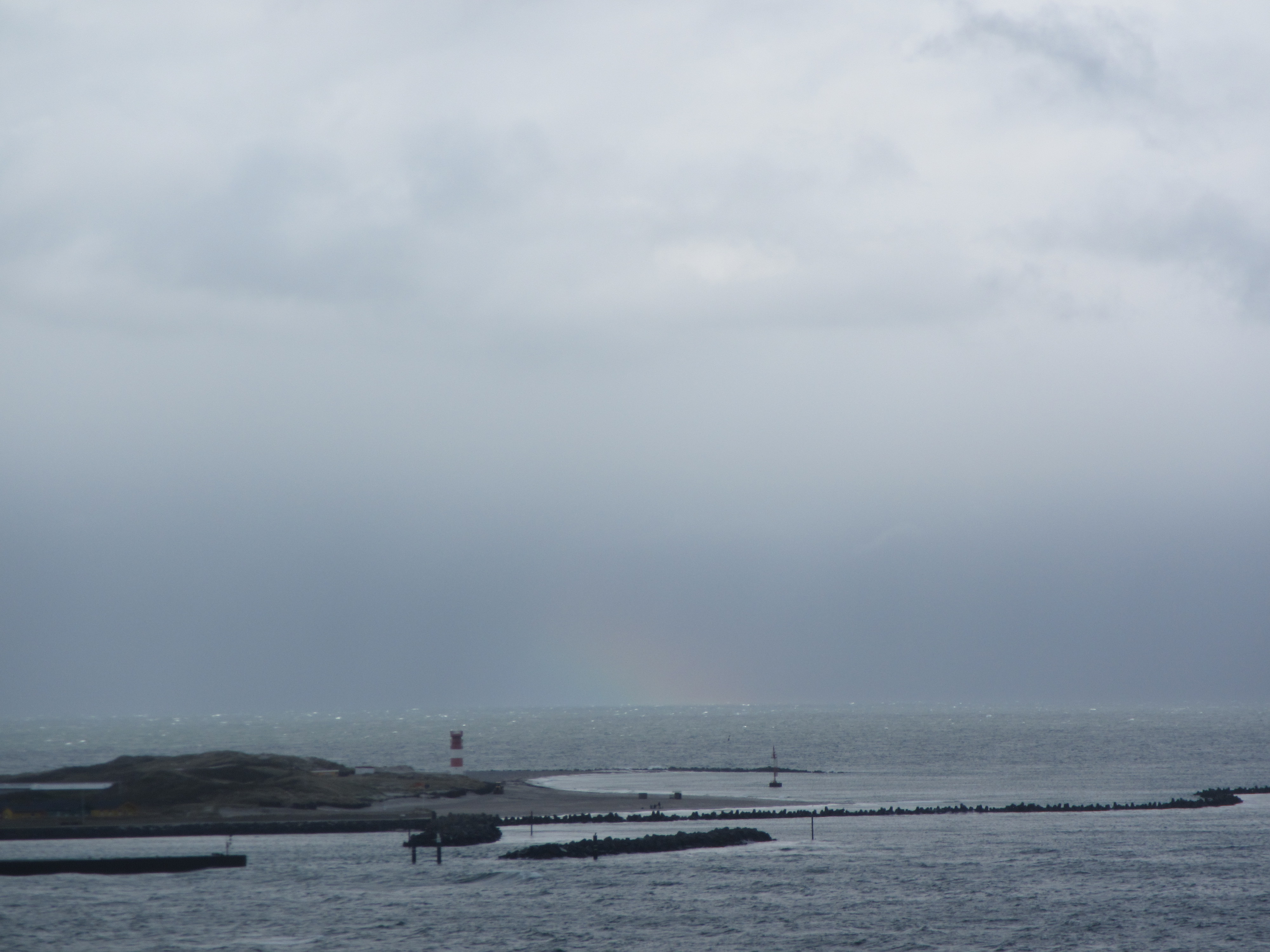
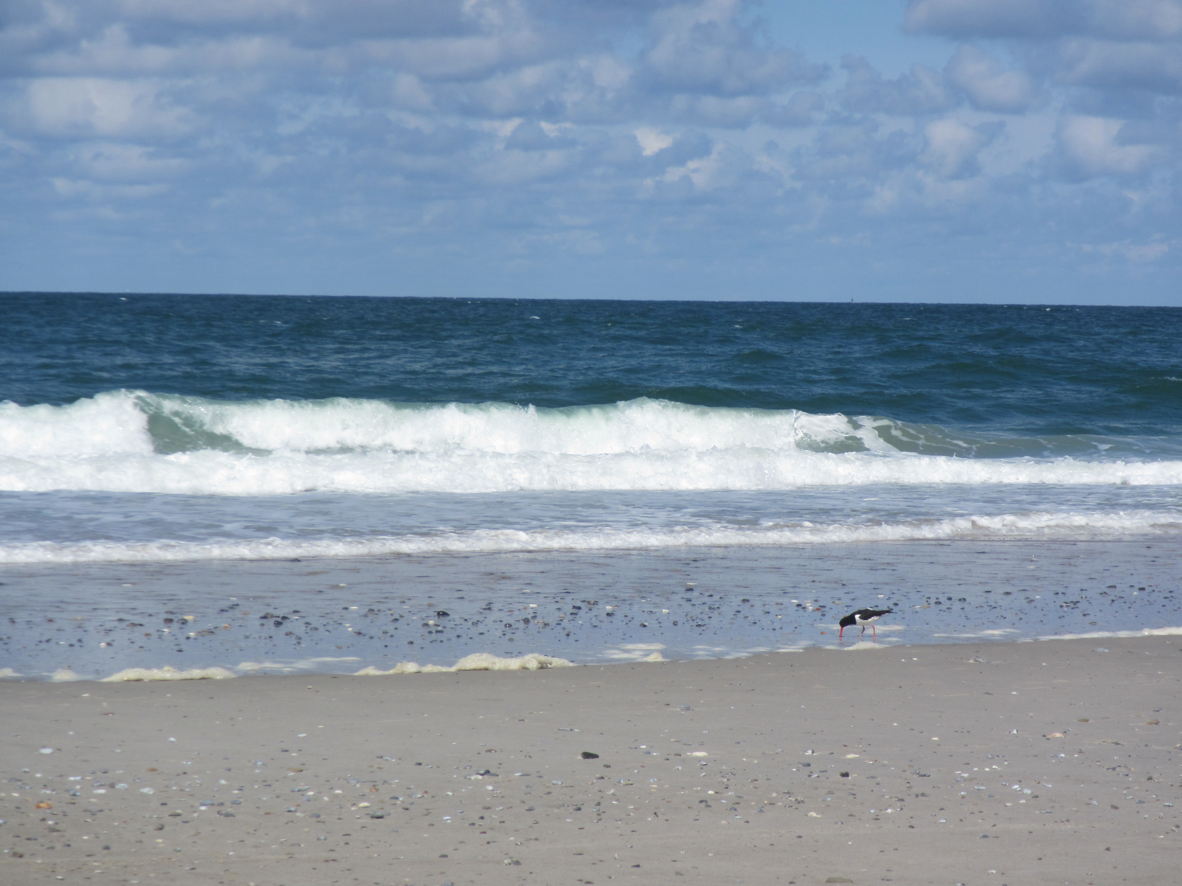
They also have a very nice beach on Heligoland, where you can see the bending of waves due to changes in topography that we talked about before.
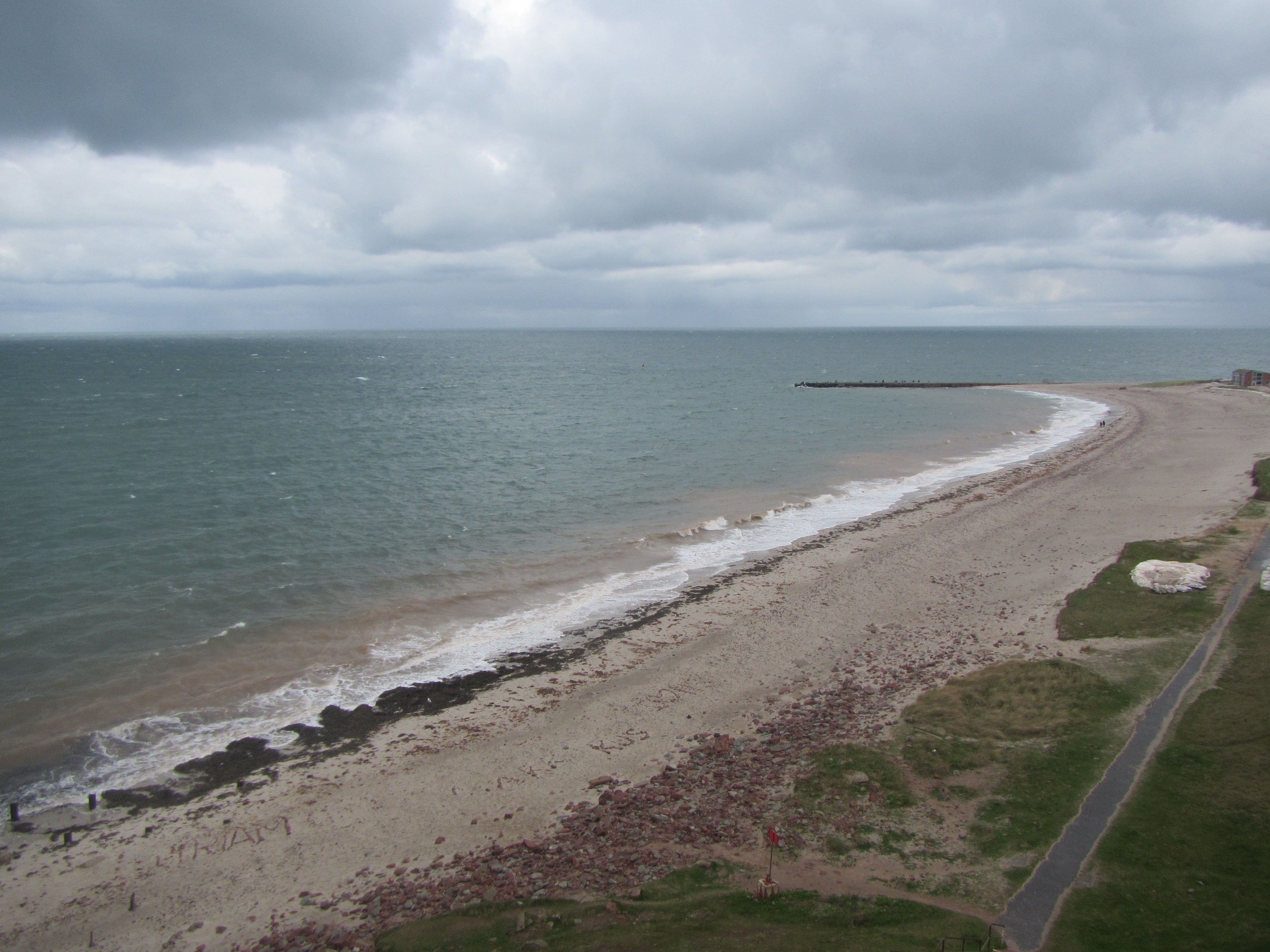
And if you look over to the second island, you can very nicely compare and contrast the upwind and downwind coasts of islands:
See how there are lots of breaking waves (well, you probably only see the foam) on the upwind coast of the island in the back of the image, and how there are absolutely no waves in the lee of the sea wall in the foreground of that picture?
Btw, the downwind side of that same second island looks also a lot calmer as it is sheltered by the island itself:
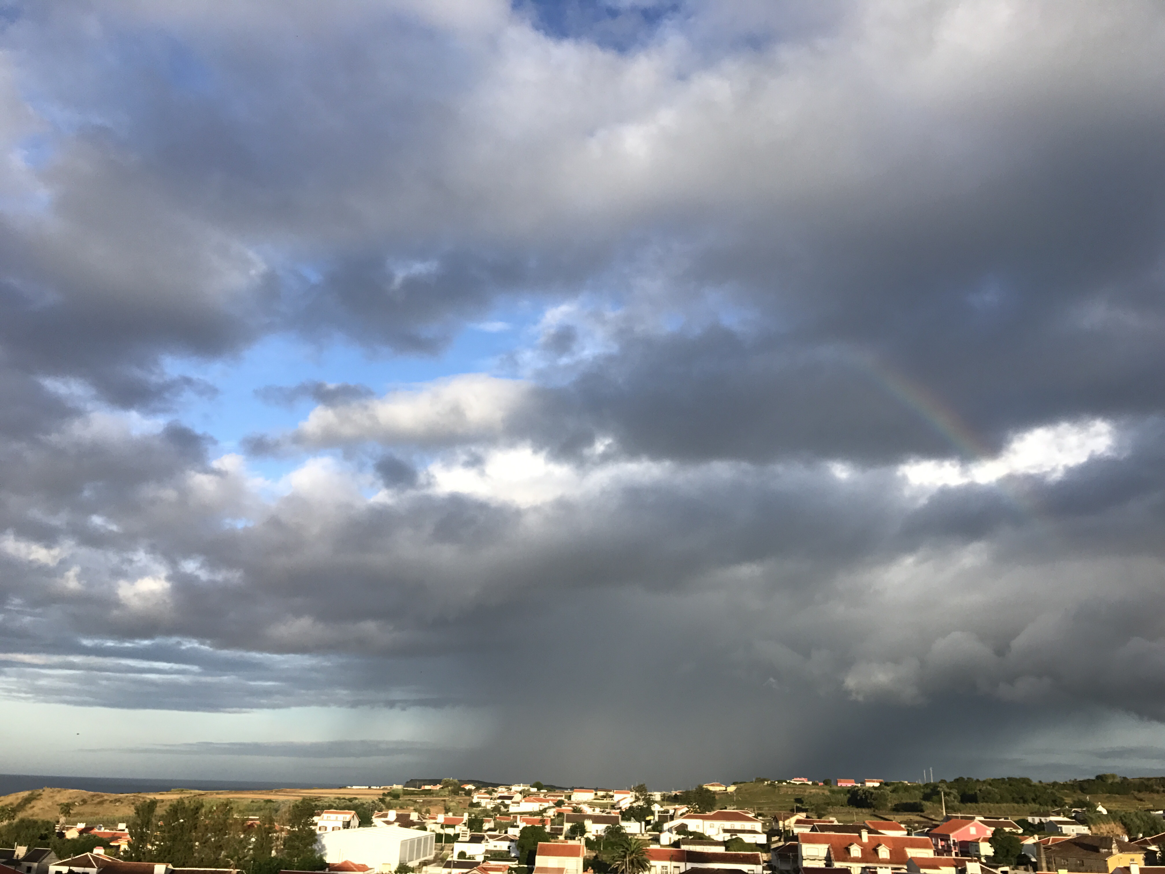
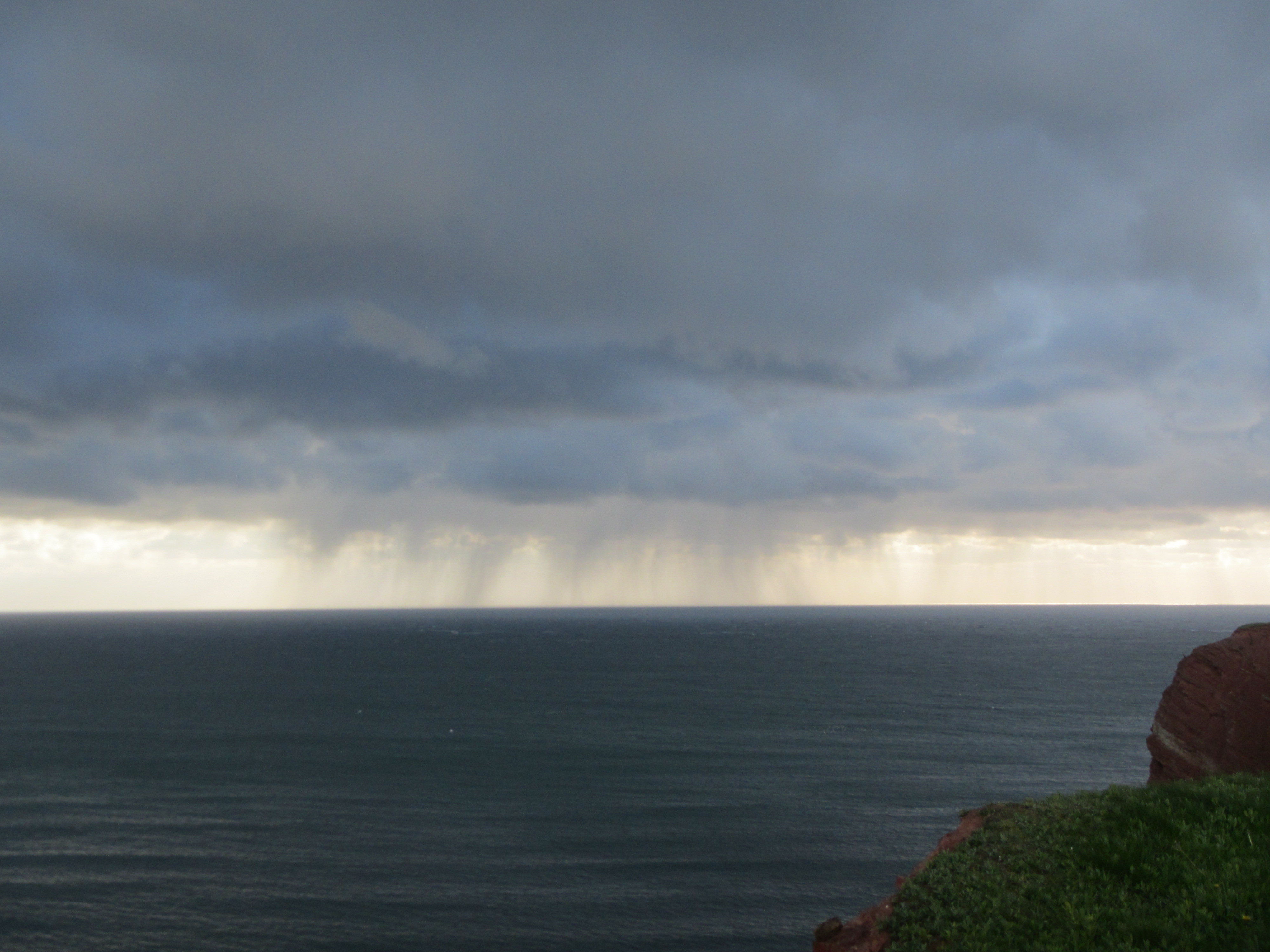
Unfortunately, I couldn’t take a picture of the whole island at once, I really need to upgrade my camera… But can you spot the rainbow above?
Also there is some more, pretty spectacular weather to be seen:
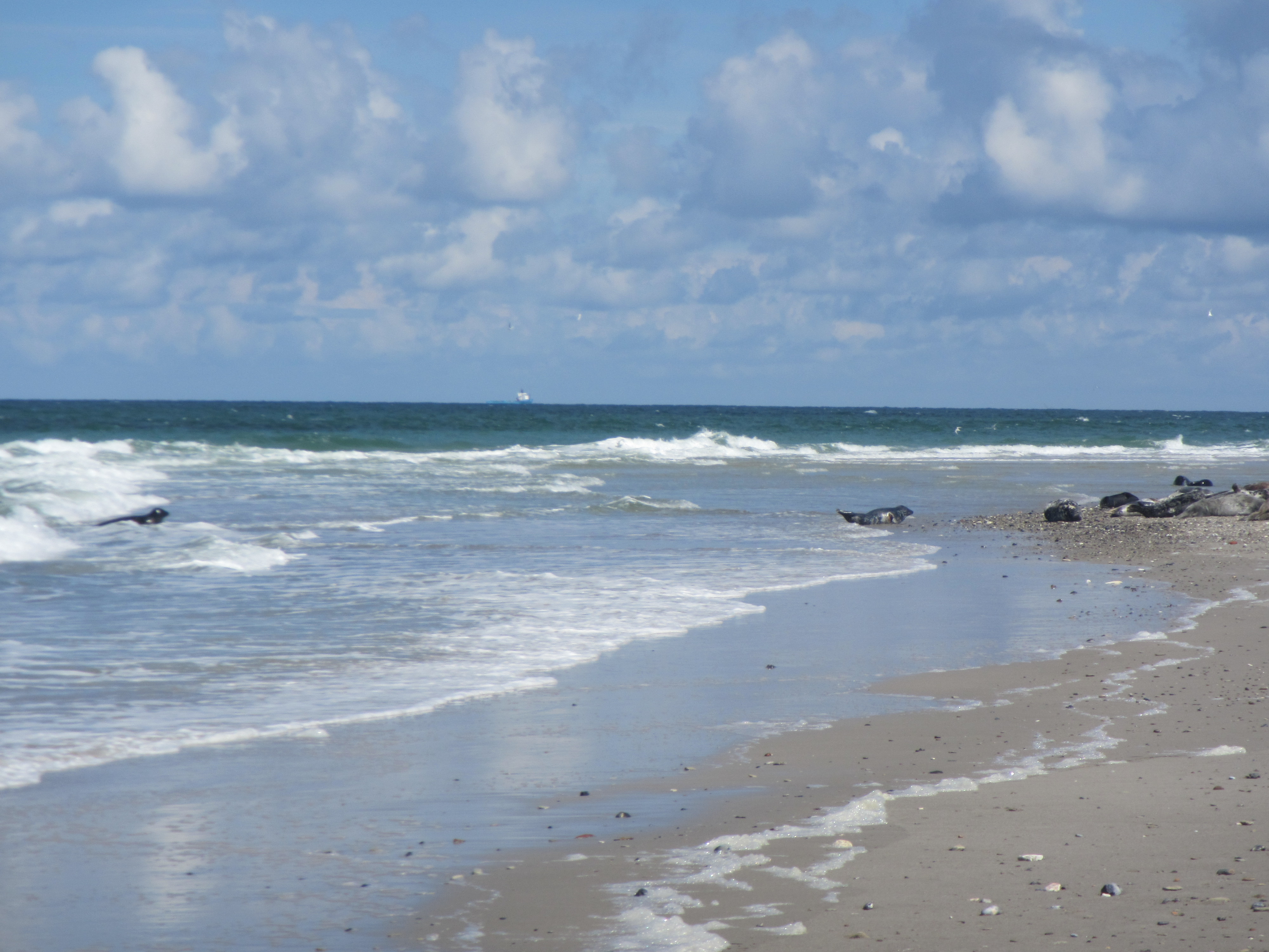
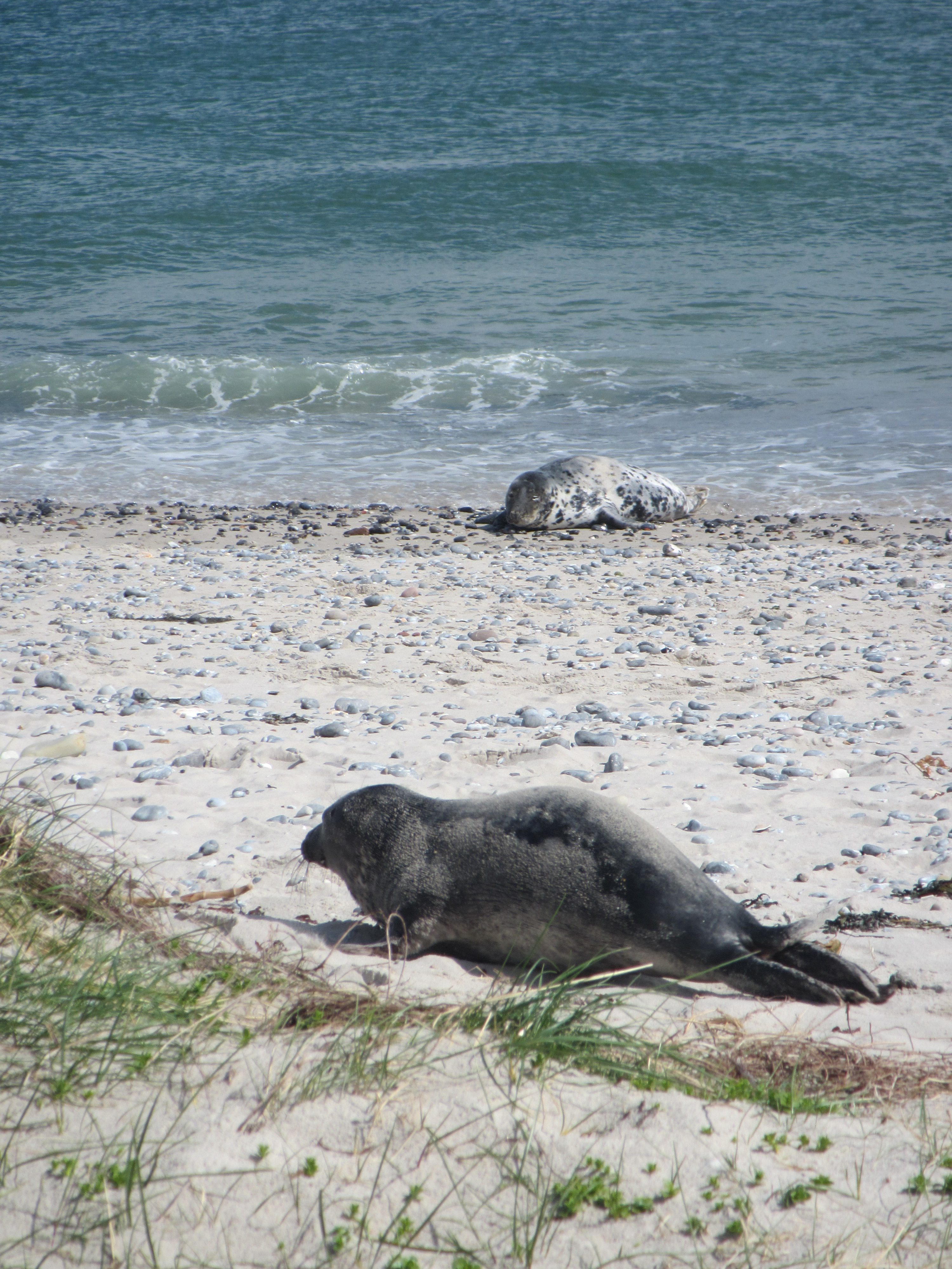
If you go over to the other island, there are TONS of seals. Like several hundred, right on the beach! Obviously, I only have pictures of seals when there are also nice waves happening at the same time :-)
Oh, and birds.
And more seals! This one is cute, I have to admit…
Oh, and I was lucky (lucky means bold enough to ask!) enough to hitch a ride on the local research vessel, Aade. Below, they just finish a plankton trawl. We weren’t allowed out on deck because the weather was so rough…
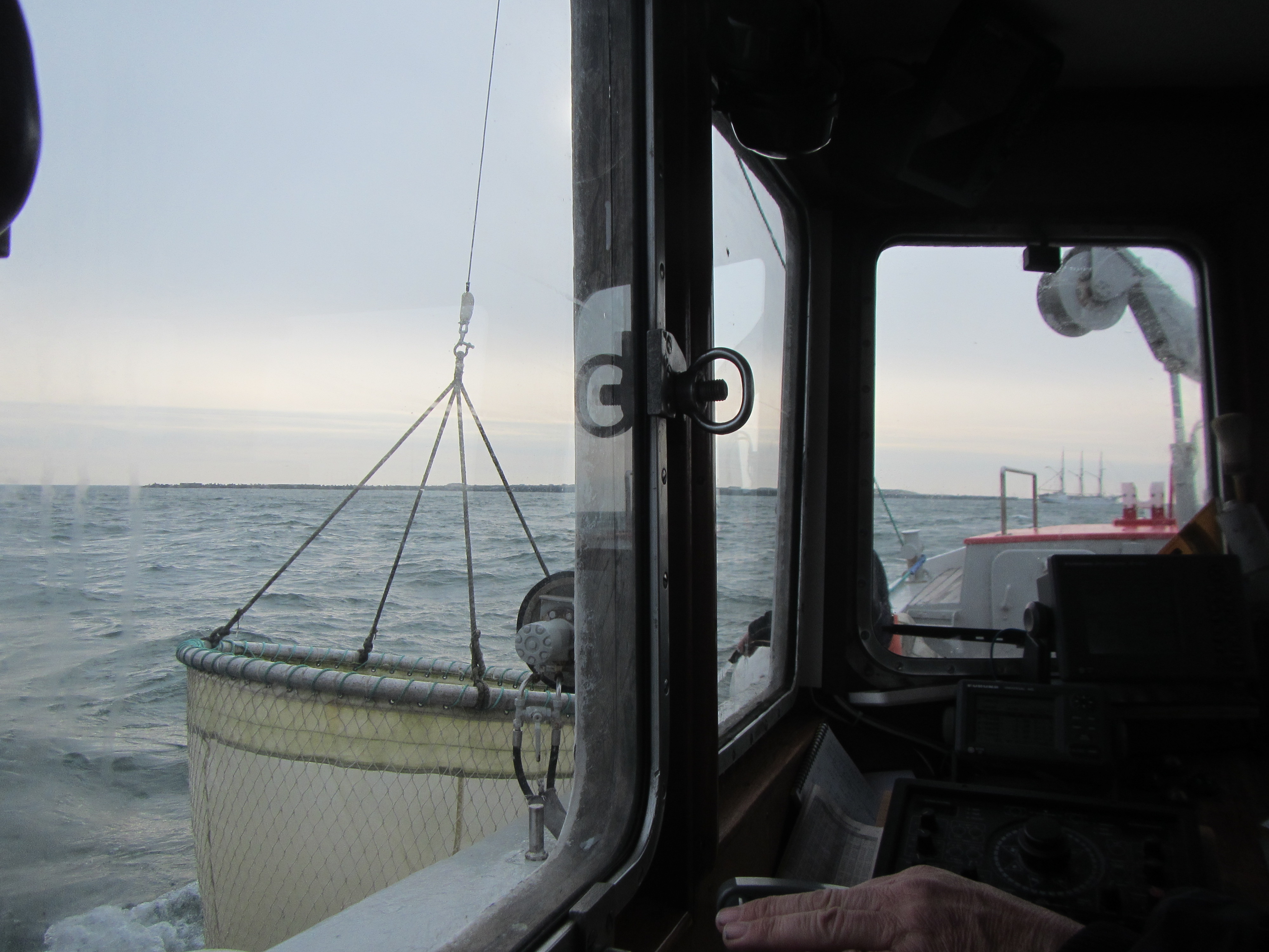
What looks like a calm and serene morning really wasn’t one. It was super windy and wavy! Good thing I don’t get sea sick.

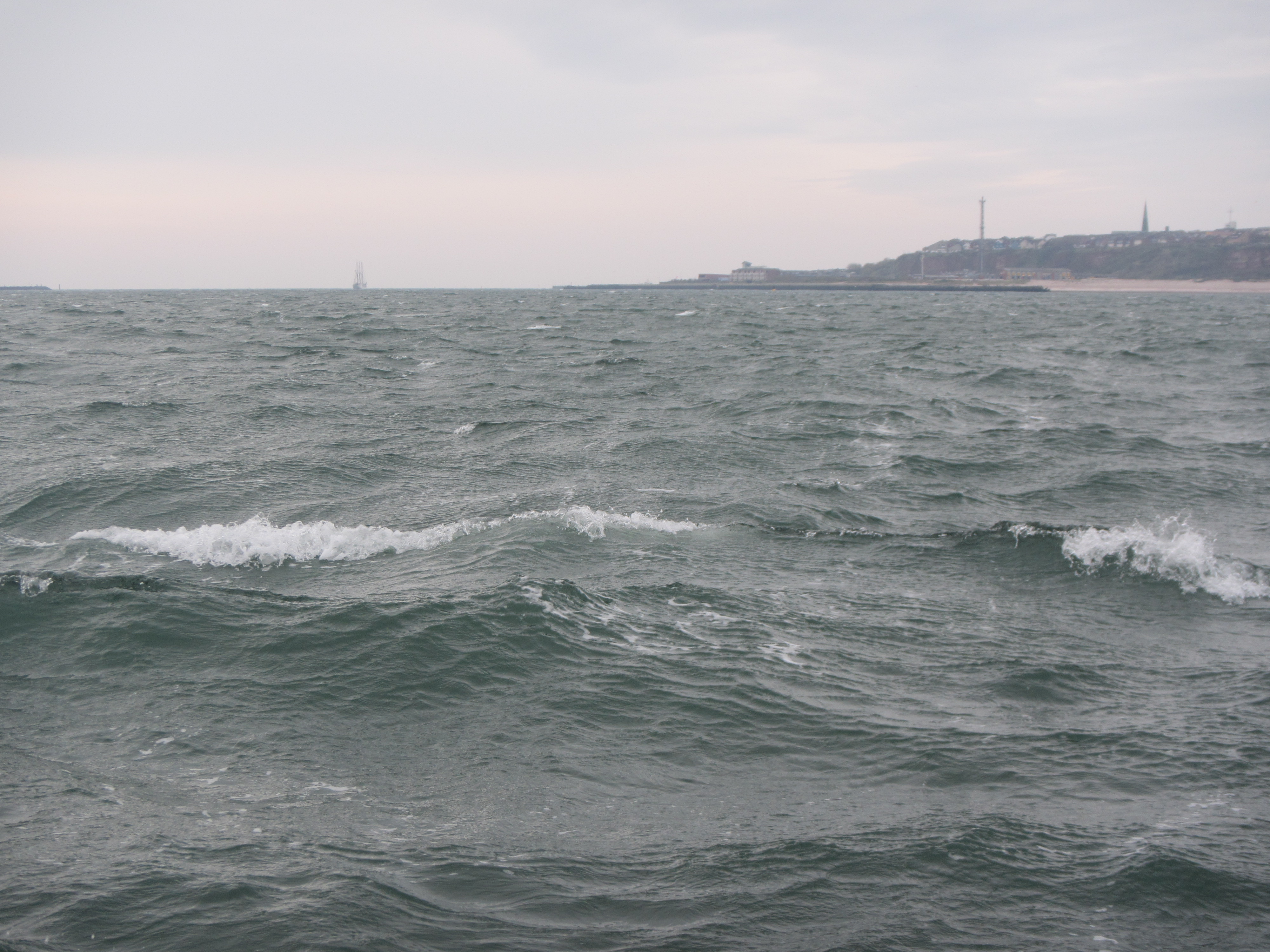
It turns out it’s super difficult to take pictures of waves that look as impressive as the waves are in reality. I really need to learn how to do that! But even if you don’t see the size of the waves, at least you get a different look at “lange Anna” below.

And these are white caps on the “open” sea, not waves breaking on a shore.
And for a nice comparison: The Aade (the research vessel I was on) and the catamaran that took me home later that night.

Anyway, it was a great trip!
Today I am excited to share with you a guest post about a super cool tool for geoscience teaching and outreach that I will definitely be using in the future (if only to decorate my office until I get the chance to teach again):
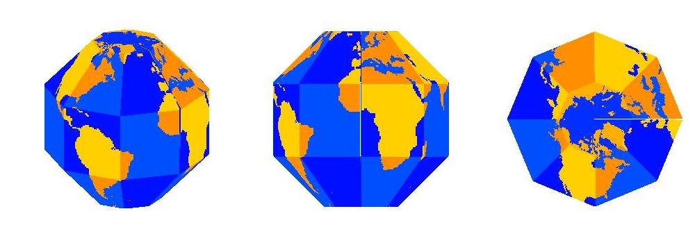

The Earth is a sphere which is best represented by a globe, but there are many interesting geophysical features which are not available on a globe. Try going to a bookstore and asking for a globe showing sea surface temperature! To remedy this gap, I have written software to create SectorGlobes: polyhedral approximations to a globe, such as the ones shown below.
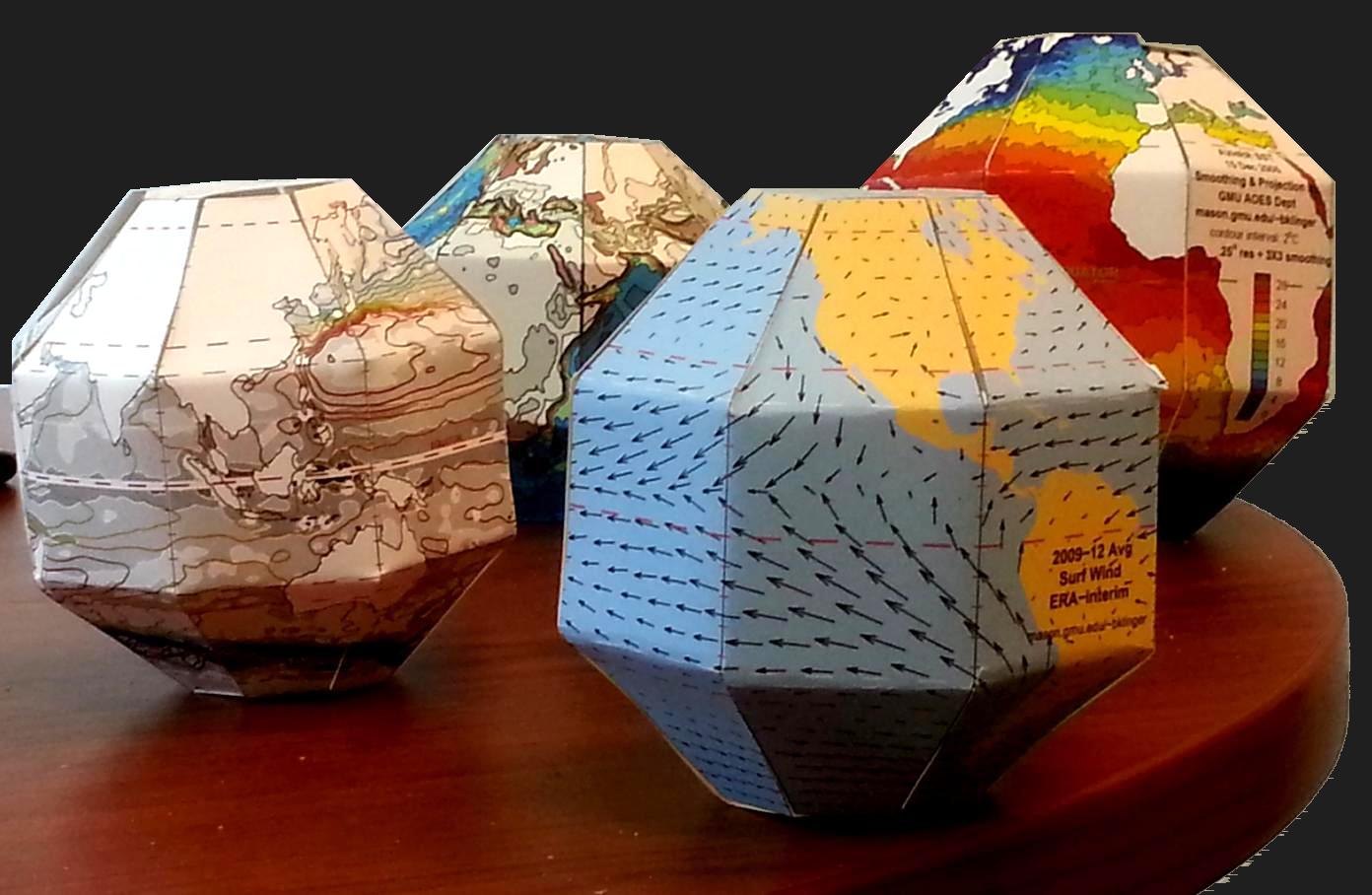
Polyhedral approximations to a globe with geoscience properties on them. Photo: Barry A. Klinger
The front-right SectorGlobe shows annual average surface wind (ERA interim reanalysis). In this image you can see the trade winds in the Pacific blowing towards the west and converging on the Inter-Tropical Convergence Zone just to the north of the equator (the dashed red line intersecting South America on the right). The front-left SectorGlobe shows a more esoteric oceanic quantity: sea surface height, represented by the colored contours (AVISO 2004-2008 average). The sea surface height only varies by a meter or so over most of the globe, but because flow tends to be along the contours of constant height, the contours give streamlines of surface currents. In the picture you can see a good part of the North Pacific Subtropical Gyre. Just off the coast of Asia the streamlines are very close together, indicating a jet called the Kuroshio Current. The SectorGlobes in the rear show (left) sea floor and land topography and (right) sea surface temperature on a particular day (December 15 2005 from AVHRR).
All these quantities can be projected on to a virtual sphere and displayed on a videoscreen, but having a physical object that you can keep on your desk, pick up, and examine while holding in your hand can be more convenient and have more impact. I have brought these globes to classes of high school, college, and graduate students; just having an object to pass around from student to student can wake people up in the middle of a relatively abstract lecture. Students can also be encouraged to make their own – constructing them is an interesting exercise in geometry, especially for high school students.
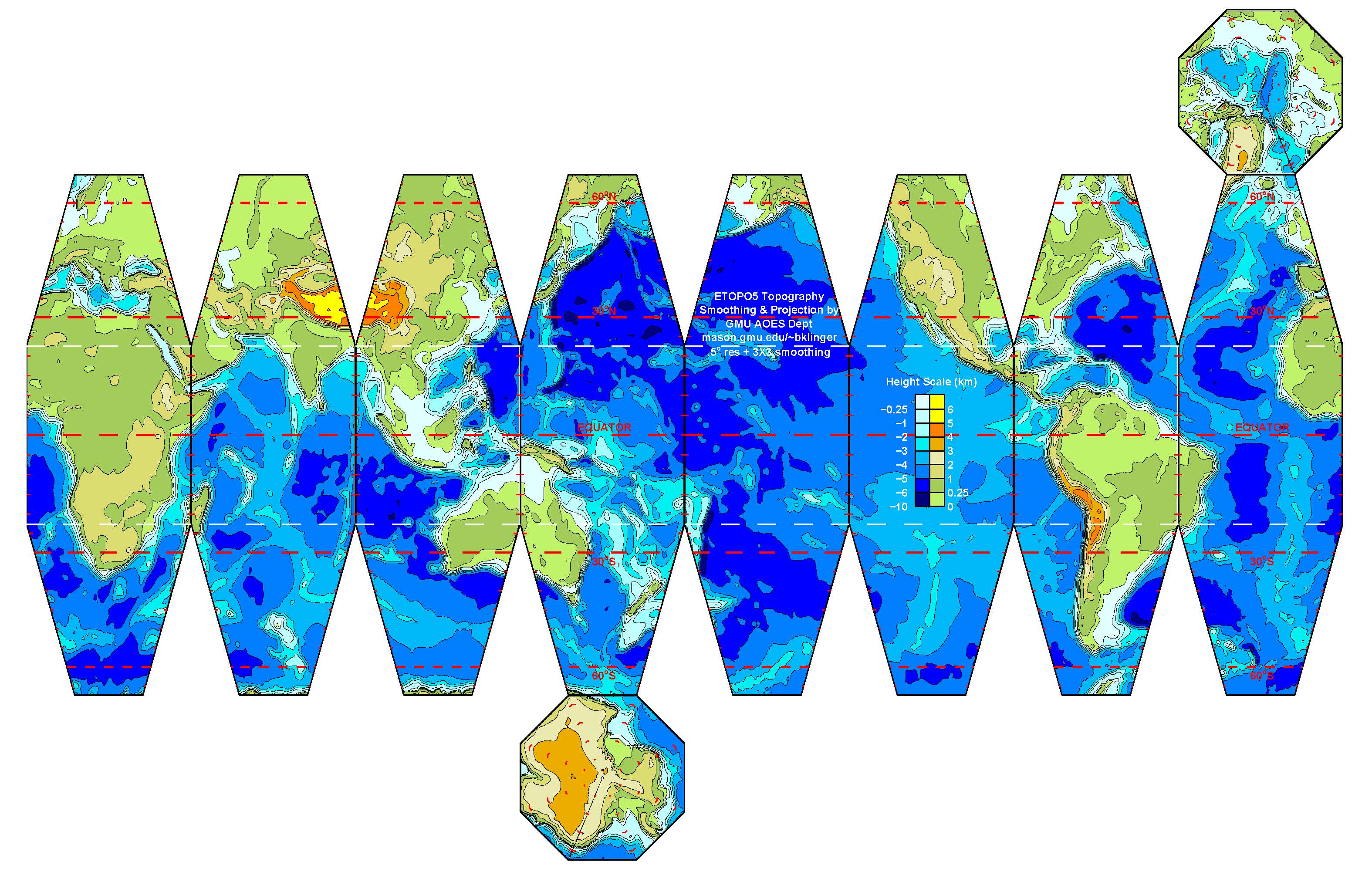
 Once a map is projected on to a flat image, like the one above, and printed out, I can create a SectorGlobe after about 20 minutes of cutting and pasting (with actual scissors and tape, not Microsoft Office products!). The sectors also have to be folded along the white lines. It is rather entertaining seeing the object snap into the correct shape as the last few edges are connected.
My SectorGlobes web pages include some sample SectorGlobes for printing as well as instructions and Matlab scripts for creating new SectorGlobes. Please contact me (bklinger@gmu.edu) if you have used any of the resources there, if you have any questions, or if you have any new ideas about how to use the SectorGlobes or new fields to display with them.
Why is moist air lighter than dry air? This seems pretty counter-intuitive at first, but then really isn’t.
I promised to do a post on why moist air is lighter than dry air a long time ago, and wrote it about a year and a half ago (!), but never published it. So here we go now!
First, we need to assume that air is an ideal gas. In that case, the number of molecules in a given volume depends only on the pressure and temperature of the gas. This is given in the ideal gas law:
PV=NkT
with P the pressure, V the volume, N Avogadro’s number = 6.0221 x 10²³ /mol, k the Bolzman constant 1.38066 x 10⁻²³ J/K and T the absolute temperature.
Is the assumption that air is an ideal gas a good one? Despite my sister’s insistence, I am not going to write a post on how I dyed all molecules in a volume of air and counted them (very funny, ha ha). So experimentally confirming N or k isn’t going to happen. But we can qualitatively show that if the number of gas molecules increases and the temperature stays the same, pressure and/or volume have to increase. We can also show that if we change the volume, this will affect pressure and temperature. All of those experiments might happen in a future post, they are all pretty standard and not very exciting.
Assuming that the ideal gas law holds for air, this means that since the number of molecules per volume is constant, the density depends on the mass of the molecules inside the volume.