Our Nature article in 20 tweets

(Not true, there were 22 tweets, but apparently I can’t count! :-D)

For those of you that don’t follow my Twitter, here is what I posted over there the day our Nature paper got published:

Published online in @Nature today: “Ice front blocking of ocean heat transport to an Antarctic ice shelf” by @a_wahlin @nadsteiger @dareliuselin @telemargrete @meermini (Yes! That’s me!!! :-)) @ClnHz @ak_mazur et al.. What is it all about? A thread. 1/x

And here is the link to our Nature article!

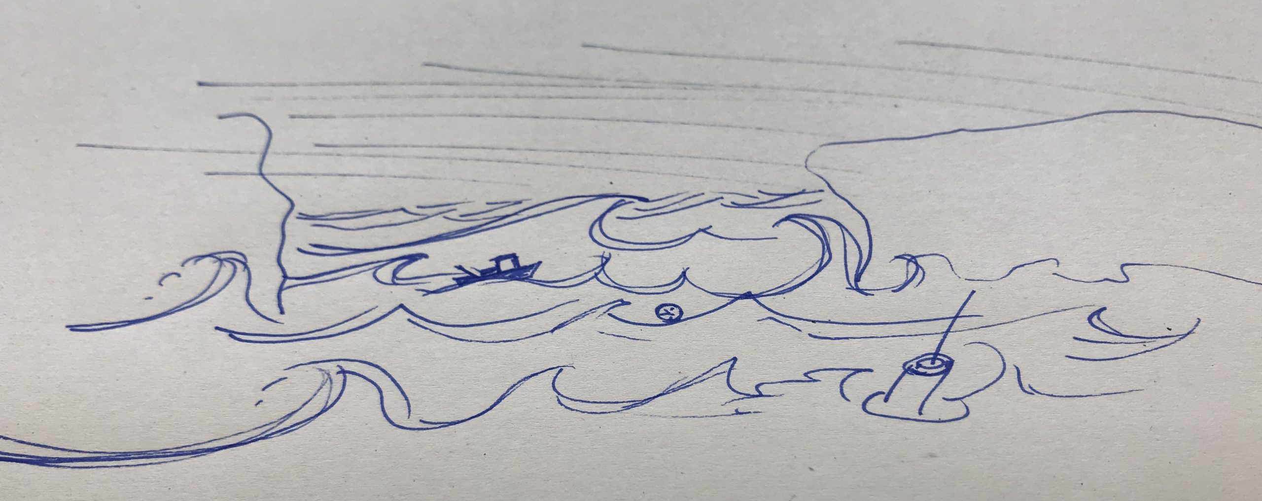
The Antarctic ice sheet has been losing mass recently. Ice sheets consist of the “grounded” parts that rest on land or sea floor, and the parts that float on the sea. If the floating part get thinner, the grounded part “flows off” land much more easily (pic by @dareliuselin) 2/x
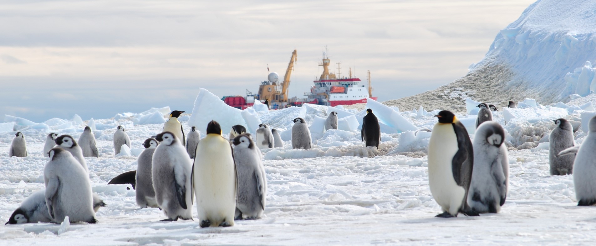
Floating parts of ice shelves break off&melt. But why are ice sheets thinning? Mainly because of melting from below. We are thus concerned with what controls how much warm(-ish) water is transported across the Antarctic continental shelf towards the ice (Sketch: Kjersti Daae) 3/x
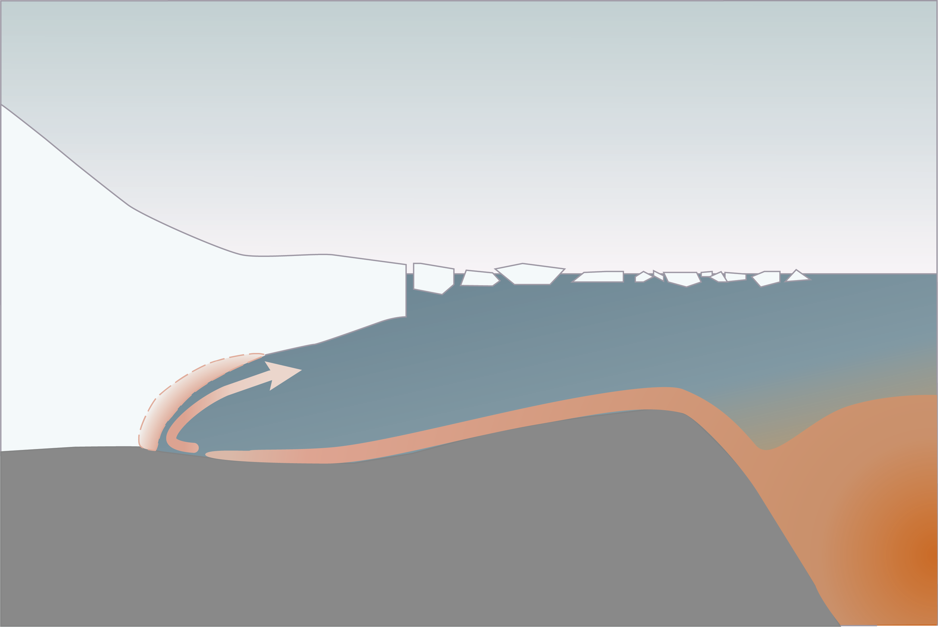
I’m writing “Warm(-ish) water”, because the water is only 1-2°C “warm”, but that’s still warmer than the freezing point. IF this warm(ish) water gets in contact with ice, it will nibble away at it. But that’s a big IF, that we set out to investigate 4/x

From existing data, it seemed that the shoreward heat flux is much larger than what would be needed to cause the observed melting. But this is a heat flux that was measured not right where the melting is happening, but a lot further offshore 5/x

It’s difficult to measure the heat flux right up to the ice shelf, because Antarctica isn’t the friendliest of environments for research ships, gliders, moorings, etc, especially in winter. Cool toys like floats, or CTDs on seals give a lot of data, but not enough yet 5/x
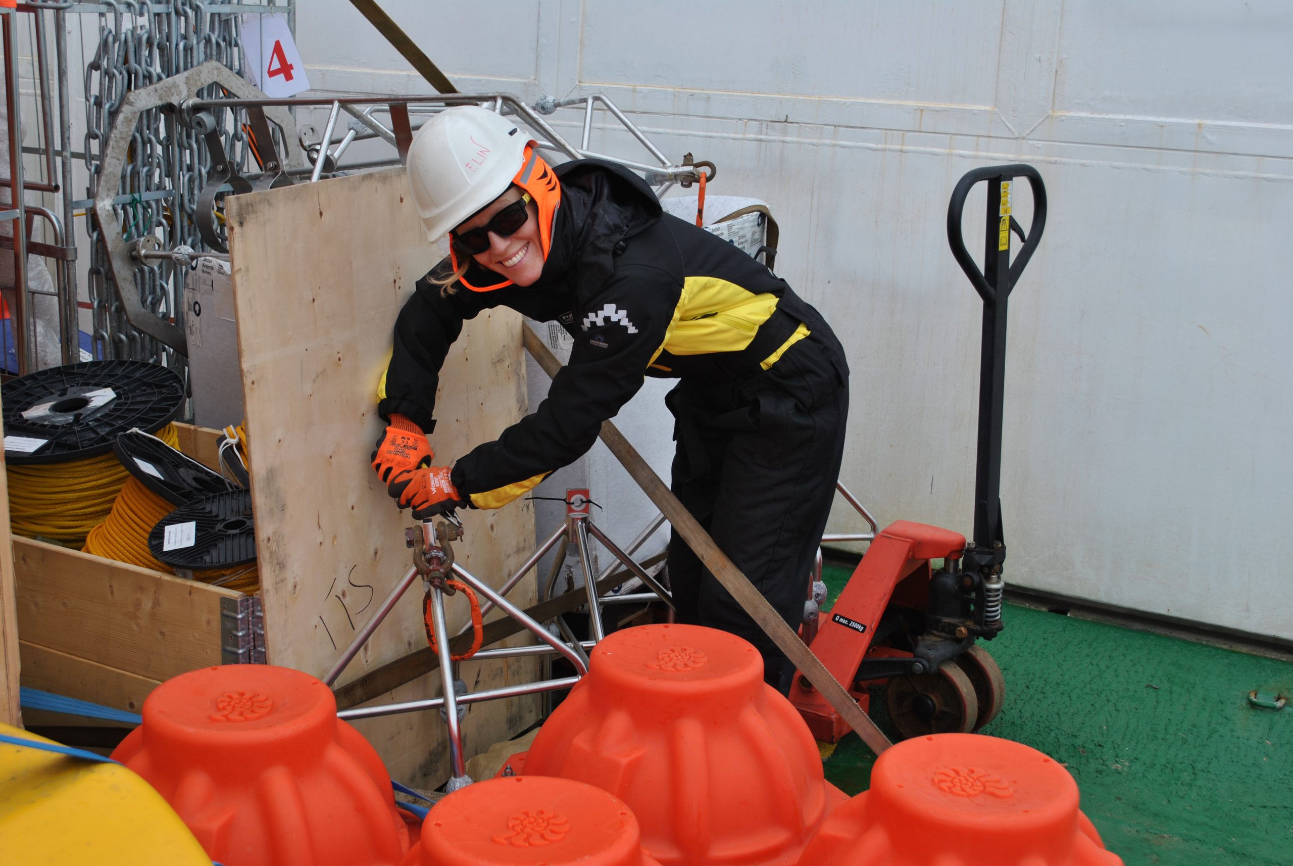
But @a_wahlin, @dareliuselin & team put moorings closer to the ice shelf than ever before, the closest one of three only 700m from the ice shelf front. There was absolutely no guarantee that the moorings would survive (Pic by @a_wahlin showing @dareliuselin) 6/x
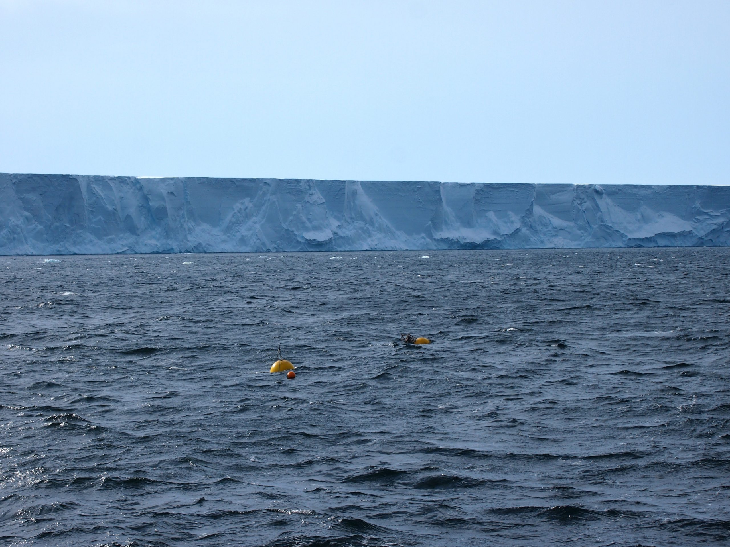
Luckily, despite being threatened by storms, ice bergs etc, the moorings recorded for two years, right next to the ice shelf, giving us better estimates of heat fluxes than were available ever before 7/x
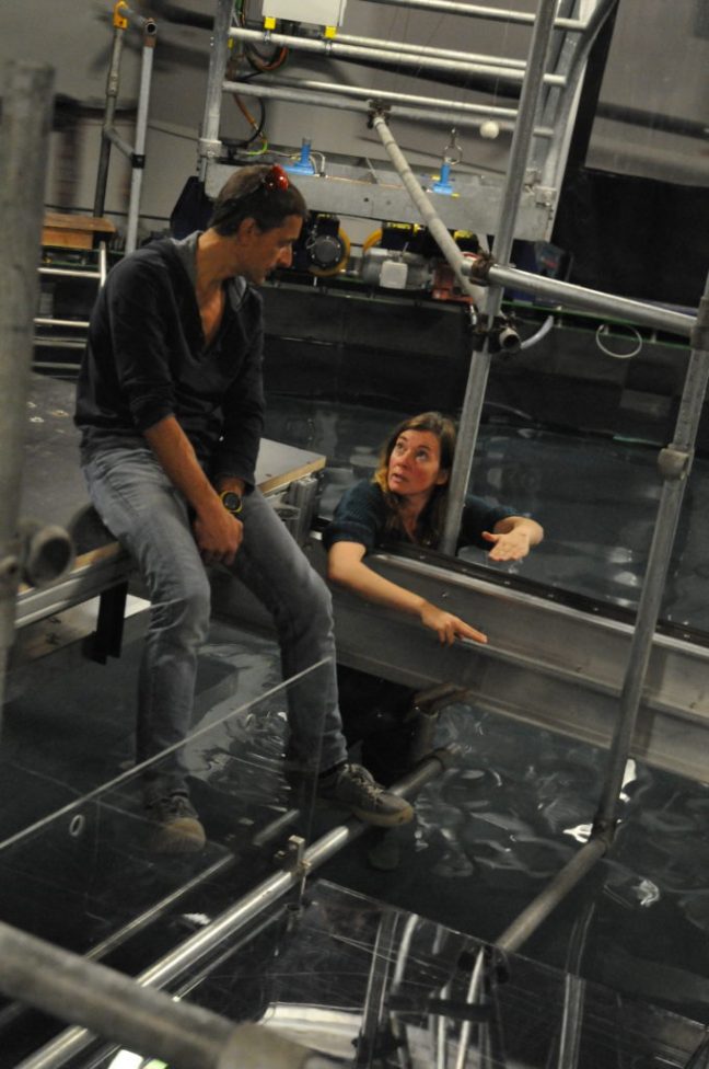
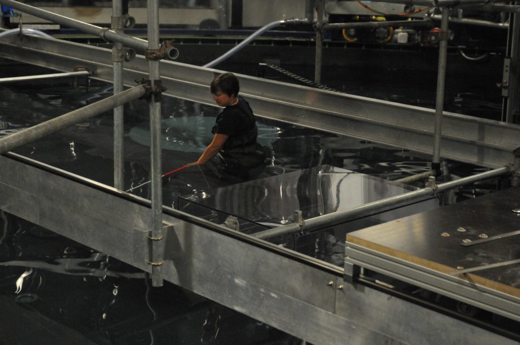
While the moorings were out in Antarctica, we went to LEGI in Grenoble and worked on the Coriolis rotating platform, basically a 13-m diameter swimming pool on a merry-go-round. SO EXCITING! (Pic by Nadine Steiger) 8/x
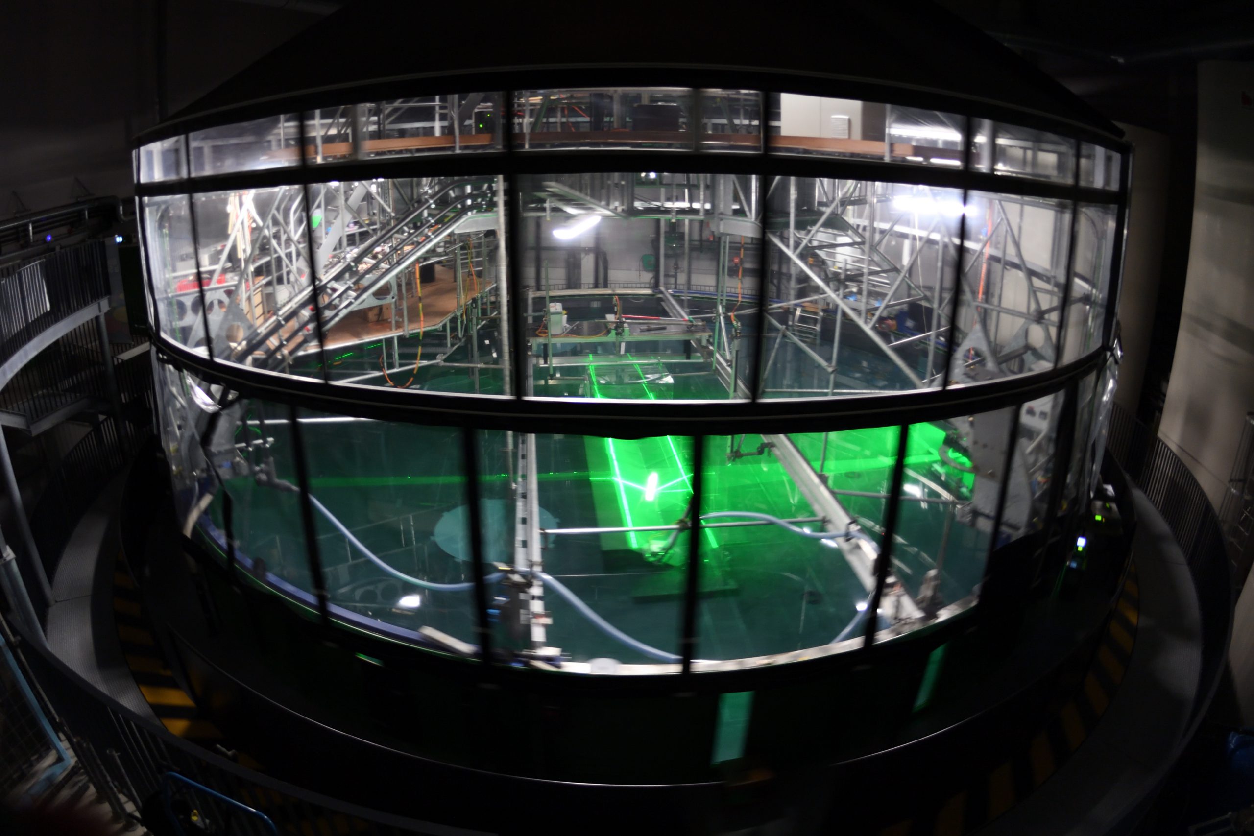
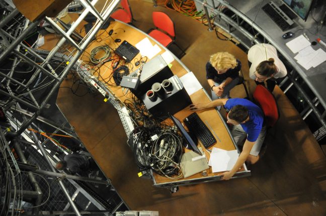
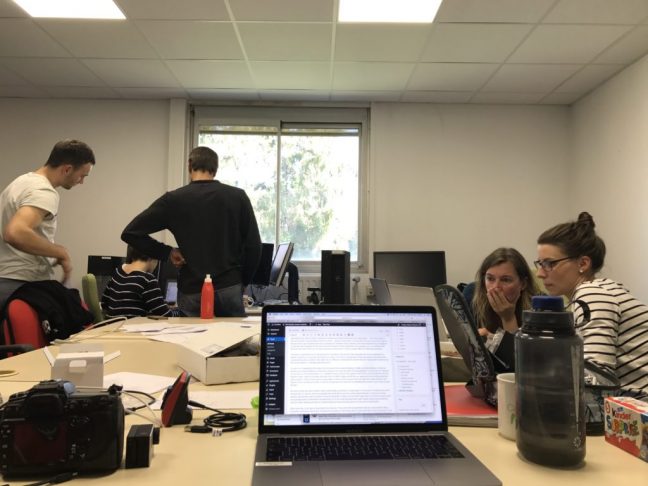
It’s really an amazing experience to sit in an office above a swimming pool when both are rotating together. As long as it’s dark outside the tent that covers both, you don’t really notice movement. But when the light comes on it’s very easy to get dizzy! (Pic Samuel Viboud) 9/x
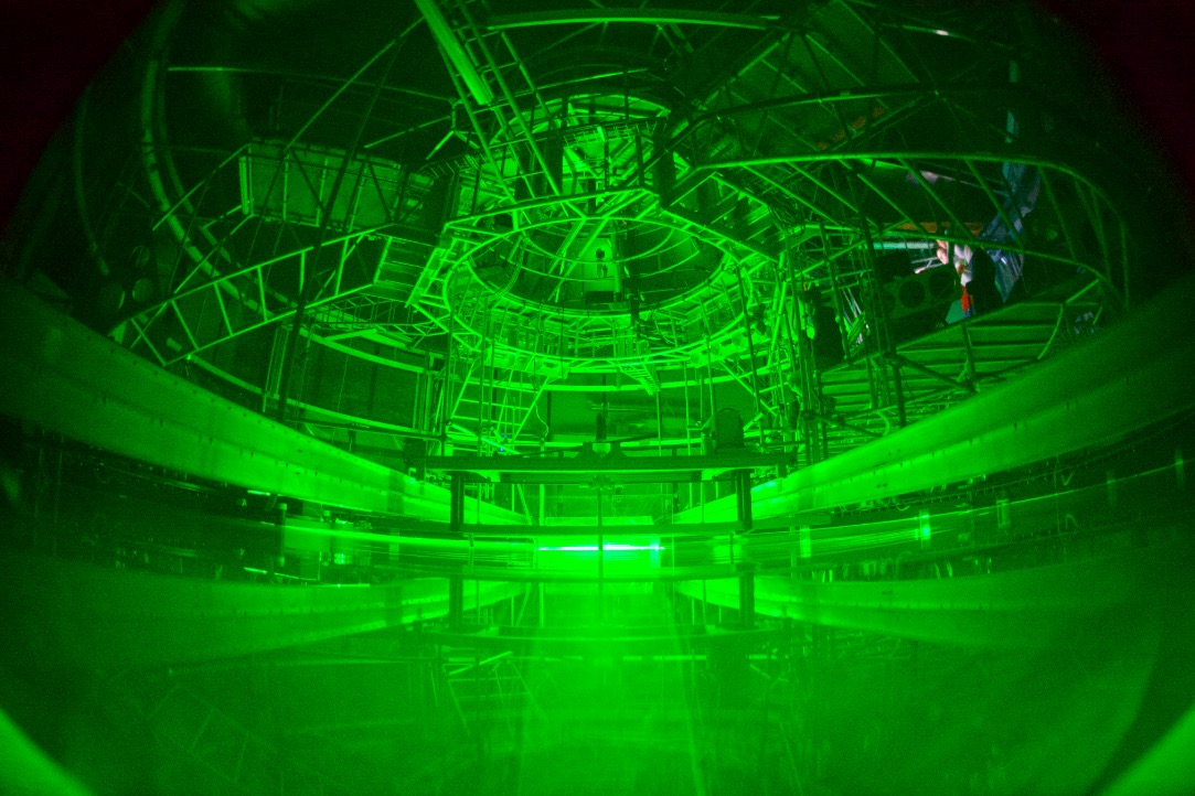
We were not playing on the merry-go-round for two months just for fun, though. Rotating the large water tank is important to correctly represent the influence of Earth’s rotation on ocean currents, which is very important for this research question 10/x
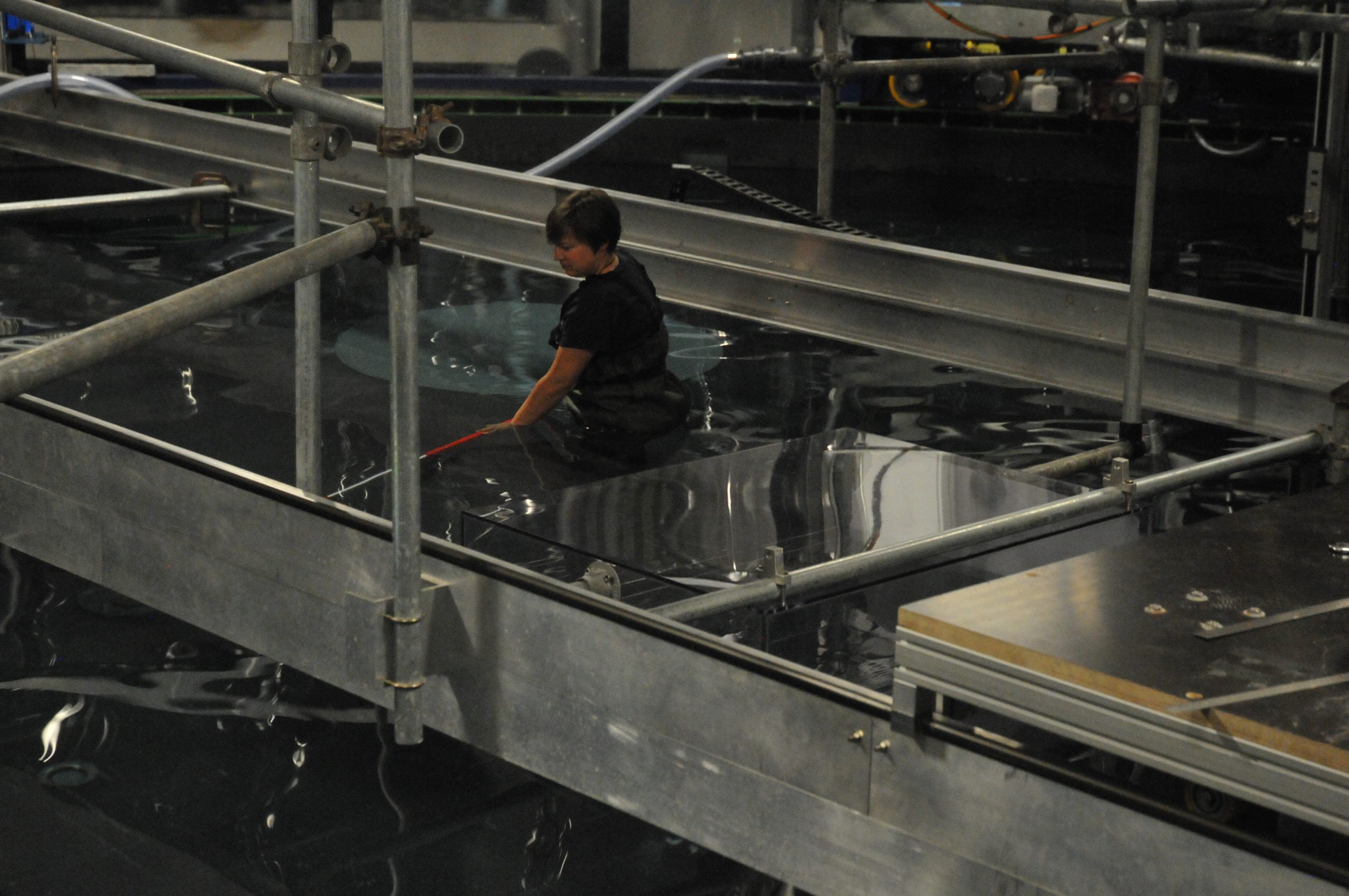
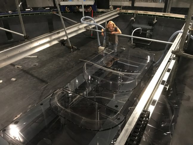
In the rotating platform, we built a plastic “ice shelf” that was mounted at the end of a v-shaped plastic “canyon”. We could set up a current and then modify parameters to investigate their influence on the transport towards and underneath the ice shelf (Pic @a_wahlin) 11/x
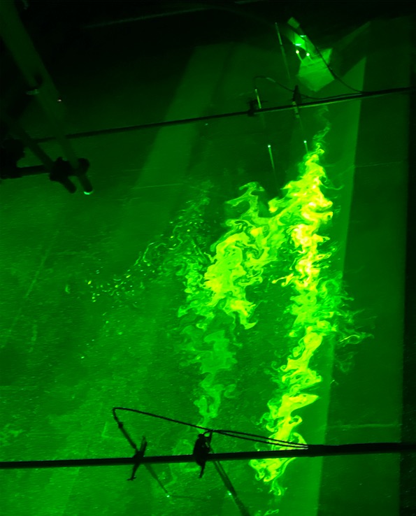
If you are interested to read a lot more about this (also about how parts of the team went for a swim in the rotating tank, and about how sick you can get when sitting on a merry-go-round all day every day for weeks), check out @dareliuselin’s blog 12/x

Link to Elin’s blog!

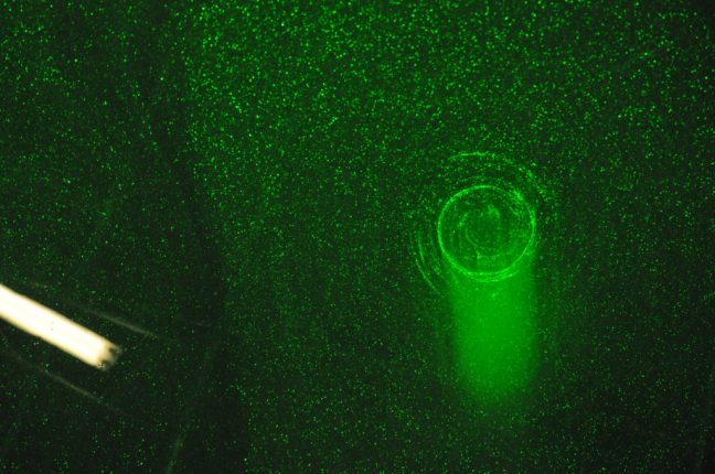
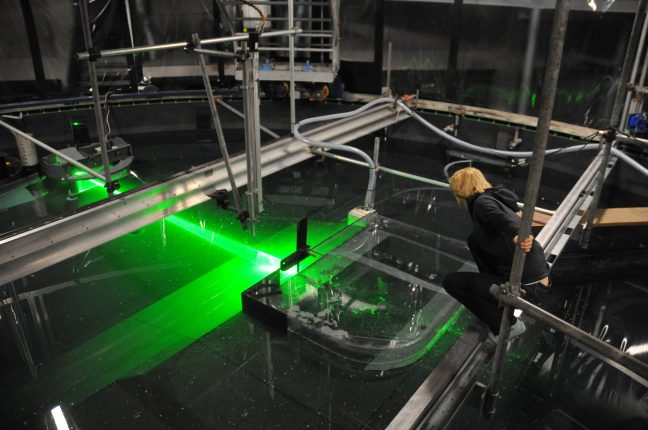
In a nutshell: We put particles in the water and lit them, layer by layer, with lasers. We took pictures of where the particles in each layer were, and with the “particle image velocimetry” (PIV) technique, we got a 3D map of particle distributions over time 13/x

And what we found both from the data that we got from the moorings in Antarctica, that we were lucky enough to recover, as well as from the tank experiments at the rotating platform was really interesting: Ice front blocking of ocean heat transport to the Antarctic ice shelf14/x

The ice shelf, at its most offshore part, still reaches down to 250-500m. That means that the depth of the water column changes drastically at the front of the ice shelf. And that has important consequences for depth-independent part of the current 15/x

The barotropic, i.e. depth-independent part of the current is blocked by the step shape of the ice front (as well as the plastic front in the tank). Only the baroclinic (depth-varying) part can flow below the ice, but that part is much smaller 16/x

In the tank we changed the shape of the ice front to see that it’s really the large step that blocks the current. Other configurations lead to different flow pattern. But the large step shape is what the Getz Ice Shelf system looks like, and other systems, too 17/x
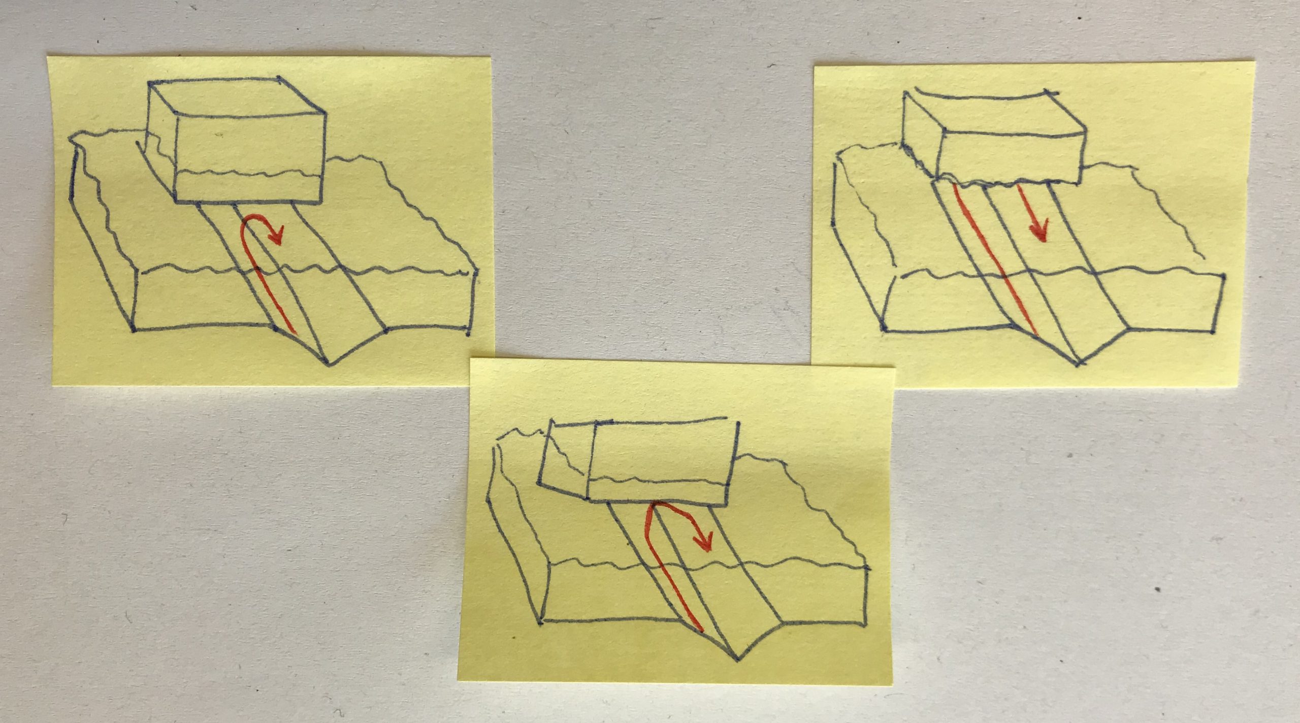
What that means is that looking at the density structure of the water column, thus the relative magnitude of barotropic and baroclinic components of the current, is a better indicator of ice shelf melting than the heat transport onto the continental shelf 18/x

It also shows the importance of accurately representing the step of the ice shelf front accurately in models in order to simulate the heat transport towards the ice as well as the melting of the ice shelves 19/x

TL;DR: Article published @Nature on ice front blocking of ocean heat transport to an Antarctic ice shelf, and I contributed to the exciting study and feel so honored to have been part of this amazing project with @a_wahlin, @dareliuselin, @clnhz et al. (Pic Samuel Viboud) 20/x
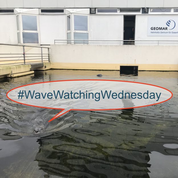
#WaveWatchingWednesday

Here’s another #WaveWatchingWednesday overview over my Instagram @fascinocean_kiel! Enjoy!

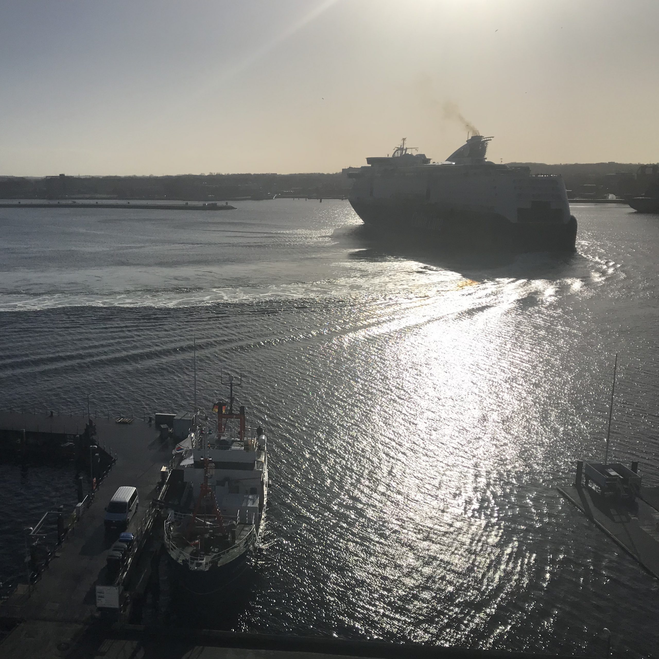
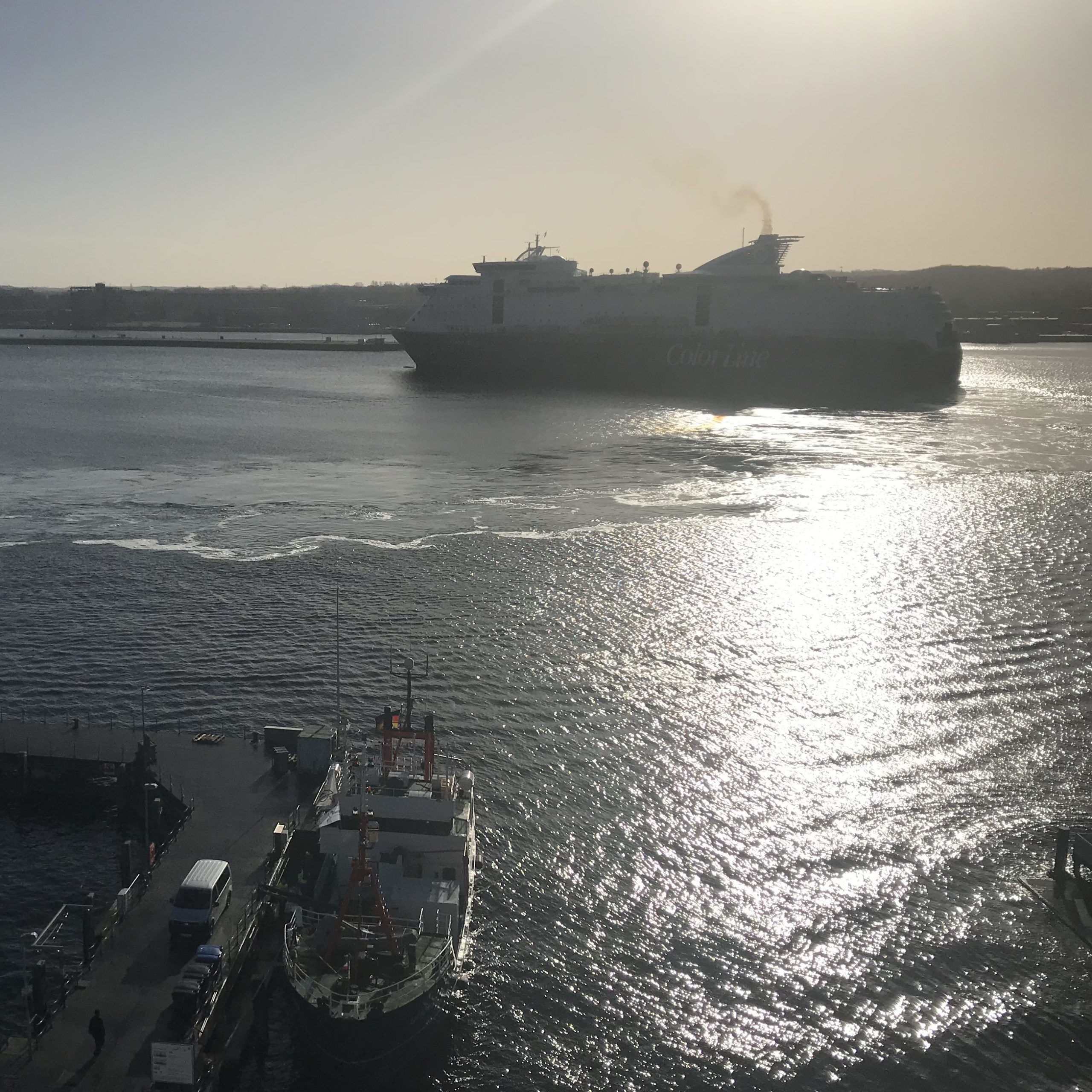
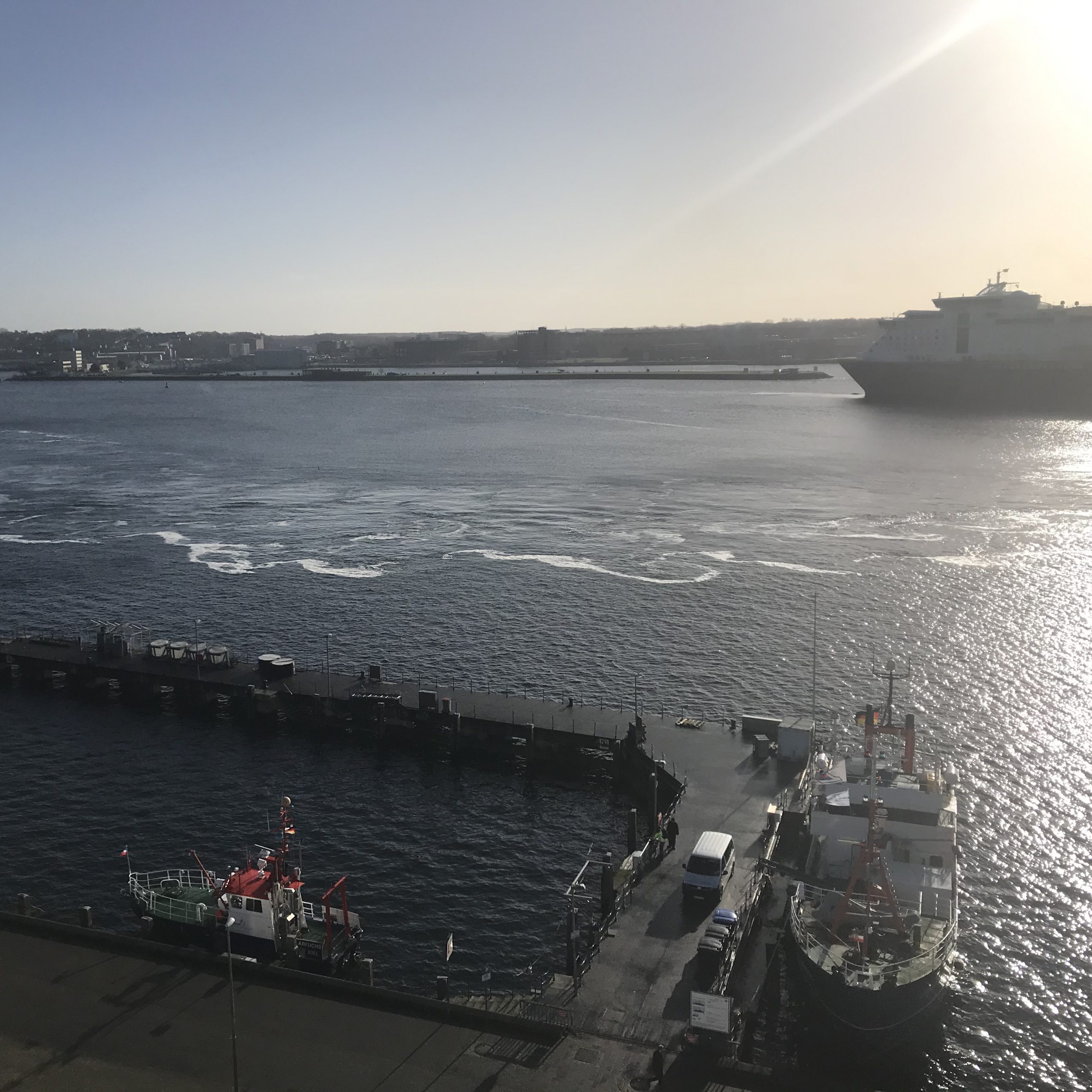
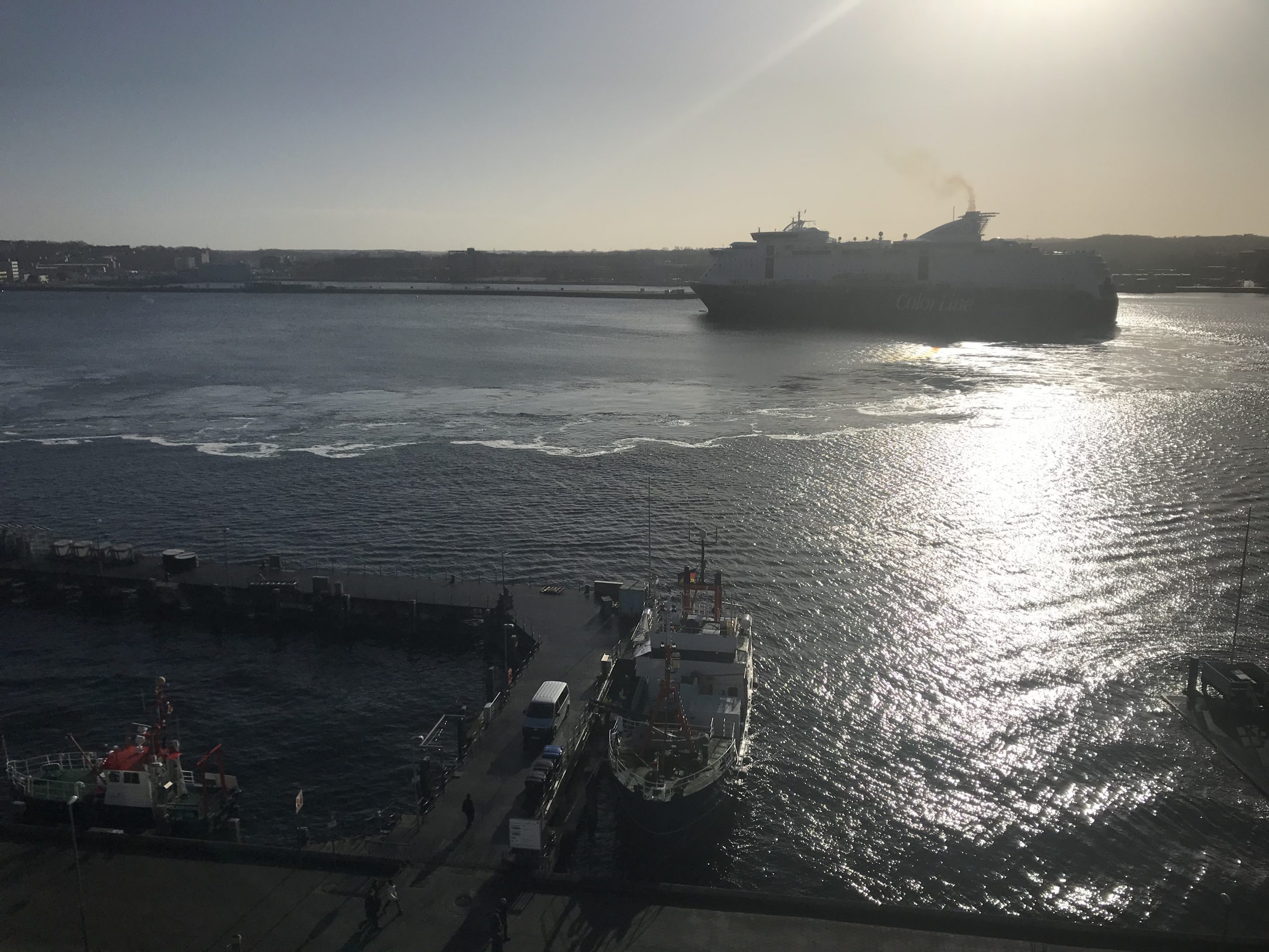
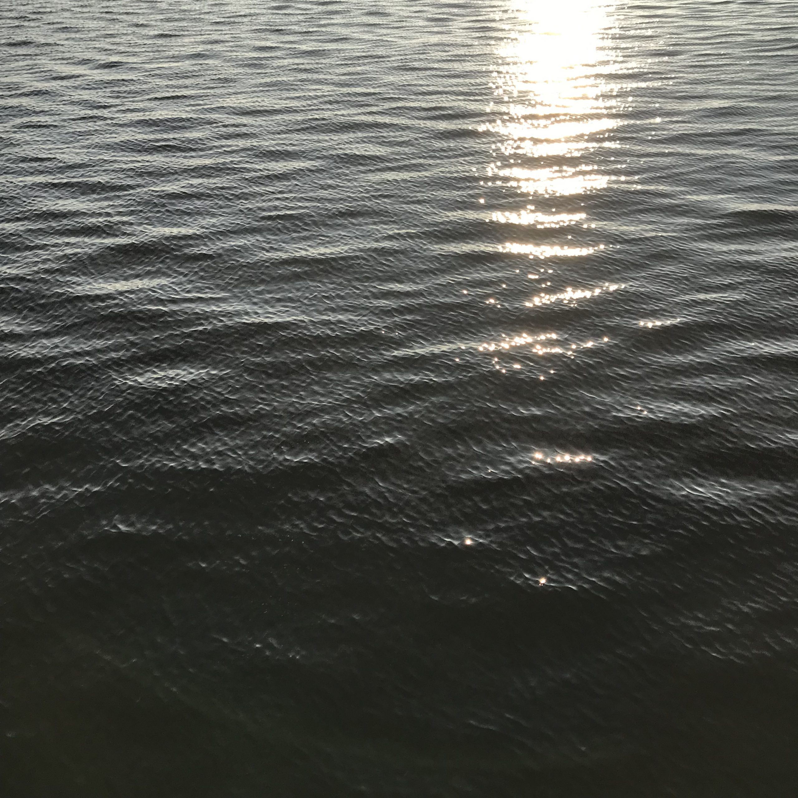
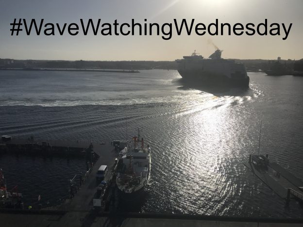
Sun glint can be so helpful to make waves visible more clearly, like this morning. I love the combination of the turbulent wake, the feathery usually V-shaped (and in this case quite wonky) wake, the sun. Always fun to watch!

Just moments later and the feathery wonky V is a lot more difficult to recognize (its remnants are reaching the shore at the very bottom of the picture). But the turbulent wake looks a lot more interesting now with that cloud-like appearance!

And one last look at the billows of the turbulent wake. I mean it’s quite impressive for such a large ship to do a 180 turn in such a narrow fjord. But it’s also really cool to see it like this, documented in the wave field!

Oh, and then I did some #FriendlyWaves for Christina on a super cool picture taken from a plane off Panama. Check it out!

…And a little wave watching on my way to work!

Christina’s #FriendlyWaves from Panama!

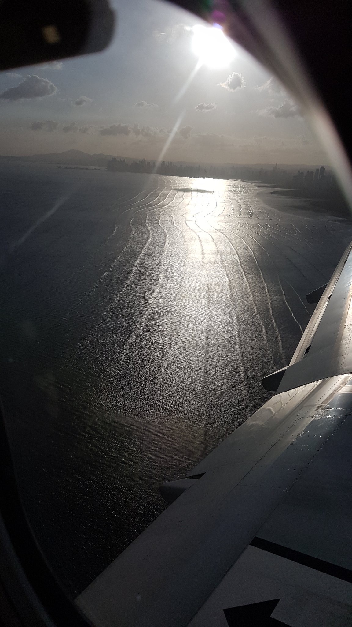
Christina writes on Twitter: “#wavewatching from a plane, approaching #Panama. @Meermini, do you know what causes those regular ‘wrinkles’?” and how could I resist writing a blog post about what I think might be the explanation?

Below is the picture Christina shared on Twitter.

Picture by Christina Oettmeier @sulfurium

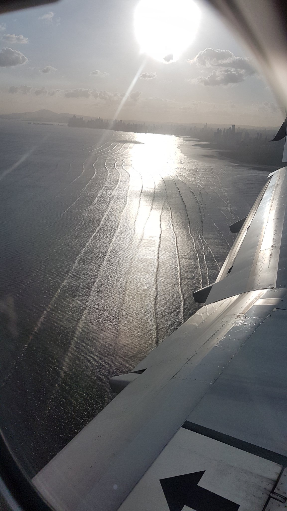
What I think we see here are basically two wave fields: The regular “wrinkles” and then a lot of small crinkle.

The small crinkle are boring: local, wind-generated waves. They are not what Christina asked about.

But the wrinkles are swell: Waves that were formed in a storm far, far away and that have propagated here over a long distance. While propagating from the area where they were formed to the beach where Christina took these pictures, the waves got sorted by wave length. The longer a wave, the faster it propagates in deep water. So long waves from a distant storm will arrive first, and over hours or days the wave lengths of the waves arriving at the beach will get shorter and shorter. The wave lengths we see here seem to be about the height of the high rise buildings we see on the shore. The highest high rise in Panama is almost 300m high, so the wave lengths might not be that long, but at least 100+m.

Why do they look so “wrinkly” and not like proper breakers? When waves are in water that is shallow compared to their wave length (so say water depth would be less than 50m for these waves if we assume they are 100m long, which I think are both reasonable estimates), their shape changes from the normal sine-shape that they would show in deep water, to steep crests and loooong troughs. You might have observed waves with this shape for example in the very shallow waters of a beach on the wadden sea coast or any other beach with a really small slope, where waves look like sausages or pool noodles that are being shoved onto the beach (compare for example to pictures in this post).

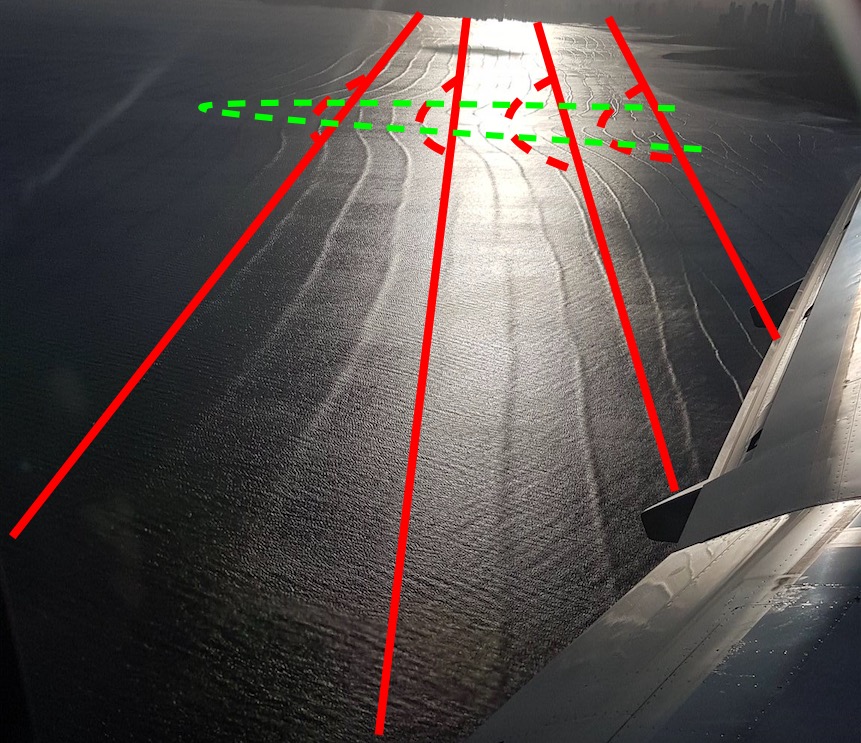
What makes me confident that we are really seeing what I’ve just described above? Mainly that I can see the interaction of the waves with the sea floor. If you look at the pic above, do you see the area where the waves bend? That’s where the water is shallower. I’ve tried to sketch that below: The red lines are — in first approximation — the wave crests (I’ve only drawn in every third or so for clarity). Red dashed lines are kinda the second approximation of the wave crests: Those are the deformations that I want to talk about. And those deformations are caused by a shallower area, which I’ve drawn in with the green dashed line. This little submerged headland slows that part of the waves down that runs above it (because in shallower water the wave’s speed only depends on water depth, not on wave length any more), but not the rest of the waves that propagate towards the beach with the straight crests intact.

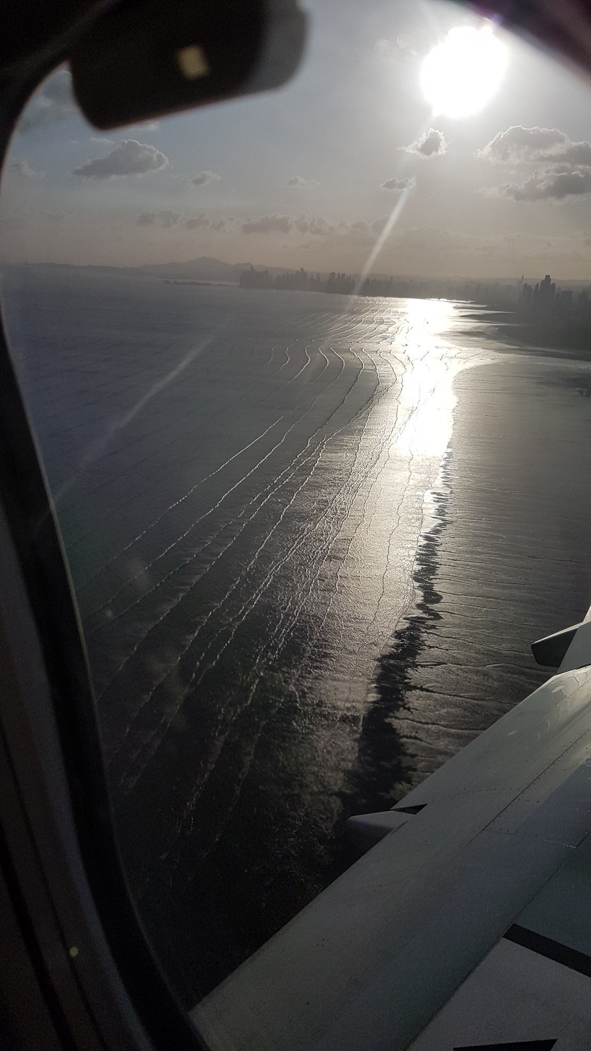
It’s even easier to be confident when we look at the next two pictures that Christina shared with me. Now we are a little closer to the beach and can see the area where the waves break and where it is shallow enough that the wave lengths drastically decrease (since the waves are slowed town more and more the closer they come to the beach, waves that are further out are still faster and can catch up to waves in front of them). This is very typical for the parts of a beach where the depth changes rapidly.
Picture by Christina Oettmeier @sulfurium

And on the next pic, we see even more clearly that the waves change from pool-noodle shaped offshore to breaking waves close to the beach:

Picture by Christina Oettmeier @sulfurium

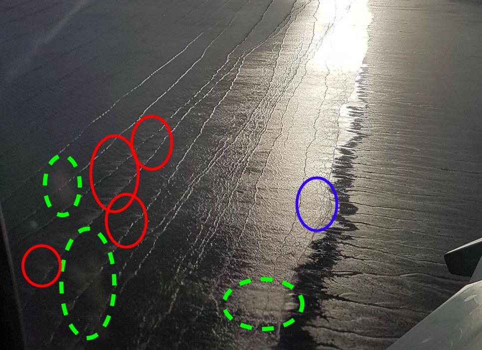
In case you don’t see what I am trying to point out, here an annotated version of the pic above. Green dashed circles: Smudges on the window, or possibly reflections on the window, but nothing to do with the waves. Red circles: Here we see foam on the back side of breaking waves, so there was definitely some wave breaking going on here. And blue circle: Cool structures in the flow of water that is retracting downslope from the beach, back into the ocean.

So much for now. No idea if that made any sense to anyone except myself. Please let me know! :-)

Playing in a 13-m-diameter pool on a merry-go-round results in Nature article

A long, long time ago (ok, in fall of 2017) I got the chance to join Elin Darelius and Anna Wåhlin’s team for a measuring campaign at the Coriolis platform in Grenoble for several weeks. I was there officially in an outreach officer-like role: To write and tweet about the experiments, conduct “ask me anything” events, write guest posts newsletters and websites, etc.. A lot of my work from that time is documented on Elin’s blog, that I blogged on almost daily during those periods. And we had so many amazing pictures to share (mostly green, that’s because of the lasers we used).

Turbulence in a rotating system is 2D, therefore the whole water column is rotating in this eddy that we accidentally made when moving parts of the structure in the tank

But I was extremely lucky: Neither Elin nor Anna nor anyone else on the team saw me as “just the outreach person”, which is a role that outreach people are sadly sometimes pushed in. Instead, they knew me as an oceanographer and that’s how I was integrated in the team: We discussed experiments all the way from the setup in an empty tank (below you see Elin with her “Antarctica”)

No matter how carefully you planned your experiments, once you start actually conducting them, there is always something that doesn’t work quite the way you imagined. But since time in facilities like the Coriolis platform is limited, it is hugely important to think on your feet, come up with ideas quickly, and fix things. Which is the part of science that I enjoy the most: Being confronted with a problem “in the field” and having to fix it right then and there, using whatever limited equipment and information you have available.

Speaking of “limited information”: Sometimes you have to make educated guesses about what’s in the data you are currently collecting in order to make decisions on how to proceed, without being able to know for sure what’s in the data. We took tons of pictures and videos and obviously also observed by eye what was happening in the tank, but in the end, the “real” data collection was happening with images that we couldn’t analyse on the spot (and that’s what the research part is about that took place in between fall of 2017 and now: many many hours of computing and analysing and discussing and rinse and repeat).

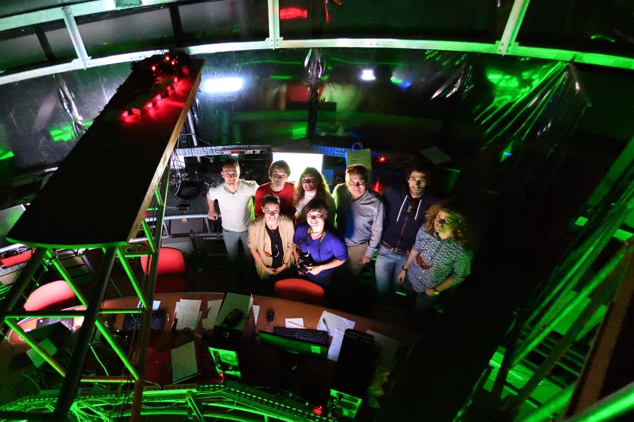
Grenoble was also an amazing experience just because of the sheer size of the Coriolis platform. Below you see the operations room, an office that is built above the tank and rotates with it. And let me tell you, being on a merry-go-round all day long isn’t for everybody!

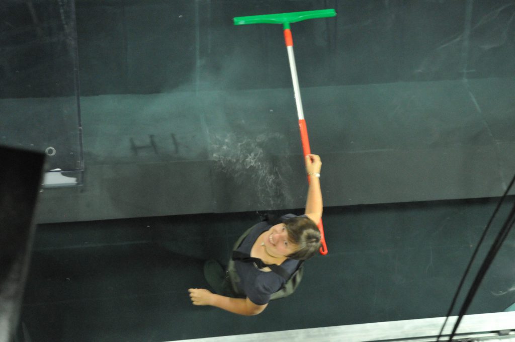
I really also enjoy the hands-on work. Below is me in waders in the 13-m-diameter rotating pool (while it’s rotating, of course), using a broom to sweep up “neutrally buoyant” particles that we use to track the flow that over night settled on the topography (so much for “neutrally buoyant”, but close enough). Sometimes it comes in handy to be an early bird and doing this work before everybody else gets up, so the tank has the chance to settle into solid body rotation again before experiments start for the day.

Here you see the layer of particles in different stages of disturbance, and me having fun with it (it might not be obvious from the picture, but I’m standing in waist-deep water there)

But then we weren’t playing all day long for weeks. There were times of intense discussions of preliminary results. Exciting times! And of course, those discussions only intensified when all the data was in and could be analysed in more depth.

I loved being part of the whole process and contributing to this exciting publication now!

#WaveWatchingWednesday

Welcome to the recap of my #WaveWatching Instagram @fascinocean_kiel! Starting off strong:

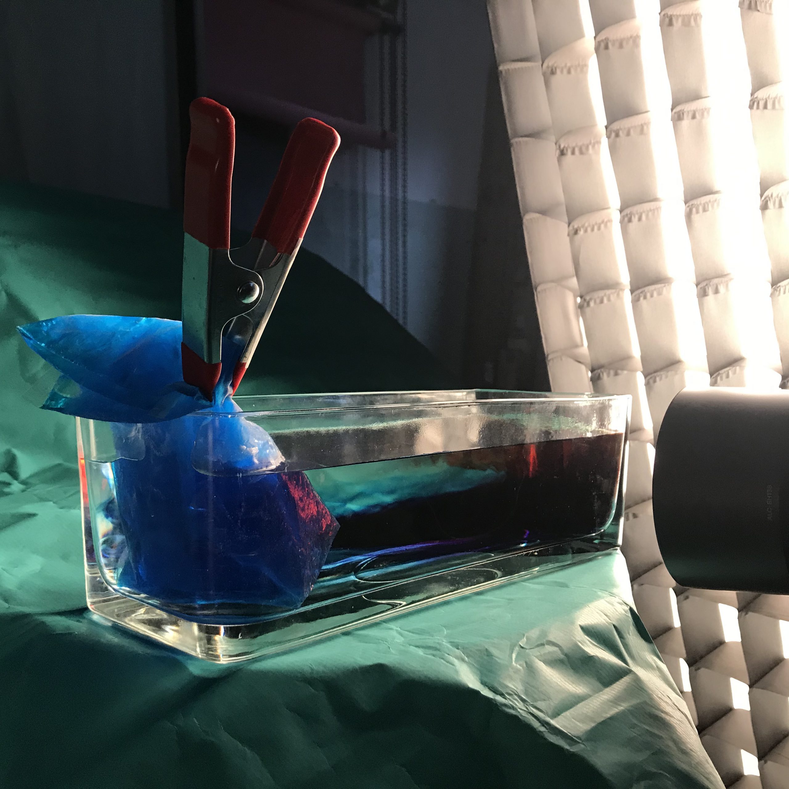
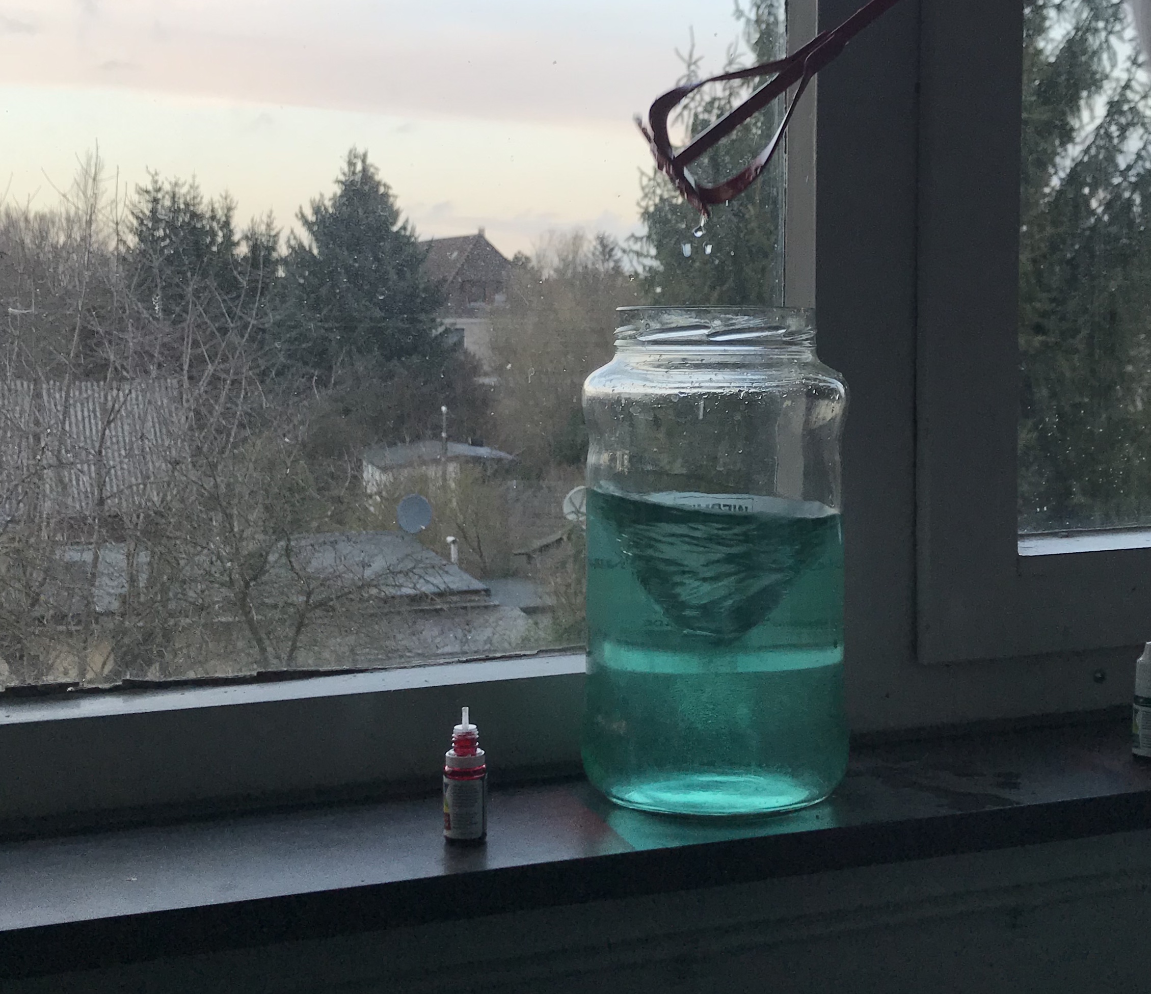
My standard #KitchenOceanography overturning circulation experiment (recognize the tank & the cool pad?) put into a very different light by @davidcarrenohansenfor the upcoming issue of @sciencenotes5x15! Can’t wait to see how the pictures turn out — definitely not the “snap a pic with my phone in my kitchen” I always do!

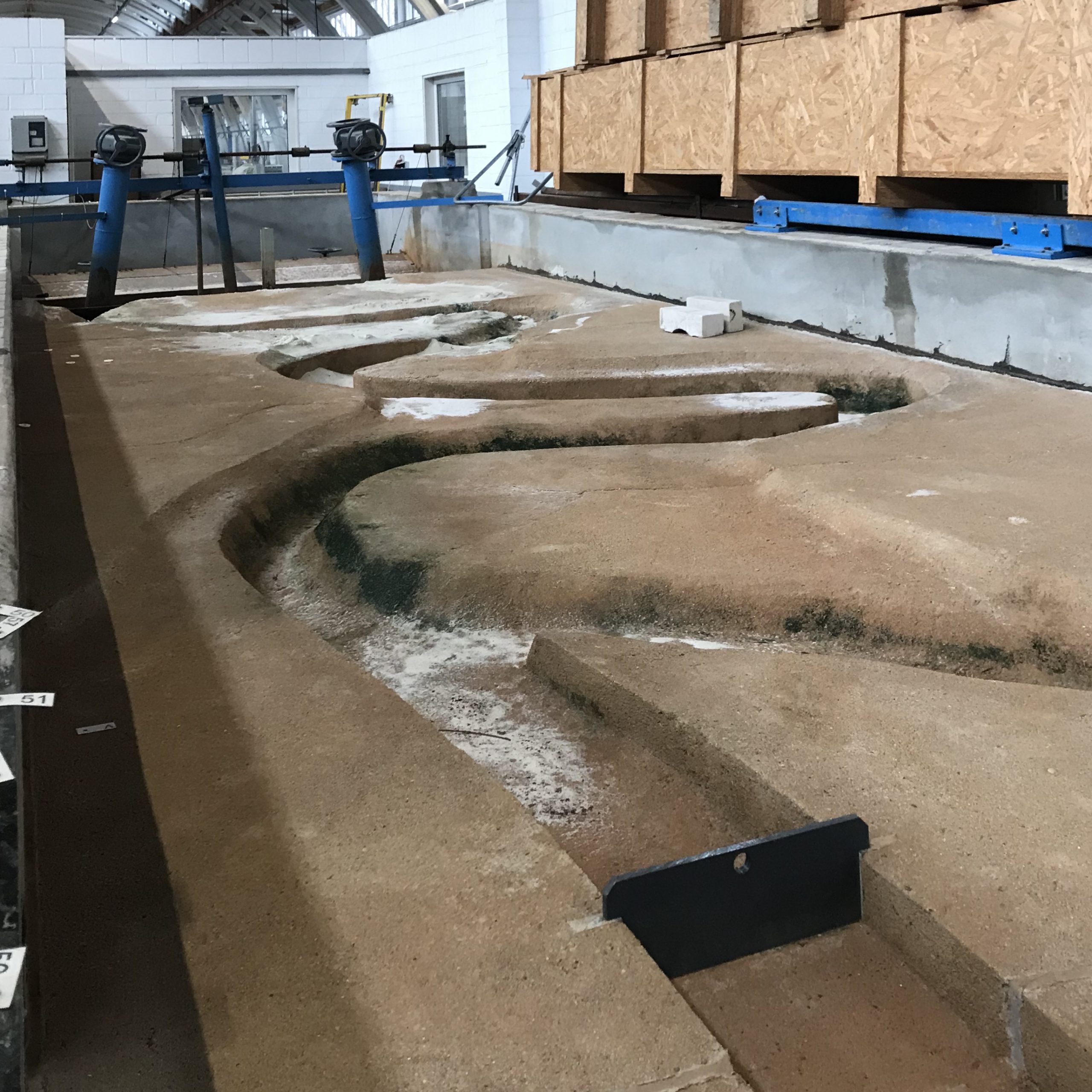
#FlumeFriday with pretty much the opposite approach to my usual kitchen oceanography: Yesterday I got to visit @lufi_luh and see all their super cool flumes and wave tanks. Unfortunately without water, but you bet that I’ll be back! Can you imagine the endless possibilities?

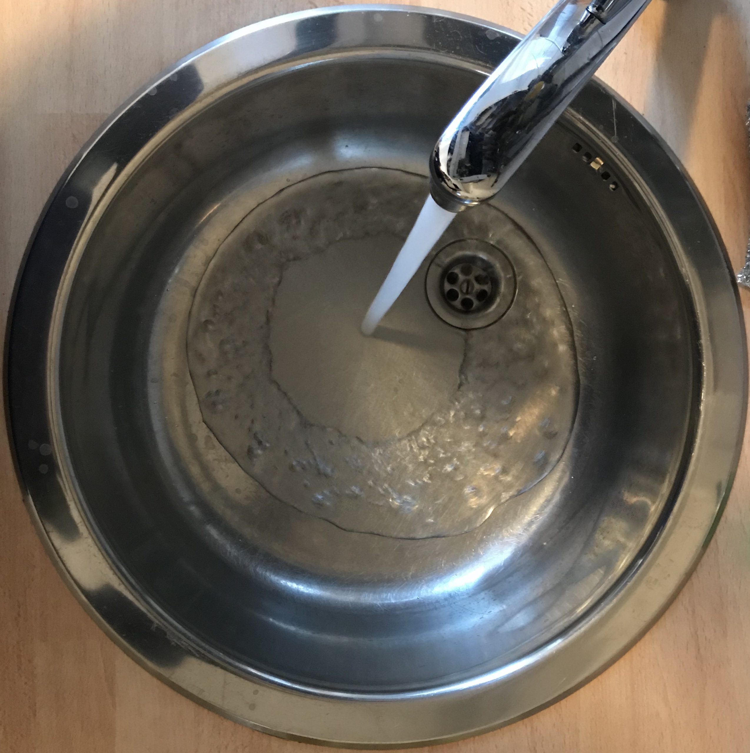
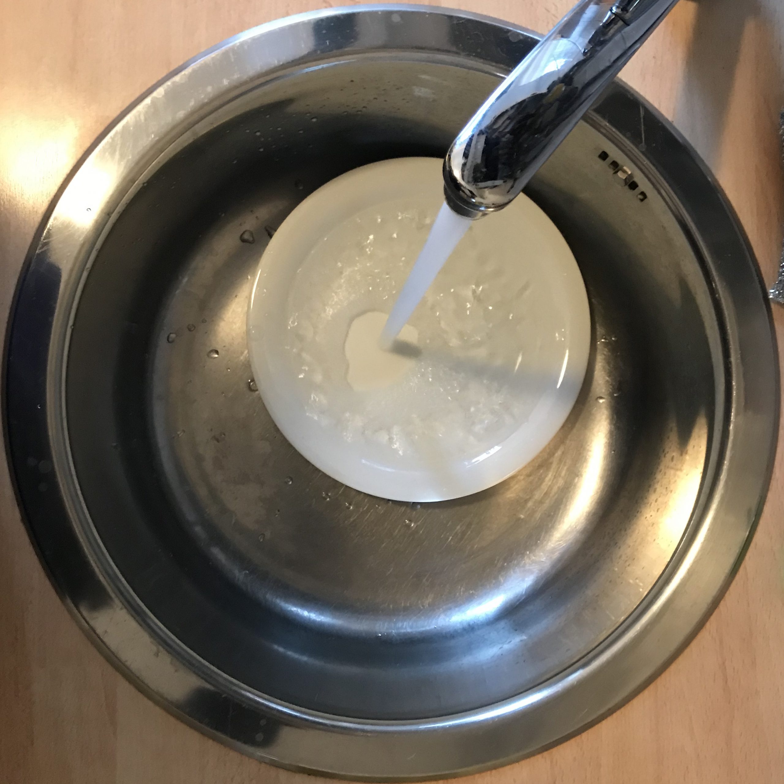
Some things make me happy every time. Like watching hydraulic jumps in a sink. What’s your guess why in the second picture the radius of the shooting water circle is smaller even though the flow out of the tap is the same in both pics?

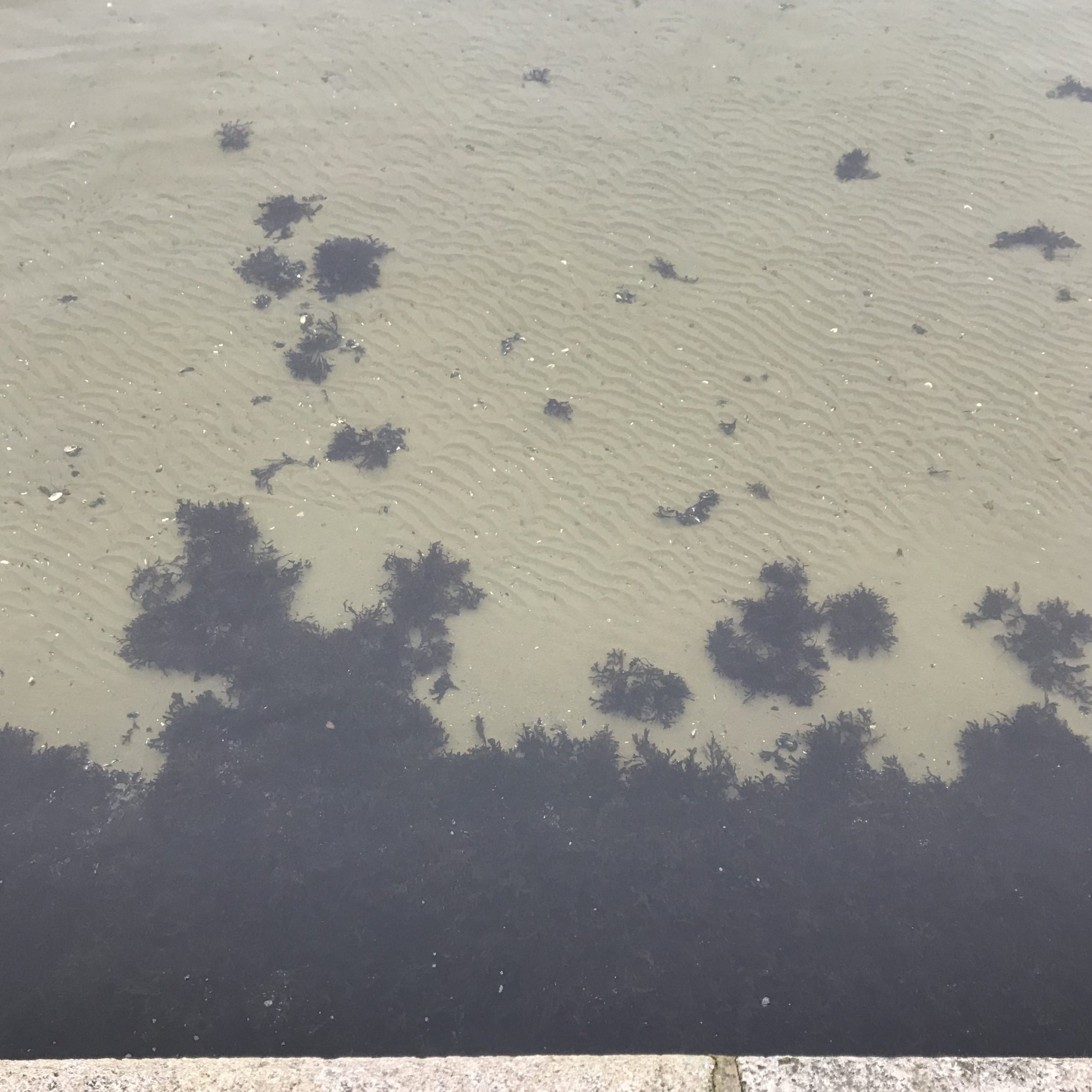
Interesting: distinct ripples on the sandy seafloor, but not all the way up to where the plants start. Why not? It’s not a change in water depth. I think it must be because of some plant wave interaction that dampens the waves enough that they can’t move the sand any more. Or possibly some reflection from the sea wall that messes something up? What do you think?

#SciCommSunday: Did you notice how I am always writing how much _I_ am fascinated by wave watching or kitchen oceanography or that stuff? Head over to my blog post on a recently published study in which it was found that writing in first-preson style is actually helpful in #SciComm because it makes you be perceived as more authentic and helps build a connection with your audience!⁠⠀
⁠⠀
Picture taken on my last trip to Bergen (when P & I met up to go watch the tidal current you see in the background).⁠

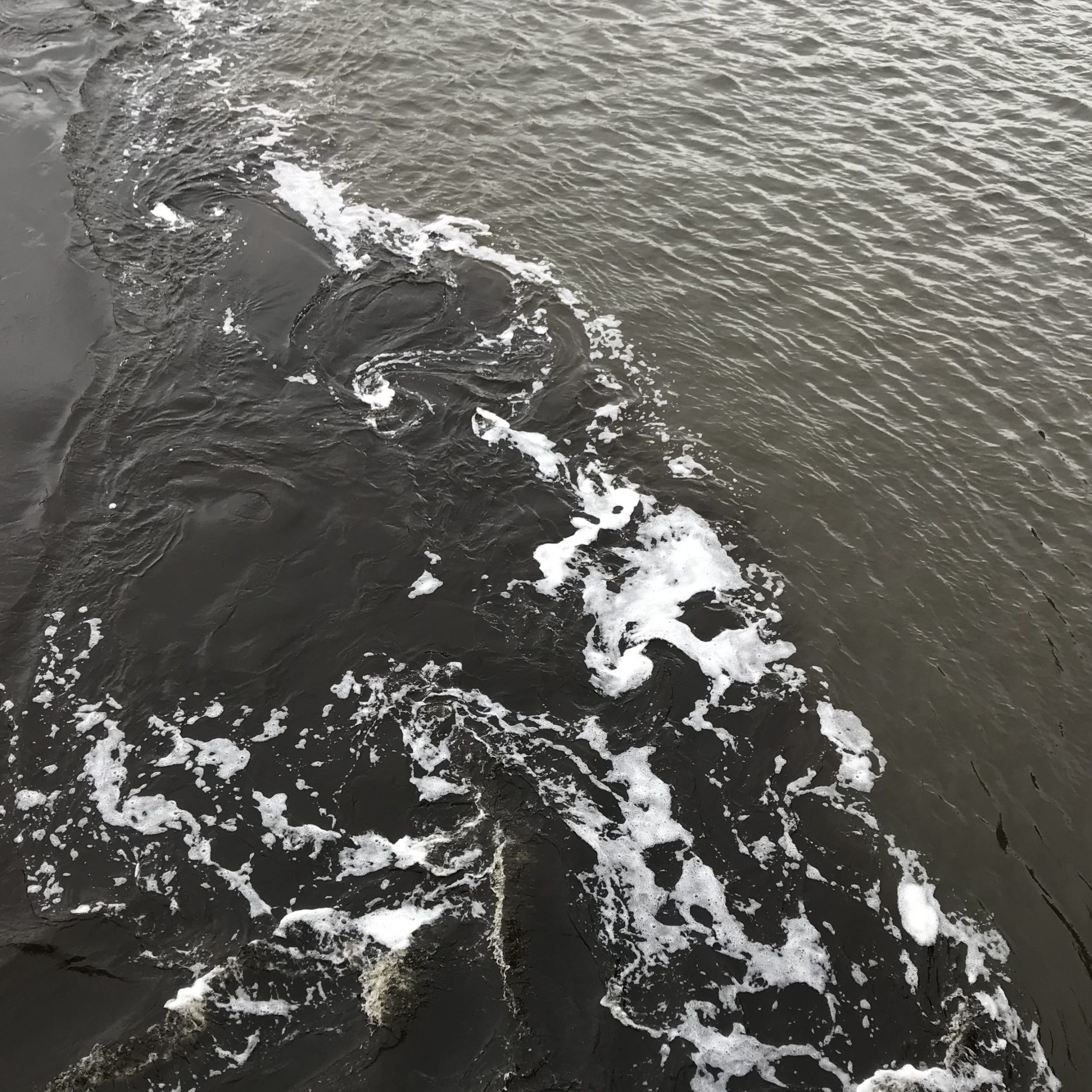
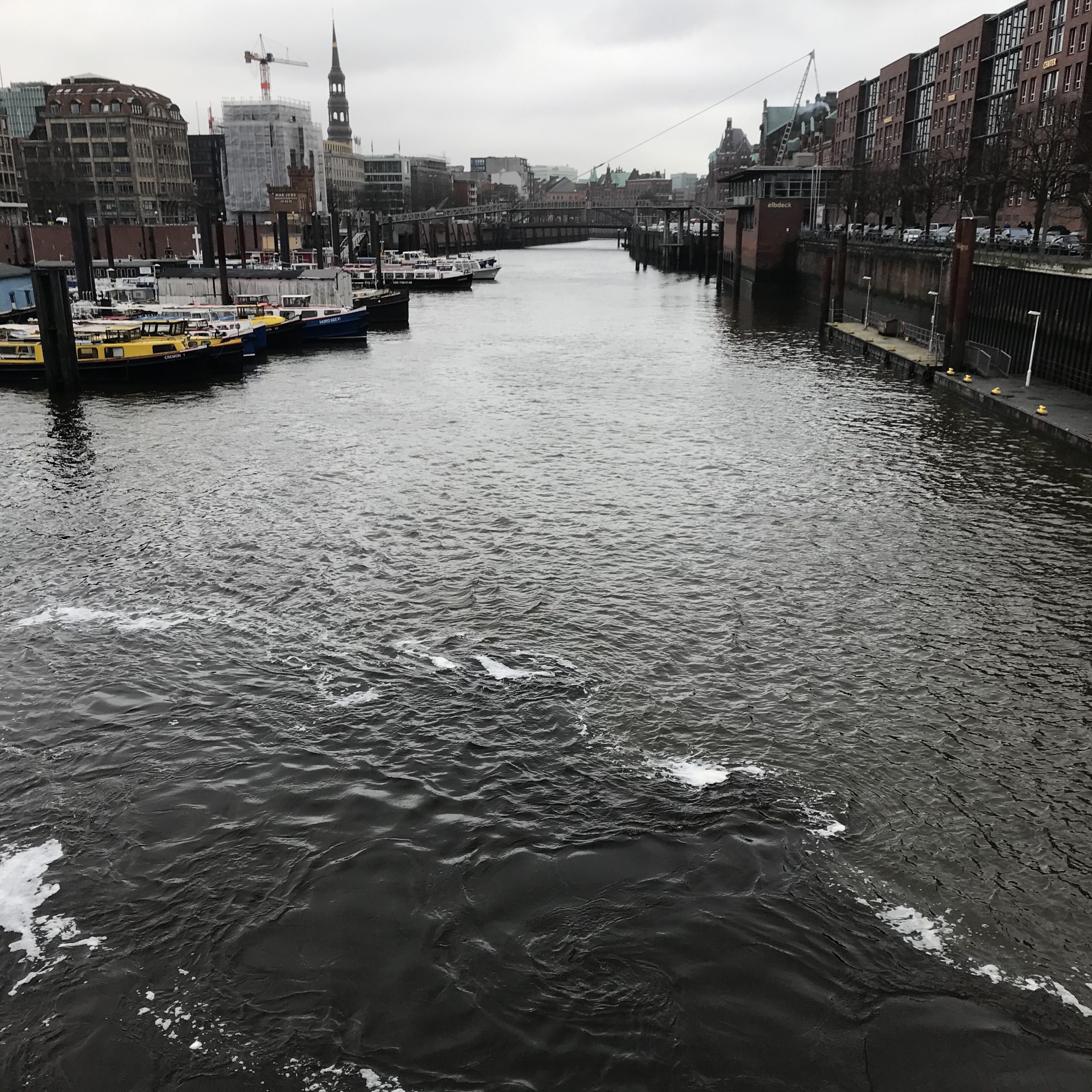
Then one day on my way to work: Shear flow (see the essies?) between two watermasses. The muddy brown water coming out of Alsterfleet, the other one is “normal” brackish Elbe water in the Port of Hamburg. I saw this from the train station and had to go investigate & document! :)

And that’s it for this week! :-)

#SciCommSunday: Why talking about myself can be a good thing in #SciComm

A couple of Sundays ago, I wrote about why I chose to post selfies on my scicomm Instagram @fascinocean_kiel, even though my topic is wave watching (check out that blog post here). And then this week I came across a very recently published study on “Constructing and influencing perceived authenticity in science communication: Experimenting with narrative” by Saffran et al. (2020), which now gives me a perfect retroactive reason for writing in the first-person style that I prefer for my blog and social media anyway.

When communicating science, we are faced with the dilemma that we, on the one hand, want to be perceived as an expert, while on the other hand we want to be relatable. Obviously our expertise needs to become visible — it’s after all what provided us with the information we are hoping to share; information that has come from years of study and highly specialized research. So in that way, we may well be very unlike our audience: Even though within academia we tend to forget how weird we really are, most people are not as highly educated and dedicated to studying very specific topics for large parts of their lives, and our choices might be alien to them. But as much as we want to point out our expertise, on the other hand, we want to be perceived as not-so-unlike our audience, in order to build rapport and be perceived as trustworthy, as authentic. Authenticity in this context means that it becomes clear what our values, world views, intentions are. The authors write that “authenticity offers an opportunity for scientist and audience to recognize each other as individuals with qualities in common that, while expressed in the context of science communication, are not dependent upon the science itself (passion, eagerness to be understood, a specific personal history).”

Authenticity, the authors find, is strongly connected to benevolence, the assumption of good intentions. Benevolence can thus be expanded to include the scientist’s passion for their topic and for using that work for the audience’s benefit. This is then defined as “connection”.

Connection is a two-way-street, though: It’s the positive feelings of the scientist towards their audience as well as the positive feelings that the audience in turn feels towards the scientist. Especially when there are power differences, for example when the scientist is a lot more educated on a topic than their audience, the audience needs to feel that the scientist is really interested in communicating about their research, about making the research relevant to the audience’s lives, about opening up to become visible as a person that a connection can be made with.

The study shows that what creates the largest feeling of authenticity is if the researcher uses first-person language and also discloses how they became interested in their topic and pursuing such a specific career in the first place. (Interestingly, being open about past difficulties or mistakes or about uncertainties in creating scientific knowledge, both included in the study to present the scientist as vulnerable and thus approachable, did not have a statistically significant effect.) Combining these kinds of stories with the traditional scicomm goals of conveying facts has “the potential to create opportunities for connection that might be otherwise closed off.”

So in a nutshell: I’ll continue with sharing what fascinates me about wave watching and kitchen oceanography and everything else, in order to share my authentic self and create connection with my readers. And I’ll do so feeling that it’s because I am following cutting edge best practice scicomm! :-)

Reference:

Saffran L, Hu S, Hinnant A, Scherer LD, Nagel SC (2020) Constructing and influencing perceived authenticity in science communication: Experimenting with narrative. PLoS ONE 15(1): e0226711. https://doi.org/10.1371/journal.pone.0226711

#WaveWatchingWednesday

Another week, another #WaveWatchingWednesday! Here are my collected Instagram posts from my wave watching Insta @fascinocean_kiel.

Even quick glimpses of water make me happy: #WaveWatching from the train! And even from the train, we see gusts of wind as darker, rougher patches of the water.

This is what a storm flood looks like at low tide. #fail. Somehow my work schedule and the tidal cycle didn’t match well today…

I always love mornings at the water side!

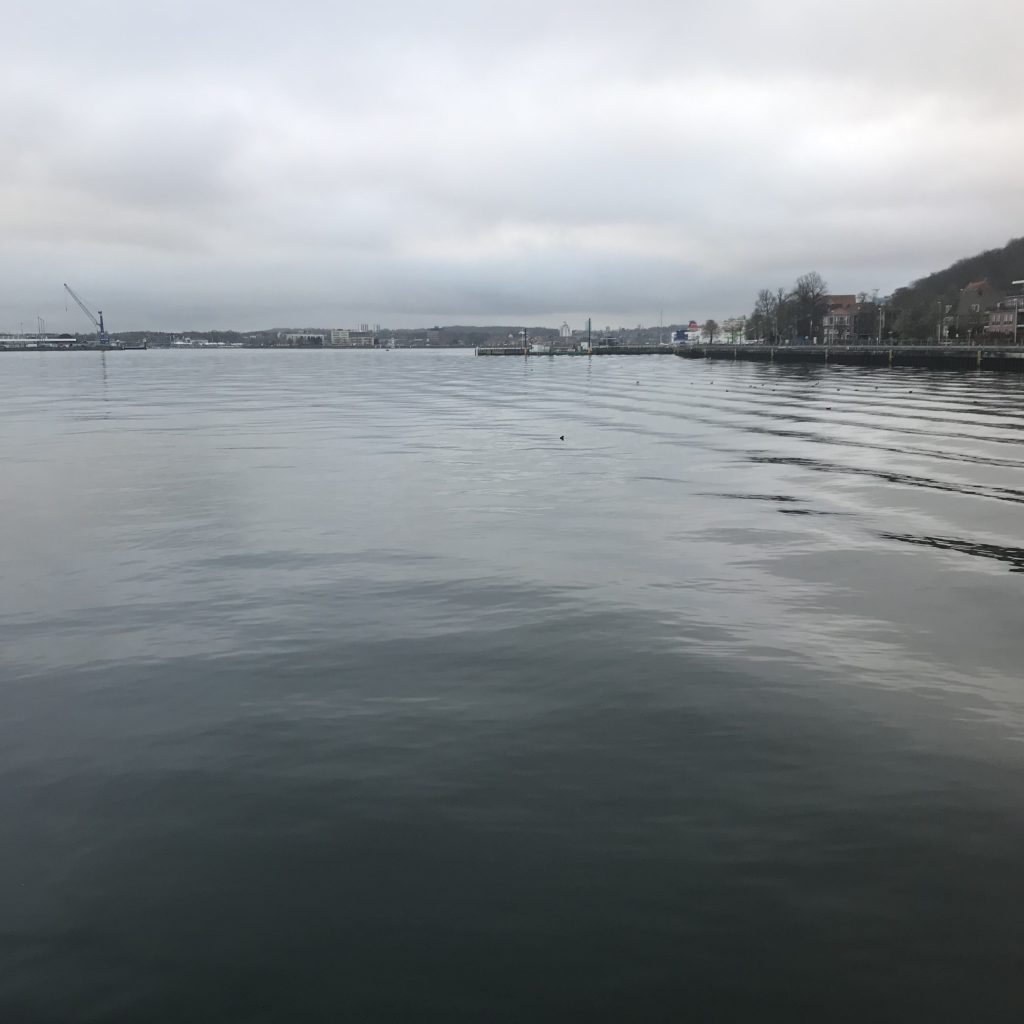
Clearly the sheltered side of the fjord today with long waves coming in from somewhere else, but hardly anything happening locally here. But higher surface roughness on the other side as can be seen from a darkening towards the horizon!

But: nice waves in the atmosphere today! Cloud stripes are often due to air oscillating up and down and clouds forming and disappearing as atmospheric conditions change with height. Check out all three pics to see those cloud stripes from different angles!

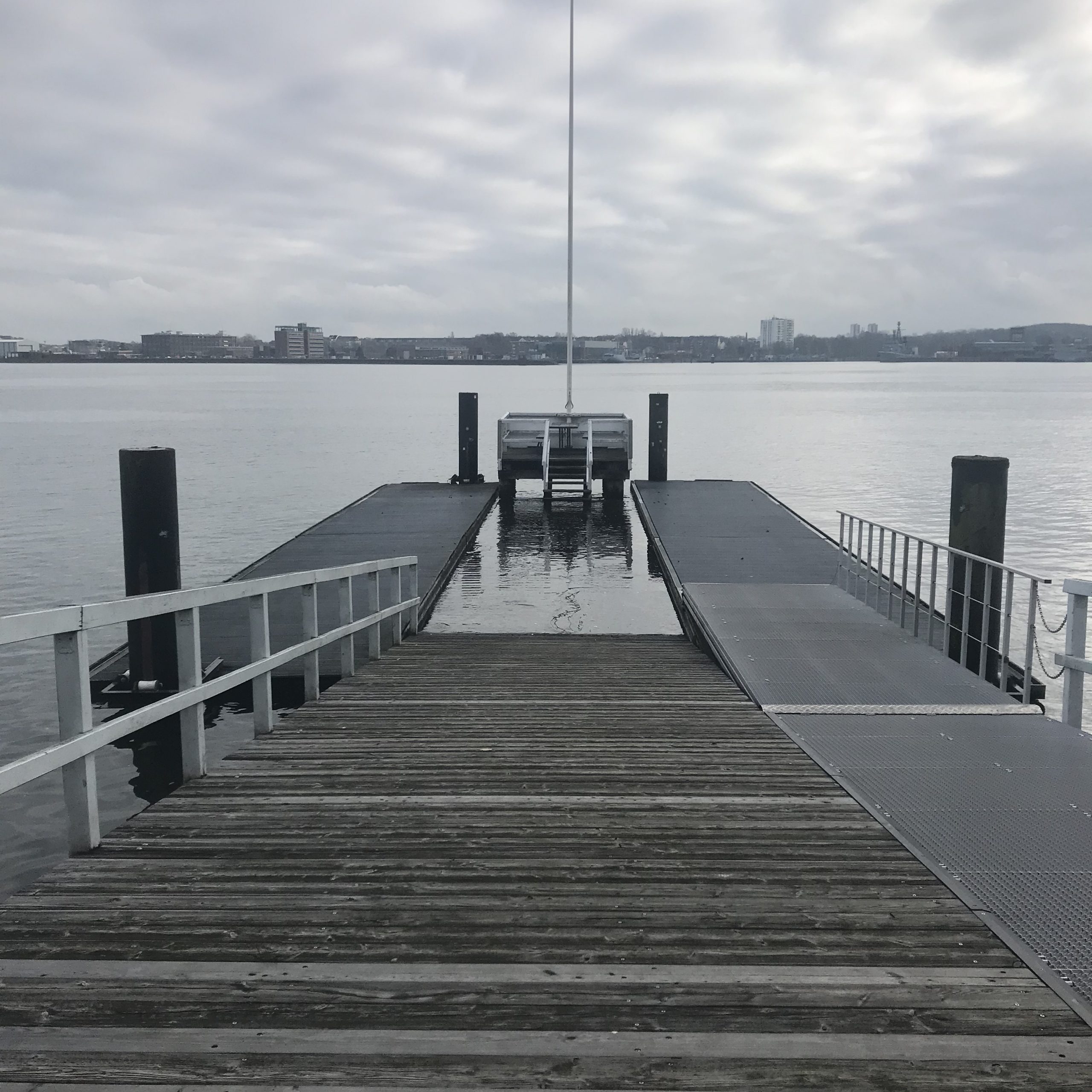
Today: slightly more water than normal, hence the swimming pool where the rigid part of the pier is flooded between the two pontons.

Can you spot the turbulent wake of where the ferry just sailed out of the picture to the right? It’s the very bright stripe across the water. On the left side of the picture you see a line of darker “feathers” of the V-shaped feathery wake (you know, the V with the ship at its tip, the 2D Mach cone…).

Also very nicely visible today: Lots of reflected waves everywhere, especially parallel to the straight edges of those harbour basins. Weird mixture of no wind (thus smooth water surface) yet enough waves to cause these reflections. But also maybe just the right water level so waves hit a ledge that is always just slightly submerged and then falls dry, thus causing those waves. Who knows? I’m just guessing, didn’t bother looking at it closely enough to find out…

Saturday stroll. These cliffs change a lot over time — se how the old footpath is gone?

Watching gusts of wind play on the water

Tide lines on the beach

Waves getting bent towards the shore

Good morning on this windy Sunday! Fascinating to watch how even over relatively short distances of open water there is such a transfer of energy to make waves this size!

Sneak peak at powertools making eddies! That’s going to be some awesome #KitchenOceanography for @sciencenotes5x15 when it’s done! Picture will then be by @davidcarrenohansen and will look quite differently! I’m just documenting the “making of” here because who would not be curious about that? :D

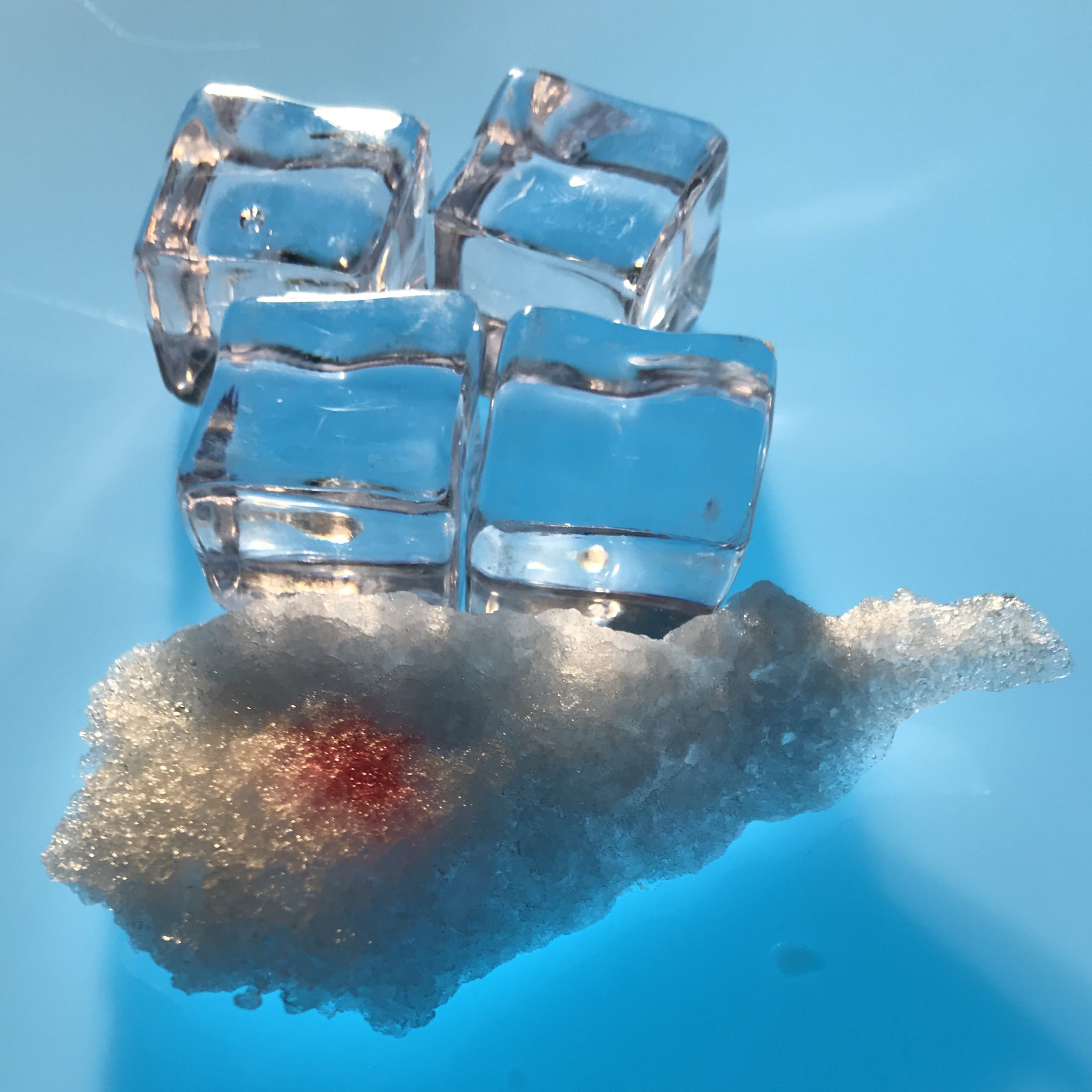
Plastic cubes and freezer frost standing in for fresh water and salt water ice in a #KitchenOceanography photography concept test for @sciencenotes5x15. Very curious what a professional photographer, @davidcarrenohansen, will make out of my experiments!

And that’s it for last week’s wave watching! Have you done any wave watching lately? If not, you should definitely take it up some time!

Telling ocean science stories on social media

This is the blog version of our iPoster for the 2020 Ocean Sciences Meeting. “Our” means the fun team consisting of Torge Martin, myself, Elin Darelius, Yasmin Appelhans — my #KitchenOceanography and science communication buddies! :-)

Torge is presenting the poster in San Diego today, but since none of us others could be there (and maybe you can’t see him present, either), here we go! (Or, alternatively, see it in all it’s glory as iPoster the way it’s meant to be)

Training students to communicate science

Why communicate science?

We believe that “science isn’t finished until it’s communicated”(Sir Mark Walport). Scientists have a moral obligation to society to not only answer scientific questions, but to make their findings available to the public, who funds the research in the first place.

Why train students?

Better learning

By giving students the opportunity to talk in layperson’s language about concepts they are currently being taught, we are providing them with a learning strategy that helps them think about the concepts in a different way and better connect it to preexisting knowledge.

Career development

Talking about specialized topics to laypersons is a skill that students will utilize throughout their lives, whether as future researchers or teachers, politicians or citizens. Learning this skill already at university is beneficial for their career development.

Authentic connections

Reaching any audience is easiest when the person reaching out has a good grasp of the interests, habits, life styles of that specific audience. For an audience of young adults, the most authentic narratives are thus told by students, “relatable heroes”. Even audiences that might not be intrinsically motivated to seek out content on ocean sciences can be reached with ocean education and outreach topics when met where they like to spend their time.

How to train the students?

The setting

We train Bachelor students in Climate Sciences in communicating with a lay audience in a clear and easy to understand, yet entertaining and engaging way. Mandatory, peer-reviewed course reports, for example on training cruises on research vessels, or on hands-on experimentation in fluid dynamics laboratories, are specifically written for the purpose of communicating science content as well as students’ enthusiasm and passion for the subject.

The training

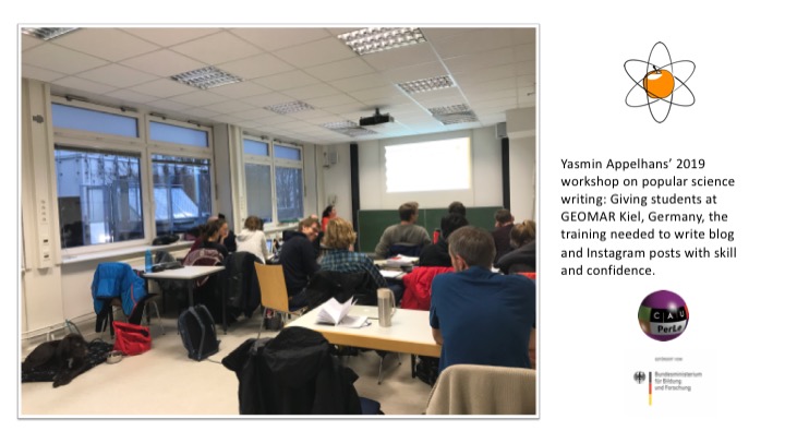
For different courses, different training concepts were used. For example, science journalist Dr. Yasmin Appelhans gave a presentation with practice opportunities plus feedback on finished products in a GFD class at GEOMAR.

Connecting on popular platforms

Why Social Media?

We use Social Media as a tool that enables communication with young audiences in a space they come to for entertainment and community. Rather than trying to establishing a profile and build a community of followers ourselves, we make use of guest posts on, and takeovers of, selected popular accounts. We thus reach a broad audience that might, once exposed, find themselves interested in the topics and might pursue that interest further on other channels, such as our blog. We discuss our experiences with this approach as well as chances and potential pitfalls.

What Social Media?

Instagram

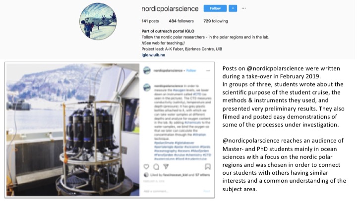
Instagram is the most frequently used social media platform in the age range of our students and target audience. We therefore use guest posts and takeovers on accounts that our target audience follows, for example

@nordicpolarsciences, made by and for Master- and PhD students in Nordic Polar Sciences at the University of Bergen.

@kieluni, the official account of Kiel University, Germany.

@doktorwissenschaft, a famous German science communication account for a young audience.

Youtube

Another hugely successful platform in our target audience’s age range is Youtube, and movies are a way to elaborate in much more detail on science concepts. One example is the noteworthy collaboration with DoktorWissenschaft on bringing oceanographic phenomena to an audience of young viewers.

Blogs

We also use blogs to

  • create a lasting archive of our social media outreach efforts on a platform we fully control
  • reach more traditionally-minded science audiences (e.g. colleagues, funders)
  • reach audiences we have already established on those platforms and that are hard to transfer to e.g. Instagram

In addition to guest posts, we use three blogs for slightly different reasons.

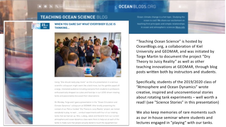
“Teaching Ocean Science” is hosted by GEOMAR’s OceanBlogs and was initiated by Torge Martin to document the project “Dry Theory to Juicy Reality” as well as other teaching innovations at GEOMAR, through blog posts written both by instructors and students.

“Scientific Adventures of Elin Darelius & Team” documents Elin Darelius & her team’s scientific life as well as teaching improvements. Posts are written both by instructors and students.

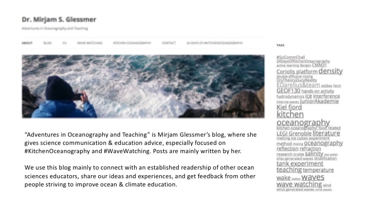
“Adventures in Oceanography and Teaching” is Mirjam Glessmer’s blog where she gives science communication & education advice, especially focused on “kitchen oceanography”. Posts are mainly written by her. We use this blog to reach other ocean educators and share our experiences.

Science Stories

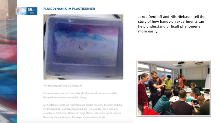
Most of our science stories are related to doing experiments in water tanks to simulate the ocean and atmosphere. Since the mathematical descriptions of ocean and atmosphere dynamics are difficult and unintuitive, we use those tank experiments to give students a tangible experience with the processes as well as the opportunity to manipulate conditions and get a better grasp of the matter at hand.

Within the project “Dry Theory to Juicy Reality”, students wrote science stories using very individual and unique approaches ranging from a diary style

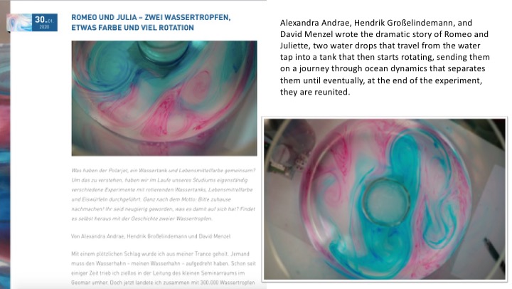
…to the fictitious story of Romeo and Juliette, two water drops that go through a lot of drama caused by cooling in a rotating water tank, simulating atmospheric instabilities…

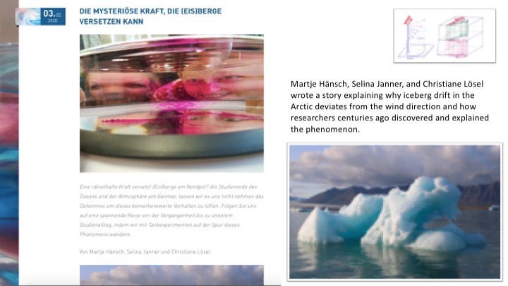
…to the historical approach of how a process was understood over centuries of research…

…and to detailed physical explanations of Rossby waves.

Our team

Dr. Torge Martin (Kiel, Germany) teaches Ocean & Atmosphere Dynamics

Dr. Mirjam S. Glessmer (Kiel, Germany, and Bergen, Norway) works on improving ocean science communication and education

Dr. Elin Darelius (Bergen, Norway) teaches different topics within oceanography, both in lecture theatres, in the lab and at sea

Dr. Yasmin Appelhans (Kiel, Germany) gives workshops on how to effectively communicate science

Thanks!

#SciCommSunday: How your audience changes the more Twitter followers you have

As my Twitter @meermini was quickly approaching 1k followers last week, I’ve been reflecting about who is following me and why. And on whether what I assume about my audience is influencing my tweeting behaviour. And I remembered an article I had read a while back by Coté and Darling (2018):

“Scientists on Twitter: Preaching to the choir or singing from the rooftops?”.

The question being discussed in the article is whether Twitter mainly serves scientists for inreach (“preaching to the choir”) or outreach (“singing from the rooftops”). Turns out that this typically depends on the number of followers an account has. There is a point at around 1k followers when scientists’ accounts typically start reaching audiences beyond other scientists and are therefore starting to be more useful as an outreach tool (outreach being defined in the article as reaching an audience of mainly non-scientists).

This doesn’t seem too surprising: Most scientists, when they start out on twitter, first follow people they know personally. Those are likely mostly scientists from within, or close to, their own speciality. But as the network grows, at some point the pool of those is “used up” and the network has to eventually expand to people who aren’t so close to that speciality any more, or even within science. I have certainly observed this for my account at just below 1k followers, probably enhanced by starting a non-academic job about a year ago that opened up a whole new world (and network) on and off Twitter.
Did the number of followers influence your tweeting behaviour, and if so, how?

I started out tweeting in the microblogging sense that I wanted my parents to be able to see pictures of my life in Norway without me having to email them. At that time I didn’t have any followers, nor did I follow anyone, so I would tend to not count this as actually “using Twitter”. But my handle @meermini still stems from that time. Nowadays I would probably choose something else for professional use… ;-)

After a little while, I began to realize the potential of using Twitter professionally, and I started following more people and reading more on Twitter. I was still mainly a passive user. I remained passive for several years, only at some point starting to have my blog automatically tweet the title and link to new blog posts as they were published. But for the longest time, I didn’t even bother to modify the tweet and really just tweeted out the title & link. This is not the best communication strategy, obviously, but it did help build an audience slowly and steadily, mainly of people who were really interested in my blog and thus my core topics.

As more and more people became interested in my kitchen oceanography stuff, I eventually started modifying the automated tweets to contain more than just the title of the blog posts, and I started thinking about what images to use as featured images on my blog, since they would be tweeted with the link & title. But I would only do it when I had time and mental space for that. I still put a lot more effort into the blog posts themselves than on advertising them on Twitter.

These days I am aware of how many people potentially see my tweets (but there are those rare times when it doesn’t register at all, too). I use the automated tweets that post with scheduled blogposts, as well as Twitter in general, a lot more purposefully now. I now pretty much always modify the automated tweets to include more information than just the blog post’s title. I also try to always include a picture in tweets. Either there is one in the blog post already that I think works well, or if there isn’t, I go find one. Sometimes I include hashtags in those pictures to make it easy to see at first glance what the post is about. I schedule blog posts (and thus the automated tweets) for specific days, so I can use meaningful hashtags on Twitter, like #SciCommSunday (that I am using for this post, btw) or #WaveWatchingWednesday or #FlumeFriday, and thus reach specific audiences.

I also try to put topics of my blog posts into context for people who aren’t in my own little #KitchenOceanography and #WaveWatching bubble. By, again, using hashtags, but also by just writing more generally about what the blog post I am linking to is about. And also when tweeting without it being automated tweets from my blog, I am definitely thinking about whether people will be able to put this into context if they aren’t exactly in my field.

So for me, things have definitely changed as I got more followers, but also as I recognized more how powerful Twitter is in terms of creating — or finding — conversations around topics I care about.

What would you recommend for when you are starting out Twitter? Do it your way or start out with a strategy?

Obviously, it depends on your goal. If you want to reach a large and non-scientists audience fast, you should probably think about a strategy and put efforts into writing nice tweets that match what your target audience would be interested in and how they would like that information presented.

But if you are just dipping your toes into Twitter, I don’t think there is anything wrong with doing what I did, and just feeling your way into it. Yes, your audience won’t grow as quickly, but maybe that means that it’s growing at a rate you are comfortable with. And if it’s too much of a hassle to tweet — just take a break, the world won’t end and neither will your career. And I am a strong proponent of the “you can only know what you are potentially missing out on for networks that you are a part of”: Even if you don’t want to spend a lot of time on Twitter, even checking in or tweeting once every couple of months is better than not doing anything at all. And who knows, you might realize that it is of more benefit to you than you thought it could be, and start spending more time and effort there. Or not. Only one way to find out!

For me, having those automated Tweets from my blog was a great way to recognize how many people were really interested in my topics, and as I recognized their interest, realizing that I wanted to present that information in a nicer, more appealing way. And I am grateful to have this platform for my topics now: Both within the ocean community, and then also — noticeably! — more and more beyond it!

#WaveWatchingWednesday

Another recap of a week on my wave watching Instagram @fascinocean_kiel. Enjoy!

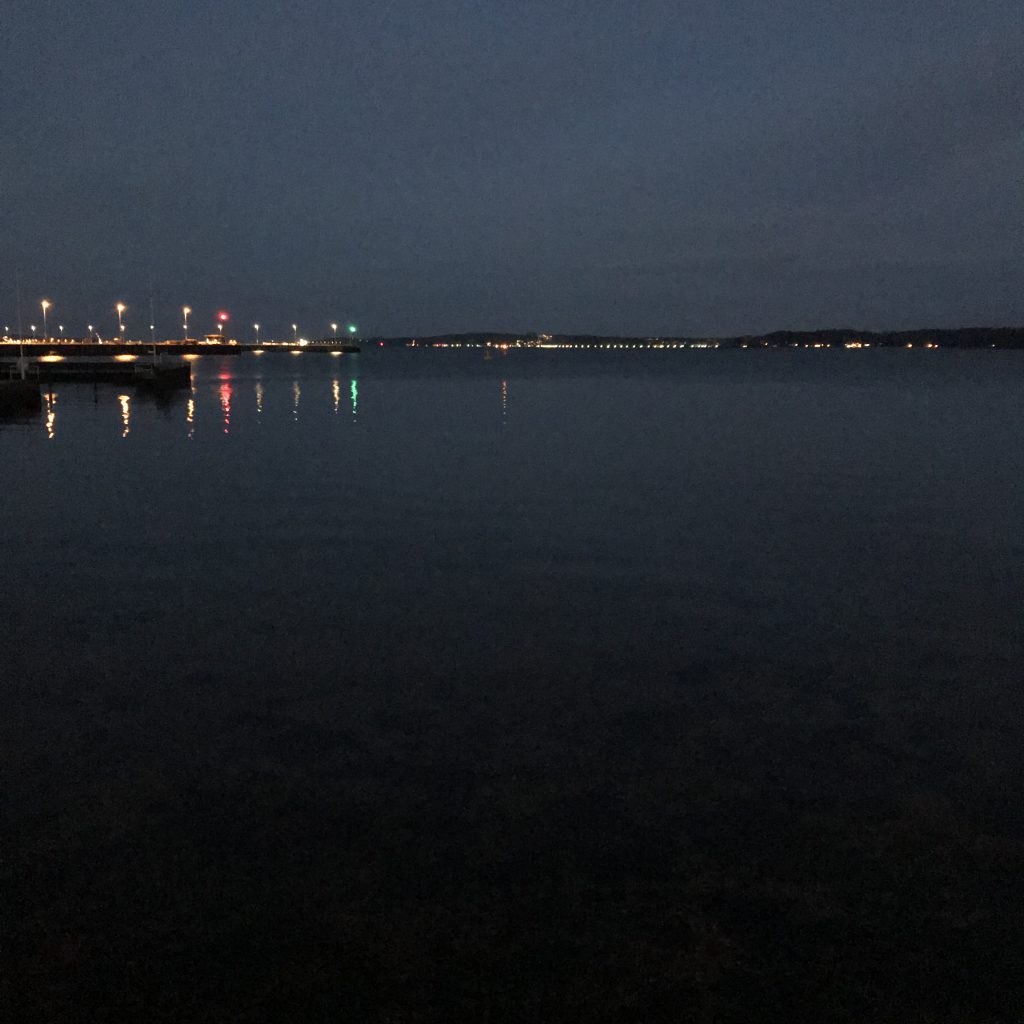
Best thing for my mental health: Running along the waterfront. Bonus if it includes wave watching as it does today: See how in the reflections of the lights there are zones where the water is almost mirror-like (those are the sad zones: no waves) and then there are dark zones with hardly any lights reflected (where the breeze roughs up the surface) and then there are those in-between zones, where you can see individual waves. Lovely evening!⁠

How is it that I am sooo happy to be home and at the same time this view makes me long to be back at sea?⁠

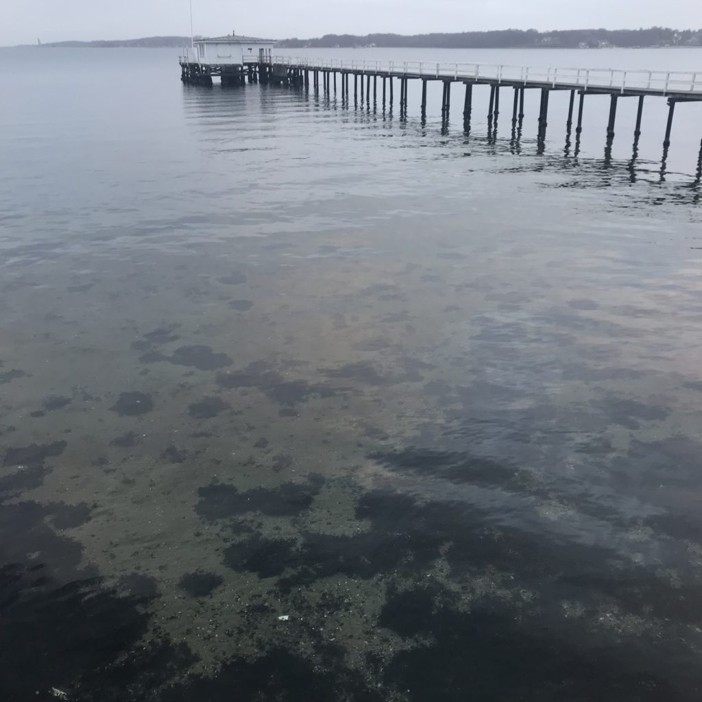
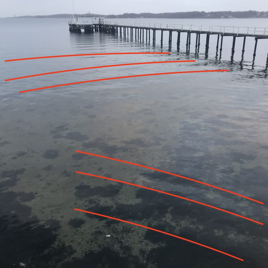
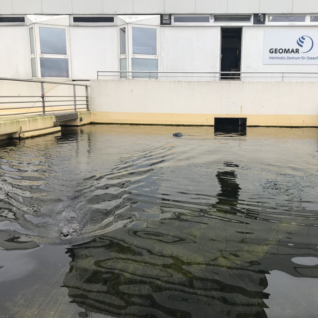
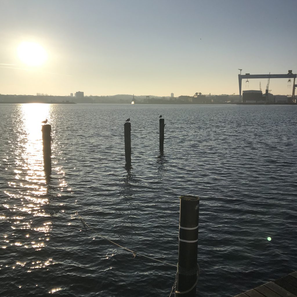
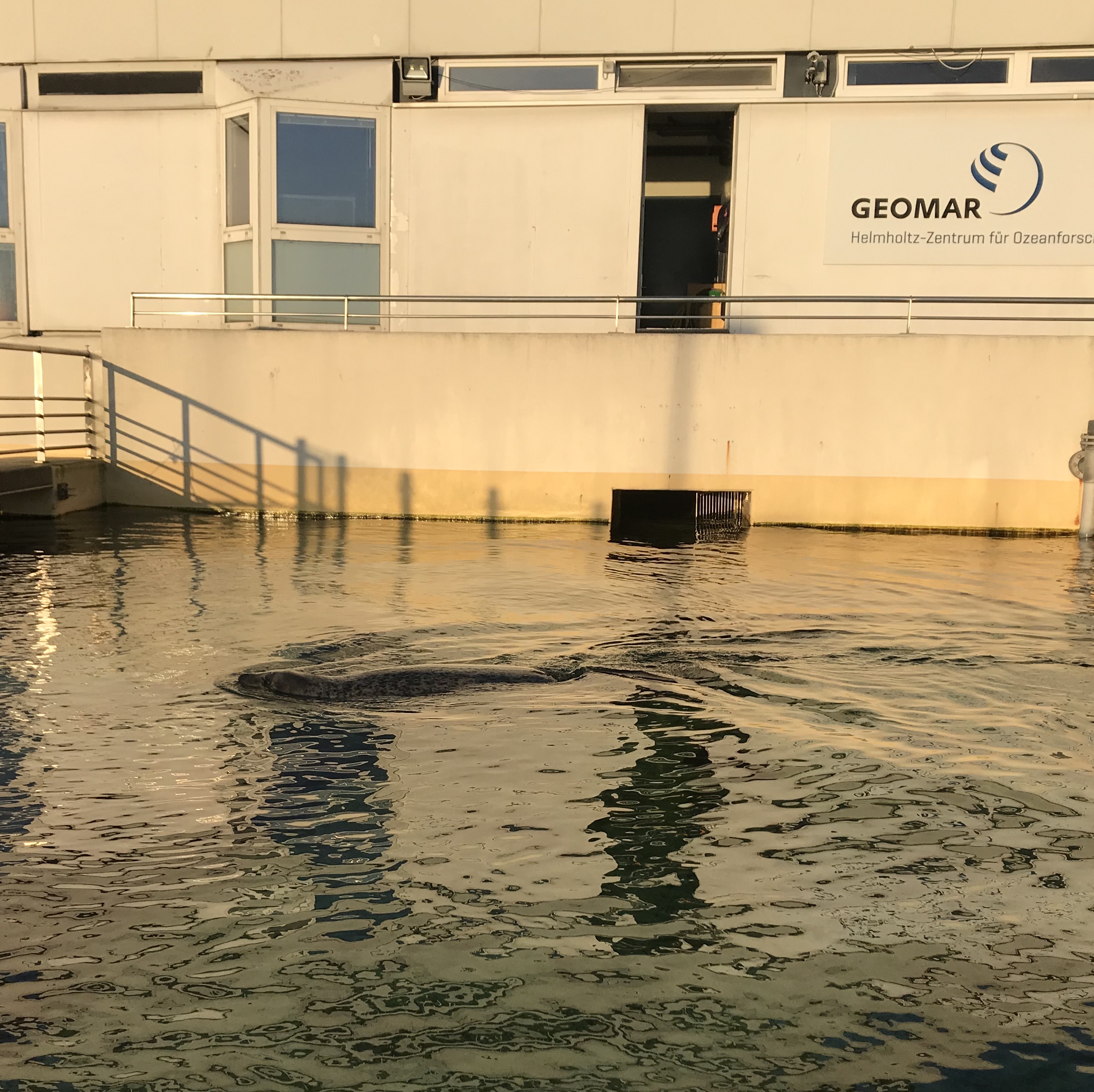
Meetings at GEOMAR are always a welcome opportunity for me to take the slightly longer way along Kiel fjord for some wave watching. Today see how waves close to the boat house have a completely different direction than those closer to the shore?

That’s because the ones closer to the shore are the reflection of the other wave field.

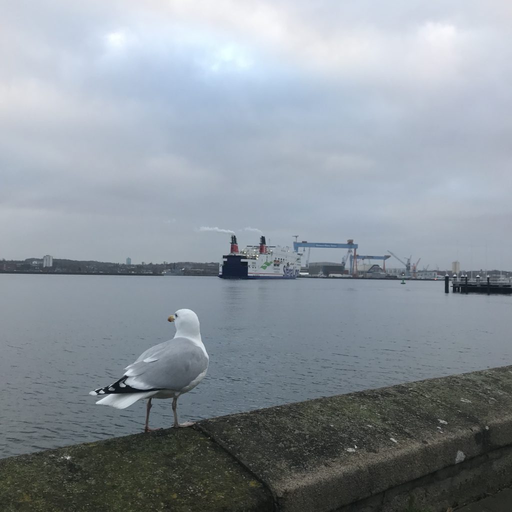
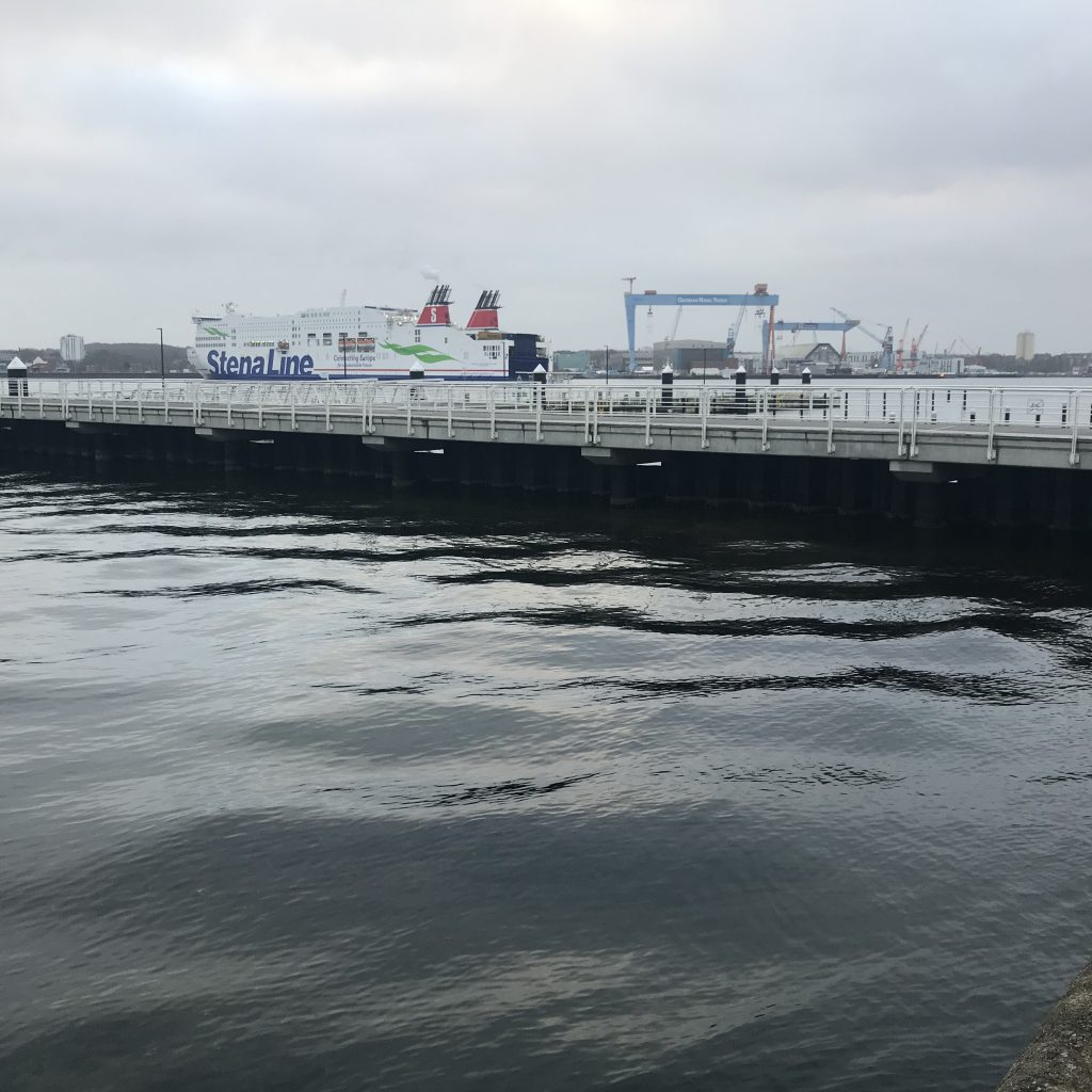
This might not be so surprising to people who don’t look at Kiel fjord as much as I am, but what is the Sweden ferry doing there? Why is it turning on its way into port rather than out? The seagull seems as confused as I am… :-D

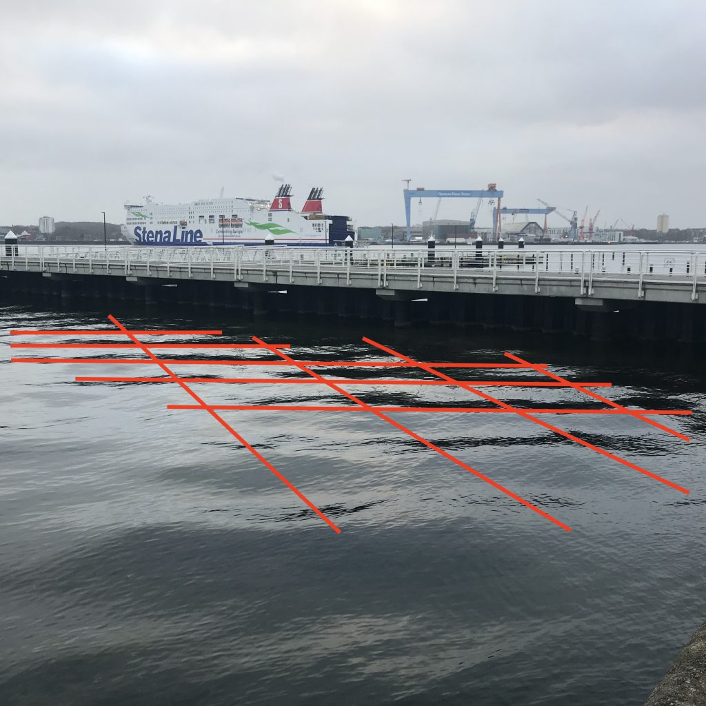
But: enough reason for more wave watching (not that I ever need more reasons to wave watch than just wanting to do it…). This corner between the sea wall and the solid structure of the pier is always great for reflections and interferences! Can you spot the two wave fields, the original and reflected one?

Well hello, thanks for making these beautiful waves for me, little buddy!

A wake approaching the pier! How do I know? Because there isn’t any wind here (which I could feel, but which you can also see because there are no ripples on the water) and the wavelengths are too short (and the waves too far in the fjord) for the waves to have traveled here from a distant storm somewhere in the Baltic.

Also, if you quickly turn your head (or look down to the next pic), you can juuust catch the Sweden ferry disappearing around the corner into the mouth of the fjord — she’s the one who made the wake (and it only arrived at the shore when she was already this much further along!).

Good morning!

This is an interesting wave field: Inside the inner harbour, therefore relatively sheltered from the wind and big waves. Yet windy enough to create all these ripples on the waves that made it into the harbour! (And don’t you just love the sun? Yep, yesterday’s picture…)

Lovely day for a swim in the sun! And with such bright light, reflections on the surface are so strong that you can’t look into the water from this angle (which you could on the picture I posted a couple of days ago on an overcast day!)

Here the waves making it into the sheltered, inner harbour are reflected on the straight edge of the sea wall and make this beautiful, very regular wave field. See the ring waves radiating from that pole? The thing in the lower left corner is some reflection on my phone’s lens, it’s not on the water…

Love the tiny ripples on the waves, and the contrast between the “sea state” outside and inside the harbour basin!

And this is what it looks like when you look from the edge of the harbour basin downwind. From the right, waves are travelling around the edge of the wall, but new wave ripples only start forming quite some distance downwind of the wall!

For comparison: Looking into a similar direction from a pier that rests on poles and lets the waves run through underneath almost undisturbed…

Storm Sabine is making waves!

Monday’s “pop up beach” pictures (the strong west winds had pushed the water far out of Kiel Bight!) are in a separate blog post

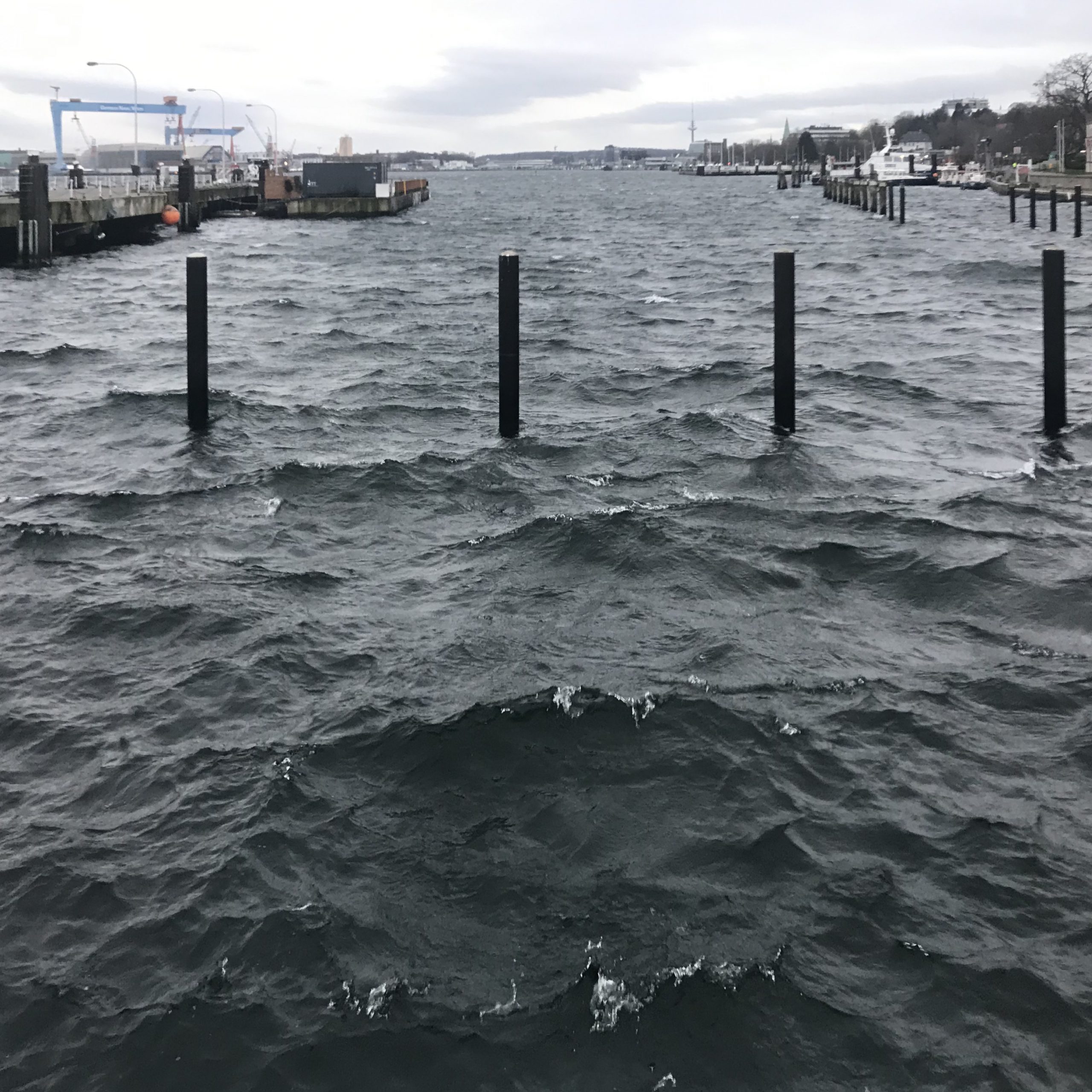
But then Tuesday: Windy day again! Can you spot the different wave fields? I see three:
1️⃣The long waves with crests more or less parallel to the shore that come out of Kiel fjord
2️⃣The short waves with crests perpendicular to the shore that come from the direction of Kiel locks and sneak around the corner
3️⃣The wind wave field that is generated right here: smooth surface right off the shore that then becomes rougher and rougher the longer the fetch gets
Unfortunately I missed the white caps (or, to be honest, I preferred to watch from the inside & didn’t take pictures when the weather was really interesting, hail and all…