Using art in your science teaching and outreach. The why and the how.
This post was first published at the EGU’s blog’s “educational corner” GeoEd, in March 2016 (link here).
—
Sometimes we look for new ways to engage our students or the general public in discussions about our science. Today I would like to suggest we use art! Someone recently told me about her work on “STEAM”, which is STEM+Arts and apparently big on the rise. While I had never heard about it before, and initially found the idea a bit weird and artificial, there are certainly many occasions where thinking about topics in a more comprehensive way than just through disciplinary lenses could be of great benefit, both to get a fuller view of what is going on, as well as to maybe reach people in a different way, and therefore reach people that might not necessarily be interested in either of the parts by itself.
There are many different kinds of art that we can use in STEM teaching and outreach, ranging from art that uses science as its central theme to art that just happens to be displaying something we have a scientific interest in. And while in this blog post “art” is taken to mean visual art, you can think this much more widely and include music, theatre, anything you can think of! Dream big!
Art that incorporates scientific data
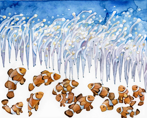
One example of art that uses science as a central theme and that is very well suited for our purposes is the amazing art of Jill Pelto, who communicates scientific research through art. What that means is that she takes graphs of recent dramatic changes in the climate system, like sea level rise or melting glaciers, and uses them in her art as part of the image. For example, a graph of the global average temperature is integrated on the boarder between a burning forest and the flames leaping into the smoky sky. Which you only notice when you look carefully, similarly to the boundary between the school of clown fish and the forest of anemones moving in the waves, showing the declining ocean pH which threatens this ecosystem (see figure below). Brian Kahn describes Jill Pelto’s paintings as “Trojan horse for science to reach a public that doesn’t necessarily think about data points and models”.
And that is a great approach to using this art. But how else could we use art like this in teaching and outreach?

“Clown Fish” by Jill Pelto. Used with permission. Click on the image to go to Jill Pelto’s gallery and discover more amazing artwork!
These kind of images I could imagine using in courses where students are to investigate a scientific topic in a project. Each group of students could be handed a different image, and they could be asked to figure out as much as possible about the topic and present it back to their peers. I would imagine that giving students a data set in such a visually appealing form would provoke an emotional connection and response much more easily than if they were presented with “just” the data. In the final exhibition, the art would work as great eye catchers to lure visitors into a topic.
I could also imagine using Jill Pelto’s art in a science outreach workshop. There, I would ask participating PhD students or scientists to take the one time series (or any other visual representation they have of their data that shows the most important part of their story) and, inspired by the art they saw, integrate their data into an eye-catching display that tells their story for them.
Wow, this really makes me want to do this for my own research!
Art that visualizes scientific results
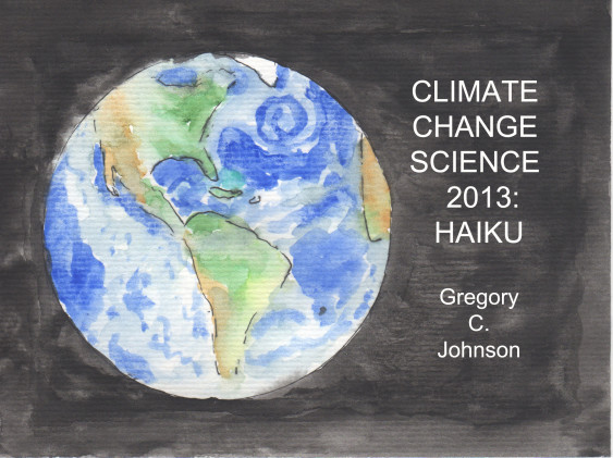
The best-known example of art that tells scientific stories is Greg Johnson’s “Climate change science 2013: Haiku“. A poster of all 20 illustrations is up in my office (Thanks, Joke and Torge!) and I can tell you – it is a great conversation piece! The haikus and illustrations provide just enough information to spark curiosity, so I often find myself discussing climate change with my (non-climate scientist) colleagues. Clearly, the haikus would also work as excellent conversation starters in outreach!

Picture from http://www.sightline.org/2013/12/16/the-entire-ipcc-report-in-19-illustrated-haiku/, used with permission
In teaching, I would use Greg Johnson’s illustrated haikus to break the IPCC report’s summary for policy makers down into its chapters, and hand out one illustration per group. Depending on what kind of students I was teaching, I would either ask them to read the corresponding summaries, or browse the chapter, or read one of the original articles cited in that chapter. Or even ask them to find articles that might shed a different light on the (obviously oversimplified) message of the haikus. What kind of evidence would they want to see to shoot down those messages or in support of it? Those kind of thoughts are a very good practice for their own research when they always need to consider whether the conclusions they draw are the only possible ones.
Here, again, the art helps to make very complex science easily approachable, and would again be awesome as eye catcher in an exhibition where student groups present their work to each other. (If you are worried about all the posters you are supposed to be printing, check out this post for a cheap and easy solution).
Or the haikus could be used as inspiration when you ask your students to read articles and summarize them in a haiku plus drawing. This would be great practice to get to the point, and also it would be great practice for outreach. How cool would it be if your students had a piece of art and a short poem summarizing their theses?
For more inspiration along those lines, check out Greg Johnson’s blog.
Art that incidentally shows science we are interested in
Alternatively to looking at art that doesn’t explicitly focuses on science as its topic, but which can still be used to discuss science.
One example is given in the TED talk “the unexpected math behind Van Gogh’s `Starry Night´” by Natalya St. Clair, where the painting is deconstructed and put in the context of the development of mathematical theories for turbulence. I have linked the video below and it is totally worth watching!
[youtube PMerSm2ToFY]The video could serve as a great first exposure to turbulence in a physics class and would make for a very interesting assignment in a flipped setting. It could also be watched in art class to help underline that art is a “serious” subject and not just a bit of splashing with paint (or whatever prejudices your audience might have).
Or you could ask your students to attempt a similar interpretation of a different picture. For example when talking about different kinds of waves in your oceanography class, ask your students to browse a gallery of famous seaside paintings, online or “for real”, pick one painting and interpret the state of the sea, the shape of the clouds, the color of the light, to learn as much as possible about the weather conditions depicted in the painting. Always interesting, too: Check for consistency of wind direction from all the flags and sails and flying hair!
Alternatively, you could use a collection of pictures to talk about how knowledge in your field developed (for an example of how this could work for soil, see Laura Roberts-Artal’s blog post.
See – so many ways to include art in your science teaching and outreach to capture new audiences’ interest or just look at your topic from a different angle!
How would you use art in your teaching and outreach? Let us know in the comments below!
—
P.S.: This text originally appeared on my website as a page. Due to upcoming restructuring of this website, I am reposting it as a blog post. This is the original version last modified on February 16th, 2016.