Home-Made Geophysical “Globes”
Today I am excited to share with you a guest post about a super cool tool for geoscience teaching and outreach that I will definitely be using in the future (if only to decorate my office until I get the chance to teach again):
Home-Made Geophysical “Globes”


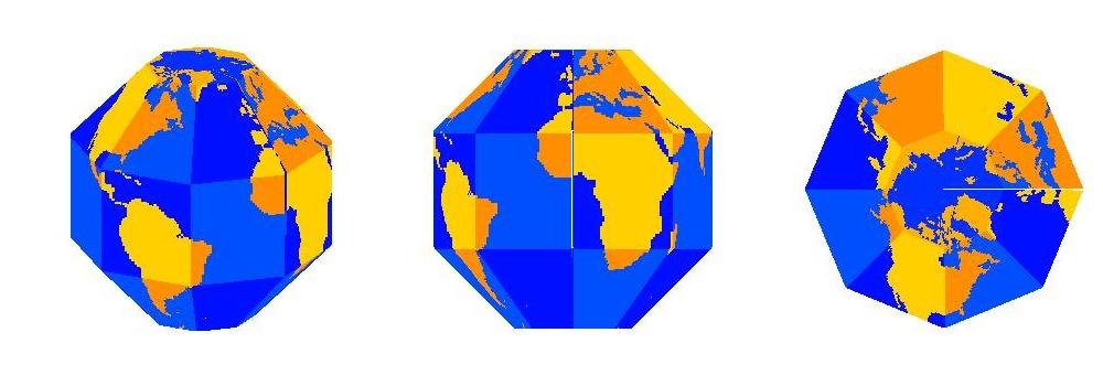
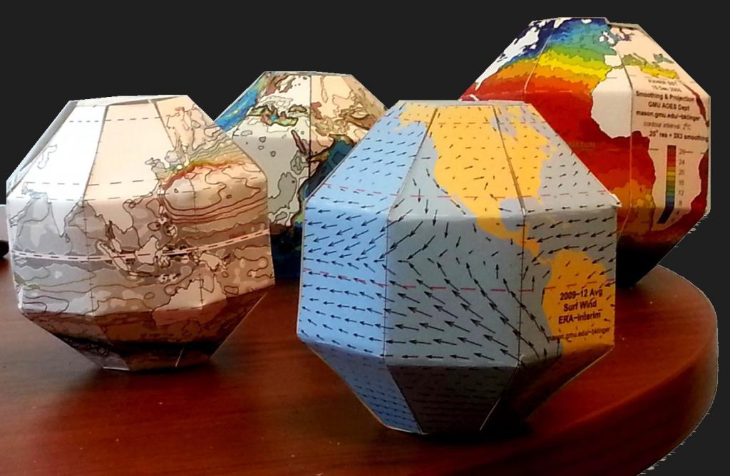
The Earth is a sphere which is best represented by a globe, but there are many interesting geophysical features which are not available on a globe. Try going to a bookstore and asking for a globe showing sea surface temperature! To remedy this gap, I have written software to create SectorGlobes: polyhedral approximations to a globe, such as the ones shown below.
The front-right SectorGlobe shows annual average surface wind (ERA interim reanalysis). In this image you can see the trade winds in the Pacific blowing towards the west and converging on the Inter-Tropical Convergence Zone just to the north of the equator (the dashed red line intersecting South America on the right). The front-left SectorGlobe shows a more esoteric oceanic quantity: sea surface height, represented by the colored contours (AVISO 2004-2008 average). The sea surface height only varies by a meter or so over most of the globe, but because flow tends to be along the contours of constant height, the contours give streamlines of surface currents. In the picture you can see a good part of the North Pacific Subtropical Gyre. Just off the coast of Asia the streamlines are very close together, indicating a jet called the Kuroshio Current. The SectorGlobes in the rear show (left) sea floor and land topography and (right) sea surface temperature on a particular day (December 15 2005 from AVHRR).
All these quantities can be projected on to a virtual sphere and displayed on a videoscreen, but having a physical object that you can keep on your desk, pick up, and examine while holding in your hand can be more convenient and have more impact. I have brought these globes to classes of high school, college, and graduate students; just having an object to pass around from student to student can wake people up in the middle of a relatively abstract lecture. Students can also be encouraged to make their own – constructing them is an interesting exercise in geometry, especially for high school students.

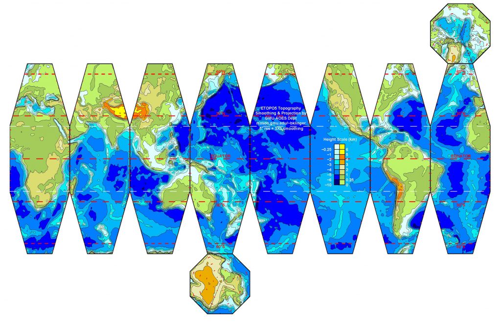
 Once a map is projected on to a flat image, like the one above, and printed out, I can create a SectorGlobe after about 20 minutes of cutting and pasting (with actual scissors and tape, not Microsoft Office products!). The sectors also have to be folded along the white lines. It is rather entertaining seeing the object snap into the correct shape as the last few edges are connected.
My SectorGlobes web pages include some sample SectorGlobes for printing as well as instructions and Matlab scripts for creating new SectorGlobes. Please contact me (bklinger@gmu.edu) if you have used any of the resources there, if you have any questions, or if you have any new ideas about how to use the SectorGlobes or new fields to display with them.

Why waves propagate so slowly into smooth patches of water | Mirjam S. Glessmer says:
[…] in the port of Hamburg, trying to film a phenomenon I had recently chatted about with the author of this inspiring guest post: How waves seem to propagate super slowly into smooth patches of water. It turned out to be really […]