How our experiments relate to the real Antarctica
After seeing so many nice pictures of our topography and the glowing bright green current field around it in the tank, let’s go back to the basics today and talk about how this relates to reality outside of our rotating tank.
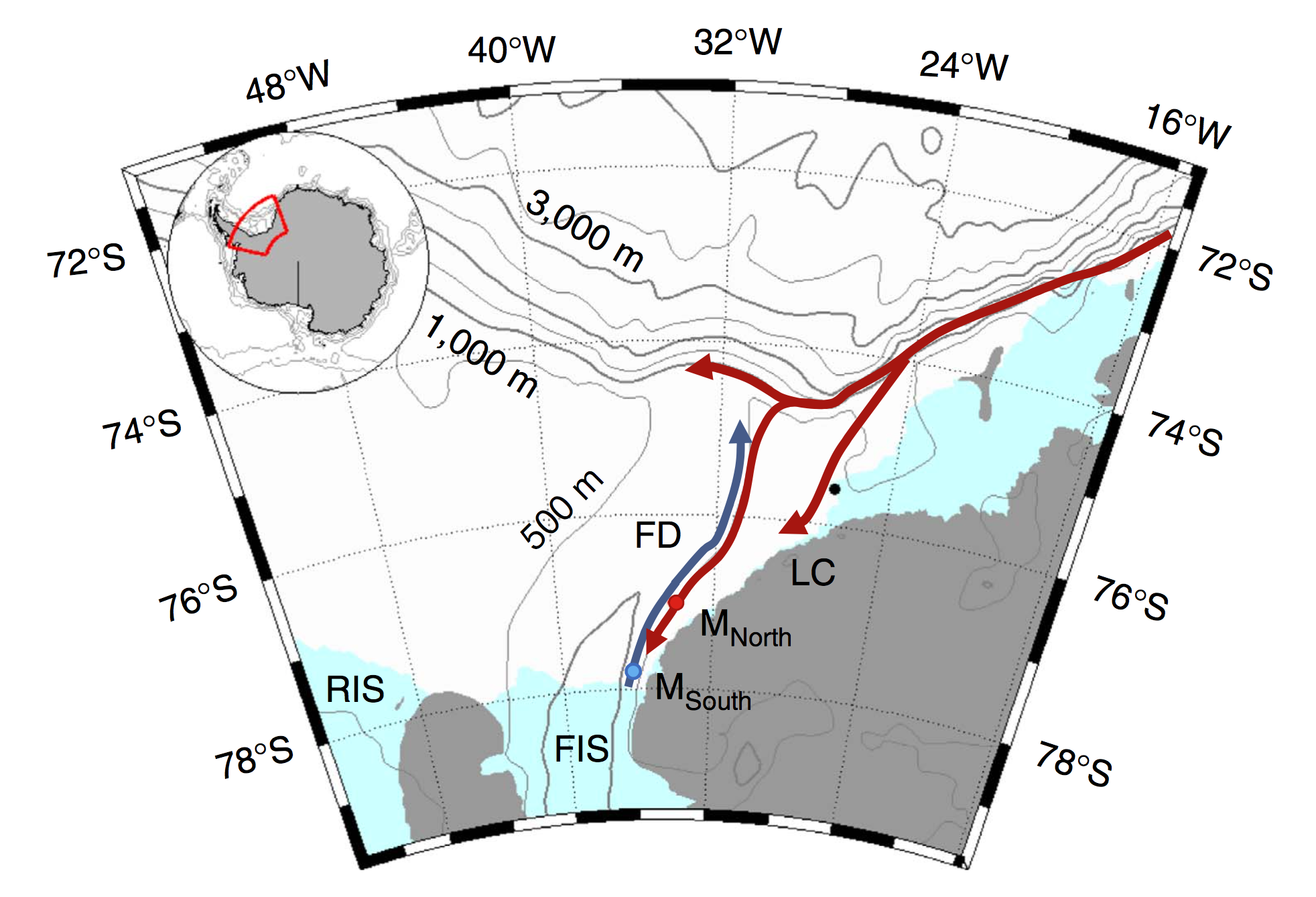
Figure 1 or Darelius, Fer & Nicholls (2016): Map. Location map shows the moorings (coloured dots), Halley station (black, 75°350 S, 26°340 W), bathymetry and the circulation in the area: the blue arrow indicates the flow of cold ISW towards the Filchner sill and the red arrows the path of the coastal/slope front current. The indicated place names are: Filchner Depression (FD), Filchner Ice Shelf (FIS), Luipold coast (LC) and Ronne Ice Shelf (RIS).
Above you see the red arrows indicating the coastal/slope front currents. Where the current begins in the top right, we have placed our “source” in our experiments. And the three arms the current splits into are the three arms we also see in our experiments: One turning after reaching the first corner and crossing the shelf, one turning at the second corner and entering the canyon, and a third continuing straight ahead. And we are trying to investigate which pathway is taken depending on a couple of different parameters.
The reason why we are interested in this specific setup is that the warm water, if it turns around the corner and flows into the canyon, is reaching the Filchner Ice Shelf. The more warm water reaches the ice shelf, the faster it will melt, contributing to sea level rise, which will in turn increase melt rates.
In her recent article (Darelius, Fer & Nicholls, 2016), Elin discusses observations from that area that show that pulses of warm water have indeed reached far as far south as the ice front into the Filchner Depression (our canyon). In the observations, the strength of that current is directly linked to the strength of the wind-driven coastal current (the strength of our source). So future changes in wind forcing (for example because a decreased sea ice cover means that there are larger areas where momentum can be transferred into the surface ocean) can have a large effect on melt rates of the Filchner Ice Shelf, which might introduce a lot of fresh water in an area where Antarctic Bottom Waters are formed, influencing the properties of the water masses formed in the area and hence potentially large-scale ocean circulation and climate.
The challenge is that there are only very few actual observations of the area. Especially during winter, it’s hard to go there with research ships. Satellite observations of the sea surface require the sea surface to be visible — so ice and cloud free, which is also not happening a lot in the area. Moorings give great time series, but only of a single point in the ocean. So there is still a lot of uncertainty connected to what is actually going on in the ocean. And since there are so few observations, even though numerical models can produce a very detailed image of the area, it is very difficult how well their estimates actually are. So this is where our tank experiments come in: Even though they are idealised (the shape of the topography looks nothing like “real” Antarctica etc.), we can measure precisely how currents behave under those circumstances, and that we can use to discuss observations and model results against.
—