Hovmöller diagrams explained
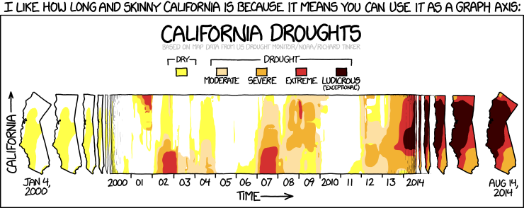
Have you ever wondered how to best explain Hovmöller diagrams? You know, those diagrams that have time on one axis and then longitude or latitude on the other, and that show the property we are interested in in color? Often used when people want to look at wave propagation?
I recently did wonder about how to best introduce that kind of diagram, and then I remembered seeing something on my favorite web comic, xkcd, that just fit the bill. Check out “california droughts“! And use it in your teaching, I think it’s awesome :-)
P.S.: Isn’t it funny how diverse the things are you learn from comics? I remember the look of utter horror on my mother’s face when, when I was quite young, we found a shisha waterpipe on a play ground and she was shocked I recognized what it was. That one I knew from Tintin… But clearly it is useful to read comics!
