Foggy morning in Kiel and thoughts on the accessibility of the images I post
I don’t want to do the actual statistics, but it feels like most of what I post is completely dependent on people being able to see the images I post. Of course, that’s kind of the idea of the wave watching that I do: To show you waves the way you might encounter them, too, and then explain what you see.
But a foggy morning run and my dad’s recent eye surgery have made me think about accessibility of my blog posts, and that it must be extremely dissatisfying to just read / listen to a constant “See? And look here! See here?” without having any idea of what is going on.
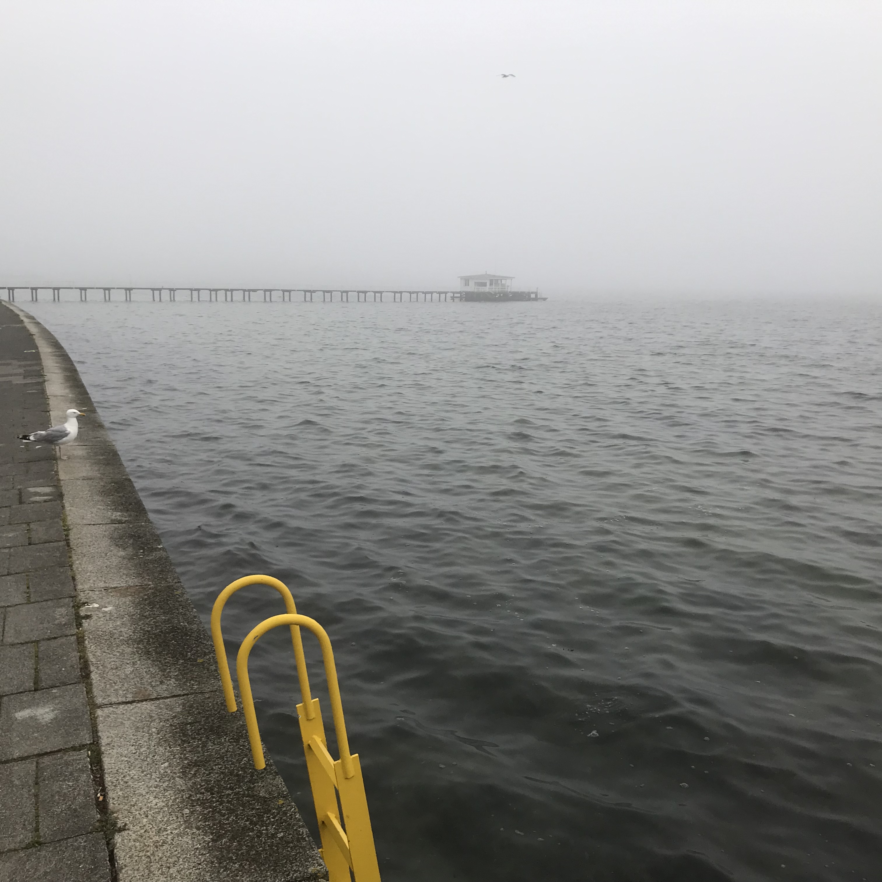
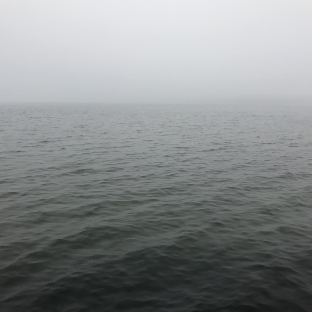
In the image below, for example, you see Kiel fjord on a foggy morning, and it’s not really clear where the grey water changes into grey sky. The other shore can kind of be guessed in the right side of the picture, but all the landmarks that you would typically see, like the light house at Falckenstein or the Memorial thingy in Laboe, are swallowed up in the fog.

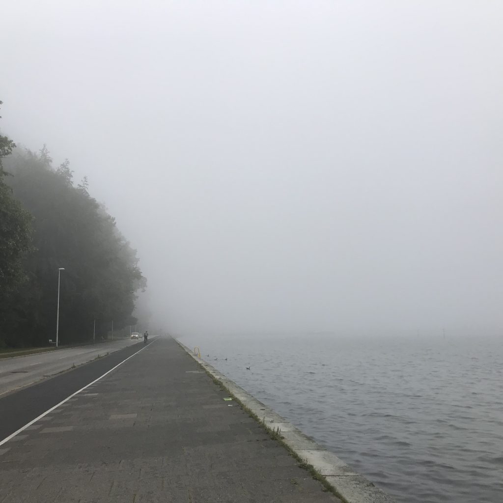
Or even more dramatic on the next picture: We see the sea front road on one side of the picture and the sea on the other, and both vanish into fog. The whole naval port is missing because it’s so foggy. There are two cars appearing out of the fog, and a cyclist about to be swallowed.

So I have decided that I need to work on my blog’s accessibility, and I am telling you this hoping that you will hold me accountable. And I am hoping for your input on this: I know that the alt text options on both blogs as well as Twitter and Instagram are there for accessibility reasons. But do people really use those, or would it be as helpful to write good figure captions going forward? Is using the same text in both the figure caption and alt text a good option or is that really annoying to people using a screen reader, because they now have to listen to it twice? What’s the best practice that you’ve seen?
kwcintranetadmin says:
This is a really interesting question. I don’t have much experience with non-sighted people, but I suspect the richness of descriptive language is important here. I just read a book by New Zealander recounting a year where she swam outside every day. It was great on anecdotes and the history of swimming in New Zealand, but her daily accounts of swims were diminished because she had limited language to describe the sea conditions – a surfer would have written a much richer account of the waves.
Descriptive language in science is vital but problematic. I used to teach botany – there is a huge vocabulary of descriptive terms for plants, describing, for example, leaf shape, venation, texture, serration etc. There are latinised names for colours that include multiple terms for shades of the colour black. Elsewhere scientists have developed descriptive formulas, for example for fin arrangement in fish, or the plates of the cell wall of dinoflagellates. No one outside the field understands these terms.
Describing waves, or a wave field, without using mathematical terms or overly technical language is a big but exciting challenge. I wonder if anyone has ever compiled a glossary on the subject?
Mirjam says:
Thank you for commenting, this is so interesting! I am not aware of any such work, but this is a great direction to do a little research in, there might actually be a glossary or at least examples of people describing waves in a way that doesn’t use technical terms.
Another thing I am wondering about is how much of the “fluff” of the picture needs to be described. The color of the sky is only relevant when talking about its effect on the water, i.e. it being reflected or something. Boundaries don’t necessarily affect the wave field, for example the opposite shore of a wide bay on the other side might be irrelevant for the waves we are observing where we are. But still the shore might be an important part of the image from an artistic point of view. Do I still talk about it but point out that it’s irrelevant to the waves I am discussing? Clearly there is still a lot of things I need to think about in more detail!