Producing a MOOC about the ocean
I’ve recently been lucky enough to be involved in the production of the MOOC “One Planet — One Ocean: From Science to Solutions” by the excellence cluster “Future Ocean” in Kiel. Well, only in one chapter, and also there only in the after-production, but it was still interesting enough (I learned so much, and it was great fun!) to warrant one of the highly competitive time slots on my blog :-)
By the time I got involved in the production, all the lectures for my part had already been filmed (read more about the filming part here), transcribed, and a “rough cut” had been uploaded on a video sharing platform. A “rough cut” it pretty much a first draft: The producers had cut down the footage they had to about 10 minutes per video, and had added graphics and animations. My task was now to carefully look through the rough cuts and evaluate whether the graphics were suitable for their purpose in the movie, and where necessary to suggest alternatives. Also, if there were redundancies or other bits that could be cut, I was to suggest those, since with people’s typical attention span, the shorter the movie, the better. For a while, I was also to suggest placing and content of slides to break up the videos and summarise previously made points, but this idea was dropped during the process.
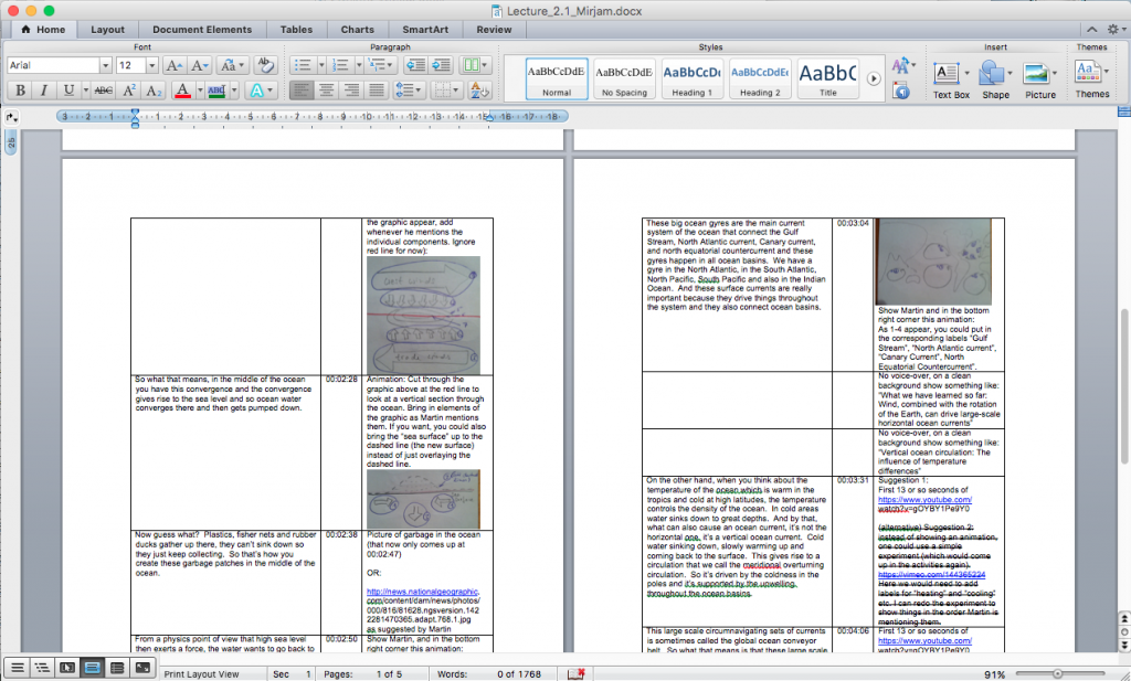
So what did my feedback actually look like? Below is a screenshot of the kind of document I sent in. In the left column are text snippets from the transcript of what the narrator of these lectures, Martin Visbeck, is saying, combined with the time from the rough cut. And on the right are my suggestions. As you can see, there are a lot of links to pictures and a couple of sketches.

My feedback on the rough cuts. Left column are text snippets from the transcript, middle column are times from the rough cut, and right column are my suggestions.
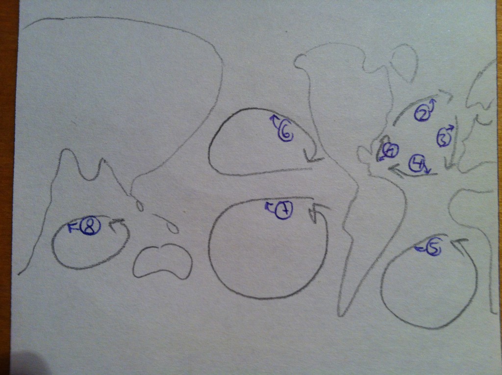
Sketches like the one below, for example:

Sketch of part of an animation that I suggested. Since Martin was talking about the individual parts of the North Atlantic gyre (Gulf stream (1), North Atlantic current (2), Canary current (3) and North Equatorial countercurrent (4)), before talking about gyres in the other ocean basins (South Atlantic (5), North Pacific (6), South Pacific (7), Indian Ocean (8)) I thought this, plus asking the individual arrows appear whenever Martin mentioned them by name, might be enough to clarify what I wanted to see. Turns out it was not.
But it turned out that sketches weren’t good enough to communicate my very specific ideas (duh! quelle surprise!), so I went and made a slide show in Power Point to show what I wanted. Click through the slide show below to get an idea of about half the animation steps (I couldn’t be bothered to screen-shoot every single step, also I thought no reader of my blog would actually want to look at all of them in the end anyway ;-))
[Best_Wordpress_Gallery id=”1″ gal_title=”Slides MOOC suggestions”]
(The map I am showing in the slides above and the movie below is taken from here with permission: http://www.freeworldmaps.net/outline/maps/world-map-outline.gif)
I had assumed that the slides above would be precise enough an instruction for the animator to translate into an actual animation, but funnily enough — they were not. Which is probably not surprising, seeing how many times I have drawn that kind of sketches before, and that they probably saw them for the first time. So I went and did this:
What you see above is movie of the slides, including the text the speaker on the video is saying, read by me. And if you want to see the final product, check it out as soon as the MOOC goes live, I will keep you posted!
So what did I learn from the whole experience? A lot!
For one: communicating with people who don’t have the same oceanography background that everybody on the Kiel-end and I have, about how to actually show the concepts. Seeing my sketches transformed into animations was fascinating, especially in those cases where the animation showed pretty much exactly what I had sketched, and I realized that what I had sketched actually didn’t fully describe what I had had in mind. Which I didn’t realize before, because everybody I talked with about my sketches had seen a similar way of describing those phenomena before, so my sketches appeared to be perfectly clear. I never before realized how very specific every description has to be when someone from a different background has to reproduce your ideas! Talk about the expert blindspot problem…
Then, that if I were to ever be involved in a MOOC production, I would first write out exactly what is supposed to be said, then bring together the visuals I want, and only then film the whole thing. Finding graphics and animations is a lot more difficult if you have to match them to the color scale the speaker is talking about after the fact ;-)
And then just by writing this blog post, I — for the first time ever! — included a gallery to one of my posts. I’ve been meaning to do this for a while, but never got round to it. How do you like it?
Oh, and my involvement with the MOOC didn’t end there: I also get to develop activities and tests connected to the physical oceanography part of the MOOC! More about that in a later post.
For now I just want to thank Martin, Avan, Georgia and Hala for the great experience!