Not an infographic, not SciArt, yet strangely satisfying: I drew my CV :-)
I’ve recently become interested in making infographics for science communication purposes. As in: I’ve been wanting to learn how to do it, but I’ve never gotten around to actually do it. So when I was asked for a one-slide CV the other day, I thought great! Let’s make it an infographic! Two birds, one stone: I get to try out something new for my #SciCommChallenge, and I end up with a cool CV. So today I will tell you the story of how that CV came to be.
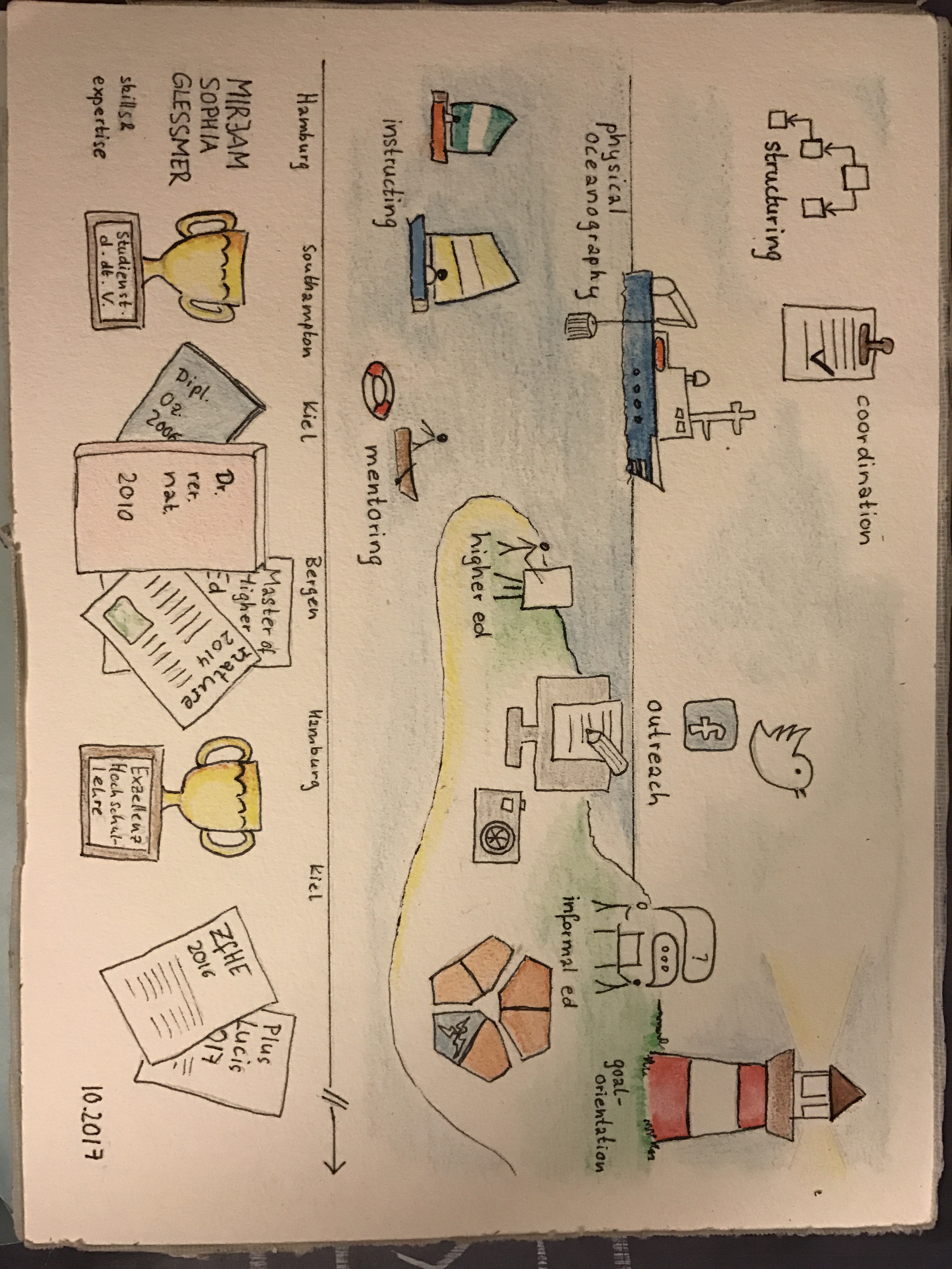
First, I started out brainstorming what I wanted to include in the infographic, and what kinds of icons I could use to visualise my skills and expertise with. I quickly ended up with the idea of using a time line that wasn’t linear, but rather organised around the different cities I had lived in for my studies, my Master thesis, my PhD thesis, my PostDoc, my job post PostDoc, and the PostDoc position I am currently on.
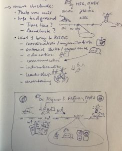
When I started sketching, I realised that it would be very difficult to a) come up with ideas for simple icons that showed “physical oceanography”, “mentoring”, or “goal orientation”, and b) to either find those icons online (in c) a style that I liked and d) freely available). Plus I didn’t have a graphics software available beyond PowerPoint. So the idea of sketching the whole thing seemed attractive.
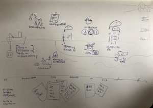
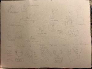
I quite liked the sketch above in pen because it gave me a lot of flexibility with my less-abstract icons, but I wanted some color. So I settled on the design below, now in pencil:
This design I then filled in in water color. That was the first time since 2003 that I had used water colors (as I could see from the top sheet of my sketch pad, which was dated), and despite being a little apprehensive about it, it went quite well (if I say so myself).
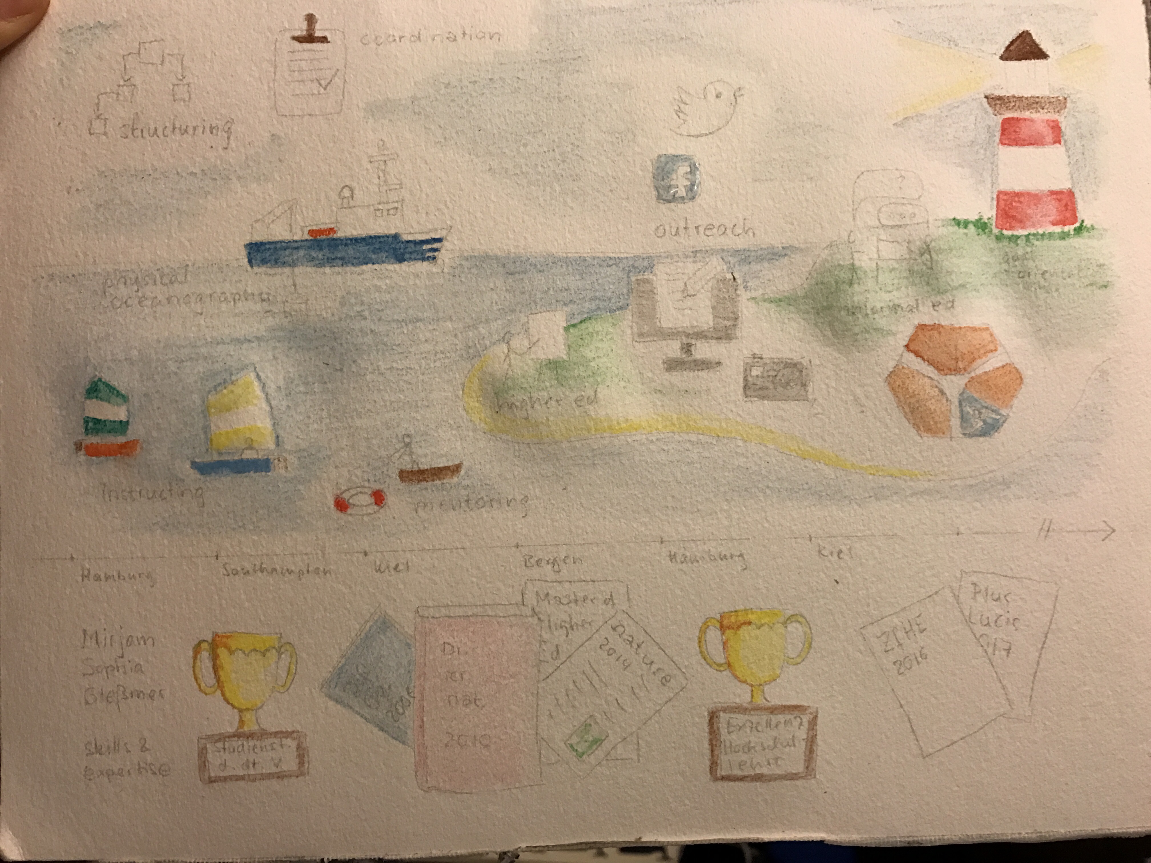
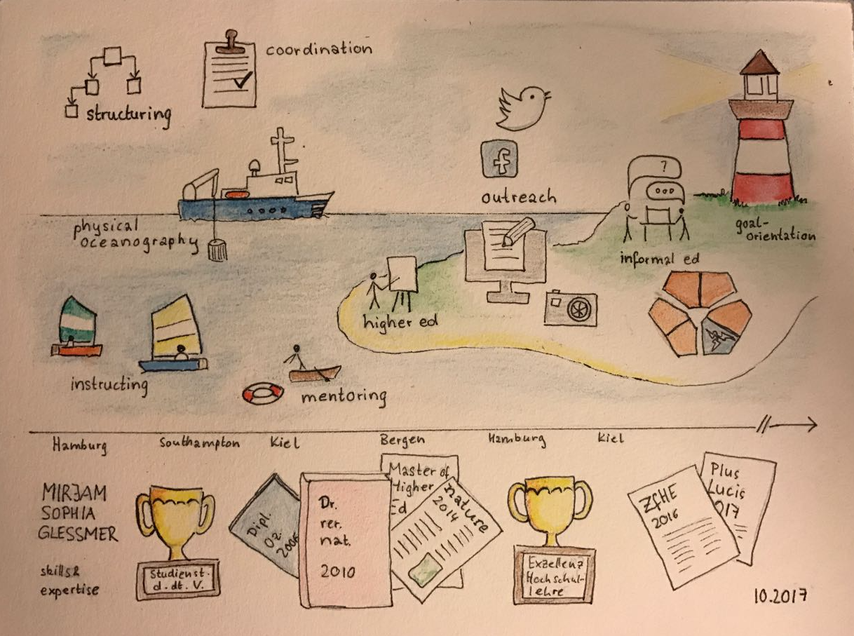
So this is the finished product:
That picture was taken on my couch with really bad lighting, but I like how it turned out with the warm background of the paper. I also scanned the CV the next day, but it came out really weird, so I decided to stick with the photo.
The whole process of drawing this CV was really interesting to me.
For example, I had a drawing of a light house in the CV right from the very first sketch. For a while I didn’t really know what to do with it — I really liked it in the picture, but it didn’t seem to serve any purpose. Yes, I want to live in a light house eventually, but how was that relevant for a CV that was supposed to highlight skills and achievements? Until it occurred to me: The light house does actually reveal a lot about me: That I am really goal-oriented. I didn’t even realise it, but my goal-orientation had been on my CV all along, and that had been important to me without me being able to verbalise why! But now that I consciously included it, it all fell into place.
Or the process of drawing those goblets below the time line, for when I won a scholarship and a fellowship. Is it over the top to draw them like I won the world cup (or the Triwizard Cup)? Maybe. But it’s probably the first time ever that I have acknowledged to myself that both were achievements that I can actually be proud of.
I like how the theme of research ships, sailing ships, light houses dominates the whole CV. When I look at it, I feel like it represents me very well, like it captures my “why”, and creating it felt like things were falling into place. And even though I did not submit that CV in the end, to me, the whole process was definitely worthwhile and empowering.
And it definitely motivated to draw more. Stay tuned for some really cool SciArt to come as soon as I have found a good way to digitalize it! :-)