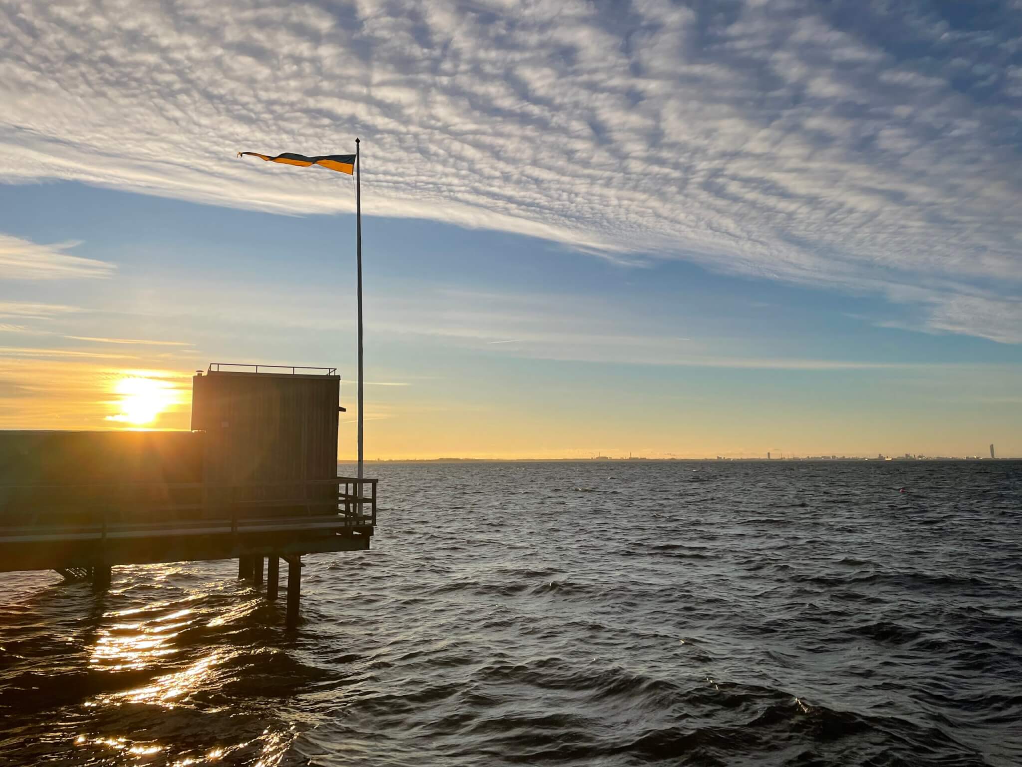
• Locks at Kiel Canal

    The locks at Kiel canal always make for interesting weekend strolls. I love watching ships!

    Especially armed with my favourite app, VesselFinder (similar to marine traffic described here), because it let’s me anticipate which ships will come next.

    And because I love my new hat! :-)

  • Melting ice cubes & thermal imaging camera

    I haven’t talked about my favourite experiment in a long time (before using it last week in the MeerKlima congress and suddenly talking about it all the time again), because I felt like I had said everything there is to say (see a pretty comprehensive review here) BUT! a while back my colleagues started playing with a thermal imaging camera and that gave me so many new ideas! :-)

    I showed you this picture yesterday already:

    img_9381

    Here we see ice cubes melting in fresh water and salt water (and my very fancy experimental setup. But I am pretty proud of my thermal insulation!). Do you know which cup contains which?

    Here are some more pics: The ice cubes before being dropped into the cups. Clearly dark purple is cold and yellow/white is warm (see my fingers?)

    screen-shot-2017-06-11-at-17-12-29

    After a while (5ish minutes), the cold meltwater has filled up the bottom of the freshwater cup while floating on top of the salt water cup:

    screen-shot-2017-06-11-at-17-12-55

    Looking in from the top, we see that the ice cube in salt water hasn’t melted yet, but that the other one is gone completely and all the cold water has sunk to the bottom of the beaker.

    screen-shot-2017-06-11-at-17-13-20

    When you check out the movie at the bottom of this post, you will notice that this experiment doesn’t work quite as well as I had hoped: In the saltwater cup, the ice cube floats against the wall of the cup and for quite some time it looks like there is a plume of cold water sinking in the salt water. I’m not quite sure what’s going on there. If it’s showing up like that because the cup is such a good thermal conductor, then why is the “plume” directional and not spreading in all directions? If there really is a plume, then how did it get there? It shouldn’t be! So many questions!

    There really can’t be a plume of cold melt water in the salt water cup. For my workshop last week I made the plot below (which, btw, I don’t think anyone understood. Note to myself: Explain better or get rid of it!). So unless the plume is cold salt water, there is no way anything would sink in the salt water cup.

    screen-shot-2017-06-11-at-17-23-02

    So maybe we are cooling the salt water around the ice cube which then sinks and shows up because it is close to the wall of the cup? We can’t look “into” the cup with a thermal imaging camera, we can only see the surface of the cup (See, Joke? Maybe it is useful after all to learn all that stuff in theoretical oceanography ;-)). That’s also why we don’t see a plume of cold melt water in the freshwater case like we see when we have dyed ice cubes and see the melt water plume, like below:

    dyed_ice_cubes_02

    Anyway. Here is the video, in which you sometimes see my finger, pushing the ice cube away from the beaker’s wall to finally get to a state that looks like what I wanted to show you above:

  • Playing with a thermal imaging camera

    Today I’ve been playing with a thermal imaging camera. Below you see a snapshot of my experimental setup, but before I tell you more about that experiment, a little bit of playing around.

    See my reflection in my porthole below? (Btw, how awesome is it that I found a porthole to decorate my living room with???)

    img_9381

    That reflection also shows up with the thermal imaging camera.

    And since I was taking pictures of myself: Here I am with “ice-cube make-up” and glasses that I had taken off for a while and then picked up again just before taking that picture. Do you see the endless possibilities of playing with a thermal imaging camera?

  • My workshop at MeerKlima.de

    Today I ran a workshop at the MeerKlima.de congress in Hamburg: A congress for high school students, organised by a student committee. The large lecture theatre of the chemistry department at the University of Hamburg was crowded for the opening lecture by Mojib Latif:

    For my workshop, however, we set a limit of 40 participants due to the size of the room (and the amount of stuff that I had lugged in from Kiel. Yesterday’s ice cubes did very well, btw!). And there were two TV crews and a photographer documenting the awesome ice cube experiment.

    You can watch documentaries of the workshop here and here (both in german).

    Sneak peak of those two documentaries, obviously only of the tiny little sequences featuring me:


    And thanks to Johanna and Dirk for their support before, during and after the workshop!

    I also got to watch another workshop by a colleague, who used the Monash Simple Climate Model (which I have talked about here) and I have got to say: That is such an awesome tool for teaching about models and/or the climate system! You will definitely hear more about it in the future as I incorporate it into my own teaching.

    And last not least we had a phone call to the Meteor off Peru which rounded off a day full of bumping into people I hadn’t seen in a while. Always great to reconnect with old friends and colleagues!

    It was great fun to be part of this congress, and it was a great way to experience first hand how science outreach can work in such a format. Since the congress was curated by the students themselves, many students were very interested and asked great questions. Also, the topics of the workshops corresponded closely to what students really wanted to see and hear. It would be amazing to see this scaled up next year, maybe over several days and with more parallel sessions, so that participating students really get to pick and choose exactly what topic they are interested in and that even more students get the opportunity to experience such an amazing congress!

  • Shallow water waves

    Have you ever noticed how, if you are at a shallow beach, no matter how choppy waves are further offshore, everything becomes nice and orderly on the beach?

    Below you see where the water depth suddenly increases, both from the color of the water and from the wave pattern. While in deeper water waves propagate at all kinds of speeds depending on their wavelength, the moment the water becomes shallow enough, all waves propagate at the same speed (except for the really short waves for which the water is still deep, but let’s forget about those). If all waves propagate at the same speed, it means that the form of the wave that we observe stays constant over time and just moves as a whole. Hence it looks a lot more tidy than the choppy waves further out.

    Funny that in all these years of wave watching, I have never thought about that before!

    Watch the movie below to see for yourself

  • Workshop prep and a riddle

    Looking at the picture below, can you guess which experiment I am going to do at the MeerKlima.de workshop? Yep, my favourite experiment — melting ice cubes! :-)

    And I am obviously prepared for several extensions of the classic experiment should the students be so inclined…

    Now I only need to get the ice cubes from Kiel to Hamburg — and as ice cubes, not a colourful, salty, wet mess :-)

    Having gotten that backstory as a hint, any idea what’s going on with the spoons below?

    Yep. Freshwater on the left, salt water on the right. Different refraction indices due to different densities. Neat :-)

  • What you know about science is not necessarily what you believe about science

    I’ve been working in science communication research for a good half a year now, and my views on outreach are constantly evolving. When I applied for this job, I was convinced that if only the public knew what we (the scientists) know, they would take better decisions. So all we need to do is inform the public, preferably using entertaining and engaging methods. However, I soon came to learn that this is known as the “deficit model” and that there is a lot of research saying that life isn’t that easy. Like, at all.

    One article I really like makes it very clear that knowledge about what science says is not at all the same as believing in what science says. The article Climate-Science Communication and the Measurement Problem by Kahan (2015) (btw, a really entertaining read!) describes how changing a question on a questionnaire from “Human beings, as we know them today, developed from earlier species of animals” to “According to the theory of evolution, human beings, as we know them today, developed from earlier species of animals” has a big impact: While in the first case, religiosity of the respondents had a huge impact and even highly educated religious people are very likely to answer “no”, in the second case religious and non-religious people answer similarly correctly. So clearly the knowledge of what evolution theory says is there in both cases, but only in the latter case that knowledge becomes relevant in answering the question. In the first case, the respondents cultural identity dictates a different answer than in the second case, where the question is only about science comprehension, not about beliefs and identity. As the author says: a question about ““belief in” evolution measures “who one is” rather than “what one knows””.

    The author then moves on to study knowledge and beliefs about climate change and finds the same thing: the relationship between science comprehension and belief in climate change depends on the respondents’ identities. The more concerned someone is about climate change due to their cultural background, the more concerned they become as their level of science comprehension increases. The more sceptical someone is, the more sceptical he becomes with increasing science comprehension: “Far from increasing the likelihood that individuals will agree that human activity is causing climate change, higher science comprehension just makes the response that a person gives to a “global- warming belief” item an even more reliable indicator of who he or she is.”

    So knowledge (or lack thereof) clearly isn’t the problem we face in climate change communication — the problem is the entanglement of knowledge and identity. What can we do to disentangle the two? According to the article, it is most important to not reinforce the association of opposing positions with membership in competing groups. The higher-profile the communicators on the front lines, the more they force individuals to construe evidence that supports the claims of those high-profile members of their group in order to feel as part of that group and protect their identity. Which is pretty much the opposite of how climate science has been communicated in the last years. Stay tuned while we work on developing good alternatives, but don’t hold your breath just yet ;-)


    Kahan, D. M. (2015). Climate-Science Communication and the Measurement Problem Political Psychology, 36, 1-43

  • Duckies, a drama and a wake

    Let me tell you the story of the picture below. I was walking along Kiel fjord with some friends and we saw this mama duck with all those tiny cute ducklings. We stopped and oooo’d and aaaaa’d and they were just so adorable!! But the after a while they swam on and we continued walking. But then there were people standing on the sea wall, obviously very worried about something. And then we saw it: a tiny duckling that had gotten separated from its family! It was struggling so hard to catch up with the rest, but they were swimming together while the little one was trying to climb over the rocks along the sea wall! The distance grew larger and larger. People started cursing mama duck for leaving the little one, or were pleading with her to come back for the poor baby. And then mama duck started heading out into the open fjord, where it was a lot more windy and wavy. How should the poor baby ever catch up? Eventually mama duck turned back. But she didn’t spot the baby! They all swam in the wrong direction away from the baby! It was dramatic. The crowd on the promenade was agitated. People were heading towards the ladders to climb down and rescue the baby! Then, finally, mama duck and all the siblings came back. Baby duck sprinted back to its family and finally everybody was reunited. Phew! The crowd wasn’t quiet ready to leave, not quite trusting mama duck that she wouldn’t abandon baby duck again. But then we decided that we had seen the happy ending, the scar hadn’t hurt for 20 years and all was well.

    The reason I am telling you this story? Because I am still fascinated by wakes of ducks. And I saw really beautiful ones this morning:

    The structure inside of the legs of the V is clearly visible.

    And what’s even better: you can see the pattern on the sea floor, too!

    The more I observe waves, the better I get at noticing details that were probably always there but that never stood out to me as clearly as they do now.

    That’s why I am so happy about having started this blog — it helps me observe so many amazing things :-)

    Oh, and if you are still waiting for the wake? Sorry, this was it. I was obviously talking about waves :-)

  • Reflected wakes

    When a ship has sailed past, at first you see only its wake.

    And then you see reflected bow waves interfering with the original wave pattern:

    See?

  • Diffraction

    I find it really fascinating to watch waves being bent by objects in their way. See how the wave is spreading out from the little slit?

    Or here how waves are coming in with straight wave crests that get bend once they run into the lee of the pier?

  • Surfactants 

    When I was talking about foam stripes the other day, you might have noticed that the foam stripe wasn’t a foam stripe all the way, but became “just a stripe”. And since I have been thinking about surfactants a lot recently, I think that’s actually what we are seeing in places where the stripe is just a stripe: Some kind of film on the water.

    Inside “the stripe” the water looks a lot smoother and waves are dampened out.

    At first I thought that it was maybe due to being sheltered from the wind, but clearly that wasn’t the case. If anything, the stripe was in a location where it was more windy (see where it comes out underneath the pier? That should be funneling wind around that corner, not sheltering from the wind!). But surfactants would make sense if they collected in the convergence zone of the stripe.

    See how the reflections from the sun are different where there is stuff on the water and the waves are dampened out?

  • Waves reflecting on a sea wall

    I really like it when waves reach a sea wall at an angle, because the resulting criss-cross looks so cool :-)

    And especially cool when you see it gradually building up, like below where the sea wall is partly protected by the gravel (or whatever you call those heaps of stones running in parallel to the sea wall?). The energy of waves hitting the sea wall at that part is dissipated, hence no reflected wave is sent off. However waves that hit the sea wall directly are reflected. Can you see how the reflections spread?

    See it more easily in the movie below:

  • Foam stripes

    One sunny morning, I noticed The Stripe again:

    Running all the way up and down the coast.

    In places where there is a large fetch the stripe is clearly foamy:

    But looking downwind from the pier the picture above was taken from, the foam stripe becomes just a stripe!

    And looking in the same direction, but from further out on the pier, we see that there is in fact a lot of foam on the water, somewhat organised in rows.

    Later the same day the wind had picked up and it became even clearer:

    See?

  • Asymmetric propeller blades

    On a recent flight to Copenhagen (actually, to Bergen, but that’s another story) I happened to sit with a great view of one of the plane’s propellers. And it struck me how asymmetrical the dark areas caused by the moving propeller above and below the axis looked!

    I guessed the explanation would have to be that the propellers were asymmetric in some way, too. Kept me entertained until I saw this:

    What could have happened there? Why would there be a seam between completely different patterns of clouds?

    I guess there is no reason there shouldn’t be, especially since the cloud / no cloud border is often quite sharp, too. But still, pretty intriguing!

    But then a pretty approach to Cph:

    And finally: a good view of the propellers. Ha!

    And now that I am writing this I am wondering. What’s the difference between asymmetric and asymmetrical? Googling has to wait, I have a plane to catch…

  • Standing waves in a current

    The other day I found the perfect standing waves on a current:

    This egg-carton-like pattern really stays pretty constant over time and I think the changes in the wave pattern are mostly due to changes in the sand bed below!

    You see the sharp edge that is currently being eroded, and sometimes you catch bits and pieces breaking off.

    I think this is super fascinating. Movie below!

  • Playing with a ROV

    The KiFo owns a ROV that — until now — has never been fully operational. But since I like a challenge (and have a really skilled research assistant who really deserves all the credit) it’s working again!

    We first went to test it in a tiny lake on campus.

    This was exciting enough, since it seemed to have been leaking on previous attempts.

    But this time round it did not, and the lake wasn’t deep enough to test whether it was actually water proof even at increasing pressure.

    So off to the Kiel Fjord we went!

    And after some careful preparations…

    …and a careful launch…

    …it worked! :-)

    Well, at least until the laptop battery died. But it’s a start! Thanks again for the great work, Nico!!!

  • Expedition learning

    In July I will be involved in teaching an “expedition learning” course for a week. It will be all about coastal protection in the Kiel region, so two colleagues and I went on a private expedition to scout out what can be explored where. This is a very picture-heavy post, be warned! It’s more a note-to-self to document the different beaches we looked at than something I expect anyone else to be interested in.

    We started out in Friedrichsort, where there were nice breaking waves to be observed. My part of the course, you might have guessed it, will be on observing waves…

    img_9010

    In Friedrichsort there is a lighthouse on a small headland, and there are sand banks around it that make for very interesting wave fields, like for example below, where the sand bank almost seems to filter out some wavelengths.

    img_9021

    Looking seaward over the sandbank, we see breaking waves over the shallow part, and waves being bent around the sand bank.

    img_9039

    A similar thing could be seen on a tiny headland: Can you see how one and the same wave crest gets wrapped around the headland?

    img_9049

    See? So cool!

    img_9052

    Btw, you might have noticed the weather changing a lot over the last couple of pictures. It’s April, I guess… But a couple of raindrops here and there make nice tracers for the time since the last wave washing up over the beach ;-)

    img_9060

    Always fascinating: When you can see wave-less spots that are shielded from the wind, and then local wind waves and others that are travelling in from further away. And breaking on a sand bank…

    img_9068

    Also, did you see how nice the weather was for a couple of minutes every now and then? ;-)

    img_9072

    And here is a close-up of the waves breaking on the sand bank.

    img_9073

    Oh, and looking back to where we came from: That’s the lighthouse on it’s headland right there! And my two colleagues figuring out what’s wrong with the GPS they brought. Their part of the course will focus on more geological things than mine…

    img_9077

    But I really like this view!

    img_9081

    See how nice and regular the waves are that reach the beach even though the local wind field is really messy (as you see a little further offshore) and the waves have gone over the sandbank?

    img_9090

    Oh, and always one of my favourites: When nice and regular waves hit a stone and it sends off wave rings. Love it!

    img_9094

    One more, because it’s so nice!

    img_9098

    And here waves bending around a wave breaker thingy.

    img_9101

    And this is a picture that really nicely shows how if you don’t have wind, you don’t have waves. The lagoon there is sheltered so well that you can actually see the reflection of the bird sitting on the edge!

    img_9107

    And here we have a very nice superposition of waves coming from different directions and with different wavelengths.

    img_9111

    And waves coming through the “slit” between sandbanks and spreading as segments of a circle. Nice!

    img_9113

    Oh, and more waves breaking on the sand bank.

    img_9119

    After a while, we reached Falckenstein:

    img_9120

    Not so far away from where we started out at that lighthouse over there:

    img_9129

    Another interesting superposition of wave fields.

    img_9131

    Oh, did I mention we did a lot of walking in the sand? About 20k steps. Well, I guess that isn’t even too bad…

    img_9146

    Below I really liked the criss-crossing of waves. It’s actually one wave crest crossing itself after being bend by the shallowing water.

    img_9151

    And those waves get deformed a lot, too!

    img_9168

    And here we knew that it was a matter of minutes until those rain showers would be where we were…

    img_9183

    Luckily, this shower went over quickly, too.

    img_9204

    And this is the kind of stuff the other courses will be dealing with: Awesome formations in the coast!

    img_9208

    Ha, another weather front:

    img_9214

    And this is my favourite geological feature: there are interesting features in the sand/soil/stone (however you call it?) and then erosion marks, clearly made by water, right below!

    img_9223

    A little bit further along the coast, there are weird wave breakers and if the wind hadn’t died down, we would probably have been able to see more interesting waves than these…

    img_9224

    But the waves below were really cool: There were the ones that you clearly see on the picture at an angle to the coast, and then there were waves that came in perpendicular to the coast (so the wave crests were parallel to the coast) and they washed the other waves on the beach and back into the sea. I should really upload the movie…

    img_9227

    So those waves above caused ripples in the sand which are parallel to the water line, even though in the pictures the other wave field is a lot more visible!

    img_9233

    See?

    img_9235

    We ended up in Schilksee and had a look around the marina. Apart from the typical wind / no wind resulting in waves / no waves, we saw……

    img_9241

    …this! Pretty cool, huh?

    img_9242

    And again:

    img_9243

    One last look at the coast near Bülk.

    img_9249

    At this point, only one of us still felt like exploring every nook and cranny…

    img_9252

    Even though there were some pretty nice wave fields, but we could see them from our vantage point without doing an extra step ;-)

    img_9253

    Actually, there were a couple of cool features on the beach still. What’s up with those little bays?!

    img_9255

    img_9256

    We ended the day with trying this very cool contraption to measure the coast with. It was actually a lot of fun!

    img_9262

    And you wouldn’t believe how much work it was to hold that ruler thingy in the wind!

    img_9267

    So yeah, that’s what we did. And how was your day in the office? :-)

  • Air-sea gas exchange inhibited by oil layer on water? Yes, but not always

    I have been brainstorming hands-on experiment ideas for a project dealing with the influence of oil films on air-sea gas exchanges, and one idea that I really liked was this one: Use sparkling water, pour oil on top, observe how outgassing stops.

    Now. I should probably have realised that this was a stupid idea before trying it, but in my defence: I have a really really busy week at work and I just wanted a quick and dirty experiment.

    As you probably know, sparkling water bottles are under a lot of pressure. Especially when you have been carrying them home right before opening them. As you will see from all the drops on my backsplash shown in the movie below, mine exploded all over my kitchen when I opened it…

    But even that wasn’t enough of a clue for me to realise that the process that drives CO2 out of sparkling water probably isn’t just a gradient in concentrations between the water and the atmosphere, but that the CO2 can only be kept in solution under high pressures. So yeah, my oil film doesn’t inhibit gas exchange at all, my sparkling water with oil on top is outgassing just as happily as the one without. I suspect the oil film will only have an impact once outgassing doesn’t happen via bubbles any more, and hence isn’t visible any more. Fail!

    But the movie is pretty, anyway.

    I guess we would actually have to measure gasses in the atmosphere and water in order to run such an experiment… Which makes it a lot less appealing. I would really have liked to be able to stop sparkling water from sparkling just by pouring oil on top. Bummer! :-)

  • Wakes of ducks

    I really like observing the wakes of ducks. Much easier to watch than those of ships because the scale is much more person-standing-on-the-sea-wall friendly. Also much less turbulence messing up the pattern. And you can get closer than you usually could.

    All three pictures from the same morning, taken within a minute of each other!

    Another awesome way to make my point about how waves look really differently depending on the angle one looks at them. Below for example my “other” way to observe waves: See how the wake leaves a shadow on the sea floor?

    And some more ducks from a different day, because I like them :-)

  • Burning foam

    One weekend, my godson’s family took me to the Explorado Duisburg, Germany’s largest museum for kids. And one thing we learned there was to make foam that you can ignite in your palm! (Although, to be fair, they didn’t tell the kids what they put in, I had to walk up on the stage and ask ;-))

    Watch the movie to see how much fun my godson’s mom and I had once the kids were asleep!

    Of course we repeated the experiment with the kids the next day, too. So much fun :-)

  • Group velocity and phase velocity

    When I recently wrote about observing waves in a different way, I talked about light being focussed by the waves on the sea floor.

    In the other post, I focussed on how looking at the light and dark pattern on the sea floor makes waves visible that are otherwise hard to see when just looking at the surface of the water:

    But it also makes something else easier to notice, and that is how phase velocity and group velocity are really different. We know they should be, but on a choppy water surface it is really difficult to keep track of individual waves as they wobble through each other. But looking at the light and dark pattern on the sea floor, it actually becomes easier to observe. See those brighter areas and darker areas? Wave groups!

    And in the movie below, you’ll see how they eat up waves that run into them, and how other wave crests come out in the front as they are overtaking the group. Cool! :-)

  • Observing waves differently

    When we speak about “observing waves”, we usually mean looking at the water’s surface as an opaque surface that reflects the sky and where we see waves mainly due to being lit differently on different sides. But there are other ways to observe waves!

    For example by how they focus light on the ground below. In the picture below you clearly see several groups of waves formed of smaller ripples.

    Of course what we see when we look at the lighter and darker spots on the sea floor is not only an image of the waves above, but it is also influenced by the structure of the seafloor itself. You see that below: The ripples in the sand distort the image of the waves a little. Nevertheless, it isn’t too difficult to see which general shapes are due to the waves and which due to irregularities in the surface below.

    Sometimes the lighting is such that you can see both into the water in some places and then see the sky reflected in others. The places that reflect the sky are showing waves the way we would usually observe them. In the picture below, we see wind ripples in the background, and in the foreground two main wave fields: one coming towards the viewer with crests parallel to the shore line on which I am standing, and a second field, whose crests are perpendicular to those of the first field.

    But in the region where we can look into the water, only the second wave field shows up clearly in the lighter and darker regions on the sea floor!

    Still, those regions give us a lot of information about the wave field that we don’t usually observe. For example all the small structures below don’t show up as clearly when we look at the sky-reflecting regions, do they?

    I find it quite fascinating how all those structures that show up on the ground are a lot more difficult to observe when just looking at the sea surface.

    Would you have guessed that there are so many tiny ripples on the surface?

    And also here, the wave crests perpendicular to the shore I am standing on show up a lot more clearly in the light and dark on the sea floor than on the surface, don’t they?

    Even easier to spot in a movie:

    Beautiful day to be watching the water! :-)

  • Using real time data of ship positions in teaching?

    This morning I was looking for the current position of a research vessel on MarineTraffic.com and noticed something that should maybe not have been surprising, but that I had never really thought about: How all the fishing vessels (orange) are sitting right on the shelf break! I guess that’s where they should be when we think about currents and nutrients and primary production and fish, but how cool is it to actually see it?

    screen-shot-2017-03-29-at-08-49-17

    And see that area west of Lofoten where there are a lot of fishing boats in a circle? An unnamed inside source told me that that’s where cod is spawning right now, so everybody is going there to fish. Tomorrow, the cluster might be in a completely different place. And even now, some 10 hours later, it seems to have migrated a little northward? Will definitely check again tomorrow!

    screen-shot-2017-03-29-at-17-50-40

    I obviously had to look whether fishing on the shelf break was just a thing in Northern Norway and turns out that it’s the same on the Greenland Shelf.

    screen-shot-2017-03-29-at-10-51-39

    Now that I got into playing, I found it also really interesting to see that there is a lot of fishing in the equatorial Pacific going on. And how clearly you can see major traffic routes even in just the distribution of ships.

    screen-shot-2017-03-29-at-10-50-11

    And then, ShipTracker even offers a density map of ship traffic:

    screen-shot-2017-03-29-at-10-55-41

    Which I had to screen-shoot in two parts because of reasons:

    screen-shot-2017-03-29-at-10-56-00

    This site would be such a great tool for all kinds of teaching purposes. Realtime data on shipping is just a click away, even with the free version! There are so many things that students could do estimates on using this site, on transport, fishing, pollution, just pick your topic! And using authentic data makes the whole thing a lot more interesting than looking at maps or numbers a teacher would provide. Pity I’m not teaching right now!

  • Playing with a thermal imaging camera

    I recently borrowed a thermal imaging camera from work. So much fun!

    Below you see a cold sky, warmer trees and two really warm people walking through the park.

    img_8074

    One thing that really surprised me was to see reflections of the warmer trees on the little lake below. Although thinking about it, I am not sure why I should be surprised: If it was a “normal” image and not a thermal image, reflections wouldn’t surprise me at all. So why should thermal radiation behave any different?

    img_8073

    But it messed up my plans quite a bit. I had hoped to maybe be able to see heat being transferred when waves crashed against the sea wall. But a) there were no waves, and b) what did the waves do? Correct: reflect the sky.  Just like they always do…

    So this is what we see:

    dd8aeddd-7b0e-4438-a071-345e8a531f65

    And this is what the thermal imaging camera sees:

    img_8076

    On a different day you clearly see the warmer clouds:

    As well as the apparently much warmer ships.

    And looking down from the sea wall:

    4321dbd9-0fc2-4b2b-bc4a-76f0e69f4981

    And what the camera sees:

    img_8079

  • Wind field

    Another boundary layer experience last week: On my way from work I stopped to take pictures of flags that were outside my university’s main building and that very nicely visualised the wind field (as flags tend to do).

    If you just look at the flags, they look weird — they wind field was clearly not changing over time, yet the flags were at a weird angle to each other.

    And in the next picture you see why: Because the air had to flow around an obstacle, so stream lines were bunching up.

    The next morning, I went past there again and stopped to take more pictures, when a colleague of mine stopped next to me, looking a little puzzled that I was taking pictures of our not especially nice main building.

    I explained what I was doing, and we got talking about how you see the world with completely new eyes once you have noticed, or have been shown, something tiny. Isn’t that exciting? :-)

  • On the impact of blogging — or how far does my message mix?

    What is the impact of this blog? And who am I writing it for?

    Those are not questions I regularly ask myself. The main reason I started blogging was to organise all the interesting stuff I was collecting for my introduction to oceanography lecture at the University of Bergen in one place, so I would be able to find it when I needed it again. And I wanted to share it with friends who were interested in teaching oceanography or teaching themselves.

    Another of the reasons why I blog is that I notice a lot of exciting features in everyday life that relate to oceanography and/or physics, that other people would just walk past and not notice, and that I would like to share the wonder of all those things with others. And noticing all this stuff is so much FUN! The blog “gives me permission” to play, to regularly do weekend trips to weirs or ship lifts or other weird landmarks that I would probably not seek out as often otherwise.

    But the other day I was browsing the literature on science blogging in order to come up with recommendations for the design of what is to become the Kiel Science Outreach Campus’ (KiSOC) blog. I came across a paper that resonated with me on so many levels: “Science blogs as boundary layers: Creating and understanding new writer and reader interactions through science blogging” by M-C Shanahan (2011). First, I really liked to see the term “boundary layer” in the title, since it brings to mind exciting fluid mechanics. Then second, I read that the boundary phenomena I was thinking of were really where the term “boundary layer” came from even in this context. And then I realised that I have had “boundary layer” experiences with this blog, too!

    So what are those boundary layers about? Well, in fluid mechanics, they are the regions within fluids that interact with “something else” — the boundary of a flow, e.g. a pipe, or a second fluid of different properties.  They are a measure for the region over which temperature or salinity or momentum or any other property is influenced by the boundary. But the same construct can be used for social groups, i.e. in my case oceanographers and non-oceanographers. (You should, btw, totally check out the original article! Her example is even more awesome than mine)

    But here is my own boundary layer experience: My sister sent me an email with the subject “double-diffusive mixing” and a picture she had taken! My sister is not an oceanographer, and I wasn’t even aware that she associated the term “double-diffusive mixing” with anything in particular other than me writing my Diplom thesis about it and probably talking about a lot. But that she would recognise it? Blew my mind!

    Turns out what she saw is actually convection, but it doesn’t look that dissimilar from salt fingers, and how awesome is it that she notices this stuff and thinks of oceanography?

    DSC03217
    Day 1. The remaining pink soap starts making its way up through the refill of clear soap.

    Obviously I asked for follow-up pictures:

    DSC03232
    Day 2. A lot of the pink soap has reached the top, passing through the clear refill.
    DSC03267
    Day 3. All of the “old” pink soap is now on its way up through the clear refill.

    And I had another boundary layer experience recently: A sailor on the Norwegian research vessel Håkon Mosby with many many years experience at sea had seen my book and told me that he now looks at waves in a new way. How awesome is that? That’s the biggest compliment my book could get, to teach something new about visual observations of the ocean to someone who looks at the ocean every single day!

    Anyway. Reading this article made me think about how happy both those boundary layer experiences made me, and that maybe I should actually start aiming at creating more of those. Maybe not with this blog, that I kinda want to keep as my personal brain dump, but there are so many different ways to interact more with people who would potentially be super interested in oceanography if only they knew about it… I guess there is a reason why I am working the job I am :-)


    Shanahan, M. (2011). Science blogs as boundary layers: Creating and understanding new writer and reader interactions through science blogging Journalism, 12 (7), 903-919 DOI: 10.1177/1464884911412844

  • More funny waves

    I think I might need to find a new route to walk along the Kiel fjord. When I was walking — in the most beautiful sunshine! — with my friend over the weekend, she pointed out that there are funny waves and it looked like there was water dripping in, and I went without looking “no, there is a step right there that’s causing those“.

    You see it in the picture below: Every wave crest washes over the step, and then when it retreats it sends off its own little waves.

    It’s a funny thing with professionalized perception. What I notice walking along the Kiel fjord is really highly trained and specialised, I guess. But still a lot of fun! And it makes me really look forward to the excursion that I’ll do later this summer with a couple of high school students where they’ll learn to observe waves my way :-)

  • Nonlinear effects in shallow water waves

    I recently googled for something related to the shape of waves and came across a photo of a wave that caught my eye, and it took me to a journey that lead to the article “nonlinear shallow ocean wave soliton interactions on flat beaches” by Ablowitz and Baldwin (2012).

    What’s discussed in that article is that while many wave interactions can be seen as (more or less) linear, sometimes there are nonlinear effects that can be replicated in a model. So far so not surprising. But I got fascinated because the phenomenon they look at I have seen over and over again and never really paid any attention to it: Wave crests forming X or Y shapes. But looking through my archives, I even had dozens of pictures of this exact phenomenon! (Actually, I didn’t have to look further back than to a beautiful day last November, when I also observed the wavelength dependency of wave-object interactions)

    Take for example the picture below: Do you see the H shape in the waves closest to shore? (In the article they would probably call it a more-complex shape, since it’s a double Y shape…)

    img_8629

    Below I’ve drawn into the picture what I mean by H-shape in green, and the typical kind of linear wave interaction in red (all crests just move on without influencing each other except in the spot where they occur at the same time, there they just add to each other):

    img_8629-copy

    Or below, I spot an X-shape:

    img_8633

    And here are several X- and Y-shapes

    img_8635

    And the picture below just to give you an orientation of where you are: Yep, it’s the same spot where we usually observe foam stripes, funny waves, or ice

    img_8625


    Mark J. Ablowitz, & Douglas E. Baldwin (2012). Nonlinear shallow ocean wave soliton interactions on flat beaches Physical Review E, vol. 86(3), pp. 036305 (2012) arXiv: 1208.2904v1

  • Optics

    I’ve even talked about it on this blog before, but I find it still fascinating how every tiny droplet manages to flip the world upside down :-)

    photo

  • Pythagoras’ Cup

    Yep, I’ve been playing this weekend :-) After seeing this on Facebook a while back I just couldn’t resist… Enjoy! :-)

  • More foam stripes

    As you might have noticed, I am getting a little obsessed with those foam stripes. Another day, a little more wind, looking up the coast:

    And down the coast…

    Do you notice the irregularities in the foam stripe in the pictures above? Those are the places where, in much calmer weather, you see the funny waves. I.e. there are steps that disturb the wave pattern and hence the foam stripe.

    But remember we saw a foam stripe connecting one going in parallel with the pier to one going parallel to the sea wall? It’s here again:

    Its taking a very similar path like it did last time, but this time it joins the one parallel to the sea wall, rather than forming a second stripe parallel to the first one.

    And if we continue further down the coast, we see a similar phenomenon (we are now walking towards that edge in the background of the picture below).

    Looking back, we see another foam stripe coming from the other edge of the pier, joining the one parallel to the sea wall.

    See, this is how they meet at the sea wall?

    And, funnily enough, a similar stripe can be seen going through the sailing harbour: Entering it through an opening in the pier and then going across the harbour and out the other end, until it finally joins the stripe at the sea wall.

    This stripe finally convinced me: There don’t need to be convergences for the stripes to exist, at least not for those that aren’t running in parallel to the coast. Because I cannot imagine a convergence zone running in such a way through the harbour that is partly sheltered from the wind, has pylons in it, and just has completely different conditions than the open fjord. Or at least the mechanisms forming that convergence zone would have to be very different from those forming the other stripes. So now I am thinking those stripes are just advecting foam from places where it accumulated (in front of the pier) to new places where it accumulates some more.

    And finally it just gets stranded on land:

    See how nicely the foam stripe is going around the obstacle? :-)

  • Funny waves on Kiel fjord

    The other day I noticed a funny wave pattern on Kiel fjord. Unfortunately I only took a picture where you see what caused the wave pattern:

    A step that was just at water level and got flooded with every wave crest and surfaced at every trough. See also in the movie below:

  • Newton’s balls

    Those are always fun! :-)

    Again seen at Phaenomenta Flensburg.

  • “Coriolis fountain”

    We’ve been thinking about Coriolis deflection a lot recently (see links at the end of this post). But this weekend, at Phaenomenta Flensburg, I came across a so-called “Coriolis fountain”. A fountain that you can put into spin and that then changes shape like so:

    Uta, remember we talked about this a couple of years ago? Nice puzzle for anyone interested in fluid dynamics…

    Watch the movie and be amazed :-)

  • Foam stripes mystery — closer to figuring out what’s going on?

    I think I might be getting closer to understanding the foam stripe mystery. Remember how we’ve always observed them going in parallel to the coast?

    Yesterday I saw this again, looking up the coast in one direction…

    …and down the other direction. I’ve had the hypothesis that they might be somehow related to Langmuir circulation, but in any case there must be some kind of convergence zone there.

    But let’s move closer to that pier we see in the background of the picture above. Here we see a foam stripe parallel to the pier, but at a 90 degree angle to the see wall that I am standing on and that has a foam stripe running in parallel, too! And even more curious: at the edge of the pier, the foam strip detaches and runs toward the coast! See?

    Looking down the coast again, we see that foam stripe coming in at an angle, and running in parallel to the coastal stripe in the far back.

    Looking up the coast from the pier right where it meets the sea wall, we see both foam stripes running in parallel (as we saw in the picture above):

    I think what is happening here is that the foam of the foam stripes doesn’t form locally (which was an implicit assumption I had whenever I was staring at the water, trying to observe more wave breaking there than in other places). Instead, foam forms somewhere else (probably pretty much all over the place) and just accumulates in those stripes. That’s actually pretty likely if we think back to the eel grass or leaf stripes: the eel grass and leaves were clearly advected from somewhere else, too. And actually that’s the same with Langmuir circulation, too: stuff just accumulates in convergence zones but isn’t formed there.

    So for some reason there is a convergence parallel to the sea wall as well as the pier, and foam just accumulates there. And as for the part of the stripe that detaches from the pier and runs to the coast? It is going more or less downwind. So it’s probably just part of the stripe parallel to the pier that gets advected around the corner and blown toward the coast.

    Why does that stripe end up in parallel to the one at the coast rather than joining it? I don’t know yet. But at least now I only need to figure out why there are convergences in some places and I can let go of the obsession with foam formation in the stripe itself :-)

    Do you have any idea that might explain those foam stripes? I’d love to hear from you!

  • Foam stripes again…

    …because they follow the coastline so nicely and I still don’t understand what’s going on there…

  • Ice and waves

    Waves going through very fresh, still flexible ice. What an exciting topic :-) We had a first look at the picture below in the last blog post already, when we looked at stages of ice formation. Can you see how the pancakes are deformed by waves going through?

    It’s a little more difficult to see in the picture below, where a storm drain drips into the fjord. Can you make out how the wave rings are spreading through the thin ice?

    And one thing that I found super fascinating was that ducky ice-breaking: You see the open water bit just behind it, and there are a lot of waves. But then you also see those waves spreading into the ice! Poor ducky must have put a lot of energy into this…

    My favourite picture, though is the one below: A crisscross of waves and an ice floe that moves (obviously) with both wave fields!

    This even works if there is more ice than just one lonely flow:

    How awesome is that??? :-)

  • Ice forming on Kiel fjord

    One thing I really like is watching ice form. Well, maybe not watching the actual freezing (don’t have the attention span for that) but looking at all the different stages.

    At first, you have all the small, individual needles that still slush around.

    Then, the needles start sticking together, and if there is a little wave action, the ice breaks apart into individual pancakes, which bump into each other and start piling up along the edges.

    If the wave action isn’t too bad, those pancakes can freeze together, forming a closed ice cover.

    Sometimes you can also see several stages at once, like in the picture below: Open water out on the fjord, slush a little further in, then smaller pancakes and then larger pancakes. Not very surprising: Most wave action in the middle of the fjord, and the further you get towards the shore, the more waves have been dampened by the ice, so the larger the ice floes can grow.

    Here you can actually see waves going through the ice-covered area, giving you an idea of how flexible the pancakes still are. More on that in the next post… ;-)

    Here you see all the stages in one pic again. Together with the raising sun it makes for very pretty pictures! :-)

  • Fictitious forces (4/5): Coriolis – how not to teach it

    Some demonstrations are really not as clever as we thought they might be.

    We have talked about how to teach aspects of the Coriolis force recently, and just to spice it up: here is one thing that I tried that totally didn’t work out.

    The idea was to have one student slowly and steadily turn a balloon around its axis to mirror the Earth’s spin, and another one drawing on the balloon with a sharpie.

    The context was a class where many students didn’t have any physics background, and we wanted to understand atmospheric circulation, and why trade winds don’t blow straight north-south (or south-north on the Southern Hemisphere). And I still think that this demonstration kind of works for this specific purpose.

    IMG_5092

    The problem though: If you have a balloon and a sharpie, drawing one single trajectory and going “oh, I got it! So that is why the trade winds have a velocity component to the west!” (like I naively had imagined) is NOT what happens.

    What happens instead is that students will draw tons of trajectories. And not only the ones that, even in this overly simplified system, show what I wanted them to see. Nope. They will also draw following a constant latitude, and then be confused as to why Coriolis force doesn’t seem to be acting. Or draw south-to-north on the Northern Hemisphere, and be confused why things are being deflected to the left. (And don’t get me wrong: this is good! They should start exploring. And they should be finding the limitations of demonstrations!)

    IMG_5093Now. All of those issues that come up are things you can talk about and that can be explained. But I’m wondering whether this demo didn’t cause more harm than good, since the impression that might have stuck in the end is that Coriolis deflection only works under very specific circumstances, but most of the time it does not.

    So this is not a demonstration I would recommend!


  • Fictitious forces (3/5): Coriolis force — how we think it should be taught

    So how do we teach about the Coriolis force? The following is a shortened version of an article that Pierre de Wet and I wrote when I was still in Bergen, check it out here.

    The Coriolis demonstration

    A demonstration observing a body on a rotating table from within and from outside the rotating system was run as part of the practical experimentation component of the “Introduction to Oceanography” semester course. Students were in the second year of their Bachelors in meteorology and oceanography at the Geophysical Institute of the University of Bergen, Norway. Similar experiments are run at many universities as part of their oceanography or geophysical fluid dynamics instruction.

    Materials:

    • Rotating table with a co-rotating video camera (See Figure 1. For simpler and less expensive setups, please refer to “Possible modifications of the activity”)
    • Screen where images from the camera can be displayed
    • Solid metal spheres
    • Ramp to launch the spheres from
    • Tape to mark positions on the floor
    folie1
    Figure 1A: View of the rotating table. Note the video camera on the scaffolding above the table and the red x (marking the catcher’s position) on the floor in front of the table, diametrically across from where, that very instant, the ball is launched on a ramp. B: Sketch of the rotating table, the mounted (co-rotating) camera, the ramp and the ball on the table. C: Student tracing the curved trajectory of the metal ball on a transparency. On the screen, the experiment is shown as filmed by the co-rotating camera, hence in the rotating frame of reference.


    Time needed:

    About 45 minutes to one hour per student group. The groups should be sufficiently small so as to ensure active participation of every student. In our small lab space, five has proven to be the upper limit on the number of students per group.

    Student task:

    In the demonstration, a metal ball is launched from a ramp on a rotating table (Figure 1A,B). Students simultaneously observe the motion from two vantage points: where they are standing in the room, i.e. outside of the rotating system of the table; and, on a screen that displays the table, as captured by a co-rotating camera mounted above it. They are subsequently asked to:

    • trace the trajectory seen on the screen on a transparency (Figure 1C),
    • measure the radius of this drawn trajectory; and
    • compare the trajectory’s radius to the theorized value.

    The latter is calculated from the measured rotation rate of the table and the linear velocity of the ball, determined by launching the ball along a straight line on the floor.

    Instructional approach

    In years prior to 2012, the course had been run along the conventional lines of instruction in an undergraduate physics lab: the students read the instructions, conduct the experiment and write a report.

    In 2012, we decided to include an elicit-confront-resolve approach to help students realize and understand the seemingly conflicting observations made from inside versus outside of the rotating system (Figure 2). The three steps we employed are described in detail below.

    folie2
    Figure 2: Positions of the ramp and the ball as observed from above in the non-rotating (top) and rotating (bottom) case. Time progresses from left to right. In the top plots, the position in inert space is shown. From left to right, the current position of the ramp and ball are added with gradually darkening colors. In the bottom plots, the ramp stays in the same position, but the ball moves and the current position is always displayed with the darkest color.
    1. Elicit the lingering misconception

    1.a The general function of the “elicit” step

    The goal of this first step is to make students aware of their beliefs of what will happen in a given situation, no matter what those beliefs might be. By discussing what students anticipate to observe under different physical conditions before the actual experiment is conducted, the students’ insights are put to the test. Sketching different scenarios (Fan (2015), Ainsworth et al. (2011)) and trying to answer questions before observing experiments are important steps in the learning process since students are usually unaware of their premises and assumptions. These need to be explicated and verbalized before they can be tested, and either be built on, or, if necessary, overcome. 

    1.b What the “elicit” step means in the context of our experiment

    Students have been taught in introductory lectures that in a counter-clockwise rotating system (i.e. in the Northern Hemisphere) a moving object will be deflected to the right. They are also aware that the extent to which the object is deflected depends on its velocity and the rotational speed of the reference frame.

    A typical laboratory session would progress as follows: students are asked to observe the path of a ball being launched from the perimeter of the circular, not-yet rotating table by a student standing at a marked position next to the table, the “launch position”. The ball is observed to be rolling radially towards and over the center point of the table, dropping off the table diametrically opposite from the position from which it was launched. So far nothing surprising. A second student – the catcher – is asked to stand at the position where the ball dropped off the table’s edge so as to catch the ball in the non-rotating case. The position is also marked on the floor with insulation tape.

    The students are now asked to predict the behavior of the ball once the table is put into slow rotation. At this point, students typically enquire about the direction of rotation and, when assured that “Northern Hemisphere” counter-clockwise rotation is being applied, their default prediction is that the ball will be deflected to the right. When asked whether the catcher should alter their position, the students commonly answer that the catcher should move some arbitrary angle, but typically less than 90 degrees, clockwise around the table. The question of the influence of an increase in the rotational rate of the table on the catcher’s placement is now posed. “Still further clockwise”, is the usual answer. This then leads to the instructor’s asking whether a rotational speed exists at which the student launching the ball, will also be able to catch it him/herself. Ordinarily the students confirm that such a situation is indeed possible.


    1. Confronting the misconception

    2.a The general function of the “confront” step

    For those cases in which the “elicit” step brought to light assumptions or beliefs that are different from the instructor’s, the “confront” step serves to show the students the discrepancy between what they stated to be true, and what they observe to be true.

    2.b What the “confront” step means in the context of our experiment

    The students’ predictions are subsequently put to the test by starting with the simple, non-rotating case: the ball is launched and the nominated catcher, positioned diametrically across from the launch position, seizes the ball as it falls off the table’s surface right in front of them. As in the discussion beforehand, the table is then put into rotation at incrementally increasing rates, with the ball being launched from the same position for each of the different rotational speeds. It becomes clear that the catcher need not adjust their position, but can remain standing diametrically opposite to the student launching the ball – the point where the ball drops to the floor. Hence students realize that the movement of the ball relative to the non-rotating laboratory is unaffected by the table’s rotation rate.

    This observation appears counterintuitive, since the camera, rotating with the system, shows the curved trajectories the students had expected; circles with radii decreasing as the rotation rate is increased. Furthermore, to add to their confusion, when observed from their positions around the rotating table, the path of the ball on the rotating table appears to show a deflection, too. This is due to the observer’s eye being fooled by focusing on features of the table, e.g. cross hairs drawn on the table’s surface or the bars of the camera scaffold, relative to which the ball does, indeed, follow a curved trajectory. To overcome this latter trickery of the mind, the instructor may ask the students to crouch, diametrically across from the launcher, so that their line of sight is aligned with the table’s surface, i.e. at a zero zenith angle of observation. From this vantage point the ball is observed to indeed be moving in a straight line towards the observer, irrespective of the rate of rotation of the table.

    To further cement the concept, the table may again be set into rotation. The launcher and the catcher are now asked to pass the ball to one another by throwing it across the table without it physically making contact with the table’s surface. As expected, the ball moves in a straight line between the launcher and the catcher, who are both observing from an inert frame of reference. However, when viewing the playback of the co-rotating camera, which represents the view from the rotating frame of reference, the trajectory is observed as curved.

    1. Resolving the misconception

    3.a The general function of the “resolve” step

    Misconceptions that were brought to light during the “elicit” step, and whose discrepancy with observations was made clear during the “confront” step, are finally corrected in the “resolve” step. While this sounds very easy, in practice it is anything but. The final step of the elicit-confront-resolve instructional approach thus presents the opportunity for the instructor to aid students in reflecting upon and reassessing previous knowledge, and for learning to take place.

    3.b What the “resolve” step means in the context of our experiment

    The instructor should by now be able to point out and dispel any remaining implicit assumptions, making it clear that the discrepant trajectories are undoubtedly the product of viewing the motion from different frames of reference. Despite the students’ observations and their participation in the experiment this is not a given, nor does it happen instantaneously. Oftentimes further, detailed discussion is required. Frequently students have to re-run the experiment themselves in different roles (i.e. as launcher as well as catcher) and explicitly state what they are noticing before they trust their observations.

    Possible modifications of the activity:

    We used the described activity to introduce the laboratory activity, after which the students had to carry out the exercise and write a report about it. Follow-up experiments that are often conducted usually include rotating water tanks to visualize the effect of the Coriolis force on the large-scale circulation of the ocean or atmosphere, for example on vortices, fronts, ocean gyres, Ekman layers, Rossby waves, the General circulation and many other phenomena (see for example Marshall and Plumb (2007)).

    Despite their popularity in geophysical fluid dynamics instruction at the authors’ current and previous institutions, rotating tables might not be readily available everywhere. Good instructions for building a rotating table can, for example, be found on the “weather in a tank” website, where there is also the contact information to a supplier given: http://paoc.mit.edu/labguide/apparatus.html. A less expensive setup can be created from old disk players or even Lazy Susans. In many cases, setting the exact rotation rate is not as important as having a qualitative difference between “fast” and “slow” rotation, which is very easy to realize. In cases where a co-rotating camera is not available, by dipping the ball in either dye or chalk dust (or by simply running a pen in a straight line across the rotating surface), the trajectory in the rotating system can be visualized. The method described in this manuscript is easily adapted to such a setup.

    Lastly we suggest using an elicit-confront-resolve approach even when the demonstration is not run on an actual rotating table. Even if the demonstration is only virtually conducted, for example using Urbano & Houghton (2006)’s Coriolis force simulation, the approach is beneficial to increasing conceptual understanding.

  • Fictitious forces (2/5): Experiencing frames of reference on a playground

    How can you be moving in one frame of reference, yet not moving in another?

    We talked about the difficulty of different frames of reference recently, so today I want to show you a quick movie on how the seemingly paradox situation of moving in one frame of reference, yet not moving in another, can be experienced on a playground.

    MVI_9331
    My dad on a playground rotator. Moving relative to the rotating disk, yet staying in the same spot relative to the playground.

    This is maybe not what you would do with a bunch of university students, but on the other hand – why not?

  • Fictitious forces (1/5): Record players and Coriolis deflection

    An experiment showing how seemingly straight trajectories can be transformed into curly ones.

    One of the phenomena that are really not intuitive to understand are fictitious forces. Especially relevant in oceanography: The Coriolis force. The most difficult step in understanding the Coriolis force is accepting that whether or not a trajectory appears straight or curved can depend on the frame of reference it is observed from.

    Or to say it with John Knauss in his Introduction to Physical Oceanography: “Even for those with considerable sophistication in physical concepts, one’s first introduction to the consequences of the Coriolis force often produces something analogous to intellectual trauma”.

    One way to show that the apparent change of shape is really due to different frames of reference, is to take a trajectory that is objectively AND subjectively straight and watch it being transformed into something curly.

    IMG_8454
    Trajectories for different voltages driving the record player.

    We did this at JuniorAkademie by taping a piece of paper on a record player, putting it into motion and then, at as constant a speed as possible, drawing along a ruler’s edge straight across. (if you don’t have a record player or rotating table at your disposal, you could also use a Lazy Susan and turn it as uniformly as possible).

    Of course, this approach has a lot of potential pitfalls. For example, if you change the speed while you draw, you get kinks in your curls (as the child drawing in the video below points out when it happens). Also, by drawing on a flat paper rather than a spherical Earth, this isn’t completely equivalent to the Coriolis force.

    And, more importantly, I think this experiment is only helpful for an audience that doesn’t “know” about fictitious forces yet. A problem we have experienced with oceanography students is that they “know” that moving objects should be deflected, and that they “see” a deflection even when there is none (for example when they are watching, from a non-rotating frame of reference, an object move across a rotating table). In that case, sliding the pen along the ruler might be perceived as forcing an otherwise curly trajectory to become a straight line, hence cheating by preventing a deflection that should occur.

  • Desublimation: When water vapour freezes to ice without becoming liquid in between

    One of my favourite phenomena right now is desublimition, or deposition: The phase transition of water vapour to ice that doesn’t go through the liquid phase. It happens when moist air is cooled below the dew point and condensation doesn’t occur spontaneously: When the supercooled water vapour then gets in touch with a cold surface, it turns to ice immediately. And the results are incredibly beautiful!

    img_8895

    img_8896

    img_8899

    img_8914

    These pictures are all from a trip I took with my godson and his family to Möhne Reservoir, the largest artificial lake in western Germany. You can see we were actually on a shore: What a surreal mixture of shells, leaves and frost flowers.

    img_8915

    And we initially just wanted to go over and have a look at the fog that we saw across the Reservoir from where we were throwing stones in the water

    img_8880

    Getting closer, we were almost afraid that we’d encounter dementors there. We could feel it getting a lot colder, and there was frost on the shore and ice on the water… Spooky :-)

    img_8879

  • Playing with water

    Sometimes playing with water is all you need to make you happy.

    Like on this gorgeous day last December at Möhne Reservoir, the largest artificial lake in western Germany:

    img_8947

    That was my godson, btw.. Throwing something, that is, not falling in…

    And this was me:

    mvi_8845

    And because I am so happy that I learned how to do that (thank you, Elsa!) I’ll show you a video, too. Maybe some day I’ll talk about the physics behind it, too, but today playing is enough :-)

  • Shelter from the storm

    Shelter from the storm, no, shelter from the breeze.

    img_8743

    But we clearly see the sheltering effect of that boat shed on the wind waves… Same thing below. And wasn’t that a beautiful day :-)

    img_8825

  • Evaporating sea water

    How much salt is there in sea water? What concentration do you need before crystals start forming? What will those crystals look like? I am sure those are the kind of questions that keep you awake at night!

    Of course this can easily assessed experimentally. On a visit to the University of Bergen’s Centre for Science Education just now, I was shown the result of such an experiment: A litre of water was mixed with 35 grams of salt to simulate sea water with its typical salinity. Below, you see what the beaker looked like after sitting out for three months.

    You can see that salt crystals are forming at the walls of the beaker, but that their structure depends on depth below the initial water level (see the 1000 ml mark on the beaker).

    When there is still a lot of water in the beaker, crystals look like ornate flowers. Then, the less water is left in the beaker, the more square the crystals become. And at the bottom of the beaker, you see the typical salt crystals you would expect.


    Actually, even though they look like the kind of salt crystals I would expect, apparently someone who knows about crystallography commented that there must be other stuff in there than just cooking salt since the crystals don’t look the way they should. I need to read up on this! :-)

    Anyway, this is an experiment that I want to do myself, so maybe in three months time there will be more pictures of this!

    Thanks for a very nice lunch, Olaug, Frede, Andreas, Morven and Elin! Looking forward to working with you a lot more in the future! :-)

    P.S.: with this blog post I am testing to blog pretty much “real time” from my mobile phone, so if you notice anything odd, please let me know!

  • Wind waves

    No matter how often I’ve seen it, I still find it absolutely fascinating how the tiniest structures can have a really visible effect on the downwind wave field. Like for example that pier below, leading to the little hut at the end. There is probably a meter and a half between the water surface and the gangway, which is propped up on really thin pylons. Yet, you clearly see that there are visibly fewer waves downwind of the structure. And the hut itself shades a huge area from wind.

    img_8608

    This kind of stuff is so cool to watch! :-)

  • Refraction of light in moving water — why stuff seems to be jumping around

    I was waking along Kiel fjord one morning and noticed a stone “jump” on the ground as waves went over it (and actually, that observation was the motivation to dive into stuff from the last post, too).

    I think the stone only looked so curious because the rest of the ground was uniformly sandy and hence didn’t seem to move.

    slide1

    So seeing that jumping stone made me want to draw the optical path, which I’ve animated for you here:

    refraction_of_light

    Funny. I think in physics class in school, I would absolutely have hated it had I gotten the task to draw all those different diagrams, and here I really enjoyed it. Maybe because of that jumping stone? Would the right motivation have helped me as a kid to get interested in this? I think it wasn’t that I was not interested in physics, but it would never have occurred to me to sit down on my own to sketch optical paths or anything like that. Now if I could figure out what changed for me, maybe we could use that to make other people interested in physics, too?

  • Refraction of light in water — looking at a couple of examples

    Looking at how light gets refracted when it enters water is always fascinating. There are a dozen blog posts on the topic on this blog alone, but let me talk about it again today.

    In a 1908 article, Charles Judd (as summarised in Barnett & Ceci, 2002) describes an experiment where kids throw darts at a target submerged under water. Half of the kids, in addition to practicing throwing darts, are taught about refraction of light in water. While all kids do equally well on the practice task, the kids that understand the physics do a lot better when the water depth was changed. Why?

    slide10

    When the water depth changes, the target appears to be located in a different position than before. With shallower water, the target we see is a lot closer to the real location of the target. So kids that did not understand why they had to aim at a position off the target they saw to actually hit the target had a much harder time adjusting the way they aimed than those kids who actually understood what had changed.

    But refraction is always cool to look at, even without throwing stuff. Here a picture from one of my very first blog posts (still in my house in Norway).

    2013-10-24 12.13.01
    “broken spoon”

    Or from this blog post — a fountain in Sheffield:

    2016-07-15 11.37.10

    Or a swimming pool in Lüneburg that appears a lot shallower than it actually is (from this blog post).

    IMG_3194

    Or a table that gets completely deformed when seen through a glass of water (from this post).

    IMG_6561
    Refraction of light in water.

    Is it only me or do other people sometimes also draw optical paths just for fun? ;-)

  • Those foam stripes parallel to the coast — again!

    I think I might be getting obsessed with those stripes parallel to the coast. We saw them as foam stripes, eel grass stripes and now today: leaf stripes!

    img_8804

    Or should it be leaves stripes instead of leaf stripes?

    img_8813

    Interestingly enough, that day there wasn’t just one stripe, but in some places there were even two. It’s a little difficult to see in the pictures, but it was very clear in person.

    img_8808

    See?

    img_8810

    A little further downwind foam also appeared, but only inshore of the innermost leaf stripe.

    img_8817

    And then a little further downwind, several parallel foam stripes appeared. Now this I could imagine being Langmuir circulation. And all the other stripes must be on individual convergence zones, too?

    img_8823

    Someone should hire a PhD student to figure this out, it is really bugging me that there is a phenomenon that we can observe pretty much every time we look at Kiel fjord, yet I can’t find anything on what is going on there.

    Luckily, the day I took those pictures, my famous oceanographer friend J was with me, and it was bugging her almost as much as it was bugging me :-) We decided the most likely explanation was that someone had pulled all those leaves on thin strings and put them out in the water just to see whether someone would notice…

  • Interference of one wave field with its reflection and a second wave field

    All you regular readers of my book and my blog surely recognize what’s going on below?

    img_8720

    Yes! A wave field comes in at an angle to the pier and gets reflected, leading to a chequered pattern. And a second wave field comes in with wave crests pretty much parallel to the pier, adding a little more interest to the pattern.

    img_8722

    I love watching these kinds of waves! But it is really difficult to take good pictures. Sorry about the over-exposed background…

    img_8723

    But it is so beautiful!

    img_8718

  • Wave-watching

    Do you know the feeling when you, even on the most beautiful of days, want to get out of the pretty parks as quickly as possible so you can finally see the water?

    2016-11-12-10-46-51-1

    Especially when it’s foggy?

    img_8544

    And it is so worth it, there is always something to see. For example on that day: what a nice field of shallow water waves!

    img_8548

    And what an awesome criss-crossing of waves being reflected on the sea wall on which I was standing when taking that picture.

    img_8559

    And how sad that this lake was frozen over! :-)

    img_8581

    P.S.: Still looking for a christmas present for your nerdy friend, your niece, anyone who should spend more time looking at water? Check out my book :-)

  • Wavelength dependency of wave-object-interactions

    Wavelength dependency of wave-object-interactions. What a title! :-) But that is exactly what I observed over the enormous timespan of three full minutes (as shown by the time stamps of my camera) when I went strolling along Kiel Fjord one Saturday morning.

    First, I saw this old, overgrown tyre in a wave field that was dominated by small wind waves. We clearly see how they are diffracted around the tyre and how there is a nice interference pattern downwind of the tyre (to the left in the picture below).

    img_8642
    Tyre in the Kiel Fjord and diffraction of small wind waves around it, leading to a beautiful interference pattern to the left of the tyre

    Also I quite like how there are absolutely no waves inside the tire, where the wind is shaded off by the tyre and the stuff growing on it.

    Then, a really short while later, the wave field was dominated by longer waves running in from the distance. Below, we still see remnants of the old interference pattern to the left of the tyre, but also how the longer waves run around it. In the picture below, the wave crest that was broken up by the tyre is about to rejoin.

    mvi_8643

    And then, only an instant later, this is what the wave field looked like. Hardly and ripples caused by local wind, but many short waves. No real interaction between tyre and waves visible any more.

    img_8645

    Isn’t that fascinating? And it all happened within three minutes! :-)

    P.S.: Still looking for a christmas present for your nephew, your friends’ kid, your geeky friend? Check out my book! :-)

  • Blog post no 500 or: My book has just been published! #superproud

    I wrote “Let’s go wave-watching! Discovering oceanography on every stroll” (available in both german and English!) for my god-daughter Pauline and her parents. Pauline wasn’t even six months old then, but I wanted her parents to learn to see everything I see when I look at water, to get as excited about it as I get, and to get Pauline addicted to wave-watching, too, as she grows up. We’ll see how that works out, but now you have the chance to be fascinated and have your eyes re-opened to all the things you theoretically learned about but forgot again :-)
    img_8731-copy

    If you are interested, you can find more information on my book HERE. Weren’t you still looking for a christmas present for your niece, your nerdy friend, anyone who should spend more time looking at water?
    img_8745

    And also how exciting is it that this announcement also marks the 500th post on this blog? My baby just had a baby ;-)
    img_8770

    P.S.: Buy it here: amazon.de (english | deutsch) or amazon.com (english | deutsch). Unfortunately, amazon.com only sells the e-book version and not the print version, but get in touch if you’d like a print version and can’t buy from amazon.de!

  • Reflections on reflections

    When we think about reflections in water, we usually think of calm lakes and trees on the shore opposite to us. Or clouds. Or at least that’s what I think of: Everything is so far away, that it seems to be reflected at an axis that is a horizontal line far away from us.

    Then the other day I walked along Kiel Fjord and it hit me that I had never actually consciously observed reflection of things that are located close to my position, and especially things who are not pretty much equidistant to me, but where one end is a lot closer than another one. Consider the picture below: Do you notice something that looks kinda odd to you (while at the same time looking super familiar)?

    2016-10-31-16-28-40

    If you are wondering what I mean, I marked it in red in the picture below: The rope and its reflection! It’s embarrassing to say that (as someone who has been sailing A LOT since the age of 7) this was the first time I really noticed, but it struck me how the maximum of the parable of the reflected rope isn’t right below the minimum of the parable of the rope, but seems shifted to the left. Of course this is exactly how it should be if we think about the optics, but I was really shocked that I had never noticed before and never thought about it before! I bet if I had had to draw the reflection I would have done it wrong and probably not even noticed…

    2016-10-31-16-28-40-copy

    Here is another picture to show you what I mean. This is what it looks like:

    2016-10-31-16-31-40

    Below I’ve drawn in the original objects in blue, the axis of reflection in red and then the reflection in green:

    2016-10-31-16-31-40-copy

    So far, so good, everything looking the way it’s supposed to look. Right? Then look at the picture below:
    2016-10-31-16-31-40-copy-2

    Sorry if this seems obvious to you, but I’m fascinated with this right now :-)

    But it leads to another interesting thought: Asking people to draw stuff in order to both check their understanding and also make them reflect on their understanding. I recently had the opportunity to observe a class of master students draw the SST of the mean state of the Pacific Ocean (which was an exercise that I had suggested in connection with a class on El Nino. I thought it would be neat to have them draw the mean state and then later the anomalies of El Nino and La Nina to activate prior knowledge) and it was surprising how difficult that was even though I’m sure they would all have claimed to know what the mean state looks like. Having to draw stuff really confronts us with how sure we are of things we just assumed we knew…

    And then I’m pretty sure that once we’ve drawn something that we have constructed ourselves from what we knew (rather than just copied a drawing from the blackboard or a book, although I think that also helps a lot), we are a lot less likely to forget it again.

    Anyway, this is a type of exercise I will use — and recommend — a lot more in the future!

  • Surface films dampen waves

    On Tuesday I talked about sea weed accumulating close to the sea wall in Kiel fjord, and I showed you the picture below.

    img_8518

    One thing that I found really interesting about that is how the floating sea weed dampens out all the waves. You can see it in the image above, bit it might be easier to see in the picture below: Can you see how there are a lot of ripples near the top of the image and none close to the sea wall at the bottom of the image?

    img_8521

    It’s not quite a surface film, yet its impact is the same.

  • Foam stripes parallel to the coast, take 2

    I recently got a new comment on my blog post on foam stripes parallel to the coast, and since you guys hardly ever comment on my blog (I like getting your emails! Really! But why not comment on here? ;-)) it spiked my interest enough to look out for more foam stripes. So about a month ago, I saw this in Kiel: Yes! A foam stripe parallel to the coast!

    2016-10-08-17-26-10

    I’m actually pretty sure that they are there most of the time, at least when there is some wave action going on, but I just never noticed since they are so close to the sea wall and it’s easy to just look out over the fjord and never look down.

    But again, as much as I tried, I could not see how the position of the stripe related to the wave field.

    But now that I was intrigued, I went back the next morning to take a look. A lot less wind than the night before, and shorter waves. And what do we see?

    img_8496

    At first glance, there is no foam stripe, but instead there is a stripe where floating sea weed accumulated (indication of a convergence zone? Can you see it? Sorry about the bad picture).

    img_8503

    But then in other spots, there is a little bit of foam, too, where the sea weed accumulated. And this time I could actually see where it came from: That is the area where most of the wave breaking happens when reflected waves meet incoming waves. Mind, though, I could not observe that on previous occasions!

    Plus, waves break when they meet the sea wall, and that creates more foam that sits between the foam stripe and the sea wall.

    Since at that point I was really intrigued, I went back around lunch time the same day. And what do we see?

    img_8512

    Foam stripes are gone, but there is a lot more sea weed now! And all confined to a narrow stripe along the coast.

    img_8518

    Actually,  if we look really carefully, we can see that there still is a foam stripe parallel to the coast, but very very close to the sea wall now.

    img_8527

    And looking down the other direction, there are even two stripes with sea weed, and only the one closer to the coast also has foam on it. It gets weirder and weirder :-)

    Anyway. I guess what we need for foam stripes is enough choppy wave action that waves break (waves alone are not enough as you can see in this post on standing waves which happens to talk about the exact same spot), because if waves weren’t breaking, where would the foam come from? Although sea weed could still accumulate, I guess?

    I will investigate further. In the meanwhile, does anyone have any more ideas of what is going on? Do you now see those foam stripes everywhere, too? :-)

    P.S.: Kiel peeps, btw, you probably know exactly when I took those pictures, since there is the Sweden ferry coming in on one and then the Norway ferry going out on the other… :-)

  • Estimating volumes

    Good thing laboratory equipment is always labeled with the volume!

    Even though I have played plenty with Legos as a child and am fairly good at 3D stuff, my mind just can’t estimate these volumes correctly. To me, the 500 ml cylinder looks a lot larger than 1 l volumetric flask and it blows my mind that if I fill the complete content of the cylinder into the volumetric flask, it is only half full.

    img_6642

    img_6643

    Anyone else or is it just me?

  • The ocean really takes on the color of the sky

    I guess it’s kinda obvious that the ocean always appears to be the color of the sky. On grey days, the ocean looks grey. If the sky is blue, so is the ocean. But if the sky is two-colored? See for yourself!

    img_8238

  • Swell and wind waves

    Sometimes waves are very regular and mostly of the same length. Those are the ones that I usually talk about when I talk about interference of waves. But of course, other times, there are different kinds of waves with different histories and different lengths, and those do interfere, too. For example in the picture below, there are long swell waves caused by a distant storm, and then small wind waves on top of those, caused by a local breeze.

    img_7264

    The really long swell you can’t even see in the picture, because waves with a couple hundred meters wavelength and just a dozen or so centimeters height are just really hard to photograph… But you get the idea!

  • Wavelets on bow wave

    The other day (well, the other day when I was still at sea and wrote that blog post. Been quite a while since…), when sailing in calm waters, I noticed the wavelets of a bow wave.

    And I cannot not see them these days! No matter how much the other waves try to disguise any trace the boat might be trying to leave to prove its existence, the bow wave wavelets put up a fight to be noticed.

    img_7135_zugeschnitten

    Below, you see the direction the ship is sailing in (yellow), the wash from the broken bow waves (green) and the wavelets that form the bow wave (red).

    img_7135_zugeschnitten-copy

    And they look extremely pretty in the setting sun, too!

    img_8262

    If you like pictures like this, you’ll love my book! Stay tuned!

  • Moving sandbanks

    A while ago I wrote a blog post on how the sand banks in this little creek form. Below you see the picture I showed then:

    IMG_6171

    Then, about two weeks ago, I passed that spot again when it was raining, and this is what it looked like:

    img_8494

    Now we can actually see the flow field, and we can see that the sand bank in the far back has moved quite a bit. We also see that during the night it must have rained more at some point, since the leaves on the sandbank on the left that got stranded there, must have been carried there by a higher water level.

    I went back later that day when it had stopped raining, and then it looked like this:

    img_8509

    Now that the water level has sunk again, you can clearly see that the sand banks have shifted compared to where they were in the first picture a couple of weeks ago.

    Funny how much you can discover if you actually look at the world around you :-)

  • Watch the dispersion relation in action

    Remember how we talked about how waves seem to propagate extremely slowly into that calm patch that occurs when a boat pulls away from a dock? Well, the other day I noticed that there is even more physics you can see when watching a similar situation: You see how long waves propagate much faster than short waves (that is for deep water waves, in shallow water the wave speed only depends on water depth, not on wave length)

    img_6925

    Here you see a formerly smooth patch of water where the Håkon Mosby was until a minute ago, and you see how long waves have already propagated into that smooth patch while shorter waves are everywhere in the choppy water around the smooth patch, but have yet to propagate into it. Now that I think of it I’ve seen this many times before, I just never noticed. It’s even visible in the video I posted with the other blog post.

    And here is a video. Note how the long waves invade the smooth spot of water long before the shorter waves do:

  • Recovering an oceanographic mooring

    So in my previous post we deployed a mooring (in fact, those pictures were from the deployment of several different moorings). Now how do we get such a monster back on board again?

    Recovering a mooring is always slightly nerve-wracking, because even though we’ve tried very hard to forget about this possibility during the year the mooring was out there in the ocean, it is never 100% certain that we will actually be able to recover it. It might not be there any more, or it might be out of batteries. I have been on cruises where we have had to give up on recovering moorings, or on another one where we had to dredge for a mooring (and found it!). Luckily, on this cruise things went smoothly and the way they were supposed to:

    A sound signal is sent and establishes contact with a releaser that connects the anchor with the rest of the mooring. After establishing the position of the mooring, a signal is sent and the releaser lets go of the anchor: The mooring floats up to the surface!

    img_7618

    Then, the task is to spot the orange floatation thingies in the waves.

    img_7218

    And bring the ship close enough to actually connect a hook to it.


    img_7222

    Once it is on the hook, it needs to be brought on board.

    img_7639

    Remember, it’s hundreds to thousands meter of rope we are talking about! Luckily the Håkon Mosby is (as all research ships are) equipped with plenty of winches and cranes and a super helpful, knowledgeable and skilled crew.

    img_7415

    Instruments are brought on board individually (or, in this case, a releaser).

    img_7312

    After having been out in the ocean for a year or two, they are sometimes overgrown with stuff. And in this particular case, that bio stuff was stinky!

    img_7334

    But pretty, I have to admit. I think it’s some sort of cold water coral. I think. Any biologists here?

    img_7396

    But there is always a lot of stuff to be recovered.

    img_7654

    img_7660

    And also pretty interesting: This is the first time I got a good look into one of those orange flotation thingies. I knew there was a glass sphere inside, but it was nice to actually see one. I had previously seen one that had imploded – it ended up pretty much pulverized. But so this is what we knock around on deck and throw out into the ocean:

    img_7684

    But yeah. In a nutshell, this is how moorings are recovered.

  • Deploying an oceanographic mooring

    Do you want to know the full story behind the rope in the mystery picture the other day? On the recent Håkon Mosby cruise, we did a lot of mooring work, and that rope was part of a mooring that we recovered after it has been out in the Iceland Sea for two years.

    So what are those moorings all about? The idea behind moorings is that it is super expensive to go out on research ships and that you can only stay out for a fairly short period of time compared to the amount of time you would like to cover with measurements. Therefore, installing instrumentation in the sea and leaving it out there for extended periods of time to measure and store data without anyone being close by, looking after it, gets you a lot of data that you could otherwise never obtain. Once a mooring is in the water, there is no communication with it at all until, after a year or two, we come back to pick up the instruments, read out the data and start on the science.

    Moorings basically consist of a lot of rope. They are one or more long pieces of rope held down to the sea floor by a large metal anchor and then pulled in an upright position by large buoys that float at some depth underneath the sea surface. And then there are lots and lots of instruments attached to the ropes at different depths, most with their own buoyant orange floatation thingies [technical term] attached so that, if the ropes broke accidentally, they would float up to the surface and there is the (tiny) chance they might be recovered.

    Below is a sketch of a mooring on the Kögur section (And check out the website http://kogur.whoi.edu for tons of information on that section!) to give you an idea of what those things look like (thanks, Kjetil, for letting me use the sketch, and thanks, Steinar, for the awesome work!). I was actually on both the cruise deploying that mooring in 2011 and recovering it in 2012 – check out the cruise blogs for those cruises, well worth a read even years later!

    gfimooring

    So now without further ado: on to deploying a mooring!

    Before a mooring can be deployed, though, a lot of work goes into preparing ropes of the correct lengths with shackles in between where instruments or floatation thingies go.

    img_7591

    On the day the mooring is deployed, instruments get attached to the ropes in the correct spots, so they end up at the right depths in the water.

    img_7899

    Since moorings are typically several hundred to thousands of meters long, instruments and floatation thingies cannot be attached beforehand and the whole thing then just be thrown out into the water. Instead, when a part of the mooring is ready, out it goes into the sea to make room on deck for the next one to be prepared to avoid creating a gigantic knot filled with very expensive instrumentation.

    img_6963

    The whole thing has to be very well coordinated, since there are several cranes and winches involved, and many expensive instruments that are all to end up at a specified depth to measure specific features.

    img_7877

    Below we see orange buoyancy floatation thingies being lowered into the sea, and still on deck there is an acoustic current meter that will be next.

    img_7864

    One thing I found super interesting on this cruise was to see the different generations of instruments all in use. For example, what we see being lowered into the sea in the picture below, above those orange flotation thingies, is a rotating current meter, predecessor to the acoustic current meter we saw in the image above. Rotating current meters work pretty similar to how we measure wind at home weather stations: The red vane will position the instrument in the current and the little wheel will turn with the current. Both the orientation of the instrument and the rotations of the wheel will be recorded.

    img_7074

    When all the instruments and orange floatation thingies are attached to the rope and it has all been lowered into the sea, everything is still floating on the surface. The final act is to drop the anchor that will pull everything under water and in an upright position. This, again, requires a lot of precision, because where the anchor is dropped determines the position in from all the data is going to be collected. So the way this works is that the ship is steaming pretty slowly towards the target position while instrumentation, floatation thingies and rope go over board, and if everything is timed well, by the time everything is out in the sea, the final position has been reached and the anchor can go out.

    img_7086

    Exciting stuff! One mooring we even deployed before breakfast (and I am showing this mainly because I like the colors in this pic).

    img_7753

    Next post will be on: So now how do we get those things back on deck again after their stint out at sea?

  • Reading the water – a new mystery picture for you!

    Back by popular demand: Reading the water in my mystery pictures series!

    Who knows what’s going on in the picture below?

    img_7272

    You might recognize a couple of details that might give you a hint: There are waves parallel to the rope and drops of water falling from the rope.

    img_7272_zugeschnitten-copy-3

    And here is what happened: A floating rope was repeatedly being pulled up from the water’s surface and then sank back down as the research ship Håkon Mosby moved in swell (white). Each time the rope broke the surface, it caused waves that propagate away from it, the ones we see as lines parallel to the rope (yellow). And when it was pulled up, water dripped from it, so drops falling directly underneath the rope (green) cause the wave rings (red).

    Like posts like these? Then you will love my upcoming book! Stay tuned! :-)

  • Measuring the concentration of dissolved oxygen in sea water – Part 3 of 3 – finding the titration volume by looking at the change in color

    Measuring the concentration of dissolved oxygen in sea water – Part 3 of 3 – finding the titration volume by looking at the change in color

    So now we have prepared our sea water sample and are ready to start titrating to figure out the concentration of dissolved oxygen. The sample itself changes color with added thiosulfate, it goes from yellow to lighter yellow to clear over a wide range of added thiosulfate. But determining the titration volume just based on this is a pain.

    When measuring dissolved oxygen with automatic titration, the instrumentation that I used previously used a UV lamp and a detector: After each tiny volume of the titrant was added, the amount of UV light that made it through the sample as it changed it color from its original apple juicy-color to clear was measured and noted. Two lines were fitted to those data points: One while the color of the sample was still changing, the other when it wasn’t any more. The titration volume is found at the intersection of those lines.

    slide1
    Winkler titration: What an automatic titration system measures


    When measuring oxygen with manual titration, like I did on this cruise, we can’t take all those individual data points and then fit lines, we can just take one single reading the moment we think the titration volume has been reached (well, we can note down volumes when we think we are close, and then just use the one we think was closest to something actually happening. But we don’t have a good account of how close we were at each of those volumes, and we can’t go back in time to compare values, so it still comes down to either getting it right or not). Having a good indicator that clearly shows when the titration volume (I.e. the point at which the amount of thiosulfate solution added to the sample is proportional to the concentration of dissolved oxygen in the original sample) is reached is key.

    Luckily, Kristin prepared an awesome starch mixture which I got to use that makes it a lot easier to determine the point when titration is done. You add it when the yellow of the sample has become so light that it gets difficult to see whether it is still yellow or clear already, and the sample turns a deep, dark purple. As you come closer to the titration point, color changes little until you are very close, when it changes very rapidly (that’s why you only put it in once you are fairly close, otherwise the looooong time with no changes would likely lead to you becoming too impatient, adding too large volumes at a time, and over-titrating [at least if you are like me at all]). Adding starch late and then having it change very sensitively to added thiosulfate makes it very easy to determine the exact volume of thiosulfate needed.

    slide2
    Winkler titration: Sketch of the color changes of just the sample, or a sample with an added starch solution, during titration. Note how it is a lot easier to find the titration volume when starch is added at the right moment!

    And here are a couple of impressions of what it looks like for real:


    Winkler titration: Sketch + photos of the color changes of just the sample, or a sample with an added starch solution, during titration. Note how it is a lot easier to find the titration volume when starch is added at the right moment!
    Winkler titration: Sketch + photos of the color changes of just the sample, or a sample with an added starch solution, during titration. Note how it is a lot easier to find the titration volume when starch is added at the right moment!

    When writing this post and showing it to people, I have been warned repeatedly to not make myself redundant by making it too easy for other people to just print this blog post and go take my spot on the next cruise to measure oxygen. So I just want to state: Clearly there is more to measuring oxygen than what was shown here! For example, you need to measure standards to calibrate your measurements, which I am too lazy to write about right now. And most importantly: If something goes wrong, you need to be able to figure out how to fix things. And that’s not always a piece of cake, I can tell you… So please don’t use this as a manual. But I’m happy to talk about my experiences if anyone is interested!

    And Kjetil and Emil, I really want to go on that winter cruise! :-)

  • Measuring the concentration of dissolved oxygen in sea water – Part 2 of 3 – the measuring part

    So how do we actually measure dissolved oxygen concentrations from the samples we took in the last post?

    We are using a method called “titration” to determine the unknown concentration of dissolved oxygen in our sea water sample. And this is how titration works in general: During titration, we add known volumes of a chemical, called “titrant”, to the sample until all of our unknown amount of the substance we want to measure has reacted with the second chemical. The volume of the titrant that we needed to add until all of the substance-to-be-measured is used up is called the “titration volume” and it is proportional to the volume of the substance-to-be-measured we had in the sample and that we want to figure out. Since the chemical reactions of the substances are well known, the factor that needs to be used to convert one substance into the other is known, too.

    Unfortunately, when attempting to measure oxygen, we can’t add the titrant directly to the water sample, but a couple of other steps have to happen before. Remember the last post? We ended by adding reagents to the sample:

    img_7987

    To be precise, we add manganese sulfate first and then a mixture of sodium iodide and sodium hydroxide. This is shaken really well to mix everything. A white manganese hydroxide precipitate forms but is quickly oxidized by the oxygen in the sample. When this happens, the sample turns the color of brownish cloudy apple juice. This is where it is important that we don’t have air bubbles in the sample – the oxygen contained in those would also take part in the reaction which would later look like there had been a higher concentration of dissolved oxygen in the sample.

    After a little while, a yellowish-brownish precipitate falls out. This is what we later want to measure, as the dissolved oxygen is bound in there and can’t take part in any further reactions for the time being.

    A sample then looks like this:

    img_6740

    Or, for a full crate of samples:

    img_6831

    Next, using a syringe, we need to carefully, take about 20ml of water off of the top of the sample flask (because we will measure inside the sample flask and need to make room for the magnet stirrer and chemicals to be added later). This works surprisingly well without disturbing the precipitate at the bottom of the bottle!

    img_6741

    Next, we add acid (sulfuric acid in our case) to the sample to dissolve the precipitate back into solution.

    img_6742

    Where in contact with the acid, the apple juice becomes clear.

    img_6743

    It will become clear everywhere once the magnet stirrer starts mixing the acid and the rest of the sample.

    And now we are ready to start titrating!

    In titration, we add known amounts of the titrant, thiosulfate solution in our case, to our sample until we reach the “titration volume”, where all oxygen has reacted. The task is figuring out the titration volume. This can be done for example by adding an indicator that changes color when the sample changes from acidic to basic. Then we need to note down the volume of the titrant, the titration volume, at the exact point that happens. The titration volume of thiosulfate solution is then proportional to the concentration of dissolved oxygen in the original sample (again, provided there were no air bubbles trapped in the sample).

    We’ll talk about what this looks like in practice in the next blog post :-)

  • Measuring the concentration of dissolved oxygen in sea water – Part 1 of 3 – taking samples

    Since my task on the recent Håkon Mosby cruise was to measure dissolved oxygen, I will give an overview over how that is done over the next couple of posts. Starting with today’s post on how to sample (because this isn’t as simple as just filling a bottle with sea water!)

    In fact, sampling oxygen requires great care and I am very grateful to Ailin and Steffi for the excellent job they did. Ailin kindly agreed to let me take pictures of her sampling to illustrate this blog post.

    Water is sampled in Niskin bottles on a CTD (For how the CTD and the water sampling in Niskin bottles works, see this blog post). We’ll start when the CTD comes back to the surface and sea water from various depths is trapped inside the Niskin bottles.

    img_6715

    The rosette is brought back on deck, and things are about to get busy for us!

    img_7971

    Oxygen has to be sampled as soon as the CTD is back on deck in order to avoid that the dissolved oxygen in the sample starts outgassing due to changed pressure, equilibrating with atmospheric oxygen, or do anything else that would change the oxygen concentration we are interested in measuring.

    In order to not contaminate the sample, the hose which we use to sample needs to be free of air bubbles, too.

    img_7973

    The sample flask is rinsed, as is the top, with water from the respective Niskin bottle the sample will be drawn from. The bottle is then filled until overflowing while care is taken that there are no bubbles trapped in the flask.

    img_7977

    Next, two reagents are added (more on those in my next post, which will be on measuring dissolved oxygen concentrations). Adding more volume to an already overflowing bottle means that some of the sample is going to be displaced and flow out.

    img_7987

    Then, the top is placed on the sample flask, again taking great care that no air bubbles are trapped in the flask.

    img_7988

    And then the fun part (for the first about three samples, afterwards this part gets really really annoying) begins: Shaking! Until the sample and the reagents are very very well mixed.

    img_7989

    We’ll end up with crates of sample bottles, all filled with something that looks like cloudy apple juice:

    img_6830

    And we’ll talk about how we can measure those samples in the next blog post.

  • Joys of a sea-going oceanographer

    So you might have noticed that the last 6 weeks or so all posts had been scheduled ahead and that I was strangely absent. Yep. That’s because I was on a research cruise in the Nordic Seas. But be assured – we’ll be talking about that for the next couple of posts!

    First, let’s get some stuff out of the way, like: Did we see whales? Yes, we did! First, an orca.

    img_6591

    It was so close to the stern of the ship that I couldn’t get a better picture since it was really THAT close.

    img_6592

    Then the guy below. He surfaced out of nowhere when I was standing on the bridge, having a chat. And then he was gone again, never to be seen again. Just like that. (See the handrail of the ship in lower left corner of picture? Yes, that’s how close he was)

    img_8119

    But most whale sightings looked like that one:

    img_8162

    Or that one.

    img_8219

    Next couple of posts: How to measure dissolved oxygen in sea water. `Cause that’s the reason I got to go on the cruise in the first place… :-)

  • Bubbles and the sun

    One thing that I always notice but that is really difficult to take pictures of: How bubbles on a water surface focus the light into little stars on the ground. See?

    IMG_5176

    Can you see which bubble corresponds to which star?

    Almost as exciting as this:

    2016-05-19 10.30.33

    Remember this, Anna? :-)

  • Awesome wake of high speed catamaran

    This post has been in the making for a very very long time. I have now decided to stop overthinking and just share the movie with you, because who wouldn’t want to watch the wake of a high speed catamaran? This is from my not-so-recent-anymore trip to Heligoland.

    IMG_4439

    Since I am too lazy to annotate, you will have to figure out by yourself what is happening when. But I give you this: It’s speeding, then slowing down, and then speeding up again. And in any case, it’s mesmerising to watch!

  • Erosion

    Erosion happens not only to sandy paths or beaches on the large scale, but also on a small scale to really sturdy structures like the groynes in Hastings, where each of the massive pillars has its own little dip around it, being bitten into the concrete little by little by the force of the waves, moving little stones around…

    IMG_5847

    We saw it in another post already:

    IMG_5845

    Yes, that’s why there are puddles exactly in the spots where one would like to sit, sheltered from the wind, the back resting against one of those pillars… ;-)

  • Tides

    Another thing I can’t stop being fascinated by: Tides.

    Sometimes you look towards Hastings Pier, and there is water all the way up to the sea wall. Those are the times I am too stunned to take pictures, unfortunately.

    Other times, the sea retreats:

    IMG_5732

    Further and further.

    IMG_5623

    And then at some point I can’t zoom out enough to capture the building on the pier at the same time as the water’s edge…

    IMG_5599

  • Standing waves

    One thing I find endlessly fascinating are – you might have heard it before – standing waves. At the waterfront in Kiel I saw some the other day:

    IMG_6149

    Watch the movie below and be fascinated, too! :-)

    Isn’t it amazing how wave crests and troughs seem to appear out of nowhere and vanish again? When we are so used to seeing waves propagate, this is such an interesting variation of the theme! And it makes it somehow more easy to accept that waves transport energy, not mass, because if we can’t see which way they propagate, which way would they transport mass?


  • Waves transport energy, but not mass

    Usually we see wave crests propagating, and since the eye can’t stop following them, it is easy to assume that they transport water with them instead of leaving the water put and just transporting energy. But here is an example of a situation where bubbles as tracers for water “parcels” show that, despite large waves passing, the water itself only moves up and down, and a little back and forth, but isn’t really transported away:

    Of course there is some Stokes drift, but compared to the wave speed the speed associated with that is tiny…

  • Waves break when they reach a critical steepness

    You can quite accurately predict when a wave is going to break. When it will break depends on its steepness, which depends on the slope that it is running up on. So due to the funny beach shape caused by the differential erosion on the upstream and downstream sides of groynes we can watch one and the same wave crest break several meters apart depending on the side of the groyne we look at. Kept me fascinated for the better part of the three days we spent in Hastings, and would have kept me entertained for a lot longer, I am sure, had I not had to go to a conference (and win a poster award there, so it was all worth it in the end ;-))

    Here we see a wave breaking on the right side of the groyne, while at the left side the previous wave is still breaking and the one breaking on the right side hasn’t even developed a clear crest yet:

    IMG_5760

    It’s a lot easier to see in a movie. Have fun!

  • Happy Birthday, dear blog!

    Wow, three years ago on this day I started this blog, and this blog post is post no 477. Can you believe that!

    And even though I had planned to take the summer off blogging, you see how that worked out — I just had so many pictures that I wanted to share that I didn’t blog for a total of three weeks or so, and then in one day wrote and scheduled bi-weekly posts from early August way into September. When I’m back from my cruise, it’ll be with more actual content, I promise!

    So today, here is a picture of a fountain in Sheffield, where I went to a great engineering education conference in summer.

    2016-07-15 11.36.42

    I like the “infinity pool” look of it, even though there is no ocean behind it, and I find it really fascinating how the spouts seem to be in completely different places than where the water actually comes out when you look through the glass from the side. Isn’t physics just awesome?

    2016-07-15 11.37.10

    P.S.: CONGRATULATIONS A&I!!! :-)


  • Waves change their direction because of changes in water depth

    When waves run up a beach, they change their direction because for shallow water waves, phase speed depends on water depth (see this post for a nice little visualization for why the whole wave crest swings in towards the beach).

    Unfortunately, it is really difficult to take good pictures of this phenomenon, but I tried:

    IMG_5832

    See below for an annotated version that shows the wave crests:

    IMG_5832 copy

    It is easier to see in a movie, so here you go with a movie from that exact same spot:

  • How water changes coast lines

    One thing I have been noticing a lot recently is how water changes coastlines (or even just paths in parks).

    IMG_5650

    Not really surprising, considering the enormous amounts of energy stored in waves that are released on the beach every couple of seconds. For example in Hastings, UK, the shape of the beach looked different after every high tide of the three-day mini break we spent there. groynes, built there to prevent erosion of the beach, get buried in pebbles on one side and totally hollowed out on the other side.

    IMG_5845

    Or, looking down towards the water:

    IMG_5826

    And this doesn’t only happen to one particular groyne that was built in a particularly nasty spot, but to every one for miles and miles along the coast line.

    IMG_5685

    This gives the beach a see-saw-like edge:

    IMG_5784

    And this is what it looks like when waves arrive at the beach and meet groynes. Enjoy!

  • The enormity of waves

    It’s easy to forget the enormous size and power associated with waves in the ocean. Yes, we see pictures of surfers on Hawaii or of ships in waves occasionally, but usually we don’t really think about how large waves out in the ocean actually are. Which makes it easy to underestimate the force that the ocean holds within, not only on days when natural disasters like storm surges or tsunamis occur, but on a daily basis, just in the swell of distant storms. So sometimes it is quite healthy to look at waves on the beach and compare them to other buildings.

    For example here, waves and Hastings Pier:

    IMG_5766

    IMG_5528

    Those aren’t even particularly large waves, yet we see that their wavelength, peak to peak, is easily a lot more than 20m. This is what coastal structures deal with on a daily basis!

  • Waves in the clouds

    On my way back from London I had an almost equally interesting flight as on my way to London, which I talked about here and here. Except that most of the excitement this time round came from discovering that I wasn’t, in fact, sitting next to the person I thought I was, but that I was booked on a different flight from a different terminal. Which isn’t so terribly exciting in itself, but seeing that Terminal 5 is quite a distance away from the other terminals and the discovery itself happened at security some 20 minutes before boarding was supposed to start, it made for an interesting race across Heathrow.

    But at least I ended up seeing pretty waves in the clouds:

    IMG_5857

  • The building of sand banks

    The eroding force of moving water can be seen in so many places when you pay attention. For example in a park where I sometimes go for walks, the really well-maintained paths are forever eroded and washed away by the heavy rains we’ve had recently.

    IMG_6173

    In the picture below you see a green pipe opening into the pond, and what you can’t see is a second, larger pipe just to the right of the first one. Both pipes drain water from the park’s paths. Water then flows through the pond and eventually into Kiel fjord. And what happens is that all the pebbles and sand from the park’s paths end up in the drainage system and get washed into that little pond, where they get deposited in a sand bank.

    IMG_6171

    Interestingly enough, water exiting the pipes seems to typically do so at such a high velocity that all the debris doesn’t get deposited right then and there, but carried downstream until the water has slowed enough that a sandbank can form. And on the sandbank you can see that larger rocks get deposited first while smaller ones are carried further with the current before they settle.

  • Summer holidays! :-)

    This summer, I went sailing the way I used to when I was still a teenager: At Ratzeburger Segelschule. And because I had such a great time, I have to share pictures today. They are to do with water, so not too far off topic for this blog ;-)

    IMG_5875

    A beautiful summer and lots of kids learning how to sail. In recent years, there have been a couple of cool ideas implemented that were not around ages ago when I practically lived there all summer: For example, in order to learn to paddle and steer a sailing boat (before actually learning how to sail it), kids get to collect some 50 plastic duckies out of the lake:

    IMG_5879

    And then, they get to sail. Seeing this particular sail always makes me super happy: It used to belong to my family’s boat! Lots of happy memories connected with this yellow sail.

    IMG_5949

    Therefore, most pictures I took this year involve this sail. Also, the color contrast is nicest.

    IMG_6074

    When there is more wind, things get a little more stressful for the sailing instructors.

    IMG_6134

    But sometimes, when there are not so many kids around and it isn’t too windy, I get to sail in an optimist, too.

    IMG_5976

    But usually there are so many kids sailing at the same time that it’s better to be on a dinghy and shout at them, because most of the time they aren’t all nicely sailing together, but are shooting away in different directions.

    IMG_5977

    Another recent invention is the crowning of “Dödelkönig” – the king of Dödel. A Dödel is someone who is clumsily doing stupid things that he or she should really know better. We now keep a running list of Dödel-points, and at the end of the week, the person who has collected the most points (plus who we think can handle it, not everybody would like to become the center of attention that way) gets crowned, and then “abandoned” on one of the pillars of the old pier. All the other kids then throw in the rubber duckies and the Dödelkönig has to collect them all with a net while swimming from one to the other.

    The particular week I was there, we had two Dödelkönige.

    IMG_5999

    And then afterwards, we do the baptism. Since the kids have now learned how to sail, they get welcomed into the community of sailors by having whipped cream put on their head and being thrown into the lake.

    IMG_6029

    A very satisfying feeling for all the sailing instructors to throw in those kids! How far they fly is usually a good proxy for how much they got on our nerves during the week…

    IMG_6059

    And this is what it looks like after all the kids have gone home, when everybody starts to relax and wind down again.

    IMG_5892

    Beautiful!

    So if you are looking to learn how to sail (or just go sailing in the nicest place there is): Check out Ratzeburger Segelschule!

  • 2nd harmonic oscillation of a rope full with balloons — and announcing a summer break

    On one of my very last days in my old job, I walked across campus and noticed this:

    2nd_harmonic

    I had to, of course, alert all my nearby friends! Especially since, on this engineering campus, apparently nobody else stopped to take a quick video. Seriously, what’s wrong with the world?

    I obviously had to come back at different wind conditions to get a better dataset, which I proudly present in the movie below:

    It felt a bit like the university was waving me goodbye, and a part of my life was ending. Which is not a bad thing necessarily, but before I plunge head-first into my upcoming research cruise and then the new job and all the other small or not-so-small commitments that I’ve made, I am going to take it slow(er), take a break and reevaluate my priorities. And for that I will be taking a summer break from regular blogging, too, so you might not hear from me for a bit.

    I’ve had this song from the 2007 Hitchhikers Guide to the Galaxy movie stuck in my head for days now. So here we go:

    So long, and thanks for all the fish!

  • Shadows of condensation trails (aka “cirrus aviaticus”)

    It wouldn’t be surprising at all to hear that if a cloud moves in front of the sun, a shadow appears on the ground. But I recently observed pretty much the same thing and found it quite fascinating.

    I was looking out of a plane window and saw long dark lines in the clouds below me. For quite some time I tried to come up with processes that might cause that. The line didn’t look like a lee wave of some very high tower. It also didn’t look like it was mirroring a channel or autobahn below. So what could it be?

    IMG_5443

    That became quite obvious when I looked up (which I had tried to avoid before, because the spinning blades of the propeller were a bit unnerving): the dark line was the shadow of a plane’s condensation trail!

    IMG_5448

    Not that surprising after all, but it took me surprisingly long to figure it out.

    IMG_5447

    And it does look pretty cool, doesn’t it?

    IMG_5445

  • Front-spotting in muddy waters

    On a recent flight from Hamburg to London City Airport, I ended up on one of the tiniest planes I’ve ever been on. Which meant that we flew super low, I took tons of pictures out of a not-very-clean window, and all my pictures have at least one propeller blade in them.

    But look at what we saw!

    For example in the picture below, a plume of muddy water coming from some canal into a river (and I should probably know where this is, but I have no idea. Somewhere between Hamburg and London?). I’m not sure whether the inflowing water itself was muddy to begin with, but I would guess that it is stirring up mud from the bottom of the river since it seems to be low tide and the inflowing water is maybe moving a lot faster than the water in the river itself?

    IMG_5393

    Closer to England we flew across this wind farm, where turbines have mud stripes in their lee. Also pretty interesting. Maybe they change direction with tides?

    IMG_5467

    And then coming to the mouth of the River Thames, there is quite a clear front between outflow and muddy North Sea water.

    IMG_5483

    Going upstream on the River Thames, boats stir up a lot of mud!

    IMG_5493

    So you can clearly see where they went for a pretty long time.

    IMG_5494

    On this flight, I sat next to a professional photographer who rolled his eyes at me taking pictures pretty much non-stop. And yes, they might not be the best quality. But at least you see what I saw, right?

  • Outreach is about more than about the perfect presentation (or even the perfect hands-on tank experiment!)

    In most of my blog posts on outreach I focus on how to run the _perfect_ experiment. And while I still think that’s awesome, I recently read an article by Johanna Varner (“Scientific Outreach: Toward Effective Public Engagement with Biological Science”, 2014) that made a lot of points that I have definitely not stressed enough on my blog, and probably not even considered enough.
    Outreach is often modeled on scientific communication and intuition. Of course, since that is what we’ve learned over the years and gotten good at, and what we are most comfortable with. But when we are trying to engage the “general public”, those are mostly people who have a very different background from us. Speaking of backgrounds — there is a problem with the concept of “the general public”, as there is no _one_ general public. The general public is very very diverse, and it is important to consider each audience individually. And there is the next thing: “Audience” then often implies that a scientist talks and “the general public” listens, which is not the best model. One-way communication that we often use in outreach, more often than not using simplified, sensationalized stories, is just not effective. For retention of facts as well as for building enthusiasm and for engaging in deep thinking, the public needs to be actively engaged, not talked to.
    To also consider is that the reliability of a source is not judged by how many PhDs a speaker has, but by how well it supports the listener’s preconceptions. Any new information is interpreted in such a way that it supports existing ideas. And even if ideas could be “objectively transferred”: new knowledge does not change attitudes or behaviour. And even the intention to act is a poor predictor of future behaviour!
    So what can we do?
    The article provides a structure for planning outreach activities which is basically backward design: Start with what you want people to learn, then think about what you would take as evidence that they actually learned it, and then plan the activity. Check out the article if you are not familiar with the concept, it’s a really nice introduction. And it is always important to remember that effectiveness of any activity depends on an explicit definition of the goals.
    Then, there are a couple of design elements we can use. All of those come from the article originally, but I give my own interpretation and examples.
    • Use “trusted resources” to help us share our message. Instead of doing our outreach activity as a self-organized event, use local churches, artists, any institution or person whom the community trusts to invite you and set the stage for you, this will make it much more likely that people will not only listen to, but actually consider taking on your message.
    • Know your audience. This is super difficult! But since you will want to create personal relevance for your audience (since personal relevance is essential for engagement), you need to know about what your audience’s knowledge, attitudes, values are. And it goes without saying that every outreach activity needs to be tailored to each audience specifically.
    • Establish common ground with your audience, this makes your message more likely to be accepted. Don’t be the scientist who nobody can relate to, be the person who lives in the same neighbourhood, who supports the same sports team, who likes the same kind of music, whatever is applicable in your case.
    • Use appropriate language! Don’t alienate by speaking to science-y, and also beware that words carry a very different meaning in science than in everyday language sometimes (And if you have never seen those tables that tell you that the term “alcohol”, vor example, means “booze” to the general public, when you use it to mean “solvent”, definitely check out examples of such tables here or here!)
    • Get into dialogue instead of just “preaching” in a one-way manner. Ask for questions and feedback, offer to follow-up by email, engage with the people there!
    • Frame your science in a storyline. It makes it much easier to follow and to digest as well as to remember.

      wasserflaschen copy
      Click to enlarge
    • Use “vivid hooks”, i.e. present your research question as an actual question or puzzle to solve, ask people to brainstorm hypotheses, show them the real data, let them get actively involved! Experiential learning and personal experience influence attitudes and beliefs strongly. This might be easiest if you had animals to show, but even just a good question works. Sometimes it’s actually surprising to see what works: The other day I had a blog post showing an empty bottle and one filled with water and asked whether people knew which one was which. And I got so many private messages with people’s answers, asking me to confirm they were correct! I had never thought that this particular blog post would raise such interest.
    • Emphasize benefits of action rather than risks of inaction. Fear appeals can backfire, since they lead to feelings of helplessness, which then lead to denial, apathy, resignation. And all of those prevent engagement.
    • Provide action resources. Enthusiasm and active engagement don’t stay up for very long after you are done with your outreach experiment if you don’t do something to keep them up. Therefore, provide action resources! Let people know when your next event will be, or the schedule of public events at your institution. Hand out take-home activities. Provide online resources or lists of other people’s online resources. Make sure that those who would like to stay engaged have a very low threshold to do so!

    And now, go read the original research where all of these ideas came from:

    Varner (2014) “Scientific Outreach: Toward Effective Public Engagement with Biological Science”
  • You learn better when you explain to yourself

    You learn better when you explain to yourself

    I just read a really interesting article on explaining to yourself as a mechanism for learning by Tania Lombrozo. We have talked about peer instruction being valuable because explaining to others helps both the “others” and the explainer, and it’s really common to hear student tutors say that they only understood something really well when they had to explain it to students they were tutoring. In fact, many people I know use putting someone in the position of having to explain something to make themselves (or their students, if they appoint them as tutors) understand better, and studies show it works. But explaining to yourself?

    The author describes research on how, why and when explaining leads to new learning. You should go check out the original blog post, too, but here is what I am taking away from it: When you explain, you are looking for general pattern.

    The author cites research that shows that explaining to yourself is not the best strategy for all kind of learning outcomes — only for those that are related to the causal effects you were explaining to yourself. For other details, it might be a better strategy to just observe, or describe what you are seeing.

    How is this relevant for our teaching? There are several ways.

    Explaining to themselves is a strategy we can recommend to our students. I remember studying for my oral examinations at Vordiplom (now equivalent to Bachelor) level. I used to come up with questions and try and answer them late at night when I couldn’t go to sleep (Why is the Atlantic ocean more salty than the Pacific ocean? This kind of stuff). Those were questions that I didn’t know the correct answer of at the time (and some of my questions there might not be an answer) and it definitely helped me when I was then asked what geometry of sound receivers I would use if I were to build an array for SOFAR floats, and it made me feel safer going into the exam, knowing that I had answered all questions that I could come up with previously as well as I could.

    And of course you can just tell students that they will have to teach about a topic, since anticipating having to teach already leads to improved learning. Then you can reflect later on how thinking they would have to teach led them to use different learning strategies, and whether they might want to use those in the future even when they were not expecting having to teach.

    I even see a similar effect with having a blog. Now, when I take pictures of water somewhere, I observe pretty carefully, anticipating that I will write about what I saw and that someone might ask questions about it. That definitely makes me put a little extra effort into observing and thinking about what might be going on there!

    Check out the original blog post on explaining to yourself as a mechanism for learning by Dr. Lombrozo — there is a really nice example in there that I definitely want to use in future workshops to make that exact point. You will enjoy it, too!

  • You learn better when you think that you will have to teach

    You learn better when you think that you will have to teach

    Have you ever worked as student tutor? Then you’ve probably felt like you understood the content of the course you tutored a million times better after tutoring it. Or at least that’s what I hear over and over again: People feel like they understood a topic. Then they prepare to teach it, and realise how much more there was to understand and that they actually understood it.

    And there is research that shows that you don’t actually need to teach in order to get the deeper understanding, it is enough to anticipate that you will teach: “Expecting to teach enhances learning and organization of knowledge in free recall of text passages” by Nestojko, Bui, Kornell & Bjork (2014).

    In that article, two groups of participants are given texts that they are to study. One group is told that they will be tested on the text, the other one that they will have to teach someone else who then will be tested. After all participants study the text, they are then all tested (and nobody gets to teach). But it turns out that even expecting to teach had similar benefits to what we see in student tutors who actually taught: Participants expecting to teach have a better recall of the text they had to study, can answer more questions about it and especially questions regarding main points.

    So what does that mean for teaching? As the authors say: “Instilling an expectation to teach […] seems to be a simple, inexpensive intervention with the potential to increase learning efficiency at home and in the classroom.” And we should definitely use that to our advantage! :-)

  • One glance — do you know which of the bottles is empty?

    The other day I was sitting in my conservatory with a friend when I had to take the photo below:

    Can you see how one bottle refracts light and the other one does not? What does this tell us about whether there is water in either of those bottles? I met most “normal” people wouldn’t even notice a difference.

    I know, I’m a nerd, but I have so much fun “discovering” small stuff like that! :-)

  • Frost flowers on ice cream: When you start thinking about phenomena and something really annoying, all of a sudden, becomes really cool.

    Frost flowers on ice cream. You must have seen them before: They sometimes occur when you’ve had some ice cream, put the left-overs back in the freezer, and take them out again. And there you have it: Water-ice crystals all over your lovely ice cream! Completely annoying because, obviously, they only taste like water and mess up your whole ice cream experience (or is that only me)?

    You know I’m kinda fascinated with ice crystals on frozen blended strawberries, but last time I had some, there weren’t only crystalline structures, but there was frost on it:

    Erdbeereis_1

    Frost occurs when water vapour freezes without going through the liquid phase. Look at the awesome crystals!

    Erdbeereis_2

    Once I started thinking about the process that formed the ice and realised that those were actually frost and not just ordinary ice crystals, they all of a sudden stopped being annoying and instead became something that I kinda look forward to finding when I open a tub of my frozen blended strawberries. Because the structures are different every time, and really really pretty! And also how awesome is it to know that those ice crystals formed from water that wasn’t even liquid? Yes, this is the kind of stuff that makes me happy! :-)

  • Another wave hunt expedition: Learning to discover ocean physics wherever you go

    One of my favourite topics right now: Learning to “see” ocean physics wherever you go. For example here: A visit to my goddaughter in Schleswig, and this time we are practicing all she and her mom read about in MY BOOK (and if you have good ideas for a title for that book, please let me know!). So today I’m showing you pictures of phenomena similar to those in my book, but discovered on this recent visit.

    For example diffraction when waves pass this pier:

    IMG_5225

    In the image below, I’m showing what I mean: Waves coming in from the right have straight crests (red). As they pass the pier, they get diffracted and bent around (green).

    IMG_5225 copy

    In this spot, this phenomenon can be seen on most days. I wrote about it before, but I have more pictures from previous visits, where the same thing happens in the opposite direction, too: Waves propagating in from the left and being bent around the pier to the right.

    Or we can see other wave crests, meeting a rock that breaks the water’s surface.

    IMG_5229

    Those waves (shown in red in the image below) get reflected from the rock, and circular waves radiate away from the rock (green).

    IMG_5229 copy

    A similar thing can also be observed from a flag moored out in the water:

    IMG_5238

    This time, incoming waves are green and the circular waves radiating off the flag are red.

    IMG_5238 copy

    And we also got to see awesome criss-crossing again, albeit in a different spot:

    IMG_5246

    Here we have the red wave crests coming in, and the green reflections.

    IMG_5246 copy

    If we look at it from a little more distance, we can also see another phenomenon: The wave crests are refracted towards the shallower shore:

    IMG_5242

    Again the red crests are the original, incoming ones, and the green ones are the reflection:

    IMG_5242 copy

    And then finally, let’s look at duckies again. And on waves being created by wind:

    IMG_5248

    Below you see the direction of the wind (white): One side of this little channel is shaded from the wind, so hardly any ripples there. But then on the other side, we clearly see ripples and small waves. And we see the wake the ducky made!

    IMG_5248 copy

    And one last picture: Which direction does this little channel flow in?

    IMG_5252

    Yep. From the left to the right!

    If you enjoy discovering this kind of stuff on your walks, or know someone who enjoys it, or want someone to learn to enjoy it, you might want to consider checking out my book. In my book, I show many pictures like those above, but I actually explain what is shown in the pictures rather than assuming (like I do on this blog) that my readers are oceanographers anyway… :-)

  • Help me name my book!

    Help me name my book!

    If you like my blog, you will LOVE my book. It’s an alternative travel guide: Instead of talking about sights you can see when you visit a city, I am talking about wave and current phenomena that you can spot on puddles, streams, lakes, or the ocean — anywhere, really.

    For that, I am showing tons of photos of waves, about half of them annotated to point out the specific things that can be seen on those photos (like I sometimes do on my blog, for example here). While you have seen some of the photos that I show in my book on this blog before, all the annotations are new, and the photos are now put together and into a larger context.

    I wrote this book first in german for my niece, but now I am translating it to make it available to a wider readership, and it will be published as print and e-book just in time for summer vacations! How exciting!!! All I still need to do is find a good title. And since you and your friends are my intended audience, who better than you to tell me what kind of title you think fits a book like mine?

    I am looking for a title that conveys excitement and discovery related to water, that anyone can experience any time, anywhere. On walks in the city or on the beach, when looking at puddles, rivers, lakes, the ocean. In german (and I am not completely set on this, either), it’s called “Komm, wir gucken Wasser! Beim Spaziergang Wellen und Strömungen entdecken” — which roughly translates to “Come, let’s go water-watching! Discovering waves and currents on your walks”. Which is neither a good translation nor a good title.

    Please help me name my book! Leave a comment with your suggestion, I’m super grateful for your input! (And I will consider “Wavy McWaveface’s guide to water-watching” ;-))

    P.S.: if you would like to get an email when the book becomes available (it will be available as e-book and in print in german, and as e-book in english), you can let me know HERE and I will let you know!

    Werbebild

  • Learning about tides from art moored in a river

    Disclaimer: This post might well be called “fun with tides” similar to Sheldon Cooper’s “fun with flags” — it is super nerdy, but at least I am having fun!

    There is some really cool art around Hamburg, and the one I want to talk about today is called “four men on buoys” by Stephan Balkenhol: Four wooden statues of approximately live-sized men, standing on little floats, moored in four different spots all over Hamburg. One of them happens to be on the Elbe river, visible when you cross the bridge from where I work over to the city center. You ca see the scene below: The train going across the bridge, and the guy (in the white shirt) standing on the river.

    IMG_5376

    What you can sort of see in the picture above from the yellow buoy being tilted to the right: There is quite a strong current in that river. And what you can’t see in the picture, but will find out below: It’s a tidal current, hence its direction reverses regularly.

    You can guess what that means for anything moored in the river: Yes, it will change its position following the tides!

    This is where my nerdy self comes in. Whenever I take the train across that bridge, I try to snap a picture of the guy on the buoy. It is quite a difficult endeavour — the train usually goes pretty fast, and I never know where exactly the guy is going to be (well, I guess I could look at a tide table beforehand, but I’ve never done that) and taking pictures out of a train window is not that easy in itself. But sometimes it works out beautifully to show both the position of the guy and the currents:

    3_32_nach_2016-05-09 10.47.55
    The guy on the buoy 3 1/2 hours after high water that day

    As you see in the image below, the wake is in the direction towards the viewer. This means that the water is flowing towards the viewer, i.e. downstream. You can see that the current is fairly strong because the wake is very pronounced (“very” at least relative to some other pictures you’ll see later).

    For this post, I checked my phone and found a collection of 16 pictures of that guy. So clearly I had to see when they were taken relative to the time of high water that day. In the image below, each tick marks the time of one of my pictures relative to zero, the time of the nearest high water.

    1_38_nach_2016-04-25 06.07.56 copy
    The guy on the buoy, plus an eye-balled plot of my data points. 0==high water. This picture was taken 1 1/2 hours after high water that day.

    As you can see, I seem to be on the train more when it’s close to high water than close to low water. Funny!

    Now, when I show you all my 16 data points, let’s remember that we are now only looking at time before/after high water. We are neglecting important things like where exactly the picture was taken from (I’m excited to catch the guy on the buoy at all from a fast train!) or where we are in the spring / neap cycle. Plus the different times of day when the pictures were taken and the different weather conditions make comparison hard. Yet, it’s fun to see how the strength and even direction of the current (which you can see by looking at the wake and the position of the guy relative to the bridge) is changing!*

    Before I show you the pictures, a CALL TO ACTION: If you happen to be on that train, snap a picture and send it to me! I’ll happily compile a better series with more data points! I’ll continue taking pictures, too, that’s for sure! :-) Imagine how you could use this kind of data in teaching! If I were to teach a class on tides at this university, I would have students collect this type of data and use it to say something about the tides on Elbe river. If there is enough data (which should be easy enough to get with many students commuting across this bridge every day), I am sure one could learn a lot from this case study! And working with data students collect themselves is always more fun than looking at some data set in a text book anyway. Plus how much more exciting would commuting get for those students once they start observing in this way, and starting to think about water, instead of just being bored on the train? There are actually a couple more times where you see the river quite well on the train journey between university and the city centre, so there might be many more case studies easily done if only people started looking for them…

    And here are all 16 pictures, in the order going from low water to high water to low water. The caption includes the time before/after high water. Enjoy!

    Guy on buoy. Picture taken 4h 50min before high water.
    Guy on buoy. Picture taken 4h 50min before high water.
    Guy on buoy. Picture taken 4h 02min before high water.
    Guy on buoy. Picture taken 4h 02min before high water.
    Guy on buoy. Picture taken 2h 34min before high water.
    Guy on buoy. Picture taken 2h 34min before high water.
    Guy on buoy. Picture taken 1h 14min before high water.
    Guy on buoy. Picture taken 1h 14min before high water.
    Guy on buoy. Picture taken 1h 06min before high water.
    Guy on buoy. Picture taken 1h 06min before high water.
    Guy on buoy. Picture taken 1h 02min before high water.
    Guy on buoy. Picture taken 1h 02min before high water.
    Guy on buoy. Picture taken 0h 27min before high water.
    Guy on buoy. Picture taken 0h 27min before high water.
    Guy on buoy. Picture taken 0h 26min before high water.
    Guy on buoy. Picture taken 0h 26min before high water.
    Guy on buoy. Picture taken 0h 25min before high water.
    Guy on buoy. Picture taken 0h 25min before high water.
    Guy on buoy. Picture taken 0h 12 min past high water.
    Guy on buoy. Picture taken 0h 12 min past high water.
    Guy on buoy. Picture taken 0h 48min past high water
    Guy on buoy. Picture taken 0h 48min past high water
    Guy on buoy. Picture taken 1h 17min past high water.
    Guy on buoy. Picture taken 1h 17min past high water.
    Guy on buoy. Picture taken 1h 38min past high water.
    Guy on buoy. Picture taken 1h 38min past high water.
    Guy on buoy. Picture taken 1h 48min past high water.
    Guy on buoy. Picture taken 1h 48min past high water.
    Guy on buoy. Picture taken 3h 32min past high water.
    Guy on buoy. Picture taken 3h 32min past high water.
    Guy on buoy. Picture taken 6h 05min past high water.
    Guy on buoy. Picture taken 6h 05min past high water.

    *Btw, sometimes you see that my mapping is clearly not right (for example, when the wake is in the direction away from the viewer, we cannot be past high water already, since the current is clearly still going up the river, so the tide hasn’t turned yet). These errors might be due to me not taking enough care when looking up the tidal data (yep.) or the tide tables that were used not accounting for factors that might have influenced the tides other than the classical tidal components, like for example wind conditions. I could, of course, go back and look at actual data and/or double-check, but I am happy with what I can see from the data already. If you are not, please knock yourself out and I’d be happy to host your guest post with corrections of my post! :-)

  • Why waves propagate so slowly into smooth patches of water

    The morning I went to Heligoland I spent some time in the port of Hamburg, trying to film a phenomenon I had recently chatted about with the author of this inspiring guest post: How waves seem to propagate super slowly into smooth patches of water. It turned out to be really difficult to film (because ships didn’t go where I expected them to go [you see me walk a couple of steps half way through the video below, because I needed to get away where a boat was docking], other ships cross the water you are filming, and because filming water is pretty difficult in general).

    Here is my best attempt:

    So why does it seem to take waves so surprisingly long to propagate into smooth patches of water? Well, because what we see and notice is the phase speed of waves, with which the crests propagate. But the wave field itself only propagates with group speed, which is half the phase speed. So from the movement we notice, waves should be invading the smooth patches twice as fast as they actually do!

    Now I need to go and find a good way to film this phenomenon…

  • Observe a fresh water layer (with your eyes, not a CTD!)

    Sometimes you actually see fresh water layers (see with your eyes, not a CTD or some other instrument) floating on top of denser waters, not only in your kitchen and with the help of dye, but for real. In this case, you see the layers because the shadow of a pole appears twice — once on the surface itself, and once on the interface between the layers.

    IMG_4859

    See below: Shadow on the surface between the red lines, on the interface between green lines, and the reflection on the surface between blue lines.

    IMG_4859

    I took these pictures on a trip to Husum with my sister and her family.

  • Foam stripes parallel to the coast.

    On my way to Heligoland the other day I noticed a phenomenon that I found really intriguing and that I should probably be able to explain. I first saw it on the screen of the boat’s web cams when we were about to leave the port of Hamburg. Unfortunately I could, at that point, only take a photo of the screen (but see how I excited I was to actually take a photo of the screen? ;-)).

    2016-04-27 08.48.59

    Can you spot what I mean? Yes, that foam stripe running pretty much parallel to the pier! The place where it bends is right in front of our boat, which you see the railing off as that white stuff at the bottom of the screen).

    But then, on Heligoland, I saw it again and became even more intrigued. Right in front of the place I stayed at, you could see it looking down the coast to your left…

    IMG_4591

    …and to your right!

    IMG_4592

    Here we can also see the stripe bending at some point, but here again the bend coincides with a change in the coast line. Similarly to what we saw in the port of Hamburg above, the stripe stays at more or less the same distance from the coast, so it is parallel while the coast is straight, and bends out when there are obstacles (like the catamaran above or the rocks below).

    IMG_4635

    So how do we interpret the whole thing? I am not quite sure. I seem to have a very vague recollection that it should have something to do with half a wave length of the dominant wave, and foam collecting in a node point. And that makes sense intuitively. Except that I have several (ha! understatement of the month) minutes of video footage of the above, and I cannot for the life of me spot anything that would explain the stripe. If it is a node point, it is a very well-disguised one and I am surprised the foam can find it!

    But there must be something different about that location than about all the other places closer to or further away from the coast. Any ideas, anyone?

  • A touristy post about my trip to Heligoland

    I recently went on a trip to Heligoland, Germany’s only island that is far away from the mainland (70 km in this case). It was a great trip, and I know you’ll be reading about it for some weeks to come :-)

    Today, we’ll just do the touristy parts, though, and get into the oceanography later.

    The trip started out super awesome. I went on a ferry and got the chance to see ships being greeted by Wilkomm Höft, the Ship Welcome Station, by dipping the Hamburg flag and playing the national anthem. I’ve seen this before, but only from land (this is a place that I love going to for birthdays, mine and other people’s). Sitting on a ship and being bid farewell this way is really touching! I loved it and got a little teary-eyed.

    2016-04-27 09.41.47
    Being bid farewell (by dipping the Hamburg flag and playing music) at Wilkomm Höft in Wedel on the Elbe river.

    The ferry itself is a high speed catamaran, which, as you might have guessed, produces an amazing wake.

    IMG_4439
    Wake of the Halunder Jet, the high-speed ferry going from Hamburg to Heligoland.

    Unfortunately, the ship is set up such that the rescue boats obscure the view of the wake a little. How inconsiderate ;-) Please ignore the outboard engine…

    On Heligoland itself, there are the famous red cliffs, and tons of birds. Let me just show you a few:

    Heligoland
    Heligoland

    The best-known part of Heligoland is the Lange Anna — a red rock called “long Anna”. You see it on the picture below. What I liked most about it — besides the beauty of the rock and the birds, obviously — was the wave breaker build there to protect the coast, and what it did to the waves.

    IMG_4509
    “Lange Anna”, the famous red rock on Heligoland in the German Bight

    Zooming in on the wave breaker’s edge, there is clearly very strong winds coming around that corner:

    IMG_4515

    To be fair, it was a super windy day.

    They also have a very nice beach on Heligoland, where you can see the bending of waves due to changes in topography that we talked about before.

    IMG_4535

    And if you look over to the second island, you can very nicely compare and contrast the upwind and downwind coasts of islands:

    See how there are lots of breaking waves (well, you probably only see the foam) on the upwind coast of the island in the back of the image, and how there are absolutely no waves in the lee of the sea wall in the foreground of that picture?

    IMG_4567

    Btw, the downwind side of that same second island looks also a lot calmer as it is sheltered by the island itself:

    IMG_4571

    Unfortunately, I couldn’t take a picture of the whole island at once, I really need to upgrade my camera… But can you spot the rainbow above?

    Also there is some more, pretty spectacular weather to be seen:

    IMG_4585

    If you go over to the other island, there are TONS of seals. Like several hundred, right on the beach! Obviously, I only have pictures of seals when there are also nice waves happening at the same time :-)

    IMG_4677

    Oh, and birds.

    IMG_4693

    And more seals! This one is cute, I have to admit…

    IMG_4703

    Oh, and I was lucky (lucky means bold enough to ask!) enough to hitch a ride on the local research vessel, Aade. Below, they just finish a plankton trawl. We weren’t allowed out on deck because the weather was so rough…

    IMG_4735

    What looks like a calm and serene morning really wasn’t one. It was super windy and wavy! Good thing I don’t get sea sick.

    IMG_4745

    It turns out it’s super difficult to take pictures of waves that look as impressive as the waves are in reality. I really need to learn how to do that! But even if you don’t see the size of the waves, at least you get a different look at “lange Anna” below.

    IMG_4762

    And these are white caps on the “open” sea, not waves breaking on a shore.

    IMG_4776

    And for a nice comparison: The Aade (the research vessel I was on) and the catamaran that took me home later that night.

    IMG_4797

    Anyway, it was a great trip!

  • Looking at how waves are bent

    As soon as waves run into water that becomes shallow enough for the wave to “feel” it, the waves start changing how fast they propagate. And depending on the shape of the topography, this often means that the waves change direction. This is called refraction and we can see it on many many different scales.

    On a large scale, we see the wind waves coming down a fjord with long, straight crests, therefore not influenced by the sea floor yet . But when those waves come close to the shore, they start feeling the sea floor and react to that by being bent towards the shallower depth:

    IMG_5120

    Below, I have drawn the wave crests I want you to focus on:

    IMG_5120 copy

    Straight crests coming in from the left, and then bent crests running into the mouth of the little bay to the right. Seeing it put like this, this might actually also be diffraction if we think of the mouth of the bay as of the widening behind a slit that the waves came through. Oh well.

    But the same thing can also be seen on smaller scale, for example in the bay shown in the picture below. You can see some of the topography through the water, and you can infer some more: Wherever sea weed breaks the surface, water around it is probably shallower than water a little further away. And when you look closely, you can again see the waves reacting to the topography.

    IMG_5122

    Similar thing again below:

    IMG_5123

    Btw, this little bay is the one you see on the right of the picture on top of this blog post!

    IMG_5124

    And it is not only physics of water that make this place super interesting: repeat after me, Ib: Anemones! :-)

    IMG_5126

    Although it is pretty cool to spot more wave processes, like for example the wind shade — no waves phenomenon.

    IMG_5128

    Again on large and small scales:

    IMG_5129

    And you see the interference of waves coming round either side of those tiny “islands”.

    Or just look at the beautiful blue water, the fjord, the snowy mountains in the back…

    IMG_5131

    Or at something completely different: The salt rings that remain when rock pools fall completely dry.

    IMG_5148

    Anyway, I love it here. Thanks, Elin, for having me again!


  • More wave-spotting in “urban environments”

    I recently started looking at waves in “urban environments” (in contrast to “on the sea”) with a new found fascination. The reason why will be revealed soon, but for now just know that there are more waves coming up on this blog!

    Today, let’s start by looking at more waves on Store Lungegårdsvannet, like we did before.

    Here, you look downwind and see the flat water right in front of you, shaded from the wind by the walls around the lake. And then the further away you look, the larger the waves grow.

    IMG_5109

    Another very funny picture of a similar situation below: See how parts of the lake’s surface reflect the buildings and mountains and clouds really well (since that part of the surface is really flat), whereas other parts are way too choppy and appear a lot greyer on the picture?

    IMG_5110

    Yes, I admit, the purpose of this blog post was not so much to talk about waves as to show you how beautiful Bergen is in May. I miss this city… And my AMAZING Bergen friends!!! <3

    IMG_5115

  • Home-Made Geophysical “Globes”

    Today I am excited to share with you a guest post about a super cool tool for geoscience teaching and outreach that I will definitely be using in the future (if only to decorate my office until I get the chance to teach again):

    Home-Made Geophysical “Globes”

    By Barry A. Klinger

    makeocta
    The Earth is a sphere which is best represented by a globe, but there are many interesting geophysical features which are not available on a globe. Try going to a bookstore and asking for a globe showing sea surface temperature! To remedy this gap, I have written software to create SectorGlobes: polyhedral approximations to a globe, such as the ones shown below.

    ontable2
    Polyhedral approximations to a globe with geoscience properties on them. Photo: Barry A. Klinger

    The front-right SectorGlobe shows annual average surface wind (ERA interim reanalysis). In this image you can see the trade winds in the Pacific blowing towards the west and converging on the Inter-Tropical Convergence Zone just to the north of the equator (the dashed red line intersecting South America on the right). The front-left SectorGlobe shows a more esoteric oceanic quantity: sea surface height, represented by the colored contours (AVISO 2004-2008 average). The sea surface height only varies by a meter or so over most of the globe, but because flow tends to be along the contours of constant height, the contours give streamlines of surface currents. In the picture you can see a good part of the North Pacific Subtropical Gyre. Just off the coast of Asia the streamlines are very close together, indicating a jet called the Kuroshio Current. The SectorGlobes in the rear show (left) sea floor and land topography and (right) sea surface temperature on a particular day (December 15 2005 from AVHRR).

    All these quantities can be projected on to a virtual sphere and displayed on a videoscreen, but having a physical object that you can keep on your desk, pick up, and examine while holding in your hand can be more convenient and have more impact. I have brought these globes to classes of high school, college, and graduate students; just having an object to pass around from student to student can wake people up in the middle of a relatively abstract lecture. Students can also be encouraged to make their own – constructing them is an interesting exercise in geometry, especially for high school students.

    topogocta0bOnce a map is projected on to a flat image, like the one above, and printed out, I can create a SectorGlobe after about 20 minutes of cutting and pasting (with actual scissors and tape, not Microsoft Office products!). The sectors also have to be folded along the white lines. It is rather entertaining seeing the object snap into the correct shape as the last few edges are connected.

    My SectorGlobes web pages include some sample SectorGlobes for printing as well as instructions and Matlab scripts for creating new SectorGlobes. Please contact me (bklinger@gmu.edu) if you have used any of the resources there, if you have any questions, or if you have any new ideas about how to use the SectorGlobes or new fields to display with them.

  • Walking around a lake to look at waves from all sides

    Walking around a lake to look at waves from all sides

    The most awesome thing about being on vacation is that I have the time to stare at water as much as I like.

    For example the other day, I walked around Lille Lungegårdsvannet on a windy day.

    Looking downwind, one sees a very smooth surface right in front of us, and then waves start developing further away. Looking at the fountain, you see that it is actually pretty windy.

    IMG_5068
    Lille Lungegårdsvannet in Bergen

    Walking a quarter of the way around the lake, we now look at the fountain at a 90 degree angle to the wind: it is blown over to the right. We now see wave crests traveling and see the shape of the waves much more clearly.

    IMG_5022
    Lille Lungegårdsvannet in Bergen

    Walking further, we see the waves coming directly towards us; the fountain is also blown in our direction. All of a sudden the water looks a lot more rough. And of course it feels a lot more windy, too, when the wind is coming right towards us and not in our back.

    IMG_5008
    Lille Lungegårdsvannet in Bergen

    And bonus picture: A rainbow in the fountain when we’ve gone 3/4 of the way around the lake. Beautiful day in a beautiful city!

    IMG_5014
    Lille Lungegårdsvannet in Bergen


  • Why moist air is lighter than dry air.

    Why moist air is lighter than dry air.

    Why is moist air lighter than dry air? This seems pretty counter-intuitive at first, but then really isn’t.

    I promised to do a post on why moist air is lighter than dry air a long time ago, and wrote it about a year and a half ago (!), but never published it. So here we go now!

    First, we need to assume that air is an ideal gas. In that case, the number of molecules in a given volume depends only on the pressure and temperature of the gas. This is given in the ideal gas law:

    PV=NkT

    with P the pressure, V the volume, N Avogadro’s number = 6.0221 x 10²³ /mol, k the Bolzman constant 1.38066 x 10⁻²³ J/K and T the absolute temperature.

    Is the assumption that air is an ideal gas a good one? Despite my sister’s insistence, I am not going to write a post on how I dyed all molecules in a volume of air and counted them (very funny, ha ha). So experimentally confirming N or k isn’t going to happen. But we can qualitatively show that if the number of gas molecules increases and the temperature stays the same, pressure and/or volume have to increase. We can also show that if we change the volume, this will affect pressure and temperature. All of those experiments might happen in a future post, they are all pretty standard and not very exciting.

    Assuming that the ideal gas law holds for air, this means that since the number of molecules per volume is constant, the density depends on the mass of the molecules inside the volume.

    Air contains a lot of N2 and O2. N’s atomic unit mass is 14, O’s is 16. N2 and O2 hence are heavy molecules with N2 weighing 28 and O2 32 atomic units. Water vapor are water molecules, and the atomic weight of H2O is 16+1+1 = 18. Each water vapor molecule is hence a lot lighter than any N2 or O2 molecule, and since the total number of molecules per volume at a given temperature and pressure is constant, the more H2O molecules replace N2 or O2 molecules, the moister – and lighter – the air gets.
  • Ships sailing through trees

    Ships sailing through trees? What?

    The other day I went on a trip to Husum with my sister and her family. While walking along the sea, we saw the weirdest thing: Birch trees growing in the middle of the water! From their positions it was clear that they were some kind of marker for the waterway, but it looked very strange. But google suggests that this kind of marker is very common in wadden seas, where the water is too shallow for traditional buoys.

    IMG_4880
    “Pricke” – birch trees serving as markers for the water way

    When coming from the sea, you’ll see the birch trees on the port side of the waterway, and on the starboard side there will be poles with branches which are tied together on the very top of the pole, branching out below. Apparently this is called “Pricke” in german. You live and learn! :-)

  • Diffraction and reflection of waves

    Last night, we saw really nice wave phenomena on the Schlei in Schleswig.

    Do you see the waves being diffracted by the pier in the picture below?

    diffraction_of_waves

    Waves are coming in from the right (see the three lines on the right in the picture below) and at the head of the pier they get bent around (all other lines).

    IMG_4813 copy

    Now look at the line on the very left. What happens where that wave hits the pier?

    This.

    IMG_4818

    Awesome criss-crossing of wave crests!

    reflection_of_waves

    An annotated picture of what happens below: The red lines show the incoming original wave crests, and the green lines show the wave crests of the wave that got reflected by the shore.

    reflection_of_waves copy

    If all those lines are a tad confusing, thankfully a ducky in a fairly wave-less spot made a single wake which also got reflected on the sea wall:

    IMG_4824

    Same picture as above, this time with the original wake marked in red, and the reflected wake marked in green:

    IMG_4824 copy

    Nice evening, isn’t it?

    IMG_4823

    And since everybody else is asleep, I put together some short video clips into a movie for you:

    What I learned from the movie-making? I need to take longer footage and practice my editing-skills! :-)

  • How you can bring students into the right mindset and get them curious about your topic before your class even starts.

    How you can bring students into the right mindset and get them curious about your topic before your class even starts.

    Do you remember the awkward feeling when you sit in class a couple of minutes before class starts, the instructor is nervously shuffling some papers, students fill the room but there is an awkward silence because nobody knows anybody else? Or, as the instructor, do you sometimes wish you had started an interaction with the first student who got through the door, because now everybody is just doing their thing, waiting for the class to start, and approaching someone to chat with would be embarrassing for you and them? Or do you sometimes stand in front of a class that is busy chatting about anything — sports, their weekend, what’s on the menu at the cafeteria — and you know it is going to be really difficult to get them thinking about your topic of the day?

    Well, here is something you might want to try (and what I am about to suggest is a modification of the first activity in yesterday’s Faculty Focus post by Barbi Honeycutt (link here)): Have a slide show of a handful of interesting slides in an endless loop!

    Here are a couple of examples of slides one might use.

    For example, after having spent the last lecture on hydrostatics and when wanting to continue talking about the topic in more depth, one might show the slide below. This will get students thinking about hydrostatics, and you can later on take up this slide again and have students check their answers and reasoning.

    slides_loop_1
    Example slide for an endless slide loop before the lecture starts

    (More about that question here and here)

    Or if one wanted to talk about different wave phenomena, one could provide pictures of lakes or the sea and ask students to spot and name as many different phenomena as possible, and then later during the lecture come back to the picture and “solve” the mystery.

    slides_loop_2
    Example slide for an endless slide loop before the lecture starts

    You could, of course, also mix in slides with important equations or definitions, with the homework assignment students were supposed to finish for this class, with interesting trivia related to the topic you are teaching, or with any other information you want to share but not spend any class time on.

    Yes, preparing the slide deck takes some thought and effort. And many students might come to class so promptly (or even late) that they don’t even get to see your slides*. But especially if you return to the same slides later on during your class**, the effort isn’t that large but potentially has several benefits, for example:

    So what do you think, will you give this a try?

    *which is something that might change once your slides have become popular! :-)

    **and please don’t use too many slides! As a rule of thumb, I would go with five slides and show each forat least 20 seconds or so, so students have the chance to read it and look at it carefully.

  • Ask your students to take a picture to help them connect theoretical lecture content to the reality of their everyday life

    Ask your students to take a picture to help them connect theoretical lecture content to the reality of their everyday life

    “Ask your students to take a picture to help them connect theoretical lecture content to the reality of their everyday life”! This is the title of a post I wrote for an issue on current technologies and their integration into teaching of the journal “Teaching in the Academy” that is being distributed to everybody who has an email address at a university or college in Israel — about 15,000 people! The article was translated to Hebrew (link here), but you can find the original text here.

  • Foam stripes on the water.

    Sometimes you need to look at the bigger picture to understand what is going on, especially when looking at phenomena on the water.

    My dad recently sent me the images below from Schleswig: Weird foamy stripes on the water.

    They don’t really make a lot of sense until you look at it from a different angle:

    WP_20160408_007

    Now you see how the foam is forming in the waves all over, but that only some of that foam makes it through the gaps in that floating pier, forming a stripe behind every single gap. Cool, isn’t it?

    What I found also really interesting in one of the pictures was this:

    WP_20160408_009

    The different wave fields upwind and downwind from the pontoons. On the upwind side (right side of the picture above), you see really choppy water. On the downwind side, though, close to the pontoons, the water is pretty calm, and only with increasing distance from the pontoons waves start to build again. And we can see that the waves at the far left of that picture are still a lot smaller than those coming in on the right side, just right of the pontoons!

  • Rain on water — why does each raindrop cause several concentric waves?

    When we watch rain falling on a water surface, we observe that each raindrop causes several concentric waves with different radii. In my post on Tuesday I just stated that that was what we observe, but today I want to look into the explanation.

    This is what it looks like when it rains on a water surface. Not much surprise here!

    Secondary_droplets_01

    But when I was visiting my parents last weekend, it started to rain with nice and heavy drops that were few and far between. So I saw my chance, grabbed my camera and ran outside to try and capture exactly what happens when a rain drop hits the water surface. Not an easy task, since everything happens very fast and it’s impossible to anticipate where the next drop will fall, so I had to rely on my camera’s auto focus and just press the trigger as often as possible. And guess what? It stopped raining within a minute! How annoying is that?

    But I still managed to capture enough pictures to show you what I wanted to show (see image below):

    First, a raindrop just causes a dent in the surface, starting the first circular wave. But if the raindrop was sufficiently large and fast, the surface will bounce back, throwing a secondary (and sometimes tertiary) droplet up into the air. Those droplets will fall in the same spot as the first one, causing the smaller waves.

    Secondary_droplets_02

    Isn’t this amazing? I’ll definitely work on better pictures in the future, but I am not sure it can be done with my camera.

    [Edit 20.4.2016, 12:24. We don’t actually need the secondary and/or tertiary droplets, as Martin pointed out. It is sufficient that the surface gets deformed by the first rain drop, then bounces back and overshoots. When the water that overshot falls back down, this has the same effect as a secondary droplet: to cause a new circular wave just inside of the first one. And of course, the overshooting and triggering of new waves can happen several times, depending on the impact of the initial drop. In a way, my secondary / tertiary drops are just the extreme case of this more moderate version of wave formation.]

    To wrap up this post — a bonus picture: Four stages of wave development all captured in one (lucky) shot!

    Secondary_droplets_03

    Are you looking forward to the next rainy day now because then you can go outside and observe all this cool stuff?

  • If waves spread equally in all directions, then how come we see linear wakes?

    If waves spread equally in each direction along the water’s surface, then how come ships (or ducks) have wakes that are just those long lines of waves and not circular at all?
    So. Kids are typically familiar with what it looks like when you throw stuff in the water (for proof see below: my godchild on a “Tour de Ruhr” where I learned tons of stuff about mining in Germany. I had no idea that stuff was so interesting! Anyway, I digress. Obviously you had to throw stuff in the water when the reflections are this awesome!)
    IMG_4137
    But then wakes are seemingly behaving in a very different way. For a nice example of a wake, see the movie below. In that movie, you are looking backward from a boat at its starboard wake. The boat has been sailing straight ahead for a bit after turning to the starboard side (and you will see the resulting curve in the wave in the movie).
    Even though slightly curved due to the ship’s change in heading, that wave clearly doesn’t look like a ring around the boat (from where I found the video on my phone I think it must have been a touristy boat in Bergen that I went on with my friend Leela).
    So. Good question, isn’t it? Why does the wave look straight? Now don’t tell me it has something to do with interference and stuff, because I need to explain it to a young kid.
    I have attempted an explanation, but I am really not sure if it works. What do you think? Check it out and let me know!
    The image below shows a sketch of what it looks like if you throw a pebble into the water (or the pattern a raindrop would make). Ideally, we would only see one ring, but since a secondary drop is typically thrown into the air (and sometimes a tertiary) let’s work with three concentrical rings of waves so that the pattern looks as much as possible like what the kid would be likely to observe. The fading colors indicate that the second and third ring have a smaller amplitude than the first one (whose amplitude should be decreasing as time goes on, but let’s not get too technical here…).
    Stein
    So now how to go from the pebble to the wake? Continuous pebble drops!
    From this we have the bow wave and the choppy water inside those two rays of waves. Of course, there we would also have turbulence due to the ship’s propeller or the duck’s feet etc, but maybe this is enough for now?
    Except to add that those kind of waves are shock waves (the source of the waves traveling faster than wave speed) — in 3D and in air, the same physics would lead to sonic boom! :-)
  • Taking the hydrostatic paradox to the next (water) level

    How well do people understand hydrostatics? I am preparing a workshop for tomorrow night and I am getting very bored by the questions that I have been using to introduce clickers for quite a lot of workshops now. So I decided to use the hydrostatic paradox this time around.

    The first question is the standard one: If you have a U-tube and water level is given on one side, then what is the water level like on the other side? We all know the typical student answer (that typically 25% of the students are convinced of!): On the wider side the water level has to be lower since a larger volume of water is heavier than the smaller volume on the other side.

    Clearly, this is not the case:

    IMG_3362

    However, what happens if you use that fat separator jug the way it was intended to be used and fill it with two layers of different density (which is really what it is intended for: to separate fat from gravy! Your classical 2-layer system)?

    Turns out that now the two water levels in the main body of the jug and in the spout are not the same any more: Since we filled the dense water in through the spout, the spout is filled with dense water, as is the bottom part of the jug. Only the upper part of the jug now contains fresh water.

    IMG_3364

    The difference in height is only maybe a millimetre, but it is there, and it is clearly visible:

    IMG_3364
    Water level 1 (red line) is the “main” water level, water level 2 (green line) is the water level in the spout and clearly different from 1, and water level 3 is the density interface.

    We’ll see how well they’ll do tomorrow when I only give them levels 1 and 3, and ask them to put level 2 in. Obviously we are taking the hydrostatic paradox to the next (water) level here! :-)

  • A string of bubbles

    Have you ever noticed champagne bubbles that form as a string right in the middle of the glass and hardly anywhere else? This leads to the very cool pattern you see here:

    Screen shot 2015-11-17 at 4.29.46 PM

    Astrid and I recently happened to notice how differently bubbles in champagne and in mineral water behaved. In the mineral water, bubbles formed in random spots along the sides of the glass. In the champagne, they mainly formed in the middle; and formed a string of rapidly forming bubbles.

    So now I was hoping for a really interesting explanation of why the bubbles behave so differently. They form at different rates, but that makes sense if the partial pressure of CO2 in both drinks is different. After a bit of research on the web it turns out that fancy champagne glasses have tiny scratches right in the center of the glass to serve as condensation nuclei — in other words: to cause exactly what we observed: A nice string of pearls instead of bubbles forming randomly along the sides of the glass. So theoretically, if we had had our mineral water from the same glasses, we would have observed the same thing in mineral water. What a disappointing explanation!

    [vimeo 146250051]
  • Considered exemplary: My “ice cubes melting in fresh water and salt water” in the “on the cutting edge” teaching collection! :-)

    Considered exemplary: My “ice cubes melting in fresh water and salt water” in the “on the cutting edge” teaching collection! :-)

    After reading recently that I am being considered the queen of the melting ice cube (aaaaw, thank you!!!), having my movies of the experiment featured in Elin Darelius and Petra Langebroek’s article on “fun in the kitchen”, and hearing that the activity I posted on the “On The Cutting Edge”‘s website using the very same experiment has been awarded “exemplary” status (so excited!), I simply had to talk about this experiment again. Even though just two days ago I talked about using it as a tool to let future instructors experience inquiry-based learning. One really cannot talk about this experiment enough!

    Go check it out on On The Cutting Edge’s website, check out my own summary page with all the best tips and tricks, watch the movie below or look at all the posts tagged with “melting ice cubes experiment“. And then go and DO THE EXPERIMENT!

  • Using the “melting ice cube” experiment to let future instructors experience inquiry-based learning.

    Using the “melting ice cube” experiment to let future instructors experience inquiry-based learning.

    Using the “melting ice cube” experiment to let future instructors experience inquiry-based learning.

    I recently (well, last year, but you know…) got the chance to fill in for a colleague and teach part of a workshop that prepares teaching staff for using inquiry-based learning in their own teaching. My part was to bring in an experiment and have the future instructors experience inquiry-based learning first hand.

    So obviously I brought the ice cubes melting in fresh water and salt water experiment! (Check out that post to read my write-up of many different ways this experiment can be used, and what people can learn doing it). On that occasion the most interesting thing for me was that when we talked about why one could use this — or a similar — experiment in teaching, people mainly focussed on the group aspect of doing this experiment: How people had to work together in a team, agree to use the same language and notation (writing “density of water at temperature zero degree Celsius” in some short syntax is not easy when you are not an oceanographer!).

    IMG_3179

    And this experiment never fails to deliver:

    • you can be 100% sure that at least in one group, someone will say “oh wait, which was the salt water again?” which hands you on a plate the opportunity to say “see — this is a great experiment to use when talking about why we need to write good documentation already while we are doing the experiment!”
    • you can also be 100% sure that in that group, someone will taste the water to make sure they know which cup contains the salt water. Which lets you say your “see — perfect experiment to talk about lab safety stuff! Never ever put things in your mouth in a lab!”
    • you can also be sure, that people come up with new experiments they want to try. At EMSEA14, people asked what would happen if the ice cubes were at the bottom of the beaker. Today, people asked what the dye would do if there was no ice in the cups, just salt water and fresh water. Perfect opportunity to say “try! Then you’ll know! And btw — isn’t this experiment perfect to inspire the spirit of research (or however you would say that in English – “Forschergeist” is what I mean!). This is what you see in the pictures in this blog post.

    IMG_3184

    So yeah. Still one of my favorite experiments, and I LOVE watching people discover the fascination of a little water, ice, salt and food dye :-)

    Experiment_06
    Photo taken by Ulrike Bulmann
    Experiment_08
    Photo taken by Ulrike Bulmann

    Btw, when I gave a workshop on active learning last week and mentioned this experiment, people got really really hooked, too, so I’ll leave you with a drawing that I liked:

    IMG_4306

  • This *hic* is your captain spea*hic*ing. Spectacular condensation trails!

    One day last year I spotted the weirdest thing from my office window: A condensation trail of a plane whose captain clearly had the hiccups. See for yourself:

    IMG_3286

    Have a closer look below. Poor guy.

    IMG_3287

    And all the other pilots flying around him on nice and straight courses, only him hiccing…

    IMG_3291

    Happy April fool’s day!

  • Refraction of light in water

    How deep is the pool? Really looks like it is super flat, doesn’t it? It’s not, it’s almost shoulder-deep (if you aren’t taller than me ;-))

    IMG_3194

    Even though I’ve known about the effect since I was a small child and we did this kind of experiments, I still find it super fascinating to see a pool like that one, climb in and confirm that both ends are, in fact, the same depth. Don’t you?

  • Using art in your science teaching. The why and the how.

    Using art in your science teaching. The why and the how.

    Using art in your science teaching. The why and the how. This is a blog post that I wrote for the EGU’s blog’s “educational corner”. Check it out here.

  • More wave phenomena on a lake, and a bit about wind

    More wave phenomena on a lake, and a bit about wind

    Last week I showed you the results of my “wave hunt expedition” on Aasee in Münster. Today, I am following up with the same lake on the day after and the day after that. Even more wave phenomena to observe!

    First, on my second day in Münster on my way to the conference:

    20160316_photo 2

    Clearly it had been windy for a while with more or less constant winds: You see Langmuir circulation cells.

    20160316_photo 1

    So imagine my surprise when, on day 3, I wake up to this view:

    IMG_3868

    Absolutely no waves at all, and no wind! Reason enough for a pre-breakfast stroll.

    IMG_3869

    As I was walking the wind picked up, as you can see in the increased surface roughness in the middle of the lake.

    IMG_3874

    But many parts of the lake were still completely calm. For example that weird building, which I sat at for the next half hour or so.

    IMG_3885

    Sitting there, I watched the “sea state” turn to slightly more wavy (see above — aren’t those pretty reflection patterns? :-))

    IMG_3883

    And I love how you have those tiny wave trains. So pretty!

    At some point it got too windy for my liking, and I wandered on. And noticed a spot that I had missed on my last walk: A drain going into the lake, making more pretty patterns!

    IMG_3886

    Eventually I had walked all the way around the lake again into the lee of the land, which would have been really boring if it had not been for some duckies:

    IMG_3909

    Oh, and of course more pretty reflections.

    IMG_3897

    Hope you have a great day, too! :-)

  • Wave hunt expedition. You don’t need to live close to the coast to observe all kinds of wave phenomena!

    Wave hunt expedition. You don’t need to live close to the coast to observe all kinds of wave phenomena!

    A 1.5 hour walk around a lake — and 242 photos of said lake — later I can tell you one thing: You definitely don’t need to live close to the coast in order to observe wave phenomena!

    The idea to go on a “wave hunt expedition” is actually not mine (although it definitely sounds like something I could have come up with!), it’s Robinson’s idea. Robinson had students go on wave hunt expeditions as part of their examination, and present their results in a poster. I was so impressed with that, that I had to do it myself. Obviously. So the second best thing about work travel (right after the best thing, again, obviously!) is that I find myself in a strange place with time on my hand to wander around and explore. Not that Münster might not have been a nice city to explore, but the lake…

    Anyway. I only want to show you 53 out of the 242 pictures. I was going to annotate all of them so you actually see what I mean. And I started annotating. But since I am giving a workshop tomorrow (which is all prepared and ready, but I do need my beauty sleep!) I only drew the key features in the pictures, and you will have to come up with the correct keywords all by yourself (have your pick: refraction! diffraction! fetch! interference! :-)) So click through the gallery below and see first the original photo and then one that I drew in. Do you spot the same stuff that I saw, or what else do you see? Let me know!

    Waves on Aasee in Münster. By Mirjam S. Glessmer

    [Best_Wordpress_Gallery id=”2″ gal_title=”Münster Aasee”]

    If you think it would be useful to see all those pictures with proper annotations and descriptions at some point please let me know. I might still be excited enough to actually do it, who knows…

    P.S.: I actually really enjoy work travel for the work parts, too. For example, I went to a great workshop in Dortmund earlier this year to learn about a quality framework for quantitative research, and that workshop was amazing. And a week ago, I went to Stuttgart for a meeting with all the fellows of the Stifterverband für die Deutsche Wissenschaft, which was also great. And now I am giving this workshop in Münster, that I am actually really excited about because I managed to condense pretty much all I know about “active learning in large groups” into a 2.5 hour workshop. Just so you don’t get the wrong idea about my priorities. Obviously water comes first, but then work is a very close second ;-)

  • One of the most exciting things about work travel?

    One of the most exciting things about work travel? Staying in tons of different hotels, which all have different opportunities to play with water.

    For example at a recent team event, there was this tap with a really efficient aerator, that made the hydraulic jump look even more exciting than usual:

    IMG_3611

    And then at a conference last week, this happened:

    Wasserhahn_Stuttgart

    Can you see what happened? Obviously, I turned the water on, and the right side of the armature fogged up because of all the cold water going through! (Even though I can assure you: My shower was nice and warm!)

    And I am not even going to apologise for how excited I get by observing these kinds of things. Remember the kind of tap I have at home?

    2015-11-18 13.15.31

    Still the coolest tap I have ever seen! :-)

  • How to know for sure whether a teaching intervention actually improved things

    How do we measure whether teaching interventions really do what they are supposed to be doing? (Spoiler alert: In this post, I won’t actually give a definite answer to that question, I am only talking about a paper I read that I found very helpful, and reflecting on a couple of ideas I am currently pondering. So continue reading, but don’t expect me to answer this question for you! :-))

    As I’ve talked about before, we are currently working on a project where undergraduate mathematics and mechanics teaching are linked via online practice problems. Now that we are implementing this project, it would be very nice to have some sort of “proof” of its effectiveness.

    My (personal) problem with control group studies
    Control group studies are likely the most common way to “scientifically” determine whether a teaching intervention had the desired effect. This has rubbed me the wrong way for some time — if I am so convinced that I am improving things, how can I keep my new and improved course from half of the students that I am working to serve? Could I really live with myself if we, for example, measured that half of the students in the control group dropped out within the first three or four weeks of our undergraduate mathematics course, while of the experimental group, only much fewer students dropped out, and much later in the semester? On the other hand, if our intervention had such a large effect, shouldn’t we be measuring it (at least once) in a classical control group study, so we know for sure what its effect is, in order to convince stakeholders at our and other universities that our intervention should be adopted everywhere? If the intervention really improves this much, everybody should see the most compelling evidence so that everybody starts adopting the intervention, right?

    A helpful article
    Looking for answers to the questions above, I asked Nicki for help, and she pointed me to a presentation by Nick Tilley (2000), that I found really eye-opening and helpful for framing those questions differently, and starting to find answers. The presentation is about evaluation in a social sciences context, but easily transferable to education research.

    In this presentation, Tilley first places the proposed method of “realistic evaluation” in the larger context of philosophy of science. For example Popper (1945) suggests using small-scale interventions to deal with specific problems instead of large interventions that address everything at once, and points to the opportunities to investigate the extent to which the theories (on which those small-scale interventions were built) can be tested and improved. Similarly, Campbell (1999) talks about “reforms as experiments”. So the “realistic evaluation” paradigm has been around for a while, partly in conflict with how we do science “conventionally”.

    Reality is too complex for control group studies
    Then, Tilley talks about classical methods, specifically control group experiments, and argues that — in contrast to what is portrayed in washing detergent ads, for example — studys are typically too complex to directly transfer results between different contexts. In contrast to what science typically does, we are also not investigating a law of nature, where the goal is to understand a mechanism causing a regularity in a given context. Rather, we are investigating how we can cause a change in a regularity. This means we are asking the question “what works for whom in what circumstances?”. With our intervention, we might be introducing different mechanisms, triggering a change in balance of several mechanisms, and hence change the regularities under investigation (which, btw, is our goal!) — all by changing the context.

    The approach for evaluations of interventions should therefore, according to Tilley, be “Context Mechanism Outcome Configurations” (CMOC), which describe the interactions between context, mechanism and outcome. In order to create such a description, one needs to clearly describe the mechanisms (“what is it about a measure which may lead it to have a particular outcome pattern in a given context?”), context (“what conditions are needed for a measure to trigger mechanisms to produce particular outcome patterns?”), outcome pattern (“what are the practical effects produced by causal mechanisms being triggered in a given context?” and this finally leads to CMOCs (“How are changes in regularity (outcomes) produced by measures introduced to modify the context and balance of mechanisms triggered?”).

    Impact of CCTV on car crimes — a perfect example for control group studies?
    Tilley gives a great example for how this works. Investigating how CCTV affects rates of car crimes seems to be easily measured by a classical control group setup. Just install the cameras and compare their crime rates with those of parking spaces without cameras! However, once you start thinking about mechanisms through which the CCTV cameras could influence crime rates, there are lots of different possible mechanisms. There are eight named explicitly in the presentation, for example offenders could be caught thanks to CCTV and go to jail, hence crime rates would sink. Or, criminals might not choose to commit crimes, because the risk of being caught increased due to CCTV, which would again result in lower crime rates. Or people using the car park might feel more secure in using it and therefore start using it more, making it busier at previously less busy times, making car theft more difficult and risky, leading to sinking crime rates.

    But then, we also need to think about context, and how car parks and car park crimes potentially differ. For example, crime rate can be the same whether there are a few very active criminals, or many not as busy ones. So catching the similar number of offenders might have a different effect, depending on context. Or the pattern of usage of car parks might depend on working hours of people working close by. So if the dominant CCTV mechanism would be to increase confidence in usage, this would not really help because the busy hours are dedicated by people’s schedules, not how safe they feel. If this would lead to higher usage, however, more cars being around might mean more car crimes because there are more opportunities, yet still a decreased crime rate per use. Another context would be that thieves might just look for new targets outside of the one car park that is now equipped with CCTV, thereby just displacing the problem elsewhere. And there are a couple more contexts mentioned in the presentation.

    Long story short: Even for a relatively simple problem (“how does CCTV affect car crime rate?”), there is a wide range of mechanisms and contexts which will all have some sort of influence. Just investigating one car park with CCTV and a second one without will likely not lead to results that help solve the car crime issue once and for all everywhere. First, theories of what exactly the mechanisms and contexts are for a given situation need to be developed, and then other methods of investigation are needed to figure out what exactly is important in any given situation. Do people leave their purses sitting out visibly in the same way everywhere? How are CCTV cameras positioned relative to the cars being stolen? Are usage pattern the same in two car parks? All of this and more needs to be addressed to sort out which of the context-mechanism theories above might be dominant at any given car park.

    Back to mathematics learning and our teaching intervention
    Let’s get back to my initial question that, btw, is a lot more complex than the example given in the Tilley-presentation. How can we know whether our teaching intervention is actually improving anything?

    Mechanisms at play
    First, let’s think about possible mechanisms at play here. “What is it about a measure which may lead it to have a particular outcome pattern in a given context?” Without claiming that this is a comprehensive list, here are a couple of ideas:
    a) students might realize that they need mathematics to work on mechanics problems, increasing their motivation to learn mathematics
    b) students might have more opportunity to receive feedback than before (because now the feedback is automated), and more feedback might lead to better learning
    c) students might appreciate the effort made by the instructors, feel more valued and taken seriously, and therefore be more motivated to put in effort
    d) students might prefer the online setting over classical settings and therefore practice more
    e) students might have more opportunity to practice because of the flexibility in space and time given by the online setting, leading to more learning
    f) students might want to earn the bonus points they receive for working on the practice problems
    g) students might find it easier to learn mathematics and mechanics because they are presented in a clearer structure than before

    Contexts
    Now contexts. “What conditions are needed for a measure to trigger mechanisms to produce particular outcome patterns?” Are all students and all student difficulties with mathematics the same? (Again, this is just a spontaneous brain storm, this list is nowhere near comprehensive!)
    – if students’ motivation to learn mathematics increased because they see that they will need it for other subjects (a), this might lead to them only learning those topics where we manage to convey that they really really need them, and neglecting all the topics that might be equally important but where we, for whatever reasons, just didn’t give as convincing an example
    – if students really value feedback this highly (b), this might work really well, or there might be better ways to give personalised feedback
    – if students react to feeling more valued by the instructor (c), this might only work for the students who directly experienced a before/after when the intervention was first introduced. As soon as the intervention has become old news, future cohorts won’t show the same reaction any more. It might also only work in a context where students typically don’t feel as valued so that this intervention sticks out
    – if students prefer the online setting over classical settings generally (d), or appreciate the flexibility (e), this might work for us while we are one of the few courses offering such an online setting. But once other courses start using similar settings, we might be competing with others, and students might spend less time with us and our practice problems again
    – if students mainly work for the bonus points (f), their learning might not be as sustainable as if they were intrinsically motivated. And as soon as there are no more bonus points to be gained, they might stop using any opportunity for practice just for practice’s sake
    – providing students a structure (g) might make them depend on it, harming their future learning (see my post on this Teufelskreis).

    Outcome pattern
    Next, we look at outcome patterns: “what are the practical effects produced by causal mechanisms being triggered in a given context?”. So which of the mechanisms identified above (and possibly others) seem to be at play in our case, and how do they balance each other? For this, we clearly need a different method than “just” measuring the learning gain in an experimental group and compare it to a control group. We need a way to identify the mechanisms at play in our case, and those that are not. We then need to figure out the balance of those mechanisms. Is the increased interest in mathematics more important than students potentially being put off by the online setting? Or is the online setting so appealing that it compensates for the lack of interest in mathematics? Can we show students that we care about them without rolling out new interventions every semester, and will that motivate them to work with us? Do we really need to show the practical application of every tiny piece of mathematics in order for students to want to learn it, or can we make them trust us that we are only teaching what they will need, even if they aren’t yet able to see what they will need it for?

    This is where I am currently at. Any ideas of how to proceed?

    CMOCs
    And finally, we have reached the CMOCs (“How are changes in regularity (outcomes) produced by measures introduced to modify the context and balance of mechanisms triggered?”). Assuming we have identified the outcome patterns, we would need to figure out how to change those outcome patterns, either by changing the context, or by changing the balance of mechanisms being triggered.

    After reading this article and applying the concept to my project (and I only read the article today, so my thoughts will hopefully evolve some over the next couple of weeks!), I feel that the control group study that everybody seems to expect from us is not as valid as most people might think. As I said above, I don’t have a good answer yet for what we should do instead. But I found it very eye-opening to think about evaluations in this way and am confident that we will figure it out eventually! Luckily we have only run a small-scale pilot at this point, and there is still some time before we start rolling out the full intervention.

    What do you think? How should we proceed?

  • The importance of playing in outreach activities.

    Some time ago, I wrote two blog posts on the importance of playing in outreach activities for the EGU’s blog’s “educational corner” GeoEd. Both have now been published, check them out! Here is the link on EGU’s website (here) and in case that ever stops working, it is also available on my own website (here – including a lot of bonus materials that didn’t make the cut over at EGU)

    What do you think? What makes for the best outreach activities?

  • How to learn most efficiently when participating in a MOOC

    How to learn most efficiently when participating in a MOOC

    How to learn most efficiently when participating in a MOOC? Yes, I’ll admit, that title promises quite a lot. But there is a new article by Yong and Lim (2016) called “Observing the Testing Effect using Coursera Video-Recorded Lectures” that tells us a lot about how (not) to learn. We have talked about the testing effect before: repeated testing leads to better results on examinations that repeated studying does. And it is confirmed again in this study.

    Why am I so excited about this? Because both video-based studying and testing are becoming more and more common these days, and both are sometimes made out to be really bad ideas.

    We find video-based learning in most aspects of our lives now (at least if we are talking about lives similar to mine ;-)) — I always follow one or two Coursera courses at the time, and I love watching TED talks. Most softwares I use have video tutorials, and in fact I talked about how I liked the video tutorials of the Monash simple climate model interface only on Tuesday. And whenever I get stuck with a task, I watch video tutorials on youtube to get me going again. And of course many of the lectures at my university are being recorded and many students rely on re-watching them when studying for exams. And, of course, there is the One Planet — One Ocean MOOC that I am involved in preparing. So obviously I see value in video lectures. Even though many people believe that re-watching a lecture does not provide the same experience as seeing it “live”, I don’t think that matters much for lectures in which there is not a lot interaction between lecturer and audience. If you can make yourself use them wisely, I think video lectures are a great substitute for lectures you — for whatever reasons — can’t watch live.

    But this is also the biggest issue I have with video lectures: they can easily seduce us into believing that we are learning, when we in fact are not. For example, when I say that I am “following” those Coursera MOOCs, what that means is that I have videos playing while I do something else (like writing emails or cleaning my apartment), i.e. I am not listening carefully, and I never ever do the tests and quizzes they provide. Yet, I still feel like I am learning something. I might or might not* be, but in any case I am not using those resources as effectively as I could be, and in fact most people aren’t.

    And testing, I get it: Educators typically don’t like designing tests, because it is really hard. And most students don’t like taking tests, again because it is really hard, so tests have a really bad reputation all around. Especially repeated testing and e-assessment (like we are developing for mathematics and mechanics) people really love to hate!

    But this is where the Yong & Lim (2016) study comes in. They showed a short (<3min) Coursera lecture to their participants. Depending on the group, during study time, they showed the clip either once and then tested three times, showed it three times and tested once, or showed it four times. Initial recall right after the study period is best for the group that watched the same clip four times, but it turns out that both groups that test during studying perform significantly better on a test a week after the study period: testing as part of studying (and in contrast to just repeatedly watching a clip) helped anchor the new knowledge significantly better.

    From this is it clear that we should definitely be taking advantage of the tests provided with video lectures! Or if there are no tests available, like with TED talks**, instead of watching a lecture over and over again, test ourselves on it: Can I remember the main points? What were the reasons for x or the steps in y? Why did she say z?

    And, more importantly, as educators we should take these results to heart, too.  If testing is this important, we need to provide good tests to students, and we need to encourage them to use them to practice.

    One scary fact to end this post with: Of the 30 idea units presented in the videos of the study, the best group retained on average only about half until a week after watching those videos. And the worst group only one-third. I didn’t see those videos so I can’t speak about how well they were made and whether the tests addressed all of those 30 idea units, but I wouldn’t bet on students remembering more of the videos I want them to learn from. Which really gives me something to think about.

    *watching those videos and feeling good about doing something productive might actually just give me the illusion of competence

    **or if we feel that the tests are really bad, which does happen

    Yong, P., & Lim, S. (2016). Observing the Testing Effect using Coursera Video-Recorded Lectures: A Preliminary Study Frontiers in Psychology, 6 DOI: 10.3389/fpsyg.2015.02064

  • Using the Monash Simple Climate Model as first exposure to “real” climate models

    When talking to the “general public” (which sometimes just means friends or relatives) about working in climate sciences, it is sometimes really difficult to explain what it is we do every day. I have described a very simple way of explaining how climate models work before. But while this might help provide a general idea of what a model does, it does not show us what climate models actually do. But there is a great tool out there that does exactly that!

    The Monash simple climate model is a real climate model. When I was still in Kiel, almost 10 years ago, my sailing buddy Janine was working on implementing the first version of that model! And now the DKRZ (the German Climate Computing Center) hosts an web-based interface that lets anyone access the model.

    You can build up the climate model step by step, adding representations of processes like ice albedo, clouds, or many other and then compare model runs including those processes with those runs without. You are even shown the difference between those two runs to see how properties like surface temperatures are affected by the process under investigation! And really awesome feature? The visualization of which processes are switched on and off. See below: On the left, in experiment A, all processes are switched on (and therefore shown in the picture on the top left). In Experiment B, on the right, almost all processes have been switched off, only incoming solar radiation and outgoing radiation are active. Looking at the temperatures below, this shows how Experiment B is only influenced by the sun and temperatures are the same along lines of constant latitude. In Experiment A, though, the temperatures are modified by many more processes, and therefore the distribution is a lot more messy.

    Screen Shot 2016-02-24 at 14.39.55
    Screenshot from http://mscm.dkrz.de, shared under CC BY-NC-SA

    You can also look at different climate change scenarios, and you always get to see the CO2 forcing of the respective scenario. You can also compare scenarios with each other (see below). Doing this, you can vary parameters, too, to investigate their impact. You can always look at different model fields like surface and subsurface ocean temperatures, atmospheric temperatures, atmospheric water vapor or snow/ice cover.

    Screen Shot 2016-02-24 at 14.52.44
    Screenshot from http://mscm.dkrz.de, shared under CC BY-NC-SA

    There are very nice video tutorials for a quick start, and puzzles where you can test how well you understand the model.

    I absolutely love this tool, and I wish I was teaching anything related to ocean and climate so I could use it in my teaching. This opens up so many possibilities for inquiry-based learning. Or basically just interest-driven exploration, which would be so fun to initiate and then support! You should definitely check it out! http://mscm.dkrz.de/

  • Judging at a youth science competition. Or: Colourful bubbles!!!

    Last week my colleague Uta and I had the pleasure to act as a judges in the largest German youth science competition, “Jugend forscht“. Jugend forscht has been around for a long time, and I’ve been familiar with it for quite some time, too: My sister participated a couple of times when she was a teenager, and my mom was the instructor for many many projects over the years. But this was my first direct exposure, and it was so much fun! For a collection of pictures, assembled in a fun movie by TUHH staff, check this out!

    Participants, aged between 15 and 21, choose their own topic to do research on. They work on the project, write a short thesis, and then present their work at a science fair. The projects are judged by volunteers with a background in the respective topics of the projects. I got to be the judge on five projects: four in physics and one in Arbeitswelt (and I have no idea how one would call that in English – Wiki suggests “work environment” but I don’t know that one would understand what that is supposed to mean if one didn’t understand the German). And three out of my five projects were actually from the young version of Jugend forscht: “Schüler experimentieren”, where participants can enter as early as fourth grade.

    2016-02-20 12.36.13
    Participants being handed their certificates for their first price! Hamburg University of Technology, February 20, 2016

    There were so many great, innovative projects around! But my personal favourite was Lina and Lia’s project: Producing coloured bubbles! The two of them were bored with the white bubbles in their baths and set out to figure out how to make colourful bubbles. Not an easy task, seeing that the colour is actually only in the water/soap mix, not inside the bubbles themselves! But they did brilliantly and even came up with methods to make the foam last longer.

    But of course there was this nagging thought in the back of my mind: What if I could make bubbles with colour INSIDE? How would one do that?

    Here is my idea. At least grey bubbles should be easy enough to produce: Blow out a candle so that it produces smoke. Blow the smoke through the ring of a soap bubble maker into the bubble. The smoke should stay visible inside the bubble! Right? I think the challenge is that whatever colors the air needs to stay suspended inside the bubble, so any pulverized color won’t be helping as it would just stick to the walls of the bubble. What do you think, any great ideas? Best picture of bubbles with colors inside wins a fantastic price! :-)

    Anyway. Congratulations to all participants — you did a great job!

    P.S.: Obviously, the above could be achieved much more easily. One could just ask a smoker to exhale into soap bubbles! But we don’t want to encourage anybody to use this as a pretense to smoke, not even for science’s sake… ;-)

  • Producing a MOOC about the ocean

    I’ve recently been lucky enough to be involved in the production of the MOOC “One Planet — One Ocean: From Science to Solutions” by the excellence cluster “Future Ocean” in Kiel. Well, only in one chapter, and also there only in the after-production, but it was still interesting enough (I learned so much, and it was great fun!) to warrant one of the highly competitive time slots on my blog :-)

    By the time I got involved in the production, all the lectures for my part had already been filmed (read more about the filming part here), transcribed, and a “rough cut” had been uploaded on a video sharing platform. A “rough cut” it pretty much a first draft: The producers had cut down the footage they had to about 10 minutes per video, and had added graphics and animations. My task was now to carefully look through the rough cuts and evaluate whether the graphics were suitable for their purpose in the movie, and where necessary to suggest alternatives. Also, if there were redundancies or other bits that could be cut, I was to suggest those, since with people’s typical attention span, the shorter the movie, the better. For a while, I was also to suggest placing and content of slides to break up the videos and summarise previously made points, but this idea was dropped during the process.

    So what did my feedback actually look like? Below is a screenshot of the kind of document I sent in. In the left column are text snippets from the transcript of what the narrator of these lectures, Martin Visbeck, is saying, combined with the time from the rough cut. And on the right are my suggestions. As you can see, there are a lot of links to pictures and a couple of sketches.

    Screen Shot 2016-01-13 at 07.25.35
    My feedback on the rough cuts. Left column are text snippets from the transcript, middle column are times from the rough cut, and right column are my suggestions.

    Sketches like the one below, for example:

    2015-12-12 17.05.17
    Sketch of part of an animation that I suggested. Since Martin was talking about the individual parts of the North Atlantic gyre (Gulf stream (1), North Atlantic current (2), Canary current (3) and North Equatorial countercurrent (4)), before talking about gyres in the other ocean basins (South Atlantic (5), North Pacific (6), South Pacific (7), Indian Ocean (8)) I thought this, plus asking the individual arrows appear whenever Martin mentioned them by name, might be enough to clarify what I wanted to see. Turns out it was not.

    But it turned out that sketches weren’t good enough to communicate my very specific ideas (duh! quelle surprise!), so I went and made a slide show in Power Point to show what I wanted. Click through the slide show below to get an idea of about half the animation steps (I couldn’t be bothered to screen-shoot every single step, also I thought no reader of my blog would actually want to look at all of them in the end anyway ;-))

    [Best_Wordpress_Gallery id=”1″ gal_title=”Slides MOOC suggestions”]

    (The map I am showing in the slides above and the movie below is taken from here with permission: http://www.freeworldmaps.net/outline/maps/world-map-outline.gif)

    I had assumed that the slides above would be precise enough an instruction for the animator to translate into an actual animation, but funnily enough — they were not. Which is probably not surprising, seeing how many times I have drawn that kind of sketches before, and that they probably saw them for the first time. So I went and did this:

    What you see above is movie of the slides, including the text the speaker on the video is saying, read by me. And if you want to see the final product, check it out as soon as the MOOC goes live, I will keep you posted!

    So what did I learn from the whole experience? A lot!

    For one: communicating with people who don’t have the same oceanography background that everybody on the Kiel-end and I have, about how to actually show the concepts. Seeing my sketches transformed into animations was fascinating, especially in those cases where the animation showed pretty much exactly what I had sketched, and I realized that what I had sketched actually didn’t fully describe what I had had in mind. Which I didn’t realize before, because everybody I talked with about my sketches had seen a similar way of describing those phenomena before, so my sketches appeared to be perfectly clear. I never before realized how very specific every description has to be when someone from a different background has to reproduce your ideas! Talk about the expert blindspot problem…

    Then, that if I were to ever be involved in a MOOC production, I would first write out exactly what is supposed to be said, then bring together the visuals I want, and only then film the whole thing. Finding graphics and animations is a lot more difficult if you have to match them to the color scale the speaker is talking about after the fact ;-)

    And then just by writing this blog post, I — for the first time ever! — included a gallery to one of my posts. I’ve been meaning to do this for a while, but never got round to it. How do you like it?

    Oh, and my involvement with the MOOC didn’t end there: I also get to develop activities and tests connected to the physical oceanography part of the MOOC! More about that in a later post.

    For now I just want to thank Martin, Avan, Georgia and Hala for the great experience!

  • A vision for open door classrooms

    A vision for open door classrooms. Or maybe a reality in some places already? At the very least something to aspire to!

    While browsing the materials connected to the #MOOCMOOC, I got a bit side-tracked and came across a slide show by Jesse Stommel on Open Door Classrooms. That slide show brought up a lot of points that resonated with me, for example “We need to recognize that the best learning happens not inside courses, but between them”. SO TRUE!

    There are several tips on how to adapt content for an Open Door Classroom, one of which I particularly like: “Realize that content is not actually a marker of expertise. From the first moments of a course, relinquish (some, but perhaps not all) authority and model uncertainty. Say directly that the course will focus less on the expertise of a teacher and more on the growing expertise of students.”.  And the next one: “Student-generated content is the stuff of learning. And it can’t be populated into a learning management system in advance of the students’ arrival to the course”. And the next one, and the one after that, and then the one after that. Check it out below!

    http://www.slideshare.net/jessestommel/open-door-classroom

    I found this slide show so very inspiring. I am currently “protecting” this blog by the strictest creative commons licence, CC BY-NC-ND. When I chose that license, I was thinking that if anyone wanted to use any of the materials I present here and modify them for their own purposes, all they needed to do was get in touch with me to get my permission, which I have no reason of withholding. By not using a more open license, I was hoping to have people contact me, thus providing opportunities for discussion, potential cooperation and definitely interesting contacts. But now, inspired by the slide show above, I am wondering whether I shouldn’t have used a less restrictive licence to begin with. People who want to talk to me would still do that, and everybody else, who might do great things with my materials, is now prohibited from using them and thus I am keeping my thoughts from being developed further by others.

    I am still a little reluctant about changing the license, because I do put a lot of time into this blog and I really wish people got in touch with me if they liked and wanted to use my work, but I feel like my stand on this might be changing right now. So if you see my license change, you know why: Because of that slide show!

  • Observing hydrodynamics on a very large scale

    Observing hydrodynamics on a very large scale

    You know I like to point out where you can spot hydrodynamics concepts in your everyday lives (at least if your everyday lives include strolls along rivers and generally a lot of water)

    A while back we went to Geesthacht. We were hoping for more ice on the Elbe river, but sadly there was none. But! In Geesthacht they have a weir, combined with locks. They keep water back to bring the level of the Elbe upstream of Geesthacht up to 4 m above sea level for shipping purposes. But then they obviously need a lock to get ships up and down this sill. But the coolest thing is the weir:

    IMG_3441
    Weir on Elbe river near Geesthacht

    200 m of pure hydrodynamics! You know I love a good hydraulic jump

    IMG_3435
    Weir on Elbe river near Geesthacht

    Do you see the three different states the fluid in the picture above is in?
    Looking from right to left (i.e. with the direction of the flow), we first see normal flowing water. You can see that there are waves and ripples going in all directions. Then, the middle part of the picture, all disturbances on the water surface are clearly oriented right-to-left. That is because here the water is shooting (meaning flowing faster than waves can propagate), and all disturbances get deformed by the flow rather than spread by themselves. And then on the very left, we have a submerged hydraulic jump (which we cannot see, because, as the name says, it is submerged) and above massively turbulent water.

    IMG_3426
    Weir on Elbe river near Geesthacht

    I just love the look of it!

    Watch the video below to see the whole thing in motion.

  • Observing hydrodynamic phenomena on a creek

    Observing hydrodynamic phenomena on a creek

    Looking at a creek on a Sunday stroll, and seeing lots and lots of concepts from hydrodynamics class.

    For example below, you see waves radiating from each of the ducks. And you see interference of waves from all those ducks.

    IMG_3460

    What happens if the ducks bring their waves closer?

    IMG_3454

    At some point, all those waves from the ducks are going to hit the weir in the picture below.

    IMG_3461

    And there, they are going to somehow react to the flow field caused by the changes in topography.

    IMG_3472

    And you can spot so many different phenomena: Standing waves, hydraulic jumps, and lots more!

    Weir_Pinnau_2016_Slide4

    Watch the movie below to see the whole thing even better!

    Btw, you might remember this spot, I have talked about standing waves from right there before. Interestingly, the wave pattern in the other post looks really different, probably due to different water levels or changes in topography (maybe someone threw in rocks or they did some construction work on the weir?). But it is still just as fascinating as last time :-)

    And for those of you who like to see a “making of”:

    Screen Shot 2016-02-01 at 07.00.33

    Screen Shot 2016-02-01 at 07.00.19

  • Frost flowers – when water vapour freezes to ice without going through the liquid phase. Examples “at sea”

    Frost flowers – when water vapour freezes to ice without going through the liquid phase. Examples “at sea”

    Frost flowers! I learned about those in the context of Arctic and Antarctic ice formation. I kinda assumed that ice flowers only formed in salt water, because I remember hearing about how the ice needles that form wick up brine and that, due to their large surface (which you will remember noticing in the last post where we looked at them forming on trees), they are super important in the air-sea exchange of all kinds of stuff,  like for example bromine. So imagine my excitement when I saw them growing the other day!

    IMG_3564
    Frozen Schlei river in Schleswig

    Frost flowers are really pretty by themselves, but they also tell us a lot about recent weather conditions. For example, they only form when the air is A LOT colder than the water/ice surface. Do you know the snowy ice crystals you sometimes find on the inside of ice cream containers when you’ve opened and refrozen them? Yep – same thing! I even suspect that the ice crystals I was talking about in this post are also frost flowers.

    IMG_3546
    Frost flowers

    I find it really fascinating how they are distributed over the larger surface of the Schlei river.

    IMG_3552
    Schlei river in Schleswig coated in frost flowers

    Here, for example, you see them forming on the edges of ice that has been broken up by some mechanical process. Judging from their placement, I would suspect that they only formed after the ice was broken and some of the pieces tilted up.

    IMG_3542
    Cracked ice and frost flowers

    Here, they were probably everywhere, but then the ice got broken up and some parts submerged. When the water there refroze, no snow flowers formed, just “normal” ice. However, the existing snow flowers seem to have continued growing!

    IMG_3548
    Ice with frost flowers. Partially submerged and then refrozen into “normal” ice

    The really interesting thing is that frost flowers don’t actually form from the water that is freezing below, but from water vapour in the air. Which, btw, explains why they can form on benches, ice cream lids or trees (all of which would be really difficult if they could only form on open water surfaces).

    IMG_3553
    Ice with frost flowers. Partially submerged and then refrozen into “normal” ice

    Above you see a larger part of the Schlei’s surface: Seems like there used to be frost flowers everywhere, but when the ice broke up, some of it got pushed out of the water, and as such preserving the frost flowers and letting them continue to grow. Meanwhile, other parts got flooded and only normal ice formed there. Maybe because the temperature gradient at that point wasn’t large enough any more?

    Isn’t this just beautiful??? I could watch this all day, every day.

    IMG_3558
    Frozen Schlei river in Schleswig with frost flowers

    But let’s look at some more details. No idea why that patch of frost flowers formed there! But they seem to always start in small patches, which eventually grow together if the conditions are stable enough over long enough periods of time.

    IMG_3561
    Frost flowers on ice

    Here, we see the opposite situation to the one a couple of pictures up: “Normal” ice had formed, and then was broken up. And then, when the crack froze over, frost flowers formed!

    IMG_3563
    Frost flowers growing in a crack in the ice

    Very cool stuff!

    IMG_3568
    Frost flowers

    Yep, I would still just sit there and watch!

    IMG_3588
    Frozen Schlei river in Schleswig
  • For the best hands-on outreach experiences, just provide opportunities for playing!

    For the best hands-on outreach experiences, just provide opportunities for playing!

    Have you seen my blog post over at GeoEd on four steps to designing and implementing hands-on outreach activities? Go check it out! And at the end of this month I’ll walk you through those four steps using one of my favourite experiments as an example! Stay tuned (and read GeoEd) :-)

  • Frost flowers – when water vapour freezes to ice without going through the liquid phase. Examples on land

    Frost flowers – when water vapour freezes to ice without going through the liquid phase. Examples on land

    What happens when water vapour freezes to ice without going through the liquid phase? Frost flowers!!!

    That’s when trees suddenly look like this:

    IMG_3522
    Frosted tree.

    Btw – the stem of that tree is painted white! That’s just to confuse you a little but…

    But let’s take a closer look. This is what the branches look like: Tiny ice needles growing on the individual pine needles! And the orientation of the image below is correct. They are growing to the side!

    IMG_3524
    Frosted tree.

    You can clearly see them all growing to one direction, to one side!

    IMG_3575
    Frosted tree.

    When you take off a bit of frost, this is what it looks like. Needles, but with a fractal 3D structure! Since what happened here (water vapour freezing without becoming liquid in between) is basically snow forming on the surfaces down here instead of in the clouds up above, it isn’t too surprising that snow is exactly what the frost bits feel like.

    IMG_3529
    A piece of frosting. This picture isn’t blurry – the ice needles have a fractal 3D structure!

    Look below, you can clearly see the frost only growing to one side (and this picture is the right way up, too!):

    IMG_3569
    Frosting on tree branches

    Doesn’t it make you want to sit there and just watch?

    IMG_3588
    What a nice picknick spot!

    Although every time the slightest of breezes comes, this is what happens:

    IMG_3593
    Tree being de-frosted by wind

    Also really cool: These plants growing on a balcony behind a glass railing. Only the tips have been frosted!

    IMG_3510
    Plants on balcony with frosted tips

    And if you were wondering what this post has to do with oceanography, check out the image below. Can you spot it?

    IMG_3556
    Frozen Schlei river in Schleswig

    Can you spot it now? No, not my niece (although she is pretty cool, too!), the frost flowers!

    IMG_3564
    Schlei river in Schleswig with frost flowers

    We’ll talk about those next time :-)

  • Making a spinningtop from a metal paper clip

    One of my favourite memories of my physics classes at university is of the day when the professor brought in metal paper clips for everybody — to make spinning tops!

    When we were playing with the drawing spinning top recently, my mom brought back the paper clip one that I had made some 15 years ago! How is that for a well-organized collection of experimental materials? :-)

    IMG_3387
    Paper clip and paper clip spinning top

    So here is what you do: You unfold the paper clip and turn it into a spinning top! Easy peasy. And if you are keen on all the physics, you can even calculate the angle between the spokes going out from the central axis! 53° or something close is what I remember (and it is confirmed by a quick google search, too). The trick is that the center of gravity has to lie on the rotating axis in the center of the wire that goes around.

    IMG_3398
    Spinning top made from paper clip

    If you want to do this with your students, be nice and hand out the plastic-coated paper clips, they are usually easier to bend. But even with a very imperfect circle and bends that aren’t very sharp or precise, these spinning tops run surprisingly well!

  • Combining the adventures of an Antarctic research cruise with exercises and experiments for school pupils

    Combining the adventures of an Antarctic research cruise with exercises and experiments for school pupils. Are you still reading Elin’s blog? You definitely should! Many new experiments and exercises up there every Monday, plus great stories about life on board a Korean research ship!

  • Using the period of a swinging lamp to calculate the height of the ceiling

    Using the period of a swinging lamp to calculate the height of the ceiling

    Using the period of a swinging lamp to calculate the height of the ceiling.

    When, on December 31st of last year, I was sitting in church on the gallery, listening to a friend of mine play music, I had a lamp right in front of my nose that swung ever so lightly because of warm air raising from a vent below. I’ve actually written about the same observation a year ago when I sat in pretty much the exact same spot, listening to the same friend play, but since you liked my recent post on a different church (actually built by the same team of architects!) I thought we’d go back to churches again today.

    This is what the church looks like on the outside when it’s dark:

    2015-12-31 19.28.47
    Johanneskirche in Hamm, Germany

    And here is the inside.

    2015-12-31 18.23.35
    Inside of the Johanniskirche, Hamm, Germany

    The picture above was taken from a more or less central position on the gallery when we walked in. I ended up sitting a lot further to the left (as you can see in the video below).

    Now. For small displacements from the equilibrium position, we can use the period of the lamp’s movements to calculate the height of the ceiling, since the period of a swing only depends on the acceleration due to gravity and the length of the cable.

    Btw, in old pendulum clocks, the pendulum is often shaped as a disk. I always implicitly assumed that was to make sure it didn’t break the glass closing off the case in which the pendulum swings or to have a better surface to decorate, but according to Wikipedia it is to reduce air resistance. Which makes a lot more sense, obviously. Why I thought the pendulum might start swinging perpendicularly to its original path beats me. But then you never really think about why you assume stuff, do you?

    Anyway. Since in this year’s video the lamp’s movement is a lot easier to spot than in last year’s, and it is therefore much easier to actually measure the period, here we go:

    Taking the time for six swings, I measure something like 27 seconds, which would mean 4.5 seconds per swing.

    Using T = 2π sqrt(L/g) with T the period and L the length of the cable, it follows that the cable is something like 5 meters long. Which seems realistic when you look at the size of the people in the benches. Now I should really go back to last year’s video and do the comparison, or at least take the time from this video a second time, to estimate the error. But I can’t take all the fun away from you, so please go ahead and let me know what you find! :-)

  • Designing and delivering instruction “Gagné-style” #MOOCMOOC

    Are you interested in learning how to design instruction? Then there is a MOOC that might be really interesting for you!

    The “MOOC MOOC: Instructional Design” started yesterday, and for three weeks presents readings to different topics which are then to be discussed on twitter as well as on participants’ personal blogs, facebooks, or other social media.

    I have only looked into the first reading at the time of writing this, and it turns out that the “reading” is, in fact, a short movie on youtube! How motivating when you expected each of the six links to lead to scientific papers or other heavy reading! :-)

    Because it is an interesting topic also for my blog, I am going to pick out certain parts of the video and talk about them here. You find the original video at the bottom of this post in case you are interested.

    So, here we go.

    Robert Gagné developed 9 steps of developing instruction and 9 steps of delivering instruction. (And when I say “instruction”/”course”/”class” in this blogpost, I mean courses you teach, summer camps you run, outreach activities you do with the general public, anything that you do with the goal of other people learning something with your help).

    I find it helpful to see the processes of designing and delivering of instruction broken down into small steps. Not because I think you should religiously follow them, or necessarily in that order (for example I find the “constructive alignment” idea of designing your exam before planning your instruction really helpful), but to be reminded of steps that you currently might not be paying enough attention to. I find that my own designing and delivering of instruction goes through phases where the focus definitely changes.

    9 steps of planning instruction

    1. Take home message. Figure out what you want your participants to take away from the instruction. What will they be able to do after having completed your course? What methods can they use? What questions can they answer? In a nutshell: Figure out your learning outcomes.

    2. Figure out what prior knowledge your students will need to be successful in your class. This point is both to do with gaining an understanding of who your target audience is (so if you have this really exciting topic and a very precise idea of the content you want to convey but don’t know who you want to present it to yet: is it more appropriate for a group of kindergardeners or university students? Or if you are planning a curriculum over several weeks or months or years: At which point does your audience know enough for that specific piece of instruction you want to do and what other courses might they have to do beforehand?) and who is in your actual audience (in case you are given an audience rather than being free to pick one: What will your audience know?)

    3. Now figure out what exactly it is you need to teach to bring them from what they know/can do before they meet you to what you want them to be able to do afterwards.

    4. Then think about the context. Why should they learn what you want them to learn? What is their benefit? How can they use the new skills to be more successful in their studies, their job, their lives?

    5. Now think about the different kind of people you might have in your course. Who is there? What kind of support will they need to learn? What methods will best reach them?

    6. Now it is time to think about the kind of media and teaching materials you want to use. Should they read articles? Watch movies? Will you give a lecture? How much interaction, if any, do you want between participants?

    7. And now: Get your participants excited! Create motivation to learn your content! (whether or not that is actually possible we don’t know, but here is what I wrote earlier about motivation) Put it in the context of their reality and make a compelling case for why they should want to engage.

    8. Now we are ready for a trial run with a small group of students.

    9. Evaluate the trial run. The idea here is that instruction never works exactly as imagined the first time round, or even if it did, that would most likely not be optimal. So test how it is going, and then improve! (And then test again, and improve again, …) :-)

    Step 8 from the list above can itself be broken down into 9 steps of delivering instruction.

    9 steps of delivering instruction

    These 9 steps are a good guideline along which you can plan your instruction. Each step represents a phase, most of which can be walked through one after the other. You will typically circle through these 9 steps at least once during each unit of instruction, sometimes more often than that.

    1. At first, you need to gain attention. Create some kind of hook as to why people should listen to you at all. Why is your topic super interesting and super important? Tell them!

    2. Present learning outcomes. What will participants be able to do when you are done? Knowing that will both help them learn (because they now actually know what they are supposed to be learning) and will motivate them because they see that your content is applicable to their real lives.

    3. Activate prior knowledge. All participants know something about your topic before joining your course, or at least think they do. Help them remember what they know already, so you have a good foundation to build on and your topic gets integrated into the larger context of what participants already know!

    4. Now give an introduction to the topic itself.

    5. Provide guidance in form of the teaching materials you want to use. Syllabus, where applicable. Powerpoint slides, text books, whatever materials you want your participants to work with. Teaching materials could, for example, also mean your tank filled with water if you were doing tank experiments!

    6. Let them try it out! Let them actively learn by applying new concepts or ideas, by solving puzzles or exercises, by engaging with the topic.

    7. Provide feedback while students are engaging with your topic! (This step happens at the same time as the previous one. This means you are giving formative feedback, that participants can use to increase their performance in real time)

    8. Assess performance.

    9. Support transfer and application of your topic to where participants are supposed to be using it later: Have office hours, or follow up with participants, or have some other structure set up that continues after your course itself is over.

    And finally, here is the video that inspired this blog post:

  • Laborpraktika didaktisch gestalten – unsere Broschüre jetzt auch als pdf!

    Am Zentrum für Lehre und Lernen der Technischen Universität Hamburg-Harburg haben wir eine Broschüre zum Thema “Die Spannung steigern – Laborpraktika didaktisch gestalten” geschrieben. Das pdf ist -> HIER <- abrufbar.

    Titel_Broschuere

  • Reading ice on a river as tracer for flow fields

    Reading ice on a river as tracer for flow fields

    For most of my readers it might be pretty obvious what the movement of floating ice says about the flow field “below”, but most “normal” people would probably not even notice that there is something to see. So I want to present a couple of pictures and observations today to help you talk to the people around you and maybe get them interested in observing the world around them more closely (or at least the water-covered parts of the world around them ;-)).

    For example, we see exactly where the pillars of the bridge I was standing on are located in the river, just by looking at the ice:

    What exactly is happening at those pillars can be seen even more clearly when looking at a different one below. You see the ice piling up on the upstream side of the pillar, and the wake in the lee. Some smaller ice floes get caught in the return flow just behind the pillar. Now imagine the same thing for a larger pillar – that’s exactly what we saw above!

    And then we can also see that we are dealing with a tidal river. Looking at the direction of the current only helps half of the time only, and only if we know something about the geography to know which way the river is supposed to be going.

    But look at the picture below: There we see sheets of ice propped up the rails where the rails meet the ice, and more sheets of ice all over the shore line. As the water level drops due to tides, newly formed ice falls dry and that’s all the sheets of ice you see on land.

    The bigger ice floes in the picture have likely come in from the main arm of the Elbe river.

    Screen Shot 2016-01-13 at 06.26.57
    Small port on a tiny bay on the Elbe river in Hamburg. Look at the sheets of ice on shore!

    It is actually pretty cool to watch the recirculation that goes on in all those small bays (movie below picture). Wouldn’t you assume that they are pretty sheltered from the general flow?

    Screen Shot 2016-01-13 at 09.40.53

  • Using a morphological box to plan online teaching

    In our recent workshop on “supporting self-organized learning with online media”, Nicole Podleschny and I came up with a morphological box to help plan the teaching units. You can find it HERE.

  • Spinningtop trajectories

    A new physics toy in my house: A spinning top that has a pen as its tip and leaves trajectories as it spins!

    IMG_3380
    New drawing spinning top and its trajectory.

    The trajectories are really cool. Depending on how you spin the spinning top, they look really different. But they all have a common feature: When the spinning top has slowed down, they end in a long swivel away from all the neat spirals, and in the very end they have the small circle as seen in the top left corner of the picture below.

    IMG_3378
    Close-up of the trajectory in the photo above

    See? The radius of that circle is given by the distance from the tip of the pen to the point on which the spinningtop rests, hence it is the same for all the trajectories. But the rest? The trajectories that are really drawn out were those where the tray on which we were drawing was slowly tilted, so they went away from their point of origin, trying to go downhill.

    IMG_3379
    Trajectories made by spinningtops.

    Now if you don’t have such a spinning top, don’t despair. Use the stub of an old pencil (or of one from your favourite Swedish furniture place), pierce it, tip down, through a circular piece of cardboard, and there you go: Your drawing spinning top is ready!

    Watch the movie at the bottom of this post to see this trajectory forming:

    IMG_3409
    Trajectory made by a spinning top.
  • When water doesn’t seek its level

    When water doesn’t seek its level

    Last week we talked about misconceptions related to hydrostatic pressure, and how water always seeks its level. Today I’m gonna show you circumstances in which this is actually not the case!

    We take the fat separator jug we used last week. Today, it is filled with fresh water, to which we add very salty water through the jug’s spout. What is going to happen? Watch the movie and find out!

    Turns out that now the two water levels in the main body of the jug and in the spout are not the same any more: Since we filled the dense water in through the spout, the spout is filled with dense water, as is the bottom part of the jug. Only the upper part of the jug now contains fresh water.

    IMG_3364

    The difference in height is only maybe a millimetre, but it is there, and it is clearly visible.

    Do you see the opportunities for discussions this experiment provides? If we knew the exact volumes of fresh water and salt water, and the exact salinity, we could measure the difference in height of the water levels and try to figure out how much mixing must have taken place when the fresh water was added to the jug. Or we could use the difference in height to try and calculate the density difference between fresh water and salt water and then from that calculate salinity. So many possibilities! :-)

  • Can you make “boring” math or physics exciting by relating it to the adventures of a research cruise in Antarctic? Elin can!

    Can you make “boring” math or physics exciting by relating it to the adventures of a research cruise in Antarctic? Elin can!

    My friend Elin is currently on a research cruise in Antarctica and you really need to check out her blog. She is writing about life at sea, including the most beautiful photos of sea ice. Today’s post is called “ice or no ice” and describes the first couple of days of the research cruise. Elin combines the catching narrative with exercises and experiments that will be conducted by at least 30 schools all over Norway! And maybe you can use some of her posts, exercises and experiments in your teaching, too?

    Today, for example, the exercises are all about ice. Depending on how much brain power you want to invest and how much prior knowledge your students have, you could for example do an exercise about Archimedes’ principle, calculating how much of an ice floe is visible above the water’s surface, and how many scientists you could put on it before people start getting wet feet. Or, more challenging, you could work with real data that Elin provides to practice your statistics and look at the annual cycle of sea ice in Antarctica. Or you could even set up differential equations for how ice thickness increases over time.

    There will be new exercises every Monday for the next two months. How exciting!

    Elin’s blog, “På tokt i Antarktis“, is available in English, Norwegian and Swedish. So you can use it not only to practice your maths and physics, but also your language skills! :-)

    Btw, if you got hooked and can’t nearly get enough of reading about that research cruise, there is a second blog that tells you, for example, about the different kind of New Year’s Eve the scientists and crew had before heading off to Antarctica. Also very much worth a read!

    LA03_Pfannkucheneis_klein

  • Water seeks its level

    Water seeks its level

    There are a lot of misconceptions related to hydrostatic pressure. One of them is that if you took a jug like the one below (or a U-tube, as in my post on letter tubes and misconceptions around hydrostatic pressure) the water level would have to be higher in the narrow snout of the jug than in the main body. So when I saw a cheap-ish fat separator jug recently, I had to get it “for my blog” (ok, because I wanted to play with it) to show that water, indeed, seeks its level.

    IMG_3354
    Fat separator jug

    But it turns out it is really difficult to take pictures of the water level! My first attempt (above) was with dyed water because I thought that might make it easier to see what is going on. Turns out that the adhesion of water makes it really difficult to observe the water level: The water is pulled up along the walls of the jug, leading to these weird changes in color.

    In the picture below, taken from slightly above water level, you can see the curvature of the water surface both in the main body of the jug and in the spout:

    IMG_3355
    Fat separator jug

    Using clear water turns out to be the best way to photograph this phenomenon (below).

    So there you see it: Water seeks its level!

    Another problem with this setup is that the spout is so narrow that I am not entirely sure capillary effects don’t come into play.

    One thing we can do about it: reduce surface tension by adding a little bit of dish soap!

    IMG_3362
    Fat separator jug. Water seeks its level!

    Now you clearly see it. Don’t you? :-)

  • Using a shadow to estimate the date a photo was taken

    This post might be a bit nerdy, but at least it runs in the family: My dad was recently trying to find out when this photo inside a church had been taken.

    MM_image1
    Photo of the inside of the “Maria Magdalena” church in Hamburg Klein-Borstel, taken some time before its official opening in 1938. (Picture used with permission; HAA_ORh_028.9_(0567) of the Hamburgisches Architekturarchiv)

    Since some parts of the altar aren’t finished yet, we knew it had been taken some time before the church was opened on December 11th, 1938. We also know that the church runs east-west, so in the picture above, we are facing east, south is to the right.

    Zooming in on the shadows the benches make on the floor, we see that they are close to parallel to the joints in the floor, hence the sun must be pretty much south.

    MM_image5
    Detail of the photo above. (Picture used with permission; HAA_ORh_028.9_(0567) of the Hamburgisches Architekturarchiv)

    Now we can estimate the height of the benches and the length of the shadows. Actually, we only need the ratio.

    MM_image2
    Detail of the photo above. (Picture used with permission; HAA_ORh_028.9_(0567) of the Hamburgisches Architekturarchiv)

    Using all the random bits of trigonometry we can remember, we can calculate the angle of the sun in the sky.

    Then, we can use that angle to go to a page like  http://www.sonnenverlauf.de to find the date on which the sun is at that angle when also standing directly in the south.

    Ignoring details like summer/winter times and the small angle we see between the shadow and the joints, it turns out that the picture was taken in early October.

    Or at least that’s what I first thought, assuming that the church will not have been ready in early March if it only officially opened in December. Then my dad pointed out that you can see numbers of the songs up on the wall: Number 213, 391, 392, and 394.

    HAA_ORh_028.9_(0567)_Ausschnitt_wie_KG_MM_1963_S_11
    Photo of the inside of the “Maria Magdalena” church in Hamburg Klein Borstel, taken some time before its official opening in 1938. (Picture used with permission; HAA_ORh_028.9_(0567) of the Hamburgisches Architekturarchiv)

    In 1938, that church most likely used the “Hamburgisches Gesangbuch, Einheitsgesangbuch der Evang.-luth. Landeskirche in Schleswig-Holstein-Lauenburg, Hamburg, Mecklenburg-Schwerin, Lübeck, Mecklenburg-Strelitz, Eutin” from 1930. Now if we had that song book, we could probably see whether the picture was taken in spring or fall.

    But since I did all the heavy lifting with the trigonometry, it is now my dad’s turn to hunt down the song book and find out. I will report back! :-)


  • How do we make climate predictions? An idea for an outreach activity

    Do you need an idea of how to keep your friends and family edutained this holiday season? Then how about using a “mystery tube” to talk about how climate models work? I wrote it up as an outreach activity for GeoEd, the EGU blog’s column on teaching and learning. Find the full text here.

    My very first mystery tube
    My very first mystery tube

    And with this I’ll leave you to play. I’ll be back with exciting new stuff in January. Until then – happy holidays!

  • How your behavior as an instructor influences how your students behave during peer instruction phases

    How your behavior as an instructor influences how your students behave during peer instruction phases

    It probably doesn’t come as a surprise to you that how you behave as an instructor influences how your students work during peer instruction phases. But do you know what you can do to make sure that student discussions are reaching the level of critical thinking that you want? I.e., how do you construct classroom norms? There is a paper by Turpen and Finkelstein (2010) that investigates just that.

    In their study, they focus on three factors of classroom culture: faculty-student collaboration, student-student collaboration and sense-making vs answer-making. For this, they use Mazur-like sequence of Peer Instruction (PI) (except that they usually omit the first silent phase) and compare their observations of instructor behavior with student observations.
    On the continuum between low and high faculty-student collaboration, there are a couple of behaviors in which mainly those instructors engage who have a high collaboration with students: leaving the stage during PI phases to walk around and listen to or engage in student discussions, answering student questions, and hear student explanations publicly (often several explanations from different students). Here students have many opportunities to discuss with the instructor, and the correct response is often withheld until the students have reached a consensus. Unsurprisingly, in classes where instructors are on the high end of faculty-student collaborations, students talk to the instructor more often, have lower thresholds of asking questions, and feel more comfortable discussing with the instructor.
    Looking at student-student collaboration, there are again instructor practices that appear helpful. For example, low-stakes grading does provoke competitive behavior the same way high-stakes grading would.
    When using clickers, collaboration is more prevalent when discussion phases are sufficiently long, when collaboration is explicitly encouraged (“talk to your neighbor!”), and when the instructor often models scientific discourse. Modeling scientific discourse (“can you explain your assumption?”) is more effective when the instructor talks to student groups during peer instruction and they have the chance to practice the behavior rather than being one out of several hundred students listening passively, but even modeling the behavior you want in front of the class is better than not doing it.
    Sense-making (in contrast to answer-making) can be encouraged by the instructor through practices like explicitly putting emphasis on sense-making, reasoning, discussion, rather than just picking an answer, which means that ample time for discussions needs to be given.
    Another practice is providing explanations for correct answers (also in the lecture notes) rather than just which answer was correct.
    I find it really interesting to see that the observations made by researchers on concrete teaching practices can be related to what students perceive the classroom norms in a particular course are. This means that you can explicitly employ those behaviors to influence the norms in your own classroom and create a climate where there is more interaction both between the students and yourself, and among the students. So next time you are frustrated about how students aren’t asking questions even though they obviously haven’t understood a concept, or about how they just pick a random answer without sufficiently thinking about the reasons, maybe try to encourage the behavior you want by explicitly stating what you want (and why) and by modeling it yourself?


    Turpen, C., & Finkelstein, N. (2010). The construction of different classroom norms during Peer Instruction: Students perceive differences Physical Review Special Topics – Physics Education Research, 6 (2) DOI: 10.1103/PhysRevSTPER.6.020123

  • My favorite demonstration of the coolest mixing process: Salt fingering!

    I am updating many of my old posts on experiments and combining multiple posts on the same topic to come up with a state-of-the-art post, so you can always find the best materials on here. And today I would like to present you my favorite experiment: Salt fingering!

    Check out the new page I made for salt fingering!

    IMG_9084
    Self-portrait with salt fingers

    As you guys might have noticed, I’ve been playing around with my site a quite bit. My blog has moved to mirjamglessmer.com/blog in order to make room for static pages of my favorite experiments or teaching tips right at the landing site mirjamglessmer.com. What do you think? Good idea? Did you notice anything that isn’t quite working yet or do you have advice or wishes? Let me know!

  • How your students might be hurting themselves by skipping classes

    Mandatory attendance is seldomly done in german higher education. The system relies on a series of examinations, and whoever passes those get the degree, no matter how much or how little time they have spent inside university buildings*. At the same time, there is a push for mandatory attendance because people feel that only if they force students to be physically present in class, they can make sure students learn what they are supposed to be learning, because they feel students can pass examinations with good grades without ever having set foot in a class, thereby missing out on a lot of learning they should have done**.

    And then Ib (Hi Ib! :-)) recently asked me about an article on the importance of student attendance by Schulmeister (2015, “Abwesenheit von Lehrveranstaltungen. Ein nur scheinbar triviales Problem“). In that meta study, about 300 articles from many different countries are brought together to ponder the question of mandatory attendance.

    The motivation is that one of the German Federal States recently changed its laws and now prohibits making attendance at university compulsory. The two main reasons are that attendance (and more generally, learning) is seen as the personal responsibility of students, and that students may depend on working to fund their studies. However, Schulmeister argues, many studies have shown that even though personal responsibility for outcomes is a huge motivator, there is no way to “force” someone to take on personal responsibility. And for the need to work to finance being at university, recent studies show that most students don’t work out of the necessity to earn money, but because they would like to have a higher income to be able to splurge on more things. Hence those two arguments don’t seem to carry a lot of weight. But what are the reasons for students not attending class?

    There are a couple of “external factors” that affect student attendance. Students who live further away have higher attendance rates than those who live close by, maybe because they aren’t as tempted to have a quick nap at home in the middle of the day and then never come back to university. The weather also plays a role: the worse the weather, the lower student attendance. On the other hand students miss class more often due to vacations during summer. And attendance even depends on the day of the week!

    But there are also other reasons for students to decide to stay away from class. Being tired or expecting the class to be boring are often mentioned, and most reasons appear trivial. Some students — interestingly, typically those with low grades — mention that they stay away because the teaching is bad. And studies find that students are convinced that it doesn’t matter for their learning outcome whether they attended class or not.

    In fact, students often claim that they can compensate for not being in class by studying at home. And that might be the case if someone missed a single meeting for important reasons. However once people miss a couple of classes, on average they don’t compensate for it by studying more at home. On the contrary – students who miss a lot of classes often don’t even use the resources provided in learning management systems or by their peers. And even when they do, it cannot compensate for the missed attendance. Attendance is an important predictor of student success.

    A big part of the discussion is whether personal freedom of students is limited if they were to be forced to attend classes. Some say that students are grown-ups, so it should be up to them to decide. On the other hand, studies show that those students who miss more classes hurt themselves by earning lower grades. Studies also show that the more classes someone attends, the higher their learning outcomes and the lower the risk to fail classes or drop out of university. So might it even be the responsibility of teachers to ensure students don’t hurt themselves, even if it meant limiting their personal freedom?

    So what does all of this mean for us?

    First, students need to be aware that they are, in fact, hurting themselves by staying away from classes. There are enough studies that have shown this, no matter what they might believe. And there are further studies that show that being aware of this alone already leads to increased attendance.

    Second, we need to be aware that making attendance mandatory will make weaker students perform better (and the weaker students are also those who miss more classes in the first place).

    Third, if we want mandatory attendance, policies that punish for missing class are more successful than those rewarding attendance (in most studies – not all). This seems to contradict the classical “dangle a carrot rather than threaten with a whip“.

    But in the end, the best way to ensure high learning outcomes is probably the middle ground between mandatory attendance and complete laissez-faire. A compromise might be to monitor student attendance and use extended absence as a reason to warn students about the dangers of missing classes, and to provide mentoring and education on how learning works. And to keep negotiating with our students how much freedom they want and need and how much we are willing to provide to keep them from harming themselves.

    What is your take on student attendance? Should they decide for themselves whether  or not they want to attend, or should attendance be mandatory?

    And Ib, what else would you like to know about this study? :-)

    *Of course there are courses where attendance is or can be made compulsory, for example certain lab courses or student cruises. And even without mandatory attendance there are courses where you have to submit work continuously throughout the semester, making attendance compulsory for logistical reasons. But those are not the norm.

    **To which I would reply — well, if your examination actually tested everything you want students to know and be able to do after your class, you would make sure that only those students pass that actually mastered everything. And then it would not matter how and where they learned it! Not relying on your examinations to “filter out” students who have not learned “enough” means that your examinations failed, not necessarily your teaching…

    Rolf Schulmeister (2015). Abwesenheit von Lehrveranstaltungen. Ein nur scheinbar triviales Problem Studien zur Anwesenheit in Lehrveranstaltungen

  • Why you should shuffle practice problems rather than blocking them

    Why you should shuffle practice problems rather than blocking them

    We like to get into the flow when practicing something, and we like to have our students concentrate on one particular type of problem at a time until they have mastered it, before moving on to the next. But is that really the best way of learning? Spoiler alert: It is not!

    In a 2014 study, Rohrer, Dedrick and Burgess show the benefits of interleaved mathematics practice for problems that are not superficially similar. If problems are superficially similar, it makes intuitive sense that one needs to – at least at some point – practice several types together, because clearly distinguishing different kinds of problems and choosing the appropriate approach to solving it is not easy since the problems themselves look so similar. But for problems that look already very different one might think that blocking similar problems and practicing on them until they are mastered, and then moving on to the next type of problem might be a good choice, since one can really concentrate on each type individually and make sure one masters it.

    However, this is not what the data shows. Mean test scores in their study (on an unannounced test two weeks after a nine-week practice period) were twice as high for students who had practiced interleaved problems than for those who had been objected to blocked study. Why is that the case?

    There are many possible reasons.

    One not even connected to interleaving or blocking is that the spacing effect comes into play: just by learning about a topic spaced in chunks over a longer period of time, the learning gain will be higher.

    But interleaving itself will help students learn to distinguish between different kinds of problems. If all problems students encounter in any given lesson or homework assignment are of the same kind, they cannot learn to distinguish this kind of problem from other kinds. Being able to distinguish different kinds of problems, however, is obviously necessary to pick the appropriate strategy to solving a problem, which in itself is obviously necessary to actually solving the problem.

    So why can’t student learn this in blocked practice? For one, they don’t even need to look for distinguishing features of a given problem if they know that they will find its solution by applying the exact same strategy they used on the problems before, which will also work for the problems after. So they might get a lot of practice executing a strategy, but likely will not learn under which circumstances using this strategy is appropriate. And the strategy might even just be held in short-term memory for the duration of practice and never make it into long term memory since it isn’t used again and again. So shuffling of types of problems is really important to let students both distinguish different types of problems, and associate the correct strategy to solving each type.

    If you are still not convinced, there is another study by Rohrer and Taylor (2007) that shows part of what you might be expecting: That practice performance of “blockers” (i.e. students who practice in blocks rather than mixed) is substantially higher than that of “mixers”. Yet, in a later test on all topics, mixers very clearly outperformed blockers here, too.

    So what does that mean for our teaching? Shuffle practice problems and help students learn how to discriminate between different kinds of problems and associate the right approach to solving each kind!

    Rohrer, D., & Taylor, K. (2007). The shuffling of mathematics problems improves learning Instructional Science, 35 (6), 481-498 DOI: 10.1007/s11251-007-9015-8

    Rohrer D., Dedrick R.F., & Burgess K. (2014). The benefit of interleaved mathematics practice is not limited to superficially similar kinds of problems. Psychonomic bulletin & review, 21 (5), 1323-30 PMID: 24578089

  • Using twitter as a tool to let students discover that the topics of their courses are EVERYWHERE

    This is a method that I have been excited about ever since learning about #birdclass in the “Evidence-based undergraduate STEM teaching” MOOC last year: Help students discover that the content of your class is not restricted to your class, but actually occurs everywhere! All the time! In their own lives!

    The idea is that students take pictures or describe their observations related to course materials in short messages, which are posted somewhere so every participant of the class can see them.

    One example where I would use this: Hydraulic jumps. As I said on Tuesday, hydraulic jumps are often taught in a way that students have a hard time realizing that they can actually observe them all the time. Most students have observed the phenomenon, maybe even consciously, yet are not able to put it together with the theory they hear about during their lectures. So why not, in your class on hydrodynamics, ask students to send in pictures of all the hydraulic jumps they happen to see in their everyday life? The collection that soon builds will likely look something like the image below: Lots of sinks, some shots of people hosing their decks or cars, lots of rivers. But does it matter if students send in the 15th picture of a sink? No, because they still looked at the sink, recognized that what they saw was a hydraulic jump, and took a picture. Even if all of this only takes 30 seconds, that’s probably 30 extra seconds a student thought about your content, that otherwise he or she would have only thought about doing their dishes or cleaning their deck or their car.

    hydraulic_jumps
    A collection of images, all showing hydraulic jumps of some kind.

    And even if you do this with hydraulic jumps, and not with Taylor columns or whatever comes next in your class, once students start looking at the world through the kind of glasses that let them spot the hydraulic jumps, they are also going to look at waves on a puddle and tell you whether those are shallow water or deep water waves, and they are going to see refraction of waves around pylons. In short: They have learned to actually observe the kind of content you care about in class, but in their own world.

    The “classic” method uses twitter to share pictures and observations, which apparently works very well. And of course you can either make it voluntary or compulsory to send in pictures, or give bonus points, and specify what kind and quality of text should come with the picture.

    You, as the instructor, can also use the pictures in class as examples. Actually, I would recommend picking one or two occasionally and discussing for a minute or two why they are great examples and what is interesting about them. You can do this as introduction to that day’s topic or as a random anecdote to engage students. But acknowledging the students’ pictures and expanding on their thoughts is really useful to keep them engaged in the topic and make them excited to submit more and better pictures (hence to find better examples in their lives, which means to think more about your course’s topic!).

    And you don’t even have to use twitter. Whatever learning management system you might be using might work, too, and there are many other platforms. I recently gave a workshop for instructors at TU Dresden and talked about how awesome it would be if they made their students take pictures of everything related to their class. They were (legitimately!) a bit reluctant at first, because you cannot actually see the topic of the course, measuring and automation technology (MAT), just the fridge or camera or whatever gadget that uses MAT. But still, going about your everyday life thinking about which of the technical instruments around you might be using MAT, and discovering that most of them do, is pretty awesome, isn’t it? And documenting those thoughts might already be a step towards thinking more about MAT. At least that is what I claimed, and it seems to have worked out pretty well.

    We are about to try this for a course on ceramics (and I imagine we’ll see tons of false teeth, maybe some knees, some fuses, many sinks and coffee cups and flower pots, maybe the occasional piece of jewelry ), and I am hoping they will relate what they take pictures of to processes explained in class (like sintering, which seems to be THE process in that class ;-))

    I am going to try to implement it in other courses, too. Because this is one of the most important motivators, isn’t it? The recognition that what that one person talks about in front of the class all the time is actually occurring in – and relevant to – my own life. How awesome is that? :-)

    Have you tried something similar? How did it work out?

  • Submerged hydraulic jump – observing hydrodynamic phenomena in real life

    Hydraulic jumps, especially submerged ones, are a very theoretical concept for many students, one that occurs in a lab experiment if they are lucky, but more likely only seems to exists in videos, drawings, and text books. But we can observe them all the time if we know what we are looking for! They don’t only occur in hard-to-see places like the Denmark Strait (for you oceanographers) or inside some big plant, mixing in one chemical or another (for you engineers), they are everywhere!

    So. Submerged hydraulic jumps. You don’t think about them for years and years, then one day a friend (Hi, Sindre!) asks about them and the next day you come across this:

    IMG_3266
    A tiny waterfall in Schleswig

    A tiny waterfall that not only shows a beautiful submerged hydraulic jump, but provides extra entertainment in the form of two empty bottles caught up in the return flow above the submerged hydraulic jump:

    IMG_3272
    Litter caught up in the return flow above a submerged hydraulic jump

    You should watch the video, it is really entertaining!

    So what is going on here? Below a sketch: Water from the reservoir (A) flows down over a sill. It actually doesn’t flow, but it shoots (B), meaning that it flows faster than waves can propagate. Any wave in the flow that would normally propagate in all directions now cannot propagate upstream any more and is just flushed downstream. At (C), the flow has slowed down enough again that wave speed is the same as flow speed, we are at the hydraulic jump. In this case it is submerged – meaning that it occurs below the water’s surface. We can also think of non-submerged hydraulic jumps – see for example here. But what also happens with submerged hydraulic jumps is that the water jet shooting down the slope is so fast that it entrains water from outside the jet and pulls it down with it. This water has to come from somewhere, so we get a return flow (D). And this is exactly where the bottles are caught: In the flow that goes back towards the jet shooting down the slope.

    Schleswig_hydraulic_jump
    Sketch of the submerged hydraulic jump. A: reservoir. B: water shooting down the slope. C: hydraulic jump. D: turbulent return flow.

    When the bottles come too close to the jet, they get pulled under water and then “jump” because they are too buoyant to actually sink. They might jump away a little from the jet, but as you see in the movie, the return flow reaches out quite a bit from where the jet enters the water, trapping the bottles.

    This is actually what makes man-made waterfalls so dangerous: You saw in the movie that the return flow pattern is very similar over the whole width of the “waterfall”. So anything trapped in there will have a really hard time getting out. If either the sill or the slope were a little more irregular, it might break up the symmetry and allow things (and animals or people) to get out more easily. Of course, in this case the drop isn’t very high, but imagine a larger weir. Not fun to get caught in the return flow there!

    Talking to my Norwegian friends about these things and especially using movies from my reality to illustrate concepts always makes me want to apologize for how tiny our waterfalls are, how in the middle of a city everything is, how much litter there is everywhere, how regulated even the tiniest streams around here are. But then I realize that it is actually really cool that even in the middle of the city we can spot all this. You don’t need the wide open, pristine nature to get yourself – and your students! – excited about oceanographic phenomena!

  • On being a multipotentialite (did you know the term even existed?)

    A slightly different post today to mark the 400th blog post on “adventures in oceanography and teaching” (can you believe it? In words: FOUR HUNDRED!). Since this blog has become such an important part of my life — let’s talk about career choices :-)

    I’ve gone through a lot of phases in what I am especially interested in at any given time. All of the phases are pretty all consuming while I am in them – taking up a substantial part of my time and energy, only to become boring and be replaced by something else eventually.

    For a while, it was being a sailing instructor at many different places at the same time. Then, actually overlapping with the sailing, it was playing the violin in every ensemble and orchestra I imaginable. Then it was oceanography. During the oceanography phase, it was pottery, more sailing instructor jigs, mentoring women in STEM, learning Norwegian. Then it was playing canoe polo. Then it was teaching oceanography. Right now it is understanding how people learn so we can improve teaching. And I imagine it will be something else in a couple of years at the latest.

    Trio_in_Ratzeburg
    Playing music with my sisters at Ratzeburger Segelschule for some cultural event, a long time ago.

    Whenever I dropped one thing and moved on to the next, many people did not understand why I would give up on something that I had invested so much in, and that in many cases I had gotten pretty good in, to start from scratch somewhere else. And I never had a good answer, except that it was what felt right at the time, and what I wanted to do. And then I recently found the blog puttylike – a home for multipotentialites and all of a sudden the world makes so much more sense to me. So apparently it is a thing to not specialize in one single niche for all your life. There are more people out there whose interests are as broad and changing as mine! And apparently it isn’t necessarily a bad thing to decide to change careers when you actually have one that you enjoy — like postdoc-ing in oceanography — just because something new is more exciting.

    I still enjoy playing the violin, I just do it every couple of weeks now, not all day every day. And I still enjoy being a sailing instructor. I’ve done it for two weeks this summer, and it was great fun! But now I’m good until next season comes around. I still have tons of handcraft projects that I do, most recently, as you might have noticed, I have started illustrating didactical theories. And obviously I am still hooked on oceanography, and teaching oceanography, and understanding how people learn.

    Looking at all my phases, this seems to be the pattern that emerges: Water – instructing – doing something tangible. Which is what I am doing now on here: creating materials and providing ideas to people how to use those materials to teach others about the ocean. And even in my job, that is what I am doing: Mechanical engineering is not that far from oceanography (and after all, I minored in naval architecture and ocean engineering, which falls into mechanical engineering at my work), and I consult with people to prepare teaching materials to best convey a given content.

    Arbeitsblatt_Opti
    The first instructional material I designed (at least that I remember). I was probably 12 at the time and the “helper’s help” at Ratzeburger Segelschule.

    So maybe doing what I do now is the perfect combination of things for me. Or maybe it will develop into something else, but I’m pretty sure that something won’t be completely unrelated, even though it might not be obvious to everybody right away how it follows from what I have done so far. But maybe that doesn’t even matter. When I studied for a Masters of Higher Education during my PhD, most people who knew about it thought I was mad. Turns out that in retrospect it makes a lot of sense for the job that I chose to pursue years later, one that I didn’t even know existed at the time.

    The point of this post? Some people need to be interested in many different things, and bring expertise from different niches together to form a new one, otherwise you wouldn’t be reading the 400th (can you believe it? Four hundredth!) post on your favorite blog right now. So be supportive of the multipotentialites in your life, they might be crazy, but it’s a good crazy! :-)

  • Why blogging is addictive (for me, at least)

    As you might know, I never planned on starting a blog. I just started it on a whim one day, and have been hooked ever since. When I re-read the article “How to make any behavior addictive” by Marelisa Fabrega recently, it resonated with me on several levels: It is a neat framework and I am convinced it would likely work for most behaviors I would like myself to develop as a habit. And it can explain one habit (addiction?) I know I have: Blogging.

    In the article, the six human needs are described as significance, certainty/comfort, uncertainty/variety, connection/love, growth, and contribution. So how are these met for me by blogging?

    1. Significance. My blog fills a unique niche. Or at least I know of no other blog that combines oceanography and teaching the way that mine does. And I get a lot of positive feedback that all the pedagogy I write about is a lot more palatable – and relatable – to the oceanographers, climate scientists, medical doctors out there because it is applied to their context rather than delivered as “just” the pedagogy. Many people who wouldn’t typically look into articles on teaching and learning still read my summaries because all of a sudden it seems relevant to their own teaching. I find that makes my blog pretty significant.

    2. Certainty/comfort. This is about gaining pleasure from doing something. I gain a lot of pleasure from blogging! I love taking pictures of every body of water I encounter, be it in my kitchen, a puddle in the street or the ocean. And I love taking the time to go back to these pictures and think a little about what it was that fascinated me when I first took them. So blogging gives me the certainty that I will take the time to be fascinated rather than rush through life ignoring all the oceanography I encounter.

    2015-11-18 13.15.31
    As an example: I don’t think I would have bought and installed this faucet if I wasn’t constantly thinking about how awesome water is. Might I spend less time cleaning a conventional tap? Probably. But then how awesome is it to see water running out of this tap every time you go to brush your teeth?

    3. Uncertainty/variety. At the same time that it gives me certainty and comfort, blogging also constantly gives me new stimuli and takes me out of my comfort zone. For example, a while back I started illustrating blog posts by hand when before I had almost always used powerpoint. I love sketching, but putting sketches (rather than refined diagrams) out on the internet took some guts. Or a different example: I started out with a blog hosted by wordpress and then moved to my self-hosted site here, which meant taking on more responsibility for the technical side of things, which is fun and scary at the same time. And then I never know who might read my posts and get in touch, and what kind of request they might have. Variety indeed!

    4. Connection/love. In the article, this is defined as “closeness or union with someone or something”. At first I wasn’t sure how that fit for my blog, but there are so many ways! Blogging helped me find a community interested in the same topics that I blog about. Many people I have never met follow my blog and approach me with questions or suggestions. Blogging has made me someone people come to for advice on teaching and learning, that people invite to give talks or workshops, so the community aspect definitely reaches beyond just the online part. And last but not least, blogging lets me feel the connection to the ocean, which was a huge part of my life throughout my studies, my PhD and my PostDocs, and which I cannot imagine ever giving up.

    5. Growth. While many parts of my job could probably be done just as well by any trained monkey as by me (there, I said it!), blogging gives me the opportunity to grow. Writing three blog posts per week for two years now has made me a much stronger writer, even if only because I don’t think so much before starting, but just put it on paper to edit later (or not). Writing about articles I read challenges me to find other interesting articles on the topic and to expand my understanding. Writing about topics that aren’t my own field of research (and sad as it is, I can’t write about double diffusion every single day!) always keeps me on my toes to do proper literature research to write on a sound basis. As my blog archive grows, I see that I am making progress in building a collection of posts that are relevant for anyone working in teaching or outreach in STEM fields.

    6. Contribution. My blog definitely gives me a sense of service and focus on others. As described above, I know that people come to this blog for advice on teaching and learning, and that they get inspiration from my posts. And I enjoy taking materials that I produced for one specific purpose (like a one-off workshop or consultation) and modify them into a blog post that many more people might find useful.

    So I guess this framework explains pretty well why I am addicted to blogging. At least I can’t think of a reason for why I blog off the top of my head that isn’t included here. And as I said above, I can well imagine that many different behaviors can become addictive if you make sure those six needs are met. Moral of the story? Be careful when you start blogging!

  • Student poster presentations: the cheap and easy way

    Sometimes we really want our students to practice presenting posters, but we can’t afford printing all those nice A0-posters for everybody in our large class, or we don’t want them spending time on design but focus on content, or both. What then?

    Well, instead of having them design A0 posters, just give them a template for 6 A4 (or letter, if you are in the US) pages (or 9, if you want more categories than I did in the example below), let them fill those with content, print them, and then either tape or pin them to a wall. Instant poster session!

    Bild_Poster_English
    A cheap and easy way to have students practice poster presentations

    You could of course also hand them the sheets of paper that already contain the heading, or give them blank papers and let them write the titles themselves. As long as you are not interested in the design-part of creating a poster, this is a really cheap and easy way!

  • Will giving your students more structure make them need more structure?

    One of the arguments against offering students practice opportunities online and providing automated feedback right then and there is that that way, they will never learn to work independently. Since I am working on e-assessment a lot and with many different courses at the moment, this is a fear that I definitely need to take seriously. I don’t believe that the danger is as big as it is sometimes made out to be, but I do believe that there is a vicious circle to be aware of.

    It all starts with the instructor having the impression that students are not able to organize their learning on their own. Since the instructor wants the students to succeed, she offers them a clear structure, possibly with bonus points or other kinds of rewards, so they have a safe space with instantaneous feedback to practice skills that are required later. So far, so good.
    Now the students are given this structure, and get used to working on problems that are presented in small portions and with instantaneous feedback. They start believing that it is the instructor’s job to organize their learning in such a way, and start relying on the instructor to provide both motivation and bite-sized exercises.
    Which the instructor, in turn, notices and interprets as the students becoming less and less able to structure their learning.
    At this point it is very easy to fall in the trap of trying to provide an even better, more detailed, structure, so that the students have a better chance of succeeding. Which would likely lead to the students relying even more heavily on the instructor for structure and motivation.
    Teufelskreis
    It is easy to fall into a vicious circle where the instructor feels like they need to provide more and more structure and motivation, and the students feel less and less responsible for their own learning.
    So what can we do? On the one hand we want to help students learn our content, on the other hand they also need to learn to learn by themselves. Can both happen at the same time?
    I would say yes, they can.
    The first step is recognizing the danger of entering into this downward spiral. There is absolutely no point in hoping that the students will take the initiative and not fall into the trap of relying on us, even if we point out that the trap is there. Of course they might not fall in, but whether they do or not is beyond our influence. We can only directly influence our own actions, not the students’, so we need to make sure to break the spiral ourselves.
    The second step is to make sure that we resist the urge to give more and more detailed exercises and feedback.
    The third step is to create an exit plan. Are we planning weekly quizzes as homework that students get a certain number of bonus points for? Then we should make sure that over time, either the number of bonus points will decrease, the time interval will become longer, the tasks become more difficult, or a combination of all three. The idea is to reward the behaviour we want just long enough that students establish it, but not any longer than that.
    And of course, last but not least, instead of giving students more structure, we can help them learn the tools they need to organize their learning. Be it training skills to organize yourself, or helping them find intrinsic motivation, or teaching them to ask the right questions so they can walk themselves through complex problems until they find an answer.
    It’s a pretty thin line to walk, and especially the fourth step might really be out of an instructor’s control when there is a lot of content to go through in very little time and the instructor isn’t the one deciding how much time is going to be spent on which topic. Most TAs and even many teaching staff won’t have the freedom to include teaching units on learning learning or similar. Nevertheless, it is very important to be aware of the vicious circle, or of the potential of accidentally entering it, to be sure that our best intentions don’t end up making students depending on us and the structures we provide, but instead make them independent learners.
  • Bridging the gap between conventional mathematics teaching and the topics that engineering students are really interested in

    I’m very excited to announce that I, together with Christian Seifert, have been awarded a Tandem Fellowship by the Stifterverband für die Deutsche Wissenschaft. Christian, among other things, teaches undergraduate mathematics for engineers, and together we have developed a concept to improve instruction, which we now get support to implement.

    The problem that we are addressing is that mathematics is taught to 1300 students from 12 different engineering study programs at once. At the moment, in addition to lectures and practice sessions in both very large and small groups, students get weekly online exercises that they can earn bonus points with. Student feedback is positive – they appreciate the opportunity to practice, they like that they are nudged towards continuously working on whatever is currently going on in class, and obviously they like to earn bonus points they can use on the exam.
    However, mathematics is not typically a subject that non-mathematicians are very keen on. Many feel like there is no relevance of the content to their lives or even their studies. And many don’t feel confident they have a chance to succeed.
    As I wrote in my recent posts on motivation, both believing that you can succeed and seeing the relevance of things you are supposed to be studying to your life are necessary for people to feel intrinsically motivated. So this is where we want to start.
    Since the experience with the weekly online tests is so positive, we want to develop exercises that apply the mathematics they are currently learning to topics from their own, chosen fields. So if they are supposed to practice solving a set of linear equations, students of mechanical engineering, for example, might as well use one from a mechanical engineering case. Or even better: they might be asked to develop this set of equations first, and then solve it. By connecting mathematics with topics students are really interested in, we hope to get them to engage more with matematics.
    More engagement will then likely mean that they improve their understanding both of mathmatics itself and – equally important – of their main subjects, where currently manystudents lack the math skills required. At the same time, we hope this will increase student motivation for both subjects.
    Of course, there is still a lot of work to be done to first implement this concept and then evaluate whether it is working as well as we thought it would, and then probably modifying it and evaluating some more. But I am excited to get started!
  • Jan Mayen picture dump

    I’ve been thinking about that one research cruise in 2012 (Cruise webpage: “Greenland’s frozen coast”) where we passed Jan Mayen and had the chance to see the amazing coast line and glaciers. This post is basically a picture dump from that day. Enjoy!

    When we approached Jan Mayen, the first thing we saw were Kelvin Helmholtz instabilities – breaking atmospheric waves.

    Coming closer, we saw fog spilling down the coast.

    Screen shot 2014-07-18 at 2.53.42 PM
    Fog spilling down the coast of Jan Mayen

    And then: glaciers!

    Screen shot 2014-07-18 at 2.57.56 PM
    Glacier on Jan Mayen
    Screen shot 2014-07-18 at 2.57.28 PM
    Glacier on Jan Mayen
    Screen shot 2014-07-18 at 2.57.16 PM
    Glacier on Jan Mayen

    For a while we had a huge flock of birds accompanying the boat. Quite an eerie feeling!

    I don’t miss the kind of work I used to do in oceanography. It was fun, but I am even happier with what I am doing now. But I do miss going on cruises!

  • Reflections in a cylinder


    Sometimes you find the most exciting examples in the most random places. Like here, for example: Straight lines being reflected on a cylinder.

    2015-10-31 15.22.10

  • Why does the sun have to be a lot further from us than the moon? A deduction.

    Remember the hands-on demo of the phase of the moon?

    Mondphase
    In both pictures: Model of the moon between my fingers on the left, and moon in the background on the right. See how the lit and dark sides of both spheres are in the same position?

    Holding a sphere up in the sunlight in the direction of the moon, the sphere will show the same phase as does the moon. Of course it has to, because the sun is so far away that its rays hitting the moon and the ones hitting the sphere are pretty much parallel.

    If the sun wasn’t so far away, what would we see?

    Schematic of how the Earth, your little sphere you are holding up in the direction of the moon (marked X) and the Moon would be lit if the Sun was not very far away (left) and very far away from Earth and Moon. See how the phase of the moon differs from that of your little sphere when the sun is “close”?

    So the only way we can explain that the lit and dark sides of the sphere and the moon are the same is that the light lighting both of them comes in parallel, which can only be the case of the sun is very very very far away compared to the distance of earth, sphere and moon.

    Isn’t that a nice little thought experiment?

  • Temperature-driven overturning experiment – the easy way

    In my last post, I showed you the legendary overturning experiment. And guess what occurred to me? That there is an even easier way to show the same thing. No gel pads! (BUT! And that is a BIG BUT! Melting of ice cubes in lukewarm water is NOT the process that drives the “real” overturning! For a slightly longer version of this post check this out).

    So. Tank full of luke warm water. Red dye on one end. Spoiler alert: This is going to be the “warm” end.

    overturning-ice-1Now. Ice cubes on the “cold” end. For convenience, they have been dyed blue so that the cold melt water is easily identifiable as cold.

    overturning-ice-2A very easy way to get a nice stratification! And as you see in the video below, awesome internal waves on the interface, too.

    overturning-ice-3

    And because I know you like a “behind the scenes”:

    I took this picture sitting on my sofa. The experiment is set up on the tea table. The white background is a “Janosch” calendar from 15 years ago, clipped to the back of a chair. And that is how it is done! :-)

    Screen shot 2015-11-02 at 3.41.24 PM

  • A very simple overturning experiment for outreach and teaching

    A very simple overturning experiment for outreach and teaching

    For one of my side-projects I needed higher-resolution photos of the overturning experiment, so I had to redo it. Figured I’d share them with you, too.

    You know the experiment: gel pads for sports injuries, one hot (here on the left), one cold (here on the right). Blue dye on the cold pad to mark the cold water, red dye on the warm pad as a tracer for warm water.

    overturning
    Thermally-driven overturning circulation: Warm water flowing near the surface from the warm pad on the left towards the right, cold flow from the cool pad at the bottom right to left.

    A circulation develops. If you drop dye crystals in the tank, the ribbon that formed gets deformed by the currents for yet another visualization of the flow field.

    overturning2
    Thermally-driven overturning circulation. In the middle of the tank you see a ribbon of dye, caused by falling dye crystals, being transformed by the currents in the tank.

    Lighting is a problem this time of year. I chose natural light over artificial, and it came out ok, I think.

    And here is the video:

  • Getting a “feeling” for ocean currents using adrift.org.au

    Getting a “feeling” for ocean currents using adrift.org.au

    It is very difficult to get a feeling of how fast and how far ocean currents can transport heat, plankton, plastic, or many other properties and things. Even looking at maps that depict the ocean currents it is hard to translate those lines into what that actually means in the real world. Here is an activity you can have your students do to help them get a feeling for the scales – both temporal and special – involved here.

    Thanks to Dr. Erik van Sebille for creating such a great tool!

    Here is the activity I would suggest:

    On the website http://www.adrift.org.au [edit: now https://plasticadrift.org] you can release virtual rubber ducks and watch how they are transported by surface currents around the world oceans for the next 10 years.

    Can you predict what the plastic distribution will look like 10 years after you released the plastic in the ocean?

    1. Look at the image below. Plastic is distributed all throughout the South Pacific Ocean. Where would one have to release the plastic for the distribution to look like this 10 years later?Adrift_01_ohne_Ente
    2. In this image, the plastic is spread out throughout the Southern Hemisphere over all three oceans. Where would one have to release the plastic to find such a distribution 10 years later?Adrift_02_ohne_Ente
    3. Now, in the image below, plastic can be found in both subtropical gyres in the North and South Atlantic. Where would you have to dump the plastic trash to reproduce such a distribution?Adrift_03_ohne_Ente


    P.S.: If you use this in teaching, it’s a good idea to bring the un-edited versions of the plots as a backup (so you still see the ducky where the tracer was initially released). Here they are:

    Adrift_01Adrift_02Adrift_03

  • The Marshmallow Challenge

    The Marshmallow Challenge

    My colleague Caroline and I recently ran a training course for student tutors and we started it out with the Marshmallow Challenge, that Siska had suggested, both as an ice breaker, team building task and to have participants gain experiences together that we could refer to later on during the workshop.

    So, Marshmallow Challenge. Except that we modified it and used a kind of pasta that was a lot more bendy than typical spaghetti — we are working with future engineers, after all!

    So this is what we started out from: Every group got

    • 20 “spaghetti”
    • 1m of tape
    • 1m of string
    • 1 marshmallow

    They were then asked to build the highest possible, free-standing tower with a marshmallow on top in 18 minutes.

    IMG_3125

    Some groups started sketching out solutions, others started experimenting. Lots to talk about later on: How did the design process go? How did you assign roles to different participants? Was there conflict? How did you solve it?

    IMG_3127Everybody was busy and 18 minutes flew past! When looking at the schedule for the workshop, it seemed like a lot of time out of the half day to spend on, basically, a game. But there was so much going on!

    In some of the constructions looked very sophisticated, and all of them looked very different from all the others. And the design and prototyping and construction process went very differently from team to team, too.

    This is at the very end of the 18 minutes, when all the hands had to be off the towers. As you see, some had difficulties staying upright.

    IMG_3161

    The Marshmellow Challenge definitely worked well for our purposes, and it was fun!

    After the Marshmallow Challenge, we went on for the more conventional part of the workshop, and this is when we talked for example about group development.

    IMG_3164

    I like giving workshops! :-)

  • How to support group processes as a tutor

    In my last post, I talked about a model for stages of group development. Today I want to talk about how you can use this model when you are trying to make a group work together well.

    First, it is important to recognize that every team will go through most of the phases. Except for the ones that get stuck in the storming phase, but then once we recognize that we are stuck in the storming phase (rather than despair that the group just won’t work well together ever), we can support them to get to the next stage.

    So what kind of support might the groups need from their tutor at different stages?

    1. Forming

    During the forming stage, since participants don’t know each other, it is important that the tutor provides the structure in which the team will operate, and helps participants feel comfortable in the situation. It is helpful to make sure participants getting to know each other. Depending on how long the team will work together, how well participants know each other already, on group size and on personal preferences, a tutor might want to do sociometry or some other game to introduce participants to each other. Pretty similar to what you might want to do at any first day of class.

    Forming
    Group stage no 1: Forming.

    2. Storming

    This is the most difficult phase, both for the tutor and for participants. Since there is so much conflict on so many different levels, it is very important that the the tutor models the behavior he or she wants. Be trustworthy, communicate openly, above all, stay constructive and positive.

    Also, let participants know that this is an important phase. It is necessary to openly talk about conflicting interests, different preferences in how a group works, or different ideas of what the goal should be.

    If there is conflict but it isn’t really clear what it is about, it is important to figure out whether it is something personal or where it is coming from, and then address it.

    If this phase is skipped, even though the team might have a nicely structured hierarchy with clear roles, not everybody might be happy with his or her role, meaning that the conflict is going to erupt at some later stage and become destructive if not addressed properly.

    It is helpful to remember – and to remind participants of – the rules for good feedback to solve the conflict constructively.

    Storming
    Group stage no 2: Storming.

    3. Norming

    When a group reaches this phase, the tutor can start to withdraw and only intervene occasionally, or, of course, provide support on the topic or methodological advice. But the group process is on a good way now and it is important that they find rules that work for them. If they think it’s cool to work all night once a week and then not at all over the next week, the tutor should let them be. They need to take ownership of how their group works and what their goal is, otherwise they won’t be as invested.

    Norming
    Group stage no 3: Norming.

    4. Performing

    Now the tutor should leave the team to work as independently as possible, only giving advice (advice! Not the solution!) when asked.

    Except for when the tutor notices conflict – maybe the group has slipped back into the storming stage. Then it is important to address the conflict and go through a new norming phase, too, before continuing working on the task. Ignoring that a group has slipped back into the storming phase will only prolong that unproductive phase and maybe let a relatively minor conflict blow out of proportion just because nobody addressed it.

    Performing
    Group stage no 4.: Performing.

    5. Adjourning

    Here the tutor can participate in celebrations and even initiate them. But it is important to recognize that participants might be very sad to be leaving a team that worked well together and where they had a lot of fun together. So it is always helpful to have a couple of ideas at hand how either this team can come back together to work on new tasks, or where similar experiences can be had with other teams.

    Adjourning
    Group stage no 5.: Adjourning

    Happy group working! :-)

  • Stages of group development

    Stages of group development

    Last weekend I had the chance to fill in for a colleague and help run a training course for student tutors. One of the topics was what kind of group processes they should be prepared to encounter and how to deal with them.

    Here is more or less what I told them about Tucker’s 1956 model of stages of group development.

    There are a couple of stages that occur with every group.

    1. Forming

    The forming stage occurs when a new group first meets. Everybody is a little unsure of what to expect, people are very polite and don’t quite open up. Everybody is trying to figure out what is going to happen. Trust needs to be established.

    Forming
    Group stage no 1: Forming.

    2. Storming

    This is the conflict phase in the team. People start staking claims — both in terms of leadership, topics, loyalties. During this stage emotions are high, the mood of the team can change dramatically over short periods of time. The team recognizes that the task they are supposed to be working on might be harder than they thought initially, and less well defined.

    Storming
    Group stage no 2: Storming.

    3. Norming

    When a group reaches this phase, everybody is working towards defining a common goal. Group rules are negotiated, roles filled. The group finds compromises that everybody is happy with and team members take on responsibilities for tasks.

    Norming
    Group stage no 3: Norming.

    4. Performing

    After all the previous stages have been lived through, a team can reach the performing stage. Now work runs smoothly, roles are filled confidently but also flexibly. Most decisions are made within the team and there is no need for external guidance.

    Performing
    Group stage no 4.: Performing.

    5. Adjourning

    The task is completed and the team members are moving on to new tasks with new teams. Now it is time to celebrate the achievement! But especially if the team worked really well together, team members might be sad to be leaving.

    Adjourning
    Group stage no 5.: Adjourning

    But the thing is: These stages aren’t just passed through once. And there is no rule for how long each of the phases typically lasts.

    A team that has reached the performing stage won’t necessarily perform well until the task is finished, quite often it “falls back” into a storming phase. This can happen for many different reasons. A new member might join the team, or an old one leave, opening up a role that someone else wants to claim. To get back to performing, this team now needs to go through a full storming and a full norming phase.

    Another time might never leave the storming phase at all. Especially if there are personal of work style conflicts that are not adequately addressed it might be really difficult to leave this phase.

    Yet, ideally we want to spend most of the time in the performing phase.

    So what can a tutor do to move a group to the performing stage? That we’ll talk about in a later post! :-)

    Stages_of_group_development
    Stages of group development


  • Awesome light fixtures – are my favorite, as is – pretty pink lunch box.

    Sorry guys, I don’t have the time to come up with great hands-on experiments right now. But that doesn’t mean there isn’t a lot to discover (and a lot of haikus to write! Are you getting annoyed yet? ;-)) It’s probably all inspired by the awesome poster Joke gave me of the Climate Change Science 2013: Haiku by Gregory C. Johnson, that is up in my office. So it’s your fault, Joke!

    Anyway, today’s blog isn’t about the view from the office, but about my kitchen sink and the awesome chandelier in my kitchen:

    IMG_3124

    It used to be up in my grandma’s living room, and now it’s filing up pretty much the whole volume of my kitchen above 1.70 m. Good thing I’m not tall, and that my friends were used to constantly ducking at my place anyway ;-)

    Anyway, as my faucet was dripping (no, it doesn’t do that all the time! Only when the water is heating) into my pretty pink lunch box in the sink (the one with the “little twin stars” on it that I have had since primary school) I saw this:

    How pretty is that? And do you see why I had to tell you about the chandelier? Because you can see the individual lights underneath each of the bubbles!

  • As frost starts melting, and the roof is getting dry, oh! The sun is up.

    My office looks out directly onto the roof of our main lecture theatre, and it is fascinating how much you can observe just by looking out of a window and onto a roof.

    Below is a picture of one of the first cold mornings we had this year. As the sun rose, more and more of the roof was lit and the frost melted away. Can you see where the shadow used to be just minutes ago from the shape of the still-frozen frost?

    IMG_3109


    Some time later, the first corner was completely dry, while other parts of the roof were still wet, the only-recently-lit parts of the roof still had frost n them, and some parts of the roof were still frosty in the shadows.

    IMG_3113

    I really enjoy making random observations that I bet most people wouldn’t even notice, but I take pictures of and write a haiku about. Good thing I have my blog :-)

  • Granular convection

    What is wrong with this picture?

    IMG_3103
    Random wall somewhere between Mölln and Hamburg

    Don’t you guys make your parents stop the car when you drive by newly built walls in random villages somewhere when they are a perfect example of what the Paranuss-Effekt (Brazil nut effect, or granular convection, for all you non-german-speakers) does NOT look like?

    For comparison, this is what it SHOULD look like:

    2015-10-13 20.25.37
    My emergency snacks. Why is it always so hard to get the sunflower seeds out of a jar of mixed nuts?

    Yep. Granular convection!

  • The difference between secondary rainbows and double rainbows

    More reflection or more rain?

    Ha, aren’t you enjoying talking about optics again?

    Sometimes you see two rainbows that both have red on the outside and blue on the inside. And according to my post on secondary rainbows, that should not be the case. Yet is has been observed. Why?

    Screen shot 2015-06-07 at 8.09.47 PM
    Rainbow and secondary rainbow, seen at Heathrow Airport. Picture by my friend F.

    As you remember, secondary rainbows form outside the primary rainbows because the light is reflected twice inside the raindrop rather than only once as in the case of a primary rainbow. But that second rainbow with red on the outer rim and blue on the inner is formed differently.

    Until now we’ve assumed that all the rainbows appear on the same rain front. This is not the case for the rainbow we are talking about here – it is formed on a second rain front behind the first one. So the path of light within rain drops of both rainbows on both fronts is similar, with light being only reflected once for each rainbow.

    When you google double rainbows, you sometimes find pictures of two rainbows, both with red on the outer rim, nicely separated from each other. And when you see those pictures, you can be pretty sure that they’ve been photoshopped. Double rainbows of the kind we are talking about here overlap, and usually you see one full rainbow with all its colors, and then a slightly smaller rainbow with only green, blue and purple peeking out:

    Screen shot 2014-07-13 at 3.34.19 PM
    If you look closely, there is a green-and-purple band on the inside of the complete rainbow. Double rainbow!
  • Sun dogs

    Recently spotted: sun dogs, a special form of halo! Or rather sun dog (singular), since there was only one to be seen and not a second one at equal distance from the sun but on its opposite side.

    IMG_3096
    Sun dog spotted somewhere between Mölln and Hamburg

    These pictures are exactly as my camera took them without any filters or color enhancement or anything. Isn’t it weird that we appeared to be the only car stopping every couple of minutes to watch while everybody just continued driving?

    IMG_3106_2
    Sun dog spotted somewhere between Mölln and Hamburg
  • Raindrops on water

    I’ve been trying to take good pictures of drops falling on water for a while now, but somehow it always ends up meh-ish. These kind of situations look so pretty when you are watching, but then pictures never do them justice.IMG_2919

    But then my mom sent me the picture below. Doesn’t it look like an impressionist painting?WP_20140421_007a1

    And zooming out you might be surprised that the lily pond is actually pretty small:WP_20140421_007But this picture has inspired me to set up a dripper so that I have full control over the conditions, and take pictures of drops falling on water. One day, that is – right now I’m pretty comfy on my couch :-)


  • Does multitasking hurt learning? Show ’em!

    Does multitasking hurt learning? Show ’em!

    I am reading the “Faculty Focus” mailing list, and a side-note in one of their recent posts, “Why policies fail to promote better learning decisions” by Lolita Paff, really struck a chord with me.

    The article is about how to modify policies (like no screens! compulsory attendance! etc) to help students understand why behaving in a way the policies tries to enforce is actually beneficial to them and their learning. She refers to the article “The effect of multitasking on the grade performance of business students” by Ellis, Daniels, Jauregui (2010), where they show the effect of multitasking by splitting a class in two, and allowing one half to text while the other half has to switch off their phones. It turns out that the half that wasn’t multitasking performed significantly better on a test later.

    So far, so not surprising. But what Paff suggests is really simple: Rather than telling your class about how multitasking is harming their learning, or even talking explicitly about the Ellis et al. paper, re-do this experiment with your class! In times of clickers in most (many? some?) classrooms and online-testing as abundant as it is, doing this for a class period, then testing, then showing the results is really not a big deal any more. And how much more impressive for your students to see how one half of the class performs significantly better than the other than just hearing that multitasking might not be such a good idea? I would certainly like to give this a try next time I’m teaching a class where I feel that students are multitasking too much.

    P.S.: Maybe you shouldn’t split your class front vs back to get those results or other factors might come into play ;-)

    Yvonne Ellis, Bobbie Daniels, & Andres Jauregui (2010). The effect of multitasking on the grade performance of business students Research in Higher Education Journal

  • Why is the bottom of the other shoreline cut off?

    Why is the bottom of the other shoreline cut off?

    My dad keeps asking me about a claim I made in my post about the curvature of the Earth: That looking at sea level across a 500 m wide part of a lake, we should be missing the bottom 20 cm of ships moored on the other side. So to shut him up, here are the calculations.

    First: This is what we assume:

    • The Earth is round.
    • Its radius is 6.371 km.
    • We can actually see in a straight line and the light isn’t bent by weird things in the air or other processes.

    This gives us this situation:

    We are situated at position x right at water level. We look out tangentially along b, so there is a right angle between the radius of the Earth, a, and b. Side c of the triangle we are looking at consists of c2 (which is equal to a, the radius of the Earth) and c1, which we are looking for: The height below which we cannot see from position x.

    2015-09-26 18.14.27
    Calculating how much we cannot see at a given distance looking at water level.

    We know a to be 6,371 km and b is 0.5 km. Now we just need to put everything into Pythagoras’ theorem, solve for c1 and we are done!

    2015-09-26 18.31.22
    Calculating how much we cannot see at a given distance looking at water level. Are you sure you really want to look at this?

    Turns out we find c1 as 19.6 cm. Which is pretty close to the 20 cm I claimed last time, right? Everybody happy now? If you want to look at a more realistic and less simplified calculation – go do it yourself! :-)

  • Wave train

    When you look at waves, do you sometimes notice the train of smaller waves being pushed forward by the “main” wave? That has always fascinated me. Kind of like in the center of this picture:

    Screen shot 2015-09-26 at 5.16.21 PM
    wave train

    When we were sailing in Ratzeburg earlier this year, one day there were hardly any wind waves on the lake, so putting a foot in the water from a sailing boat resulted in exactly the phenomenon that had puzzled me for so long.

    In the movie below you see it “occurring naturally” and then afterwards “created” like in the picture above. I’m pretty sure it’s the “group velocity is only half the phase velocity” thing, with small waves passing forwards through the group and vanishing, only to be replaced by waves coming from the back of the group. Is this what is happening here? Anyone?

  • Amplifying waves

    A pier full of sail boats, perpendicular to the prevailing wave direction, and voila: Instant demonstration of an amplified wave!

    Screen shot 2015-09-26 at 5.06.57 PM
    Ratzeburg 2015

    Look at how the masts show a transversal wave:

    Maybe consider bringing this video as a backup when you are not sure whether your class will be able to do this visualization of transversal waves and calm back down again :-)

  • Waves on a slope

    Earlier this year at Forscherfreizeit Ratzeburg – the summer camp at which Conny, Siska, Martin, a bunch of teenagers and myself spent a week sailing, exploring and playing with water – I spent a good amount of time staring at waves hitting the wooden boards that form the slip in the port. They create a nice slope with a very interesting structure, especially at the joints where the angle of the slope isn’t exactly the same.

    Watch what happens when the wave approaches the shore (and focus on the left part of the picture, where it is clearer):

    At first, it arrives pretty much as an ordinary wave.

    Screen shot 2015-09-26 at 4.40.53 PM

    As it is running up the slip, you start seeing the structure of the boards below.

    Screen shot 2015-09-26 at 4.41.14 PM

    As the wave becomes steeper and steeper, the front one is being slowed down more than the second one, because it is in shallower water (and we all know that the phase velocity of shallow water waves depends on the water depth, right?).Screen shot 2015-09-26 at 4.41.34 PM

    Eventually, they form one steep wave and break.
    Screen shot 2015-09-26 at 4.41.54 PM

    Watch the movie to see it happen:

    For more waves on a slope, check out these posts (Norway, Hawaii).

  • Fetch and wind waves

    Summer holidays in beautiful Cornwall – what more can you ask for? If only these pictures weren’t from last year… Anyway, one can dream.

    And one can find awesome oceanography everywhere. Take for example the picture below. Do you see how the bow lines of the ships have enough slack to hang in the water?

    IMG_7972
    Mevagissey harbour

    If you look closely, this is what you see: Wind waves being dampened out by the swimming ropes, and then gradually building up again on the other side of the rope.

    IMG_7970
    Wind waves

    Oceanography is everywhere! :-)

  • Preparing my workshop on how learning works

    As you know, I’m preparing a workshop for teaching assistants in mechanical engineering at Dresden University of Technology. And even though I’ve given similar workshops successfully more than once before, it somehow happened that I changed my plan a bit here, and then changed a bit there, and am now constructing the whole workshop from scratch. Oh well…

    Anyway, this is my current plan (which is going to change again more likely than not).

    First: Start out with how people learn. It doesn’t work like this:

    2015-09-19 14.29.49
    This is not how learning works!

    To talk about constructivism, I am using the examples presented in this blog post. I will talk about the consequences for teaching, for example that no matter how well we explain and describe, it would be really surprising if people understood exactly what we meant.

    A nice game, by the way, that illustrates this nicely, was played at my friend Zhenya’s wedding: the couple is sitting, back to back, and each of them gets an identical set of Lego stones. Only that one person gets them assembled and the other person loose, and the person who got the assembled set has now to describe the assembled construction well enough that the other person can recreate it from their pieces! Quite fun, especially if — in contrast to how it worked at Zhenya’s wedding — they don’t define a common frame of reference first…

    2015-09-19 14.29.29
    “…and there are three branches on either side of the tree, and there is an apple hanging from the lowest branch on the right side”

    Next, I want to talk about active learning. There are many papers on that that I have presented here on this blog, too, for example Freeman et al. (2014), Smith et al. (2009), or Crouch et al (2004). All those certainly deserve to be mentioned.

    Then, I want to go into motivation, and you’ve seen a couple of blog posts on this recently (for example on why do students actually engage in learning activities or how do boundary conditions influence learning).

    Obviously, the way those three topics are presented will not be a lecture, but I will be using various active learning methods (currently, there are a dozen on my list!). And while we are talking about those three topics and using those 12 different methods, we will always link back the current method to the theory of learning or motivation we are talking about at that moment.

    Quite a tall order, you say? Well, yes. But all the parts have worked really well individually, so I am pretty confident that they will work even better when combined this way. I’ll let you know! And if you want to pre-book me to do a workshop where you are at, just get in touch! :-)

  • And even more on motivation

    And even more on motivation

    Last week we talked about motivation quite a bit: First about why do students engage in academic tasks?, then about how motivation is proportional to the expectation of achieving a goal. Today I want to bring it all together a bit more, by presenting two other theories (both also described in the Torres-Ayala and Herman (2012) paper, which — should you not have read it yet — I strongly recommend you look into!).

    The self-determination theory describes three components of motivation: Autonomy (i.e. being able to determine what you learn, when you learn it and how you learn it), competence (feeling like what you are learning is giving you (more) options to achieve what you want to achieve) and relatedness (feeling connected to a group).

    Folie4
    Self-determination theory

    Those are all components that you, the instructor, do have some influence on. For example a feeling of autonomy can be fostered as easily as giving students the choice of three problem sets and asking them to choose the one they want to work on. Or to let them choose the group they want to work with rather than prescribing groups yourself. Or even only letting them determine the order in which you talk about homework questions.

    A feeling of competence is a little more difficult for you to influence, but can be achieved by giving problem sets that gradually become more difficult, instead of giving them really challenging problems right away.

    And a feeling of relatedness can be achieved for example by letting students choose who they want to work with, and by making sure you observe the group processes and intervene when necessary.

    So far, so good.

    There is a fourth theory in the paper, that I also drew little pictures for, but which when preparing for my upcoming workshop for TU Dresden, I chose to drop for now. After all, there is only so much theory one can take in at a time, and I know that what the participants of the workshop come for are methods, methods, methods. Which I might actually give them!

    Anyway, I still want to look at the expectancy-value theory here.

    Expectancy-value theory basically connects motivational beliefs with achievement behavior.

    If you believe you can achieve your goal (expectancy) and reaching that goal is important to you (value), this will modify your behavior. For example, you will likely choose to practice more, and on harder problems than people who don’t have the same beliefs. You will likely be more persistent in pursuing your goal. The quality of your effort will be higher, your cognitive engagement will be higher, and your actual performance will also be better.

    Folie5
    Expectancy-value theory

    There are a lot of studies that link student beliefs with their behavior, and I find this super interesting. I’ll definitely get back to reading and writing about this very soon!


    Ana T. Torres-Ayala, & Geoffrey L. Herman (2012). Motivating Learners: A Primer for Engineering Teaching Assistants American Society for Engineering Education

  • Reading the water

    Let’s play another game of “reading the water“. This is a picture that my dad sent me. Can you see what is going on there?

    WP_20150907_014

  • Motivation proportional to the expectation of achieving a goal?

    In the last post I talked about a paper on “Motivating Learners: A Primer for Engineering Teaching Assistants” by Torres-Ayala and Herman (2012). Today, I want to present a different motivation theory, also described in that paper:

    Attribution theory

    Attribution theory basically says that motivation is proportional to the expectation of achieving a goal. Three different factors come into play: externality, stability and controllability. So there are basically four different mindsets students can have:

    The most desirable one is one that places an emphasis on effort. Students believe that their chance for success is something internal and unstable, which means that since it is determined within themselves and is not fixed, it can be changed. So they know that if they work harder (or work differently), they can be successful. Since their fate is in their own hands, it is easy to be motivated to do your best.

    Other students focus on their ability. This is not desirable, because while they still perceive their chance for success as something that is determined within themselves, they also think that they cannot influence whether they are successful or not. They typically feel like they are not smart enough (or — almost as bad — that they are so smart that everything has to go their way, no matter how much effort they put into it).

    A third group of students focusses on task difficulty. Task difficulty is obviously determined externally and is stable – students are likely to feel like the exam was too difficult anyway and they had no chance of controlling whether or not they would be successful.

    And then lastly, students that feel that their success depends on luck. Luck is also external, and it is unstable. They don’t know whether they will be lucky or not, but in any case they feel like there is no point putting in an effort.

    Folie2
    My illustration of attribution theory of motivation

    How does knowing about attribution theory help us improve our teaching?

    When we know that students are basically only motivated when they feel like they have a direct influence on whether or not they will be successful, we should try and create an environment where learners do feel like that. That means fostering a growth mindset, i.e. not focussing on student abilities, but making sure they realize that they can learn whatever they chose if they put in the effort. It also means making sure that students can rely on the environment being exactly like you said it would be, meaning that if you say you won’t call on people which didn’t raise their hands, you can absolutely not do it. And it also means that students cannot get the impression that you favor some over the others, or that your mood and your grades depend on the weather. Lastly, it means that the task difficulty has to be appropriate. Some challenge is good, but if students don’t have a chance to succeed, they will not continue trying indefinitely (in fact, most quit a lot faster than expected). And who can blame them when their chances of success aren’t more or less proportional to the amount of effort they put in?


    Ana T. Torres-Ayala, & Geoffrey L. Herman (2012). Motivating Learners: A Primer for Engineering Teaching Assistants American Society for Engineering Education

  • Motivation: dangle a carrot rather than threaten with a whip!

    Why do students engage in academic tasks?

    Next week I am giving a workshop on teaching large classes at TU Dresden. I gave a similar workshop there in spring, but because of its success I’ve been given twice as much time this time around. So there is a lot of exciting content that I can add to the (obviously already exciting!) workshop ;-)

    When preparing what I want to talk about, I came across a paper that discusses motivation theories in the context of engineering education, and, even better, tailored to telling teaching assistants how they can improve their classes: “Motivating Learners: A Primer for Engineering Teaching Assistants” by Torres-Ayala and Herman, 2012. They give a great overview over theories on motivation, and today I want to talk about one of them:

    Goal theory

    Goal theory describes the different reasons why students engage in academic tasks. There are two different kinds of drivers students can have, avoidance or approach, and two kinds of quality of learning they can be striving for: performance and mastery.

    Students who are in a state of avoidance and look for performance will state something like “I don’t want to fail this class!”, whereas students in avoidance striving for mastery will say “I don’t want to look or feel stupid!”. Students with an “approach” attitude, on the other hand, will say “I want to get an A!” if they are aiming at performance, or “I want to understand this material, so I can do … with it”.

    Folie3
    Illustration of the different kinds of motivation described by the goal theory of motivation

    While all four kinds of motivation for learning will produce some kind of learning, students with an approach mindset striving for mastery will be the most intrinsically motivated students who will likely do best.

    So what does this mean for your teaching? Making students learn to avoid repercussions or public shaming, hence driving them into an avoidance mindset, is not as effective as creating a learning environment where students work towards something positive. And while having students work to earn, for example, bonus points gets them going in the short run, in the long run it is much more effective to help them discover what they can use the skills and knowledge for in their own lives for, discover the intrinsic value in them, and strive to learn because they want to apply the knowledge and skills to better their own future.

    Or, as the authors say: Dangle a carrot to pursue rather than threatening with a whip.


    Ana T. Torres-Ayala, & Geoffrey L. Herman (2012). Motivating Learners: A Primer for Engineering Teaching Assistants American Society for Engineering Education

  • Waterfalls

    You saw the waterfall in my post two days ago already, when I talked about continuity. But now let’s take a closer look.

    IMG_2989
    Waterfall in Lüneburg

    Obviously, it’s artificial, but that makes for really pretty symmetric flow patterns:

  • Continuity

    Last week I went to beautiful Lüneburg with a group of climate scientists to continue working on a very exciting project I’ve been involved in over the last year or so (see “scales in the climate system” funded by CliSAP here). I so enjoyed being with a group of people who talk about converging solutions of discretized differential equations over dinner! I have really spent way too little time with people like that ever since I left oceanographic research and went for instructional design. So it was great to discover that I haven’t lost that side of my life but that I can still happily talk about climate models and eddy covariance measurements!

    IMG_2982
    Waterfalls in Lüneburg

    But the “continuity” in the title of this post is actually referring to something else which I saw during a break we took. In the picture above you see the river going through Lüneburg, which is clearly going downhill, just like every good river should. You also see a couple of fronts, so clearly something is going on there. Watch:

    [vimeo 138396707]

    I find it super fascinating. Where does the water that comes down the wide waterfall go to if the sea grass (hey, I’m not a biologist! You know, the green stuff in the river!) is going towards the waterfall, too? Is there a vertical circulation involved? But then where does the water actually sink? Yet it doesn’t really look like it could all go in the current along the front. What is going on there?

    Isn’t it weird how I always look for continuity? :-)

  • Can there be “too much” instruction? Apparently yes!

    Can there be “too much” instruction? Apparently yes!

    I recently, via the blogpost “lessons from a toy” by Eyler (2015), came across the article “The Double-edged Sword of Pedagogy: Instruction limits spontaneous exploration and discovery” by Bonawitz, Shafto, Gweon, Goodman, Spelke and Schulz (2011). The article sets out to find out whether children primarily learn from instruction or from exploration. 85 pre-schoolers are divided into four groups that are exposed to a toy under different conditions.

    • In the pedagogical condition, the experimenter said “Look at my toy! This is my toy. I’m going to show you how my toy works. Watch this!” and then demonstrated one function of the toy. She then exclaimed “Wow, see that? This is how my toy works!” and demonstrated the function again.
    • In the interrupted condition, the experimenter began the same way, but after the first demonstration came up with an excuse and left, without reinforcing the message and demonstrating again.
    • In the naive condition, the experimenter seemed to accidentally discover the function of the toy.
    • In the baseline condition, the experimenter just presented the toy without demonstrating its function.

    In all four groups, the experimenter then left the toy with the kid and said “Wow, isn’t that cool? I’m going to let you play and see if you can figure out how this toy works. Let me know when you’re done!”. When the child stopped playing with the toy, the experimenter asked whether the child was done, and only when it answered “yes”, the experiment was concluded.

    Analysis of the time each child spent with the toy and of the number of functions a child discovered is fascinating. Children who had been in the pedagogical condition group spent less time with the toy, and didn’t explore nearly as much as the kids in the other groups when left to their devices. Instead, they spent the little time they spent on the toy mainly on the one function that had been demonstrated to them. Children in the baseline group, on the other hand, spent the most time with the toy and discovered the most different functions.

    In a second study, the authors place children in situations where they overhear the experimenter explain the toy either to another child or to an adult. They find that when kids overheard the toy being explained to another child, the effect was similar to when the toy was explained to them directly, whereas when the toy was explained to a grown-up, they were more free in their exploration of the toy later on. In their words, “preschool children rationally extend their assumptions about pedagogical situations to contexts in which they overhear instruction to comparable learners”.

    To conclude, the authors state that “the current results suggest that instruction leads to inductive biases that create a genuine “double-edged” sword: teaching simultaneously confers advantages for learning instructed information and disadvantages for learning untaught information. Thus, the decision about how to balance direct instruction and discovery learning depends largely on the lesson to be learned.”

    And while this study was done on pre-schoolers, I think there is a lot we can learn from it for higher education, too. Yes, of course there is some information that all our students need to learn and for which direct instruction might be the best way forward. But if we want to educate future researchers, then shouldn’t our labs be a lot more about exploration and a lot less about following instructions? Shouldn’t the questions we ask be a lot more open? Shouldn’t there be time for exploration and discovery?

    Bonawitz, E., Shafto, P., Gweon, H., Goodman, N., Spelke, E., & Schulz, L. (2011). The double-edged sword of pedagogy: Instruction limits spontaneous exploration and discovery Cognition, 120 (3), 322-330 DOI: 10.1016/j.cognition.2010.10.001

  • Interference of waves

    The advantage of wind-less days on a sailing holiday is that you can play with water as much as you like. For example in order to look at the interference of waves, which is what I did.

    Screen shot 2015-08-16 at 11.44.47 AM

    Check out the movie below!

    Sitting on the pier, playing, over time the interference pattern get more and more creative:

  • On buoyancy

    This is an experiment that Martin brought to Ratzeburg and that he let me use on my blog: Using a beam balance to talk about buoyancy.

    So at first we have two objects hanging on the beam balance, a heavy one with a large volume, and a lighter one with a smaller volume.

    IMG_2527

    As we lower the beam balance towards the water, the large object starts floating! Whereas the other one does not.IMG_2526

    And in fact, the small object sinks and the larger one keeps floating.IMG_2525

    What a great experiment to talk about density and buoyancy!

  • When math hurts

    When math hurts

    One of the larger projects I am currently working on deals with connecting the math courses, which are compulsory for all freshmen at my university and taught for most students together, with the other subjects they are taking at the same time. Our assumption (which we are testing as we are trying the new setup) is that once students see the relevance of the content of the math courses to the subjects they actually chose (e.g. mechanical engineering), they will learn math more easily and feel less resistance towards the content that they otherwise might perceive as dry and unnecessary for their personal goals. So I have been thinking about math and how math is taught a lot recently, especially because I hated math as a subject throughout university. However, my dislike of the subject itself didn’t keep me from studying and doing a PhD and postdoc on theoretical oceanography and numerical modeling, which relied heavily on the skills and methods I learned in math courses, and where using the math was fun. So what is it that makes math courses so painful?

    Actually, a study by Lyons and Beilock (2012) shows that it is not actually math that is painful, it is the anticipation of math. In their paper “When Math Hurts: Math Anxiety Predicts Pain Network Activation in Anticipation of Doing Math“, Lyons and Beilock show that the higher levels of anxiety connected to mathematics a person has, the more the region in the brain that is associated with feelings or pain and terror is activated in anticipation of a math task. In other words: the more afraid someone is of math, the more painful and threatening it is to think of the math homework they still have to do. Which, I would think, explains pretty well why the worse you are at math or even think you are at math (for whatever reason, and don’t tell me it’s related to how intelligent someone is!), the more resistance you will feel to just sit down and work on your problem sets or practice that thing you know you should be practicing. So far, so good.

    BUT! The authors don’t stop there. What they then found is that when the participants of their study were working on math problems, the activity in that brain area linked to pain and threat is not related to how math-anxious someone is. So DOING math, in contrast to THINKING ABOUT math, is not more painful for people who don’t like math! And that I find pretty fascinating, and potentially very relevant for math teaching.

    Potentially, because I am not quite sure yet what to make of it. I’m not done thinking about this, but what if we tried, for example, practicing math at random times throughout all courses, so nobody would have time to build up fear and everybody got to practice a lot? There are of course arguments against this, like the huge effort it would require from the university as a whole, or, more importantly, all the research that shows that it is beneficial to always link back to prior knowledge of a subject so that new experiences and knowledge can be connected to all that was there on that topic before and placed into context, so one would always have to tell people that they are, in fact, practicing math and not mechanics. But maybe it might still be good to place the math skills needed for a mechanical engineering problem with other ways to solve that problem before eventually connecting it to other math stuff? What do you think?

    Lyons, I., & Beilock, S. (2012). When Math Hurts: Math Anxiety Predicts Pain Network Activation in Anticipation of Doing Math PLoS ONE, 7 (10) DOI: 10.1371/journal.pone.0048076

  • Would you believe it? Two years of “adventures in oceanography and teaching” today!

    I find it really hard to believe that I have written about my adventures in oceanography and teaching for two years already. And what a journey it has been! It all started out when I wanted a place to document my ideas for cool experiments, teaching methods, or just pictures of oceanographic phenomena, all of which I wanted to keep to use in future teaching. And a lot of stuff has accumulated over the last two years! Am I glad that I decided on a semi-structured way of documenting them! My facebook feed or desktop on my computer are nowhere near as manageable as this blog.

    Collecting all that stuff in a public space has allowed me to “meet” many amazing people who are interested in teaching oceanography, and it has given me the opportunity to give talks and to run workshops for teachers and students, which I enjoy tremendously. Ultimately, it helped me recognize my long-term professional goal: Living in a light house, watching the ocean and thinking and writing about teaching oceanography, occasionally giving a workshop or two. And of course having all of you over to play testing new experiments, discuss marine science education and STEM education more generally, develop new concepts and – of course! – enjoy the sunsets over the sea! Now where am I going to find that light house? :-)

    And it is interesting to look at how the content of my blog has changed, and my concept of what this blog is all about. I don’t really plan what to blog about, I just write about what strikes me as interesting any given day. However, pattern emerge.

    About a year ago I assembled the image below to illustrate what “adventures in oceanography and teaching” was about: demonstrations in large tanks, experiments (in smaller tanks and plastic cups, for students and pupils) and observation of phenomena, all related to oceanography and to teaching of oceanography.

    Werbebild3
    This is how I perceived “adventures in oceanography and teaching” in april 2014

    And now, one year later, I still love collecting and presenting the demonstrations, experiments and observations. Yet right now, while I still include that stuff and want to continue doing so, I’ve included more and more thoughts on teaching methods, reviews of recent literature on teaching and learning, and observations that are related to fluid dynamics more so than oceanography. And I think over the next year, I would like to write more on concrete examples of good course design and what does and does not work, and why. What do you think, my dear readers, what would you like to read about on here?

    P.S.: I have recently added a page to collect the amazing feedback I am getting. If you would like to add something (and I am still amazed how much credibility a blog and the documented feedback on it give you! ;-)), please head over here.

    P.P.S.: A&I, herzlichen Glückwunsch zum Hochzeitstag! Hätten Eure süßen Kinder nicht wie die Engel geschlafen anstatt den Babysitter zu beschäftigen, wer weiss ob ich jemals diesen Blog angefangen hätte?

  • Sink or swim – experiments using tin foil

    A pet peeve of mine are books on handcrafts or experiments or any kind of activity that come with drawings instead of pictures, because I always suspect that it was easier to draw whatever the author wanted to show than to take a photo of it. Which, to me, suggests that it isn’t really all that easy to conduct the experiment or build the wicker basket or whatever it is you are attempting to do.

    So here is an experiment that I had seen drawings of and that Martin and I went to try: on swimming and sinking.

    Step 1: Take two identical pieces of tin foil.

    IMG_2528
    Two identical pieces of tin foil

    Step 2: Build a boat out of one of the pieces, and a ball out of the other one.

    IMG_2529
    Two identical pieces of tin foil made into a boat and a ball.

    Step 3: Place the boat and the ball on the water surface.

    Step 4 to step 9: (And these are the steps that the nicely drawn instructions always omit) Watch the ball float on the surface. With growing annoyance, try to make the ball as compact as possible in order to make it sink.

    Step 10: This is what we wanted to see after step 3 already. Even though the boat and the ball are made of identical pieces of tin foil and their mass is the same, the boat floats while the ball sinks.

    IMG_2531
    A boat and a ball made of identical pieces of tin foil. Boat floats, ball sinks. Nice demonstration!

    What do we learn from this? Always test experiments before using them as a demonstration, especially those that look extremely simple!

  • Creating eddies

    I always love watching paddles in water, or ships in water, or ducks in water, or anything water, really, but on a wind-less day in Ratzeburg, Siska managed to create the beautiful eddies you see in the movie below, that survived well over half a minute out in the open lake! Beautiful.

    Screen shot 2015-08-16 at 4.42.01 PM

  • Playing with a model steam boat

    I’ve shown this steam boat before, but I thought you might appreciate it in its full glory on the lake in Ratzeburg.

    IMG_2490

    Plus this time round, in the movie below, you can really see the wave field that is caused by the rhythmic thrust of the boat.

  • Curvature of the Earth

    In Ratzeburg, we very much enjoyed our daily early morning swims. One thing that is really nice to observe when you are swimming in a calm lake is how things vanish behind the horizon. Of course, you see the same effect when sitting on the beach or on a boat, but somehow it impresses me most when I’m either in the water or lying flat on my belly on a surf board.

    This is what a buoy and boats look like that are fairly close. Even though your eyes (or the camera) are very close to the water level, you still see the water line on the buoy and the boats.IMG_2441

    For buoys or boats a little further away it is very difficult to see the water line.IMG_2428

    And in this picture you still see boats in the background, but clearly the lowest part above the water line is missing.IMG_2426

    The boats in the picture above are maybe about half a kilometer away. Ignoring all effects of refraction of light and just looking at the geometry, the bottom 20 cm of the boats should be missing – which fits well with what we observe. Nice!

  • Tales of a science camp: 1. Forscherfreizeit Ratzeburg

    Conny, Siska, Martin and myself just — we came back home only yesterday! — ran a summer camp for teenagers called “Forscherfreizeit Ratzeburg”. The idea was to combine a fun summer holiday experience at a beautiful lake with all kinds of opportunities for doing experiments as well going sailing, swimming, hiking, you name it. And we had a great week!

    Today I’m gonna show you lots of pictures for a general overview, and then I’m gonna post on experiments and our experiences with the Forscherfreizeit over the next couple of days.

    So, obviously, we began with some team building. What you see in the picture below is a tower tumbling over after the participants had build it using a wire sling which they had to coordinate using long ropes. Luckily we had a great group and they all got on really really well.

    IMG_2137

    Which meant they maybe even had a little too much fun occasionally. Hence the most relaxing part of our day was just before breakfast, when all the kids were fast asleep and we could go for a swim in the quiet lake. How beautiful is this?
    IMG_2143

    And if you have ever wondered how difficult it is to swim and take pictures at the same time with the horizon being close to horizontal, I can tell you: very difficult indeed.IMG_2152A little later and the lake wouldn’t be as quiet any more…

    IMG_2208We were lucky that Søren lent us a raft-building kit. After some initial planning and intense discussions…

    IMG_2232…the kids started collecting all the parts.

    IMG_2246And then the parts needed to be put together, more or less following the plan they had designed.

    IMG_2260

    After a well-deserved break…

    IMG_2286

    …it was time to take the raft out on the lake and sail into the sunset.

    IMG_2324

    Then on the next day, it was time for some experiments! As I said, I’ll talk about all the “interesting” (as in “new to this blog”) experiments later, so for now I’ll just mention that, obviously, we had to do the melting ice cube experiment.

    IMG_2460 IMG_2468And a real highlight were, of course, the model boats. Especially playing with a remotely controlled submarine which is explicitly designed for use in bathtubs and NOT in lakes… ;-)

    IMG_2485

    And putting wood instead of a candle in a steam boat is also a lot more fun :-)IMG_2490The participants’ fascination with the toy boats resulted in an impromptu project: build your own toy boat and develop a good propulsion system!

    The ideas were really interesting. From balloons over pressurized air over mouse traps… Below you see a test run of one of the boats.

    IMG_2695

    For the instructors’ boat we had the brilliant idea to use the coke & mentos thing that you always hear about. So in order to keep the marina clean (imagine all the sugary stickiness on the nice sailing boats!) we took a raft out on the lake to test our boat. Unfortunately we were slightly underwhelmed by the result…
    IMG_2713

    Oh, and then of course there was a lot of sailing.IMG_2589 IMG_2599 IMG_2602 IMG_2660

    IMG_2775And a lot of watching the sun set.

    IMG_2753

    IMG_2763And swimming.IMG_2842 IMG_2817

    And other kinds of games with water and the sun.IMG_2742And luckily only on the very last day the weather got bad. At first, the wind died down.IMG_2868

    Which gave us the opportunity for an improvised table tennis game.IMG_2905

    But then later this happened:IMG_2919

    Very pretty, but not exactly what we had hoped for.IMG_2922

    Anyway, we’ll be back soon!IMG_2925

    Thanks Conny, Siska, Martin and everybody else for a great week!IMG_2931


  • Oh so this is what the water level usually looks like around here!

    Do you know how, on sea walls, you can see what a typical water level is by the kind of gunk that is growing on the wall in horizontal lines?

    Well, then what do you think of this?

    IMG_8794Pretty fascinating, ey? Are the waves always be leaping up in those indents or what is going on there?

  • Strawberry ice cream crystals

    My new favorite thing is to put strawberries through a blender and then freeze small portions of that to eat as ice cream later. It is super yummy plus you never know what you’ll see when you open the lid!

    Sometimes, you get long crystals like these:

    2015-07-30 20.13.27
    Ice crystals on strawberry ice cream

    And then other times, you get something completely different. Look at those circular shapes! Perhaps that’s where the UFO landed? You can’t really see it in the picture, but those disks come quite a bit higher than the rest of the ice.

    2015-07-28 16.13.08
    Ice crystals on strawberry ice cream

    In the bottom left corner, you see a smudge – that is where I pried off one of the disks to see what might have caused it. Turns out there is a cavity underneath. So somehow bubbles in the strawberry mash freeze out into those disks?

    I am guessing that the ice cream in the second picture came from a batch that I beat harder than the one in the first picture, hence more bubbles. Or maybe the one in the first picture sat outside the freezer longer, so the bubbles had all reached the surface and popped before it went into the freezer? What do you guys think? Seems like I should really be carefully writing protocols next time I’m making ice cream! :-)

  • Drawing to learn II

    Drawing to learn II

    From reading the paper on “Drawing to Learn in Science” in my last blog post, I got browsing the literature and I came across the paper “Drawing to learn: How producing graphical representations enhances scientific thinking” by Fan (2015). There, even more reasons for why we should use drawing in instruction are given.

    • Drawing as a mode to observe the world. If we are asked to draw something, we need to look more closely at the thing we are drawing than if we were just asked to “look” at it. By drawing, for example, individual time steps of the breaking of a wave, will let you understand much more about the physics involved than just mindlessly staring at breaking waves over and over. However, for drawing to be effective as a mode to observe the world, the author points out that the opportunity to reflect upon the drawing needs to be provided, the drawing must be compared against reference knowledge and feedback needs to be given. Especially feedback is crucial, as several studies have shown.
    • Drawing as window into ongoing learning. By observing students draw or looking at finished drawings, we can learn a lot about what students think are important features of the topic of their drawing, and what are not. I have used concept maps to look at the kind of general overview my students had over a the whole field of oceanography, and also to show to them how their view of the field developed over the course of the course, but any drawing can tell you about student misconceptions if you look closely.
    • Drawing to solve problems. When looking at physics problems, if the problem isn’t given in form of a sketch already, the intuitive first step is to draw a sketch and annotate it with the relevant numbers rather than work with a paragraph of text. Drawing in this case is an important skill to solve problems.
    • Drawing to communicate. We have talked about this in the last post, but authors of this paper elaborate on a different very interesting aspect: How drawings follow social norms. The more a group of people draws together, the more similar their drawings become, and the fewer details are necessary to convey the same meaning. This is visible for example when looking at pictograms. The ones that I encounter where I live all make intuitive sense, however when traveling abroad, there are often funny signs where the meaning isn’t at all obvious to visitors…
    • Drawing to explain. The authors give the example of “how a bike pump works” as benefitting from being drawn rather than explained verbally. And as discussed in the last post, drawings are a great basis to convey ideas from.

    So once more — drawing is even more important that I thought, and we should definitely provide more drawing opportunities in instruction!

    Fan, J. (2015). Drawing to learn: How producing graphical representations enhances scientific thinking. Translational Issues in Psychological Science, 1 (2), 170-181 DOI: 10.1037/tps0000037

  • Drawing to learn

    Drawing to learn

    On the sciencegeekgirl blog (which, if you don’t follow it already, you should definitely start now!) there recently was a post on “drawing to learn sketching and peer instruction“. She there discusses the paper “Drawing to Learn in Science” by Ainsworth, Prain, and Tytler (2011). The authors give five reasons why students should draw in science classes:

    1. Drawing to enhance engagement. Drawing gets students engaged in a different way than “just” listening to lectures. Drawing creates emotions towards and involvement with the content you are drawing. Drawing enhances motivation to learn about the topic.
    2. Drawing to learn to represent in science. Drawing your own diagrams or representations means that you learn to better read other people’s diagrams, that you recognize what is important in different types of representations and how they work. I have often asked students to translate temperature and salinity profiles to T-S-diagrams, or vice versa, and seeing how differently the depth-axis is represented, for example, is really powerful.
    3. Drawing to reason in science. Drawing sketches of concepts helps understand them more deeply as now for example directions of forces or characteristic shapes of graphs have to be committed to paper.
    4. Drawing as a learning strategy. Converting a concept from its verbal description to a graphic representation makes it clear very quickly whether or not the concept has been understood or where there are still gaps in understanding.
    5. Drawing to communicate. By drawing, you make your own thoughts visible to the world in a very powerful way, and visualizations help making sure that you and your students or peers are talking about the same thing.

    I’m a very visual learner myself, and I always draw everything in order to understand it (see, for example, the header of my blog if you need proof). But somehow I thought that was a learning strategy that everybody uses anyway, so it was really eye-opening to me to read all the reasons why we should use drawing more in instruction to support learning. And there are more reasons for drawing – stay tuned for the next blog post discussing a different paper!

    Finally, sciencegeekgirl offers a way to bring the individual drawings back into a large classroom, by suggesting multiple choice questions of typical representations students might come up with, where students pick the one that most closely resembles their own drawing. It is probably not easy to come up with good answer choices the first time you use drawing in your classroom, but if you browse student answers or even collect them, it’ll get so much easier the next year… ;-)


    Ainsworth, S., Prain, V., & Tytler, R. (2011). Drawing to Learn in Science Science, 333 (6046), 1096-1097 DOI: 10.1126/science.1204153

  • Hovmöller diagrams explained

    Have you ever wondered how to best explain Hovmöller diagrams? You know, those diagrams that have time on one axis and then longitude or latitude on the other, and that show the property we are interested in in color? Often used when people want to look at wave propagation?

    I recently did wonder about how to best introduce that kind of diagram, and then I remembered seeing something on my favorite web comic, xkcd, that just fit the bill. Check out “california droughts“! And use it in your teaching, I think it’s awesome :-)

    Image from here: https://xkcd.com/1410/

    P.S.: Isn’t it funny how diverse the things are you learn from comics? I remember the look of utter horror on my mother’s face when, when I was quite young, we found a shisha waterpipe on a play ground and she was shocked I recognized what it was. That one I knew from Tintin… But clearly it is useful to read comics!

  • Pinging, so we don’t hit the ground

    Pinging, so we don’t hit the ground

    I’ve been thinking about an old friends recently. I met Anton on a RV Knorr-cruise I was on in 2011, and we spent many fun night watches running CTDs. Together with Sindre, this was our favorite toy: The echo sounder. Many CTD packages have an altimeter on them so they don’t accidentally hit the bottom, and if the package is deep enough, funny pictures develop.

    In the picture below, for example, you see the CTD at its deepest at the very left of the screen. The x-axis is time – as new time steps are added on the right, old ones eventually vanish to the left. The y-axis is time in milli seconds, which is more or less proportional to the distance of the pinger to the receiver on board the ship.

    untitled9

    So on the left you see those two lines very close together – the top line being the CTD that is sending the chirps, the bottom line is the sea floor. As the CTD comes up again, its own signal rises to the top of the screen (because it’s coming closer to the receiver and hence the run times get shorter) and the sea floor sinks away (because the signal now has to travel down further and further before it is reflected up again).

    Then what you see at the right of the plot are more parallel lines emerging. And those occur because the run length of the sound signal is longer than the time between two chirps, so the receiver registers both the actual reflection from the bottom as well as the reflection from a previous chirp.untitled

    This is fine when the CTD is going up, but when it’s going down you have to pay close attention because you might have to cross what looks like a reflection from the sea floor a couple of times before you come close the actual sea floor. Unnerving if you aren’t as nerdy as Sindre and me and enjoy playing with this equipment!

    In the plot below you can see more funny features: The left half of the screen shows the ship’s echo sounder (so the sea surface and sea floor staying in more or less the same place over time), and on the right we played with different scalings and zoomed in. Obviously, the smaller the units on the scale, the larger the magnification.untitled5So yeah. It was fun. And thanks for all the good times, Anton.

    299941_1940515909256_5991249_n

  • Of the importance of giving opportunities to practice

    Of the importance of giving opportunities to practice

    When you are short on time and want to teach as much as possible in a given time, how do you allocate time to different activities and are there any that you might be able to drop? Classically, practice is often pushed into homework assignments or private study time, but a study shows that this might not be a good choice.
    There are many elements of instruction that are often combined based on gut-feeling. Martin, Klein and Sullivan (2007) investigate “the impact of instructional elements in computer-based instruction” in a systematic way in order to investigate the impact of several elements of instruction on student learning. The elements of instruction they separate are
    • objectives (statements describing intended learning outcomes that can help students by giving them structures in which to organize new material)
    • information (presentation of the actual content students are supposed to be learning)
    • practice with feedback (the element of instruction where performance is elicited and where learners confirm their correct understanding)
    • examples (examples as well as non-examples, analogies or graphical representations provide additional clarification to learners)
    • review (reinforcing learning at the end of instruction by repeating an outline of the key information)
    The authors create 6 groups which contain a comparable mix of students according to a pre-test, and each of the groups is assigned a different e-learning setup. The setups differ such that one contains the full program, one the program without content related to the objectives, one the program without content related to examples, one the program without content related to review, one the program without content related to practice and the final one consisting of information only.
    The result is that practice is the one instructional element that has the biggest impact on learner achievement. Students that were assigned the program without practice or the “lean” program did significantly worse on the post test than all other groups. Removal of no other element from the full program had a similar effect.
    What do we learn from that study? Granted, it was one study and in computer-based instruction. But I think the message is quite clear: Practice is important. And it is not sufficient to tell students to practice, but opportunities for practice need to be provided. Quite often we think that if we convey the information in a nice way, with a good structure and including examples, that should be sufficient. But this study should make us think twice and drop other elements of instruction before cutting back on practice time.

    Martin, F., Klein, J., & Sullivan, H. (2007). The impact of instructional elements in computer-based instruction British Journal of Educational Technology, 38 (4), 623-636 DOI: 10.1111/j.1467-8535.2006.00670.x

  • How do you make sure your students come prepared to your flipped course?

    How do you make sure your students come prepared to your flipped course?

    As I mentioned a while back, we are preparing a flipped course. And the biggest question always is how to make sure students actually prepare for class. Because if they weren’t prepared, what would you do? Repeat the content they should have read about at home and bore the few students who actually did the reading, risking that they won’t bother reading before the next class? Just pretend everybody did their reading even though they clearly don’t have a clue what you are talking about, hoping that they’ll see the necessity of preparing for your next class? Either option isn’t very tempting.
    But luckily I came across a study by Heiner, Banet and Wieman (2014): “Preparing students for class: How to get 80% of students reading the textbook before class”. They describe two introductory courses, physics and physiology, where they tested the method they describe, and they find that 80% of students regularly read the textbook (a lot more than what we would expect and than what has previously been reported!). So what is the secret?
    They give explicit best practice suggestions, but here is what I took away from the article:
    1. Make sure the pre-read material is actually necessary for the class! So build on it rather than re-teaching it.
    2. Keep the readings short and with a clear connection to the next class. In the study, they pointed out which parts of the texts were essential and which were not.
    3. “Force” the students to look into the textbook. By referring to figures in the textbook rather than reproducing the figures in the online test, students actually have to find the book and open it – a big threshold to reading overcome right here and my favorite trick!
    4. Don’t just prescribe reading, make sure to give opportunity for practice and feedback as well. In the study, they give a 10-15 minute quiz as part of each one-hour assignment.
    5. In your quizzes, make sure the questions are easy to answer for those students who did the pre-reading assignments, and difficult for everybody else.
    6. Explain and remind students of the purpose of the reading: To prepare them for class so class time can be spent more efficiently and the expertise of the instructor is used better.

    Another very encouraging finding of the study is that students report benefits of the pre-readings, for example being prepared for class, managing to keep up with the pace of class or getting feedback on their knowledge. 75% of the students state that the pre-readings were helpful for their learning (which is incidentally a higher percentage than those who mention that marks motivated them to do the readings! But since the latter one was in response to an open question this isn’t a fair comparison ;-).

    Are you flipping your class already? Any advice for us?

    Heiner, C., Banet, A., & Wieman, C. (2014). Preparing students for class: How to get 80% of students reading the textbook before class American Journal of Physics, 82 (10), 989-996 DOI: 10.1119/1.4895008

  • Pressure distribution on a wing

    Another neat experiment in the collection I’ve recently been talking about is measuring pressure at different points on a wing profile. It’s not terribly surprising that – as long as the wing is oriented in the correct way in the flow – pressure is high below the wing and low above it. Kinda the whole point of having a wing profile. Yet, it’s nice to actually measure it.

    Screen shot 2015-07-12 at 6.09.01 PM
    Measuring pressure at different points on a wing profile

    And yes – next time I set up that manometer I’m gonna make sure that it’s a little easier to get a good reading!

  • Pitot tube

    Another one of those awesome hydrodynamics toys: A Pitot tube!

    This is what it looks like:

    IMG_1859
    Pitot tube. The tip pointing downward in this picture would point right into the flow.

    What you can’t see here is the little hole at the tip of the tube that is pointing downwards in the picture. What the Pitot tube measures is the pressure difference between that hole (the stagnation pressure since it’s the stagnation point) and the vents some 3.5 cm above (the static pressure), from which you can calculate the dynamic pressure, hence air speed of a plane (if the Pitot tube was mounted on said plane) or, in our case, the speed of air flow from a fan relative to a stationary Pitot tube.

    Again, I’m sadly too lazy to calculate anything, but you can take the measurements from the movie below and do it yourself if you so desire! :-)

  • Playing with Venturi tubes II

    On Monday I posted about playing with Venturi tubes. Guess what: We are going to play more today! Because today the Venturi tubes are connected to a “proper” manometer:

    Screen shot 2015-07-12 at 5.19.03 PM
    Venturi tube connected to manometer

    Now, if I wasn’t so lazy this would be a great opportunity to get good readings of the pressure differences caused by different flow rates. However, I’ll just let the images speak for themselves. Enjoy!


  • Playing with Venturi tubes

    A Venturi tube is one of the things one hears about in hydrodynamics class all the time, but one never gets to see them for real. And even though I just said on Friday that the thing that I found most fascinating in the aerodynamics collection I got to borrow recently was to see how the flow reversed downstream of a paddle I might have to take that back, because the hands-down most exciting thing was to play with a Venturi tube!

    So what is all the fuss about? This is what a Venturi tube looks like:

    IMG_1854
    Venturi tube in the no-flow state

    Basically, it is a tube, open at both ends, that gets thinner in the middle and wider again. All the rest you see in the picture is props: The mouth of the fan in the top right, and then three U-tubes filled with dyed water below the Venturi tube.

    The Venturi tube is so famous because it nicely demonstrates the Venturi effect, namely the reduction in pressure that occurs when a flow is accelerated. In the case of the Venturi tube, the flow is accelerated in the thin section of the tube, where – for continuity reasons – it has to go faster than in the wider sections. So what happens when we turn on the fan?

    IMG_1853
    Venturi tube. Pressure decreases in the thin section of the tube, visible by the red water being “sucked up” in the middle U-tube

    Yep! The levels in the three U-tubes change. And most importantly, the pressure for the middle U-tube drops, as demonstrated by the red water being “sucked up” on the side of the U-tube that is connected to the Venturi tube.

    Watch the movie below to see this in action:

  • Flow direction reversing downstream of obstacle

    One of the things that fascinated me most when playing with the huge fan we used to look at the flow downstream of a paddle was how the flow direction reverses.

    Unfortunately (alas, it was to be expected) we didn’t really see this on the paper towel stream line test I did the other day.

    But here is another way to visualize it: using a propeller!

    IMG_1931
    Propeller in air flow

    Depending on the direction the air flows at the propeller, its direction changes. So as we move it towards and away from the paddle, when the flow direction changes, so does the direction of rotation of the propeller, too.

    Watch!

  • Stream lines and paper towels

    We’ve been talking about stream lines a lot recently (see for example the flow around a paddle or flow around other stuff). I’ve always heard stories about a neat way of visualizing stream lines that I wanted to show on my blog. So I set out to try it, but it just never worked exactly the way I had imagined it should. Anyway, here you go:

    We take paper towels and cut an “obstacle” in it. In this case, it’s a drop-shape. The paper towel is set up such that one end is dunked in water, and that once the water has been sucked up a little, it neatly flows down a slope through the towel. In the picture below you see that the water just came over the edge of the cutting boards.

    IMG_2102So once a flow has established (and only then, because I wanted to go for steady state stream lines, not some stuff that happens while things are still adjusting), I started dotting dye in to trace the flow:

    IMG_2103As you can see, each dot leaves a streak. In this case, though, the streaks are not nearly clear enough for me, so I decided to “recharge” a little further downstream (making sure I put the dye exactly on one of the stream lines, obviously).

    IMG_2104And voila! The flow really goes around the object similarly to what we would have imagined. And this is what the finished drop-shaped obstacle looks like:

    IMG_2106
    stream lines on paper towel

    As you see, next time it’s important to make sure there is more paper towel left downstream of the obstacle. We already get interference from the bottom edge of the paper towel where the flow is interrupted.

    It’s also important to figure out what kinds of pens work: The picture below is from a test I did at my parents’ which worked a lot better than the pens I tried above.

    IMG_2107
    stream lines on paper towel

    And finally I am not sure how the embossed pattern in the paper towel influences the flow. So maybe I should try and find something with either a smaller pattern or something more regular. Plenty to do still!

    So, all in all: Interesting visualization which I am definitely going to try again at some point, but there are still a couple of kinks I need to find fixes for!

  • Flow around obstacles

    We’ve played with the flow around a paddle recently, and you didn’t really believe I stopped there, did you?

    IMG_1890
    visualizing the flow around a paddle

    Of course I didn’t! But I have many many hours of video footage, and I haven’t had the chance to sift through all of them yet. So here’s a preview of what is about to come once my vacation starts:

    And what are your plans for the summer?

  • Rainbows and prisms

    Rainbows and prisms

    Lets go back and talk about one of my favorite non-oceanographic topics: Rainbows!

    When I had my rainbow phase about a year ago, my mom sent me the movie below, which shows what you see when you look directly into the prism that paints these kinds of rainbows all over my parents’ living room:

    Screen shot 2015-06-07 at 8.51.25 PM
    Rainbow from glass prism

    When you look directly into the prism, you don’t see a rainbow like the one projected on the wall, but you see one color at a time. Only as the prism moves you experience all the different colors of the rainbow. And that is interesting because in a rainbow you see all colors at once, yet here you don’t. This is going to go into the next version of my rainbow movie, but for now check out my mom’s:

    My renewed interest in rainbows was sparked one Saturday where I saw one on my way to the swimming pool in the morning.

    Screen shot 2015-06-07 at 8.09.00 PM

    And then a double rainbow on an evening walk with a friend.

    Screen shot 2015-06-07 at 8.09.30 PM

    And then another friend, F., sent me the picture below which he had taken at Heathrow and which he kindly allowed me to use for educational purposes on my blog.Screen shot 2015-06-07 at 8.09.47 PM

    Are you as exited as I am that we are finally getting back into rainbows? :-)

  • What does the awkward silence mean?

    I really want to recommend a blog post by Paul T. Corrigan that I recently read on “Teaching and Learning in Higher Ed”: When students don’t answer a question, what does the awkward silence mean?

    We’ve all been there: We’ve asked a question and nobody replied. Worse, even, they avoid our eyes. What can we do? Check out the post for a surprisingly simple idea!

  • Duck trajectories

    I’m sure I’ve talked about stream lines and streak lines and all the other kinds of lines that you learn about in hydrodynamics at some point. The other day I saw a very nice (and slightly disgusting) example of trajectories.

    Screen shot 2015-06-27 at 4.12.41 PM
    Trajectories of ducks

    The ducks paddling in muddy waters left distinct trajectories of where they had been. Additionally there was some flow, so the ducks as well as their trajectories were advected with the flow. Very interesting to watch!

  • Visualizing flow around a paddle

    Whenever I’m in a canoe or kayak, I love watching the two eddies that form behind the paddle when you pull it through the water. It looks kinda like this:

    Screen shot 2015-06-27 at 4.03.20 PM
    Flow around a paddle

    Instead of pulling a paddle through more or less stagnant water, we could also use a stationary paddle in a flow. And that is the setup I want to discuss today: A stationary, round paddle perpendicular to an air flow.

    A very cool feature of the paddle – which we know has to exist from the sketch above – is shown below: There is a point somewhere downstream of the paddle, where the direction of the air flow changes and a return flow towards the paddle starts. You can see that the threads on the stick I am placing in the return flow go partly towards, partly away from the paddle. So clearly the stick is in the right spot!

    IMG_1887
    Visualizing the flow field behind a paddle with a threaded stick

    Another visualization that my dad came up with below: Threads are pulled back towards the paddle in the return flow.

    IMG_1890
    Visualizing the return flow behind a paddle with threads

    Doesn’t it look awesome?

    IMG_1891
    Visualizing the return flow behind a paddle with threads

    Another way to visualize the change in flow direction is to take a rotor and move it from far downstream of the paddle towards the paddle and back.

    IMG_1931
    Visualizing the change in flow direction by moving a rotor towards and away from a paddle blocking an air stream

    All of this is shown in the movie:

    Don’t you wish you had all this stuff to play with? :-)

    (And do you now understand why I was so excited about the diving duck? :-))

  • Diving ducky and resulting eddies

    My sister and I did a little sight-seeing tour in Hamburg the other day, and one of the most fascinating things I saw was — a diving duck. Now, that is not a reflection of how exciting the rest of Hamburg is, but if you don’t see it after watching the movie below, when you read the upcoming blog post on Friday, you’ll understand why this was so exciting to watch :-)

    [vimeo 131966138]

    I’ll give you a hint:

    Screen shot 2015-06-27 at 4.03.33 PM
    Diving duck :-)
  • Guest post: Estimating salinity as a homework assignment

    Today I am super excited to share a guest post that my awesome friend Joke Lübbecke wrote for us. Joke is a professor in physical oceanography in Kiel, and we like to chat about teaching occasionally. She has great ideas for exciting tasks for students to do and I bet they learn a lot from her. Here is what she writes (and the photos in this post are the original photos that her students kindly agreed to let us use on this blog. Thanks very much!):

    Estimating salinity as a homework assignment

    When I gave the second-year oceanography students in my class bottles of salt water and – without any further instructions – asked them to find out what the salinity was, I wasn’t really sure what to expect. Would they just take a sip and guess 35? Would they all use the same approach? So when they handed in their solutions in the following week I was very happy to see how creative they had been and how many different things they had tried to get to an answer. For example, they had

    • Evaporated the water and weighted the dry salt
    Joke_image001
    Evaporating water from salt water and weighing the remaining salt to measure salinity
    • Used differences in buoyancy between salt and fresh water
    Joke_image002
    Measuring salinity by comparing buoyancy with known samples
    • Measured the electric resistance of the sample, then tried to mix a solution with the same resistance by adding more and more (defined quantities of) salt to a fresh water sample
    Joke_image003
    Measuring salinity by measuring the resistance of the sample and reproducing a sample with known salinity and the same resistance

    or simply

    • Tasted the sample and compared to water samples with known salinities :-)

    The numbers they came up with were as diverse as their approaches so this was also a nice demonstration of the difficulties to accurately measure salinity.

    (And of course the salinity of the water sample they got was about 35, but who cares? – the journey is the reward!)

  • More mystery tubes

    My mystery tube blog post seems to have inspired a lot of people. How awesome! This is what my parents sent me:

    And my friend Kristin Richter took the whole thing to the next level: She brought the mystery tube in to work and tested it on colleagues! And when we were discussing the mystery tube in the context of a possible workshop we wanted to run, she came up with a great context.

    — spoiler alert – don’t continue reading if you haven’t figured out how the mystery tube works! —

    So the thing is: In all instructions the two threads inside the tube are connected with a ring through which they are both fed. When I built my own mystery tube, I was too lazy and to cheap to put a ring inside a mystery tube where it a) wasn’t visible and b) not even necessary. My solution was instead to just cross the two threads and the result is exactly the same. So Kristin pointed out that this is actually a really cool feature of the mystery tubes when we use them to model a model. A model might reproduce the behavior of a system perfectly (like my cheap mystery tube reproduces all the functionalities of a “real” mystery tube with a ring inside), yet we do not know if it does reproduce reality for the right reasons. New scenarios might develop – for example if we shook the mystery tubes, one might make a noise and the other one might not – but still. What if one ring was made out of a material that did not make a sound when hitting the walls of the tube? We’ll never know whether there is a “ring” in the real world or not.

    Screen shot 2015-06-18 at 9.48.24 AM
    Mystery tube

    Did the mystery tubes get even more awesome now or what? :-)

  • Giving – and receiving – helpful feedback

    Giving – and receiving – helpful feedback

    For a course we recently needed to come up with guidelines for feedback on work products. This is what I suggested. Discuss! ;-)


    When giving feedback, there are a few pointers that help making it easier for you to give and for the other person to receive feedback:

    • Use the sandwich-principle: Start and end with positive remarks*
    • Be descriptive: Make sure both of you know exactly what you are talking about.
    • Be concrete: Point out exactly what you like and where you see potential for improvement.
    • Be constructive: Show options of how you might improve upon what is there.
    • Be realistic: If you are working on a tight timeline, do consider whether pointing out all issues is necessary or whether there are points that are more essential than others.
    • Don’t overdo it: Point out a pattern rather than criticizing every single occurrence of a systematic problem.
    • Point out your subjectivity: You are not an objective judge. Make sure the recipient of your feedback knows that you are giving a subjective opinion.
    • Don’t discuss: You state your point and clarify if you are asked for clarifications.
    • Don’t insist: It’s the recipient’s choice whether to accept feedback.

    When receiving feedback, there are also a couple of behaviors that make it easier for the other person to give you feedback:

    • Don’t interrupt: Let them finish explaining the point they are trying to make.
    • Don’t justify: Accept their feedback on your choices or actions without trying to make them understand why you chose what you chose.
    • Ask for clarification: If in doubt, ask what they meant by what they said.
    • Take notes: Write down the important points and review them later.
    • Be appreciative: Let them know you value their feedback and are grateful they took the time to give it to you.

    *edit 2.9.2022: These days, I tend to not recommend the sandwich principle any more. Instead, I really like this structure:

    1: neutral acknowledgement (“I see you put a lot of effort into bringing together a lot of information!”)

    2: warning of a problematic aspect (“with so many different ideas, it is not easy to find a red thread”)

    3: suggesting a solution (“provide the reader with a structure by …”)


  • Cloud waves – wave clouds

    Another one of those days where I kinda wish I had taken at least some meteorology at some point (only “kind of” because I wouldn’t want to miss any of the stuff I actually took…). But on my way to work I saw the clouds below:

    IMG_1821

    The internet says they might be cirrocumulus undulatus clouds.

    IMG_1829

    In any case, the wavy clouds started to disintegrate into cirrocumulus-like clouds.IMG_1822

    But whatever they were, they were very pretty!
    IMG_1837Meteorologists out there (Torge! :-)) – what kind of clouds were they and why did they form?


  • Water bottle & bike pump rocket

    This is another one of the experiments from the aerodynamics experiments kit that I borrowed at work (see here). We’ve all seen water bottle & bike pump rockets before, but this one worked incredibly well! You’ll see us jump whenever it launches. Don’t you want to start playing when you see this?

  • Reviewing “ocean drifters – a secret world beneath the waves”

    Do you remember how you loved watching the movie in Richard Kirby’s guest post on my blog a while ago? All that amazingly beautiful plankton? Well, here’s good news for you: He just published a book to go with the movie!

    spidercrablarva_1
    Spider crab larva. Photo from http://www.oceandrifters.org/ with permission

    Ocean drifters – a secret world beneath the waves” by Richard Kirby is a great introduction to plankton for people like me, who know embarrassingly little about that aspect of our oceans. And I am pretty sure that it might be even more exciting to people who know more about plankton and can appreciate the beautiful pictures not mainly for their artistic value and pleasing esthetics, but who actually know about the impact of each of those tiny bugs.

    phytoplankton_1
    Phytoplankton. Photo from http://www.oceandrifters.org/ with permission

    But even for ignorant people like me, there is hope yet: Just by browsing the contents we come across “jet propulsion” or “changing sea temperatures” as examples of titles that catch a physical-oceanography trained eye and lure you in. And then on the next page, a beautiful picture of a coast showing surface foam in the waves as evidence a phytoplankton bloom. A picture that I might use to talk about currents at the coast, or wave breaking – only visible because of phytoplankton!

    starfishlarva_1
    Starfish larva. Photo from http://www.oceandrifters.org/ with permission

    The book “Ocean drifters – a secret world beneath the waves” gives a great introduction to plankton and its role in the marine food chain, the carbon cycle and therefore on climate. After a short introduction each double page features magnificent photographs of plankton together with short explanations. This is a book that I would love to see on coffee tables wherever I visit, and that I pull up frequently on my phone when I have a couple of minutes, to learn about the secrets of our oceans and to enjoy the – and I can’t stress this enough – beautiful photography.

    I’ve been given the iPad version of the book – thank you, Richard! – but the opinions expressed here are my own and I don’t receive further compensation for writing this blog post.

  • Ball balancing on air flow

    Recently, someone at my university told me about a case of experiments connected to aerodynamics* that they occasionally use for demonstrations and outreach. Obviously, I asked if I might possibly borrow the case, and fast forward: my dad and I spent a whole weekend playing.

    I’m gonna go through all the experiments over the next couple of posts, so let’s get started!

    The first experiment has a slight ring of the balls balancing on water jets. I’m a little torn on which one I like better. The experiment below looks a little more like magic, because the air jet is invisible. But the balls are balancing on water jets. Water! Tough choice!

    IMG_1839
    Ball balancing on air jet

    So this is what happens: The ball sits on the edge of the jet. The jet speeds up where it flows around the ball, and according to Bernoulli the pressure sinks and the ball is being pushed into the jet by the air pressure from outside the jet.

    In the movie below you see how the ball can balance quite stably if left alone in the position it finds for itself, and how it reacts to the air flow being disturbed.

    *This is the case: Experimentierbox Flug und Fliegen. This is not an affiliate link, they don’t know me and I don’t get anything for linking.

  • Phase of the moon

    Phase of the moon

    Relating the phases of the moon to one side of the moon being lit by the sun and the other side being in the dark sometimes appears a bit unintuitive. One thing that books and “the internet” always recommend is holding up a sphere in the direction of the moon and pointing out how the same side of the sphere and the moon are lit.

    I’ve tried this before using apples or other fruit that I had on me when I happened to see the moon in the sky, but it is not really satisfying. Fruit in the sun always look like fruit in the sun, plus it is really hard to photograph (or can you spot the moon above the nectarine in the picture below?).

    IMG_1911
    See the tiny moon right above the nectarine and how its light and dark sides are the same as those of the nectarine?

    So I was really happy when I managed to take the pictures below:

    Mondphase
    In both pictures: Model of the moon between my fingers on the left, and moon in the background on the right. See how the lit and dark sides of both spheres are in the same position?

    This is the first time I felt like it actually worked for me.

  • Shear flow

    Shear flow

    Another early morning crossing this bridge.

    IMG_1544And the current and the sun glint were perfect for this kind of photos:IMG_1581They almost look like schlieren photography images in those super old papers, don’t they?
    IMG_1587And I find it extremely fascinating how you can see the boundary layer between the flow and the stagnant water, and how wind waves don’t manage to cross that boundary.
    IMG_1592See the tiny capillary waves on the right side of the boundary? Those are locally generated because the larger waves on the top left just don’t make it over the strong shear.
    IMG_1615

    You want to watch a movie? Sure!

    And another thing I love on those early morning trips? Being completely alone in a pretty park, with dew on the grass and flowers in the sun :-)
    IMG_1631

  • Why care about ocean literacy?

    Ocean literacy, the “understanding of the ocean’s influence on you – and your influence on the ocean”, is obviously a topic near and dear to my heart. But a recent paper by Guest, Lotze and Wallace (2015) on “Youth and the sea: Ocean literacy in Nova Scotia, Canada” makes ocean education seem even more important.

    In a study of more than 700 students between the age of 12 and 18 in Nova Scotia, Canada, the authors found that those students who reported greater interaction with the ocean also showed more knowledge about the ocean. The authors also found a significant positive correlation between knowledge about the ocean and the value students placed on the ocean, suggesting that in order to raise awareness of the importance of the ocean, a good first step might be to expose students to the ocean more, and then in a second step provide more ocean education.

    Interestingly, the authors find that the students have a lot more knowledge about – and interest in – topics related to ocean life than topics related to ocean physics or chemistry. This is maybe not surprising, and seeing that most ocean issues are “sold” using marine life (“Arctic sea ice melting? Poor polar bears!” or “Ocean acidification? What will that do to Nemo-like clown fish who live on reefs?”) this seems to be a good approach. But ultimately the big issues out there are not exclusively related to marine life. And it’s a bit of a hen-and-egg problem: Are they more interested in marine life because it seems to work as a hook and hence they’ve been exposed to it more, or are they exposed to it more because it does work as a hook and hence they are more interested in it?

    To contribute to a society that values and protects our ocean, using the pre-existing interest in any kind of oceanography to get students engaged with the ocean as a much larger system seems like a good plan in any case. The authors suggest using more experiential learning methods to expose students to the ocean, and hence raise their interest and knowledge and ultimately the value they place on the ocean. And that is exactly what I am planning to do, for example at Forscherfreizeit Ratzeburg :-)

    For inspiration on what YOU could do, check out the European Marine Science Educators’ Association EMSEA’s facebook page. Always great stuff to be found there!

    IMG_8706
    Students learning how to do oceanographic measurements
  • Oceanography PBL workshop and case

    My awesome colleague Marisa ran another workshop on Problem-Based Learning (PBL) in which I was lucky enough to assist. For the last workshop for people who are planning to use PBL in their teaching, we used the solar eclipse to build a case around. Since this time we weren’t as lucky to have a solar eclipse happening on our second workshop day again, we were in need of a new case. We wanted something that was interesting and challenging enough to our audience of engineers to realize that PBL is a method that can definitely be used for hard science and engineering stuff, too, and that was obscure enough that none of the participants would know all the answers right away, but that on the other hand was solvable with only about an hour of individual research in step 6 between the first and second workshop day. So we were pretty much looking for a magic unicorn.

    Enter the oceanography case!

    Paul: People always say that Arctic melting is a positive feedback loop. But I don’t think that’s true, that’s all part of the big climate conspiracy! When the ice melts, this decreases the salinity of the sea ice. If there is less salt in the water, though, the ice melts less fast. This means that the process stabilizes itself!


    Marie: Come on, Paul, don’t believe everything people tell you! As a scientist you should really be less gullible. The melting of the Arctic is influenced by so many other processes, for example the different albedos of ice and open water. That must be at least as important as the salinity!


    Now Paul starts looking for scientific proof for his theory. Marie starts researching as well, she tries to find something Paul can observe himself so her argument doesn’t rely on papers Paul might not trust.

    Even more so than in the previous PBL workshop, it was absolutely fascinating how the discussion evolved. Also, this time people were talking about my favorite topic and it was super interesting to see what a crowd of PhD students and PostDocs in engineering knew – and didn’t know – about the climate system.

    Steps 1-4 went uneventfully, as described in this post. In step 5, we ended up with four questions that the participants wanted to do research on during step 6, namely

    • How does the albedo influence melting of Arctic sea ice?
    • How is the salinity of Arctic sea water influenced by the melting of Arctic sea ice?
    • How does the salinity of the water surrounding the ice influence the ice’s melting?
    • How does atmospheric CO2 influence Arctic melting?

    Faithful readers of my blog will have recognized from the case already where the whole PBL session was heading: I wanted them to do my favorite experiment! Just by doing the experiment they could have shown Paul that more salt in sea water doesn’t mean that ice floating in it will melt faster. Luckily they were all good sports and came up with more research questions than just that one, but after discussing their answers to their research questions, we obviously had to do the experiment.

    IMG_1752
    Marisa uses food dye as a tracer for melt water

    As always, participants did the experiment in groups of 2 or 3. My ice cubes had suffered quite a bit during the day, so the experiment was quite quick. Usually I bring ice cubes in a huge thermos, but this time a) that thermos was at work and my ice cubes were at home on the day of, and b) I only needed so few ice cubes that I thought a thermo mug would do fine. Yeah. Suffice to say, next time I’ll use the thermos again.

    IMG_1758
    And what would happen if we stirred?

    In the previous PBL session on this case, there had been quite a long discussion about temperature gradients and stirring, so obviously we had to conclude the experimental part by stirring.

    So that was that. How did PBL work for an oceanography case? I really loved it. The first session was really exhausting (as all first PBL sessions are, at least in my limited experience). There were a lot of discussions that went fairly deep into the topic of climate change, and also a broad range of topics related to the melting Arctic was covered. I was actually pretty surprised how far people went into formulating models and how much they knew about different aspects, yet how difficult it was to put everything together. When writing the case, I had expected a lot less of an in-depth discussion of the issue, especially since none of the participants had an explicit ocean/climate background. So really positive surprise here how well it went!

    The second session, where everybody brought their results together was great fun, and not only for me (or at least that’s what I think). The goal of our workshop was to have instructors, who will likely use PBL in their own teaching soon, experience the method in a student’s role. Therefore we couldn’t solve all the burning questions of ocean and climate during that second session and had to focus on reflection and the how-tos of the PBL method. But I would definitely use this (or a slightly modified) case in oceanography teaching! And I would also use this case for the same purpose again, although then I would probably make it a little bit more confined in order to leave more time for the meta-aspects of the workshop.

    Thanks, Marisa, for another great workshop, I always learn SO MUCH from watching you lead discussions! :-)

  • Weird algae stripes

    The other day I was waiting for my friend and her daughter and noticed a weird stripe-y pattern in the distribution of algae. As I kept watching, the pattern started to change.IMG_1787At first I thought that maybe the algae were collecting in nodes of standing waves that were reflected from the sea wall (ok, lake wall) I was sitting on, but this really does not fit with how the pattern developed later, and I have no clue what was going on.

    Watch the movie and tell me what you think, please?

    Seriously, though. What is going on? I don’t think the pattern is formed by advective processes – you see bubbles and the occasional leave and they don’t move a lot. I noticed that whenever the wind changed, the pattern in the algae also changed, but I didn’t notice a clear rule. And the wave theory only works for the waves coming in in parallel to the wall, I think. Any ideas?


  • Multiple representations – a better chance to understand what’s going on?

    I’m currently advising a team of teachers who have taken great care to make sure they all use the same representations of a problem. They use the same symbols, have agreed on what kind of diagrams they use, even sketch the problems using the same blue print. They are pretty proud that they have gone to all that trouble to make sure their students don’t get confused. And they got pretty confused themselves when I suggested that they might not be doing their students a favor.

    Why would I say that? Well, because evidence suggests it. For example the paper “An Overview of Recent Research on Multiple Representations” by Rosengrant et al., 2007.

    The authors compare multiple representations of the same problem (for example text, sketch, motion/free-body/… diagram, graph, computer simulation, mathematical equation). And they find that the more representations students get to know when they learn new content, the easier they learn the content and the easier it is for them to interpret other representations later.

    Students who, on an exam, used representations in addition to the mathematical representation that was given to think about a problem, have higher grades. But only if their representations are correct! If students construct incorrect representations (like incorrect free body diagrams), they actually have a lower chance to correctly solve the problem than if they did not draw a representation.
    When posing problems, this applies as well. The same student might be able to answer a text-based question, but not an isomorphic question when it is posed as a vector diagram.
    Hence, learning multiple representations might be confusing in the very short run, but in the long run students need to learn to deal with them anyway. And representations are important for student learning – if students can construct a different representation of a given problem, they are likely to be able to solve it.
    Kind of reminds you of desirable difficulties, doesn’t it?

    David Rosengrant, Eugenia Etkina, & Alan Van Heuvelen (2007). An Overview of Recent Research on Multiple Representations AIP Conference Proceedings Volume 883 DOI: 10.1063/1.2508714

  • Importance of designing experiments

    At work, we are currently editing a brochure on designing and carrying out lab courses, and we are working on a lot of projects which aim at redesigning labs. And one question that comes up all the time is this: Does it really make a difference whether students design an experiment themselves or whether they carry out an experiment that was set up for them beforehand?

    There is a nice paper, “Spending Time On Design: Does It Hurt Physics Learning?” by Etkina et al., 2007, that sets out to answer exactly this question. They are wondering: Are students in design labs able to transfer the scientific abilities to new content the next semester?

    In their context, “design labs”are labs in which students design their own experiments. “Scaffolding” is provided, meaning that questions the students work on focus on the individual steps of the scientific process. The students work is guided by TAs who ask questions in response to being asked questions, but who don’t give answers. Non-Design labs, on the other hand use the same equipment, the same number or more experiments, and a guided write-up. Students have to, for example, draw free-body diagrams etc to solve problems, but theoretical assumptions were provided in the text. In this type of lab, TAs provide an overview in the beginning and do answer questions.

    On the midterm and final exam, the authors find that the design group outperformed the other group, especially when they had to identify and analyze assumptions. And the difference persisted even a semester later, during which both groups had performed design labs.

    So I guess yes, it does make a difference. And when we are redesigning lab courses, we should try to include as much design by the students as possible if our goal is to help them become scientists.

    Eugenia Etkina, Alan Van Heuvelen, Anna Karelina, Maria Ruibal-Villasenor, & David Rosengrant (2007). Spending Time On Design: Does It Hurt Physics Learning? AIP Conf. Proc. 951 DOI: 10.1063/1.2820955

  • Streak lines?

    A common problem in hydrodynamics is to distinguish between all the different kinds of lines that characterize a flow field: Stream lines, streak lines, path lines, time lines, and probably more that I can’t think of right now.

    A common way to think of streak lines is that they are similar to hairs caught in the flow of a blow dryer. So when I saw these long grassy things caught in a flow recently, I thought they would be a nice visualization of streak lines.

    IMG_1254
    Algae showing streak lines in the water

    But when you look at them moving, you realize that they are not actually showing streak lines. Streak lines would be visualized if, at the root of each of those blades of grass (or whatever they are, I’m not a biologist), dye was dispersed. The dye streak would be exactly showing the streak line. But looking at the grass move, you see that it is sometimes being jerked one way or another, when the direction of the flow changed and the blade is pulled in the new direction of the flow, even though the downstream end might still be caught up in some old flow.

    So yes, there are points in time when a streak line is visualized by hairs in the air or grass in the river, but there are also times when they are not. Right?


  • On vorticity

    I’ve promised a long time ago to write a post on vorticity (Hallo Geli! :-)). So here it comes!

    Vorticity is one of the concepts in oceanography that is often taught via its mathematical formulation, and which is therefore pretty difficult to grasp for those of us with less mathematical training. But it’s also a concept that you can have an intuitive grasp of, and I’ll try to show you how.

    The easiest way to imagine what “vorticity” is, is to think of a little float in a flow. In a vorticity-free flow, that little float will always keep its orientation (see below). However if there is a shear in the flow, i.e. the flow field carries vorticity, it will start to turn.

    vorticity1
    Flow fields without vorticity (top) and with vorticity (bottom).

    This even holds true for vortices: There are vorticity-free vortices as well as those that carry vorticity (as the name “vortex” would suggest).

    vorticity2
    Vorticity-laden and vorticity-free vortex. In the left plot, angular velocity of all particles is the same. In the right plot, angular velocity increases the closer you get to the center of the vortex.

    If you think back to the discussion on a tank spinning up to reach solid body rotation, you might recognize that only the vortex with vorticity moves like a solid body. To me, a solid body is basically a fluid with so much friction in it, that molecules cannot change their position relative to each other. And that serves as my memory hook for one condition for the formation of vorticity – the flows must have viscous forces and friction in it.

    This sounds very theoretical, but there are a lot of instances where you can spot vorticity in real life, for example twigs caught up twirling in eddies at the edge of streams are clearly moving in a vorticity-filled environment. Below, for example, the stream is clearly not vorticity-free.

    Did this help a little? Or what else might help?

  • Refraction of waves

    I remember being on a looooong walk on some Danish dike when my sister was small and really didn’t want to walk any more, telling her about how phase velocity of shallow water waves depended on water depth and how you could observe that when waves are refracted towards the coast (assuming the sea floor has the right slope). And whenever I see this happening now I have to think of that freezing cold and windy day a long time ago.

    refraction_of_waves_Elbe
    Wave fronts turning towards the shore

    Watch how the angle of the wave fronts changes as they come closer to the shore:


  • Reading the water

    Reading the water

    As you might know, I really enjoy reading the water – watching the water trying to figure out what processes caused the patterns I see. So here are two more movies from my recent Birthday trip.

    First, look at the Este and tell me: Which way does the water go?

    And then a second look at the Este shortly before it flows into the Elbe. Watch the oscillating flow. Can you guess what’s going on underneath the surface?

    What you see is one of the two Este flood barriers.

    Screen shot 2015-05-15 at 6.35.00 PM

    The other one, by the way, has an awesome flap bridge, that happened to open right when we arrived there, so I jumped out of the car to watch:

    Screen shot 2015-05-15 at 6.35.55 PM

    Oh, and it will be a great year for pears :-)Screen shot 2015-05-15 at 6.34.08 PM

  • Facilitating student group work

    Facilitating student group work

    Grouping students together for collaborative work is easy, but how do we make them work as a team?
    Collaborative learning is often propagated as the ultimate tool to increase learning outcomes, help students learn at a deeper level and remember what they learned for longer, and become better team players as professionals. But many people I work with perceive “group work” as a hassle that costs a lot of time, lets weak or lazy students hide behind others, breeds conflict, and is deemed more of a “kindergarten” method than worthy of being used at a university.
    I recently found a paper that addresses all those issues and – even better – provides instruction on how to organize student team work! “Turning Student Groups into Effective Teams” by Oakley et al., 2004. I’ll give a brief summary of their main points below.


    Should you even form teams?
    Do you form them or let them form themselves? The authors are clear on this point:
    “Instructors should form teams rather than allowing students to self-select.” As we’ve seen over and over, if students are allowed to find themselves together in the groups they’d like to work in, weak students will likely end up working together, and strong students will end up working together. This is, for obvious reasons, not optimal for the weak groups, but also the strong groups don’t benefit as much from the assignments as they could when working in mixed groups: Strong students tend to divvy up the work among themselves and put pieces together in the end without much discussion of how the individual pieces fit, ignoring the bigger picture. Forming student groups rather than having them self-select will raise objections from the students, but it is probably worth facing that discussion anyway.


    Then how do you form groups?
    The authors present two guidelines, based on previous research:
    1. Make sure groups are diverse in ability and that they have common free time slots outside of class so they have a chance to meet up.
    2. Make sure at-risk minority students are well included in their groups
    Team sizes, they say, are optimally between 3 and 5 members.
    The second guide line on at-risk minority students is interesting: In the case of women being the minority you are currently concerned about, they suggest to form groups with all men, all women, two of each, two or three women and one man, but not one woman and two or three men, because the isolation that woman might feel within her team could reinforce the feeling of isolation at university.


    And what data do you need to form groups?
    This is where I am not sure the authors’ advice can be applied to our situation. Of course, it is desirable to know grades in previous courses etc, but collecting that data is problematic in our legal system.


    And what if I want to re-form groups?
    The authors announce that they will re-shuffle after 4-6 weeks unless they get individual signed requests to stay together from all team members. Which they report they do from most teams except the really dysfunctional ones. They also report that difficult (domineering or uncooperative) team members usually behave a lot better in the new teams.


    So now we have groups. But how do we build effective teams?
    The authors say “With a group, the whole is often equal to or less than the sum of its parts; with a team, the whole is always greater.”, so investing into team building is definitely worthwhile. The fist thing they recommend is to


    -> establish expectations
    This consists of two steps: Set out clear guidelines and have team members formulate a common set of expectations of one another. The authors provide forms to help guide the process, a statement of policies and an agreement on expectations. The former gives guidelines of how good teamwork should be done, the latter is a form that students sign and hand in.
    A nice tip is to have students name their teams, maybe based on common interests, to help build identity in the team.


    -> give instructions on effective team practices
    In order for students to learn to work in teams effectively, the authors give several pieces of advice that they tell students:
    – Stick to your assigned roles! It will make teamwork run more smoothly, plus each roles comes with a skill set that you are expected to practice while filling that role, so don’t cheat yourself out of that learning experience
    – Don’t “divide and conquer”. If you split up the work and only stick it back together in the end, you won’t learn enough about all parts of the project to fully understand what we want you to understand.
    – Come up with solutions individually and then discuss them as a team. If you are always listening to the fastest person on your team coming up with ideas, you won’t get the practice yourself that you need later.


    Dealing with problematic team members
    Have you ever been on a team where everybody pulled their fair share of the weight, nobody tried domineering the group, nobody refused to work in the team, and everybody had the same goal? Right, me neither. So what can you do?
    The authors suggest handing out a short text on “coping with hitchhikers and couch potatoes on teams” and ask students to write a short essay on it. Having them write something about the text makes sure they have actually read it – and maybe even thought about it. The authors state – and I find this super interesting even though not surprising – that “probably the best predictor of a problematic team member is a sloppy and superficial response to this assignment.”


    -> firing students from teams, or students quitting
    The authors present a model of “firing” problematic students from teams, or individual students resigning, where the whole group has to go through a counseling session with the instructor. Both parties learn to actively listen, repeating the complainer’s case back to the complainer. This, the authors say, almost always resolves the problem because by verbalizing someone else’s position, a reflexion process sets in. If things are not resolved, however, a week later a letter is sent notifying everybody on the team and the instructor of the intention of firing or quitting. A week later, if things haven’t improved, a second letter is sent, again to everybody on the team plus the instructor, finalizing the decision. Apparently this hardly ever happens because things have resolved themselves before.


    For those students that do get fired there are several possible models: They can either get zeros on the team assignments for the rest of the year, or find another team that is willing to take them on. The authors point out the importance of having those rules written out in the time and age of lawsuits.


    -> the crisis clinic
    Another measure that the authors suggest is to occasionally run “crisis clinics”, i.e. short sessions on problematic behaviors, like for example hitchhiking, and putting students together to brainstorm how to deal with those issues. Collecting ideas serves two purposes: To show hitchhikers how frustrated the rest of the group might get with their behavior, and also to equip everybody with the strategies to deal with that kind of behavior.

    But it is also important to point out to students that if they continue putting a hitchhiker’s name on the group assignment, they can’t complain later.


    Puuuuh. The authors continue on, talking about peer grading and going through a long list of FAQs, but I think for today I’ve written enough. But check out the paper, there is so much more in there than I could talk about here!

    Barbara Oakley, Rebecca Brent, Richard M. Felder, & Imad Elhajj (2004). Turning Student Groups into Effective Teams New Forums Press, Inc., P. O. Box 876, Stillwater, OK

  • Experiencing constructivism

    For a recent workshop on “active learning”, my colleague Timo and I were looking for ways to have participants “experience constructivism”, i.e. show examples of instances that might make conversations about constructivism more applied to their realities.

    First, we did a little exercise on blind spots. Which we all know we have, yet it is always surprising to experience them. So here is what you do: Close your left eye. Focus your right eye on the circle in the figure below. Move your head towards the screen, and maybe away again, always focussing on the circle, until the star disappears.

    Blind_spot
    Find your blind spot: Close your left eye. Focus your right eye on the circle in the figure below. Move your head towards the screen, and maybe away again, always focussing on the circle, until the star disappears.

    Got it? It’s weird, isn’t it? And what do you make of the fact that you obviously have a blind spot, yet even when you close one eye you cannot see it unless you specifically trick your eye into seeing it like we did above?

    So next we had participants look at the alphabet below for 15 seconds, asking them to memorize it.

    ZahlenABC03
    A different alphabet

    After 10 seconds, we hid the alphabet and asked participants to code my colleague’s 9-digit office number, using what they remember of the alphabet.

    Very difficult!

    We then went back to the table above and asked them to find an easy way to remember the alphabet. Still very difficult!

    Finally we showed them a way to easily remember:

    ZahlenABC02
    A different alphabet and how to remember it.

    Not likely to forget this ever again, are you? ;-)

    Next time – provided my workshop was long enough – I might actually show the telephone number in “code” before revealing the alphabet, giving participants a chance to compare their solutions and maybe figuring out the system themselves. Here is my own phone number:

    ZahlenABC04
    My work phone number in the new alphabet.

    Participants’ feedback was that they really enjoyed those two examples. We had a third one: The image of black spots all over a white background where you can see a dalmatian. Or can’t you? One of our participants could not, which was another great way to talk about how we construct reality around us, and how we each individually construct it differently.

    It was a fun workshop, working with one of my all-time favorite colleagues. Hope we’ll get to lead another workshop together soon!


  • Thank you, Archimedes!

    I really like hydrostatics. Of course I like moving water even better, but even static water is great. And there are so many things to explore! If I was to teach hydrostatics any time soon, there are so many little teasers I would use.

    For example this one:

    A sailor is standing on the bottom step of a rope ladder, painting the outside of his ship. The bottom step is 50 cm above the water, the distance between steps is 30 cm. The flood is coming in, and the water is expected to rise by 1.5 m. How many steps will the sailor have to climb in order to keep his feet dry?

    Or this one:

    How much heavier will a trough in a ship lift get when a ship is inside?

    A: the weight of the ship
    B: the weight of all parts of the ship above the water line
    C: not at all
    D: I don’t know*

    IMG_1295
    Ship lift Scharnebek

    You might think that these are really easy questions, but then you might be surprised! Funnily enough I drafted this post weeks ago, and then last week a colleague of mine talked about how this was a really difficult question, so I had to post it now ;-)

    Another question that he mentioned that students found really difficult is similar to this one:

    If an anchor is dropped from a boat into a pond, what will happen to the water level?

    A: It will rise
    B: It will sink
    C: Nothing
    D: I don’t know

    Answer to that one in this post

    *Remember why we always include the “I don’t know” option? If not, check out some more posts on multiple choice questions under the MCQ-tag!

  • Ship lift Scharnebeck

    Today I’m going to share a long movie with you, but I’m planning to talk about ship lifts in more detail soon. But just how awesome is it that they can lift ships (SHIPS!) 40 meters up just like that? Each of the troughs carries 5,800 t water. You see the counterweights move when the troughs move, and it is totally fascinating.

    I went there with my parents, but this is pretty much all they saw of me for a very long time :-) Weirdly enough I was the only person standing right at the railing. Well, maybe not so weird considering how wet I got. But you’ve gotta do what you’ve gotta do and I definitely enjoyed watching!

    Screen shot 2015-04-11 at 9.55.21 PM
    Fascination.

    The movie below is sped up by a factor 3.5 because there was so much footage that I wanted to show…

  • Finding the right instructional method for different kinds of knowledge

    When reading Anderson & Krathwohl’s 2001 revised taxonomy of educational objectives, I really liked how they made clear that different kinds of knowledge require different instructional approaches as well as different kinds of assessment.

    For example, if you were to teach remembering factual knowledge, you would probably spend quite some time reminding students of the details you want them to remember. You would probably also point out strategies that could help, like rehearsing facts, or techniques, like mnemonics.

    To assess whether students remember factual knowledge, you might want to have them match lists of technical terms with definitions of those terms, drawings of technical parts with the names of those parts, or physical constants with their units or values.

    If, on the other hand, you were to teach analyzing conceptual knowledge, good strategies would be to focus on categories and classifications so students get an idea of where a concept is located in the bigger landscape of the field they are currently studying. To better understand categories and classes, discussing examples as well as non-examples is helpful. Also, emphasizing the differences between categories helps.

    To assess analysis of conceptual knowledge, you might want to give a new example of a member of a category you discussed in class. Then you might ask students which category the example belongs to, how they know which category it belongs to, or how you could modify the example so it matches a different category.

    While you probably do a lot of this intuitively already, I find it helpful to think about the different categories in order to systematically find good instructional strategies. And it is especially helpful to remember that even though you might be able to classify your learning objective in one category, teaching that activity might require activities that belong to different categories. Especially, you might want to use complex processes to facilitate learning of simpler objectives.

    For example when applying conceptual knowledge, you might want to give your students the chance to first classify the type of problem they are working on. Then, they should select the appropriate laws that describe the problem. Then, they need to implement the proper procedures to solve the problem. In order to be able to do that, they might need to recall meta-cognitive strategies, and then implement those. They should also check the implementation of the procedure before finally critiquing the correctness of their solution. And as you might have noticed, those steps are all over the place both along the knowledge dimension as well as along the cognitive dimension (see below).

    Bloom_matrix_02
    Revised taxonomy of educational objectives: Instruction for “apply conceptual knowledge”

    Now thinking of assessment. Do you really only want to test whether students are able to come to the correct solution when you ask them to apply conceptual knowledge, or would you rather see how well they do along the way and test all the different categories? This is, of course, up to you, and either choice has its advantages. But it is definitely worth thinking about it.

    The book gives a lot of examples of assessment for all the six categories along the cognitive process dimension, broken down to match all the sub-categories along that dimension. It’s really worth looking into that, if only for inspiration!

    Bloom, B., Englehart, M. Furst, E., Hill, W., & Krathwohl, D. (1956). Taxonomy of educational objectives: The classification of educational goals. Handbook I: Cognitive domain. New York, Toronto: Longmans, Green.

    Anderson, L. &  Krathwohl, D. (Eds) (2001). A taxonomy for learning, teaching and assessing. A revision of Bloom’s taxonomy of educational objectives Pearson Education

  • Currently reading: A revision of Bloom’s taxonomy of educational objectives

    I am currently reading the Anderson & Krathwohl (2001) revised taxonomy of learning outcomes. They modified some of the higher levels of the original Bloom (1956) taxonomy and now use a continuum of cognitive processes from “remember” to “create”. They also introduced a second dimension of types of knowledge, ranging from concrete to abstract. While they break those two dimensions down into discrete categories for discussion, they point out that the categories lie along a continuum, similar to how colors lie on a continuum of wave lengths of light.

    Bloom_matrix_01
    Revised taxonomy of educational objectives

    I have recently worked a bit on how using taxonomies of learning outcomes can help me give advice to university teachers, and reading the book was really helpful, because they break down the categories and give examples how learning objectives in each of the categories can be assessed.

    For example the most basic category, “remember”, can consist of either recognizing or recalling, which would be assessed in different ways. Whether students recognize something can be tested by asking verification questions: “Is it true or false that …?”. Students could also be asked to match corresponding items on two lists or to find a best choice in a multiple choice scenario. Recalling, however, might be assessed by giving a prompt and asking students to complete: “A freak wave is a wave with a wave height that ___”.

    If you are interested in learning more about how learning outcomes can help you in planning your teaching, check out this awesome resource and stay tuned – I will be back with more!

    Bloom, B., Englehart, M. Furst, E., Hill, W., & Krathwohl, D. (1956). Taxonomy of educational objectives: The classification of educational goals. Handbook I: Cognitive domain. New York, Toronto: Longmans, Green.

    Anderson, L. &  Krathwohl, D. (Eds) (2001). A taxonomy for learning, teaching and assessing. A revision of Bloom’s taxonomy of educational objectives Pearson Education

  • Teaching: intentional and reasoned act

    I’ve talked about Bloom’s taxonomy of learning objectives before but I have to admit that I’ve only gone back and read the original Bloom (1956) book and the revised taxonomy by Anderson & Krathwohl (2001) very recently. And it has been so worth it!

    I’ve spent the better part of last year coaxing people at work into writing learning objectives, and there has been a lot of opposition to doing so, mainly because people didn’t see the point of writing down learning objectives when they could just write down the content of their courses instead. But what we need to remember is that everybody does have learning objectives, even though they might not have formulated them explicitly.

    In the Anderson & Krathwohl (2001) book there is a quote that I like:

    Objectives are especially important in teaching because teaching is an intentional and reasoned act.

    Nothing too surprising here, but when you think about it it is really beautiful, and a lesson that many of my colleagues should take to heart.

    Of course teaching is reasoned: We teach what we believe is important for our students to learn. What we judge as important to learn might depend on many different factors like it is closely related to our own speciality, or our own speciality builds on it, or a group of experts we trust decided it is important, or it has been on the curriculum forever and we feel like it stood the test of time; but in the end all we teach has been judged important enough by us.

    Screen shot 2015-05-01 at 6.48.39 PM

    But then how we teach is also intentional. We provide materials and activities, help students gain experiences, create a learning environment. No matter how much or how little thought is put into creating the learning environment: In the end we all do our best to create an environment that is conductive to learning. Now what we deem important is highly subjective. Some people think that a lecture theatre with blackboards and a frontal lecture is the best environment, others like studio learning on projects in small groups better. But I think it is super important for educational developers to recognize that no matter whether they agree that the learning environments they encounter at work are the best possible ones, they are still (for the most part) intentional. Of course there is usually room for improvement, but I find it really dangerous to assume that people we work with are not intentional in how they approach teaching, and that they might not have very good reasons for doing exactly what they are doing.

    So I guess what I am trying to say is this: Please, dear colleagues (and you know who you are!), instead of going on and on about how they are using instructional strategies that you don’t like, give the teaching staff you are working with the benefit of the doubt, and try to support them in a way they would actually like to be supported. And believe it or not: they might even be happy for you to work with them! :-)

    Bloom, B., Englehart, M. Furst, E., Hill, W., & Krathwohl, D. (1956). Taxonomy of educational objectives: The classification of educational goals. Handbook I: Cognitive domain. New York, Toronto: Longmans, Green.

    Anderson, L. &  Krathwohl, D. (Eds) (2001). A taxonomy for learning, teaching and assessing. A revision of Bloom’s taxonomy of educational objectives Pearson Education

  • Developing a hypothesis: Mystery tubes

    Finally I know why I’ve been collecting empty toilet paper and kitchen paper rolls for ages: To build mystery tubes!

    Mystery_tube
    Mystery tube

    I only built a prototype, but it works just fine.

    So here is what you do with it:

    And now it’s your turn. How does the mystery tube work?

    I can’t wait to use mystery tubes to introduce students to the scientific method. Obviously I would make sure to tape off the open ends of the roll so nobody can have a peek inside! The students can play with the tube and then start developing hypotheses on how the mystery tube works. Ideally, I would bring all kinds of materials for them to build their own tubes to test their hypotheses.

    For this exercises to be as close to real-life science as possible, I think it is important to never reveal the solution and not have them check it out, either. Building a model and not knowing whether it is an exact replica of the real world or if it only worked fine for all cases we tried it on, but would break down on a different case, is part of the game after all!

    P.S.: I got the idea here.

    P.P.S.: Kristin, what do you think?


  • Waves radiating from an object

    In the last post, I showed you flow separation on a pylon in Elbe river. Remember?

    Screen shot 2015-04-18 at 3.26.30 PM
    Flow separation at a pylon in Elbe river

    Today, we are back at the same pylon, only that this time the tidal current is a lot less strong, but there is a lot of wind, so our focus is on wind-generated waves.

    Screen shot 2015-04-18 at 3.25.59 PM
    Waves running towards the pylon and radiating radially away from the obstacle.

    It might be admittedly a bit hard to see, but if you watch closely and use your imagination, you might be able to see the waves propagating towards the pylon and then being reflected and radiating radially outward from where they hit the pylon. Pretty fascinating!

    Can you see the locally generated waves to the left of the pylon? All those tiny waves where the wind is funneled around the pylon?


  • Flow separation

    On the way to the pool I cross over the Elbe river on this pretty bridge.

    IMG_0898

    Which is pretty spectacular, just because the structure itself is so amazing.

    IMG_0901 IMG_0906 IMG_0923But what is even more spectacular is how every time I am there I see new things in the flow field. And the example I want to show to you today is the flow field around one of the pylons of the bridge that runs in parallel to the one I am on.

    In the movie below you see a classical flow separation, similar to what might happen at an airplane’s wing. The water flowing towards you under the bridge arrives (pretty much) laminar, but then on contact with the pylon turbulence develops, eddies form and the flow separates from the boundary of the obstacle. Nice! :-)


  • Eddy generation and optics.

    Eddies. Dips in the surface and shadows on the ground.

    I always get really fascinated by watching how eddies are generated by obstacles in a fluid. But it is especially exciting when you don’t only see the eddies because you see how they deform the surface, but when the water is clear enough so you can see the “shadows” on the ground!

    IMG_1266

    Of course, the dark spots you see aren’t shadows, strictly speaking. As light enters the water from the air, it is being refracted. And since the eddies’ surface imprints are dips in the surface, light is being refracted away from the perpendicular, leading to a less-well lit area – the dark spots.

    But isn’t it fascinating to watch how eddies form when the water passes the stick and stones in the water when there is absolutely nothing going on upstream?

  • Conceptual change and wooly hats

    “Conceptual change” is one of the big words that gets thrown into every conversation on teaching and learning these days. But most people I talk to don’t really have a clear idea of what conceptual change actually means, let alone how you would go about to change concepts. But I found this article by Watson and Kopnicek (1990) that tells a nice story of conceptual change happening for some students of a primary school class.
    In the story, children claim that sweaters, down sleeping bags, hats are “hot”. So they expect to be able to measure rising temperatures when they put their thermometers inside of those hot garments, and when this does not happen, they try for days to improve the measuring conditions in order to not distort the measurement by drafts of cold air that must be currently keeping the measurements at room temperatures, even though the thermometers are in places where they are bound to get hot. At some point, the children reach a point where they are confused because they cannot get the thermometers to measure what they know to be true: That it must be hot inside hot garments. Eventually, most of the children come to be convinced that there is a difference between bodies that produce heat (like the sun or their own bodies) and other things that just keep heat from disappearing.
    What I really like about this article is that it illustrates very well why children have the mental models they have about heat: “For nine winters, experience had been the children’s teacher. Every hat they had worn, every sweater they had donned contained heat. “Put on your warm clothes,” parents and teachers had told them. So when they began to study heat one spring day, who could blame them for thinking as they did?”. Also, it describes the struggles the children have with the cognitive dissonance that arises when their observations just don’t match their expectations, and the long time it takes until they are willing to consider that their initial model might not be correct.
    Those struggles felt very real to me when reading the article. And I think it is very important to always remember that if we are asking someone to change their concept of something, what we are putting them through is a really difficult process. Not just intellectually, but also emotionally.
    The article ends with recommendations of how to support conceptual change and with children running around with thermometers in their hats, testing the new theory that – even though they had found that a hat itself could not produce warmth – a body heating the hat would finally lead to rising temperature readings on the thermometers.
     Go check it out for yourselves!
  • Waves on a current

    When you throw a stick in the water and the waves don’t form circles.

    Throwing something in the water usually results in waves traveling out in circles from the point of impact. But if you throw your stick into a current, the waves get distorted. Watch the movie below!

    Slightly confusing that the stick drifts away, too, so that it doesn’t mark the center of the circle. But still it is clear that waves travel a lot faster downstream than upstream – at least relative to the whole system, not the water ;-)

  • When diet coke cans don’t float better than regular coke cans

    This is why you should always test an experiment before you run it…

    On recent travels, when I saw that they were serving drinks out of tiny cans, I asked for coke and coke light, because I really like the experiment where you put two coke cans in water and the diet one floats while the regular one sinks.

    Soft drinks in cans. Who knew you could do science with them?

    And then I had those two new tiny cans sitting in my kitchen. My parents came over and we talked about how I am so happy I got those tiny cans, because it is less equipment to lug around when I travel to workshops or courses. And then my mom says that she has never seen the experiment for real. So of course, I have to show her. And what happens? This!

    Screen shot 2015-04-06 at 4.28.11 PM
    What??

    Yes, the regular coke might have sunk a little deeper, but this is really not as impressive as the experiment is supposed to be!

    Good thing I moved the cans (which a friend’s friend brought to Norway for me, which I then brought from Norway to Iceland and then back to Norway) with me to Germany… As you see: The large cans still show what I wanted them to show!

    Screen shot 2015-04-06 at 4.27.49 PM
    Better.

    So who knows what is going on here? Too much head space in the tiny cans relative to the amount of soft drink they contain? New formula? Anything else?

    And the moral of the story: ALWAYS try your experiments when you are using new equipment before you show them to anyone. Who would have thought that this experiment was not fail safe???

  • Peer instruction! Combine it with individual thinking or discussions with the whole class?

    Make sure it stays silent during the first step of the clicker process.

    When using clickers in class, there are many different possible ways of implementing clicker questions and peer instruction, for example the Mazur sequence (which is our default sequence) and the Physics Education Research Group at UMass (PERG) sequence. Let’s recall:

    The Mazur sequence:
    1. A concept question is asked
    2. Students think individually for a couple of minutes
    3. Students vote on the question
    4. The result of the vote is shown as a histogram
    5. Students are asked to convince their neighbor of their answer (“peer instruction”)
    6. Students vote again on the same question
    7. The result of the second vote is shown as a histogram
    8. Lecturer explains correct response and why the distractors were incorrect

    The PERG sequence:
    1. A concept question is asked
    2. Students discuss the question for a couple of minutes in small groups
    3. Students vote (individually or as a group)
    4. The result of the vote is shown as a histogram
    5. Students discuss their answers with the whole class, lecturer facilitates the discussion
    6. Lecturer explains correct response and why the distractors were incorrect

    So the difference here is that in the Mazur sequence, students get the chance to think and vote individually before entering the peer-instruction phase, whereas in the PERG sequence, students first discuss and then discuss in an even bigger group (which is, in my experience, basically what happens when you don’t explicitly ask students to think for them selves first in the Mazur sequence).

    Firstly, for both models students report that the clickers helped them learn compared to a conventional lecture, because they were more actively involved, felt motivated by receiving the immediate feedback, and felt that the instructor adapted instruction to meet their learning needs.

    Secondly, in both cases students liked peer instruction, for many of the reasons we use it: They felt like they were convinced by the best arguments in the discussion, thus practicing putting forward strong arguments as well as learning the “actual content” of the course. They also mention how scaffolding, i.e. learning something from someone who only just learned it themselves is easier than learning from an expert, helps, because it is more accessible both in language and in explanation itself.

    But do the different sequences make a difference? Rhetorical question, of course they do!

    Almost all students preferred starting with individual thinking and voting rather than with peer discussion. They state that the individual vote forced them to think for themselves, whereas in an initial peer discussion they might slide into a passive role and unthinkingly accept answers from others.

    As for class-wide discussions, while some students liked hearing both correct and incorrect responses from outside their own peer group, and some also liked the pressure that comes with knowing that you might be called upon to answer a questions as a motivator for staying focussed in class, there are drawbacks to it, too. For example, it takes a lot of time, it is easy to drift away from the question and it can easily become confusing, in addition to threatening. Benefit of class-wide discussion is seen mostly in cases where the class was clearly divided between two answer choices.

    So based on this study, we should definitely make sure to have students vote individually before peer discussion, and this means enforcing silence in the classroom while the students think about what to vote.

     —

    David J. Nicol, & James T. Boyle (2003). Peer Instruction versus Class-wide Discussion in Large Classes: a comparison of two interaction methods in the wired classroom Studies in Higher Education, 28 (4)

  • Currents caused by thrusters

    Or: fast inflow into nearly stagnant water body

    Did you ever notice how when certain ferries dock, they stop, already parallel to the dock, a couple of meters away from the dock and then just move sideways towards the dock? Usually they don’t even move passenger ferries any more, just use thrusters to keep them steady while people get on and off.

    MVI_0977
    Currents caused by thrusters of a harbor ferry in the port of Hamburg

    But why this weird sideward motion?

    One reason is the Coanda effect – the effect that jets are attracted to nearby surfaces and follow those surfaces even when they curve away. You might know it from putting something close to a stream of water and watching how the stream gets pulled towards that object, or from a fast air stream that can lift ping pong balls. So if the ship was moving while using the thrusters, the jets from the thrusters might just attach themselves to the hull of the ship and hence not act perpendicularly to the ship as intended.

    But I think there is a secret second reason: Because it just looks awesome :-)

  • Flipping the classroom

    How can we make sure students actually prepare for the next session?

    This post is a work-in-progress – I am working on flipping my first ever class, and this is a collection of my thoughts on the matter which I thought might be interesting to others, too. But I will definitely come back to the topic later once I have more experiences! But let’s get started:

    What is a flipped classroom?

    If you are following discussions in higher education, you’ve certainly come across the idea of a “flipped classroom”. What it means in a nutshell is that anything that takes a lot of studying and practicing, but isn’t particularly hard, is moved out of the classroom, so that class time can be used on difficult tasks where students need the instructor’s help. So instead of gathering for content transfer, people gather for things you need to gather for: interactions and discussions.

    Why flip your class?

    There are many good reasons for flipping your class. In no particular order:

    • face-to-face class time is typically limited to 2 to 4 hours per week, so in order to make the best use of it, students should make the most of having an expert present
    • most parts of a typical lecture are basically the same as listening to any random person read from a script on a topic. Yes, of course the typical lecturer comments spontaneously on occasion, but compared to “reading time”, those are very short moments, few and far between
    • the difference between passively listening to a lecture and passively listen to a video of a lecture is not very large (provided the video has good quality)
    • “learning facts” is not really difficult. Making sense is. So this is where the instructor should be supporting the students (for example by giving them the opportunity to discuss during a lecture)

    How do you flip your class?

    So now everybody is talking about flipping their classes. But how do you actually do it?

    We are currently working on the first course to be completely flipped, and here are some concerns we have and some ideas I’ve either heard of somewhere or had myself. I’ll let you know how well they worked after we’ve actually tried…

    • How do we make sure students come to class prepared?

    This seems to be the biggest worry, which I completely understand. Interestingly, everybody who has tried flipping their class says that it is actually not an issue: Students do realize that if they are not prepared, they won’t gain anything from coming to class. So they come prepared.

    But of course there are strategies that can be implemented in order to feel more secure in the beginning:

    – Make sure every student gets the opportunity to ask their questions on the topic so students recognize the value of using that time for their own progression.

    – Peer pressure. If students work in fixed groups throughout the whole course, group dynamics will tend to make sure everybody pulls their weight.

    – Implement a control system: Make pre-class tests grade-relevant or award bonus points.

    • How do I decide which materials the students should be studying in preparation for my class?

    I really like this question, because I’ve never been asked this for a regular lecture! Even though, of course, this question should always be asked. I think, the answer in this case is fairly easy. You know what kind of activity you will want to do during the class. Have students discuss a certain problem? Then they will have read about that problem beforehand. Apply a method to a new type of problem? Then they should have practiced applying that method to the “regular” type of problem beforehand. Talk about a new topic in a foreign language? Then they need to study the relevant technical terms before coming to class.

    Basically, we need to figure out what we want students to be able to do once they are in class, and from there we can go to what information they need in order to do it, and provide that information (see my post on constructive alignment).

    • But what if I don’t want videos of my face floating about the internet?

    While videos seem to be the preferred medium for content-delivery outside of a flipped classroom, this does not mean that your face has to be visible. You could use screen casts, where you show your slides and add your voice, or you could use other people’s videos which you edit together or ensemble to a playlist, or you could use podcasts or written materials instead of videos. Or you could put your videos on a protected learning management system, but of course then there is no guarantee then that the materials won’t end up on the open internet eventually.

    And this is where I am currently at when it comes to flipping a class. I’ll get back to you once we’ve actually tried!

    P.S.: Here is a very interesting blog post by Ryan Kilcullen, who discusses a flipped class from a student’s perspective. Make sure to also read the great comments on that post!

  • Constructive alignment

    Or: Think first about what you want students to be able to do, then about what they need to learn in order to do it.

    One term that I’ve noticed I am referring to in blog posts without ever having actually talked about what I mean by it is “constructive alignment”. It is the most fundamental idea underlying my work, so this post is about what I mean by “constructive alignment”.

    What is constructive alignment?

    Constructive alignment focusses on what students will be able to do after having attended a class or course, and on how you can design assessment to make sure to measure whether they now are able to do, and on how to design your teaching to help them do.

    Constructive alignment originally goes back to Biggs and Tang, and here is a nice guide by those authors. My own use of the term differs slightly, because this is how we use it at work and I want to stay consistent with that.

    Why do constructive alignment?

    At a day and age where factual knowledge increases exponentially, it is important to not focus too much on conveying information, but more on helping students develop skills to do something with all that information.

    Also, the “constructive” in “constructive alignment” refers to the understanding that you cannot funnel meaning from a book or your brain into the students’ brains, but that students have to construct their own meaning. So rather than focussing on telling them exactly what you are thinking and why, the idea is to have them think on their own, supported by activities you designed to guide them in the right direction.

    How can you implement the idea of constructive alignment in your teaching?

    The most important step, in my opinion, is to recognize that you need to think about skills you want students to have at the end of your course rather than topics you want to have talked about. Of course, there is a lot of factual knowledge that everybody needs to learn regardless. But if you think about it, often it is more important that students recognize the kind of problem they are dealing with and then look up the exact value of a constant or form of a solver, than knowing the constants and solvers by heart and not being able to apply them correctly. Because just because you have talked about something in your lecture does not mean that students have understood it and are able to apply it.

    So in a first step, the learning goals are defined. Then, you think about how you could actually measure whether students have reached those goals (this is the point where you notice that “differential equations” are not a good learning goal, whereas “solving DEs”, “formulating DEs”, “classify different kinds of DEs” are a lot better, because they already give you an indication of how you can assess whether the goal has been met). And then from your assessment, you think about how you will prepare your students for the assessment, i.e. what teaching methods you will need to use and what materials should be provided.

    To me, the idea of constructive alignment makes a lot of sense. But it does seem weird to not start out by gathering all the important slides you want to show and then come up with a story to connect them (or isn’t that how you prepare your lectures?) but to rather take the path indicated above. However, it does get easier over time, especially once you start getting the feedback that students do have better conceptual understanding and higher skill levels than before. So maybe give it a try?

    (As with everything – you don’t have to jump in head first if you are hesitant. Try it out for one particular session and see how it goes! And then as you get bolder, you can design a whole course this way, and maybe eventually even the curriculum. It’s worth it!)

  • 300 adventures in oceanography and teaching!

    Because I have a blog!

    Can you believe that this is post no. 300 on “adventures in oceanography and teaching“? That means more than 25.000 views, consistently more than 50 views per day over the last weeks  (most coming from the US, followed by Germany, the UK and Norway; I had no idea so many people would be interested in such a niche topic!), many many nice comments, lots of new contacts to other people interested in teaching and oceanography, hours and hours of playing when I should be doing other things. “Because I have a blog!” has become my favorite excuse to do what I love: Play in/on/at/with water.

    To celebrate, I’d like to point you towards my new “best of” page. Is your favorite post on there already? Or which one should I add? Let me know!

  • Design of experiment – why?

    This is a skill we need to learn a lot more systematically than we currently do!

    I have recently started working on a small teaching unit on the design of experiments. And I realized that the training that I received on that matter was really not sufficient and I am pretty sure that’s the same for most people in my field.

    Imagine, for example, you were at sea. You were running a common procedure to measure something, but you noticed that a color change was happening that was not supposed to be there. What would you do?

    yellow
    See the yellow tint in the flasks on the left side? Yep, it’s not supposed to be there, it’s supposed to be completely clear.

    In a first step, you might just repeat what you just did to see whether it is going to happen again (which, allegedly according to Einstein, is a sign of your madness). Not that it not happening would be telling you anything at all about what caused the color change in the first place, but still. So then let’s say it were to happen again. What would you suspect could cause this reaction that should not be happening? It could be that you didn’t rinse the flasks properly so that you are contaminating your sample. Or it could be that the distilled water which you are taking from a dubious apparatus on the wall isn’t quite distilled (after all you can see stuff growing in the tubes on the downstream end of the actual distillation, so you might reasonably have your doubts). Or that the micropore filter is not doing a good job any more. Or that your reagents are contaminated. Or that you contaminated your reagents yourself with a contaminated pipette you used. Or that the lab on this ship was previously used for something that is now contaminating your samples. At the same time you start wondering how robust an indicator the color change is. If you don’t see it, does it mean that the reaction that causes it has not happened? And how could you be sure of that without adequate lab equipment?

    How would you proceed in order to figure out what exactly is causing this color change that isn’t supposed to be happening? I learned this lesson the very very hard way: You need to have a good plan in place of how to figure out where exactly a problem is.

    So now I am very excited to be working on how to teach exactly this skill. Because it is just that: there are methods you can apply to systematically figure out what is wrong. People who find themselves on such a doomed cruise (or even in a doomed lab) need not not panic, not just randomly exchange reagents or vessels, pipettes or distilled water, but just remember to figure out what all possible variables are, and then follow the procedure.

    Stay tuned! :-)

  • Thermoplastic ketchup bottles

    After all those text-heavy posts this week, here is something that really fascinated me recently. I had an empty ketchup bottle lying in my sink when I strained some pasta. Some time later I picked up the bottle and noticed how the label was all wrinkly. So this is how much a ketchup bottle shrinks if you pour hot water over it:

    IMG_0829And funnily enough, the thread didn’t shrink and the lid still fits perfectly.


  • Activating students – a vicious circle?

    Can we become “too motivating”?

    One thing I’ve been pondering recently are vicious circles, especially in teaching and learning contexts.

    Imagine this situation:

    You observe that your students are not as active as you would like them to be. Hence you change something in your teaching to make them become more active: You act more entertaining, you include more peer instruction, you add clickers. Initially, your students respond, but then you notice that the more effort you put into keeping them active, the less activity they show by themselves. Hence you become even more active.

    What is going on?

    Teufelskreis_Motivation
    Motivating students – a vicious circle?

    You might have gotten caught in a vicious circle. So how do you get out again and make them take on responsibility for their own learning?

    The first thing to note with vicious circles is that you are caught in one. And that even though there are several players in a vicious circle, you can only influence what you do in reaction to the other player, and how you interpret their reaction. So even though they seem to expect more entertainment from you, that does not mean that you have to provide it.

    A good start would be to decide for yourself how far you want to go in “activating” your students, and from which point onwards you think they should really take on the responsibility themselves. And then, all you can do is stick to your decision. Sorry ;-) No, kidding. Basically you’ll have to help them find intrinsic motivation. Which sounds contradictory in itself. But we’ll talk about your options in a later post.

  • Watching the solar eclipse using “household items”

    Different methods to project the sun to watch it safely.

    During our recent PBL workshop, we came up with a number of different ways to watch a solar eclipse by projecting the sun’s image on a screen, using “household items” (which was the task we had set). Many different methods are shown here:

    DSC_3766
    Watching the solar eclipse on March 20th, 2015. Photo by Alina Gruhn (thanks! :-))

    Below are descriptions of the different projectors, starting with the easiest and becoming more and more difficult as you read along.

    The pin-hole cardboard projector

    The easiest way to watch a solar eclipse anyone can imagine is the green card you see in the picture above: It’s just a piece of cardboard with a hole in the middle. The result might not be the most exciting of all, but in the picture below you see the small projection at the bottom right corner with a small bit bitten out of it. Not too bad for a no-tech version of a projector!

    IMG_0954
    “Solar projector”. Cardboard with a pin hole in the middle. See the projected image of the sun in the bottom right corner of the picture?

    Next time one might want to use darker cardboard. But since this was just a proof of concept, I was happy enough with it.

    The chips tube projector

    Participant F brought a cardboard chips tube which she cut in half, added sandwich paper in the middle, made a tiny hole in the bottom of the can and voila: projector.

    IMG_0947
    Creating the chips tube projector

    While she was disappointed by the size of the image, I thought it was pretty cool:

    IMG_0968
    Projection of the solar eclipse in the chips can projector. See how the left part of the sun is missing?

    The binocular projector

    One projector that was amazingly easy to set up (provided you have binoculars handy) and that gave pretty impressive results is shown here:

    IMG_0969
    Projection of the solar eclipse using binoculars.

    So easy, yet so effective!

    Anna’s special projector

    This is a project that had great potential, only we gave up on adjusting everything properly because all the other projectors were set up already and it was too exciting to watch the solar eclipse.

    IMG_0948
    Anna and Siska building a projector

    I think here the sun was projected on a screen inside the box, which you could look at through a tube. And the other tube is covered on top except for a tiny hole.

    The solar projector

    I know it is cheating a bit, but I decided to have the solar projector I talked about last week count as a “household item”. And it is, because I had it at home before we wrote the solar eclipse PBL case!

    The projections with the real projector were super impressive:

    IMG_0973
    Projection of the solar eclipse in a real projector

    In fact, we could even watch solar spots on the sun. I will definitely bring out this projector again long before the next solar eclipse!

    IMG_0963
    Projection of the solar eclipse. Can you spot the sun spots?

    And one extra:

    The box-projector

    This one we didn’t try out ourselves (even though I had brought all the materials, but as I said above, we got so caught up observing that we didn’t pursue all the different options), so the pictures are from my mom’s school where my mom and my dad (and 20 something kids, I suspect*) had to play, too. See the tripod for scale – this projector is a lot bigger than anything we built at my work!

    WP_20150320_002And their projections look pretty impressive, too:

    WP_20150320_019
    Projection of the solar eclipse

    By the time the sun was covered that much, the sky was completely overcast at my work. But it looks like the kids got to see a pretty impressive solar eclipse!

    *because, funnily enough, lots of classes weren’t allowed to watch the solar eclipse but had to sit inside with the curtains closed. Because on this one day the sun was clearly so much more dangerous than on any other given day, especially when watching only a projection of it (and there are tons of methods to do that as you might have noticed from the post above…). Always amazing  how stupid some people are…

  • Problem-based learning: Solar eclipse, part II

    PBL – the final steps.

    Two weeks ago, I described the first five steps of the problem-based learning (PBL) method. Last week, we continued with the workshop and went through the final steps.

    Step 6, the research phase, was completed over the week between the two workshops: Everybody worked on questions related to observing the solar eclipse safely. Results of this step were brought together last Friday in step 7:

    Step 7 then finally happened on the day of the solar eclipse, March 20th. Everybody was supposed to bring the answers to the questions as well as some sort of equipment made from “household items”. This is what we ended up with:

    DSC_3766
    Participants of the PBL workshop watching the solar eclipse using many different methods. Picture by Alina Gruhn (thanks! :-))

    I am going to describe all the different methods in Wednesday’s post, but today I want to focus on the PBL method. We had planned the workshop from 9:30 to 12 am, which luckily coincided pretty much exactly with the solar eclipse. Originally, we wanted to follow the method, i.e. bring together everybody’s results and discuss their merits, and only then start our observation. The idea was to watch over the period of maximum coverage because we thought that would be the most exciting part.

    Luckily, though, facilitator Siska was flexible enough* to let us start observing only a couple of minutes into the workshop, when someone realized that we could actually see the moon moving in front of the sun. Everybody got super excited and we even brought in our colleagues who didn’t participate in the workshop to watch with us.

    After a while we got back to work, and then clouds started to appear and the weather changed completely. While we had had completely clear, blue skies during the observation, it now became overcast and foggy. Good thing we didn’t wait!

    So there were a lot of things to be learned during that workshop, too. (Remember, the topic of the workshop wasn’t really the solar eclipse – we had just used it as an example case. The real goal was for instructors to experience the method before they are to use it in their own teaching!). For example: If your group gets excited during the process – let them run free for a bit and use the momentum to your advantage. You miss the best learning opportunities if you don’t!

    * need more proof of her flexibility? She was only that very morning told that she would have to fill in for Marisa, who wasn’t well enough to continue running the workshop!


  • Solar projector

    In preparation of our solar eclipse PBL workshop, my parents came to play. And they brought the Astromedia solar projector cardboard kit! It took us the better part of a day to assemble, but when we were done we could even test it in a sunny corner of my couch!
    IMG_0841

    There were tiny twigs between the projector and the sun, which made for beautiful projections.

    IMG_0839Plus it was amazing to watch how fast the sun was moving (or, to be precise, the Earth was turning). In the space of 30 seconds, the projection changed from the left to the right photo below!

    twigs_in_sun
    Shadows of twigs. Absolutely same angle and everything, 30 seconds apart.
  • Problem-Based Learning: Solar eclipse

    Workshop on PBL, using the upcoming solar eclipse (on Friday!) as a case study.

    I am currently attending a workshop run by one of my all-time favorite colleagues, Marisa, on Problem-Based Learning. The workshop is aimed at people who want to use PBL in their teaching, and is split into three sessions. By pure dumb luck I realized that the second session will be on March 20th, the day of the solar eclipse. So of course I had to hijack the workshop a make her write a case study on that topic! (We really had to – I don’t think we could expect anyone to sit inside and work on some old case study if a solar eclipse was happening outside).

    IMG_0939
    Marisa teaching us how to use PBL

    I am going to use that case and that workshop to talk you through the concept of problem–based learning.

    The solar eclipse case.

    In a nutshell, this is our case: Imagine it’s your god-daughter’s 7th Birthday on March 20th, 2015. She’s super into astronomy and you want to watch the solar eclipse with her. You don’t want to buy equipment, but you know she gets very excited and therefore need to make sure she’s ok. What do you do?

    The seven steps of PBL

    During the first workshop last Friday, we went through steps 1 to 5 of the Maastricht PBL model. Before the first step, Marisa gave a brief introduction to the method, and picked someone to document the discussion. Usually you would also pick someone to lead the discussion, but since we were all inexperienced with the method, Marisa took that role herself – something she’s recommend we do the first time we do PBL in class, too.

    1. Clarifying terms

    In this step, participants read the case and make sure they understand all the terms. For example, in our case, people discussed “equipment”, “household items” (which we had said they could only use for their equipment) and “solar eclipse”. Discussion here is merely to clarify that everybody reads the case the same way – if terms came up that we couldn’t come to an agreement on in this step, we wouldn’t do research now but postpone it to step 2.

    2. Defining the problem

    Here, all possible questions that we might want to answer during this PBL case were collected. Again, we were not answering anything yet, just collecting facets of the problem that people thought were interesting and should be investigated. For us, this meant for example “what can we use to protect our eyes?”, “will we need to make sure our god-daughter gets out of school so we can take her to watch the solar eclipse?”, “how much background do we want to convey to her?”.

    The second question – about how we’d get her out of school, was answered by Marisa: We can assume that that is not an issue. So here the tutor can interfere and guide the discussion if it leads too far from the desired learning goals.

    3. Brainstorming

    In this step, we collect all kinds of possible answers to the questions brought up in step 2. Since this is still a brainstorming phase, they should not be judged or discussed, just collected. So for example we came up with different activities that we could pursue with her in case the weather was bad or possibly for giving her a bit of a theoretical background before watching the solar eclipse.

    4. Structuring and hypothesis

    Now we took keywords from phase 2 and 3 and sorted them. As a group, we didn’t actually decide on whether to sort by importance or by logical order of steps (so for example if we looked at the weather forecast and were sure we would not be able to see anything, we would not need to look into eye protection, however eye protection seems really important and also fun to investigate). It was interesting to see how it led to quite some frustration that people weren’t sorting following the same criteria, yet nobody “made” the group decide which criteria they wanted to use.

    5. Learning objectives

    In this step, the structure found in step 4 is being written up in complete questions – those are the questions that will be answered later.

    So all that is missing now are steps 6, “Searching for Information”, which students are currently doing and which should be finished by Friday, and 7, “Synthesis”, which we will do on Friday.

    Working with people who will later use PBL in their teaching, one of the important points was to let them experience what it is like to be a student in a PBL setting. Seeing how frustrated some people got, and how we really often didn’t know what to do was super important to get an idea of what it would be like for our students.

    Until now, nothing “step 6″ish has happened. I am curious how much work outside of the workshop is going to get done, and if it will get done by a group or by individuals. I’m kinda itching to get the group together to discuss, but I’m going to try to not do it and see what happens.

    I’ll keep you posted on my experience with step 6 and 7, on how I can see myself using this method, and on how things turn out :-)

  • Transit of Venus and upcoming solar eclipse on March 20th!

    In 2012, I happened to be at an ESWN workshop in Madison, WI, when, during one of the breaks, one of the participants mentioned that it might be possible to get into the historic Washburn Observatory to watch Venus’ transit. Of course I had to go!

    We stood in a very long queue under overcast skies for a very long time. We slowly approached the observatory, all the while watching people ahead of us go in and leave disappointed – due to the clouds all they could see when inside were live streams from other observatories. Still, there was a lot of people still in front of us. We had dinner plans and we knew that we would have to be very lucky to make it in and out of the observatory and to the restaurant on time. Half our group left in order to not be late at dinner. The rest of us stayed, still hoping.

    And then we were finally inside! The observatory itself was impressive enough, but then right when we were inside, the sun broke through the clouds. All the astronomers who had been there for hours and not seen anything got super excited, as did, of course, the rest of us. Having waited all that time, knowing that we would very likely not be able to see a thing, and then coming in the moment the skies were opening up? Unbelievable. I still get excited thinking about this 3 years later.

    DSCF6448
    Projection of the transit of Venus, observed at the Washburn Observatory in Madison, WI, on June 6th, 2012

    The projection on the screen shown above only shows a small area of the sun, zoomed in on Venus. You can imagine the size of the projected sun by looking at the curvature on the upper left: That’s the real rim of the Sun, the rest of the circle is just due to the telescope. Watch a (very shaky) movie to get an impression of what it looked like:

    So why am I telling you about this today? Because on Friday, there’ll be a solar eclipse and you should totally make sure to watch it! It won’t be a total eclipse where I’m at, but still, I’m looking forward to it! :-)

  • Drops and a pool

    Sometimes I am so glad to have this blog, just because it gives me permission to do things like film drops falling from a wet life vest into a pool with a calm water surface.

    MVI_0767

    Of course, nobody actually needs permission to do this, but it might seem a bit weird if you don’t happen to have a perfect excuse ready, like “I need this for my blog!”.

    And, of course, it is absolutely worthwhile (as well as fascinating) to look closely at those drops falling from the dripping wet life vest. Especially if you have a slow motion function on your camera.

    We theoretically know everything about what the splash looks like when a drop hits the water surface because it is on pretty much every brochure or poster or website of every wellness or health resort or spa place. But to watch it is still amazing to me.

    P.S.: Na, Mone? Was hat die Stunde getropft? Herzlichen Glückwunsch!!!

  • How theories influence the scientific process

    Observations are not as objective as we thought they were.

    Today I want to talk about the paper “The theory-ladenness of observations and the theory-ladenness of the rest of the scientific process” by Brewer and Lambert (2001). I’ve been thinking about the topic of theory-ladenness of observations quite a bit recently in the context of a brochure we are currently writing on lab instruction, and I found this paper really interesting, especially because it a lot of examples are offered* which makes it an entertaining read. The authors discuss the influence of theory not only on observation, but also on attention, data interpretation, data production, memory and scientific communication. Here is my summary:

    How perception is influenced by theory has for example been shown in a study where a picture similar to the one below is shown to participants, after one group had been primed with an unambiguous picture of a young woman, while the other group had seen an unambiguous figure of an old woman. Almost all participants of either group perceived the picture below as whatever had been shown to them in the unambiguous picture.

    Screen Shot 2015-03-06 at 11.37.38
    Old woman or young woman?

    Another example is the figure below, where showing study participants a lot of animals (but no rats) dramatically shifts whether participants see a man or a rat when looking at the figure below. (Both figures are my renditions of the actual figures, btw!)

    Screen Shot 2015-03-06 at 11.37.48
    Man or rat?

    Other studies find that students whose hypothesis is that a plastic ball will fall faster than a metal ball are more likely to report that their observations support that theory than the other group, who said that both balls would fall at equal speeds.

    For all these cases, the observations were either ambiguous or difficult to make, resulting in weak bottom-up information which was easily overridden by the top-down theories. However, if the bottom-up information was strong enough, it would still be able to override the top-down information.

    But even looking at the history of science, similar examples can be found, for example when the belief that some planets had moons made it difficult to observe the rings of Saturn as rings rather than moons. It does seem that perception is indeed theory-laden.

    Attention is under cognitive control, too. You probably know the video where you are supposed to count how many times a basket ball is passed between players (or touches the ground, or whatever). For those of you who don’t know what I am talking about, I was asked to edit my original post so as not to tell you about it and not spoil the surprise when you do watch the video. But Malte might be writing a guest post for me on this topic :-)

    Similar things have been observed throughout the history of science, too, because attention seems to be theory-directed: For example there is evidence of 22 pre-discovery observations of Uranus, that have at the time been rejected for many different reasons.

    But here again: If the bottom-up processes are strong enough, you will see it even if you did not expect to see it.

    Data evaluation and interpretation are also influenced by existing theories. It has been shown that scientists, probably not consciously, try to avoid having to change their theories. Data that is consistent with participants’ theories is considered more believable.

    Additionally, having a theory can help make sense of and interpret data. The authors give the example of “The haystack was important because the cloth ripped”, which makes a lot more sense if a theoretical framework is given, e.g. “parachute”, and which is a lot easier to remember with that theoretical framework, too.

    Even though again top-down processes play an important role in data interpretation, these are typically constrained by bottom-up processes.

    In data production, “intellectual phase locking” has been observed, i.e. that measurements of “constants” tend to cluster around the same value for a while, and then jump to a different value, where they cluster again. This is indicative of the tendency to believe earlier, established measurements more than newer measurements, and hence tune instrumentation towards the established values of certain properties.

    And I am sure we can all think of moments where a new piece of instrumentation showed something and we rejected it right away because it did not match the value we expected. And probably our assumption that the new equipment needed to be fine-tuned was correct. But then maybe it was not and we just missed the discovery of our life.

    Last but not least, memory. Here it has been shown that memory errors are based on pre-existing theories: Information confirming a theory is easier to recall than information that deviates from the theory, which might even be distorted to match the theory better. The recognition of this has led to attempts to counteract memory errors, like for example lab book-keeping.

    Again – I am sure we can all think of situations where our memory played tricks on us.

    Ok, and one more: Communication. According to the authors, formalized ways of communication are structured as to reduce and organize information. For example, in a standard peer review process, information that doesn’t seem relevant to the topic at hand gets kicked out – a process that is clearly theory-laden.

    This, to me, was actually the most scary point the authors make, because we are used to think that structuring a paper and omitting all non-relevant information improves the work. And I never stopped to think about how all the information that did not make it into my papers might not have been “objectively” not relevant, but might have been discarded based on my subjective perception of relevance to the topic.

    To summarize: Theories DO influence perception. However, if bottom-up evidence is strong enough, it might still be able to override the theoretical top-down mis-perceptions. The authors conclude saying that “theories may have their greatest impact, not in observation, but in other cognitive processes such as data gathering, interpretation, and evaluation.

    Wow. Now I will retire to my winter garden to think about what that means not only for my teaching, but maybe even more for my research…

    P.S.: Discussing with my colleague P I realized that we might have to define the term “theory” at some point, because my understanding is clearly different from his…

    *since this is an overview paper, the examples come from all kinds of different papers which I am not referring to here, because I haven’t looked at them. But they are properly referenced in the Brewer&Lambert (2001) paper, so please go check them out there!

  • How the shape of your bow can save you a lot of time and money

    How the shape of your bow can save you a lot of time and money

    My dear ship builder and naval architect friends, if this post seems horribly oversimplified to you, you are very welcome to write a guest post and go into this topic in as much detail as you feel is needed :-)

    So now my dear non-ship builder and non-naval architect friends, here is a post about ships. And be warned: it is very simplified. I have been taking pictures with a post on this topic in my mind for more than a year now, so here we go:

    Have you ever noticed the bow waves that ships make?

    IMG_7984
    Bow wave on a ship somewhere in Cornwall

    It’s pretty easy to imagine that a lot of energy is lost generating the wave field around the ship. Energy that could be used on propulsion or on something completely else instead.

    IMG_7998
    Energy wasted on creating an enormous wave field.

    So what if the solution to this problem was really simple? As simple as a ball right in front of a ship’s bow, just below the water line? That would produce a wave field as seen below.

    MVI_8234
    Wave field created by a submerged buoy in a current.

    And indeed that is what you see when you look at big container ships like the one on the picture below.

    IMG_6963
    Bulbous bow on a container ship in the port of Hamburg

    So why would this work? In the picture below, I’ve sketched an over-simplified explanation. In A) you see a ship moving from left to right, and the bow wave that is created by the ship moving through the water. Then in B) you see the wave field created by a submerged ball (compare to the ball in the third figure in this post – that’s not so unrealistic!). And then in C), you see the water levels from A and B added together: They cancel each other out (pretty much). Voila!

    Bugwulst
    Sketch explaining how a bulbous bow cancels out the wave field created by a conventionally shaped bow.

    Of course, it is not quite that easy in reality. Having a bulbous bow is only an advantage if you are planning on driving with a set speed most of the time, since the wave field created by both the bow and the bulb depend on the ship’s speed, and both have to be tuned for a specific speed. And you will still lose energy to the wave field that you are creating as you are moving your ship through the water, but not as much as before. But still, since you see bulbous bows on most large ships these days, it seems to be working quite well, and, according to Wikipedia, yields fuel savings of the order of 10-15% for any given speed. Not too bad!

  • Vortex street

    Do you use a tide chart to find the best time for your Saturday walk, too?

    I showed you a vortex street on a plate formed by pulling a paint brush through sugary water as an example. Now today I want to show you the real thing: Instead of stagnant water and a moving object, I bring to you the flowing Elbe river and a bollard!

    IMG_0820

    Watch how vortices with alternating spin are shed every three or four seconds!

  • Confluence of Danube and Morava river

    Confluence of Danube and Morava river.

    Watching the shear flow on Elbe river the other day, I was reminded of another shear flow which I had watched a long time ago. In 2009, J and I went to Bratislava in Slovakia, and from there did a trip to Devín castle.

    What you see below is the confluence of the Danube and Morava rivers (with the muddy water coming in from the right).

    P1020527
    Confluence of Danube and Morava river near Bratislava

    I found it fascinating to watch the muddy water coming in, and then being forced downstream by the much faster flowing Danube. In the picture above you can see the sharp corner and then the front carrying instabilities caused by the strong shear.

    Unfortunately, this was at a time when I didn’t even dream of ever blogging, so I don’t have more pictures of the shear instabilities. But I have a better picture of the front in the more stagnant part of the flow:

    P1020529
    Devín castle

    Fascinating how such a sharp feature can persist! Both in almost stagnant water (wouldn’t boats going through, or fish, or something mix it up?) as well as fast-flowing (there are clearly huge instabilities on the front, why don’t they mix more efficiently?). Plus the muddy water should warm up faster than the green-ish water, so why doesn’t the muddy water form a surface layer, at least in the stagnant part?

    Digging out these pictures really was a journey down memory lane. First, I had to dig out my old laptop. Which was the second laptop I ever owned, but still it’s huge. Then I had to remember how to get into the correct partition on that laptop. Funny how somehow my fingers remembered the password to the computer based on the different shape of keyboard, maybe? I could type it, but I would not have been able to spell it out. And then I had to somehow get the pictures off! Not easy, I can tell you. But it is incredible how fast technology advances. I did have a good digital camera then, and I uploaded the pictures at full resolution. So that is really all there is to look at. I am really curious what digital photography will be like in another 6 or so years…

  • Shear flow

    Kelvin-Helmholtz instabilities in a shear flow in Elbe river.

    Last week I talked about how I wanted to use the “Elbe” model in teaching. Here is another idea for an exercise:

    On the picture below you see Kelvin-Helmholtz instabilities. They might be kinda hard to make out from the picture, but there is a movie below where they are a bit easier to spot.

    MVI_0791
    Kelvin-Helmholtz instabilities the boundary layer of Elbe river

    Anyway, this is what they look like: Kind of like the ones we saw off Jan Mayen in 2012.

    Breaking_wave_Jan_Mayen
    Kelvin-Helmholtz instability off Jan Mayen

    Kelvin-Helmholtz instabilities occur in shear flows under certain conditions. And those conditions could be explored by using a tool like Elbe. And once students get a feel for the kind of shear that is needed, why not try to reproduce a flow field that causes something similar to the instabilities seen in the movie below?

  • How can we use interactive flow simulations in teaching of hydrodynamics?

    How can we use interactive flow simulations in teaching of hydrodynamics?

    That was quite a teaser on Wednesday, wasn’t it? I said I had the solution to any hydrodynamics problem you might want to illustrate. So here we go:

    I recently had the privilege to be given a private demonstration of the “Elbe” flow solver, which is being developed at Hamburg University of Technology. Elbe allows for near real time simulation of non-linear flows, and can be run in an interactive mode.

    Look at the Karman vortex street below (their movie, not mine!) – doesn’t it remind you of the vortex street on a plate?

    Now. How can we use such an awesome tool in teaching?

    There are a couple of scenarios I could imagine.

    1) Re-create flow fields.

    This is mainly to help students get “a feel” for how a flow reacts to obstacles.

    Provide students with a picture of a current field and ask them to recreate it as closely as possible. This is not about creating the exact same field, but about recognizing characteristics of a flow field and what might have caused them. Examples could include a Karman vortex street or a Kelvin Helmholtz instability.

    Elbe_01
    Possible sketches of A) Karman vortex street and B) Kelvin Helmholtz instabilities as examples for flow fields that students could be asked to recreate using Elbe.

    In the above examples, students need to recognize, for example, that while a vortex street can be formed in a single-phase flow, a Kelvin Helmholtz instability typically forms on the boundary of layers of different densities in a shear flow (but could also form in a single continuous fluid), and recreate this in the model.

    2) Visualize hydrodynamic concepts.

    Here we would name a concept and ask students to set up a flow field that visualizes it. They might submit an annotated snapshot, for example. Possible examples are

    – difference between stream lines, path lines and streak lines

    – hydrodynamic paradox

    – dead water

    Elbe_02
    Hydrodynamic paradox. Moored ships are pulled towards each other because the flow is faster between them than upstream of them. (yes, the current in the picture is coming from the left, yet the ships are drawn as if the current was coming from the right. Shit happens.)

    3) Test engineering applications.

    Here we could imagine giving students different shapes and asking them to find their optimal position in a flow field, for example the pitch of a given wing profile to maximize lift, or the relative placement of a ship’s hull and a submerged ball for maximum canceling of waves.

    4) Understanding of limitations of model and/or theory. 

    In some cases, students might be able to find optimal solutions from theory. In those cases it might be interesting to have them model those solutions and compare results with theoretical values. Can they come up with reasons why the modeled answers are likely different from the theoretical ones?

    So far, so good. But how do we make sure that students don’t spend an insane amount of time fiddling with the nitty gritty details of the model, but focus on understanding hydrodynamics?

    Combination of individual and group work

    One idea might be to have students work individually on defining the important parameters (for example one- versus two-phase flow, obstacle at fixed position or moving, shape of obstacle) and then have them work in groups on putting those parameters into the model. If we were to grade this, we could give individual grades for individual answers to the first part, and then add a group grade in form of bonus points for a good model.

    Model as a tool rather than the ultimate goal

    Another idea would be to let them use the model as a tool rather than as the final application. As in students could be allowed to play with the model in order to, for example, figure out an approximate shape of an obstacle, and then they sketch their solution and annotate (e.g. “The longer X, the less turbulent region Y”). This would let them experience and explore hydrodynamics.

    Peer-review

    Whether or not a concept has been visualized well can be judged by the instructor, or it can become a learning activity in itself, for example as peer-review. Figuring out whether a visualization is correct or how it could be improved supports a deeper understanding of the concept as well as all kinds of interpersonal skills. In order to keep this interesting for students, several concepts could be visualized by different students and it can be made sure that the one students work on themselves is not the same as the one they will review later.

    I am really excited to really start developing ideas on how to use this model in teaching. How would you use it?

  • Wave fields around objects in a channel

    One of the reasons I have been wanting to do the vortex street experiment I wrote about on Monday is that it is pretty difficult to visualize flow fields (especially if you neither want to pollute running water somewhere in nature, nor want to waste a lot of water by setting up the flow yourself). As a first order approximation, pulling an object through a stagnant water body is the same as the water body moving past a stationary object.

    At the Thinktank Birmingham, they do have a small channel with water constantly running through, and a couple of objects that you can place in the current. Unfortunately, what you see is the wave field that is caused by the obstacle, not the current field.

    MVI_9288
    Wave field developing around a body inserted into a channel

    It is still pretty cool to play with it, though!

    [vimeo 119838613]

    But neither of the setups (the channel discussed above or the vortex streets on a plate thing from Monday) is really optimally suited to teaching students the way a flow field will react to an obstacle. How amazing would it be if we had a flow field that could be modified to suit our needs? Stay tuned – I might have a solution for you on Friday! :-)

  • Vortex streets on a plate

    You might think that three hours of canoe polo on a Saturday morning would be enough water for the day, but no.  As when I did the experiment for the “eddies in a jar” post a while back, sometimes I just need to do some cool oceanography. So last Saturday, this is what I did:
    Screen shot 2015-02-21 at 4.38.32 PMI took a plate, mixed some sugar, silvery water color, and water, pulled some stuff through the water and that was pretty much it. As a first order approximation, pulling an object through a stagnant water body is the same as the water body moving past a stationary object. And since it is usually pretty difficult to visualize flow around stationary objects (at least if you don’t want to pollute that little creek nor waste a lot of water). So this is really exciting.

    Screen shot 2015-02-21 at 5.01.02 PM

    Depending on the size of the object you pull through the water, and its speed, all kinds of different eddies develop. So fascinating! Watch the movie below to get an impression. (It’s really only an impression – it’s 2 minutes out of the 40 or so that I filmed ;-))

    And for those of you who are always like “oh, I would love to, but I couldn’t possibly do this at home!”: This is what it looked like in my kitchen when I filmed the video above:Screen shot 2015-02-21 at 4.27.15 PM

    The plate I am filming is the one underneath the camera (I love my gorilla grippy). My water colors from back when I was in primary school, a paint brush, a chop stick, the plate I tried first that turned out to not have enough contrast with the silver paint, a blanket because the tiles are cold to sit on. Oh, and the flowers that I have been meaning to put into nice pots for a couple of days now. So – no big mystery here! Go try! And let me know how it went.

  • Exploding water balloons – again!

    I am usually very motivated to write posts for this blog, but for some reason today I’m not. I have interesting posts scheduled for next week, don’t you worry, but today was supposed to be a review of some literature on teaching and learning, and I just cannot be bothered. So instead you’ll get this:

    Wasserbombe
    Yep. I like playing with water!

    As you’ll see in the movie below: All it takes to make a crappy mood go away are about two exploding water balloons and a camera that can do slow motion! :-)

  • Signal velocity

    How can a signal travel faster than the phase of a wave, or individual particles?

    I remember having a really hard time with the concept of a signal traveling faster than the phase of a wave or than individual particles when I first heard about it during my first year at university. I know my physics professor had an example he thought would help us, and I remember that it was something about being on a playground and stepping on something, but I remember that even then I didn’t get what point he was trying to make.

    Anyway. I have blinds in my living room, and whenever I open or close them, I somehow think about this. In the movie below you’ll see me crank the blinds up and down. From the reflection of the lit door in the background you can see that the camera stays in more or less the same position during the movie (yes, dad, next time I’ll use a tripod!), and from the sound you hear that I’m cranking with more or less the same rate throughout the movie. And yet you see the blinds seemingly move with two different velocities: One when all the panels move in parallel, and one when the signal that something started moving (or stopped, as in the second case) propagates through the blinds as the gaps between the panels open or close.

    Now tell me: Is this a good example? Or why not? What would be better?

  • Guest post: ‘OCEAN DRIFTERS – a secret world beneath the waves’

    Today, I am very excited to share with you a guest post by Dr Richard Kirby, who recently produced an amazingly beautiful film on plankton (linked at the very bottom of this post, a MUST SEE!)

    Dr Richard Kirby – the Plankton Pundit @planktonpundit, tells us why it is important not to overlook the plankton:

    Plankton are the ocean’s drifters. The plankton is an amazing diversity of life forms that get their collective name from the Greek word Planktos, which means wanderer or drifter, since what unites all these creatures is that none can swim against a flow of water; they all drift at the mercy of the ocean currents. The plankton are incredibly important. They bring life to our seas through the plankton food web and the marine food chain it supports, and they play a major role in the Earth’s carbon cycle to influence our climate and weather. While the majority of the plankton are microscopic and so hidden from view, they also include the largest invertebrates on Earth – the jellyfish.

    The plankton live mainly at the sea’s sunlit surface. Here, the microscopic phytoplankton begin the plankton food web underpinning life in the sea. These plant-like cells photosynthesise, using the energy in sunlight to combine carbon dioxide with water to create sugar and oxygen. In this way the phytoplankton begin the marine food chain. The phytoplankton are grazed by the herbivorous zooplankton (animal plankton) that in turn are eaten by other carnivorous zooplankton to create the plankton food web that supports life in the sea. Without the plankton the oceans would be a barren wilderness, there would be no fish, sharks or whales, no crabs, mussels, starfish or worms on the seabed or upon the seashore (many bottom-dwelling creatures begin their life in the plankton). Without the marine food chain there would also be no seabirds in the sky, and no penguins or polar bears on the ice.

    The plankton do much more than just support the marine food web, however. As mentioned above, the plankton also play a central role in the global carbon cycle. You can find out how they do this by watching Richard’s remarkable Ocean Drifters film (see below) that is narrated by Sir David Attenborough. This short film not only reveals the incredible beauty of the plankton and their amazing and intriguing adaptations to life at the surface of the sea, but it describes how these tiny creatures influence our climate to have a global impact far greater than their size would suggest. The film also importantly, reveals how we are currently influencing the plankton with ramifications for the marine food chain and the ecology of the seas.

    To find out more, visit Richard’s website http://www.planktonpundit.org.

    Dr Richard Kirby is also the leader of the global Secchi Disk project www.secchidisk.org, the world-wide citizen science project engaging sailors in a study of the phytoplankton.

  • Standing waves in a tank

    And really high order ones, too!

    On Monday, I showed you a movie on wave generation in Hamburg Ship Model Basin (HSVA)’s wave tank. At the end of that movie, we see that the wave energy is being dissipated by a “beach”. Well, we actually see that some of the energy is reflected in those cute little baby waves. And there is another fraction of the total energy that passes through the beach into another part of the tank. And that’s what I want to show you today.

    When I’ve talked about standing waves in a tank before, that always meant the simplest form: Only one node. We have always tried to avoid higher-order modes before, partly because they are a lot more difficult to generate, at least using our method.

    But here is what happened in the wave tank:

    Isn’t it beautiful?

  • Stokes drift

    Stokes drift

    When a higher-order effect suddenly becomes important.

    During our excursion to Hamburg Ship Model Basin (HSVA), one of the experiments we ran was on Stokes drift. You can already see in that post’s movie that there is some swimming thing moving down the tank in the direction of wave propagation, but of course we had to quantify.

    “Experiment” sounds too sophisticated for what actually happened: We dropped a piece of styrofoam in the waves and took the time it took that styrofoam piece to travel two meters. The piece of styrofoam has the advantage over the other swimming thingy that it hardly sinks into the water, and therefore constitutes an almost passive tracer of the waves’ movements.

    Now, we all know that Stokes drift is one of those ugly non-linear higher-order things that we ignore as much as possible. It is basically the effect of orbital movements not being closed circles, but rather spirally things. But we have all heard over and over again that the effect can be neglected, and whenever we see a bird bobbing up and down in the waves but also moving horizontally, we quickly rationalize that it must be swimming autonomously, or that there is a current superimposed on the wave field.

    So, what do you think, how long will it take for that little styrofoam piece to travel 2 meter’s distance? Of course that depends on the kind of wave field, but give it a rough guess. What’s your estimate?

    36 seconds! To travel 2 meters! That doesn’t sound so insignificant now, does it? I’m still trying to figure out why that happened because it seems way too fast. And according to theory it should even have travelled faster than that. So please excuse me while I put on my thinking cap…

  • Wave tank

    Excursion to Hamburg Ship Model Basin.

    I recently got to join a class on their excursion to Hamburg Ship Model Basin (HSVA, “Hamburgische Schiffbau-Versuchsanstalt” klingt so viel besser!). Those are amazing facilities and shipbuilding students are always excited to go there and get a glimpse at all the exciting research going on. Since they are working on the cutting edge of naval architecture, unfortunately I couldn’t take pictures of any of the model ships. But that doesn’t make this any less exciting – I still got to take pictures of the waves! :-)

    IMG_0717
    Waves in the “small” towing tank (80 m in contrast to 300 m) at HSVA. Notice the student group in the back on the left? That’s how long the tank is. And they aren’t even at the far end… 

    Below is a movie of waves being generated in the 80 meter long towing tank. Pretty amazing!

    Thanks for taking us, Robinson! :-)

  • Dictionary oceanography terms English-Norwegian-German – Work in progress: we need you!

    For anyone interested: a couple of years ago we started working on a collection of translations of oceanography terms in English, Norwegian and German. If you find it useful, please feel free to use and share it!

    Oceanography terms: English – Norwegian – German

    This dictionary is definitely a work in progress. If you find typos, better translations, if you are missing terms – give me a shout and I am happy to fix it. If you think this is super useful and would like to help develop it further (or just add to it whenever you just looked up a new term anyway and want to write it down somewhere you won’t lose it): I’d love to have you on board! Let me know and I’ll give you editing permissions on the document.

    Also if you are a meteorologist, paleontologist, climate scientist or someone from any other related discipline and want to expand the scope to include your speciality, or if you want to add a new language – you are very welcome to join us!

    Thanks to Eli, Sindre and Kjetil for helping me getting this started!

  • Centrifugal governor

    One of the advantages of working at a university: You always find people who enjoy playing :-)

    Last summer, I visited the ThinkTank museum in Birmingham. I already posted about all their cool water features back then (the balancing ball or cool fountain, for example). But there is this one movie that I took that I have been wanting to post about but never got round to actually doing it.

    MVI_9284
    A centrifugal governor

    What you see above is a part of a steam engine. As you will see in the movie below, it seems that all it does is spin around. But that is really not true. This little device is connected to the engine’s output shaft by a belt. So basically its speed is proportional to the engine’s speed. The faster the engine goes, the faster the little device rotates. The faster it rotates, the more the centrifugal force acts on the two massive metal balls, driving them away from the axis. As they move outwards, levers close the valve supplying steam to the engine, hence reducing the engine’s speed. As the engine slows down, so does the little device, and the two balls come back towards the axis, hence re-opening the valve. This negative feedback loop continues until a steady state is found. So this innocently-looking device really regulates the speed of the engine! Pretty cool, huh?

  • Continuity

    What do you see when you look at an aquarium?

    When I was in Gothenburg last year for EMSEA14, one night we got to hang out at the Sjöfartsmuseet Akvariet there, and, even cooler, had the whole place to ourselves. A lot of the staff was around and happy to chat, including people who actually designed the exhibitions, so that was really exciting. But those are the times when I realize that I am really a physical oceanographer at heart. I like looking at colorful anemones or fishies or sea horses, sure!

    IMG_9755IMG_9735IMG_9766

    But what I am most excited about is stuff like this: When there is enough suspended stuff in the water to visualize a flow field to recognize hydrodynamic principles, like in this case continuity.

  • Desirable difficulties

    Desirable difficulties

    Initial harder learning might make for better longterm retrieval.

    A lot of the discussions at my university on how to improve learning focus on how to make it easier for students to learn. That never sat quite right with me without me really having a solid basis for that feeling, so today I want to share with you an article by Adi Jaffe, who argues for “desirable difficulties in the classroom” – difficulties that make the learning process harder in the short term, but more successful in the long term.

    A couple of such desirable difficulties are given in the article, some of which I want to discuss here:

    Being tested on items repeatedly even after successful retrieval attempts helps long-term learning – I discuss this paper in my post titled “testing drives learning” based on The Critical Importance of Retrieval for Learning” by Karpicke and Roediger (2008), so go check it out, and for now let’s just remember that dropping an item from practice after it has been successfully recalled isn’t a good idea.

    Having learners generate target material themselves rather than passively consuming it. In the paper that is referred to in the above article, students get paragraphs of text which they have to order before being able to read the whole text. Other methods might be to have students read different parts of a text and then having them reconstruct the whole text from the pieces each of them knows. Intuitively, this makes sense to me, and it is something we have been applying.

    Spacing lessons on a topic out rather than massing them together (see for example Dempster (1990). “The spacing effect: A case study in the failure to apply the results of psychological research.”). This one goes against the trend of grouping instruction on specific topics together, both in terms of having “math week”, followed by “biology week”, etc, and in terms of having absolutely coherent curricula inside a specific discipline.

    I have to say, I am struggling with this one. I do see the research is pretty unambiguous, but… What about all those nicely designed teaching materials that build knowledge, baby step by baby step, that we put so much effort into? Sometimes letting go of an ideal can be really hard. (On the other hand – it does make me feel a whole lot better about not properly proof-reading what I post on this blog. Desirable difficulties, people!)

    Speaking of nicely designed materials, let’s get to the last point I want to discuss:

    Making fonts harder to read to improve processing. This one I found really interesting: In their 2010 study “Fortune favors the bold (and the italicized): Effects of disfluency on educational outcomes”, Diemand-Yauman, Oppenheimer and Vaughan find that changing fonts from something really clear to something slightly less clear yields improvements in educational outcomes. And this holds both for laboratory as well as for classroom settings.

    Thinking back to my days in school when we were often given texts that had been repeatedly photocopied of old photocopies of type-written documents, this seems intuitive to me. If I spent slightly more time reading the texts, I actually did think a little more about them, too. Deciphering did help me process, and remember. But the days of the crappy photocopies are long gone, and now we are given perfectly font-set documents on crisp white paper. However such an intervention would be really easy to implement.

    I feel like I would like to read a little more on this topic before actually suggesting this at my university, but I am looking forward to digging into the literature on the last two points! How about you? Ready to go for desirable difficulties?

    P.S.: There is even some research that suggests that learning in an instructional design that doesn’t cater to your preferred learning style might be one of those “desirable difficulties”. But I’ll save that one for a later date :-)

    Dempster, F. (1988). The spacing effect: A case study in the failure to apply the results of psychological research. American Psychologist, 43 (8), 627-634 DOI: 10.1037//0003-066X.43.8.627

    Diemand-Yauman C, Oppenheimer DM, & Vaughan EB (2011). Fortune favors the bold (and the Italicized): effects of disfluency on educational outcomes. Cognition, 118 (1), 111-5 PMID: 21040910

    Karpicke, J., & Roediger, H. (2008). The Critical Importance of Retrieval for Learning Science, 319 (5865), 966-968 DOI: 10.1126/science.1152408


  • Eddies in a jar

    Rotating experiments in your kitchen.

    Do you know those Saturday mornings when you wake up and just know that you have to do oceanography experiments? I had one of those last weekend. Unfortunately, I didn’t have a rotating table at hand, but luckily most of my experiments work better than the exploding water balloon time-lapse I showed you on Monday, so this is what I did:

    MVI_0698
    Dye spiral

    I took a large cylindrical jar, filled it with water, stirred, let it settle down a little bit and then injected dye at the surface, radially outward from the center. Because the rotating body of water is slowed down by friction with the jar, the center spins faster than the outer water, and the dye streak gets deformed into a spiral. The sheet stays visible for a very long time, even as it gets wound up tighter and tighter. And you can see the whole eddy wobble a bit (or pulsate might be the more technical term) because I introduced turbulence when I stopped stirring. So pretty, the whole experiment. And so satisfying if you need a really quick fix of oceanography on a Saturday morning!

    Watch the movie below if you want to see more. Or even better: Go play yourself! It’s easier than making one of those microwave mug cakes and sooo goooooood :-)

  • Women in oceanography

    I just found out that “Women in Oceanography: A Decade Later.” is out! The special issue on women in oceanography was published by The Oceanography Society, as a supplement to the December 2014 issue of Oceanography. It includes biographical sketches of over 200 awesome women oceanographers, many of which I know personally, some of which are close friends. I am super excited to start reading the whole thing, and you should go read it, too!

    Knorr_Profil_von_Rob
    Me onboard RV Knorr in 2011. Picture by Rob McGregor

    Find my bio sketch here. Because I am, and will always be, an oceanographer at heart (as you will also see in the post that is scheduled for Wednesday morning :-)).

  • Playing with time lapse

    One of my not-so-bright ideas as you’ll see…

    Last week we talked about the thought experiment on how all objects have to fall at the same rate. Which is clearly only true in a vacuum, otherwise all those smart innovations like parachutes would be kinda pointless. But today I had just set up my camera to film a time-lapse of a water balloon in which I was going to poke a hole with a needle when it started snowing. So I ended up with a demonstration of things falling at different rates, namely snowflakes in the background and the contents of my water balloon in front.

    MVI_0701
    Exploding water balloon


    The point I wanted to make though was a different one. I’ll have to repeat the experiment some other time, when a) I have someone to help me either film or poke the hole, so the main focus isn’t my hands, and b) when I’ve thought it through well enough to be well clear of the open doors of my winter garden. I like water a lot, and I’ve plenty of times joked about how I would like to flood my winter garden for nice experiments, but yeah. In reality I kinda like it to be dry… Anyway, here is the movie for you. Point of this post: Some experiments don’t work out exactly the way as planned. But they are still fun! :-)


  • Thought experiments

    How do you deal with experiments that you would loooove to run in your course but just can’t?

    We are currently working on a guide to instructing lab experiments. A colleague is writing on a piece on thought experiments, one of which I found super interesting.

    Thought experiments are quite common in philosophy. Think, for example, of the one where a person has to decide whether or not to pull the switch that sends an out-of-control trolley on that branch of its tracks where it will kill one person, rather than not interfering and letting it drive straight ahead, killing five people. Or another example: the prisoners’ dilemma where confessing to a crime is in each prisoner’s best interest, but remaining silent would be the optimal solution for all prisoners taken together. While those are interesting in themselves, thought experiments can be directly relevant in science teaching, too.

    The example my colleague talks about, for example, is a free fall experiment. Two metal balls, a large one and a small one, are connected with a chain, and dropped. Conventional wisdom would dictate that the heavier ball drops faster than the lighter one. However, since the two balls are connected, the lighter ball should slow down the heavier one a little bit, making the whole system fall slower than the heavy ball, yet faster than the lighter one. On the other hand, since the two balls are connected, this system is heavier than either of the balls individually, and should hence fall even faster than either of the balls. The only way to solve this contradiction is to have both balls fall at the same rate – which is what happens in reality (when friction is neglected at least).

    Now the really interesting question is this one: How can we use this in our teaching? One could imagine using a similar thought experiment before running an actual experiment. Or to use thought experiments in cases where running “real” experiments is too expensive or not feasible for other reasons.

    Einstein’s elevator, for example, discusses how you cannot distinguish whether an object you drop falls down due to gravity, or whether the floor accelerates towards the object if you happened to be in a space ship. There are ways to experimentally show that the effect is the same in both cases, but conducting this experiment as a thought experiment requires a lot less resources.

    Another example is that of the scientist who works on colors, but has only ever seen black and white, due to some weird glasses that she has to wear day and night. She knows everything there is to know about color vision from an academic point of view: which wavelength of light has which name, what happens when the light hits our eyes, how the information is transmitted to the brain and how it is then processed. But what would happen if that scientist ever took off her glasses and, for the first time ever, saw color? This is a really nice thought experiment on how we cannot know what we don’t know.

    How would you use thought experiments in your teaching?

  • On grading strategies.

    How do you deal with grading to make it less painful?

    Talking to a friend who had to grade a lot of exams recently I mentioned a post I had written on how to make grading less painful, only to realize later that I wrote that post, but never actually posted it! So here we go now:

    Last semester student numbers in the course I taught went back to less than 1/3rd of the previous year’s numbers. And yet – grading was a huge pain. So I’ve been thinking about strategies that make grading bearable.

    The main thing that helps me is to make very explicit rubrics when I design the exam, long before I start grading. I think about what is the minimum requirement for each answer, and what is the level that I would expect for a B. How important are the different answers relative to each other (and hence how many points should they contribute to the final score).

    But then when it comes to grading, this is what I do.

    I lock myself in to avoid colleagues coming to talk to me and distract me (if at all possible – this year it was not).

    I disconnect from the internet to avoid distraction.

    I make sure I have enough water to drink very close by.

    I go through all the same questions in all the exams before moving on to the next question and looking at that one on all the exams. This helps to make sure grading stays consistent between students.

    I also look at a couple of exams before I write down the first grades, it usually takes an adjustment period.

    I remind myself of how far the students have come during the course. Sometimes I look back at very early assignments if I need a reminder of where they started from.

    I move around. Seriously, grading standing (or at least getting up repeatedly and walking and stretching) really helps.

    I look back at early papers I wrote as a student. That really helps putting things into perspective.

    I keep mental lists of the most ridiculous answers for my own entertainment (but would obviously not share them, no matter how tempting that might be).

    And most importantly: I just do it. Procrastination is really not your friend when it comes to grading…

    What do you think? And ideas? Comments? Suggestions? Please share!

  • Heat engine – drinking bird

    Heat engine – drinking bird

    A heat engine.

    This is my sister’s drinking bird (which I was asked to mention explicitly). If you don’t know how they work, check out the image below or the video. Too lazy to type it out again, it’s explained in both the image and the video… And enjoy, those are cool birds!

    schluckspecht

  • Steam boat

    Steam boat

    A pop pop boat in action!

    Following up on the steam-powered spinning top we talked about earlier, today we have a steam-powered pop pop boat.

    IMG_0432
    My little steam boat out at sea

    The mechanism is exactly the same as for the spinning top, except the boat is propelled forward rather than spinning around its own axis.

    IMG_0446
    Tiny candle on spoon heats up water tank that is connected to the tubes that come out at the stern of the boat, driving the boat forward.

    Since the water that is pressed out of the tube is being sucked back in one might wander why the boat is still driving forward rather than driving forward and then being pulled backwards when the water is pulled back up into the tube. Here is why:

    poppopboat

    Water coming out of the tube is pushed mainly backward, water sucked in is sucked in from many different directions. An analogy that someone told me about is that it is fairly easy to blow out a candle that is some distance away, whereas it is really really difficult (probably impossible) to suck it out from the same distance.

    Watch the movie to see the boat drive around:

    [vimeo 115379711]
  • Designing exercises with the right amount of guidance as well as the right level of difficulty

    An example of one topic at different levels of difficulty.

    Designing exercises at just the right level of difficulty is a pretty difficult task. On the one hand, we would like students to do a lot of thinking themselves, and sometimes even choose the methods they use to solve the questions. On the other hand, we often want them to choose the right methods, and we want to give them enough guidance to be able to actually come to a good answer in the end.

    For a project I am currently involved in, I recently drew up a sketch of how a specific task could be solved at different levels of difficulty.

    The topic this exercise is on “spotting the key variables using Shainin’s variables search design”, and my sketch is based on Antony’s (1999) paper. In a nutshell, the idea is that paper helicopters (maple-seed style, see image below) have many variables that influence their flight time (for example wing length, body width, number of paper clips on them, …) and a specific method (“Shainin’s variables search design”) is used to determine which variables are the most important ones.

    photo-3
    Paper helicopter

    In the image below, you’ll find the original steps from the Antony (1999) paper in the left column. In the second column, these steps are recreated in a very closely-guided exercise. In the third column, the teaching scenario becomes less strict, (and even less strict if you omit the part in the brackets), and in the right column the whole task is designed as a problem-based scenario.

    Screen Shot 2015-01-09 at 15.45.23
    Flight time of a helicopter investigated at different levels of difficulty

    Clearly, difficulty increases from left to right. Typically, though, motivation of students tasked with similar exercises also increases from left to right.

    So which of these scenarios should we choose, and why?

    Of course, there is not one clear answer. It depends on the learning outcomes (classified, for example, by Bloom or in the SOLO framework) you have decided on for your course.

    If you choose one of the options further to the left, you are providing a good structure for students to work in. It is very clear what steps they are to take in which order, and what answer is expected of them. They will know whether they are fulfilling your expectations at all times.

    The further towards the right you choose your approach, the more is expected from the students. Now they will need to decide themselves which methods to use, what steps to take, whether what they have done is enough to answer the question conclusively. Having the freedom to choose things is motivating for students, however only as long as the task is still solvable. You might need to provide more guidance occasionally or point out different ways they could take to come to the next step.

    The reason I am writing this post is that I often see a disconnect between the standards instructors claim to have and the kind of exercises they let their students do*. If one of your learning outcomes is that students be able to select appropriate methods to solve a problem, then choosing the leftmost option is not giving your students the chance to develop that skill, because you are making all the choices for them. You could, of course, still include questions at each junction, firstly pointing out that there IS a junction (which might not be obvious to students who might be following the instructions cook-book style), and secondly asking for alternative choices to the one you made when designing the exercise, or for arguments for/against that choice. But what I see  is that instructors have students do exercises similarly to the one in the left column, probably even have them write exams in that style, yet expect them to be able to write master’s theses where they are to choose methods themselves. This post is my attempt to explain why that probably won’t work.

    * if you recognize the picture above because we recently talked about it during a consultation, and are now wondering whether I’m talking about you – no, I’m not! :-)

  • Steam-powered spinning top

    Steam-powered spinning top

    How changing the state of water can drive motion.

    Somehow over the holidays we ended up playing with a lot of toys related to the change of state of water, or the expansion of air. First, over the next couple of posts, let’s go through the ones dealing with the change of state.

    IMG_0438
    A steam-powered spinning top.

    The steam-powered spinning top is super simple. It’s a cork disc with a loop of copper tubing on top. The two open ends of the copper tube come through the cork disk into the water, where they are twisted at a 90 degree angle in opposite directions.

    The copper tube is filled with water. A tea candle is placed on the disk underneath the copper tube. As the candle heats up the tube and the water inside, eventually the water will change its state from liquid to gaseous, it dramatically increases its volume: Water at 100 deg C has a density of approximately 0.96 kg/l. Water vapor at the same temperature has a density of approximately 0.6 g/l. Since mass can’t be lost, it has to go somewhere, in this case out at the ends of the tube. Since the increase in volume happens quite suddenly, this leads to a sharp pulse, propelling the spinning top. As the water vapor reaches parts of the tube that aren’t directly above the candle, it cools and becomes liquid again, drastically decreasing its volume, sucking water back up into the copper tube.

    This is what it looks like:

  • Enigma

    My friend F and I used to send each other coded messages. Without ever telling each other what cipher was used, though – figuring out how to decipher the message was the main source of entertainment, the actual content of the message was never important.
    The first ciphers were fairly easy, like simple substitution ciphers. But then after a while we both started writing programs to both cipher and decipher, because the more complex the systems got, the less fun it was to go through the tables or transformations for every single letter that needed to be coded or decoded. And then after a while we stopped.
    So this is what I did over Christmas:
    2014-12-26 16.11.39
    Home-made Enigma 
    And then, obviously, I had to decipher stuff. Luckily my dad is as fond of these kind of games as I am! And – as I found out earlier this week – some of my colleagues are completely and utterly fascinated by this kind of stuff, too.
    Check it out, it is fun! :-)


  • What do I want from my students – sense-making or answer-making?

    What do I want from my students – sense-making or answer-making?

    On different approaches to peer-instruction and why one might want to use them.

    Having sat in many different lectures by many different professors over the last year, and having given feedback on the methods used in most of those lectures, I find myself wondering how we can define a standard or even best practice for using clickers. Even when professors go through the classical Mazur steps, there are so many different ways they interpret those! Do we, for example, make sure that the first vote is really an individual vote, so that no interaction happened between students before they have to make this very first decision? I have not seen that implemented at my university. But does that matter? And why would one decide for or against it? I would guess that in most cases I have observed there was really no conscious decision being made – things just happen to happen a certain way.

    A paper that I liked a lot and which describes a framework for describing and capturing instructional choices is “Not all interactive engagement is the same: Variations in physics professors’ implementation of Peer Instruction” by Turpen and Finkelstein (2009). I don’t want to talk about their framework as such, but there are a couple of questions they ask that I think are a helpful basis for reflection on our own teaching practices. For example there are questions clustering around the topic of listening to students and using the information from their answers. For example “what do I want students to learn, and what do I want to learn from the students?” might seem basic at first, but it is really not. What do I want students to learn? No matter what it is, what this question implies is “is the clicker question I am about to ask going to help them in that endeavor?”. The clicker question might be just testing knowledge, or it might make students think about a specific concept which they might get an even better grasp of by reflecting on your question.

    And what do I want to learn from my students? The initial reaction of people I have talked with over the last year or so is puzzlement at this question. Why would I want to learn anything from my students? I am there to teach, they are there to learn. But is there really any point in asking questions if you are not trying to learn from them? Maybe not “learn” as in “learn new content”, but learn about their grasp of the topic, their learning process, where they are at right now. Do I use clicker questions as a way to test their knowledge, to inform my next steps during the class, to help them get a deeper understanding of the topic, to make them discuss? Those are all worthwhile goals, for sure, but they are different. And any one clicker question might or might not be able to help with all of those goals.

    Another question is “do I need to listen to students’ ideas and reasoning and what are the benefits of listening to students’ ideas?”. Again, this is a question that I am guessing many people I have recently worked with would find strange. Why would I listen to student reasoning that doesn’t lead to the correct answer, or student reasoning that is different from how I want them to reason? Yes, I might learn something about where they go wrong, which might make it easier for me support them in getting it right. But isn’t it a really bad idea to expose the other students to something that is wrong? I would argue that no, it is not a bad idea. Students need to learn to distinguish between good reasoning and bad reasoning. And they can only do that if they see both good and bad reasoning, and learn to figure out why one is good and one is bad. I know many people are very reluctant of having students explain their reasoning that lead them to a wrong answer. It takes time and it doesn’t seem to lead towards the correct answer. But then what do we want? Answer-making or sense-making? Sense-making might involve taking a wrong turn occasionally, and realizing why it was a wrong turn before taking the right turn in the end. If the wrong answer isn’t elicited, it can’t be confronted or resolved.

    I would really recommend you go read that paper. The authors are describing different instructional choices different instructors made, for example how they interact with students during the clicker questions. Did they leave the stage? Did they answer student questions? Did they discuss with students? (And yes, answering questions and discussing with students is not necessarily the same!). Even though there is not one single best practice to using clickers, it is definitely beneficial to reflect on different kinds of practice, or, at to at least become aware that there ARE different kinds of practice. Plenty to think about!


  • Simple pendulum

    Simple pendulum

    Because physics is everywhere!

    Happy New Year, everybody! Hope you all had a good break and are excited to start lots of exciting projects in 2015! One project I will definitely continue working on in 2015 is this blog. It is so much fun to notice physics everywhere!

    A friend of mine played music in church on New Year’s Eve, and I was sitting on the gallery, listening. And right in front of me, I saw this (and you’ll need to watch closely in order to spot it!):

    Yes, the lamp right in front of the gallery is swinging! We of course remember that the period only depends on the acceleration of gravity and the length of the pendulum. So of course the obvious thing to do is to measure the period and from that calculate the height of the ceiling. Right? Right! Hope you’ll all have as much fun in 2015 as me, spotting science everywhere!

  • Last chance to let me know what ocean/climate demo you would like to see!

    Folks, before we are all off to our well-deserved breaks (and I am starting my blogging break early because, you know, life and work and that kind of stuff): Take a moment to head over to this post and leave a comment to set me a challenge: What kind of ocean/climate phenomenon would you like to see a demo on?

    I will be back in the new year with a demo specifically tailored to my dear readers’ wishes :-) And I am excitedly looking forward to the process of coming up with something that you’ll like. Ooooh, playing ;-)

    Until then – I wish you all a peaceful and relaxing break!

    God_jul
    Christmas tree in Bergen
  • “Isostasy” of ships


    Empty ships look weird.

    Since we talked about the ship-and-anchor thing last week (you know – what happens to the water level when an anchor that was previously stored on board is thrown into the sea) I remembered that I took pictures when I went to Gothenburg in September that I had been meaning to share on here.

    We (or I, at least) hardly ever see empty ships. For one, it doesn’t make a whole lot of sense economically to have ships driving around empty, but also the stability of ships is maximal at a certain position of the ship in the water. Therefore people will always try to drive a ship that is neither loaded too full or not enough. But don’t empty ships just look funny?

    IMG_9618
    Ships in the port of Gothenburg

    Especially when you see sister ships next to each other where one is full and the other is empty (below).

    IMG_9617
    Ships in the port of Gothenburg
  • Influence of stratification on mixing

    A wind stress is applied to the surface of a stratified and a non-stratified tank to cause mixing.

    This is an experiment that Martin and I ran at the JuniorAkademie this summer, but since I posted soooo much back than (just look for the tag “JuniorAkademie” to get an impression of what we did) I feel it never got the attention it deserves. So here we go again! :-)

    We ran two experiments, one after the other.

    In the first one, we took a tank full of freshwater, added dye droplets and switched on a hair dryer to force mixing through the wind stress. After about a minute, the tank was fully mixed.

    In the second experiment, we created a salt stratification: salt water with approximately 35 psu, and freshwater. We then added the dye droplets. The droplets never penetrated into the salty layer but instead layered in at the interface between the two layers. We then added the wind stress.

    After a minute, the surface layer was well mixed, but there was no mixing penetrating into the bottom layer. To fully mix the whole depth, the wind forcing ran for 86 minutes (and I am proud to report that my hair dryer survived this ordeal!).

    Mixing in a non-stratified tank (left) and in a stratified tank (right). See the stop watch at the bottom of the panels for an impression of the time scales involved!

    This is a great demonstration of how mixing is inhibited by stratification. We had been expecting to see a difference, but we were really surprised that the difference was so large. I started the experiment an hour before a meeting we had to attend, but then obviously couldn’t leave on time, because I could neither stop the experiment (seriously! How could I have stopped?) nor leave the hair dryer running while I wasn’t in the room.

    Watch a short movie below and a movie containing the full time lapse even further down!


  • First day of class

    …because there are always classes starting somewhere or other…

    Ever wondered what a good practice for your first day of class might be? I started talking about this with colleagues prompted by a video on the coursera course on evidence-based undergraduate #STEMTeaching (which, btw, I recommend you put on your watch-list and take it as soon as it becomes available again! It was really that good!). The video showed a dramatization of a not-very-good first-day-of-class speech, and my colleagues and I used it as a starting point to come up with a good practice list of what should (and should not!) be included in such a speech.

    It turned out that we came up with a very long list, and many of the items on that list were a bit know-your-audience. But then I came across a document by L.D. Fink (1999): First day of class: What can/should we do? and it provides a really nice summary of things I personally think are important. Below is my own take on their points:

    1. Involve students quickly. This way, students know that they are expected to actively participate in this specific course (even if not in other courses). Also for many people, it is pretty important to hear your own voice in a new setting fairly early on in order to not build up a threshold of “I haven’t spoken until now, so what if I start now – how will people react?”. Have them speak to their neighbors if the class is too large for everybody to introduce themselves in front of the whole class, but make them talk.
    2. Identify the value and importance of the subject. Even though you yourself know that your course is the most fascinating course on the most fascinating topic one could possibly imagine, many students might be in your class because it’s a requirement. So it is a good idea point out the relevance of the subject early on. And it’s an even better idea to have them figure it out themselves, for example by asking them to draw mind maps, for example on what they might need to know about your subject in order to solve a specific problem. You can then for example take up the topics they come up with, cluster them and relate them to your curriculum.
    3. Set expectations. It will be very hard to get students to actively participate once they have come to expect that your class is one where one can largely sit and listen. Also respectful behavior is a lot more likely if it is modeled and lived from the get-go rather than reinforced later on. Let students know what your class will be like, what the rules are, how much participation you expect, these kinds of things.
    4. Establish rapport. Let them know they can approach you if problems manifest. Let them see you as a human being.
    5. Reveal something about yourself. This point was contested in my discussion group mentioned above, but I think it is a very important one. Get your students to see you as a person with interests and dedicated to the subject. I like to talk about what led me to stand in front of them – why I got interested in the topic, how I pursued that interest, what interesting things happened along the way.
    6. Establish your own credibility. For me, this is strongly linked to the previous point. As you talk about your own path, students learn about previous positions you held, achievements, research cruises, all those things that establish your own credibility.
    7. Establish the “climate” for the class. This ties back to earlier points, too. You should know what kind of climate you want in your class: Will it be relaxed or intense? Funny or serious? Personal or distant? By starting out your course in a certain climate, it is easier to ensure that this is the climate that will dominate the class for the rest of the semester, than trying to change climate once you’ve got going.
    8. Provide administrative information. This is kind of a no-brainer – after all, this is what most first classes are all about. What are the requirements? Deadlines? Formats? Where is your office, what are your contact details, this kind of thing.
    9. Introduce the subject matter. This is a point I feel strongly about: No matter how good a job you do on all the other points: You need to get going with content right from the start, or, in line with what I wrote above about setting the tone, nobody will expect that this class is actually about content if you only talk about admin info during all of the first class.

    The document closes with a final note:

    “Remember that it is imperative that you do on the first day whatever it is you want the class to do the rest of the semester. If you want them to discuss, discuss on the first day. If you want them to work in small groups, find something for them to do in small groups on the first day.”

  • Stages of group development

    Why you need a good storm in order to perform with a group.

    We’ve all made the experience of having to work in groups. Sometimes it is fun, sometimes it is less fun. But you can actually influence how well group work is going to work out, and a first step is understanding that there are a couple on inevitable phases in group work that every group goes through before it reaches productive working mode. I’m going to talk you through the stages of Tuckman’s model of group development and point out the challenges and chances of individual phases.

    group_development
    Stages of group development, loosely adapted from the Tuckman model.

    Forming

    When a new group comes together for the first time, they enter into the “forming” phase. In this phase, participants get to know each other and trust needs to be established. It is important for participants to feel accepted and liked, so everybody is on their best behavior and conflicts are avoided.

    Storming

    In this phase, participants are comfortable around each other, so they start expressing disagreements. Conflicts can develop, and power struggles emerge. Some teams never make it past this phase, which means that the team work basically fails. To overcome this phase, team leaders need to deal with conflicts and help participants resolve it.

    Norming

    Now the team manages to identify common goals and establish norms on how they will work together and what is acceptable behavior. Compromises are found and participants take on responsibilities for tasks.

    Performing

    After all the previous stages have been lived through, a team can reach the performing stage. Now work runs smoothly, roles are filled confidently but also flexibly. Most decisions are made within the team and there is no need for external guidance.

    Performing teams can fall back into earlier stages if, for example, new participants join the group and challenge existing norms or roles. The team then goes back into the storming phase and needs to go through it, and the norming phase, before it is back to good performance.

    The original model has later been expanded to include two more stages: dorming and adjourning.

    Dorming

    In this stage, the team gradually slides into a mode where it is satisfied by what has been achieved already and where new challenges are missing or not taken on head-on.

    Adjourning

    At the end of projects when a team dissolves, a sense of loss is experienced by team members who mourn the loss of their roles, the group, their tasks.

    So how does it help to know about these stages of group development? Well, firstly if you are aware that they are part of the normal process, you might not be too shocked to find that your super nice team suddenly starts struggling when, for example, it moves from the forming to the storming phase. And once you are able to diagnose that, for example, after a period of very successful group work you have slipped into the dorming phase, you realize that this means that you might need new challenges to mix things up and come back into the performing stage. Also, conflicts are much easier to bear if everybody is aware that they are not personal, but that they are a necessary part of a group finding their working mode, and if they can therefore be used constructively to reach the working mode even earlier.

    And these stages of group development do not only occur when you have a student group work on a project, or when you and your colleague form a working group on a new topic, they also occur in your lectures. Think about it – at first, students are curious about what is going to happen. Then they start testing you. If things work well, you establish ground rules together and move on to working productively together. If not, this is the phase where many lectures remain for most of the semester. So realizing they are testing you and it is possible to move on from there might help overcome the frustration that comes with the storming phase.

  • Which displaces more water, a boat with the anchor onboard or in the water?

    Not that this is a big effect in the ocean, but still, it’s a nice demo.

    A body submerges into the water until it displaces an amount of water that is equal to its own weight. So if you have a ship with an anchor onboard, and then you drop the anchor into the water. Will that affect the water level? And if so, how?

    anchor_and_boat
    How much water is displaced by a boat carrying the anchor onboard vs a boat and the anchor in the water? It’s the same amount of water in the jars and the same coins in both pictures…

    I like this demonstration because it is so easy and also because so few people get it right when you ask them about it (which is actually a bit shocking).

  • What’s your perspective on good teaching?

    What’s your perspective on good teaching?

    Taking a test as a basis for reflection in teaching beliefs, intentions and actions.

    I am always looking for ways to make teachers think – and talk – about best practice in teaching. And one important aspect is, of course, what the teachers themselves believe to be best practice. There is no one single answer to this, and many people only start reflecting on it when we start talking about it.

    After sifting through several others, I came across a tool recently that I liked a lot: The Teaching Perspectives Inventory. You are asked a lot of questions about what you believe you should be doing, what you are doing, and what you are planning on doing in your teaching (focussing on one single setting, because your teaching style likely varies depending on the context). The tool then groups your answers and gives you scores for five different teaching perspectives, both summing up all your answers and differentiating for beliefs, intentions and actions. There are very helpful videos that show how to read the results by talking through an example.

    I had thought a lot about what my perspectives in teaching were before taking the test, but I found it enlightening nevertheless and would totally recommend you take the test!


  • Set me a challenge: What ocean/climate topic would you like to see a demonstration on?

    Really! Let me know what demo you would like to see!

    It’s officially almost Christmas and I am sure you are looking forward to a bit of a break over Christmas and New Year’s as much as I am. But do you know what I am most looking forward to? Having the time to play with oceanography-related experiments and demonstrations! I know my family is always happy to play, too, as are many of my friends.

    So here is what I would like you to do: Set me a challenge!

    What ocean / climate topic would you like to see an experiment or demonstration on? Is there anything you would really like to visualize for your students, kids, friends, but can’t think of how? Let me know in the comments below! And “like” other people’s comments if you want to see the demonstration they suggested! As soon as my break starts, I’ll get myself, family and friends to work on the most popular topic, so I can show you a brand new demonstration by January, 1st, to start off 2015 in style.

    Don’t forget to share, so your colleagues and friends also get a say in what demo they would like to see! I’m excited to see what I’ll be working on over the break! :-)

  • Building a miniature well

    Groundwater dynamics in the kitchen.

    This activity is suitable for young children who wonder where the tap water comes from. All you need is some sand, an empty toilet paper roll, and some water.

    First, you need to build your well. You could dig a hole into a sand-filled bucket and then put in the toilet paper roll, or you can just set the roll into a bucket and then fill sand around it (which is what I did).

    MVI_0349
    Put your empty toilet paper roll in a larger vessel and fill the space around the roll with sand.

    Next, you “let it rain” on the sand to replenish the ground water.

    MVI_0349_2
    Let it “rain” to replenish the groundwater.

    After a while, water starts collecting in the well, and the water level rises. It looks pretty yucky at first, clearly the sand I got from the playground is pretty dirty.

    MVI_0349_3
    After a while, the water starts rising up in the well.

    Things to discuss:

    • How will different sands / soils influence the water quality in your well?
    • What could you do to improve the water quality?
    • What effect will torrential downpours (like what I did above) have on the water quality compared to nice and slow summer rain?

    And then if you want to go there, you could discuss pollutants in the soil that will have an effect on water quality etc..

    And you could actually try different sands / soils on water that you either color, or in which you dissolve other things, or in which you suspend things. But I was too lazy to do this for this post. But I might come back to this experiment for nicer pictures in natural light, but you might have to wait for that until next summer :-(

    I really like this demo, it is quick and easy and nice if you don’t feel like digging a massive hole in your garden (which I did not).

  • Taxonomy of multiple choice questions

    Examples of different kinds of multiple choice questions that you could use.

    Multiple choice questions are a tool that is used a lot with clickers or even on exams, but they are especially on my mind these days because I’ve been exposed to them on the student side for the first time in a very long time. I’m taking the “Introduction to evidence-based STEM teaching” course on coursera, and taking the tests there, I noticed how I fall into the typical student behavior: working backwards from the given answers, rather than actually thinking about how I would answer the question first, and then looking at the possible answers. And it is amazing how high you can score just by looking at which answer contains certain key words, or whether the grammatical structure of the answers matches the question… Scary!

    So now I’m thinking again about how to ask good multiple choice questions. This post is heavily inspired by a book chapter that I read a while ago in preparation for a teaching innovation: “Teaching with Classroom Response Systems – creating active learning environments” by Derek Bruff (2009). While you should really go and read the book, I will talk you through his “taxonomy of clicker questions” (chapter 3 of said book), using my own random oceanography examples.

    I’m focusing here on content questions in contrast to process questions (which would deal with the learning process itself, i.e. who the students are, how they feel about things, how well they think they understand, …).

    Content questions can be asked at different levels of difficulty, and also for different purposes.

    Recall of facts

    In the most basic case, content questions are about recall of facts on a basic level.

    Which ocean has the largest surface area?


    A: the Indian Ocean

    B: the Pacific Ocean

    C: the Atlantic Ocean

    D: the Southern Ocean

    E: I don’t know*

    Recall questions are more useful for assessing learning than for engaging students in discussions. But they can also be very helpful at the beginning of class periods or new topics to help students activate prior knowledge, which will then help them connect new concepts to already existing concepts, thereby supporting deep learning. They can also help an instructor understand students’ previous knowledge in order to assess what kind of foundation can be built on with future instruction.

    Conceptual Understanding Questions

    Answering conceptual understanding questions requires higher-level cognitive functions than purely recalling facts. Now, in addition to recalling, students need to understand concepts. Useful “wrong” answers are typically based on student misconceptions. Offering typical student misconceptions as possible answers is a way to elicit a misconception, so it can be confronted and resolved in a next step.

     At a water depth of 2 meters, which of the following statements is correct?


    A: A wave with a wavelength of 10 m is faster than one with 20 m.

    B: A wave with a wavelength of 10 m is slower than one with 20 m.

    C: A wave with a wavelength of 10 m is as fast as one with 20 m.

    D: I don’t know*

    It is important to ask yourself whether a question actually is a conceptual understanding question or whether it could, in fact, be answered correctly purely based on good listening or reading. Is a correct answer really an indication of a good grasp of the underlying concept?

    Classification questions

    Classification questions assess understanding of concepts by having students decide which answer choices fall into a given category.

    Which of the following are examples of freak waves?


    A: The 2004 Indian Ocean Boxing Day tsunami.

    B: A wave with a wave height of more than twice the significant wave height.

    C: A wave with a wave height of more than five times the significant wave height.

    D: The highest third of waves.

    E: I don’t know*

    Or asked in a different way, focussing on which characteristics define a category:

    Which of the following is a characteristic of a freak wave?


    A: The wavelength is 100 times greater than the water depth

    B: The wave height is more than twice the significant wave height

    C: Height is in the top third of wave heights

    D: I don’t know*

    This type of questions is useful when students will have to use given definitions, because they practice to see whether or not a classification (and hence a method or approach) is applicable to a given situation.

    Explanation of concepts

    In the “explanation of concepts” type of question, students have to weigh different definitions of a given phenomenon and find the one that describes it best.

    Which of the following best describes the significant wave height?


    A: The significant wave height is the mean wave height of the highest third of waves

    B: The significant wave height is the mean over the height of all waves

    C: The significant wave height is the mean wave height of the highest tenth of waves

    E: I don’t know*

    Instead of offering your own answer choices here, you could also ask students to explain a concept in their own words and then, in a next step, have them vote on which of those is the best explanation.

    Concept question

    These questions test the understanding of a concept without, at the same time, testing computational skills. If the same question was asked giving numbers for the weights and distances, students might calculate the correct answer without actually having understood the concepts behind it.

    To feel the same pressure at the bottom, two water-filled vessels must have…


    A: the same height

    B: the same volume

    C: the same surface area

    D: Both the same volume and height

    E: I don’t know*

    Or another example:

    If you wanted to create salt fingers that formed as quickly as possible and lasted for as long as possible, how would you set up the experiment?


    A: Using temperature and salt.

    B: Using temperature and sugar.

    C: Using salt and sugar.

    D: I don’t know.*

    Ratio reasoning question

    Ratio reasoning questions let you test the understanding of a concept without testing maths skills, too.

    You are sitting on a seesaw with your niece, who weighs half of your weight. In order to be able to seesaw nicely, you have to sit…


    A: approximately twice as far from the mounting as she does.

    B: approximately at the same distance from the mounting as she does.

    C: approximately half as far from the mounting as she does.

    D: I don’t know.*

    If the concept is understood, students can answer this without having been given numbers to calculate and then decide.

    Another type of question that I like:

    Which of the following sketches best describes the density maximum in freshwater?

    MCQ_questions

    If students have a firm grasp of the concept, they will be able to pick which of the graphs represents a given concept. If they are not sure what is shown on which axis, you can be pretty sure they do not understand the concept yet.

    Application questions

    Application questions further integrative learning, where students bring together ideas from multiple sessions or courses.

    Which has the biggest effect on sea surface temperature?


    A: Heating through radiation from the sun.

    B: Evaporative cooling.

    C: Mixing with other water masses.

    D: Radiation to space during night time.

    E: I don’t know.*

    Students here have the chance to discuss the effect sizes depending on multiple factors, like for example the geographical setting, the season, or others.

    Procedural questions

    Here students apply a procedure to come to the correct answer.

    The phase velocity of a shallow water wave is 7 m/s. How deep is the water?


    A: 0.5 m

    B: 1 m

    C: 5 m

    D: 10 m

    E: 50 m

    F: I don’t know*

    Prediction question

    Have students predict something to force them to commit to once choice so they are more invested in the outcome of an experiment (or even explanation) later on.

    Which will melt faster, an ice cube in fresh water or in salt water?


    A: The one in fresh water.

    B: The one in salt water.

    C: No difference.

    D: I don’t know.*

    Or:

    Will the radius of a ball launched on a rotating table increase or decrease as the speed of the rotation is increased?


    A: Increase.

    B: Decrease.

    C: Stay the same.

    D: Depends on the speed the ball is launched with.

    E. I don’t know.*

    Critical thinking questions

    Critical thinking questions do not necessarily have one right answer. Instead, they provide opportunities for discussion by suggesting several valid answers.

    Iron fertilization of the ocean should be…


    A: legal, because the possible benefits outweigh the possible risks

    B: illegal, because we cannot possibly estimate the risks involved in manipulating a system as complex as the ecosystem

    C: legal, because we are running a huge experiment by introducing anthropogenic CO2 into the atmosphere, so continuing with the experiment is only consequent

    D: illegal, because nobody should have the right to manipulate the climate for the whole planet

    For critical thinking questions, the discussion step (which is always recommended!) is even more important, because now it isn’t about finding a correct answer, but about developing valid reasoning and about practicing discussion skills.

    Another way to focus on the reasoning is shown in this example:

    As waves travel into shallower water, the wave length has to decrease

    I. because the wave is slowed down by friction with the bottom.

    II. because transformation between kinetic and potential energy is taking place.

    III. because the period stays constant.


    A: only I

    B: only II

    C: only III

    D: I and II

    E: II and III

    F: I and III

    G: I, II, and III

    H: I don’t know*

    Of course, in the example above you wouldn’t have to offer all possible combinations as options, but you can pick as many as you like!

    One best answer question

    Choose one best answer out of several possible answers that all have their merits.

    Your rosette only lets you sample 8 bottles before you have to bring it up on deck. You are interested in a high resolution profile, but also want to survey a large area. You decide to


    A: take samples repeatedly at each station to have a high vertical resolution

    B: only do one cast per station in order to cover a larger geographical range

    C: look at the data at each station to determine what to do on the next station

    In this case, there is no one correct answer, since the sampling strategy depends on the question you are investigating. But discussing different situations and which of the strategies above might be useful for what situation is a great exercise.

    And for those of you who are interested in even more multiple choice question examples, check out the post on multiple choice questions at different Bloom levels.

    * while you would probably not want to offer this option in a graded assessment, in a classroom setting that is about formative assessment or feedback, remember to include this option! Giving that option avoids wild guessing and gives you a clearer feedback on whether or not students know (or think they know) the answer.

  • Activating the backchannel

    Activating the backchannel

    Using technology to enable active engagement with content in a large lecture.

    I have recently presented the paper “Enabling backchannel communication between a lecturer and a large group” at the SEFI 2014 conference in Birmingham. That paper is based on work that I have done with two colleagues – the instructor of a large lecture, and the teaching assistant at the time.

    Now if oceanographers hear something about “large lectures”, they typically envision a couple dozen students. In this case, it was a couple of hundred students in a lecture theatre that sits about 700.

    The challenge

    When sitting in on the class last year, I noticed that there were a lot of questions that students were discussing around me that never made it to the instructor’s attention. This is not very surprising given the large number of students and that there were only two instructors in the room. But when talking about it afterwards, we decided that we wanted to find a way to channel student questions to make sure they reached the instructor. The “backchannel” was born.

    We met up to discuss our options. It became clear very quickly that even though there are a lot of nice methods out there to invite feedback of the sort we wanted (for example through “muddiest point” feedback), this was not feasible with the number of students we were dealing with. So instead we decided to go for an online solution.

    Twitter has been propagated for use in instruction for a while, and there are many other tools out there that enable backchannel communication. But we realized that we had very specific requirements which none of the existing tools were meeting simultaneously:

    • anonymous communication, to keep the threshold as low as possible
    • no special hardware or software requirements
    • easy to use
    • communication student to instructor, but not student-student
    • possibility of moderation

    The solution

     In the end, Patrick coded a “backchannel” tool that could do all that. On a webpage, students enter text in a text field. They click a button to submit the text, and a moderator then, in real time, decides whether to forward the text to the instructor. The instructor then gets the text on a screen and can decide whether and when to incorporate it in their teaching.
    We’ve found that this works really well from an operational point of view. The instructor has been really happy with the quality of questions he has been getting, and sometimes students even send links that they think should be shared with the class.
    Students seem to like it, too, even though they aren’t engaging with the tool as much as we had anticipated. But there are a couple of reasons for that which we all name in our paper. Ultimately, we liked the tool enough to continue using it this year. The new semester has just started, so let’s see how it goes!
    Thanks to my co-authors for a very interesting and enjoyable collaboration!
  • Fog and clouds in a bottle

    A little bit of hands-on meteorology for a change.

    This post is inspired by www.planet-science.com‘s “fog in a bottle” and “make a cloud in a bottle” posts. Inspired meaning that I had to try and recreate their experiments after I saw this when approaching Zurich airport recently:

    IMG_0301
    Clouds and fog somewhere close to Zurich airport.

    So let’s start with fog in a bottle. I’m doing fog in a jar, because it is easier to balance a sieve with ice cubes on a wide-mouthed jar than on a bottle… There is about 2 cm of hot water in the jar and the sieve with ice cubes is put on top to cool the moist air enough for fog to form.

    And now the cloud in a bottle. This one is fun! And a lot more impressive in the flesh than in the movie, so try it out yourself! Suck some smoke into a bottle that contains a little water. Close the cap, press and release the bottle and see a cloud forming when you release it. The smoke acts as condensation nuclei here. And pressure changes, temperature changes, yada yada… Anyway, try it yourself!

    P.S.: Kristin – erkennst Du die Flasche? Die, die Deine Freundin Dir mitgegeben hatte, damit Du was zu trinken hast, die dann mit in Göteborg war und die ich dem Recycling zuführen sollte? Hat offensichtlich nicht geklappt, aber viele Grüße an Deine Freundin! :-)

  • How to plan a course from scratch

    How to plan a course from scratch

    Where do I even start???
    A very helpful concept, which is completely contrary to how most people approach course planning, is “backward design”. Instead of looking at all the cool experiments, the awesome, fun materials, the best case studies, we first look at the learning outcomes we want to achieve with our course. From those learning outcomes, we think about how we could determine whether they have actually been met (the assessment) and only then we look at how we can convey what students need to learn in order to meet the learning outcomes.
    In practice that means that with every new course, the first step is to think about why are we teaching this course? What will students be able to do, and what attitudes will they have once they have participated in our course?
    Imagine I were to plan a summer camp on oceanography for teen-aged kids. It would of course be most important that they enjoy their summer holiday, but once that is taken care of, there are a couple of things I would want them to take away from their week with me. As you’ve probably heard about a million times by now, learning outcomes are commonly written from the students’ point of view, using active, measurable verbs. So learning outcomes for that summer camp could look something like this:

    Learning outcomes for an oceanography summer camp with teen-aged participants

    After participating, students are able to
    1. give a broad overview over the field of ocean sciences to a lay audience, demonstrate practical applications of oceanography and illustrate their relevance to our lives;
    2. develop simple experiments following the scientific method, assess their validity with respect to answering a specific question and decide on further steps;
    3. develop joint questions and solutions in heterogeneous teams and reflect on team collaboration and their own contribution towards it; and
    4. perform independently and assess their own state of learning with the aid of the instructors.
    Looking at those learning outcomes, you might notice that those cover all four groups of competences: 1 and 2 are professional competences (knowledge and skills, respectively) and 3 and 4 are personal competences (social competence and self-reliance). You might also notice that I am dealing with fairly high skill levels here: In Bloom’s classification, the knowledge learning outcomes are around level 2 and 3, the skills are even as high as Bloom-level 5 and 6. The personal competencies are more difficult to place in the Bloom categories, but are also on the high end.
    Ambitious goals for a week with teenagers, you say? Yes, true. But I am really not interested in just conveying factual knowledge, and as soon as things become interesting, they also become more difficult. Plus note that following the conventions, I only mention the highest Bloom-level learning outcomes – in order to illustrate something (i.e. Bloom-level 3 “application”), I will need to have the factual knowledge (level 1) and also have understood it (level 2).

    Assessment of the learning outcome

    Obviously I don’t want to turn my summer camp into a permanent assessment of skills (or at least not the way that sounds to most people) – the main aim is still that participants have a good summer. But still it is nice to have some part of assessment included, both for myself so I know whether I achieved what I wanted to achieve, and for the participants so they realize how much they have learned in just one week. I have cleverly included “assess their own state of learning with the aid of the instructors” as one of the learning outcomes, but what would that look like in practice?
    As you can see from my learning outcomes, the whole summer camp is about working in teams on understanding how the ocean works, and presenting that to a lay audience (so probably the parents when they come to collect the kids, or other guests at the camp). So a good assessment would be to have them do just that: Present an experiment that they developed themselves, in a team, to an audience and explain what it is all about. Since this is a summer camp, this is probably about the extent of the assessment I would go to, but knowing how I like to function as an instructor, there will be a lot of formative feedback along the way on all four learning outcomes.

    Determining the instructional method

    So now to the part that people usually start with: Finding an instructional method to prepare students for the assessment to make sure they take away from the course what I want them to take away.
    It makes sense to only assess what the participants had a chance to practice before, so we should be practicing working in groups on developing experiments and presenting them. This means our course plan should look something like this (This is a half-day raster. Not mentioned here are the “purely fun” activities like the afternoon at the beach, the canoeing trips, the BBQ, etc, but the schedule below is flexible enough to fit in all of those weather-dependent activities, which are currently indicated by empty “-“s):

    Course plan:

    Day 1
    – Arrive at camp. Get to know everybody. Rules & boundary conditions.

    Day 2
    – What is so exciting about the ocean? Collect questions participants are interested in.
    – Introduction to the scientific method. How do scientists learn about the world? Melting ice cubes experiment to practice the process as well as learning to write protocols.
    Day 3
    – Develop own questions and experiments to answer them.
    Day 4
    – Conduct experiment
    – Conduct experiment
    Day 5
    – Analyze and interpret data
    Day 6
    – Prepare presentation of results.
    Day 7
    – Present everything to parents & everybody else interested.
    So there we go! Coming up with all of this and writing it down took me maybe one hour, and we already have a pretty good idea of what that course might look like. Of course, the course planning isn’t done. In future posts, we will look at individual units and see how learning outcomes are reflected in the activities, and we will likely enter into an iterative process which will change our initial plan. But such is life :-)
    P.S.: So why, on this blog, do I keep talking about how awesome experiments are, and how we can use them for almost any class, and with any audience, in any setting? Shouldn’t I be talking about the learning outcomes first, and then the assessment, and only then the teaching methods (i.e. the experiments)? Yes. Totally. But, in my defense, even though I don’t always make them explicit on this blog, I know what my underlying learning goals are. But I’ll try to do better and make them more explicit on here in the future!
  • Asking students to tell us about “the muddiest point”

    Getting feedback on what was least clear in a course session.

    A classroom assessment technique that I like a lot is “the muddiest point”. It is very simple: At the end of a course unit, you hand out small pieces of papers and ask students to write down the single most confusing point (or the three least clear points, or whatever you chose). You then collect the notes and go through them in preparation for the next class.

    This technique can also be combined with classical minute papers, for example, or with asking students to write down the take-home message they are taking away from that teaching unit. It is nice though if take-home messages actually remain with the students to literally take home, rather than being collected by the instructor.

    But give it a try – sometimes it is really surprising to see what students take home from a lesson: It might not be what you thought was the main message! Often they find anecdotes much more telling than all the other important things you thought you had conveyed so beautifully. And then the muddiest points are also really helpful to make sure you focus your energy on topics that students really need help with.

  • Oceanographic concepts and language, reloaded

    How we might misunderstand our students and therefore diagnose misconceptions where there are none.

    Imagine you are in an Earth Sciences class and your teacher talks about glaciers and how they are “retreating”. They probably also show you pictures comparing a very old photograph from, say, 1900, with a current photo of the same glacier. What you see is that where used to be ice, ice and nothing but ice, now there is likely only a little left somewhere up high on a mountain, and that the whole plain in the foreground that used to be covered in ice is now bare rock. I’m sure we’ve all sat in that class at some point.

    Now consider the everyday usage of the term “retreat”: When we talk about a retreat, we talk about movement away from a place or situation especially because it is dangerous, unpleasant, etc.. So what a student who hasn’t thought about glaciers much before associates, is the poor glacier crawling back up the mountain to safety.

    This is a pretty easy misunderstanding to clear up. If you think about it, there is no mechanism that would drive enormous amounts of ice up a mountain, and the other explanation, that the backward melting at the front of the glacier is faster than the forward motion of the glacier itself, is a lot more plausible.

    This was one of the examples I used to set the scene for my recent talk at FIE in Madrid. Our paper on “misalignment of everyday and technical language” is basically a summary of my earlier posts on this blog on oceanography and language (see below), where we talk about a couple of cases where everyday and technical language are misaligned, and to what kind of problems that can lead.

    But there are other misunderstandings that are a lot more persistent and harder to even diagnose. I recently read the paper “”Force”, ontology, and language” by Brookes and Etkina (2009). I found it a really difficult read, but a very worthwhile one.

    What I’m taking away from it:

    When physicists talk about force, they typically do so in a very short-hand kind of way. As they talk among themselves, this is not a problem because the meaning of the shorthand has been negotiated and even though people might not be aware that they are talking in metaphores, everybody is aware of the underlying meaning of what is being said.

    The authors now span the space of physicists’ language along two axes: role and location. This leads to four quadrants in which they can place recorded physicists’ language about forces (see figure below):

    1. active & internal: Force is an internal desire or drive. Example: “the moon is attracted to the Earth”.
    2. active & external: Force is an agent. Example: “The force acts on an object”.
    3. passive & external: Force is a passive medium of interaction. Example: “A applies force to B
    4. passive & internal: Force is a property of an object. Example: “the tension in a rope”
    Brooks2009
    My rendition of Brookes & Etkina (2009)’s Figure 1: The dimensions of physicists’ language about force.

    Looking at those examples (and there are more in the paper, so go read the original rather than my take on it!) it is clear that in the way we speak about force, we do assign properties, at least by the way we are using language about it, if not intentionally.

    The authors come up with a model of language in physics and do a very careful analysis of what this means for different case studies, but the very compelling message that I am taking away from this is:

    What we might conceive as misconceptions on the student’s part might very well be just a miscommunication because, taking all the grammatical clues I am giving through my language, the student understands what I am saying differently from what I think I am saying. Being aware of this might help us answer the questions the students are asking, rather than the ones we are hearing. Which, in turn, will make it easier for them to understand what we think we are saying. So let as close with a quote of the final two sentences of the paper: “If learning physics involves learning to represent physics, then learning physics must involve a refinement of terminology and cases in language. And part of the teacher’s role in the classroom must be to support that learning process—something that we, as teachers, are often unaware of.”

  • Using the “jigsaw” method for practicing solving problem-sets

    A method to get all students engaged in solving problem sets.

    A very common problem during problem-set solving sessions is that instead of all students being actively involved in the exercise, in each group there is one student working on the problem set, while the rest of the group is watching, paying more or (more likely) less attention. And here is what you can do to change that:

    The jigsaw method (in German often called the “expert” method), you split your class into small groups. For the sake of clarity let’s assume for now that there are 9 students in your class; this would give you three groups with three students each. Each of your groups now get their own problem to work on. After a certain amount of time, the groups are mixed: In each of the new groups, you will have one member of each of the old groups. In these new groups, every student tells the other two about the problem she has been working on in her previous group and hopefully explains it well enough that in the end, everybody knows how to solve all of the problems.

    This is a great method for many reasons:

    • students are actively engaged when solving the problem in their first group, because they know they will have to be the expert on it later, explaining it to others who didn’t get the chance to work on this specific problem before
    • in the second set of groups, everybody has to explain something at some point
    • you, the instructor, get to cover more problem sets this way than if you were to do all of them in sequence with the whole group.

    How do you make sure that everybody knows which group they belong to at any given time? A very simple way is to just prepare little cards which you hand out to the students, as shown below:

    IMG_0314
    Cards to help organize the practice and discussion groups

    The system then works like this: Everybody first works on the problem with the number they have on their card. Group 1 working on problem 1, group 2 on problem 2, and so forth. In the second step, all the As are grouped together and explain their problems to each other, as are the Bs, the Cs, …

    Jigsaw with 9 participants

    And what do I do if I have more than 9 students?

    This works well with 16 students, too. 25 is already a lot – 5 people in each group is probably the upper limit of what is still productive. But you can easily split larger groups into groups of nine by color-coding your cards. Then all the reds work together, and go through the system described above, as do the blues, the greens, the yellows…

    Slide2
    Jigsaw with 18 participants in 6 sub-groups of 9 students going through the system as described above

    This is a method that needs a little practice. And switching seats to get all students  in the right groups takes time, as does working well together in groups. But it is definitely worth the initial friction once people have gotten used to it!

  • Diffraction of light

    Today I’m playing with the sun.

    As I mentioned in the sun dog post already, I recently went on the ferry from Kiel to Gothenburg. And I had plenty of time to watch the sun rise and set.

    One thing that kept me entertained for quite a while is to squeeze the sun through the imaginary eye in the mast:

    IMG_0058

    As the sun moved behind the mast (or as I moved in front of the mast, whatever), the sun seemed to get pinched in while passing.

    IMG_0054

    Watch the video below to see the whole thing in action:

    Also highly entertaining: Watching how the sun eats into my finger tips as I bring them together in front of the sun:

    Kids. If you try this at home, please make sure you only look at the sun on the display of your camera, never look directly into the sun…

  • Tidal elevations and currents in Fowey, Cornwall

    Tides in Cornwall.

    The other day we talked about a very simplistic models of tides in a glass, and how the high tide and low tide travel as a wave around an ocean basin. This isn’t really a news flash for people reading this blog, I know. But it is sometimes hard to imagine how big the differences between high tide and low tide actually are, since the water rises and falls so slowly it is hardly noticeable.

    IMG_7708
    Fowey harbor in Cornwall at high tide

    On my most recent holiday (even though “most recent” means “some time during summer”, which is actually quite a while ago), A and I stayed in Fowey and had the best time. Anyway, we happened to stroll along the pier, and I happened to snap this picture.

    Some more strolling happened (and we might or might not have had Cornish Cream Tea), and six or so hours later we were back in the same spot, to see this:

    IMG_7765
    Fowey harbor in Cornwall at low tide

    The water was gone! And I still find it absolutely fascinating.

    Especially since at first glance the tides don’t seem to result in alternating currents. Which is really not possible.

    IMG_7893
    Fowey harbor – incoming tide

    But it took more than just a second look to realize that the tide in the picture above is coming in, whereas the one below is going out (Pictures taken from pretty much the same spot).

    Screen shot 2014-08-17 at 8.29.59 PM
    Fowey harbor – tide is going out

    You can only see that if you look at the moored sailing ships far across the water. The colorful boats always face out towards the sea – because they are moored between two moorings and are not turning freely around a single mooring as I had assumed they would. Duh! But for the yachts in the background it is clear they are only moored in one spot: They face right on the upper, and left on the lower picture. Yep, those are the kind of things that fascinate me while I’m on vacation! :-)

  • Communicating climate change to young people

    How do we talk about climate change in a way that will engage young people?

    I don’t know about you, but I sometimes get slightly tired of talking about climate change. It is a super important topic, one of the most important topics we can talk about, yet it sometimes feels like so much hard work and absolutely no progress. So many people just don’t care, and so many more just don’t get it, no matter how hard we try. But there is hope:

    The Climate Outreach and Information Network (COIN) recently released a study on young people’s attitudes towards climate change. The results were not really surprising to me, but they came up with recommendations on how to talk to young people about climate change, and some of those are really helpful reminders.

    I can read the short or the long report or even just the recommendations on their website, but here are my personal take-home messages from their work:

    • Talk about how climate change impacts them, here and now, in terms of their own reality and people and places they care about, not what it might mean for future generations or places they cannot relate to. For that, you obviously need to figure out first what they care about, and then relate those places to the bigger picture.
    • Concentrate on convincing the people you are talking to, not on fighting sceptics’ arguments that the person you are talking to might not even be aware of. This is something that I personally really need to learn. While a scientific discussion of course needs to deal with all the arguments that you know exist, talking to an interested laymen you do not need to mention every single argument for and against everything within the first minute of conversation.
    • Be a trustworthy messenger. Young people rely on social media as a source of information a lot more than on conventional media, so your blog, facebook group or twitter is a great medium to reach them. But talking about climate change often comes with a stigma, so avoid being “uncool” or preachy to help them avoid that stigma, too.
    • Focus on solutions more than on science, and give specific recommendations. Young people want to change the world. Give them something they can (rather than should!) do, and tell them what, when, where and how it could be done. Then be there to practice what you preach, and report on it via social media, so the whole thing can grow. And let me know about it, too, so we can all be part of the solution!
  • Tides in a glass

    A very simple experiment to show how waves can travel around an ocean basin.

    I wrote these instructions for a book project that I was lucky enough to get involved in at the very last minute and figured I could just share them here, too. Why not try a new style every once in a while? You tidal purists out there – come up with a better experiment if you aren’t happy with this one! :-)

    • Age: 6 years and above
    • Group size: 1-3 per group
    • Time: 15 min
    • Topic: Tides in enclosed basins 

    Resources and Materials:

    • 1 clear plastic cup
    • 1 waterproof pen
    • water

    Introduction:

    [In a previous experiment] we have learned how tides are caused by the sun and the moon. In the picture there, we see the two “mountains” of water that form on either sided of the earth. The earth rotates underneath those two “mountains” of water, which is what causes high tides twice a day.

    But what happens when those “mountains” of water reach a coast? Clearly the continents are not flooded twice a day every day, so the “mountains” of water cannot travel all the way around the globe undisturbed. What does happen instead is that the tidal wave will propagate around the rim of an ocean basin, even in semi-enclosed basins like the North Sea, which we will show in the experiment below.

    1. Fill the plastic cup approximately half full with water.
    2. Mark the still water level with a permanent marker.
    3. Gently start twirling the cup and observe how the water level starts changing: On one side of the cup it rises, on the other side it falls.
    4. Continue twirling the cup and observe how the “mountain” of water moves all the way round the cup, leaning against the side of the cup, and how opposite of the “mountain” a “valley” forms that also travels around the cup.
    5. Mark those two new water levels: The higher one is the high tide line of your ocean in a cup, the lower one the low tide line.
    Tides_MSB
    Figure 1: Twirl a cup filled with water to see how tides propagate around an ocean basin

    This is how high tide and low tide travel around an ocean basin. In the real world, though, coastlines are not as smooth as the walls of a cup, and also ocean basins are connected to each other, so tides in different basins interact. For a real world example, look at the tides in the North Sea, shown in Figure 2.

    Tides2_MSB
    Figure 2: Simplified timing of tides in the North Sea.


  • Assessing participation

    One example of how to give grades for participation.

    One of the most difficult tasks as a teacher is to actually assess how much people have learned, along with give them a grade – a single number or letter (depending on where you are) that supposedly tells you all about how much they have learnt.

    Ultimately, what assessment makes sense depends on your learning goals. But still it is sometimes useful to have a couple of methods at hand for when you might need them.

    Today I want to talk about a pet peeve of mine: Assessing participation. I don’t think this is necessarily a useful measure at all, but I’ve taught courses where it was a required part of the final grade.

    I’ve been through all the classical ways of assessing participation. Giving a grade for participation from memory (even if you take notes right after class) opens you up to all kinds of problems. Your memory might not be as good as you thougt it was. Some people say more memorable stuff than others, or in a more memorable way. Some people are just louder and more foreward than others. No matter how objective you are (or attempt to be) – you always end up with complaints and there is just no way to convince people (including yourself) that the grades you end up giving are fair.

    An alternative approach.

    So what could you do instead? One method I have read about somewhere (but cannot find the original paper any more! But similar ideas are described in Maryellen Weimer’s article “Is it time to rethink how we grade participation“) is to set a number of “good” comments or questions that students should ask per day or week. Say, if a student asks 3 good questions or makes 3 good comments, this translates to a very good grade (or a maximum number of bonus points, depending on your system). 2 comments or questions still give a good grade (or some bonus points), 1 or less are worth less. But here is the deal: Students keep track of what they say and write it down after they’ve said it. At the end of the lesson, the day, the week or whatever period you chose, the hand you a list of their three very best questions or comments. So people who said more than three things are required to limit themselves to what they think were their three best remarks.

    The very clear advantage is that

    • you are now looking for quality over quantity (depending on the class size, you will need to adjust the number of comments / questions you ideally want per person). This means people who always talk but don’t really say anything might not stop, but at least they aren’t encouraged to talk even more since they will have to find a certain number of substantial contributions to write down in the end rather than make sure they have the most air time.
    • you don’t have to rely on your memory alone. Sure, when you read the comments and questions you will still need to recall whether that was actually said during class or made up afterwards, but at least you have a written document to jog your memory.
    • you have written documentation of what they contributed, so if someone wants to argue about the quality of their remarks, you can do that based on what they wrote down rather than what they think they might have meant when they said something that they recall differently from you.
    • you can choose to (and then, of course, announce!) to let people also include other contributions on their lists, like very good questions they asked you in private, or emailed you about. Or extra projects they did on the side.

    I guess in the end we need to remember that the main motive for grading participation is to enhance student engagement with the course content. And the more different ways we give them to engage – and receive credit for it – the more they are actually going to do it. Plus maybe they are already doing it and we just never knew?

  • Sun dogs

    More refraction of light.

    Recently I found myself on the ferry from Kiel to Gothenburg, watching the sun rise.

    IMG_9454

    Next to the sun, I noticed a piece of a rainbow.

    IMG_9469

    Now as we all know, rainbows are supposed to only be visible when we are facing away from the sun. Clearly not the case here.

    IMG_9476

    By the way, I’m talking about the rainbow-y thingy to the right of the sun, the spec close to the sun is probably something on the lens of my camera, or some other artefact of some sort.

    IMG_9477

    So I read up on the rainbow-y thingy, and apparently it is called a sun dog.

    IMG_9487

    There are supposed to be two of those, on either side of the sun.

    IMG_9494Do you know those medieval pictures of three suns, with the outer two facing the inner one? Apparently those are supposed to be sun dogs! I never knew.

    IMG_9512

    Anyway, I stood, fascinatedly watching the rainbow-y thingy.

    IMG_9516

    Occasionally distracted by cool ships.

    IMG_9522The higher the sun rose, the more colorful the rainbow-y thingy became. While it had been colorful for the naked eye (ok, I’m wearing glasses, but you know what I mean. No filters or polarization or anything), it started to show up on pictures, too.

    IMG_9530

    In the beginning I tried finding the second sun dog on the left of the sun, but there was nothing. But the one on the right got prettier and prettier!

    IMG_9545

    Eventually we arrived in the port of Gothenburg and I got distracted by container terminals and other exciting things that you will surely hear about very soon.

    IMG_9551But for now I’ll leave you with this amazing view of the little islands right before you enter Gothenburg. Ready for a Scandinavian holiday? :-)


  • Awesome fountain Birmingham

    Because water is endlessly fascinating.

    As those of you who know me in person are acutely aware – I am traveling too much right now. Hence the content on this blog is a little thin right now, at least on the experimental side. Difficult to run a lot of awesome experiments when at conferences (although we did manage at EMSEA!). But I will come back to more experiments soon (plenty of things in the pipeline!!!) and the great thing is that as I travel, I get to see lots of cool places with even cooler water features.

    So today I’m sharing something I saw at the ThinkTank science museum in Birmingham, UK: an amazing fountain. Enjoy!


  • On purpose and aim of hands-on experiments.

    On purpose and aim of hands-on experiments.

    Why it is important to make clear the purpose of experiments in teaching.

    As you all know by now, I am a big fan of hands-on experiments in teaching. One reason is that I enjoy running the experiments. Another is that students generally enjoy running experiments. And the third is that I believe that hands-on experiments offer learning opportunities that cannot be replaced by any other form of teaching, and that are a valuable and necessary part of any science and engineering education.

    All the more reason to pay close attention when colleagues say that they don’t see the value in letting students do experiments themselves. In the paper “What is the purpose of this experiment? Or can students learn something from doing experiments?” Hart et al. (2000) state that despite of many historical claims of the value of lab work in schools, research often doesn’t support the expectation that lab work leads to meaningful learning. They give many reasons that can prevent students from actually learning in lab work settings, for example that students are, in those settings, mainly concerned with the completion of the task at hand, which can overwhelm any serious learning possibilities. In the same vein, lab experiments can lead to a cognitive overload because there are so many things to recall at the same time. Most importantly, the authors state that students often fail to relate the hands-on experiments to the other aspects of their learning.

    The authors go then on and run a lab course which is not primarily aimed at conveying scientific knowledge, but which has as a main purpose that the students understand how the scientific process works. From that successful course, the authors come to the more optimistic conclusion that lab work can actually help learning – if not learning of science knowledge, so at least of other things.

    The main point I am taking from the article is that the purpose of the lab work (the pedagogical reason why the teacher chose to run an experiment at that specific time) and the aim of the experiment (for example proving Newton’s law) are two very different things, that need to be communicated as two very different things. Students need to be aware that the process is the most important thing right now, or their learning to use a specific instrument, or whatever the purpose is, so they can focus and consciously engage in the learning process rather than focus on something meaningless (like finding the correct numbers to write in the lab report without understanding the process).

    This article is very interesting to me, because I am currently trying to structure an article on the purpose of lab work at university. Apart from stressing again the importance of discussion in the process, I think we need to clearly distinguish two purposes of lab works: understanding of concepts and learning of methodology. And these two types need very different labs.

    If the purpose of lab work is conceptual understanding, experiments need to be simple, easy to conduct and quick. That way students have the time for discussion and reflection that they need to actually learn and understand.

    If the purpose, on the other hand, is to learn a methodology or how to handle an instrument, the experiments can be a lot more complex and time-consuming. But it is important that in this case it is clearly communicated that the purpose is to learn a new practical skill, otherwise students are likely to just go through the steps, completing them one after the other without actually engaging in the learning process.

    And then in both cases it is of course important that the whole course is designed following the concept of constructive alignment: If the purpose of the experiment is to learn how to use the scientific method, this is what should be practiced during the course and also what should be evaluated in the end, regardless of whether the scientific method led to the correct results of any given experiment. If, however, the purpose is to learn to use an oscilloscope, this is what needs to be practiced and evaluated – not whether the students know any theory about oscilloscopes.

    So what is the purpose of the experiments you are having your students run?

  • Balls balancing on water jets

    Water is just endlessly fascinating.

    When I was recently at the ThinkTank science museum in Birmingham, UK, they had water fountains that you could balance balls on, like so:

    MVI_9299

    Even though it was raining, you can probably imagine how much time I spent there… But I made a video for you so you can enjoy it, too. Have fun!

  • Trajectories of a projectile

    And you know me – it had to be a projectile made of water.

    The shopping mall where I live has some really nice water features that I always get fascinated by, so I had to share. My favorite one is the fountain in the picture below (and if it is too hard to see in the pictures, there is a movie at the bottom of this post).

    It doesn’t look terribly spectacular here, but the really nice feature is that the water sometimes goes in short bursts.

    In the picture below, for example, you see a moment where the water has stopped, but there is still quite a lot on its way.

    You can watch it falling, and you see that on the right, the next burst is starting.

    What I find so fascinating is that the short bursts of water visualize the trajectory so much more clearly than a continuous stream of water does, and also than a flying ball would. It almost gives the impression of being slow motion, even though of course it is not.

    If I were to teach introductory physics any time soon, I would make a really nice teaching unit out of this one. But for now I’ll leave you with a movie:

  • All learning is relearning

    Where did the concept of “elicit, confront, resolve” come from?

    We often imagine that ideal learning happens the same way we often imagine ideal teaching*: We enter a room, students are waiting with anticipation of the new topic, the blackboard is clean and we can dive in and start drawing a picture from scratch. The students have no prior knowledge (or only exactly the prior knowledge we want them to have) and it is organized exactly the way we want it to be. The reality is, of course, different. The blackboard is hardly ever clean when we enter the room. And what is worse: Everybody always has a more or less articulate idea on any topic, and those ideas will interfere with any new information or theory that the teacher wants to convey.

    Kolb states that a lot of resistance to new ideas stems from their conflict with pre-existing ideas that are inconsistent with the new ideas we are trying to convey. From this, he suggests an education process that has been termed “elicit, confront, resolve” by others later (compare, for example, McDermott’s (1990) Millikan lecture), which Kolb describes as “If the education process begins by bringing out the learner’s beliefs and theories, examining and testing them, and then integrating the new, more refined ideas into the person’s belief system, the learning process will be facilitated”.

    The new ideas can enter the learner’s belief system in two ways: By integration or substitution. According to Kolb, integration lets the new ideas become part of a highly stable conception of the world, whereas substitution can lead to a dual theory of the world where both ideas exist in parallel** and where the reversion to earlier understanding is a possibility.

    The challenge is now to successfully integrate the new ideas with the pre-existing ideas. While for example Muller et al. (2008) show that explicitly stating misconceptions helps subsequent learning of the correct conceptions, there is still no easy fix that could routinely be used in university teaching (at least that I am aware of). Plenty of work to do still! :-)

    *of course, this is not _my_ idea of ideal teaching

    **a nice example of two parallel ideas about gravity is shown in Derek Muller’s video on “misconceptions about falling objects” where the interviewees explicitly state what they expect will happen, which is in contrast with what science told them will happen.

  • Ice cubes melting at the bottom of the beakers

    Ice cubes melting at the bottom of the beakers

    Because surely there is one more post in this topic? ;-)

    For those of you who haven’t heard about the “melting ice cube” obsession of mine, please check out the links to other posts at the end of this post. For everybody else’s sake, let’s dive right in!

    When Kristin and I ran the workshop at EMSEA14, a couple of people asked very interesting questions. One that I totally had to follow up on was this: What would happen if the ice cubes were forced to the bottom of the beakers? Of course we knew what theory said about this, but who cares? I still had to try.

    If you have ever tried holding down ice cubes with straws…

    MVI_9786
    …and we have a movie of this! :-)

    …you might know that that is quite difficult. So this is the experimental setup I ended up with:

    MVI_0251_01
    Ice cubes melting at the bottom of a fresh water and a salt water beaker

    Zooming out a little bit, this is my fancy equipment:

    Screen shot 2014-10-12 at 8.59.10 AM
    The camera gets a white skirt over the tripod because the reflection of the tripod is seriously annoying

    Zooming out a little more, this is the whole setup:

    Screen shot 2014-10-12 at 8.58.46 AM
    Chair on table in my winter garden, holding the white-ish oilcloth that serves as background. I should invest in a proper rod for the upper edge of the oil cloth, the current one has suffered a bit…

    I know that some people want to try the experiment for themselves, so I’ll hide the rest of the experiment behind the cut, at least until Kristin tells me that she’s done it :-)

    (more…)

  • Lighthouses and Fresnel lenses

    Or more reasons for why I want to live in a lighthouse.

    I have always been fascinated by lighthouses. Always. Usually because they are built in the most wonderful places and I would just love to live there. For example one near San Francisco that has this view:

    IMG_4191
    Golden Gate Bridge

    But then also because they can cast their beams of light over such long distances, even though they look perfectly harmless during daytime:

    IMG_4192
    Close-up of the same lighthouse as above

    So this is what the inside looks like (pictures taken at the ThinkTank science museum in Birmingham, UK):

    IMG_9276
    The insides of a lighthouse

    And the whole thing is only lit by a tiny lightbulb!

    IMG_9278
    And there is just a tiny light bulb on the inside!

    Watch the movie below to see how the light is focused by the Fresnel lenses. Really fascinated how the light bulb is surrounded only by glass, but still the light is focused really sharply.

    I have a Fresnel lense that I’ll play around with soon, so stay tuned for more on cool optics! :-)

  • Kolb’s learning cycle

    A very brief history of learning theories.

    Discussing a paper on learning theories with a friend last week, I realized how far I have come from when I first started reading those papers. Then I felt like most of those papers were a lot of hot air, a lot of waffling around, completely disconnected from the real world. Especially when looking at the diagrams for some of the theories, I just never got what all the fuss was about. So now I am hoping to explain one theory in a way that is understandable – and maybe even interesting. Give me a shout if things are unclear and I’ll try to do better!

    One of the classic papers in education is Kolb’s (1984) “Experiential learning: experience as the source of learning and development”, where a theory of the process of learning is presented. Kolb bases his theory of learning on earlier theories of Lewin, Dewey and Piaget, and rereading his paper recently put things into a new perspective for me.

    Lewin imagines learning as a cyclic process, where he emphasizes the here-and-now concrete experience to test abstract concepts. Learning, as a feedback process, starts from a concrete experience, which leads to observation and reflection. From that, abstract concepts are formed to explain the new situation. Those concepts and their implications are then tested in even more new situations, leading to new concrete experiences, and the cycle is hence repeated over and over again. So far so good.
    Lewin_learning_cycle
    My adaptation of Lewin’s learning cycle

    A similar feedback process is described in Dewey’s work, where a purpose is formed through a cycling through similar stages: An initial impulse (I1) is carried out, and its effect on the surrounding conditions is observed (O1). Together with knowledge (K1) of what has happened in similar situations in the past, as well as through information, advice and warnings from others, a judgement (J1) is created, which leads to a modified impulse (I2). This would be where Lewin starts the second round around his circle, but to visualize that the two impulses are different, Dewey does not close the circle, but rather forms a spiral. Still the process is repeated until several cycles later a purpose is formed. The purpose differs from the initial impulse: “mature purpose develops from blind impulse” through modification by observation, knowledge and judgment.

    Dewey_learning_cycle
    My adaptation of Dewey’s learning spiral

    Piaget then describes the learning process as a cycle of interactions between an individual and its environment. He links different steps in the cycle to steps in child development. For me, his main message on the topic is the interaction between the accommodation of concepts or schemas to experiences, and the assimilation of events or experiences into existing theories. He describes two extremes: One, where accommodation is a lot stronger than assimilation, where actions of the individual are determined completely by the environmental constraints. Or the other, where assimilation is a lot stronger than accommodation, where the individual lives in a dream world and sticks to their concept without being influenced by the environmental realities.

    On the basis of this, Kolb developed his learning cycle. According to Kolb, there are four different skills an effective learner needs to master, all pretty much similar to the earlier theories described above:

    1. Concrete experience: learners must be able to enter into new situations openly and without bias in order to experience them fully.
    2. Reflective observations: the learners must be able to reflect on their new experiences from different perspectives.
    3. Abstract conceptualization: from the observations, the learner must be able to form logically sound concepts and theories.
    4. Active experimentation: the learner must be able to use those theories to make decisions and to solve problems.

    Learning thus requires abilities that are polar opposites of each other: A learner must act and reflect on a given topic, as well as bring together concrete experience and theoretical reflections.

    This is shown in the orthogonal axes in the classical picture of Kolb’s learning cycle:

    Kolb_learning_cycle
    My interpretation of Kolb’s learning cycle (1984)

    Contrary to my first interpretation of that image, the axes don’t span up the polar opposites of different learner types, but each endpoint is a necessary part of the learning process. For successful learning, we need to create situations in which all four of those processes can occur.

    This is especially relevant for me (and readers of this blog) who like to include hands-on activities in their teaching. While I think hands-on activities are great, I implicitly understand them to include more than just the hands-on parts – namely reflection, conceptualization and transfer (which happen to be the other steps in Kolb’s learning cycle!). But in my opinion, this needs to be made explicit more, for two reasons: Firstly, so that both instructors and students are aware that those are necessary steps in the learning process. And secondly, so that the old “oh, so you are just playing – in my classes students learn the hard way!” can stop. Using hands-on activities is activating an additional channel (and we’ve talked about the importance of peer discussion before and after running experiments), but by no means is that the only channel we should be using, or are using right now.

  • Why folic acid might be good for people, but not so good for tank experiments

    I had to do the complete series of experiments, of course…

    The other day I mentioned that I had used salt from my kitchen for the “ice cubes melting in fresh and salt water” experiment, and that that salt was the super healthy one that was both iodized and containing folic acid. And what happened is that the experiment looked like I was using milk. Not what I had envisioned.

    MVI_9236
    Ice cubes melting in fresh water (left) and in iodized-salt-with-folic-acid water (right)

    Since I had often before used just regular table salt – which is usually iodized – I was intrigued by the opaqueness that seemed to be due to the addition of folic acid. Or was it? That I had never noticed the milky-ness of the salt water didn’t necessarily mean that it had not been milky before. So this is what the same experiment looks like if regular iodized table salt is used:

    MVI_9249
    Ice cubes melting in fresh water (left) and in iodized-salt water (right). Turbulence in the freshwater beaker due to me stirring (don’t ask)

    In the literature it is always recommended to use kosher salt for experiments. Kosher meaning in this context that the salt should be only NaCl with no other additions. I happened to have some at hand after having bought it for the “teaching oceanography” workshop in San Francisco last year (after the salt that I brought for the workshop didn’t make it to the US. Long story). So this is what that looks like:

    MVI_9248
    Ice cubes melting in fresh water (left) and in kosher salt water (right)

    In summary: Folic acid is what makes the salt water look opaque – but iodized salt is completely fine for tank experiments. I think it’s tiny air bubbles that cling to something folic acid-y, but I have no clue what is going on. I noticed that the dusty stuff settled down over night (so the top experiment here is a lot clearer than the experiment I ran with the same batch of water the day before), but even the next day the water wasn’t completely clear.

    Anyway, now we know. And I came out of this series with more movies of ice cubes melting in fresh water and salt water!

    Links to previous posts on the topic after the cut.

    [Edit: Using my mom’s iodized, but not folic acid containing, table salt leads to milky water, too. So there you have it. I have no clue what is going on!]

    (more…)

  • Melting ice cubes, again

    Somehow I am stuck on this demonstration!

    I can’t let go of this experiment. Last time I posted about it, someone (Hallo Papa!) complained about the background and how I should set a timer and a ruler next to the beakers for scale. The background and timer I did something about, but the ruler I forgot. Oh well, at least there is room for improvement still, right?

    I always find it fascinating to see how differently the ice melts in fresh water and salt water. Below you see how convection has completely mixed the fresh water with the melt water, whereas the melt water forms a layer on the salt water. You can even still distinguish horizontal currents in there!

    IMG_9241
    The beakers after ice cubes have melted in fresh water (left) and salt water (right)

    For everybody who still enjoys watching the experiment: Here is a movie. Top one as time lapse, bottom one in real time, all 8 minutes of it. Enjoy!

    The links to the “melting ice cubes” series after the cut.

    (more…)

  • Conducting experiments at EMSEA14

    Kristin’s and my workshop at EMSEA14.

    As I mentioned before, Kristin Richter and I are running the workshop “Conducting oceanographic experiments in a conventional classroom anywhere” at the European Marine Science Educator’s Association Meeting in Gothenburg, Sweden. There is quite an active Twitter crowd around, so you can follow the storyfied meeting or look out for #EMSEA14 on Twitter.

    Our workshop has been represented quite well there, too, so I’ll just post a couple of my own pictures here.

    IMG_9702
    Final preparations: Kristin is mixing salt water
    IMG_9704
    Watching intently the melting ice. As my former boss would say: It’s like watching paint dry.
    IMG_9708
    Except that it is really fascinating and that there are so many things to discuss!
    IMG_9717
    Kristin and I took turns presenting the workshops, which was great. Plus it was really nice to have two instructors walking around, talking to the groups, instead of just one.
    IMG_9725
    Kristin talking about using our favorite experiment to practice applying the scientific method.

    For further reading, here are our slides.

    Plus there are a lot of post dealing with the exact same experiment after the cut below. And there are two more posts on this exact experiment coming up that are scheduled already, one tomorrow, the other one in two weeks time. And thanks to a very nice family of participants I already have plenty of ideas of how to modify this experiment in the future!

    [edit: There finally is a picture of me in the workshop, too, to show that I actually did contribute and not just leave it all to Kristin:

    IMG_9779
    So I did actually do something, too, and not just take pictures. Plus did you notice how there is a EMSEA sign on the podium? There were signs on the doors, too, both on the inside and outside, so one of them was visible even when the door was wide open. Such good thinking of the organizers! Gothenburg University does have a seriously impressive infrastructure in any case: Tables and chairs on wheels so the whole room could easily be modified to suit our needs. Awesome.]


  • Development of student attention over time

    Do we really know how student attention develops over time?

    One thing that is shown over and over again in teachers’ trainings is the curve of how student attention peaks 10-15 minutes into the lecture, then declines sharply, and then starts picking up again at about 40 minutes (so 5 minutes before the end of a typical lecture).

    aufmerksamkeitskurve
    The curve shown traditionally in teachers’ trainings

    I come across this curve all the time, and I’ve always been curious how one would be able to measure student attention, and whether those measurements would really be valid. So I finally got around to doing a literature search on the empirical basis of this curve and found a literature review by Wilson and Korn (2007). They were also getting curious about the origin of this curve, and looked into empirical studies on the topic.

    What they found is interesting, though not surprising: the literature does not support the “attention drops after 10 to 15 minutes” claim that is often made. However, it is also clear that student attention does vary throughout a lecture, but there are more important variables than just a time dependency. Which is encouraging – if student attention does depend on more than just time into the lecture, there are ways to influence it, too. The authors call for more research and an empirically based estimate if people want to continue using the student attention curve to encourage teachers to develop ways to keep students interested in their lectures. They conclude that “Beyond that, teachers must do as much as possible to increase students’ motivation to “pay attention” as well as try to understand what students are really thinking about during class.”

    What could teachers do to increase students’ motivation to pay attention during class? The main thing seems to be to change activities regularly. For example introduce clicker questions or show demonstrations (but then don’t forget the peer instruction phases before and after the demonstration to increase learning!). Or have students work in groups for a bit, or even just switch from a Powerpoint presentation to explaining something on a blackboard. Or include some quick physical activity. If you are getting bored by your own classes, chances are students have been asleep for hours and you just haven’t noticed.

    Wilson, K., & Korn, J. (2007). Attention During Lectures: Beyond Ten Minutes Teaching of Psychology, 34 (2), 85-89 DOI: 10.1080/00986280701291291

  • The icy elevator

    Weird things happening when ice cubes melt.

    Remember I said that there were weird and wonderful things going on when I last ran the melting ice cubes in salt and fresh water experiment? It is really difficult to see in the picture below (sorry!) but you can probably spot the ice cube floating at the surface and the melt water sinking down, inducing some turbulence? And then there is a small ice bit a bit to the right of the center of the picture. And that ice bit is floating upwards.

    MVI_9219
    Dyed ice cube floating at the surface, and small ice bits floating up

    Watch the melting ice cubes video below to see all the thing in action, it is visible really well as soon as the picture is moving:

    So what is going on there? I think the solution to this riddle lies in me forcing ice to freeze even though it contains more salt (or in this case, red food dye) than it is happy with. Remember how dyed ice cubes look?

    IMG_4523
    Ice cubes frozen from colored water

    So basically there is dye trapped in the middle of the cube, because cooling is happening from all sides, hence ice is starting to form from all sides, pushing the dye to the center of the ice cube. In the ocean, cooling would of course only happen from above, so salt is being rejected as brine.

    Anyway, since I wanted to dye the ice cubes to make things more visible for this blog, I am adding a dissolved substance to the water that would usually not be there. Hence I am making the ice slightly denser than it would otherwise be. So when small ice bits chip away from the main cube (which still contains large parts of pure fresh water ice from the sides of the cube where, during the freezing, the dye could still be rejected; and which therefore still floats), they are denser than the water and sink. But as they melt, the dye washed out, and eventually the remaining ice is fresh, hence less dense, enough to float up again.

    The whole thing looks pretty fascinating.

    What do you think, is that the correct explanation? Or can you come up with a better one? Let me know!

    P.S.: Everybody I showed this video to was fascinated by how the little piece of ice is floating up. But what I find a lot more fascinating is how it came to be at the bottom of the beaker in the first place! After all, ice is supposed to float on water (or drift up again if pulled down and then released) but how did it get down there???

  • Melting ice cubes reloaded

    Or why you should pay attention to the kind of salt you use for your experiments.

    The melting ice cubes in salt and fresh water is one of my favorites that I haven’t written about in a long time, even though (or possibly: because) I wrote a whole series about it last year (see links at the end of this post).

    Now that the EMSEA14 conference is almost upon us and Kristin and I busy preparing our workshop, I thought I’d run the experiment again and – for a change – take the time to finally know how much time to schedule for running the experiment. This is the experiment that I have run most often of all in all kinds of classes, but there you go… Usually I have more time than just 30 minutes, and there is so much other content I want to cover in that workshop!

    There are a couple of things that I learned running this experiment again.

    • It takes at least 10 minutes to run the experiment. My water was slightly colder than usual room temperature, my ice cubes slightly smaller, though. And those 10 minutes are only the time the ice takes to melt, not the time it takes to hand out the materials and have the groups settle down.
    • There is a reason it is always recommended to use kosher salt for these kind of experiments. Look at the picture from one of the old posts in comparison to the ones from today: The iodized salt containing folic acid I had in my kitchen dissolves into really milky water. I really should have walked the two extra meters to get the good salt from my oceanography supplies in the other room!
    Melting_ice_cubes_2
    Ice cubes melting in fresh water (left) and salt water (right) – old experiment
    IMG_9220
    Ice cubes melting in fresh water (left) and salt water (right) – experiment today
    • Some food dyes are the devil. My whole kitchen is red. Plus the ice cubes didn’t freeze nicely (for a post on ice cubes freezing from salt water click here), the ice chipped when I tried to get the cubes out of the ice cube tray. I definitely can’t have that mess at a workshop. So here is another argument for using non-dyed ice cubes! The more important argument being that you think more if the cubes are not dyed and you don’t immediately see the explanation…

    But it is always a fun experiment to run, and there are always new things to spot. Watch the video below and see for yourself! (Explanations on the weird phenomena coming up in a future post!)

    The links to the “melting ice cubes” series:

    Ice cubes melting in salt water and freshwater (post 1/4)

    Ice cubes melting in fresh water and salt water (post 2/4)

    Melting ice cubes – one experiment, many ways (post 3/4)

    Melting ice cubes – what contexts to use this experiment in (post 4/4)

    Other posts on this experiment:

    Dangers of blogging, or ice cubes melting in fresh water and salt water

    Guest post: The mystery of the cold room

  • Why talking to your neighbor might help more than listening to the lecturer

    Why talking to your neighbor might help more than listening to the lecturer

    Why does learning through peer instruction work?

    As you might have noticed by now, I’m a big fan of concept questions combined with “talk to your neighbor” peer instruction. And studies show that talking to your neighbor is often more successful in teaching you new things than listening to the lecturer is.

    In their paper “Why peer discussion improves student performance on in-class concept questions“, Smith et al., Science (2009), try to separate two possible reasons for the success of peer instruction: Does learning gain through PI result from gains in understanding during discussion, or simply from peer influence of knowledgeable students on their neighbors?

    In order to separate those effects, the authors first ask a multiple choice question, let the students vote, use peer instruction, and let students vote again. They then ask a very similar question, which students who didn’t vote correctly the first time for the first question likely wouldn’t be able to answer correctly, either. So if those students answer correctly now, that supports the idea that they gained understanding during discussion rather than being just influenced by the knowledgeable students in the previous case. And their data shows that the third vote consistently gives better results than the first vote, and, surprisingly, often even better results than the second vote after peer instruction.

    The power of increasing understanding through conversations with the neighbor is also supported by 47% of students disagreeing with the statement “When I discuss clicker questions with my neighbors, having someone on the group who knows the correct answer is necessary in order to make the discussion productive”. Discussing concepts seems to be the key, not being convinced by someone more knowledgeable.

  • Learning with fluid toys

    How fluid toys can be used to demonstrate principles of fluid mechanics.

    I guess every attempt to hide that I LOOOOVE fluid toys of any kind is futile. So imagine my excitement when my colleague sent me an article titled “Serious Fun: Using Toys to Demonstrate Fluid Mechanics Principles” by Saviz and Shakerin (2014). While their ideas are not really applicable to the kind of courses I usually teach, it is refreshing to see them embrace fluid toys in teaching, and it made me realize that I didn’t post movies that I made of toys that my sister gave me and my dad for our Birthdays back in May.

    If you fancy seeing this thing in motion, go watch the videos below!

  • Creating a continuous stratification in a tank, using the double bucket filling method

    Because I am getting sick of stratifications not working out the way I planned them.

    Creating stratifications, especially continuous stratifications, is a pain. Since I wanted a nice stratification for an experiment recently, I finally decided to do a literature search on how the professionals create their stratifications. And the one method that was mentioned over and over again was the double bucket method, which I will present to you today.

    Two reservoirs are placed at a higher level than the tank to be filled, and connected with a U-tube which is initially closed with a clamp. Both reservoirs are filled with fresh water. To one of the buckets, salt is added to achieve the highest desired salinity in the stratification we are aiming for. From this bucket, a pump pumps water down into the tank to be filled (or, for the low-tech version: use air pressure and a bubble-free hose to drive water down into the tank as shown in the figure above!); the lower end of the hose rests on a sponge that will float on the water in the tank. When the pump is switched on (or alternatively, the bubble-free hose from the reservoir to the tank opened), the clamp is removed from the U-tube. So for every unit of salt water leaving the salty reservoir through the hose, half a unit of fresh water flows in to keep the water levels in both reservoirs the same height. Thus the salt water is, little by little, mixed with fresh water, so the water flowing out into the tank gets gradually fresher. If all goes well, this results in a continuous salinity stratification.

    Things that might go wrong include, but are not limited to,

    • freshwater not mixing well in the saline reservoir, hence the salinity in that reservoir not changing continuously. To avoid that, stir.
    • bubbles in the U-tube (especially if the U-tube is run over the top edges of the reservoirs which is a lot more feasible than drilling holes into the reservoirs) messing up the flow. It is important to make sure there is no air in the tube connecting the two reservoirs!
    • water shooting out of the hose and off the floating sponge to mess up the stratification in the tank. Avoid this by lowering the flow rate if you can adjust your pump, or by floating a larger sponge.

    P.S.: For more practical tips for tank experiments, check out the post “water seeks its level” in which I describe how to keep the water level in a tank constant despite having an inflow to the tank.

  • Making science topics relevant to students’ lives increases interest and performance

    Making science topics relevant to students’ lives increases interest and performance

    Duh!

    That students are more interested, and hence perform better, when they are motivated to learn something sounds not terribly surprising. But did you know that you can actually increase motivation by making the students write about the relevance of the topics you are teaching?

    In the study “Promoting Interest and Performance in High School Science Classes” by Hulleman and Harackiewic (2009), 262 high school students taught by seven science teachers were randomly assigned one of the following tasks, to be conducted periodically throughout the semester: either to summarize the content of the lessons, or to write about the usefulness of the course material in their own lives.

    At the end of the school year, the authors of this study found that the grades of students writing about the relevance of the material to their own lives were on average a full grade point higher than those of the students only summarizing the material. This effect was especially large for students with low expectations of performing well in class.

    Yes, this was only one study on a limited number of high school students and those results are not directly transferable on every other course. But they seem significant enough to warrant considerations in the way we plan our courses. Writing more always seems to be a good idea (at least in the field I teach in). But if tweaking the writing assignment just this tiny little bit can have such an effect on learning outcomes, why not just tweak it and make students think about the relevance of course content in their lives?

  • What are the ingredients of a rainbow?

    Still collecting materials for our instructional short movies.

    A while back I talked about how my colleague and I were experimenting with short instructional screen casts, and I shared some first attempts at movies on how rainbows form. We are still working on a story board for an improved version, but I was lucky enough to see a very pretty rainbow in a fountain the other day.

    The picture below is a good demonstration of how rainbows form where there are water droplets in the air (provided there is enough sunlight, too, and we are watching from the right position) – we still see a bit of the rainbow to the right of the fountain, even though the wind direction has changed and the fountain is now blown to the left, visible because of the mist and the lower part of rainbow.

    Fascinated as I was I had to film clips of this, too, which are combined in the movie below. There you see the rainbow appearing and disappearing, depending on where the fountain is moved by the wind, i.e. whether it is moved to the part of the sky where all the angles are right for us to see a rainbow, or not.

    It was a magical moment – enjoy! :-)

  • The effects of rotation on a collapsing column

    Comparing a rotating and non-rotating dipole.

    I just realized that I never explicitly showed the difference between rotation and no rotation, even though I do have the footage to do so: Two experiments set up to create a monopole, which both turned dipole.

    In the non-rotating experiment (which was, by the way, set up carefully in preparation for a rotating experiment, but then the v-belt on the rotation table failed [but luckily this was on the last night of the JuniorAkademie, so we had otherwise run everything we had been planning to run], so we ended up with a non-rotating experiment), the dipole shown below develops within seconds of the central dense column being released.

    IMG_9100
    A dipole created by releasing a column of dense water in the middle of a non-rotating tank.

    In the rotating experiment, however, this is what the dipole looks like after a similar amount of time:

    And we see that in the non-rotating case, the eddies are spreading to fill the whole width of the tank within seconds, whereas in the rotating case the eddies mainly stay confined into their respective columns. This is the often quoted phenomenon of conservation of vorticity in a rotating system, where movements happen mostly in the horizontal plane, whereas in non-rotating system, vertical movements happen easily, too (i.e. the dense water from the upper part of the initial dense column can sink to the bottom of the tank in this case, which it could not do in the rotating case), and turbulence can hence develop in 3D and not only 2D.

    For videos of both experiments, please check out the posts on the rotating case and the non-rotating case.

  • Simulations of hetonic explosions

    Because sometimes it’s easier to control a computer than rotation, salinity, water and dye.

    After looking at a non-rotating cylinder collapse the other day, it is time to look at proper hetonic explosions (you know? The experiment on the rotating tank where a denser column of water at the center of the tank is released when the whole tank has reached solid body rotation). In Bergen, we used to show this experiment as a “collapsing column” experiment, the tilting of a frontal surface under rotation. For those cases, all the parameters of the experiment, e.g. the rotation rate, the density contrast, the water height, the width of the cylinder, were set up such as to ensure that one single column would persist in the middle of the tank. At JuniorAkademie, we’ve also run it in other setups, to form dipoles or quadrupoles. For a real hetonic explosion, we would typically go for even more eddies than that.

    Screen shot 2014-08-25 at 7.36.25 PM
    Students watching the experiment shown below. We put paper on the outside of the tank because all the feet swiping past are kind of distracting on the movie later, but that is obviously really annoying for live observers. But in our defense – we only did this once for one experiment late one evening, and didn’t expect so many people to be interested in the experiment! Plus they got to watch on the tablet which showed the top-camera’s view via WiFi… ;-)

    But if you read through all those posts then, you might remember that I’ve been complaining about how it is really difficult to set up an experiment in such a way that you have total control over the amount of vortices that form. Firstly, because the system is inherently chaotic, but let’s forget about that for a minute. But then because the calculations aren’t that easy for school kids to do, and then even when everything is calculated correctly, water has to be prepared with the correct salinity, the rotation has to be set to the correct period, the cylinder has to be completely centered in the tank, the water level has to be just right and when the cylinder is pulled up, this has to happen with a swift movement as to add as little disturbance as possible. Not an easy task, especially when there is a camera mounted on the tank!

    To show us what to expect, Rolf did some model simulations for us. This is what a monopole looks like:

    Shown is an isoline in density, separating the dense water below from the lighter water above. Superimposed are the horizontal velocities, so you get a sense of the rotation.

    For more advanced experimentalists to recreate, here a dipole:

    As for the monopole, you see chimneys that are open on top. That is because the density is higher than the one of the isoline inside the eddy, so you get the impression that you can look inside.

    But the picture is different for quadrupoles, here the four eddies (that form when the central column breaks up) do not reach the water surface any more, hence they appear closed in the visualization below.

    Btw, the time is of course not measured in weekdays, that’s just a glitch in the visualization that we didn’t fix.

    Seeing the simulated situations for the three cases above was quite comforting  after having run this experiment a couple of times. When you run the experiment in a tank, there is always a lot of turbulence that you wish wasn’t there. But it really helps to keep your expectations in check when you see that in the simulation there are always little vortices, trying to break away from the main ones, too, and that that is how it is supposed to be.

    So now for an attempted experimental monopole, which turned out as a dipole due to turbulence introduced when removing the cylinder, similarly to what happened to us in the no-rotation collapsing column experiment.

    When you watch the side views closely, you can see that the tank appears to be wobbling (which we usually can’t see, because this is the only time we taped a camera to the side of a tank – usually when filming from the side, I film from outside the rotating system, holding the camera in my hand). You see it most clearly when the yellow dye crystals are added – the water is sloshing back and forth, and that is most definitely not how it is supposed to be. Oh, the joys of experimentation! But what is pretty awesome to see there is how the vertical dye streaks get pulled apart into sheets as they get sucked into the vortices. Reminds me of Northern Lights! :-)

  • Collapsing column

    Or: This is what happens to a hetonic explosion experiment without rotation.

    I’ve posted a lot while at JuniorAkademie a while back, so it is hard to believe there are still experiments from that time that I haven’t shown you. But I’ve probably only shown you about half the experiments we’ve done, and there are plenty more in the queue to see the light of day on this blog!

    Today I want to talk about hetonic explosions (you know? The experiment on the rotating tank where a denser column of water at the center of the tank is released when the whole tank has reached solid body rotation). In Bergen, we used to show this experiment as a “collapsing column” experiment, the tilting of a frontal surface under rotation. For those cases, all the parameters of the experiment, e.g. the rotation rate, the density contrast, the water height, the width of the cylinder, were set up such as to ensure that one single column would persist in the middle of the tank. At JuniorAkademie, we’ve also run it in other setups, to form dipoles or quadrupoles. For a real hetonic explosion, we would typically go for even more eddies than that.

    Today I want to show you this experiment under very special conditions: The no rotation case!

    For all of you oceanographers out there who know exactly what that experiment will look like, continue reading nevertheless. For all of you non-oceanographers, who don’t know why some oceanographers might be disappointed by this experiment, continue reading, too!

    You see, one of the fundamental assumptions we often make when teaching is that what is exciting to us, the instructor, is exciting to the students, too. And the other way round – that experiments that we might find boring will be boring the students, too. But I often find this to be completely wrong!

    In case of the hetonic explosion experiment with no rotation, the experts know what will happen. We pull out the cylinder containing the denser water, so the denser water column will collapse and eventually form a layer of denser water underneath the rest of the water. We know that because we are aware of the differences between rotating and non-rotating systems. However, many students are not. And if you don’t have a strong intuition of how the water will behave, i.e. that in this case you will eventually have two layers, rather than a dense column surrounded by lighter water, it is not terribly exciting when you finally do the rotating experiment and – contrary to intuition – the dense water does not end up below the lighter water. So in order to show you in my next post what to be excited about, today I am showing you the normal, non-rotating experiment:

    But note that the experiment is not nearly as boring as you might have thought! We had put a lot of vaseline at the bottom of the cylinder to prevent the denser water from leaking out, so when the cylinder was pulled up, it gave an impulse to the dense column, which ended up splitting up into a dipole upon hitting the wall of the tank. Still looks pretty cool, doesn’t it? And for this to be a good teaching video, I really should have continued filming until the layers had settled down. In my defense I have to say that we had a second experiment set up at the other rotating table that we wanted to run, so I had to get the cameras over to the other table… And you’ll see those movies in my next post!

  • Will getting it wrong help or hinder future learning?

    Will getting it wrong help or hinder future learning?

    A study shows that unsuccessful retrieval attempts enhance subsequent learning.

    I’ve talked about how testing drives learning a while back, and today’s post is on a similar topic. If testing drives learning, what happens when you don’t know the right answer on a test – will it help or hinder future learning?

    In the paper “Unsuccessful retrieval attempts enhance subsequent learning” by Kornell, Hays and Bjork, students are tested on material where they can’t possibly succeed at the first attempt, for example by asking fictional general-knowledge questions (like what peace treaty ended a fictional war) or questions where a correct answer, based on a weak association, is unlikely (and correct answers were excluded from the analyses).

    Two cases are compared: the test condition, where participants try to answer the questions and are only shown the answers afterwards, and the read-only condition, where the participants are shown questions and answers at the same time. In both cases, unsuccessful retrieval attempts enhanced learning.

    The authors conclude that “These results demonstrate that retrieval attempts enhance future learning; they also suggest that taking challenging tests—instead of avoiding errors—may be one key to effective learning.” They comment on the practical implications of this research and recommend that both educators and learners should introduce challenging tests as learning events, even though initially the likelihood of the wrong answer being given is quite hight. Under the crucial condition that feedback is being given, this will help learning in the long run.

    There are practical implications of this for my work, too. For example results of this study should help dissipate fears that pre-tests (which we would like to pose in order to determine the learning gain throughout a course), where students likely will not likely know most of the answers, will make students remember the wrong answers they gave. Or, similarly, that clicker questions will cement the wrong answers in the students’ memories. Or even that asking questions during a lecture without immediately providing the correct solution will have negative effects on student learning. Quite the contrary, the study shows: “the attempt to retrieve the answer may enhance the activation of these related concepts, which may, in turn, create a fertile context for encoding the answer when it is presented.”

  • Double overflow

    Because sometimes one overflow simply isn’t enough.

    Finn’s group came up with – and ran – an overflow experiment with many different densities and even more colors. While the movie didn’t turn out too well, the idea was pretty awesome.

    Rolf went ahead and modeled the experiment right away. And because the plume didn’t go across the second ridge in a dramatic enough fashion, he did the same experiment again, this time with a higher density contrast.

    overflow_saltier
    Salinity – the higher, the redder, the lower, the bluer. Density higher than in the figure above. Figure courtesy of Rolf Käse

    If you compare those two figures, you notice that the second one is a lot more diffusive than the first one. To test whether the model was doing well, we obviously had to run both experiments in the tank, too. Watch the movie below to see how they turned out:

    Turns out that also for us, the run with the higher density contrast is a lot more diffusive. Kelvin-Helmholtz-instabilities develop on the first down slope of the first ridge, and generally a lot more mixing is going on. To get an impression of the regions of high mixing and recirculation, rather than guessing from the diffusing salinities, Rolf displayed the horizontal velocity:

    overflow_velocity_saltier
    Along-tank velocity. Blue to the left, red to the right. Figure courtesy of Rolf Käse.

    Notice the high mixing whenever the plume is running down a slope, and then the recirculations in the valleys. Pretty awesome, huh?

  • Cylinder collapse on a cone

    Water running uphill during spin-down – how much more awesome can it get?

    After hours, when all but the most curious students had left, Rolf and I ran another collapsing cylinder experiment, this time on Rolf’s old disk player turned rotating table.

    IMG_9097
    Rolf setting up the experiment

    Rolf has a cone-inset for the round tank, and we set a cylinder on top of the cone and filled it with dyed salt water. The rest of the tank was filled with fresh water and the whole system spun up into solid body rotation. Then the cylinder was pulled out and here is what happened:

    IMG_9107
    Column sitting on top of the cone!

    The column sat right on top of the cone! And stayed there, and stayed there, and stayed there. Slowly a bottom boundary layer started creeping down the slope, so we decided to add more color.

    IMG_9119
    Still only one column on top of the cone

    Nice to see that, for a change, we calculated all the parameters correctly! But then The Boss himself had done the calculations this time round…

    IMG_9120
    The column creeping back up the slope during spin-down

    But the most fascinating thing happened during spin-down when we had stopped the tank: The column slowly withdrew up the slope again! Our two fascinated students were absolutely wowed (and that’s saying something – they were really impressed with the salt fingers earlier already).

    Watch the movie below for some impressions of the experiment.

  • Tagebuch – Tag 7

    Von Carolin und Marie

    Am heutigen Tage wurden auch das Salz, die Dichte und die Wellen endgültig überführt. Das, was jetzt noch alles abschließt, ist die morgige Gerichtsverhandlung.

    Darauf haben sich alle Detektive genauestens vorbereitet und sie haben sich überlegt, wer welche Beweise im Gerichtssaal vorstellt. Genauere Details werden aber Morgen noch geklärt.

    Die Salzüberführung erfolgte, indem die zugeteilte Lehrlingsgruppe herausfand, wo das Salz seine Finger mit im Spiel hatte. Dieses Experiment nannten sie Salzfinger.

    Langsam wurden die drei mutigen Lehrlinge, die schon die ganze Zeit die geheimen Versuche der Meisterdetektive beobachtet hatten, ungeduldig. Als sie den Meisterdetektiven ein weiteres Mal zugeschaut hatten, durften sie sogar selbst Hand anlegen.

    Bald müssen sie sich jedoch verabschieden und ihren eigenen Weg durch das gefährliche, aber spannende Leben gehen. Sie werden noch viele weitere hundert Male mit Schiffen zum Tatort reisen und auch noch viele weitere Täter schnappen.

    Das war`s für Heute und bis Morgen,

    Eure Berichterstatter.

  • Salt fingering

    My absolute favorite experiment ever: salt fingering.

    I know I’ve said it before about another experiment, even today, but this is my absolute favorite experiment and I still get endlessly fascinated. I’ve written about salt fingering before, and given tips on run the experiment, but today we tried a different setup.

    We used the same tank as in the “influence of salinity and temperature on density“, put warm, dyed water on the one side of the dam and cold fresh water on the other side.

    Contrary to Rolf’s advice, we didn’t aim for specific temperatures and salinities to hit the density ratio in a specific way, but just went for really hot and really cold.

    We pulled the parting out, and after a couple of minutes, salt fingers started to develop.

    Unfortunately, they are really difficult to take pictures of.

    But a lot of students watched and will hopefully remember what they saw.

    And even if not – I thought it was awesome and Rolf said they were the best salt fingers he had seen yet – even though we just winged it ;-)

  • Hetonic explosion

    Trying to tweak conditions to force a set number of vortices.

    We’ve done the hetonic explosion again. This time the group was super careful to calculate the Rossby radius correctly, and then to set up the experiment accordingly. We aimed for a single column like in our tilting of a frontal surface under rotation experiment.

    We did manage to create one main vortex, but we saw at least two additional smaller vortices. And since we know how vortices are created, it is pretty likely that there were four in total.

    But never mind, it is still a very nice experiment that we are happy to do over and over again!

    Movies will come up once I have time to actually write the posts – we do have numerical simulations that we want to compare our experiments with. Stay tuned!

  • Thermally driven circulation

    One of my all-time favorite experiments.

    The salt group got a bit bored from watching ice cubes melt, so I suggested they look at temperature differences for a change, and they ran the “leaking bottles” experiment.

    MVI_8938
    Thermally-driven circulation.

    Watch a movie combining their four different setups below!

  • Hadley cell circulation – slow rotation

    In order to not be in the eddying regime, this time we are rotating our tank as slowly as possible.

    Since we ran the Hadley cell experiment the other day, I’ve been obsessed with running it again, this time with the slowest rotation possible in order to visualize a different flow regime – one were the heat transport happens through an overturning circulation rather than through eddies.

    Unfortunately the camera we had mounted above the tank only started up halfway through the experiment (no idea how that happened!), so today you’ll only get snippets of this experiment. But all the more reason for us to run it again soon!

    And I promise you’ll get a discussion of the differences between this and the Hadley cell experiment with the higher rotation rate soon. I just don’t have the time or mental space to write more than a couple of incoherent sentences while I’m still at the JuniorAkademie

  • Happy Birthday, my dear blog!

    Adventures in Oceanography and Teaching has been around for a full year today!

    So today marks the first anniversary of this blog’s existence. Coincidentally, it also marks another anniversary – congratulations, A&I! You are the best!

    Funny story. I started this blog completely spontaneously one night when I was babysitting the bestest I in the world <3. My friend C had just moved to China, and in order to read her blog, I had to create a wordpress account for myself. While I was registering, I got a message saying that I now had automatically created a blog at mirjamsophiaglessmer.wordpress.com – the blog you are reading now. At that time, I was teaching an intro to oceanography class and had been playing with classroom demos for a while. I had often posted pictures of those demonstration on facebook and had had interesting conversations with my friends about the demonstrations and how to use them in teaching. I liked having those conversations and had thought about documenting them somewhere, as well as collecting my photos in a more convenient and structured way, but I had never seriously considered blogging since it seemed like too much hard work and such a commitment.

    But anyway, now I had a blog. In addition to the first hesitant “hello world!” post, I posted six other posts that first evening! The next day, I posted “only” two posts and then went down to one post every day of the week for some time. After a while, I went to only posting on working days, and now I’ve been at 3 posts a week for the last couple of months. Which is probably more sustainable in the long run. Sometimes I have a lot more content, but then I force myself to save it up a bit and schedule it for those weeks when I’m on conference travel or on no-internet vacation (it does happen!).

    In any case, except for on one rare occasion when I wrote a blogpost to force myself to think a concept through for work, blogging has never felt like work to me. Yes, I had those Sunday nights when I thought “ooops, I have no content lined up for next week”, and then I went to my kitchen and got out the food dye and straws or test tubes or kettle or whatever other props. But that never felt like a chore, it was always more of a reminder that even though I really really do enjoy doing experiments, I had not done enough of it recently, so when I started doing something about it I was always really happy to do it. So in addition to professional benefits, this is what the blog does to me – it forces me to do stuff I love more regularly than I would do it otherwise.

    Thanks for reading and joining me on this journey!

  • Tagebuch – Tag 6

    Von Carolin und Marie

    Heute haben sich die Lehrlinge gegenseitig ihre beantworteten Fragen vorgestellt. Vollständig überführt wurden zurzeit das Klima und die Strömungen, die Gezeiten und das Eis. Beim Salz und der Dichte, sowie bei den Wellen, sind noch einige wenige Fragen zu klären. Die Übrigen Lehrlinge beantworten nun einige Fragen, denen kein Täter zuzuordnen war. Sie beschäftigen sich jetzt mit der Plattentektonik, der Corioliskraft und einigen anderen, kleinen Themen.

    Doch am heutigen Tage haben die anderen Lehrlinge nichts von Meisterdetektiven Glessmers geheimen Versuch mitbekommen. Auch am heutigen Abend haben die Meisterdetektive wieder ein geheimes Experiment durchgeführt, wobei die drei neugierigen Lehrlinge sie gesehen haben, doch sie wissen dieses Mal nicht genau, worum es sich dabei handelt.

  • Overflows

    The unavoidable tank experiment when playing with Rolf ;-)

    After the first attempt – embarrassingly shown by the instructors – failed miserably, one of our groups ran the overflow experiment successfully.

    Watch movie below to see the experiment in all its beauty.

  • Currents on soap bubbles

    There are currents and eddies and whirls everywhere!

    Today, Rolf showed us currents on soap bubbles.

    Check out the movie below for moving pictures!

  • Mixing in a non-stratified and in a stratified tank

    A wind stress is applied to the surface to cause mixing.

    This is an experiment that I have been wanting to do for a long time, but somehow it never worked out before. But last night Martin and I finally ran it!

    We ran two experiments, one after the other.

    In the first one, we took a tank full of freshwater, added dye droplets and switched on a hair dryer to force mixing through the wind stress. After about a minute, the tank was fully mixed.

    In the second experiment, we created a salt stratification: salt water with approximately 35 psu, and freshwater. We then added the dye droplets. The droplets never penetrated into the salty layer but instead layered in at the interface between the two layers. We then added the wind stress.

    After a minute, the surface layer was well mixed, but there was no mixing penetrating into the bottom layer. To fully mix the whole depth, the wind forcing ran for 86 minutes.

    Watch a short movie below and a movie containing the full time lapse even further down!


  • Tagebuch – Tag 5

    Von Carolin (12) und Marie (13)

    Am heutigen Tage wurden die gesammelten Hinweise genauestens dokumentiert. Dann begannen die Lehrlinge ihren Tätern weiter auf die Schliche zu kommen.

    Es wurde getestet, ob der Täter Welle ein Problem mit Steinstränden hat. Der Täter Gezeiten wurde auf die Verteilung des Meeresgrundes geprüft. Den Strömungen wurde nachgewiesen, dass ihr Schwachpunkt Hindernisse sind. Weiterhin wurden mit dem neuen Wissen mehrere spannende Experimente geplant und vorbereitet.

    Am frühen Abend kamen die Kollegen der Meisterdetektive mit ihren Lehrlingen und sie haben sich gegenseitig ihre bisherige Arbeit präsentiert.

    Doch spät am Abend konnten einige Lehrlinge noch nicht schlafen, schlichen sich ins Labor und entdeckten Meisterdetektiven Glessmer, wie sie noch ein geheimes Experiment durchführte. Sie sind bis jetzt die einzigen, die das Ergebnis dieses Experiments kennen.

  • Dropping slinky

    The spring first pulls together, and only then falls to the ground.

    I saw this video of a falling slinky from Veritasium some time ago and ever since wanted to film it myself, so here we go:

    To understand why it falls the way it does, go look at Veritasium’s explanation.

  • More interference of waves, this time as seen “at sea”

    “At sea” in quotes, because technically we were at the mouth of the Weser river… But still! (deutscher Text unten)

    The really exciting thing working with the kids here at the JuniorAkademie is that they are really good at transferring things that we talk about theoretically to what they see in a tank experiment, and even to what they see on the “real ocean”.

    The day before we went on the student cruise, we did the wave interference experiments described here and here. But then “at sea” they saw a situation similarly to the one I filmed and posted below and they got so excited to see the same phenomena for real. One kid said that before, he couldn’t see the waves for the wave (alluding to not being able to see the wood for the trees), but that it was so cool to look at the water and see so much physics. Those are the moments we teach for, aren’t they? :-)

    Das wirklich spannende daran, hier bei der JuniorAkademie zu unterrichten ist, dass die Jugendlichen sehr gut darin sind, das theoretisch erlernte Wissen (wobei wir uns sehr bemühen, nicht über Theorie an die Dinge heran zu gehen!) auf praktische Situationen zu übertragen und die Phänomene wieder zu erkennen – sowohl im Tank als auch “auf See”. “Auf See” in Anführungszeichen, weil die Wesermündung natürlich noch nicht so richtig zur See zählt, aber immerhin.

    Am Tag vor der Ausfahrt haben wir die Interferenzexperimente gemacht, die ich hier und hier beschrieben hatte. Aber dann “auf See” waren mehrere Jugendliche wirklich begeistert, als sie eine Situation beobachtet haben die so ähnlich war wie die, die ich gefilmt habe (Siehe Film unten). Ein Teilnehmer sagte, dass er vor unserem Workshop “die Wellen vor Wellen nicht” gesehen habe, in Anlehnung an “den Wald vor Bäumen nicht sehen”. Jetzt aber sei er total begeistert und fasziniert davon, aufs Wasser zu gucken und so viel Physik zu sehen. Das ist ja eigentlich das beste Kompliment, das wir als Lehrer bekommen können.

    [vimeo 104339641]
  • Cruise on RV Uthörn

    Picture dump – in german only today, sorry.

    So. Noch schnell die Bilder von der heutigen Ausfahrt auf der Uthörn für alle, die es gar nicht erwarten können!

    Hier ist das Schiff:

    IMG_8807
    Die Uthörn.

    Wir hatten natürlich ein ambitioniertes wissenschaftliches Programm. Zum Beispiel mit mehreren, vom Wind-Workshop selbstgebastelten, Anemometern die Windgeschwindigkeit messen.

    Zuerst mussten die natürlich an alten Zaunlatten befestigt und am Schiff montiert werden.

    Danach konnten wir dann anfangen, halbstündig die Werte abzulesen. Dafür war viel Kommunikation zwischen der Wind-ablese-Gruppe und der Brückenprotokoll-Gruppe notwendig: Wir haben auf der Brücke alle Navigations- und Meteorologie-Daten aufgeschrieben.

    Zwischendurch war sogar Zeit, sich vom Steuermann zeigen zu lassen, wo genau wir uns befinden und wo unsere Stationen sein werden.

    Während ich gemütlich auf der Brücke war, wurde unten hart gearbeitet.

    Worauf in dem Bild oben die Leute alle wohl so fasziniert gucken? Genau, unsere CTD.

    Nachdem die CTD-Gruppe gestern viel von der sogenannten Rosette erzählt hatte, waren sie von unserem einen Wasserschöpfer doch leicht enttäuscht.

    Interessant war auch das Wetter. Am Anfang strahlender Sonnenschein, doch dann sah es irgendwann so aus:

    Es wurde dramatischer und dramatischer, aber zog dann letztendlich doch schnell vorbei.

    So richtig schlimm sah es auch erst aus, als es schon wieder vorbei war.

    Trotzallem haben wir natürlich weitergearbeitet, zum Beispiel mit dem Plankton-Netz, das auf dem Bild unten zu sehen ist.

    Und mit der Secci-Scheibe, die hier gerade wieder an Deck geholt worden ist.

    IMG_8765
    Secci-Scheibe

    Eine sehr erfolgreiche Ausfahrt! Nicht nur die 17 Schüler waren begeistert.

    Vielen Dank an Kapitän und Steuermann, mit denen ich viel Spaß auf der Brücke hatte, und an die Crew der Uthörn!


  • Wave interference in a tank

    Creating waves and watching them interfere. (deutscher Text unten)

    You might not have guessed it from reading about our waves meeting over a sandbank experiment, but we weren’t doing in purely for its entertainment value. Our goal was to see how waves interfere, because the theory of interfering waves seems to be counter-intuitive in some cases. A second experiment we have been doing on this topic is shown below. We create waves by dripping water drops on the water surface and film (and in some cases also watch) from below. Movie at the end of this post!

    Obwohl es sicherlich nicht danach aussah, haben wir das  Experiment mit den Wellen auf der Sandbank nicht nur aus Spaß veranstaltet, sondern durchaus mit einem wissenschaftlichen Hintergrund: Wir wollten uns ansehen, wie sich mehrere Wellen überlagern.

    Von oben werden Wassertropfen in den Tank getropft, das daraus entstehende Wellenfeld wird von unten gefilmt (und in einigen Fällen auch beobachtet).


  • Tagebuch – Tag 4

    Von Carolin (12) und Marie (13)

    Heute war der Tag der Tage: Die Detektive sind mit dem Forschungsschiff Uthörn zum Tatort gereist.

    Zuerst mussten die Lehrlinge sehr früh aufstehen und dann mit dem Bus zum Hafen fahren. Dort sind sie auf das Forschungsschiff gegangen und die Matrosen haben ihnen die Sicherheitsregeln noch einmal vor Ort erklärt.

    Dann der große Moment:

    Die Uthörn legt ab und fährt geradewegs durch die magische Schleuse, kaum war das Schiff in einem kleinen Teil eingeschlossen, sank der Wasserspiegel auf mysteriöse Art und Weise.

    Nun waren sie am Tatort angelangt und die Arbeiten konnten beginnen:

    Es wurden viele Hinweise gesammelt und dokumentiert. Zum Beispiel wurden dem Ozean mehrere Speichelproben ( Wasserproben J) entnommen und ins Identifizierungslabor mitgenommen. Außerdem wurde mit selbstgebauten Windmessgeräten der Atem des Ozeans geprüft. Außerdem wurden kleine Zeugen, die im Ozean leben, aufs Schiff berufen. Nach diesem Tag wurde der Wissensdurst der Detektivlehrlinge gestillt und sie werden diese Hinweise in den nächsten Tagen auswerten und somit den Täter überführen und festnehmen. Den Detektivlehrlingen wünschen wir bis dahin alles Gute!!!

  • Waves and sandbanks

    Creating waves in a tank. (deutscher Text unten)

    In the big tank, we have a paddle that is really good for making big waves. And if you create them in just the right way, they reflect at the back of the tank to meet up with the incoming waves right above the “sandbank” we put in (that’s what the label is you see in the movie below: it says “this is a sandbank”).

    Im großen Wellentank können wir mit einem Paddel Wellen erzeugen. Wenn man das genau richtig macht, treffen sich die primären und die reflektierten Wellen direkt über der Sandbank und es spritzt schön. Viel Spaß beim Anschauen des Films!

  • Hadley cell experiment

    Cooling and rotation combined. (deutscher Text unten)

    I can’t believe I haven’t blogged about this experiment before now! Pierre and I have conducted it a number of times, but somehow the documentation never happened. So here we go today! Martin and I ran the experiment for our own entertainment (oh the peace and quiet in the lab!) while the kids were watching a movie. But now that we’ve worked out some of the things to avoid (for example too much dye!), we’ll show it to them soon.

    This is a classical experiment on general atmospheric circulation, well documented for example in the Weather in a Tank lab guide. The movie below shows the whole experiments, though some parts are shown as time lapse.

    Für unsere eigene Unterhaltung haben Martin und ich dieses Experiment gemacht, während die Kinder mit allen Gruppen gemeinsam einen Film gesehen haben. Himmlische Ruhe im Labor! Aber wir werden es bald auch der Gruppe vorführen.

    Dieses klassische Experiment zeigt, wie die großskalige atmosphärische Zirkulation in der Hadley-Zelle angetrieben wird und ich weiß auch schon, wie wir es beim nächsten Mal noch eindrucksvoller hinbekommen als bei diesem Mal!

  • Cruise preparations

    Tomorrow, we’ll all go on a cruise! (deutscher Text unten)

    Tomorrow, we’ll take all 17 participants on a cruise on the Weser. So today, we talked about how that is going to be, and groups presented the instruments they are going to work with.

    Plankton nets, CTDs, anemometer and more. It’ll be fun!

    Heute haben wir uns auf die Ausfahrt morgen vorbereitet. Dafür wurden die einzelnen Messinstrumente von Teilnehmergruppen vorgestellt: CTD, Plankton-Netze, Anemometer und mehr.

    Wir werden Spaß auf der Weser haben morgen! :-)

  • Hetonic explosion

    Or, an experiment on this blog often known as “slumping column”. (deutscher Text unten)

    If you don’t scale your tilting of frontal surfaces under rotation experiment correctly, you get a phenomenon called “hetonic explosion”: the formation of a cloud of baroclinic point vortices. From the densities, the rotation rate, the dimensions etc you can calculate the Rossby radius and determine how many eddies you will generate. In our case, though, the calculation went wrong by a factor 10 (9.81, to be precise) and what we ended up getting is shown below.

    Watch the movie below for the whole experiment (though most of it in time lapse).

    Heute haben wir ein sehr spannendes Experiment gemacht. In einem Drehtank hatten wir in der Mitte einen Zylinder mit gefärbten Salzwasser und außen herum klarer Süßwasser ins Gleichgewicht gedreht. Dann wurde der Zylinder entfernt und die Säule blauen Wassers musste ein neues Gleichgewicht finden.

    Im Film oben zeigen wir das Experiment – zum Teil allerdings im Zeitraffer. Viel Spaß!

  • Tagebuch – Tag 3


    Von Carolin (12) und Marie (13)


    Am heutigen Tage waren die Lehrlinge wieder besonders fleißig, denn sie mussten sich auf die spektakuläre Reise zum Tatort vorbereiten. Doch bevor dieses geschah, haben sie noch eifrig Indizien gesammelt.

    Die Gruppe, die sich mit dem Täter Eis befasste, hat die Dauer der Tat festgestellt. Der Täter Strömungen wurde mit einem Farbenspiel überführt. Am Nachmittag waren dann die großen Vorbereitungen im Gange: Die Lehrlinge teilten sich in neue Gruppen auf und planten ihre Tatortuntersuchung. Genauere Details können leider noch nicht angegeben werden, da dies zurzeit noch streng geheim ist!!! Meisterdetektiv Vogt hat den Detektivlehrlingen aber schon erklärt, wie man sich an einem Tatort zu verhalten hat und wie man professionell Beweise sammelt.

    Nun werden sie sich gemütlich zusammensetzen und einen Film gucken. J

  • Forced internal waves in a continuous stratification

    Plus all kinds of dyes. (deutscher Text unten)

    Using the continuous salinity stratification created yesterday, Rolf and Daniel conducted a really cool experiment: They forced internal waves and watched them develop. I’ve converted their movie into a time-lapse; watch it below.

    Mit der kontinuierlichen Salzschichtung, die Daniel und Rolf gestern gebastelt haben, haben sie danach noch weiter experimentiert. Sie haben einen durch einen kleinen Motor angetriebenen Stempel in die Schichtung eingeführt und auf und ab bewegt. Das Wellenfeld, das sich dadurch entwickelt hat, sieht man im Film oben im Zeitraffer (einige kurze Abschnitte zwischendurch zeigen auch Echtzeit). Farbkristalle, die nachträglich hinzugefügt wurden, helfen, die Strömungen zu visualisieren.

  • Creating a continuous stratification.

    And watching internal waves – a data-model comparison. (deutscher Text unten)

    In an experiment similar to the one done by the group looking at the effects of temperature and salinity on density, the wave group, supported by Rolf, started looking at how to create a continuous stratification through internal wave action. Two water masses, one saline and one fresh, were separated in a tank. When the separation was removed, an internal wave developed.

    Salinity and tank dimensions were recreated similarly in the tank and in a model, and you can watch the comparison below. Impressive, isn’t it?

    Mit der Unterstützung von Rolf hat die Wellengruppe angefangen zu untersuchen, wie eine kontinuierliche Salzschichtung durch Vermischung durch interne Wellen erstellt werden kann. Genau die gleichen Bedingungen wie im Tank (Dimensionen und Salzgehalt) hat Rolf auch in seinem Modell losgelassen und hier ist die Simulation zum Vergleich. Eindrucksvoll wie ähnlich sich die Natur und die Modelllösung sind, oder?

  • Tagebuch – Tag 2

    Von Carolin (12) und Marie (13)

    Heute sind die Detektivlehrlinge schon mitten in der Planung der Experimente, aber Meisterdetektivin Glessmer erklärt vorher noch, wie sie ein Experiment vorbereiten und durchführen sollen.

    Die erste Gruppe, die ein Experiment durchführt, glaubt, somit die Strömungen und das Klima zu überführen. Sie planen alles nach dem Prinzip von Detektivin Glessmer und die ersten Durchführungen gehen leider schief. Als sie jedoch den vierten Versuch starten tut sich etwas. Eine kleine Strömung bildet sich und somit können sie einen Hinweis beantworten, doch ihre Arbeit ist noch lange nicht getan.

    Weiter hinten hat sich die Gruppe, die sich mit dem Verdächtigen Nummer 1 (Der mysteriöse Salzgehalt und die Dichte) beschäftigt schon auf ihr Experiment vorbereitet. Dieses führen sie 3 Mal erfolgreich durch.

    Auch die Gruppe, die sich mit den Wellen befasst hat, kommt ihnen etwas mehr auf die Schliche.

    Die Rekonstruktion des Verbrechens der Gezeiten wurde ebenfalls erfolgreich durchgeführt.

    Die Lehrlingsgruppe, die sich mit dem Verdächtigen Eis befasst, plant noch eifrig seine Überführung.

    Am meisten freuen sich die Detektivlehrlinge aber auf die Reise zum Tatort an Tag 4…


  • Hair-dryer driven surface waves

    Looking at wave length, frequency and speed. (deutscher Text unten)

    The wave group played with a tank and a hair dryer (the hair dryer safely away from the water, obviously) and different modes of recording. high definition, slow motion and what have you. They also did a really cool data-model comparison, which is still top-secret, but we might reveal it tomorrow. Stay tuned!

    Die Wellengruppe hat mit einem Fön (der natürlich in sicherer Entfernung vom Tank war!) Wellen erzeugt und sich die Wellenlänge, Frequenz und Geschwindigkeit angesehen. Sie haben außerdem mit unterschiedlichen Modi der Kamera gespielt: High Definition, Zeitlupe und noch mehr. Sie arbeiten außerdem an einem geheimen Daten-Modellvergleich, von dem wir wahrscheinlich morgen schon berichten werden. Stay tuned!

  • Effects of temperature and salinity on density and stratification

    Removing a barrier between waters of different densities and watching what happens. (deutscher Text unten)

    Today, one of the groups performed a classical experiment (shown for example here) – but the awesome thing is that they came up with the planning pretty much by themselves in order to determine the effects of temperature and salinity on density. They compared water of the same temperature, but one fresh and one salty; warm salty vs cold fresh water; and cold salty vs warm fresh water. They predicted the outcome correctly, and we are showing two movies below: One normal movie and one in slow motion. Enjoy!

    Heute hat eine Gruppe ein klassisches Experiment reproduziert. Allerdings haben sie es quasi selbstständig entwickelt.

    Um den Effekt von Temperatur und Salzgehalt auf die Dichte zu bestimmen, werden zwei Wassermassen in einen Tank gefüllt, durch ein Wehr getrennt. Das Wehr wird herausgezogen und die dichtere Wassermasse schichtet sich unter die weniger dichte. Die Gruppe hat drei Fälle verglichen: Wasser gleicher Temperatur mit und ohne Salz; warmes salziges Wasser mit kaltem süßen; und warmes süßes Wasser mit kaltem salzigen. Der Film unten zeigt eine Zeitlupe der Bewegung.

    :-)


  • Tides in a rotating tank

    A first attempt where gravity (due to a tilted axis of rotation) replaces the pull of the moon. (deutscher Text unten)

    The movie contains both a view from a co-rotating camera and from a non-rotating camera.

    Gezeiten im rotierenden Tank, in dem die Anziehung durch den Mond durch Erdanziehung simuliert wird, die wir durch eine schräg stehende Rotationsachse simulieren. Im Film zeigen wir sowohl den Blick aus mit-rotierender Perspektive, als auch nicht-rotierend.


  • Why we absolutely need toy boats at the JuniorAkademie

    Luckily I’m not the only one believing that we absolutely need remotely controlled boats! – Zum Glück bin ich nicht die Einzige, die findet, dass wir ferngesteuerte Boote brauchen!

    Mein Boot hat Hochkonjunktur. D. kann es in einem Tank wenden, der nur etwa 1.5 mal so breit ist wie das Boot lang! Das kann man im Film unten bewundern. Der Film zeigt eine der ersten Wendungen, mittlerweile wendet er ohne die Ränder zu berühren. Ich hingegen komme nur um die Kurve wenn ich mit Bande spiele, und auch dann nur mit Mühe…

    Und dann ist da ja noch das U-Boot. Was wir heute in Schichtung ausprobiert haben. Interne Wellen anzuregen war nicht so einfach, aber Vermischung ist doch auch was schönes!

    Und dann bekam ich heute morgen von meinen Eltern das Foto unten geschickt mit dem Kommentar “Eins ist für uns”. Offensichtlich haben sie erkannt, dass man wirklich ferngesteuerte U-Boote braucht! Sind meine Eltern super oder sind meine Eltern super?

  • Thermally-driven overturning circulation

    Cooling on one end of the tank, heating on the other: A temperature-driven overturning. [deutscher Text unten]

    Always one of my favorite experiments – the overturning experiment (and more, and more).

    IMG_8467
    Final preparations. – Letzte Vorbereitungen

    Unsere “Klima und Strömungen”-Gruppe hat heute ausprobiert, wie man in einem Tank eine Umwälzströmung erzeugen kann, indem man an einem Ende wärmt und am anderen Ende kühlt. Einige Versuche waren nötig, bis das Experiment perfektioniert war: Am Anfang fehlte die Wärmequelle am einen Ende, was aber erst auffiel als das kalte Wasser am Boden schon das Ende erreicht hatte. Dann war die Wärmequelle zwar vorhanden, aber von außen am Plexiglastank angebracht.

    IMG_8482
    Warm red surface current, cold blue deep current. – Warme rote Oberflächenströmung, kalte blaue Tiefenströmung.

    Letztendlich wurden ein rotes Wärmepack erhitzt und ein blaues Kühlpack eingefroren, und beide in den Tank gesteckt. Und voila! Eine tolle Zirkulation!

    Ganz gegen Ende des Experiments haben wir dann noch Farbkristalle in den Tank fallen lassen, und wie man im Bild unten sehen kann, sind die super, um die Zirkulation zu visualisieren. Aus den anfangs senkrechten Streifen formt sich schnell ein Strömungsprofil: Am Boden von kalt nach warm (links nach rechts) und an der Oberfläche in die entgegengesetzte Richtung.

    IMG_8499
    Dye streaks as circulation tracers. – Blaue Farbstreifen, um die Zirkulation zu verdeutlichen.

    Und wenn man ganz genau hinschaut: Salzfinger! :-)

  • Hydraulic jumps when filling a tank

    The most impressive hydraulic jump might be in the Denmark Strait, but there are others around, too! [deutscher Text unten]

    When filling the big wave tank with a hose, we can see a hydraulic jump. Of course, the flow field isn’t mainly controlled by hydraulics, but still we see the Froude number changing from greater 1 to less than 1 – there is a clear boundary where the surface height jumps up and waves, that were flushed away closer to the point of impact, start propagating.

    IMG_8479
    Hydraulic jump as seen from above. – Hydraulischer Sprung von oben gesehen. In diesem Bild sieht man, warum man von Strömen und Schießen spricht, oder?

    Beim Befüllen des großen Tanks für die Wellenexperimente kann man schon interessante Phänomene beobachten. Obwohl die Theorie der Hydraulik die meisten Prozesse in diesem Beispiel nicht beschreibt, kann man trotzdem einen hydraulischen Sprung erkennen, an dem die Höhe der Wasseroberfläche auf einmal sprunghaft ansteigt. Am hydraulischen Sprung ist die Froude-Zahl genau 1. Auf der Seite hin zum Auftreffpunkt des Wasserstrahls schiesst das Wasser – das heisst, es fliesst schneller als die Wellengeschwindigkeit – alle Wellen werden also weggespült und können sich nicht in alle Richtungen ausbreiten. Auf der anderen Seite des Sprunges fliesst das Wasser langsamer als die Wellengeschwindigkeit, Wellen können sich also ausbreiten.

  • The scientific method

     Planning and conducting a scientific study [deutscher Text unten]

    Before letting loose all 17 junior scientists, we talked about the scientific method, about lab safety and common pitfalls. And now they are ready to go! We estimated that developing a hypothesis and planning the experiments would take them all morning, but several groups are starting their experiments already.


    Bevor wir die 17 Jungwissenschaftler auf die Experimente losgelassen haben, haben wir erstmal über die wissenschaftliche Methode gesprochen. Dabei haben wir natürlich auch Sicherheit im Labor und typische Fallstricke besprochen. Wir hatten dann erwartet, dass das Formulieren der Hypothesen und Planung und Vorbereitung der Experimente den ganzen Vormittag dauern würden, aber die ersten Gruppen fangen schon an zu experimentieren.

    IMG_8439
    Diskussionen mit Rolf
  • Tagebuch – Tag 1

    Mission Ozeanographie

    Von Carolin (12) und Marie (13)

    Tag 1

    Die Meisterdetektive Käse, Vogt und Glessmer wollen 17 neue Lehrlinge in 8 Tagen das Detektivleben im Hauptfall Ozean näherbringen. Kaum sind sie da, werden neue Fälle gemeldet:

    Der Ozean hat schon wieder sein Unwesen getrieben und einige Fragen sind noch ungeklärt.

    Die Detektive teilen sich in fünf Gruppen auf, die die unterschiedlichen Verdächtigen des Falls bearbeiten.

    Nummer 1:

    DER MYSTERIÖSE SALZGEHALT + DIE DICHTE

    Nummer 2:

    DIE STÜRMISCHEN GEZEITEN + STRÖMUNGEN

    Nummer 3:

    DIE MONSTRÖSEN WELLEN

    Nummer 4:

    DAS GEHEIMNISVOLLE EIS

    Nummer 5:

    DAS RÄTSELHAFTE KLIMA

    Die Detektivlehrlinge planen schon eifrig die Überführung der Täter. Ihnen wird das Konzept der Fallbearbeitung vorgestellt und sie können es gar nicht erwarten endlich die notwendigen Experimente zur Identifizierung der Täter durchzuführen. Dem Täter wird vorgeworfen, dass er ohne Genehmigung die Kontinente und Landschaften verändert und mehreren Straftätern Unterschlupf gewährt.

    Den Verdächtigen werden Hinweise in Form von Fragen zugeordnet und die Aufgabe der Lehrlingsgruppen ist es, diese Fragen zu beantworten und die Täter somit zu überführen.

    Nach diesem aufregenden und anstrengenden Tag sind die Detektive erschöpft und gehen zu Bett. Doch bald werden sie wieder aufstehen und eifrig weiterermitteln.


  • So many questions! Fragen über Fragen.

    These are the questions we are hoping to answer during our 8 days at the JuniorAkademie [deutscher Text unten]

    17 participants and 66 questions!

    We managed to cluster the topics into five working groups: “Climate”, “Ice”, “Currents and Tides”, “Salt and Density” and “Waves”. We learning-provokers have ideas for experiments for all of those topics, but before we give those away, we are going to see what the groups come up with themselves. There has already been a lot of discussion and one thing is certain: We will need A LOT of ice!

    17 Teilnehmer und 66 Fragen! Wir haben die Fragen geclustert und daraus fünf Themen entwickelt: “Klima”, “Eis”, “Strömungen und Gezeiten”, “Salz und Dichte” und “Wellen”. Wir Lehrprovokateure haben Ideen für Experimente für alle diese Themen, aber bevor wir die verraten, werden wir erstmal abwarten, was die Gruppen selbst entwickeln. Es gab schon große Diskussionen und eine Sache ist klar: Wir werden VIEL Eis brauchen!


  • Playing with remotely controlled toy boats

    More toys we brought for the JuniorAkademie

    For the JuniorAkademie, we brought all kinds of toys. The ones that I am most excited about is this remotely controlled boat.

    I am pretty sure that I wasn’t older than 8 when I got that boat, and when I discovered it the last time I moved houses, I was super excited and had to bring it to the JuniorAkademie to play!

    Another toy we have available is almost even cooler (it would really be cooler if I wasn’t so excited about my boat still working after all these years) – a remotely controlled submarine!

    If you would like a taste of what that thing can do, watch the movie below.

    Now you know me. And you know that we’ll likely set up stratified tanks very soon. Do you see the endless possibilities this submarine offers???

    [edit on the next day: my parents already sent me a picture of two submarines that they bought after reading my post. Do I have awesome parents or what???]

    Oben zeige ich zwei der tollsten Spielzeuge, die wir mit zur JuniorAkademie gebracht haben: das ferngesteuerte Boot, das ich habe seit ich ungefähr 8 Jahre alt bin (und ich hab mich so gefreut, als ich es gestern ausprobiert habe und es noch funktioniert hat! Das hatte ich kaum zu hoffen gewagt), und das U-Boot, das Martin neu erstanden hat.

    Mit ferngesteuerten Booten zu spielen ist immer toll, aber wir wollen ja in den nächsten Tagen auch “normale” Tankexperimente machen, wo wir Wasser in unterschiedlichen Farben und mit unterschiedlichen Dichten übereinander schichten. Wenn wir dann da unsere Boote drauf loslassen: Was das für tolle interne Wellen geben wird!

    [Nachtrag am nächsten Tag: Meine Eltern haben mir schon ein Foto geschickt von den zwei U-Booten, die sie sofort gekauft haben, nachdem sie meinen Post von gestern gelesen haben. Habe ich tolle Eltern oder habe ich tolle Eltern?]

  • Hovercraft

    Using air for reducing ship resistance and for propulsion. [deutscher Text unten]

    One of my favorite toys at the moment: My new hovercraft.

    Unfortunately, it has a couple of issues. As A and I realized in a field test: it does not like wind.

    And even under control conditions in a lab, it doesn’t always go forward – usually it likes going sideward a lot better.

    But all issues of my hovercraft aside, there are a couple of interesting things to be learned from this toy. For example how it propels itself forwards by kicking back air. And how it rides on a layer of bubbles, which, as air lubrication, is used as an energy-saving technique for ships. The air bubbles, trapped underneath the ship’s hull, reduce resistance. In the context of carbon emissions and fuel prices, this technology looks pretty interesting!

    Seit einiger Zeit habe ich ein neues Spielzeug: Ein Hovercraft. Wenn man den Ballon aufbläst und auf das Boot aufsetzt, kann man das Boot ins Wasser setzen und durch die aus dem Ballon ausströmende Luft das Boot antreiben. Das ist einerseits ein lustiges Experiment, andererseits zeigt es sogar ein Phänomen, was in der Entwicklung von neuen Schiffen heutzutage auch genutzt wird: Luftbasen, die unter den Schiffsrumpf geblasen werden, um die Reibung zu verringern. Das hat sowohl was den Treibstoffverbrauch als auch für den CO2-Ausstoß natürlich interessante Konsequenzen. Hoffentlich will auf der Juniorakademie jemand mit mir und meinem Hovercraft spielen! Dafür habe ich es auf jeden Fall mitgenommen ;-)

  • Oceanography experiments deluxe: JuniorAkademie

    A week-long workshop for school kids on ocean and climate, using both tank experiments and numerical models. [deutscher Text unten]

    Be warned: I will post a lot over the next 8 days. And that is because I am attending the JuniorAkademie “Wind und Meer” in Bad Bederkesa in Lower Saxony, Germany. The JuniorAkademie is aimed at school pupils grade 7-10, and together with Rolf Käse and Martin Vogt I’ll be a Lernprovokateur, a learning-provoker, for a group of 17 students interested in oceanography and climate. We will run experiments and do numerical modeling and have a lot of fun together. I am very excited to be here!


    Über die nächsten 8 Tage werde ich live und in Farbe aus Bad Bederkesa, Niedersachsen, berichten. Ich bin hier auf der JuniorAkademie “Wind und Meer”, wo ich zusammen mit Rolf Käse und Martin Vogt ein Lernprovokateur für die 17 Schüler bin, die am Workshop “Ozeanographie: Meeresströmungen und Klimaforschung” teilnehmen. Wir werden gemeinsam Experimente und numerische Modellierung durchführen und eine Menge Spaß zusammen haben! Ich freue mich sehr, hier zu sein!

  • The structural complexity of learning outcomes

    The Structure of the Observed Learning Outcome taxonomy.

    I talked about the classification of learning outcomes according to Blooms’s taxonomy recently, and got a lot of feedback from readers that the examples of multiple-choice questions at different Bloom-levels were helpful. So today I want to present a different taxonomy, “Structure of the Observed Learning Outcome”, SOLO, this one classifying the structural complexity of learning outcomes.

    SOLO has first been published in 1982 by Biggs and Collis, and the original book is sadly out of print (but available in Chinese). There is a lot of material out there that either describes SOLO or applies it to teaching questions, so you can get a quite good idea of the taxonomy without having read the original source (or so I hope ;-)).
    SOLO has four levels of competence: unistructural, multistructional, relational and extended abstract. At the unistructural level, students can identify or name one important aspect. Multistructural then means that the student can describe or list several unconnected important aspects. At the relational level, students can combine several important aspects and analyze, compare and contrast, or explain causes. Lastly at the extended abstract level, students can generalize to a new domain, hence create, reflect or theorize.
    Slide1
    Visualization of the different levels of competence in the SOLO taxonomy
    While competence is assumed to increase over those four levels, (in fact, there is a fifth, the prestructural, level before those four levels, where the student has completely missed the point), difficulty does not necessarily increase in a similar way.

    Depending on how questions are asked, the level of competence that is being tested can be restricted. I am going to walk you through all the levels with an example on waves (following the mosquito example here). For example, asking “What is the name for waves that are higher than twice the significant wave height?” requires only a pre-structural response. There is basically no way to arrive at that answer by going through reasoning at a higher competence level.

    Asking “List five different types of waves and outline their characteristics.” requires a multi-structural response. A student could, however, answer at the relational level (by comparing and contrasting properties of those five wave types) or even the extended abstract level (if the classification criteria were not only described, but also critically discussed).

    A higher SOLO level would be required to answer this question: “List five different types of waves and discuss the relative risks they pose to shipping.”

    At worse, this would require a multi-structural response (listing the five types of waves and the danger each poses to shipping). But a relational response is more likely (for example by picking a criterion, e.g. wave height, and discussing the relative importance of the types of waves regarding that criterion). The question could even be answered at the extended abstract level (by discussing how relevance could be assessed and how the usefulness of the chosen criteria could be assessed). Since the word “relative” is part of the question, we are clearly inviting a relational response.

    In order to invite an extended abstract response, one could ask a question like this one:

    “Discuss how environmental risks to shipping could be assessed. In your discussion, use different types of waves as examples.”

    Is it helpful for your own teaching to think about the levels of competence that you are testing by asking yourself at which SOLO level your questions are aiming, or do you prefer Bloom’s taxonomy? Are you even combining the two? I am currently writing a post comparing SOLO and Bloom, so stay tuned!

  • Testing drives learning.

    Once you’ve tested on something correctly once, you will remember it forever. Right?

    In a study on “The Critical Importance of Retrieval for Learning” by Karpicke and Roediger (2008), four different student groups are compared in order to figure out the importance of both repetition and testing for longer-term recall of learned facts.

    Students are asked to memorize a list of 40 Swahili-English word pairs, and then tested on those pairs. After the first test, the four groups are then treated differently: The first group continues studying and testing on all word pairs. The second group continues studying all word pairs, but is only tested on those words that were not successfully recalled. As soon as one word pair is successfully recalled, it is dropped from all subsequent tests. The third group is tested on all word pairs in all tests, but word pairs that were successfully recalled in a test are dropped from subsequent studying. And for the last group, every successfully recalled word pair is dropped from all subsequent studying and testing.

    The learning gain during the study period is very similar for all four groups, but interestingly the recall a week later is not.

    The groups that were always tested on all word pairs, no matter whether the word pairs were studied until the end or dropped after successful retrieval, could recall about 80% of the word pairs one week later. The students in the other two groups, where word pairs were dropped from testing after successful retrieval, only recalled between 30 and 40% of word pairs correctly.

    This basically shows that repeated studying does not have an effect once a word pair has been successfully recalled once, but that repeated testing even after a successful recall consolidates the learning. Testing drives learning, indeed.

    These findings should probably have substantial implications on the way we teach – and on how we learn ourselves. The authors report that self-testing is rarely reported as a self-studying technique and that practicing retrieval is only ever a side benefit of students testing whether or not they have learned. And the findings are indeed contradicting the widely accepted conventional wisdom that repetition will improve retention of material. So at the very least, we should share the findings of this study with students and educators.

    One way to include more testing in large classes are clickers and multiple choice questions, and the benefits of clickers on retention of material are discussed in the Marsh et a. (2007) paper discussed recently.

    Another way would be to encourage students to not just repeatedly read a text when studying for an exam, but to ask themselves questions on details of the text to test what they remember and how well they understand it.

    Come to think of it, there are really a lot of possibilities for including question-asking in classes. How are you going to do it?

  • First day of class – student introductions.

    How do you get students to get to know each other quickly while getting to know them yourself at the same time?

    The new school year is almost upon us and we are facing new students soon. For many kinds of classes, there is a huge benefit from students knowing each other well, and from the teacher knowing the students. But how do you achieve that, especially in a large class, without having to spend enormous amounts of class time on it?

    There are of course tons of different methods. But one thing that has worked really well for me is to ask a question like “where are you from?” and have people position themselves on an imaginary map (you show which direction is north, but they have to talk to each other to figure out where they have to position themselves relative to the others). For the first question they are usually a bit hesitant, but if you ask three or four, it works really well. For other questions you could ask which of the class topics they are especially interested in, on which topic they have the most knowledge already, or the least, or where they want to go professionally, or what their favorite holiday destination is – all kinds of stuff. Depending on the level of the class, you can ask questions more on the topic of the class or more on a personal level.

    This is highly interactive because you always have to talk to people to find your own position, and it is very interesting to see how the most complex configurations of students form, representing maps to scale even though some people might live in the same city whereas other people are from a different continent, for example.

    The best thing is that it is a lot easier to remember stuff like “oh, those two used to live really close to where I am from, we were all clustered together for that question”, “those two are interested in exactly the same stuff as I am because they were right next to me when the question was x”, … than to recall that information from when everybody had to introduce themselves one after the other.

    I really like this method, give it a try! And don’t be discouraged if students are hesitant at first, they will get into it at the second or third question. And getting them up and moving does wonders for the atmosphere in the room and makes it a lot more comfortable for you, too, to stand in front of a new class.

  • Miraflores Locks on the Panama Canal

    My friend Astrid recently went to see the Panama Canal and I so wish I had been there, too!

    But luckily Astrid made tons of movies of how a ship went through one of the locks, and kindly let me share those movies here. For your convenience I’ve combined 7 movies spanning the 15 minutes it took the ship to go through the lock into the movie below.

    The Miraflores lock is on the Pacific side of the Panama Canal. In two steps, ships are lifted or lowered 16.5 m here. That’s about 2/3 of the total height ships are being lifted when traveling through the Panama Canal.

    I am so impressed with those locks. Can you imagine the forces they have to withstand? There would be a lot of water spilling if they ever gave way. I wouldn’t want to be downstream of a broken lock…

    Also did you notice those “mules”, those tugs, on either side of the basin, keeping the ship in position?


  • Let’s do the wave! Longitudinal or transversal?

    A simple visualization of two types of waves.

    The FIFA world cup has been over for a while now, but I still need to share an idea I had watching one of the games when the audience got bored and started doing a wave around the stadion: this would be a great in-class demonstration of how waves do not transport matter! I usually show demos of waves travelling on ropes, but this could be much more fun – to see the shape of the wave travelling when clearly the students are not moving away from their spots.

    Depending on how easy it is to calm that particular class down again you might even consider letting them do a longitudinal wave, too.

    Have fun and let me know how it goes!

  • Surface tension with a twist

    The coolest surface tension demonstration yet!

    Just because it is AWESOME. Enjoy!

    Watch the video here.

    oh, you didn’t think I would only post one video, did you? ;-)

  • Trying to understand surface tension

    Who has an understanding of the effect of washing-up liquid on surface tension on a molecular level? Please help!

    I’ve recently shown a lot of experiments on the topic of surface tension. And while it is a helpful analogy to think of a thin membrane on top of the water that lets water striders or paper clips sit on the water and not sink, and that rips open when washing-up liquid is introduced – this is really not satisfactory to me. But I am having a hard time understanding surface tension on a molecular level.

    So let’s go back to the basics. Water molecules have a polar structure that allows each water molecule to form up to four hydrogen bonds to neighboring water molecules. A water molecule in midst of other water molecules will hence experience strong cohesive forces in all directions, which vanish in sum.

    A water molecule at the very water surface will only experience strong cohesive forces from water molecules underneath it or from water molecules sitting at the surface right next to it, since there are no (or hardly any) water molecules above it, and adhesion with air molecules is much less strong. A water molecule at the surface will hence not easily leave the surface, and the surface itself will try to minimize its area, since that’s the best configuration energetically. If small weights are put on the water surface, the water surface will be deformed slightly, but not break, and this behavior will indeed look similar to a membrane spread over the water surface.

    So far, so good. But why does this “membrane” rip when we put washing-up liquid on it?

    That is because the molecules in dish soap attach to the uppermost water molecules with their hydrophil end, hence the resulting force on the uppermost layer of water molecules isn’t downward any more. The hydrophob ends of the soap molecules make sure the soap stays at the surface and prohibit formation of a new “membrane”.

    Do you hate these graphics, too? My excuse: no computer allowed on this vacation and the ipad doesn’t have a better app. Do you have suggestions for ipad graphics apps that can deal with typed text well? I’m all ears!


  • Why do we only see rainbows in the mornings and evenings, but never at noon?

    Another movie on rainbows

    My dearest readers, I hope you are still as fascinated by rainbows as I am? Today I’m giving you another movie explaining something rainbow-related, namely why we do not see rainbows when the sun is too high up in the sky. The video is stylistically similar to the ones I did before, and while practice really helps and I am getting pretty fast in making this kind of videos now, I am ready to try something new. But using doceri is something that I could imagine doing operationally if I was to use this kind of movies in my courses. It is really a nice tool!

    So here is my movie. As always, let me know how you like it and what I could do better!

    P.S.: Whenever I say or write 82, what I mean is 84! But according to my colleague it is actually beneficial to learning if movies aren’t perfect, because hesitation or small mistakes create irritations in the learner, which then make him think about what you were saying. And as the learner is now engaging more actively, the learning process is more successful. So there you go! :-)

  • Rainbows III

    Updated movie following Arne’s advice.

    When I asked for feedback on the rainbow movies the other day, Arne had a pretty good idea for how one of the explanations could be made more intuitive. I have other people’s comments still in the queue and I’m working on them, this is still very much in the trial & error phase… And unfortunately it’s in german, which I didn’t realize until I had uploaded it.

    But please do keep the comments coming, I will include them eventually!

  • How to ask multiple-choice questions when specifically wanting to test knowledge, comprehension or application

    Multiple choice questions at different levels of Bloom’s taxonomy.

    Let’s assume you are convinced that using ABCD-cards or clickers in your teaching is a good idea. But now you want to tailor your questions such as to specifically test for example knowledge, comprehension, application, analysis, synthesis or evaluation; the six educational goals described in Bloom’s taxonomy. How do you do that?

    I was recently reading a paper on “the memorial consequences of multiple-choice testing” by Marsh et al. (2007), and while the focus of that paper is clearly elsewhere, they give a very nice example of one question tailored once to test knowledge (Bloom level 1) and once to test application (Bloom level 3).

    For testing knowledge, they describe asking “What biological term describes an organism’s slow adjustment to new conditions?”. They give four possible answers: acclimation, gravitation, maturation, and migration. Then for testing application, they would ask “What biological term describes fish slowly adjusting to water temperature in a new tank?” and the possible answers for this question are the same as for the first question.

    Even if you are not as struck by the beauty of this example as I was, you surely appreciate that this sent me on a literature search of examples how Bloom’s taxonomy can help design multiple choice questions. And indeed I found a great resource. I haven’t been able to track down the whole paper unfortunately, but the “Appendix C: MCQs and Bloom’s Taxonomy” of “Designing and Managing MCQs” by Carneson, Delpierre and Masters contains a wealth of examples. Rather than just repeating their examples, I am giving you my own examples inspired by theirs*. But theirs are certainly worth reading, too!

    Bloom level 1: Knowledge

    At this level, all that is asked is that students recall knowledge.

    Example 1.1

    Which of the following persons first explained the phenomenon of “westward intensification”?

    1. Sverdrup
    2. Munk
    3. Nansen
    4. Stommel
    5. Coriolis

    Example 1.2

    In oceanography, which one of the following definitions describes the term “thermocline”?

    1. An oceanographic region where a strong temperature change occurs
    2. The depth range were temperature changes rapidly
    3. The depth range where density changes rapidly
    4. A strong temperature gradient
    5. An isoline of constant temperature

    Example 1.3

    Molecular diffusivities depend on the property or substance being diffused. From low to high molecular diffusivities, which of the sequences below is correct?

    1. Temperature > salt > sugar
    2. Sugar > salt > temperature
    3. temperature > salt == sugar
    4. temperature > sugar > salt

    Bloom level 2. Comprehension

    At this level, understanding of knowledge is tested.

    Example 2.1

    Which of the following describes what an ADCP measures?

    1. How quickly a sound signal is reflected by plankton in sea water
    2. How the frequency of a reflected sound signal changes
    3. How fast water is moving relative to the instrument
    4. How the sound speed changes with depth in sea water

    Bloom level 3: Application

    Knowledge and comprehension of the knowledge are assumed, now it is about testing whether it can also be applied.

    Example 3.1

    What velocity will a shallow water wave have in 2.5 m deep water?

    1. 1 m/s
    2. 2 m/s
    3. 5 m/s
    4. 10 m/s

    Example 3.2

    Which instrument would you use to make measurements with if you wanted to calculate the volume transport of a current across a ridge?

    1. CTD
    2. ADCP
    3. ARGO float
    4. Winkler titrator

    This were only the first three Bloom-levels, but this post is long enough already, so I’ll stop here for now and get back to you with the others later.

    Can you see using the Bloom taxonomy as a tool you would use when preparing multiple-choice questions?

    If you are reading this post and think that it is helpful for your own teaching, I’d appreciate if you dropped me a quick line; this post specifically was actually more work than play to write. But if you find it helpful I’d be more than happy to continue with this kind of content. Just lemme know! :-)

    * If these questions were used in class rather than as a way of testing, they should additionally contain the option “I don’t know”. Giving that option avoids wild guessing and gives you a clearer feedback on whether or not students know (or think they know) the answer. Makes the data a whole lot easier to interpret for you!

  • Classifying educational goals using Bloom’s taxonomy

    How can you classify different levels of skills you want your students to gain from your classes?

    Learning objectives are traditionally categorized after Bloom’s (1956) taxonomy. Bloom separates learning objectives in three classes: cognitive, affective and psychomotor. Cognitive learning objectives are about what people know, understand and about their thinking processes dealing with and synthesizing that knowledge. Affective learning objectives are about feelings and emotions. Lastly psychomotor learning objectives are about what people do with their hands. Even though Bloom was trying to combine all three classes, in the context of today’s university education, the focus is clearly on cognitive learning objectives.

    Cognitive learning objectives can be divided into sub-categories. From low-level to high-level processes those categories are as follows:

    Knowledge Learning gains on this level can for example be tested by asking students to repeat, define or list facts, definitions, or vocabulary.

    Comprehension In order to test comprehension, students can for example be asked to describe, determine, demonstrate, explain, translate or discuss.

    Application Ability to apply concepts is shown for example by carrying out a procedure, calculating, solving, illustrating, transferring.

    Analysis Competency on this level can be tested by asking students to contrast and compare, to analyze, to test, to categorize, to distinguish.

    Synthesis Ability to synthesize can be shown by assembling, developing, constructing, designing, organizing or conceiving a product or method.

    Evaluation The highest level, evaluation, can be tested by asking students to justify, assess, value, evaluate, appraise or select.

    In the next post I’ll talk about how you can use this classification to help with developing good multiple-choice questions, so stay tuned!

  • Secondary rainbows

    Sometimes you get lucky and see a double rainbow. But how does the second rainbow form?

    On my first 17th of May in Bergen, Ellen invited me to her home for a traditional dinner, which was exceptional. And as a bonus we got to see a double rainbow over Store Lungårdsvann!

    Screen shot 2014-07-11 at 6.16.13 PM
    Double rainbow in Bergen on May 17th 2011

    The outer rainbow is the so-called secondary rainbow, and as you can see the colors in the secondary rainbow are reversed, with red being on the inside and blue being on the outside.

    Having watched my explanations in the textbook-style movie or in the short movie collection, is the sketch below enough information for you to make sense of how a secondary rainbow forms?

    If the sketch isn’t clear – what additional information would you need to make sense of the sketch?

    Here comes the movie in case you’d like to watch it:

    I have yet a newer version of the rainbow movies as well as the one pictured above ready for you, but I thought I’d give you a bit of a break from rainbows and talk about something else for a while. But we’ll be back to rainbows soon, promise!

  • Rainbows and refraction II

    Taking the same graphics as in this post, but presenting them differently.

    In the previous post, I presented a screen cast explaining, in a very text-booky way, how rainbows form. Today, I am using the same graphics, but I have broken the movie into six individual snippets.

    I’m starting out from the schematic that concluded last post’s movie and ask  five questions that you could ask yourself to check whether you understand the schematic:

    Ideally I want to link the other five of the movies into the one above, but I haven’t figured out how to do that yet, so here you go for the answers:

    What do you think of this way of presenting the material? Do you like it better than the textbook-y movie? I’m curious to hear your opinions!

    For both this and the other way of displaying the material, I am toying with the idea of adding quizzes throughout the movies, in a programmed learning kind of way. But considering all the pros and cons, I haven’t made a final decision on it yet. What do you think?

  • Rainbows and refraction

    Why is a rainbow always red on top and blue at the bottom?

    We always talk about prisms and refraction and stuff, but be honest – would you be able to explain the order of colors in a rainbow without pausing and thinking first?

    Screen shot 2014-07-13 at 3.34.19 PM
    Rainbow. Picture taken in Laufenselden in 1996

    As I said the other day, I am currently experimenting with screen casts. This is my very first attempt – I didn’t write a script so it is pretty chaotic, I have a cold (which you can hear from my voice), my handwriting sucks, the movie is, at 4 minutes, about twice as long as I wanted it to be – it is not perfect and I will certainly modify it before using it in teaching. But I would be very interested in your feedback so I can improve it!

    As you noticed, this is a very textbook-y screen cast. I’ll present an alternative model for the same topic in my next post.

    P.S.: As you might have noticed from the watermarks in the video, I have continued experimenting with screen cast programs and am currently using Doceri. And I am very happy with it!

  • Sun halo

    A rainbow that isn’t one, technically speaking.

    Browsing through the photos on my phone, I came across the one below that I took two years ago in Bergen. I remember taking the picture with Nadine on our way home, and wanting to look up what phenomenon caused this ring around the sun, but I never did – until now.

    photo 3
    Halo in Bergen

    So, according to Wikipedia and various other internet sources, what we see in that picture is a 22° halo. In contrasts to rainbows which you see when you are facing away from the sun, this kind of halo forms as a circle around the sun. Also in contrast to rainbows, in this case sun rays aren’t refracted at raindrops, but at ice crystals. Since ice crystals typically have a hexagonal shape, this causes the radius of the halo to be on average 22°. On average, since refraction still depends on the wavelength of the refracted light – hence the halo is red-ish towards the middle and blue-ish towards the outer rim. This is also different in a rainbow, where the outer rim is red and the inner rim is blue.

    Why is that? Stay tuned for the next posts, I’m still trying to figure out a good explanation. For those of you who saw my post on teaching videos a week ago, you might have noticed that I was working on something related to refraction and reflection and light already then… ;-)

  • Listening to computer code

    You need to check out this blog: OceanInsight – musings of a blind oceanographer.

    Amy Bower is a physical oceanographer who I’ve had the pleasure to hear speak on several occasions. I mainly associate her with her work on the deep western boundary current and interior pathways in the North Atlantic, but she has worked on many other exciting topics. A while back I discovered her blog OceanInsight – musings of a blind oceanographer which is a fascinating read. In the post Jaws Goes to Sea she describes how she uses a screen reader to work on a computer, and gives examples of what it sounds like when she is reading emails or editing computer programs. Especially if you are coding yourself, but even if you are not, you need to go and check out her blog and that specific post!

  • Help! Weird ice crystals

    Geli, Torge, and all you other ice people – do you know what this is?

    Browsing pictures on my phone, I came across the pictures below that I took a while back in Bergen. What you see in the picture below is a photo taken down at the flat surface of a picnic bench. Each individual ice needle is about 1 cm high measured from the wooden surface of the bench. I only saw the crystals on that one bench that one day, but not on any other surface.

    Screen shot 2014-07-11 at 6.18.53 PM
    Ice crystals growing on a picnic bench

    I’ve googled a little to figure out how these crystals formed, since they don’t look like either ice flowers or ice needles or any other ice crystal that I am used to seeing. However, I haven’t found anything yet.

    The picture below is a close-up of some of the crystals and even though it looks like the picture has a very bad resolution and like you can see individual pixels, that is not the case. That impression is caused by the weird shapes of the ice crystals.

    Screen shot 2014-07-11 at 6.19.17 PM
    Close-up of some of the ice crystals

    Geli, Torge, anyone – do you know what these crystals are and how they form? Or do you have any idea where I could find out more?

    P.S.: People who don’t understand why it’s awesome to have a camera on your phone either never had one or don’t have a blog.

  • Similarity requirements of a hydrodynamic model

    Why downscaling only works down to a certain limit

    When talking about oceanographic tank experiments that are designed to show features of the real ocean, many people hope for tiny model oceans in a tank, analogous to the landscapes in model train sets. Except even tinier (and cuter), of course, because the ocean is still pretty big and needs to fit in the tank.

    What people hardly ever consider, though, is that purely geometrical downscaling cannot work. I’ve talked about surface tension a lot recently. Is that an important effect when looking at tides in the North Sea? Probably not. If your North Sea was scaled down to a 1 liter beaker, though, would you be able to see the concave surface? You bet. On the other hand, do you expect to see Meddies when running outflow experiments like this one? And even if you saw double diffusion happening in that experiment, would the scales be on scale to those of the real ocean? Obviously not. So clearly, there is a limit of scalability somewhere, and it is possible to determine where that limit is – with which parameters reality and a model behave similarly.

    IMG_5320
    Mediterranean outflow. Mediterranean on the left, Atlantic Ocean on the right. The warm and salty water of the Mediterranean Outflow is dyed red.

    I’ve noticed that people start glazing over when I talk about this, so in the future, instead of talking about it, I am going to refer them to this post. So here we go:

    Similarity is achieved when the model conditions fulfill the three different types of similarity:

    Geometrical similarity
    Objects are called geometrically similar, if one object can be constructed from the other by uniformly scaling it (either shrinking or enlarging). In case of tank experiments, geometrical similarity has to be met for all parts of the experiment, i.e. the scaling factor from real structures/ships/basins/… to model structures/ships/basins/… has to be the same for all elements involved in a specific experiment. This also holds for other parameters like, for example, the elastic deformation of the model.

    Kinematic similarity
    Velocities are called similar if x, y and z velocity components in the model have the same ratio to each other as in the real application. This means that streamlines in the model and in the real case must be similar.

    Dynamic similarity
    If both geometrical similarity and kinematic similarity are given, dynamic similarity is achieved. This means that the ratio between different forces in the model is the same as the ratio between different scales in the real application. Forces that are of importance here are for example gravitational forces, surface forces, elastic forces, viscous forces and inertia forces.


    Dimensionless numbers can be used to describe systems and check if the three similarities described above are met. In the case of the experiments presented on my blog, the Froude number and the Reynolds number are the most important dimensionless numbers.

    The Froude number is the ratio between inertia and gravity. If model and real world application have the same Froude number, it is ensured that gravitational forces are correctly scaled.

    The Reynolds number is the ratio between inertia and viscous forces. If model and real world application have the same Reynolds number, it is ensured that viscous forces are correctly scaled.

    To obtain equality of Froude number and Reynolds number for a model with the scale 1:10, the kinematic viscosity of the fluid used to simulate water in the model has to be 3.5×10⁻⁸m2/s, several orders of magnitude less than that of water, which is on the order of 1×10⁻⁶m2/s.

    There are a couple of other dimensionless numbers that can be relevant in other contexts than the kind of tank experiments we are doing here, like for example the Mach number (Ratio between inertia and elastic fluid forces; in our case not very important because the elasticity of water is very small) or the Weber number (the ration between inertia and surface tension forces). In hydrodynamic modeling in shipbuilding, the inclusion of cavitation is also important: The production and immediate destruction of small bubbles when water is subjected to rapid pressure changes, like for example at the propeller of a ship.

    It is often impossible to achieve similarity in the strict sense in a model experiment. The further away from similarity the model is relative to the real worlds, the more difficult model results are to interpret with respect to what can be expected in the real world, and the more caution is needed when similar behavior is assumed despite the conditions for it not being met.

    This is however not a problem: Tank experiments are still a great way of gaining insights into the physics of the ocean. One just has to design an experiment specifically for the one process one wants to observe, and keep in mind the limitations of each experimental setup as to not draw conclusions about other processes that might not be adequately represented.

  • Teaching videos

    Trying to figure out a technique that works for me.

    I recently talked to a professor at my university who is toying with the idea of making teaching videos. As a reader of my blog you know the kind of videos I usually show here: Pretty much un-edited movies of some kind of experiment. No voice-overs, no text floating in and out, nothing to make those videos work as stand-alone teaching units. And that is how I want them for my own teaching: When I use them in class, I show them on mute, and run and pause and re-run and point and talk, all the time reacting to my students’ reactions. However, this was not how that professor wanted to use the videos in his classes. And since I was ready to try something new and had wanted to explore teaching videos for some time, here we go.

    What that professor told me he wanted to do was basically have a document camera on his desk to record him drawing on a piece of paper in addition to recording his oral explanations while he is drawing. So this is the first thing I tried. For your reference I’m posting a movie below, but be warned: I stopped editing fairly early on because I realized it wasn’t working for me and I wanted to try something else.

    Why was this not working for me? Well, basically because I didn’t like the camera’s weird perspective on the paper (yes, I realize I could have set up the whole thing differently!), the shadows the tripod, the camera and my hand cast on the paper, the inflexibility when I had drawn something and couldn’t change it but had to start over. Plus pausing the camera and starting up again was complicated (as in: the camera moved, there were shadows on the paper, I would have to edit the transitions). At this point I hadn’t written a script, so when I was starting to think about the voice-over, I realized that the story would be a lot easier if I drew things in a different order (for example if I drew the incoming ray, the refracted ray and only then the vertical line relative to which we measure the angles). Somehow it all felt like too much of a hassle.

    So the next thing I tried was drawing on a tablet and doing a screen cast of that. Below you see my very first attempt. The clear advantage here is that I can easily pause and resume recording. While recording is paused, I can draw more or import graphics. I’m using ScreenChomp, which was the first tool I had at hand. I might still try others, but I am actually pretty happy with how easy it is to use and how well it works right away. Again, this isn’t a finished movie (I’m for example expecting my handwriting to become a lot clearer when I’m used to writing on a tablet and when I’m using a pen rather than my finger) and I am only posting to give you an idea of what you could expect using that tool.

    My conclusion: A lot more promising than recording the drawing on paper! And definitely an option that I am going to explore further.

    There are also screen capture tools that my university is already using in combination with lecture recordings, and I am going to find out more about how (well) they work tomorrow from my colleague Alex. [edit: Wow. There are so many different software solutions! I’ll definitely present them in more detail at some point…]

    There are all kinds of theories on how to make teaching videos (for example by Derek Muller et al. (2008) who show that including misconceptions in teaching videos helps people learn better than just simply showing them a good and correct explanation) and in what didactical scenarios to use them (for example the flipped classroom scenario). And now that I am confident that the technical aspects can work without too much of a hassle, I’m ready to start working on the didactical aspects. Stay tuned!

  • Tilting of a frontal surface under rotation

    Eddy in a rotating tank.

    This is an experiment that Pierre and I ran two years ago in Bergen but that – as I just realized – has not been featured on this blog before. Which is a pity, because it is a pretty cool experiment.

    Under rotation, vertical fronts with different densities on either side can persist for a long time without leading to the density-driven adjustment shown in the non-rotating Marsigli experiment. This is what we demonstrate with this experiment.

    In a not-yet-rotating tank, dyed salt water is filled into a centered cylinder while, at the same time, fresh water is filled in the tank outside of the cylinder.

    This setup is then spun up for approximately half an hour. Then, the cylinder can be carefully removed and the column of dense water can adjust to the new conditions.

    Screen shot 2012-03-09 at 5.50.07 PM
    The rotating tank just as the cylinder is being removed

    When the cylinder is being removed, disturbances are being introduced. Hence, several columns with sloping fronts develop in the rotating system.

    Screen shot 2012-03-09 at 5.50.16 PM
    Dense columns developing towards an equilibrium state in the rotating system.

    This is what the rotating tank looks like from the side several minutes after the cylinder has been removed.

    Screen shot 2012-03-09 at 5.50.26 PM
    Side view of the sloping front around the dense column

    Here are a couple of movies of this experiment. First a top view (note how you can see the deformation of the surface when you focus on the reflection of the ceiling lights on the water’s surface!):

    Then a side view:

    And finally (just because it’s fun) this is what it looks like when you switch off the rotation of the tank when you are done with the experiment:

  • Giving feedback on student writing

    When feedback is more confusing than helpful.

    The other day I came across a blog post on Teaching & Learning in Higher Ed. on responding to student writing/writers by P. T. Corrigan. And one point of that post struck home, and that point is on contradictory teacher feedback.

    When I am asked to provide feedback on my peers’ writing, I always ask them about what stage in the writing process they are in and what kind of feedback do they want. Are they in the copy-editing stage and want me to check for spelling and commas, or is this a first draft and they are still open for input on the way their thoughts are organized, or even on the arguments they are making? If a thesis is to be printed that same evening, I am not going to suggest major restructuring of the document. If we are talking about a first draft, I might mark a typo that catches my eye, but I won’t focus on finding every single typo in the document.

    But when we give feedback to students, we often give them all the different kinds of feedback at once, leaving them to sort through the feedback and likely sending contradictory messages in the process. Marking all the tiny details that could, and maybe should, be modified suggests that changes to the text are on a polishing level. When we suggest a completely different structure at the same time, chances are that rather than re-writing, students will just move existing blocks of text, assuming that since we provided feedback on a typo-level, those blocks of text are in their final, polished form already when that might not be how we perceive the text.

    Thinking about this now, I realize that the feedback I give on student writing does not only need to be tailored to the specific purpose much better, it also needs to come with more meta information about what aspect of the writing my focus is on at that point in time. Only giving feedback on the structure without pointing out grammatical mistakes only sends the right message when it is made clear that the focus, right now, is only on the structure of the document. Similarly, students need to understand that copy-editing will usually not improve the bigger framing of the document and only focus on layout and typo-type corrections.

    We’ve intuitively been doing a lot of this pretty well already. But go read Corrigan’s blog post and the literature he links to – it’s certainly worth a read!

  • Capillary effects

    When hydrostatics just doesn’t explain things.

    Occasionally one notices water levels in straws that are slightly above the water levels in the glass. And of course – even though we always talk about water seeking its level and hydrostatics and stuff – we know that that’s how it should be because of the capillary effects. And then we probably all did that experiment in school where we had a very thin glass tube and the water rose really really high. But have you ever wondered how heights between straws with different diameters would differ? (Really? Only me?)

    Anyway, here is how:

    I do realize that the diameter of “typical” straws differs from country to country, but these are the Norwegian – and German – typical straws, so I herewith define this as universally typical. Anyway, from left to right: 8mm, 4mm and 3mm diameter on the outside. Unfortunately I don’t have the tools to measure the inner diameter. Plus I really need to get clear thin straws! Sorry the water level is so hard to see in the yellow straw – I even dyed the water for you!

    But even with the imperfect materials I have – isn’t this quite an impressive result?

    Btw, this is what it looked like when I did the experiment in my kitchen.

    When in doubt, pile higher. And deeper.

  • Guest post: Arctic sea ice thinning.

    Exciting guest post on a newly published paper by Angelika H. H. Renner.

    I’ve met Angelika on a cruise in the Antarctic Circumpolar Current a long time ago where we worked on an instrument together and created an advent calendar to keep up everybody’s morale during the second month of the cruise before flying home on christmas eve, and we’ve since gone white(ish) water kayaking, hiking in the norwegian mountains, visited each other’s institutes, helped each other out in research and teaching crises (mainly Geli helping me out, to be honest ;-), and we are planning an exciting project together. Angelika and coauthors recently published the paperEvidence of Arctic sea ice thinning from direct observations“. In today’s post, Angelika writes about how the observations that went into the paper were obtained, and I am excited to share her story – and her amazing photos – with all of you.

    There’s been so much liquid water on Mirjam’s blog lately, I was happy to take her invitation for a guest blog to bring back some of the most amazing, interesting, and beautiful variation of sea water: sea ice!

    Sea ice comes in various shapes, from very flat, smooth, and thin sheets of newly formed ice to huge ridges several tens of meters thick. Assessing the thickness of the sea ice cover in the Arctic remains one of the biggest challenges in sea ice research. Luckily, methods become more refined, and numbers derived from satellite measurements become more accurate and reliable, but they don’t cover a long enough period yet to say much about long-term changes.

    My first proper science cruise in 2005 went to Fram Strait, the region between Greenland and Svalbard. I learned how to measure sea ice thickness the hard way: drilling holes. And more holes. And even more holes. Or the slightly-less-hard way: carry an instrument around that uses electromagnetic induction to measure ice thickness (since sea ice is much less salty than sea water and therefore much less conductive). This instrument is called ”EM31” and we kept joking that the number comes from its weight in kilograms…. So, using drills and the EM31 we measured on as many ice floes as we could and given that the cruise went all the way across Fram Strait, that gave as quite a few datapoints covering quite a large area.

    These measurements have been done by the sea ice group at the Norwegian Polar Institute every summer since 2003, and in some years also in spring. It takes dedication to build such a time series! When we could, we also used an airborne version of the EM31, the EM-bird, to do surveys over larger areas. Now, finally, the results of all these measurement have been processed, and analysed – and what do we see? The sea ice in Fram Strait is thinning a lot. Depending which measure you use (nothing about sea ice thickness is straight forward…), the ice has thinned by more than 50% over the 10 years from 2003 to 2012!

    It’s one thing to know that it has thinned, but it’s a lot more interesting to find out why. Fram Strait is a special place: Most of the sea ice that is formed somewhere in the Arctic Ocean (and doesn’t melt there again) leaves the Arctic through Fram Strait. It is a very dynamic region with strong currents and winds, which results in a lot of deformed ice regardless of its age. The extent of the ice cover here is not necessarily linked to the development of the ice in the Arctic Basin – most prominent example was the heavy ice year in Fram Strait 2007 whereas this was up to then the year with the lowest Arctic-wide ice extent in the satellite era.

    We looked in more detail at where the ice came from and found that this, too, does not correlate with our thickness time series. While the source region of the ice varied from year to year, it was continuously thinning – in our opinion a sign that the thinning occurs Arctic-wide.

    A lot of effort went into this paper and the dataset behind it, and I was very very lucky that I got the opportunity to participate in several of the cruises, do the data analysis and write the paper. It’s even more satisfying to see your work published when you know how much work drilling all those holes was……

  • Yet another view of the Port of Hamburg

    Not all adventures are oceanographic!

    Last week I had the chance to join students and alumni of the interdisciplinary bachelor project at Hamburg University of Technology for a flight above the port of Hamburg.

    The students were flying for the very first time, so it got quite exciting at times, especially during turns.


    But luckily they were quick learners and brought us home safely. Always nice to arrive at Hamburg Airport!


    For all of you getting nervous now, let me take a step back and show you another picture:

    We had the amazing opportunity to visit the German Aerospace Centre (DLR) in Braunschweig. And a couple of the students actually got the opportunity to fly the flight simulator! Even though I didn’t get to (sniff!) – it was absolutely fascinating. Even though the simulator opens up into a well-lit room, as you see in the picture above, it was so easy to forget we were staring at simulated landscapes in a simulated plane. It was really exciting! Some people even started feeling sick from all the turning. And we all kept staring out of the “windows” to see which part of the town we were flying over and whether we could spot our campus. Also the technology is pretty cool: the three projectors you see in the image above project onto concave mirrors, which makes the image be far away enough so the eye doesn’t focus on the screen, which makes the whole experience feel completely realistic.

    We also got to see other parts of DLR which were pretty exciting, too, like the 3D view of Mars’s surface. Did you know that the highest mountain in our solar system is on Mars, and that it’s 22 km high? I bet you did not.

    Thanks, Uta and Siska, for organizing this great field trip!


  • Floating dry dock in the Port of Hamburg

    Just because it’s fascinating.

    On my recent trips through the Port of Hamburg one thing has fascinated me a lot – the floating dry dock. It’s right there when you get off the tube and walk towards the port:

    IMG_7209
    Dry docks in the Port of Hamburg. A classical dry dock “Elbe 17” on the left, and a floating dry dock on the right.

    The floating dry dock basically has a u-shaped profile of water tanks that can be flooded or emptied to adjust the buoyancy of the whole structure. As the tanks are flooded, the dry dock sinks and a ship can drive in. Then the tanks are emptied, the dock floats up, carrying the ship out of the water so people can work on it above water. Voila.

    In the picture above you see some kind of dark fabric blocking the view into he floating dry dock on the right. How disappointing. But when Jenny and I were there we got lucky:

    IMG_7290As we went past, we got a glimpse of the stern of the ship inside. And a little while later, the front had been opened up, too.

    IMG_7307
    Here we can even see the bow of the ship.

    IMG_7308

    I think it is really cool to be able to see a ship propped up and out of the water like that.

     And still cooler – a while later they started to flood the dock, so it was starting to sink and the ship was starting to float. (And don’t you just looooove this view of the port? No? Is it just me?)

    When you compare the (obviously not heavily loaded) Cap San Diego in front of the dock with the ship inside, the ship in the dock seems to be almost floating already, too. Sadly we couldn’t continue watching until the ship sailed out of the dock. But we saw plenty of other cool ships and stuff, so I guess I shouldn’t complain :-)


  • Five finger feedback

    At my new job the quality management team regularly offers workshops that the whole team attends. One detail has repeatedly come up and I want to present it here, too. It is a new-to-me method to ask for specific feedback: The five finger method.

    For each finger of the hand, a specific question needs to be addressed. Many of the fingers are easy to remember if you imagine gestures that would include that finger, and/or the meaning that that finger carries in our culture.
    1) The thumb. What went well?
    2) The index finger. What could be improved?
    3) The middle finger. What went wrong? Negative feedback.
    4) The ring finger. What would we like to keep?
    5) The pinkie finger. What did not get enough attention?
    This method is certainly not suited for groups a lot larger than a dozen or so participants, especially not if everybody were asked to say something for every single finger (which we didn’t have to). But for a small group, I found it really helpful to have the visual reminder of the kind of feedback we were being asked to give, and to go through it in the order that was presented by just counting down the fingers on your hand.
  • Tidal currents at Saltstraumen.

    Watching the strongest tidal current in the world.

    Together with my friend P, I went to see the strongest tidal current in the world more than two years ago. And it only occurred to me last night that I had not shown you the movies! If you ever find yourself close to Bodø, Norway, you should definitely go. And either stay for 6 hours or – as we did – go there, leave to do something else, and come back 6 hours later. Because the currents at Saltstraumen are not only the world’s strongest currents, but they are also reversing with the tide. How amazing is that?

    So this is what the current looked like when we first were there at around lunch time:

    And this when we came back at 6 pm-ish (and this is filmed from pretty much the exact same spot as the movie above)

    And just to confuse you, the same current but the camera moving in the opposite direction:

    Look at all those huge whirlpools!


  • Currents in the Port of Hamburg

    But not what you think!

    I’ve been visiting the Port of Hamburg on all of my weekends recently. First when J&J&T came to visit and Torge described the huge thunderstorm, then more recently when Jenny came to visit. The Port of Hamburg is a tidal port with water levels changing approximately 3 meters between high- and low tide. Hence currents are pretty strong during ebb and flood and a lot is going on oceanographically speaking.

    So Jenny and I were strolling along the water’s edge when suddenly we noticed a tug behaving strangely.

    IMG_7213
    A tug in the Port of Hamburg.

    It just sat in one place, but was producing a lot of turbulence for no obvious reason.

    IMG_7223
    Tug pushing against the Cap San Diego in the Port of Hamburg.

    Then, maybe 100 meters away, a second tug was behaving even more strangely: It sat flush against the museum ship Cap San Diego and pushed against it, producing again a lot of turbulence.

    What was going on?

    Anyway, clearly the tugs weren’t only producing turbulence, but also pretty strong currents. Watch the movie to see what kept us entertained there for quite some time:

    Seeing the first boat being swung around so badly was pretty scary (and after that first one, the tug visibly tuned down the engine), but after having watched six or so little boats pass the tug, we lost interest and went on a boat ourselves to explore the harbor from a different point of view. So maybe 45 minutes later and a bit further downstream, we suddenly spotted the Cap San Diego!

    IMG_7238
    The Cap San Diego on the Elbe river, downstream of the Port of Hamburg.

    I wasn’t aware this ship was still sailing – I had only ever seen it as a museum ship, moored at Landungsbrücken. But I have since learned that it does indeed still sail. If you pay enough, that is. Apparently a while back it was rented by my university for a practical, where students of ship building measured the propulsion and engineering students something else. I will have to make sure I’ll be on board if that happens again!

    Anyway, isn’t Hamburg beautiful?

    After having finished our harbor tour, more sightseeing, lunch, and some more sightseeing, Jenny and I went up on St. Michael’s Church for its nice view over the whole city. And guess what we saw?

    No thunderstorms this time, but Cap San Diego coming back into port!

  • Guest post: The 5-minute warning of a summer’s day sudden end.

    More bad weather in Hamburg.

    Today I have the pleasure to announce a guest post by Torge Martin. Torge, together with J&J, came to visit Hamburg recently, and we got stuck in some pretty bad weather. Which, being the oceanographers and meteorologists we are, meant that we got very excited, took about 100 pictures each, and me talking Torge into writing about what actually happened there. Which he did! So without further ado – enter Torge!

    The 5-minute warning of a summer’s day sudden end.

    Guest post by Torge Martin

    A week ago we spent a wonderful day with Mirjam in Hamburg touring the harbor and downtown – very touristy. It was sunny and pretty hot for the average northern German. In the early afternoon the thermometer hit 28˚C. Perfect conditions for eating a big cup of ice cream at the Binnenalster, jumping on a Barkasse (little boats that ship tourists around the harbor) to catch at least a slight breeze, and for … a gorgeous thunderstorm.

    When we climbed the 429 steps of the Michel (St. Michael’s tower) later in the afternoon we didn’t know that this was perfect timing to witness an impressive natural spectacle: The sky darkened quickly in the West and Southwest and within minutes a dramatic cloud formation took over the scene.

    fig1b_IMG_6006_s
    Photo by Torge Martin.
    fig1a_IMG_6001_s
    Photo by Torge Martin.

    The horizontal “roll” across the picture (below the bright stripes) is a so-called shelf cloud that marks the leading edge of the approaching thunderstorm. In German such a cloud is often called Böenkragen (“gust collar”) or Böenwalze (“gust roll”), which hints at its shape and the strong winds that it is accompanied by.

    How does such a shelf cloud form? I won’t go into all details of thunderstorm formation. The high cumulonimbus clouds of typical summertime thunderstorms are formed by strong, thermally driven updraft. Updrafts can reach vertical velocities of 50 km/h. When the moist air is cooled at higher levels, say at 6-9 km, condensation starts, and water droplets or ice crystals form. The droplets begin to fall within the cumulus cloud simply due to their weight and pull the ambient air with them along their way. This forms a downdraft, which is typically found in the rear part of the cloud while updraft still dominates the front side of the cloud. The downdraft flow spreads out horizontally near the ground and often comes with strong gusts at surface level. Since downdraft air is much cooler than the surrounding warm summer air, its spreading is associated with a cold front. The latter rapidly pushes upward the warm, moist surrounding air. As the warm air is lifted condensation may occur, which we then observe as a shelf cloud marking the leading edge of the gust front. On the ground we typically feel the downdraft from a thunderstorm as a drop in temperature and strong winds—in our case the 10-minute averaged wind speed peaked at 44 km/h and temperature dropped by 5˚C—while a change in wind direction and increase in air pressure can also be observed.

    The shelf cloud, however, is not only beautiful and fascinating to observe, it also is nature’s “5-minute” warning to stop playing and go home (or find another safe place) before strong gusts and downpour hit.

    In our case rainfall was heavy enough to reduce visibility from about 15 km to a mere 2 km. The rain was pushed horizontally through the tower top hurting on the skin. The crowd remaining at the top huddled together on the lee side of the hut, which shields the staircase from the elements. The gusts picked up dust from a nearby construction site in the harbor

    fig2_IMG_6023_s
    Photo by Torge Martin.

    which probably helped the dramatic coloring of the lee side scenery. But that’s a different story …

    fig3_IMG_6029_s
    Photo by Torge Martin.

    Data kindly provided by http://www.wetter22459.de

    figsupplementary_IMG_6018_s
    Photo by Torge Martin.


  • Sailing into the sunset.

    I was going to take pictures for a specific blog post I wanted to write…

    …but then life happened and I had to concentrate on other things. We were sailing with kids and it was quite windy…

    Screen shot 2014-06-06 at 10.03.38 PM
    Alster in Hamburg

    Luckily they are all pretty skilled sailors already, and were sensible enough to accept the restrictions on sail area that we imposed without too much grumbling.

    Screen shot 2014-06-06 at 10.03.17 PM
    More Alster

    But the bad weather approaching when I took those pictures is nothing compared to the bad weather approaching when my friends J&J&T came to visit Hamburg a while back. But that’s a topic for another post.

    Screen shot 2014-06-06 at 10.00.55 PM
    Regatta training.

    In the end all we had to do that day was watch the kids sail into the sunset.

  • Interference from other demonstrations.

    Why interpreting one aspect Marsigli’s experiment might be so difficult.
    Remember how, in this post, I discussed Marsigli’s experiment and asked why the volume of pink water seemed to have increased in the end? I think the reason students have such a hard time answering that question might be related to dimension 3 “interference from other demonstrations” in the Roth et al. (1997) paper on 6 dimensions that might hinder student learning from demonstrations (discussed in this post).
    In the experiment itself, there is really nothing mysterious happening – we are not creating or destroying water. All that happens is easily observable if one knows what one is looking for:

    We have both pink water mixing into clear, and clear water mixing into pink. The product of both processes is pink water. The interface between clear and pink is always much more easily observable than that between more pink and less pink, hence, most of the mixing products are counted towards pink: we seem to have increased the pink volume.
    However this is apparently not straight forward to understand. One reason, that only occurred to me today, is that there might be interference with other observations. Before running this experiment, I’ve always shown experiments where mixing was negligible, or, in some cases, even specifically prohibited. Examples are internal waves showed at a really strong salinity interface, or at the interface between water and oil. In the latter case, the bottle is often even shaken, and water and oil never mix (or only for a very short time). Yet all I am focussing on when showing the internal wave experiment are the internal waves, not the absence of mixing. Of course, students should know that water and oil don’t mix, and I am sure that at some point I point out that it is water and oil in the bottle. But the focus of my discussions is clearly on the different densities across the interface. So I can see how mixing might not be the first thing that comes to the students’ minds in the context of recent oceanography experiments. A case of interference from other experiments making the interpretation of this one more difficult than it needs to be?
  • Separating signal from noise

    It might hinder student learning when demonstration with a low signal-to-noise ratio are shown.

    In this post, I talked about the Roth et al. (1997) paper on 6 dimensions that might hinder student learning from demonstrations. One dimension that I have neglected in the past is the one about “separating signal from noise”.

    This dimension is about how all observation is interpreted, and that it depends on existing understanding and its interplay with the world. Students perceive science demonstrations from a different perspective than that of teachers and scientists.
    I am definitely guilty of assuming that students see what I want them to see. One example of where this might totally not have worked in the figure below.
    The left column in the figure above is taken from an instruction for educators and parents of primary school kids I wrote a while back. When taking the pictures I was aware that the quality in terms of signal-to-noise was not very good (and in fact people [i.e. my parents] even told me). In my defense: The pictures of this experiment I shared on this blog are all less noisy, and I even explicitly addressed and discussed some of the noise! But still, only when reading that article today I fully appreciated how difficult it might be to see the signal through the noise (especially when the speech bubbles in the picture don’t even point exactly to the right places!), and how distracting it probably is when I implicitly assume that students see the signal and even start discussing the noise more than the signal.

    So what we see above are, in the left column, the pictures I originally shared in that manual. In the middle column, I’m showing what I see when I look at the pictures on the left. And then in the right column I’m drawing what people might be seeing when looking at that same experiment. No idea if that really is what students see, but looking at the pictures now, there is actually no reason why they should see what I see. See?
    One indicator of the signal-to-noise ratio and of what students actually perceive as important can be found in the three little essays the primary school kids wrote after my visit in December 2012: Two out of the three explicitly mention that I used a yoghurt beaker as heating on the one end of the tank (while the third only refers to a beaker). Clearly that seems to have been a very important observation to them.
    So what do we learn from this? I, for one, am going to make sure to pay more attention to the signal-to-noise ratio when showing demonstrations. And if there happens to be a lot of noise, I am going to make it a lot clearer which part of the signal is actual signal, and which is noise. Lesson learned.
  • Why might students not learn from demonstrations what we want them to learn?

    More potential pitfalls to avoid when showing demonstrations.

    Kristin and I have been invited to lead a workshop on “Conducting oceanography experiments in a conventional classroom” at the European Marine Science Educators Association EMSEA14 conference in Gothenburg in October (and you should definitely come – it’s gonna be a great conference!). And while you know I’m a big fan of showing a lot of demonstrations and experiments in class, for the purpose of this workshop I’ve looked into the literature to base the argument for (or against) demonstrations on a sound scientific basis.

    I recently discussed how demonstrations help most when they are embedded in active learning scenarios, where students make predictions before watching the demonstration, and discuss afterwards. But what else should we take care of when using demonstrations as a teaching tool?

    The paper “Why May Students Fail to Learn from Demonstrations? A Social Practice Perspective on Learning in Physics” by Wolff-Michael Roth and coauthors (1997) presents 6 dimensions that might hinder student learning. Rather than repeating what they found from their example (but you should definitely read the paper – it is really interesting!), I thought I’d ask myself how well my own teaching is doing along those 6 dimensions.

    So without further ado, let’s get started. These are the 6 dimensions:

    1) Separating signal from noise
    2) Different discourses
    3) Interference from other demonstrations
    4) Switching representations
    5) Larger context of demonstrations
    6) Lack of opportunities to test science talk

    For 1 and 3, I immediately identified situations in my teaching where I might have hindered student learning by not paying enough attention to those dimensions. Those I will discuss in separate posts over the next couple of days (dimension 1; dimension 3). I am still thinking about 2 and 4 and while there are probably examples of where I could improve along those dimensions, I still haven’t come up with examples where the signal is a lot clearer than the noise (see what I did there?). So let’s focus on 5 and 6 here.

    So, 5. “Larger context of demonstrations”? In their paper, Roth and coauthors mainly focus on how students are told that the demonstrations they see will not be relevant for the exam. This is definitely not the case in my classes – my students know that they might have to recall details of the experiments in the exam or use them as a basis to develop other experiments. Also most experiments in my class are not just presented, but are in some kind of teaching lab context, or are taken up in homework assignments. As one motivation for me to show experiments in class is for students to practice to write lab reports, the pen-dropping described in the article does not happen in my class, or at least not nearly as extensively as described.

    However, I am wondering whether the students realize the larger larger context for the demonstrations. As in whether they realize the learning objectives behind me showing the demonstrations. This I need to think more about.

    And 6. “Lack of opportunities to test science talk”? I have been using peer instruction in my courses, and I have always interacted a lot with my students, both during lectures, labs, student cruises and outside of classes, but I could probably still improve on this. Especially seeing the positive effect active learning has, I will make sure to incorporate enough opportunities to practice science talk in future courses.

    How about you? How are you doing along those 6 dimensions?

    Roth, W. M., McRobbie, C. J., Lucas, K. B., & Boutonné, S. (1997). Why may students fail to learn from demonstrations? A social practice perspective on learning in physics. Journal of Research in Science Teaching: The Official Journal of the National Association for Research in Science Teaching, 34(5), 509-533.

  • Marsigli’s experiment

    Density-driven flow.

    The experiment presented in this post was first proposed by Marsigli in 1681. It illustrates how, despite the absence of a difference in the surface height of two fluids, currents can be driven by the density difference between the fluids. A really nice article by Soffientino and Pilson (2005) on the importance of the Bosporus Strait in oceanography describes the conception of the experiment and includes original drawings.

    The way we conduct the experiment, we connect two similar tanks with pipes at the top and bottom, but initially close off the pipes to prevent exchange between tanks. One tank is filled with fresh water, the other one with salt water which is dyed pink. At a time zero we open the pipes and watch what happens.
    Marsigli1
    Two tanks, one with clear freshwater and one with pink salt water, before the connection between them has been opened.
    As was to be expected, a circulation develops in which the dense salt water flows through the lower pipe into the fresh water tank, compensated by freshwater flowing the opposite way in the upper pipe.
    Marsigli3
    The two tanks equilibrating.
    We measure the height of the interface between the pink and the clear water in both tanks over time, and watch as it eventually stops changing and equilibrates.
    Marsigli4
    The two tanks in equilibrium.
    Usually this experiment is all about density driven flows, as are the exercises and questions we ask connected to it. But humor me in preparation of a future post: Comparing the height of the two pink volumes and the two clear volumes we find that they do not add up to the original volumes of the pink and clear tanks – the pink volume has increased and the clear volume decreased.
    How did that happen?
  • So what exactly are we testing?

    Asking the right questions is really difficult.

    Last week, a paper by Gläser and Riegler was presented in the journal club at my work (can’t find it online yet, so can’t link to it, sorry!). Even though the paper itself dealt with the effectiveness of so-called “Brückenkurse” (i.e. 2-week courses that are offered to incoming students to bring them up to speed in mathematics before they take up their regular university courses), what ended up fascinating me much more is how one the choice of the test question was really unfortunate.

    The authors were trying to compare additive and proportional reasoning capabilities of the students. Additive reasoning is of the kind “if M and G share a cake and M eats 2/3rd of it, how much does G get?” or “If you want to be at school five minutes earlier than usual, how much earlier than usual should you be leaving from home?”. Proportional reasoning, on the other hand, is something like “M is driving at constant speed. After one hour, she has driven 15km. How far had she driven after 30 minutes?”. Browsing now, I see that there is tons of literature on how children develop additive and proportional reasoning skills which I haven’t read yet, so please go look for yourself if you want to know more about that.

    Anyway, the question the authors asked to gauge the additive reasoning skills of the students, went something like this:

    A rectangle with a diagonal length of 2 cm is uniformly scaled up, such that its circumference grows by 2.5 cm. The new diagonal is now 3 cm long. Now a similar rectangle, with a 7cm long diagonal, is scaled up such that its circumference grows by 2.5 cm. How long is the diagonal of the new rectangle?

    And then they offer multiple choice answers for both the result and the explanations.

    Wanna figure it out for yourself? Go ahead! I won’t talk about the answer until much further down in the figure caption…

    We did not actually solve this question during the discussion, but the ideas bounced around all focussed on “a2 + b2 = c2” or “sine and cosine!” or other stuff prompted by a right triangle – likely the kind of associations that students taking that test would also have.

    Since we weren’t aware that we were looking at a question to be solved with additive reasoning, the simplest solution didn’t occur to us. Maybe not surprisingly, since similarity in geometry means that one shape can be produced from another only by stretching and/or rotating and/or flipping it, with all angles staying the same and the proportion of all lengths staying the same, too, which seems to be all about proportionality rather than additive reasoning.

    glaeser_and_riegler_proportional_reasoning
    The main steps in discovering that additive reasoning actually works in this case. From the question we know that adding a similar rectangle with 2.5 cm circumference increased the diagonal by 1 cm, from the drawing above we see that this holds no matter the size of the original rectangle as long as similarity is given (which it is in the question), hence the length of the diagonal in the question will increase from 7 to 8 cm.

    Looking for an additive reasoning solution, in the end that one is very easy to find (see figure above). However, looking at those exercises was a great reminder for how much we are conditioned to react to certain stimuli in specific ways. See a right triangle? a2 + b2 = c2! Mathematics test? Must be some complicated solution and not just straight-forward adding up of two numbers! There is a lot of research on how correct problem-solving strategies are triggered in situations where they are not applicable, but it was a good (and scary!!) reminder to experience first hand how none* of us 15 or so colleagues came up with the correct strategy right away to solve this really very simple problem. This really needs to have implications on how we think about teaching, especially on how we condition students to react to clues as to what kind of strategy they should pick to solve a given problem. Clearly it is important to have several strategies ready at hand and to think a little bit about which one is applicable in a given situation, and why.

    * edit: apparently one colleague did come up with the correct answer for the correct reasons, but didn’t let the rest of us know! Still – one out of 14 is a pretty sobering result.

  • How to make demos useful in teaching

    Showing demonstrations might not be as effective as you think.

    Since I was talking about the figures I bring with me to consultations yesterday, I thought I’d share another one with you. This one is about the effectiveness of showing demonstrations in the classroom.

    As you might have noticed following this blog, I’m all for classroom demonstrations. In fact, my fondness for all those experiments is what led me to start this blog in the first place. But one question we should be asking ourselves is for what purpose we are using experiments in class: “Classroom demonstrations: Learning tools or entertainment?”. The answer is given in this 2004 article by Crouch et al., and it is one that should determine how exactly we use classroom demonstrations.

    The study compares four student groups: a group that watched the demonstration, a group that was asked to make a prediction of the outcome and then make a prediction and then watched the demonstration, a group that was asked to make a prediction, watched the demonstration and then discussed it with their peers, and a control group that did not see the demonstration. All groups were given explanations by the instructor.

    So how much did the groups that saw the demonstration learn compared to the control group? Interestingly, this varied between groups. Tested at the end of the semester without mentioning that a similar situation had been show in class, for the outcome, watching the demonstration led to a learning gain* of 0.15, predicting and then watching lead to a learning gain of 0.26 and predicting, watching and discussing lead to a learning gain of 0.34. For a correct explanation, this is even more interesting: watching the demonstration only lead to a learning gain of 0.09, predicting and watching to 0.36 and predicting, watching and discussing to 0.45.

    Crouch_demonstrations_learning_gains
    Learning gains found by Crouch et al (2004) for different instructional methods of classroom observations.

    So passively showing demonstrations without discussion is basically useless, whereas demonstrations that are accompanied by prediction and/or discussion lead to considerable learning gains, especially when it comes to not only remembering the correct outcome, but also the explanation. Which ties in with this post on the importance of reflection in learning.

    Interestingly, in that study the time investment that led to the higher learning gains is small – just two extra minutes for the group that made the predictions, and 8 minutes for the group that made the predictions and then discussed the experiment in the end.

    Since you are reading my blog I’ll assume that you don’t need to be convinced to show demonstrations in your teaching – but don’t these numbers convince you to not just show the demonstrations, but to tie them in by making students reflect on what they think will happen and then on why it did or did not happen? Assuming we are showing demonstrations as learning tools rather than (ok, in addition to) as entertainment – shouldn’t we be making sure we are doing it right?

    * The learning gain is calculated as the ratio of the difference between the correct outcomes of the respective groups and the control group, and the correct outcome of the control group: (R-Rcontrol)/Rcontrol. For the actual numbers, please refer to the original article.

  • Should we ask or should we tell?

    Article by Freeman et al., 2014, “Active learning increases student performance in science, engineering, and mathematics”.

    Following up on the difficulties in asking good questions described yesterday, I’m today presenting an article on the topic “should we ask or should we tell?”.

    Spoiler alert – the title says it all: “Active learning increases student performance in science, engineering, and mathematics”. Nevertheless, the recent PNAS-article by Freeman et al. (2014) is really worth a read.

    In their study, Freeman and colleagues meta-analyzed 225 studies that compared student learning outcomes across science, technology, engineering and mathmatics (STEM) disciplines depending on whether students were taught through lectures or through active learning formats. On average, examination scores increased by 6% under active learning scenarios, and students in classes with traditional lecture formats were 1.5 times more likely to fail than those in active learning classes.

    These results hold for all STEM disciplines and through all class sizes, although it seems most effective for classes with less than 50 students. Active learning also seems to have a bigger effect on concept inventories than on traditional examinations.

    One interesting point the authors raise in their discussion is whether for future research, traditional lecturing is still a good control, or whether active learning formats should be directly compared to each other.

    Also, the impact of instructor behavior and of the amount of time spent on “active learning” are really interesting future research topics. In this study, even lectures with only as little as 10-15% of their time devoted to clicker questions counted as “active”, and even a small – and doable – change like that has a measurable effect.

    I’m really happy I came across this study – really big data set (important at my work place!), rigorous analysis (always important of course) and especially Figure 1 is a great basis for discussion about the importance of active learning formats and it will go straight into the collection of slides I have on my whenever I go into a consultation.

    Check out the study, it is really worth a read!

  • On asking questions

    How do you ask questions that really make students think, and ultimately understand?

    I’ve only been working at a center for teaching and learning for half a year, but still my thinking about teaching has completely transformed, and still is transforming. Which is actually really exciting! :-) This morning, prompted by Maryellen Weimer’s post on “the art of asking questions”, I’m musing about what kind of questions I have been asking, and why. And how I could be asking better questions. And for some reason, the word “thermocline” keeps popping up in my thoughts.

    What a thermocline is, is one of the important definitions students typically have to learn in their intro to oceanography. And the different ways in which the term is used: as the depth range where temperatures quickly change from warm surface waters to cold deep waters, as, more generally, the layer with the highest vertical temperature gradient, or as seasonal or permanent thermoclines, to name but a few.

    I have asked lots of questions about thermoclines, both during lectures, in homework assignments, and in exams. But most of my questions were more of the “define the word thermocline”, “point out the thermocline in the given temperature profile”, “is this a thermocline or an isotherm” kind, which are fine on an exam maybe, than of a kind that would be really conductive to student learning. I’ve always found that students struggled a lot with learning the term thermocline and all the connected ones like isotherm, halocline, isohaline, pycnocline, isopycnal, etc.. But maybe that was because I haven’t been asking the right questions? For example, instead of showing a typical pole-to-pole temperature section and pointing out the warm surface layer, the thermocline, and the deep layer*, maybe showing a less simplified section and having the students come up with their own classification of layers would be more helpful? Or asking why defining something like a thermocline might be useful for oceanographers, hence motivating why it might be useful to learn what we mean by thermocline.

    In her post mentioned above, Maryellen Weimer gives several good pieces of advice on asking questions. One that I like a lot is “play with the questions”. The main point is that “questions promote thinking before they are answered”. So rather than trying to make students come up with the correct answer as quickly as possible after the question has been posed, why not let them produce multiple answers and discuss the pros and cons before settling on one of the answers? Or why not ask a question, not answer it right away, and come back to asking it over the course of the lesson or even over several lessons? I think the fear is often that if students don’t hear the right answer right away, they’ll remember a wrong answer, or lose interest in the question. However, even though this does sound plausible, this might not be how learning actually works.

    A second piece of advice that I really liked in that post is “don’t ask open-ended questions if you know the answer you’re looking for”. Because what happens when you do that is, as we’ve probably all experienced, that we cannot really accept any answer that doesn’t match the one we were looking for. Students of course notice, and will start guessing what answer we were looking for, rather than deeply think about the question. This is actually a problem with the approach I suggested above: When asking students to come up with classifications of oceanic layers from a temperature section – what if they come up with something brilliant that does unfortunately not converge on the classical “warm upper layer, thermocline, cold deep layer” classification? Do we say “that’s brilliant, let’s rewrite all the textbooks” or “mmmh, nice, but this is how it’s been done traditionally”? Or what would you say?

    And then there is the point that I get confronted with all the time at work; that “thermocline” is a very simple and very basic term, one that one needs to learn in order to be able to discuss more advanced concepts. So if we spent so much of our class time on this one term, would we ever get to teach the more complicated, and more interesting, stuff? One could argue that unless students have a good handle on basic terminology there is no point in teaching more advanced content anyway. Or that students really only bother learning the basic stuff when they see its relevance for the more advanced stuff. And I actually think there is some truth to both arguments.

    So where do we go from here? Any ideas?

    * how typical a plot to show in an introduction to oceanography that one is, is coincidentally also visible from the header of this blog. When I made the images for the header, I just drew whatever drawings I had made repeatedly on the blackboard recently and called it a day. That specific drawing I have made more times than I care to remember…

  • Learning by thinking

    Di Stefano et al. find that reflection is an important step in the learning process.

    I’ve always liked learning by teaching. Be it in sailing as a teenager or more recently in oceanography – I have always understood concepts better when I had to teach them to others. I have also heard tales from several professors I work with about how many concepts are only understood by students once they start working as student tutors. Intuitively, that has always made sense to me: Since I had to explain something to others, I had to think more deeply about it in order to make sure I had a comprehensive explanation ready. In other words, I was forced to reflect on what I had learned and that improved my learning.

    Recently, I came across this study by Di Stefano et al. (2014), titled “Learning by Thinking: How Reflection Aids Performance”. There the authors describe the same thing: “learning can be augmented by deliberately focusing on thinking about what one has been doing”. But, contrary to what they were expecting, they did not find that sharing the reflection did have a significant effect on performance, at least not when it happened in addition to reflection – the main factor always seemed to be the reflection.

    Interestingly, this seems to work through the reflection’s effect on self-efficacy: Reflection builds confidence that one is able to use the new skills to achieve a goal. This, in turn, leads to more learning.

    This is again something that intuitively makes sense to me: Whenever I have been writing learning journals or been doing portfolios for one course or another, I felt like I was  constantly learning new things and achieving larger or smaller goals, whereas without documenting all those small victories they never stood out enough to be remembered even minutes later. So documenting them then, of course, made me feel more confident in my ability to work with whatever specific set of skills I was working on at that time.

    So for me, the take-home message of this study is to encourage reflection whenever I get the chance. This sounds platitudinous, but what I mean is that am going to take every opportunity I get to encourage the use of learning journals, of blogs, of teaching. Both for the learning gain and for the feeling of gained self-efficacy.

  • Surface tension and washing-up liquid

    How to destroy surface tension.

    Remember how in this post my parents sent me a picture of the experiment that I didn’t get to work out?

    Screen shot 2014-04-27 at 8.08.39 PM
    Stuff floating on an overfull cup of water. All because of surface tension.

    Later the same day they sent me the movie below, demonstrating first how to put stuff on the surface without it sinking, and then how to destroy the surface tension using a tooth pick that is dipped in washing-up liquid.

    Isn’t it curious how sometimes the surface tension breaks down right away and sometimes it doesn’t? I need might have to try this for myself again. Like right now. It’s bugging me so much that it didn’t work the first time round!

  • Surface tension and office supplies.

    Lots of stuff an be made to float on water just because of surface tension.

    This morning, I was taking pictures of heaps of waters on coins. I was planning to follow up on that post with pictures of a dome of water on a full mug. So far so good.

    IMG_6570
    Surface tension preventing this over-full mug from overflowing.

    Then, I was planning on putting paper clips on top to show how surface tension would keep them afloat.

    IMG_6569
    More surface tension.

    Except it DID NOT WORK. Maybe there was dish soap residue in the glass? Maybe I was too clumsy? I have no idea what was wrong. Anyway, I was on the phone with my mom later that day, and within half an hour I had the picture below in my inbox.

    DSCN8540
    Paper clips and other stuff floating on the surface of a mug filled with water. All because of surface tension.

    I guess you can make almost anything float on the surface if you put your mind to it… ;-)

  • Surface tension – heaps of water.

    The classical way of demonstrating surface tension.

    When talking about surface tension, the classical thing to do is to talk about the shape of drops of water.

    IMG_6525
    Water drop on a coin.

    As seen before in this post, the drops of water act as lenses.

    IMG_6528

    It is pretty amazing how much water you can pile on a single coin!IMG_6533

    If you can’t see it from the photos, here’s a video. But rather than watching the video, you should try it yourself. It’s fun!

  • Surface tension and water striders

     How water striders can walk on water.

    More pictures from the same spot at the banks of the Pinnau.

    wasserlaeufer2
    Water strider making waves.

    Looking more closely, you can see the water strider:

    wasserlaeufer1
    Water strider

    And now a real close-up from the pond in my parents’ garden (because those pesky little bugs are too fast to take pictures off when you are ashore and they are on the water, and the water is wider than a meter in each direction).

    Screen shot 2014-04-20 at 6.42.30 PM
    Picture taken by my dad

    See how you can see the impression its feet make on the water surface?

  • Refraction of light in water – sticks and lenses.

    Deformation in the water surface focussing light.

    Talking about how a deformation in the surface leads to light being focussed in different ways here and here, another example came to my mind. Remember how my mom and I were watching the standing waves at the Pinnau a while back? That was the same place where we also observed the “shadows” of the eddies, so as we were playing with water and light anyway, this happened:

    Screen shot 2014-04-27 at 11.30.57 AM
    A stick poking through the water surface. See the deformation of the surface and the effect that has on focussing the light at the ground (when you follow the stick down to the ground and then follow its shadow)?

    See how the stick is deforming the water surface? This again leads to a focussing of light at the ground which you can observe if you follow the stick until you reach the ground and then follow its shadow.

  • Eddies – surface imprint and optical properties

    You can see “shadows” of eddies on the ground!

    As everybody who has ever watched a bath tub drain knows – eddies do lead to a deformation of the water’s surface. Here is an example of what that looks like in the real world:

    eddies
    Eddies coming off the edge of a rock in a current.

    In case you don’t see the eddies like pearls on a string coming off the edge of that rock in the picture above, watch the movie below – it’s much clearer when it is moving! Do you see the surface dipping where those little eddies are?

    And in the movie below you can see how there is a shadow at the bottom underneath each of those eddies.

    Why, you ask? Well, remember this from last weeks post?

    IMG_6550
    Two 1 NOK coins, the one in the back with a water droplet in the hole in the middle.

    The water droplet with the convex surface focusses the light. The eddies with a concave surface, on the other hand, does have the opposite effect: As the light enters the water, it is refracted away from its previous axis, leading to a “shadow” at the bottom underneath the eddy. How cool is that?

  • Refraction of light in water – coins and lenses.

    More on what water can do to light.

    Remember my fascination with dandelions? Just to remind you:

    IMG_6559
    Dandelions.

    Especially in combination with coins and water droplets, dandelions are a source of nearly endless entertainment:

    IMG_6540
    1 NOK with water droplet in the hole in the middle.

    See how much cooler 1 NOK coins become only by adding a little water?

    IMG_6544
    The upper coin does not have water in the hole, the lower one does. See the difference?

    Here the same two coins in the sun – see how the water droplet in the coin in the back focusses the light whereas the empty hole in the coin in the front is just a hole?

    IMG_6550
    The coin in the foreground doesn’t have water in the hole, the one in the back does. See how they affect light differently?

    Pretty cool stuff. And in the next post I’ll show you what this very effect does out in the real world!

    IMG_6555
    Left coin without water, right coin with water in the hole in the middle.
  • Refraction of light in water.

    What water can do to light.

    In the last post, I showed you a couple of pictures of a vase filled with dandelions.

    IMG_6522
    Dandelions and light being focussed by the water in the vase.

    Turns out this might not have been enough of a clue, so here we go:

    Isn’t it amazing time and time again how water refracts light and makes things look distorted?

    IMG_6561
    Refraction of light in water.

    This can be used for all kinds of cool experiments, provided you have the right kind of coins at hand:

    IMG_6541
    1 NOK with a water droplet in the middle, acting as a lens. See how the dandelions are flipped upside down in the middle of the coin?

    This kind of stuff keeps me entertained for quite some time!

  • Dandelions

    Making dandelion stem spirals.

    It’s sunny, dandelions are everywhere and not every post on this blog has to be about oceanography in the strictest sense (although you’ll see the connection at the end of this post, I promise!).

    But first, pretty pictures of pretty flowers.

    IMG_6495
    Dandelion.

    As a kid, I could never understand why nobody wanted dandelions in their lawns – they are so pretty! Now I have my own lawn to look after and I am kind of starting to see the point, but still – they are so pretty! Plus you can do all kinds of cool experiments with them.

    IMG_6503
    Dandelion with cut stem

    Which I did.

    I forget how quickly the stem slices spiral up. Look here!

    And if you kinda like doing this, but still want a connection to oceanography, look more closely at these pretty pictures.

    IMG_6519
    More dandelions with cut stems.

    Can you see it? Let me give you a clue:

    IMG_6521
    Dandelions.

    See it now? No? Oh well, you might just have to wait for the next post then…

  • Standing waves

    Standing waves caused by rocks in a current.

    I am incredibly fascinated by standing waves.

    Screen shot 2014-04-20 at 4.04.06 PM
    Standing waves.

    The standing waves are caused by rocks sitting in a current. From the pictures below it is not really clear where those rocks are situated, whether they are upstream of all this wave action or in the focal point of the wave fronts.

    Screen shot 2014-04-20 at 4.03.53 PM
    More standing waves.

    Having stood there with my mom for quite some time the other weekend, just watching the water, I can tell you that it’s the upstream obstacle. You can see for yourself here:

    What you also see in that video is that not all of the waves are, in fact, standing waves. The lower-amplitude waves to the left on both the image above and below are not – they are radiating away from some obstacle.

    Screen shot 2014-04-20 at 4.03.31 PM
    More standing waves.

    Just from looking at that image it is clear that the bathymetry is very irregular and that the current speed is quite inhomogeneous, too. So maybe it is not surprising that the condition for a standing wave – that the current speed and the wave speed are the same, but going in opposite directions – is not met everywhere. Particularly, in many cases it is hypercritical and the waves are just flushed away. Note the current speed in the video below.

    And all of this action is happening on an exciting river called … wait for it … Pinnau. In Mölln. And this is what it looks like to most people: Tiny little rapids somewhere in a forest.


    Pinnau

    P.S.: I just realized that when I’ve talked about standing waves before on this blog, I’ve always talked about the see-sawing kind. When obviously this kind is so much cooler!

  • Guest post: The mystery of the cold room

    Guest post by Kristin Richter!
    Today I’m excited to bring to you a guest post from Innsbruck, Austria, written by my friend Kristin Richter. Kristin ran the oceanography lab in Bergen before I took over, and she is a total enabler when it comes to deciding between playing with water, ice and food dye, or doing “real” work. Plus she always has awesome ideas of what else one could try for fun experiences. We just submitted an abstract for a conference together, so keep your fingers crossed for us – you might be able to come see us give a workshop on experiments in oceanography teaching pretty soon! But now, over to Kristin.
    A little while ago, I made an interesting experience while presenting some science to students and the general public on the “Day of Alpine Science”  in Innsbruck using hands-on experiments. Actually, my task was to talk about glaciers but being a physical oceanographer I felt like I was on thin ice. Well, glaciers, I thought, hmmm … ice, melting ice, going into the sea, … sea, … sea ice! And I remembered how Mirjam once showed a nice experiment to me and some friends about melting ice in fresh and salt water. And suddenly I was all excited about the idea.
    To at least mention the glaciers, I planned to fill two big food boxes with water, have ice float (and melt) in one of the tanks and put ice on top of a big stone (Greenland) in another tank filled with water to show the different impact of melting land ice and sea ice on sea level. Since melting the ice would take a while (especially on a chilly morning outside in early April) I would have enough time to present the “actual” experiment – coloured ice cubes melting in two cups of water – one with freshwater, and the other one with salt water.
    Screen Shot 2014-04-24 at 12.17.01
    Melting ice. A comparison of sea ice and glaciers melting’s impact on sea level, ice cubes melting in fresh and salt water on the right. Photo by “Forschungsschwerpunkt Alpiner Raum”, University of Innsbruck.

    As we expected many groups with many students, I needed a lot of ice. I told the organizers so (“I need a lot of ice, you know, frozen water”) and they said no problem, they will turn on their cooling chamber. The day before, I went there and put tons of water into little cups and ice cube bags into the chamber to freeze over night.The next morning – some hundreds of students had already  arrived and were welcomed in the courtyard – I went to get some ice for the first group. I opened the cooling chamber,… and froze instantly. Not so very much because of the cold temperature but because I was met by lots of ice cube bags and little cups with… water. Like in LIQUID WATER! Cold liquid water, yeah, but still LIQUID! Arrrghhhh, my class was about to begin in a few minutes and I had NO ICE. “Ah, yes”, volunteered the friendly caretaker, “come to think of it, it is just a cooling chamber!”I started panicking, until a colleague pointed out the Sacher Cafe (this is Austria after all) and their ice machine across the road. I never really appreciated ice machines, but that one along with the friendly staff saved the day. Luckily, I brought some colored ice cubes from at home – so I was all set to start.

    Screen Shot 2014-04-24 at 12.16.50
    Ice melting in fresh water (left) and salt water (right). Photo by “Forschungsschwerpunkt Alpiner Raum”, University of Innsbruck.

    And the station was a big success, the students were all interested, asked many questions and were excited about the colored melt water sinking and not sinking. :-)  I even managed to “steal” some students from the neighboring station of my dear meteorology colleagues. That was something I was particularly proud of as they could offer a weather station, lots of fun instruments to play with and a projector to show all of their fancy data on a big screen. (Actually, I also abandoned my station for a while to check out their weather balloon.)

    Anyway, I had a lot of fun that day and could definitely relate to Mirjams enthusiasm for this kind of teaching. I can’t wait for the next opportunity to share some of those simple yet cool experiments with interested students. I will bring my own ice though!


  • Wake of a house.

    Am I weird for noticing that kind of stuff?

    When I posted that picture of the fountain in the last post, it very strongly reminded me of a breakfast my sister and I had in Shetland in 2009, where the flags on the two poles outside the window were blowing towards each other (clearly caught in the wake of the house). I remember me mentioning it to her and taking pictures of it then, but even though I have looked through hundreds of pictures from that epic holiday, I can’t find the pictures that I remember taking through the window. But what I found instead is that I took pictures of the phenomenon from the outside. On three different days!

    Day 1.

    Screen shot 2014-04-12 at 10.21.21 PM
    Shetland flags outside a youth hostel in Lerwick, Shetland.

    Day 2.

    Screen shot 2014-04-12 at 10.31.16 PM
    Same house, same flags, different day.

    Day 3.

    Screen shot 2014-04-12 at 10.30.50 PM
    Same house, same flags, third day.

    Do you see what I mean? How weird and fascinating is that??? (And how weird and slightly disturbing is it that I vividly remember those flags that we saw 5 years ago?)

    But seriously. Doesn’t that make you wonder what the story behind those flag poles might be? Did they put up one and then noticed after a while that it never showed the wind direction that the flags down at the harbor showed, so they put up the second one on the other side of the house? Did they realize right away that flags on the lee side of a house were going to do something weird, so in order to show that they put two poles? Is there a hidden camera somewhere, waiting to capture people’s reaction to the flags? So many questions…

  • Wind shear.

    Wind going in different directions at different heights.

    Apparently some people were intrigued by the white mist they saw on the last picture in my last post (below).

    Screen shot 2014-04-12 at 9.39.42 PM
    Lombardsbrücke.

    First, let me tell you one thing: You clearly need to come visit Hamburg.

    But now let’s solve the mystery. This is what is causing that mist:

    Screen shot 2014-04-12 at 10.12.31 PM
    Fountain on Binnenalster. Surely by now you recognize Hamburg town hall in the background?

    And while we are talking about that fountain, have a look at that picture below.

    windshear
    Wind shear.

    The top of the fountain blowing to the left while the bottom is blowing to the right. How awesome is that???

    One last picture for those of you wondering about the “behind the blog” of this blog. How do I find the time to take all the pictures? The answer is – I never go somewhere with the specific purpose of taking pictures for my blog. The pictures from the last two posts were taken on a Saturday trip with my parents and my granddad. We were happily sailing along, enjoying the views and the sunshine, and I took pictures of whatever caught my eye.

    Screen shot 2014-04-13 at 1.32.42 PM
    Me in front of Hamburg town hall. Picture taken by my mom on the same trip as all the pictures in this and the last post.

    And I think that’s the main reason why the massive project of writing a blog is surviving even though I am pretty busy with, you know, work and life: Because I just love seeing how maybe not every single day, but at least every week I am seeing something amazing (to me!) related to ocean sciences. It’s like other people might have their #100happydays projects or that kind of thing – a constant reminder of how much I enjoy ocean sciences and, more importantly, how much ocean science there is in my life still, even though I am not at sea nearly as much any more as I would like to be.

  • Reading the water

    Just because it’s fun! :-)

    I’ve mentioned before that I tend to stare at water when nobody else seems to find anything interesting to look at. So just because I’m weird, let’s look at some more water.

    For example here. What could have caused waves like those below?

    ruderwelle
    What could have caused this pattern?

    Yes. These guys went past and what we see are both the circular waves caused by the oars and the stern wave of the boat.

    ruderwelle2
    Rowing boat. Seriously, why would anyone want to go backward all the time???

    Ok. So on to the next riddle: What could cause what we see below?

    alsterdampferwelle
    Bubbles on water. What could have caused them?

    Right, that was him:

    alsterdampferwelle2
    Alsterdampfer!

    And this?

    alsterdampferwelle3
    More waves.

    Yes! Him again!

    alsterdampferwelle4
    Alsterdampfer.

    Does anyone see where we are going with this?

    Correct. Here.

    Screen shot 2014-04-12 at 9.38.08 PM
    Hamburg town hall.

    And a last glimpse on the way back:

    Screen shot 2014-04-12 at 9.39.42 PM
    Lombardsbrücke.

    Isn’t this the most beautiful city in the whole wide world? :-)

  • Vacuum pumps

    What else did you think we tested them on?

    Before using my parents’ vacuum pumps (“vacuum” being used in a loose sense of the word…) on water in this post, we obviously had to make sure they worked. And can you guess how you best test that?

    Really. What else did you think we tested them on?

    Happy Easter!

  • Bubble size depending on pressure

    More playing with a vacuum pump.

    In this post, we talked about how decreasing the pressure on water can make dissolved gases come out of solution. But what happens if you suddenly increase the pressure again?

    This is the same movie as in the previous post, just to remind you of what we did: We decreased the pressure and then let it increase again quickly (you hear the ssssssssssss when the air is streaming back into the bottle).

    So to show it in one picture, what happens is basically this:

    bubbles2
    Bubbles under low pressure (top) and high pressure (bottom). Screen shots from the movie above.

    The lower the pressure, the larger the bubbles. When you let the air back into the bottle, the bubbles collapse (or shrink, if you want to be less dramatic).

    That reminds me that I really need to film a movie similar to the one below where one can clearly see how bubble size increases the closer the bubbles come to the surface.

    Isn’t it awesome to realize that the more you film and write and think about adventures in oceanography and teaching, the more ideas you have of what you want to do next? :-)

  • Gases dissolved in water

    A simple experiment to show that there are really gases dissolved in water.

    Luckily, my parents like to play at least as much as I do. So when I got back from doing “real science” in Bergen the other day, they picked me up at the airport and showed me their latest toys: Vacuum pumps! [edit: Not really vacuum vacuum, but at least much lower than atmospheric pressure. And apparently those pumps are sold with the original purpose of re-sealing wine bottles]

    Vacuum pumps are great to show that there are actually gases dissolved in water, because oftentimes that isn’t all that obvious. But when the pressure of the head space of a bottle is decreased, gases that were happily dissolved under atmospheric pressure start coming out of solution.

    bubbles
    Gas being bubbled out of water by decreasing the pressure of the head space of the bottle.

    Here is a comparison of normal tap water and sparkling water (sparkling water obviously containing much more dissolved CO2 than tap water, hence more bubbling).

  • Lava

    Don’t you just love lava lamps?

    I got a lot of weird looks when I excitedly told people about two years ago that I had just bought a lava lamp. But what’s not to love about them? Plus they are great for teaching. These days kids don’t know them any more, so they are missing out on a really nice mental image of how convection works. Be it in the Earth’s mantle or in the ocean…

    IMG_6106
    “Lava” flow.

    When I moved into my new flat, for the first week I only had an inflatable air bed and my lava lamp in my living room (oh, and a lot of boxes of course). So I have spent a lot of time looking at how the flow changes over time.

    Today, all I want to share is this 9 minute movie of the lava lamp. But I’m working on a post where I’m discussing the temporal development of the flow. Sounds interesting? Stay tuned! :-)

  • Wind waves meet current

    Wind waves on one side of the current – no waves on the other.

    Recently in Bergen, I was walking to meet up with a friend at the kayak club, and I had to cross a bridge that has always fascinated me. Underneath the bridge, there is only a very narrow opening connecting basically the ocean on one side and a small bay on the other side. On this part of the Norwegian coast, the tidal range is easily of the order of a meter, so this narrow opening under the bridge makes for some pretty strong currents. In fact, when paddling through that opening, when the tide is right you can really see how the surface elevation changes from one side of the bridge to the other.

    So when I was walking there recently, this is what I saw:

    Strong current from the lower left to the upper right of the picture, wind blowing from the right, hence waves on the right side of the current and no waves on the left side.

    This might be difficult to see on this picture, but there is a strong current going from the lower left corner of the picture towards the upper right. And on the right side of that current there are a lot of wind waves. But on the left side there are hardly any, even though there is nothing blocking the wind, just the current blocking the propagation of waves. Wind is coming from the right here.

    I found it really fascinating how this current acted as a barrier to the waves and stood a couple of minutes watching. A couple of people stopped and looked, too, but didn’t find anything interesting to see and were slightly puzzled. But what I see is fetch (or that there isn’t enough of it on the left side of the current) and hydraulic jumps (or that the current is clearly going faster than the waves are). Which means that I start wondering how fast that current would have to be in order to stop waves from propagating across. Which then means I start estimating the wave lengths in oder to estimate the waves’ velocities to answer the previous question. So that’s reason enough to stand there for quite some time, just watching, right?

  • Scholarship of Teaching and Learning – torn between the scholars and the teachers

    On finding my role in my new job.

    As many of you know, I’ve changed jobs a couple of months ago, and I am now in a position where I advise university teachers on their teaching while also trying to do research on how to improve students’ learning. And sometimes I feel like I am caught between a rock and a hard place*, and I have been discussing this with many people at my job.

    On the one hand, my scientific self, training and background (as well all my scientist friends!) hold me to the highest standards of science.

    On the other hand, I have those people that I am consulting, that want an answer from me right here and now.

    How do you reconcile those two demands? Yes, I want to do science right. I want to have a large population to draw from, I want control groups, I want statistics. I want to only change one parameter at a time in order to know exactly what is influencing what, and how. And I want to give advise based on science, not gut feeling. On the other hand, I do want to help the people I am advising to improve their teaching as quickly as possible. Which sometimes means relying on my gut, changing more than one thing at a time, not having control groups, and giving in to all the other practical demands of teaching and university life.

    Given the description of the position that I hold, helping the teachers is more important than doing the research. Yet I believe that what we develop as “quick fixes” can and should be made available to a wider audience. Even though it is only a report of what we did and not a scientifically sound result.

    Assuming for a moment that we should publish, there is the question of where to publish. The “real” scientists won’t want my kind of studies in their “real” journals, even if we do evaluations, but the teachers wouldn’t read those kind of journals anyway.

    From this blog I’ve learned that a lot of people (who wouldn’t necessarily read scientific papers on teaching oceanography) are following and enjoying this. And every week I get feedback from people who “spent at least an hour on your blog yesterday” (thanks Joke), “stalk my blog for inspiration and ideas” (thanks Jonathan), who have to tell me their experiences with one of the experiments right away and are typing with fingers red and blue from food coloring (thanks Kristin), who “aspire to be as creative as [me]” (thanks Fitz) who ask when I’ll be publishing my book or youtube channel (thanks Torge), who advertise my blog through various media (thanks Geli!!! And Kim and others), who tell me that after reading my blog they need to go and buy corn starch right away (thanks Ingrid). And this is just a random collection of feedback I found browsing my inbox.

    This is amazing feedback and it means a lot to me that people find reading about my teaching helpful for their own. And that makes me think that maybe publishing results of my research on teaching and learning in this or some other blog would be so much better than trying to get it into journals where it doesn’t really fit and isn’t even really wanted. And where it would most likely not be found by those people who would use it as inspiration for their own teaching**. On the other hand that means that it would never be used by people who do research on teaching and learning, and that those two worlds – the scientific and the applied one – will continue to exist on parallel trajectories, next to each other but never intersecting.

    So what to do? I’ll leave you to ponder this dilemma while I travel to Bergen to do some “real” science and meet some friends. Talk to you soon!

    *neither the rock nor the hard place are too bad, though – this is still my dream job! ;-)

    ** “inspiration” means here that they consider it and either take it as is, or modify it, or reject it and come up with better ideas themselves. For me this blog is about inspiring thinking about teaching, not about me telling people what the solution is…

  • Southern Hemisphere fascination.

    How everything works the wrong way round in the Southern Hemisphere.

    You have probably noticed how on this blog we’ve been super careful about always maintaining Northern Hemisphere rotation when talking about Ekman spirals, Kelvin waves, inertial oscillations – anything that is influenced by the Earth’s rotation. Well, today we are going to take the leap and are finally starting to talk about the Southern Hemisphere. Continue reading at your own risk!

    As you know, on the Southern Hemisphere everything works the opposite way from how it works on the Northern Hemisphere. This leads to the most astonishing effects. Ekman spirals turn left. Kelvin waves need the boundary to their left to propagate. Inertial oscillations oscillate counter-clockwise.

    But the most astonishing thing is: it doesn’t stop there! A little-known fact is that even diffusion works the other way around there. So imagine you had a container filled with water, and you had dyed different portions of the water in different colors. If you put small bottles in the water and waited for long enough, the dye would eventually separate from the water and move itself into those small bottles! Don’t believe me? Here is proof:

    Where did you think all the food dye bottles that we can buy on the Northern Hemisphere originally came from? It’s like hamburgers – they don’t grow on trees. Some people make their living by very carefully removing the freshly filled dye bottles from the containers, drying them on the outside and labeling them. The remaining water in the container can now be used to water your plants with to make the hamburgers grow faster.

    Oh wait, you still reading? Happy April Fools’ Day!

  • The insulating properties of marshmallows

    Ending hot-beverages-week in style.

    So now we know how to cool down your tea by blowing on it and how to cool it down quickly (or not) by adding milk. So what if you wanted your hot chocolate to stay warm for as long as possible?

    Yes! You should add marshmallows to prevent heat transfer both by evaporation and conduction.

    2011-06-24 17.47.00
    Elsa, I’m pretty sure it was you I had that hot chocolate with back in 2011. Recognize your hands?

    Actually, no matter what temperature you like your chocolate best at – you should always add marshmallows! :-)

    For those of you who want to read more about marshmallows and ocean mixing, check out a very nice post here. For those others getting worried that I’ll only talk about tea until the end of time – nope! Tea week is now officially over and we’ll be back with “real oceanography content” pretty soon!

  • Tea and milk

    More physics applications  connected to tea.

    After the frustrations of taking pictures of steam in my last post, I decided that I could use the very same cute mug to show other stuff, too. I know it has been done over and over again, but we have new students every year, don’t we, so someone has to keep telling the old stories, right?

    So. When should you pour the milk into your tea? Right away or a little later?

    MVI_6063_2
    Milk and tea

    The answer, as you know, is “it depends”.

    Do you want your tea as hot as possible? Then put the milk in right away and it won’t cool the tea down as much. Want the milk to cool down the tea as much as possible? Then wait for as long as you can before pouring it in.

    The explanation behind this is of course that the cooling due to evaporation is happening faster the larger the temperature difference between the tea and the surrounding air. If you let it sit without milk, due to the larger temperature difference it cools down faster than if you poured in the cold milk, thus cooling it closer to room temperature, and then waited.

    And there are even occasions when you would you put milk into the cup before adding the tea: If you have delicate china and don’t want to risk ruining it by pouring in almost boiling tea. Plus allegedly that way the milk doesn’t scald and form those weird flakes?

  • Blowing on hot tea

    Why would it be interesting to talk about this in a science class?

    As a kid I used to wonder why blowing on a hot soup or beverage should be a good idea. Wouldn’t my breath be warmer than room temperature, and hence shouldn’t the soup get warmer instead of colder?

    Then I didn’t think about this question for 25 or so years (scary, I know), and then today, when I was blowing on my tea, I realized that by now I knew why I was doing it, even though I had never related my science knowledge to the everyday act of blowing on hot tea.

    So why do we blow on hot tea?

    The main reason is that at the tea’s surface, evaporation takes place. We can oftentimes see the steam coming off. The molecules that left the cup condense in a fog over the cup. If they stay in place, evaporation will slow. If we blow them away, the air is replaced with colder surrounding air, and evaporation continues.

    Another reason is that as we blow on the surface, we create ripples. Hence the surface area is larger than before and more exchange can happen over a larger area. But I would guess that that effect is much smaller than the first one.

    The main reason I wanted to write this blog post was because I could see the picture I wanted to show before my eyes: This sweet cup with the rabbit on the handle and the steam rising from it. Turns out it is really difficult to take pictures of that! At least with my camera and my lack of patience. And believe me – I tried for a full 15 minutes with different light sources at different angles and everything! So for now all you get to see is the video below where it is slightly better visible than in a still picture – and please try to imagine the steam! And I will be back once I’ve figured out how to document it properly!

  • Advection fog

    When warm, moist air is advected and brought in contact with colder surfaces.

    Recently I’ve been starting to think about a course I’ll be teaching later this year, and how it would be cool to have household examples for most, if not all, of the topics I’ll be talking about.

    IMG_6054
    Fogged up bathroom window

    So this is one example for advection fog: Warm, moist air moves against a cold window and condenses.

    Of course you can also observe this over other cold surfaces, for example over the ocean:

    In the movie below you can witness how the iceberg slowly vanishes as the fog closes in on the ship.

    It can actually get pretty spooky.

    On this picture you can clearly see that the fog is confined to a shallow layer directly above the ocean’s surface. We were standing on the deck above the bridge, and there we were up high enough to see that it is indeed a thin layer and that the skies above are blue. From the working deck it felt like fog had swallowed us up and the Black Pearl was about to appear…

  • Clickers

    Remember my ABCD voting cards? Here is how the professionals do audience response.

    Remember my post on ABCD voting cards (post 1, 2, 3 on the topic)?

    I then introduced them as “low tech clickers”. Having never worked with actual clickers then, I really really liked the method. And I still think it’s a neat way of including and activating a larger group if you don’t have clickers available. But now that I have worked with actual clickers, I really can’t imagine going back to the paper version.

    So what makes clicker that much better than voting cards?

    Firstly – students are truly anonymous. With voting cards nobody but the instructor sees what students picked. But having the instructor see what you pick is still a big threshold. And to be honest – as the instructor, you do tend to remember where the correct answers are typically to be found, so it is totally fair that students hesitate to vote with voting cards.

    Secondly – even though you as the instructor tend to get a visual impression of what the distribution of answers looked like, this is only a visual impression. The clicker software, however, keeps track of all the answers, so you can go back after your lecture and check the distributions. You can even go back a year later and compare cohorts. No such thing is possible with the voting cards unless you put in a huge effort and a lot of time.

    Third – the distribution can be visualized in real time for the students to see. While with the voting cards I always tried to tell the students what I saw, this is not the same thing as seeing a bar diagram pop up and seeing that you are one out of two students who picked this one option.

    If you read German – go here for inspiration. My colleague is great with all things clicker and I have learned so much from him! Most importantly (and I wish I had known this back when I used the voting cards): ALWAYS INCLUDE THE “I DON’T KNOW” OPTION. Especially when you make students to pick an answer (as I used to do) – if you don’t give them the “I don’t know” option, all you do is force them to guess, and that can really screw up your distribution as I recently found out. But more about that later…

    P.S.: If I convinced you and you are now looking for alternatives to paper voting cards but can’t afford to buy a clicker system – don’t despair. I might write a post about it alternative solutions at some point, but if you want to get a couple of pointers before that post is up, just shoot me an email…

  • Hydraulic jump II

    More movies of my kitchen sink.

    I am really fascinated by the hydraulic jumps in my kitchen sink. I can’t believe I haven’t used this before when I was teaching! Yes, movies of rivers and rapids are always really impressive, too, but how cool is it to be able to observe hydraulic jumps in your own sink? Let me remind you:

    Hydraulic jump in my kitchen sink. Video here

    So this is what happens when the water jet hits the (more or less) level bottom of the sink. But what would happen if it instead hit a slope?

    Now, if I wasn’t working a full-time job, or if that job wasn’t completely unrelated to anything to do with hydraulic jumps, I would now proudly present movies of all kinds of hydraulic jumps on sloped surfaces. As it is, I can tell you that I have tons of ideas of where to go to make really nice movies, but for now this is all I can offer:

    Yes, that is a chopping board in a sink. It shows really nicely how the hydraulic jump occurs closer to the point of impact of the jet as you go uphill (because the water slows down faster going in that direction than going downhill) and again how the radius depends on the flow speed of the jet. Stay tuned for a more elaborate post on this!

  • Concept maps II

    A couple of pointers on how to use concept maps in class.

    I recently presented concept maps as a tool both here and in a workshop I co-taught. And I  was pleasantly surprised by how many people said that they were considering employing this tool in their class! So for those of you who might want to use it – here are some more pointers of how I used it. But beware – there is a whole body of literature on this method out there – these are only my own experiences!

    So. Firstly – for concept maps to work in class you will have to introduce them the first time round you are using them. What I did was to start drawing a concept maps on the board, and have students tell me what else to add to it and how. I used “roses” as my example, with the question of how roses and people interact.

    The way it developed was that students named different parts of roses (stems, petals, thorns, …) and that roses can both hurt people (with their thorns) and make people happy (because of the way they look, because of what they symbolize, because of the context they are presented in, …), that roses use up CO2 and produce O2 which is relevant for us, that roses need soil, that they might need fertilizer, that they become soil again when they die. As you can see, even this very simple example can already produce quite a complex concept map. And it gave me the chance to point out all the different features I wanted the students to include, but without me actually having to give away concepts and connections that I thought were important for the topic they were later working on.

    Another very important point: Bring sheets of paper. There will already be enough resistance against trying this (and any) new method – don’t give the students the chance to boycott it because they don’t have anything to write on!

    And most importantly – enjoy. It is really amazing to see concept maps develop over time, and it is even more amazing to see how students enjoy seeing their progress mapped out by their maps.

  • Hydraulic jumps

    Water changing its velocity from above to below the critical velocity.

    Recently in beautiful Wetzlar: The river Lahn flows through the city below the medieval cathedral at sunset. And I’m showing you this because we can observe a hydraulic jump!

    A hydraulic jump occurs when water that was flowing faster than the critical speed suddenly slows down to below the critical speed. Some of its kinetic energy is converted to potential energy (see the higher surface levels of the turbulent part of the fluid {except in this example the water is flowing down a steep slope, so the higher levels are a bit tricky to observe}) and a lot of energy is lost to turbulence. A very nice example can be seen here:

    As the water moves away from where the jet hits the sink, it slows down. Can you spot the hydraulic jump? Isn’t it cool to watch how it is pushed away if the flow rate is higher, and how it comes back again when the tap is slowly closed?

    P.S.: Yes, I’m being very vague about what that critical speed might be. Stay tuned for a post on that, I’m working on it! Just had to share the Lahn movie :-)

  • Concept maps

    Drawing concept maps at the beginning, the middle and the end of the course.

    Using concept maps in teaching is something that I first tried last year in both the GEOF130 and CMM31 courses. The idea is that coming in, students typically don’t have a very good overview over the topics and concepts that are going to be covered in an introductory oceanography class, but that that will hopefully change over the course of the course.

    The reason for trying to use concept maps in teaching was twofold.

    Firstly, I wanted students to see how they gradually learned more and more about oceanography, and how they started to see connections between concepts that initially did not seem related.

    Secondly, I am a big concept- or mind-map drawer whenever I need to study complex topics. For every big examination at university, be it in physics or ship-building or oceanography, I have drawn concept maps (even though at the time I didn’t know they were called that, and I was using them intuitively to organize my thoughts, rather than purposefully using them as a method). So why not try if it helps students study, too?

    So how did it work in practice? Students were asked to draw concept maps during the first lecture, during a lecture some time half-way through the course, and at the end of the course. I collected and scanned the concept maps (out of my own curiosity) but students always had access to them and were encouraged to work on them any time they wanted to. Concept maps got impressively complex fairly quickly, and students reported that the maps helped them both to see their progress and to organize their thoughts.

    For one of the courses, I used the concept maps as basis for the oral examination in the end (which was a lot more time-intensive to prepare on my part than I had imagined, and I wouldn’t do that again) and for part of the grade. For that, I had written down a list of concepts that I thought they should definitely have learned in my course, and a list of connection between concepts that I thought were crucial, and I just counted them and ticked them off on a list. Again, this was a lot of work and I am not sure if I would do it again. Not because it was so much work, but because I am not sure if by grading basically whether students went through the table of contents of the textbook and made sure all the headings were included in the map, I am encouraging just that and nothing more (although I actually don’t think this is what happened in either of the courses, but still, thinking of constructive alignment, basically naming concepts is not a learning outcome I want from my class).

    So in conclusion, I would definitely use concept maps in teaching again (Isn’t it impressive to see the maps develop?), but not as a tool for evaluation.

    P.S.: A big THANK YOU! to the student whose concept maps I am showing here (and who wishes to remain anonymous, but kindly agreed to let me use them as an example).

  • An overturning experiment (part 3)

    By popular demand: A step-by-step description of the overturning experiment discussed here and here.

    I wrote this description a while ago and can’t be bothered to transfer it into the blog format, so please go and find a .pdf here. This .pdf addresses young children in the first part, and grown-ups in the second part.

    Have fun and if you use this in school or with your own kid, please let me know how it went! I love to hear from my readers! :-)


  • An overturning experiment (part 2)

    How to adapt the same experiment to different levels of prior knowledge.

    In this post, I presented an experiment that I have run in a primary school, with high-school pupils, in a Bachelor-level course and in a Master-level course. The experiment itself was run identically in all cases. However, the introductions, explanations and discussions about it obviously differed.

    For example, in the primary school, I introduced this experiment by showing pictures of lions and penguins and other animals that the pupils knew live in warm or cold climates, and we talked about where those animals live. In the end this aimed at how temperatures are a lot colder at the poles than at the equator. This is the differential heating we need for this experiment to work. While this is something that I felt the need to talk about with the primary school kids, this can be assumed as a given with older students (or at least that is the assumption that I made).

    With the university-level courses, one of the points that I made sure came up during the discussion are the limitations of this model. For example that we apply both heating and cooling over the full depth of the water column. How realistic is that? Or the fact that we heat at one end and cool at the other, rather than cooling on either end and heating in the middle?

    With the university-level courses, we could also discuss other features that we could see during the experiment. Remember this image, for example?

    IMG_3214
    The thermal conveyor belt experiment.

    Let me zoom in on something.

    IMG_3214_2
    Curious features in the thermal conveyor experiment. Do you know what this is about?

    Do you see these weird red filaments? Do you think they are a realistic part of the thermal circulation if it was scaled up to a global scale?

    Of course not. What we see here is salt fingering (oh, and did you guys notice that a diagram of how salt fingering works is displayed at the very top left of my header? I wasn’t exaggerating when I said that it was my favorite process ever!). So basically, this is a process that is caused by the different diffusivities of heat and of the red dye. And while it is pretty large scale in our small tank, you cannot scale it up just like that when talking about the real ocean. And it is also really difficult to get rid of salt fingers for this experiment, in fact I haven’t yet managed. But I am open to suggestions! :-)

    Another point that I would talk about with university-level students that I would probably not bring up with primary school kids (- although, why not if I had more time than just those 45 minutes per class?) is that ocean circulation is driven by more than just differential heating. Even when just considering the density-driven circulation, that is additionally influenced by changes in salinity. Put that together with wind-driven circulation and we are starting to talk about a whole new level of complicated…

    But anyway. My point is that even primary school kids can benefit from doing this kind of experiments, even if what they take away from the experiments is not exactly the same as what older students would take away.

    One of the main messages the primary school kids got seems to have been that you need to take curd cheese beakers for your warming element (look here for some reports (in german)). Not exactly my main message, but at least they were very observant of how the experimental setup was designed ;-)

  • An overturning experiment

    A simple experiment that shows how the large-scale thermally-driven ocean circulation works.

    Someone recently asked me whether I had ideas for experiments for her course in ocean sciences for non-majors. Since most of the experiments I’ve been showing on this blog were run in the context of Bachelor or Master oceanography-major courses, she didn’t think that the experiments were as easily transferable to other settings as I had claimed.

    So here is proof: You can do pretty complex experiments with non-university level students. To prove my point, let’s go to a primary school.

    IMG_3219
    Experimenting with a primary school class.

    The experiment we are running here is the global (thermal) conveyor belt. In a long and narrow tank filled with water, a heating and a cooling element are inserted at either end. Dye is added onto the elements to visualize the flow of water.

    IMG_3212
    Adding dye to visualize the thermally driven flow in the tank.

    In the image above you see that there is something blue near the bottom of the tank, and I am adding red dye to the other side. Blue is used to track the cold water and red to track the warm water (intuitive color-coding goes a long way, no matter how old your students are!)

    IMG_3214
    The experiment as seen by the teacher.

    What you see here is the cold blue water sinking to the bottom of the tank and spreading, and the warm red water rising to the water’s surface and spreading there. As the warm water reaches the cooling pads, it gets cooled, becomes denser and sinks. Similarly, the cold water reaching the warming pads becomes less dense and rises, closing the loop.

  • Happy half Birthday!

    Adventures in Teaching and Oceanography has been around for a full 6 months today!

    Adventures in Teaching and Oceanography has been around for a full 6 months today! Can you believe this? On the one hand it feels like I have had this blog for a very long time, because writing this blog is not actually that different from doing experiments for fun, and I have been doing that for a very long time (plus SO MUCH happened over the last 6 months!).

    On the other hand, this is the one-hundred-and-fourth post published on this blog. You can easily assume that more than one hour per post went into doing the experiments and writing the posts. For some posts, it was substantially more, but for some maybe a little less. But let’s stick with one hour for simplicity. This means that I’ve put about 120 hours in over 6 months – that is the typical amount of work in a student help’s contract. I can’t decide whether that is a lot of time (about one work day per week!) or not (hey – if we hired a student help, we could do a lot of outreach for not a lot of money!), so I’m not going to comment any further. In any case, while some of this time happened on the job (and isn’t it awesome when people pay you to develop and conduct experiments with students? And some of the experiments I couldn’t have conducted at home for lack of appropriate tanks), all of the picture prepping and writing and planning happened on my own time for fun. And it is so much fun! Happy half Birthday, dear blog! :-)

  • Modeling the Denmark Strait Overflow

    Ha, this is a bad pun. We are modeling the Denmark Strait Overflow – but in a non-numerical, small-scale-and-playdough kind of way.

    More than a year ago, Kjetil and I ran that experiment with a group of high-school students and when writing a post about a much more sophisticated version of this experiment I realized I never documented this one in the first place. So here we go!

    IMG_3604_small
    The set-up: Tupper ware with a modeling clay ridge (“let’s call it Greenland-Scotland-Ridge”) across, filled with water to a level above the ridge, cooled with a sport’s-injury cooling pack in “the North”.

    Dye is added to the “northern end” of the tank (i.e. the end where the water is being cooled by a sport’s injury cooling pack). As the water cools, it becomes denser and fills up the reservoir on the northern end until it spills over the clay ridge.

    IMG_3592_small
    The overflow. See the blue, dense reservoir on the left and the dense water spilling over the ridge.

    This is a very simple demonstration of how overflows actually work.

    IMG_3607_small
    Kjetil, his Master student Eli and some of the high-school students. Can you see the sketch of the Denmark Strait Overflow on the slide in the background? (Plus, for everybody who is interested: This is the food coloring I have been using right there in the front right!)

  • Blogging as a tool for professional development

    How I see blogging as helpful tool for my professional development.
    Before I go into how blogging helps with my professional development, there is one very important fact that I want to state very clearly: This blog is first and foremost a hobby that I do in my free time for my own pleasure, because it is the greatest excuse of all to just play with water and dye and all the other things I want to play with.
    But I have come to realize that blogging is a tool that can totally be used for professional purposes, even when done in a very low-key, non time-intensive way like this blog is.
    So what are the advantages of blogging for me?
    Blogging made me more aware of everyday examples of oceanographic processes that I could use in class. After I began blogging, I started noticing everyday concepts that can be related to oceanography a lot more consciously. Looking at puddles, I noticed how waves moved on them or ice formed. Looking at a spoon in a glass, I noticed refraction in different media. I would probably have noticed those things before, but only in passing, and I would have forgotten about them 10 seconds later. Now, I stop, take a picture with my phone, and spend a couple of minutes writing a text about them after I get home that night. This little extra effort helps me in two ways: Being aware that this specific example could be useful in future teaching, and actually having a documentation that I can build on in my class (i.e. my blog post and a couple of pictures). Plus I really enjoy noticing oceanography everywhere.
    Another advantage of blogging is the community it provides. This sounds funny seeing that I write blog posts alone at home, but blogging has opened a new community that is interested in talking about teaching and/or oceanography (in many cases in both, but with different degrees of interest in either of the two). So many people read what I post, and talk to me on the corridor at work, via email, when I meet them in person, in all kinds of settings. Apart from occasionally sharing pictures of cool experiments on facebook or dragging friends down to the lab, I did not have that kind of community available to exchange ideas with before I started blogging.
    In addition to giving me community in my peer group, blogging has made me a lot more visible to colleagues both at my institution and at other institutions as someone who is interested in teaching, and more importantly, in discussing teaching and striving to improve it. This has already now, a couple of months into blogging, lead to invited talks. And I am hoping this trend will continue!
    And then blogging helps me to make time to reflect about topics tangentially related to my teaching that I want to spend time thinking about, but would not make time for if I was “just thinking” rather than sitting at my desk and writing down my thoughts in a semi coherent manner. Now I jot down topics in a designated spot as they pop up in my head, and make time for most of them the weekend after, or the one after that. Even just writing down random topics I want to think about would not happen if it wasn’t for my blog, so this point is one that I really enjoy about blogging.
    As an addendum to the previous two points, blogging ensures I have thought about a topic at enough depth that the critical readers (yes, they are out there! and they are giving me feedback!) don’t find huge holes in my reasoning at the very first glance. Calling this peer-review is an overstatement, but at least it gives me some sort of feedback mechanism before I walk into a class and test new materials.
    How about you? Are you blogging? Then please point me towards your blog! Are you not? But are you interested in a guest post here? Let me know and we can set something up!
  • Help! Equation of State?

    Is there an equation of state for hypersaline water at very cold temperatures?

    A friend of mine is looking to calculate changes in density of a hypersaline Antarctic lake from summer to winter. Apparently, this lake is about 10 times saltier than the ocean and often cools down to -17C at the bottom.

    My own spontaneous answer was that I am not aware of such an equation of state, and that I doubt that there is a lot of empirical data in that property range. Plus from talking to Dead Sea researchers while working on double diffusion, I know that measuring salinities that are that high is not at all easy – the constancy of composition of sea water breaks down (at least in the Dead Sea) which has consequences for the measurement methods that can be used, and in any case CTDs aren’t calibrated for those salinities. But I am hoping that the collective wisdom of my readers will come up with a better answer.

    So, dear readers. Do you know of an equation of state that applies to that range of properties, or do you have any other comments on the issue? Please leave a comment below or get in touch with me! That would a) really help my friend, and b) help satisfy my curiosity :-)

  • Oceanographer at heart.

    Happy Valentine’s day!

    The rose is red, the violet’s blue,
    The honey’s sweet, and so are you. […]

    I originally wrote this post to announce me starting my new job. I didn’t post it then, because it was quite a big transition and in the end I wasn’t prepared to deal with it in public. I didn’t really have any time at all to adjust – I sat in my office in Norway until late one Friday night, grading the exams my students had just written, and then the next Monday I started at another job in another country, just like that.

    Now I have already been in this job for 2.5 months, and I am really happy. I am in the job that I have been describing to people even though I didn’t know it existed until 8 months ago when I found it advertised, applied, got the offer, accepted the offer and all this time couldn’t believe my luck. And it is not in oceanography.

    It is not all completely new, and it is in fact closely related to the things that I enjoyed most at my old job and that I spent plenty of my evenings and weekends on: Thinking about how to improve teaching, developing materials to support student learning, and evaluating if that goal has been met. And if it hasn’t been met – back to square one and start from scratch!

    I am not doing this in the context of oceanography, instead I am responsible for mechanical engineering, ship building and related subjects. But I don’t feel like that is taking me too far away from oceanography – after all, I studied ship building and marine technology as a minor subject when doing my Master’s in oceanography. And the physical basis is the same anyway. So if anything, it is complementary to oceanography.

    Nevertheless, it is all new and rather than a “postdoctoral fellow in physical oceanography”, I am now a “coordinator of teaching innovation” (doesn’t sound too bad either, does it?). But being an oceanographer, going on awesome cruises every year, showing experiments to my nerdy friends and their nerdy friends at every opportunity has for the last 12 years been such a big part of who I am, so even though this new job is my dream job, I am sad to be closing this awesome chapter of my life.

    But even though in the future I might not have the opportunity to go on cruises as regularly as I would like (but pssst – there is something in the planning there!), and even though some posts on this blog might change topic ever so slightly (from playing with water towards playing with water and ships, but I’ll also spend 10 days in August just doing the kind of tank experiments you know and love from my blog, and you bet I’ll be blogging about that!), I can’t imagine any of the rest will ever change.

    Because I am, and will always be, an oceanographer at heart. <3

    […]

    Thou art my love and I am thine;
    I drew thee to my Valentine:
    The lot was cast and then I drew,
    And Fortune said it shou’d be you.

    Gammer Gurton’s Garland (1784)

  • Oceanographic concepts and language (part 4)

    On how it always helps to speak the same mother tongue as your teacher.

    As you might have realized from previous discussion on the topic of oceanography and language (part 1, 2, and 3), I have been thinking a lot about how me teaching in a foreign language to both me and most of my students affects my teaching, our interactions and their learning. I thought I was very aware of the difficulties that arise due to the second (or third or fourth) language issue, and that that awareness was helping me deal with it in a good way.

    Recently though, I was supervising students writing the exam for the course I had taught. I was walking around, talking to individual students, and a german student asked me a question to clarify what I wanted them to do. Specifically, the student repeated the question back to me in German and asked me to confirm that their understanding was correct, which it was. And that was when I realized that even though I have always been teaching in English, and always tried to respond to students in one-on-one situations in whichever language they approached me in, german students really have an advantage in my class.

    Similarly, when correcting exams, I understand the false friends that german students might use, or their weird choice of words. And while I always try to separate language problems from problems with the oceanographic concepts, I might not be doing such a good job for students whose languages I am not familiar with. Actually, not “I might not be doing such a good job” – there is no way I would do a good job if I was not familiar with the language and the false friends or weird sayings or typical mistakes that come with that language.

    I don’t know how to resolve this. I don’t even know whether it is possible. I am sure that the effect is small in my courses and grades because I am aware and actively trying to make sure this isn’t unfairly helping or hindering students. But this is the first time that I think of being back in a primarily german-speaking environment as an advantage – at least I am not introducing unfair circumstances due to different languages.

    What do you guys think? Have you come across these problems? How did you deal with them?

  • Call for Papers: Teaching STEM Principles through Oceanography Content

    The Journal of Geoscience Education (JGE) is soliciting manuscripts for a themed issue on Teaching STEM Principles through Oceanography Content

    And I am one of the guest associate editors!

    Check out the call for papers below and consider submitting to this special edition. It is going to be exciting! :-)

    If you have any questions about this special edition, please don’t hesitate to get in touch!

  • Non-leaking bottle.

    Still more on hydrostatic pressure.

    Just because it is cool :-)

  • Letter tubes and hydrostatic pressure

    How less than 25% of the tested students give consistent answers to these problems.

    This is already the third blog post talking about the paper “Identifying and addressing student difficulties with hydrostatic pressure” by Loverude, Heron and Kautz (the first two posts here and here). But I am still a bit in shock by what I read in that paper.

    Consider the figure below. A N-shaped tube filled with water.

    N-tube
    The N-tube problem.

    Students are asked to rank the pressure at points G, X, Y, Z.

    Because I hate reading electronics papers where they give you the questions and the students’ misconceptions, but don’t tell you what the correct answer would be (how would I know?) I am going to give you the answer, but I’ll assume that you know it anyway. Clearly, points X, Y and Z have the same pressure, whereas the pressure at point G is less.

    So what do students say?

    N-tube2
    The N-tube problem and the typical WRONG student answer.

    A very prominent answer, according to the authors of the study, is that students confuse pressure with weight. Since there is more water above X than above any of the other points, the pressure here seems to have to be highest. And following this logic, the pressure at Z is the smallest (for a sketch of the wrong “h”s that go into this answer, see the figure above).

    Using a different-shaped tube, and asked again to rank pressures, students find different results (rather than giving the correct answer, which would be that the pressure at X and Y is the same, the one at W is higher and the one at Z is lower):

    U-tube
    The U-tube problem.

    Here, many students conclude that the pressure must be increasing from X through W through Y through Z, hence perceiving pressure as varying along the curvature of the letter.

    When students in that study were shown both letters together, this is what the typical answers look like:

    N-and-U-tube
    Comparing the N-tube and the U-tube.

    The authors find that less than 25% of the students answer these two problems (even when shown side-by-side) consistently. And consistently means just that: They either answer both correctly, OR they answer both of them based on the misconception described for the N-tube, OR they answer both of them based on the misconception described for the U-tube.

    This means that 75% of the students in the study didn’t even have a mental model that they consistently used. And those were students who had gone through the standard instruction in hydrostatics. This makes me wonder how this translates to my own students. I have never explicitly talked about these kinds of problems, assuming that students had a full grasp of the material. But clearly this is an assumption that should not be made. But where do we have to start teaching if this is still so fraught with difficulties? Do you have any ideas? Then please let me know.

  • Help the Earth Science Women’s Network become a non-profit!

    Support ESWN’s fund-raising campaign.

    I have been a member of ESWN for many years, on the European board since 2010 and on the Leadership Board since 2012, so clearly I think it is a worthwhile cause to support. Through ESWN, I have met many amazing people, formed friendships, found support, started collaborations, received peer-mentoring, attended workshops and much more. If you haven’t joined yet, check out ESWN at ESWNonline.org. And please consider supporting ESWN – details on the campaign here or behind the cut.

    (more…)

  • Barometer problem.

    Still talking about hydrostatic pressure.

    Yes, I am not done with hydrostatic pressure yet!

    One of the problems students were given in the study “Identifying and addressing student difficulties with hydrostatic pressure” by Loverude, Heron and Kautz is a barometer problem.

    hydrostaticpressure02
    Barometer problem – compare the pressure at point x and y.

    Students are asked to compare the pressure at point X and point Y. Apparently, this is not as obvious as it seems to me. So before I go into the detailed discussion (I might do it in a later post – anyone interested in reading it?), I thought I’d just set this up. Because to me it seems that if you see this sitting there with the liquid clearly not moving one way or another, the solution has to be clear. We’ll see what others think, but here we go:

    If you want proof that the tubes are open at the bottom and that there still is a hydrostatic equilibrium, watch the movie below. Spoiler alert: You might have fallen asleep by the time things start moving in the movie ;-)

  • Hydrostatic pressure

    What are students not understanding about hydrostatic pressure?

    Tomorrow (today by the time this post will go online, I guess) I will present the paper “Identifying and addressing student difficulties with hydrostatic pressure” by Loverude, Heron and Kautz at the Journal Club at work. So tonight I am trying out a couple of experiments that I would like to show with it.

    I already know that I am not supposed to show the experiments during the talk, but I figure that there is no harm in having them prepared in case anyone wants to see them afterwards.

    And good thing I tried them before instead of just assuming that they would work!

    For the first experiment, I had this awesome idea to re-create something I saw as a child when on vacation on a farm:

    I was clearly very impressed with it – this picture is from 1994 and I remembered it and asked my parents to track it down for me!

    Anyway. Since I wasn’t sure if my colleagues would be happy with that amount of water on the floor, I decided to go for a smaller version of the same thing.

    This is what I wanted it to look like (and what it looks like in my presentation):

    hydrostaticpressure01
    Hydro(almost)static pressure in the idealized case.

    And this is what the experiment ended up looking like:

    How disappointing! I guess the holes that I poked into the bottle aren’t well made. But good thing I tried. Watch the movie if you want to pay attention to if you ever want to present this experiment.

    Yes. You want to use tape that keeps the water inside the bottle. Until you want to take the tape off. Then you wish you had used something that actually comes off…… ;-)

  • Cartesian divers – theoretical considerations

     A bit more reflection on cartesian divers.

    When I wrote the two previous posts, I had known cartesian divers for a very long time in many contexts, for example as something that is routinely used in primary school teaching. While I was aware that developing a correct physical description of such a diver is challenging, I assumed that everybody had an intuitive understanding of how a diver would react when pressure was applied on the bottle. To me, this is an experiment that I would use to demonstrate the different compressibilities of air and water, assuming that everybody can imagine what happens if the density of a floating body changes.
    Turns out my assumption of what people intuitively understand was way off. In the paper Helping students develop an understanding of Archimedes’ principle. I. Research on student understanding”, Loverude, Kautz and Heron talk about difficulties university science majors have with hydrostatics. Of seven volunteers who were interviewed, who had all completed their instruction in hydrostatics and all reported course grades at or above the mean, all but two predicted that the diver would rise as pressure was applied to the bottle. And none of the students could account for the observation that the diver sank!
    Now I’m wondering at which point the students’ difficulties arise. Is it that they don’t know about different compressibilities or is it at a much more basic level? From the study mentioned above it seems that students don’t appreciate the tiny density range (where calling it a range might already be over-stating it) in which a body can float in (non-stratified) water without swimming at the surface or sinking to the ground. In a way this makes sense – most of the time that we look at water in a way comparable to how we look at a cartesian diver (i.e. through side walls so we are looking at a depth section of a non-stratified fluid), we are actually looking at aquaria where fish float in very similar ways to the cartesian divers. But we never stop to think about how floating and adjusting depth in a fluid is actually quite an achievement. Which we see when the fish die and first float at the surface and then sink to the bottom…
    In any case. If it is the case that students don’t appreciate how rare it is for something to float in a fluid, then showing a cartesian diver might even be working against us by reinforcing a perception that is harmful to the students’ future understanding of hydrostatics. Or we can use the divers in a different way – have students build them themselves, so that they need to fiddle with them to adjust their initial density until it is just right, before they start working in the way shown in the previous posts. I think this is a thought I want to develop further… So stay tuned!
  • Cartesian diver – organic version

    Using orange peel as cartesian divers.

    Guess what my mom told me when we were playing with cartesian divers the other day? That orange peel works really well as a cartesian diver! Who would have thought?

    And just because we like playing we tried both orange peel and tangerine peel. Watch!

    Funnily enough, they behave very differently. While the thick orange peel works really well, the much less thick tangerine peel very quickly looses all the air bubbles and hence the buoyancy and the ability to adjust buoyancy. So if in doubt (and not interested in extending the experiment to a lesson in contrast and compare) – oranges are the way to go!

  • Cartesian diver

    Compressibility of water and air.

    Today I want to talk about the different compressibilities of water and air. Actually, no, I just want to show you an experiment. One way to visualize that air is a whole lot more compressible than water is to look at cartesian divers. You probably know the fancy ones as shown on the far left of the picture below that you typically find at Christmas Markets or high-end (i.e. nerdy) toy stores.

    But, as you probably guessed already, this post is about making those divers from scratch. You probably know that you could just use those old-fashioned eye-drop pipettes, or normal plastic pipettes. But how boring is that? (Plus how much material do you need when doing this experiment with a big class!) All you need is shown in the image below: Straws, scissors and paper clips.

    Some of the more complicated instructions tell you to cut a piece of straw and put modeling clay on top to seal it, but I’m lazy. A much simpler version is shown here: Bend a straw, cut the long end, close the two ends together with a paper clip (also helps as added weight to adjust the buoyancy of the diver) and there you are!

    How does that homemade diver dance? Watch the movie below:

    So how do the classical cartesian diver compare to homemade one?

    So we see that while both of them dive up and down, they don’t behave exactly the same. And if we were using this experiment in class, we would now talk about how this is due to the different volumes of air in the two divers, and the different densities of the structures themselves. But what I find much more important right now: My diver doesn’t turn as nicely as the conventional one! So what is one to do?

    Exactly. Poke a hole in it. Let’s find out if that did the trick?

    Almost as nice as the glass diver, no? So now start playing and send me movies of your divers! :-)

  • Non-newtonian fluids.

    Playing with cornstarch and water.

    The other day my mom and I played with cornstarch and water. I have always been wanting to experiment more with non-newtonian fluids, and then I had found the perfect support team to film movies of people sinking into quicksand:

    Sadly, it turns out that while he does sink slowly, it doesn’t look nearly as impressive as I had hoped, even though the quicksand has a sickly green color. (Doesn’t food coloring make everything better???)

    But small drawbacks have never kept us from playing, so watch the movie below to see how the cornstach-water mixture is clearly a fluid but on the other hand can be cut with a knife. Fascinating. Get thee some cornstarch and start playing!

    And guys, I am wondering. Would you rather read more about the science behind the experiments, or are you more interested in just seeing the experiments and getting ideas of what you would like to try yourself? Please let me know!

  • Molecular diffusion of heat and salt

    Why heat and salt diffuse at different rates.

    Why do heat and salt diffuse at different rates? This seems to always be puzzling students when talking about double diffusion.

    Well, why should they diffuse at the same rate? The processes of molecular diffusion of heat and salt are very different.

    In the case of heat, a transfer of heat only means that particles hit and transfer energy. The warmer the substance, the faster the particles’ movements. So faster particles hitting slower particles will transfer momentum, and by slowing down one of the particles and speeding up the other one, this is de facto a heat exchange.

    A transfer of salt on the other hand means that ions have to be transported from a region of higher concentration to a region of lower concentration. In order for this to happen, they have to travel over physical distances larger than just the wiggling connected to molecular movement, and they have to exchange place with water molecules and clusters.

    Clearly, this second process is a lot more time-consuming than the first one?

  • Salt fingering – DIY

    How to easily set up the stratification for the salt fingering process.

    Setting up stratifications in tanks is a pain. Of course there are sophisticated methods, but when you want to just quickly set something up in class (or in your own kitchen) you don’t necessarily want to go through the whole hassle of a proper lab setup.

    For double diffusive mixing, there are several methods out there that people routinely use.

    For example the hose-and-funnel technique, where the less dense fluid is filled in the tank first and then the denser fluid is slid underneath with the help of a hose and a funnel. And a diffuser at the end of the hose. And careful pouring. And usually a lot more mixing than desired.

    Or the plastic-wrap-to-prevent-mixing technique, where the dense fluid is put into the tank, covered by plastic wrap, and then the lighter fluid is poured on top. Then the plastic wrap is removed and by doing so the stratification is being destroyed. (No video because I was frustrated and deleted it right away)

    Or some other techniques that I tried and didn’t find too impressive. (No videos either for the same reason as above)

    But then accidentally I came across this one:

    Granted, this is not a realistic model of an oceanic stratification. But as you can see towards the end of that movie, that turns out to be a blessing in disguise if you want to talk about the process in detail. As you see in the movie, the salt fingers inside the bottle are much smaller than the salt fingers outside the bottle. Because, clearly, inside the bottle the warm water is cooled both at the interface with the cold water inside the bottle, and by heat conduction through the walls of the bottle, since the water is surrounded by cold water. The warm water that flowed out of the bottle and up towards the water’s surface is only cooled at the interface with the water below (the air above is warmer than the cold water). So this gives you the perfect opportunity to discuss the scaling of salt fingers depending on the stratification without having to go through the pains of actually preparing stratifications with different gradients in temperature or salinity.

  • Diffusive layering. Or: This is not a trick question!

    The “other” double-diffusive mixing process.

    After having talked extensively about double diffusive mixing in my courses, I tend to assume that students not only remember that there is such thing as double-diffusive mixing, but that they also remember our discussions on how the process works, and that they would be able to transfer this to processes other than salt fingering.

    So in two courses (at different universities) I asked students in the exam to describe what would happen in a stably stratified body of water, where cold and fresh water overlies warm and salty water. And in both courses I have been surprised (read: shocked) by the responses I got.

    The by far most common response goes along these lines: “Cold water is denser than warm water, so it will sink to the bottom and the warm water will rise”.

    What I find frustrating about this (besides the fact that they didn’t notice that I clearly stated in the question that the stratification was stably stratified) is that whenever I talked about density, I mention how density depends on both temperature and salinity.

    The next most common response is then this: “Heat diffuses a factor 100 faster than salt. Hence, salt fingers will form at the interface”. This answer then continues on describing salt fingering and never even mentions that the stratification I described in the question was actually the opposite one to the one they are assuming. So here, students clearly jumped to the conclusion that if I bothered describing a stratification, it clearly had to be the one for my favorite process (even though during those discussions I made sure to mention diffusive layering, too, but without talking it through in as much detail as salt fingering).

    But then there are always students (usually the ones who don’t have a lot of confidence in their oceanography skills) who take the questions I ask at face value. Those are the students who go on to write something like this (numbering referring to the sketch below):

    1) The initial stratification is stable in density, with cold and fresh water over warm and salty water. This means that the salinity stratification outweighs the temperature stratification in terms of density.

    2) Since temperature diffuses a factor 100 faster than salinity, a thin layer with an intermediate temperature will form around the interface in salinity, that will persist for a while.

    3) Focussing above the interface now, we have a stratification where cold and fresh water overlies lukewarm and fresh water. This stratification is hence unstable in temperature and convective overturning will occur. Below the interface, a similarly unstable layer has formed: lukewarm and salty water over warm and salty water. Again, convective overturning will occur.

    The thickness of those layers depends on the initial temperature stratification and on how quickly temperature exchange happens during the overturning. In the end, two new temperature interfaces will have formed.

    IMG_5958_DL
    Sketch of the diffusive layering process. The red shading indicates warmer temperatures, the black dots indicate higher salinities.

    And yes – that is exactly the response I wanted to hear!

    So why do only so few students answer this question correctly? Don’t they understand that when I talk about salt fingering it is only an example of a double-diffusive process and not the only double-diffusive process there is? That was my initial thought after I saw the exams in the first class. So for the second class, I made sure to mention diffusive layering even more, and to explicitly say that I was talking through only one of the processes and that it might be helpful if they went through the other one on their own. Yet in the exams, the results did not change. And I have no idea. Do you? Then please let me know!

  • Salt fingering

    How to show my favorite oceanographic process in class, and why.

    As I mentioned in this post, I have used double-diffusive mixing extensively in my teaching. For several reasons: Firstly, I think that the process is just really cool (watch the movie in this post and tell me that it isn’t!!!) and that the experiments are neat and that everybody will surely be as excited about them as I am. Secondly, because it shows that understanding of small processes can be really important in order to understand the whole eco- and even climate system. And thirdly, because it helps to demonstrate a way of thinking about oceanography.

    When I introduce salt fingering, I talk students through the process in very small steps. It goes something like this (Numbering is referring to the sketch below):

    1) Initially, you have a stratification where warm and salty overlies cold and fresh water. This stratification is stable in density (meaning the influence of the temperature stratification on density outweighs that of the salinity stratification).

    2) Since molecular diffusion of temperature is about a factor 100 faster than that of salinity (we will talk about why that is in a later blog post), the interface in salinity is initially basically unchanged, whereas a temperature exchange is happening across that interface, and a layer of medium temperature is forming.

    3) At the salinity interface, we now have a stratification that is no longer stable in density: while the water now has the same temperature in a thin layer above and below the interface, it is still more salty on top and less salty below the interface. This means that the saltier water in this thin layer is denser than the less salty water below. This leads to finger-shaped instabilities at the interface: The salty water will sink and the fresh water will rise.

    The individual salt fingers now have a much larger surface than the original interface, hence molecular diffusion of salt will happen much more efficiently and eventually the salinity inside and outside of the salt fingers will be the same, hence the growth of the fingers will stop.

    At the depth where the salt fingers stopped, a new interface has formed. This new interface can also develop salt fingering, leading to a staircase-like structure in temperature and salinity.

    After salt fingering has been introduced, there are usually several other occasions where it, or its effects, can be pointed out, like for example when showing this experiment (see picture below), when talking about the hydrographic properties in the area of the Mediterranean outflow or the Arctic, or when talking about nutrients in subtropical gyres.

    IMG_4233_sehr_klein
    This is a zoom in on one of the bottles shown in this experiment: In the warm bottle, the red food dye acts as salt to form salt fingers!

    While talking about salt fingering, since I focus so much on the process, I have always been under the illusion that students actually understand the reasoning behind it and that they can reproduce and transfer it. Reproduce they can – transfer not so much. Stay tuned for the next post discussing reasons and possible ways around it.

  • Double-diffusive mixing

    On the coolest process in oceanography.

    My favorite oceanographic process, as all of my students and many of my acquaintances know, is double-diffusive mixing. Look at how awesome it is:

    Double-diffusive mixing happens because heat and salt’s molecular diffusion are very different: Heat diffuses about a factor 100 faster than salt. This can lead to curious phenomena: Bodies of water with a stable stratification in density will start to mix much more efficiently than one would have thought.

    In the specific case of a stable density stratification with warm, salty water over cold, fresh water, finger-like structures form. Those structures are called “salt fingers”, the process is “salt fingering”.

    IMG_4233_sehr_klein
    Salt fingering happening with the red food dye acting as “salt”.

    Even though salt fingers are tiny compared to the dimensions of the ocean, they still have a measurable effect on the oceanic stratification in the form of large-scale layers and stair cases, and not only the stratification in temperature and salinity, but also on nutrient availability in the subtropical gyres, for example, or on CO2 drawdown.

    Over the next couple of posts, I will focus on double diffusive mixing, but less on the science and more on how it can be used in teaching. (If you want to know more about the science, there are tons of interesting papers around, for example my very first paper)

  • Defying gravity. And Happy New Year!

    Today I was browsing for a new laptop bag online and came across this page (and I am neither affiliated nor anything else with them, as will hopefully also become clear in about a second)*.

    They give a lot of advice on what to look for in a laptop bag, but there was one advice in particular that jumped at me and that I absolutely had to share with my dear readers:

    A generously padded laptop bag can also release some weight because it “holds” your computer up from the gravity.

    Isn’t this awesome? I like it so much I have to repeat it:

    A generously padded laptop bag can also release some weight because it “holds” your computer up from the gravity.

    I’m thinking about buying two so I can sit on one of the generously padded bags (sounds comfy, right?) while flying alongside my laptop, which will be safely stashed in the other generously padded one. And all the time we will be held up from the gravity!
    Clearly, there is still a lot of physics education left to be done in 2014! I’ll be back with regular postings and tons of new experiments on Monday. Until then – Happy New Year!
    * and I am especially not responsible for their content, as I am never for external links… ;-)
  • Oceanographic concepts and language (part 3)

    What level of proficiency do you need to communicate about science?

    This post is not strictly about oceanography, but I started thinking about it in the context of a class I taught recently, where I was teaching in a foreign language to me and most of the students.

    After one of the classes, a student came to me to thank me that had I continued explaining concepts, even though some of the (native speaker) students thought that that was ridiculous and everybody should know what certain terms meant (posted about here).

    And one thing this student and I noted when discussing in a language that was foreign to both of us was that even though our grammar might be not perfect and our vocabulary not as large as that of native speakers, we had a sensitivity for other speakers that many of the native speakers lacked. For example, we discovered that it comes natural to us to speak about “football” to speakers of British English, when we would say “soccer” to speakers of American English. Or that we are aware that trousers and pants might or might not mean the same thing, depending on who you are talking to. And I remember distinctly how on a British ship, sitting at a table with American scientists, I explained that when the stewart asked if we wanted “pudding” we could well end up getting cake, because in the context then what he meant was “dessert”.

    When you are a non-native speaker, you get used to listening very carefully in order to understand what is going on around you. In my first months in Norway, for example, I happily watched Swedish TV and would understand as much there as on Norwegian TV. I would recognize words, grammar rules that had been discussed in language class, even phrases. Yet many of my Norwegian friends say they find it hard to understand Swedish.  But on the other hand I remember that I found it much easier to communicate in English when in Vienna than to adapt to their German dialect.

    Sports-analogies are another example that is typically very language-dependent. I know by now what “pitching an idea” means, but not because I know pitching from a sports context, but because I have heard that phrase used often enough so it stuck. Same for this teaching assistant who helped with my class who I overheard shouting “mud pit!” when he wanted students to remember something about molecular diffusion (or heat?) – the picture I made up in my head is that of players huddling together in a muddy playing field, but I still don’t know what exactly he was referring to (and I’m sure neither do half of the students of that class).

    Now, I am not saying that native speakers of any language are necessarily unaware of those peculiarities. But what I am saying is this: If you are a native speaker, and you are communicating with non-native speakers, try to be aware of how you are communicating your ideas, and be sensitive to whether you are understood. And listen carefully to what your students are saying and don’t just assume that non-native speakers can’t possibly have anything interesting to say. And if you are the teacher who taught the class before I taught the class with the student mentioned above, and you told them that their English was not good enough because they didn’t speak (note: not because they didn’t understand, but because they didn’t speak!) your dialect: Learn their language, or any kind of foreign-to-you language, and then we can talk again.

    And on this slightly rant-y note, I’ll leave you for now. I will be back in the new year on Mondays, Wednesdays and Fridays. I have tons of ideas for more posts (you have no idea how many experiments my family will have to endure over the next couple of days! And I have about 30 hands-on experiment posts in various draft stages written already), and if you end up desperately waiting for new content here, how about you try some of my (or other) experiments and let me know how it went? Have fun playing!

  • Oceanographic concepts and language (part 2)

    How to make lectures in a foreign language less scary for the students.

    The class that I have until recently taught in Bergen, GEOF130, is taken by students in oceanography and meteorology in the second year of their Bachelor at the university. It is the first course they take at the Geophysical Institute – their first year is spent entirely at other institutes. The Bachelor is taught in Norwegian – with the exception of GEOF130. This course is taught in English, because it also serves the Nordic Master, which is taught in English, and that brings in many students who don’t speak Norwegian.

    While I am glad the course had to be held in Norwegian (I would definitely not have had the time to prepare 4 hours of lectures per week for a whole semester in Norwegian!), many of the students were not happy. They typically understand everything you say just fine, but there is a huge barrier when it comes to speaking in front of their peers in a foreign language.

    The easiest way to cope with the shyness I found is to speak to them in my less-than-perfect Norwegian. Seeing the teacher make funny mistakes in a foreign language makes it a lot easier for them to dare making mistakes in another foreign language.

    Yet students often choose to write the exam in Norwegian (and yes – I have to pose the questions in English, Nynorsk and Bokmål!). Which often leads to problems, since all of the lectures and all of the reading materials were in English, so the students don’t actually know any of the technical terms in Norwegian and often end up inventing them or, worse, mixing them up with similar sounding but not otherwise related Norwegian terms.

    So the next thing to do is to always try and be aware of which terms they are likely to know and which are technical terms. This is not always easy and depends a lot on what their native language is (see this post). One thing I did early on when I started teaching was to create a small dictionary of oceanographic terms in English, Norwegian and German. Anyone out there who wants to help edit that dictionary? And everybody, please feel free to share if you think this might be useful to someone else!

  • Student cruises (part 5 of many, or – thank you to a great mentor)

    The first student cruise I ever taught while being taught by one of the greatest teachers myself.

    As you might have noticed from the last four or so blog posts, I really enjoy teaching student cruises and I think they are a super important part of the oceanography education.

    So let me tell you about the first student cruise I taught. I was lucky enough to co-teach it with one of the most experienced and knowledgeable oceanographers out there, who was excited about sharing with me all there is to know about cruise planning, cruise leading, teaching at sea and many other topics.

    Screen shot 2012-03-09 at 6.21.44 PM
    Me and Anne on watch during that student cruise. Picture courtesy of Angus Munro.

    From the first day of the first cruise onward, my ideas and contributions were welcomed, and I got to heavily influence the scientific program of the cruise. On the second day of the first cruise, I was told to just walk up to the captain and tell him if I wanted to change the course and go measure somewhere else than planned.

    Screen shot 2012-03-09 at 6.24.50 PM
    On the bridge, discussing the scientific plan for the next day. Picture courtesy of Angus Munro.

    The cruise ended up being great learning experiences for me. For the first time, I got to decide how to allocate ship time to best investigate the question that I thought was most interesting, a topic that I had never had (the chance) to deal with previously.

    Screen shot 2012-03-09 at 6.16.03 PM
    Getting the small boat ready to recover a mooring. Photo courtesy of Angus Munro.

    At the same time, I had the opportunity to learn from – and work with – the best. One of the practical highlights: A mooring release had not been working reliably in the past, but it was the one that we had with us on this cruise. So what to do?

    Screen shot 2012-03-09 at 6.15.52 PM
    Recovering a mooring. Photo courtesy of Angus Munro.

    Easy! Just tie a rope from the mooring to a tree! (Ok, so maybe this isn’t generally helpful, but if you are in Lokksund, this is genius)

    And then I got to spend a lot of my time on watch (and a lot of my time off watch) discussing what we were seeing in the new data, what we could learn from that, where we should go next to prove or disprove our new theories.

    And I got to watch a great teacher interact with his students (other than me). I saw how he challenged, how he encouraged, how he helped, how he guided, how he inspired.

    Screen shot 2012-03-09 at 6.15.37 PM
    Bringing the mooring back on deck. Photo courtesy of Angus Munro.

    Thank you so much, Tor, for being the role model you are and for having given me all of this, which I have since been striving to give to my own students.

    All photos in this post were taken by Angus Munro (thanks!) on the 2012 GEOF332 student cruise.

  • Student cruises (part 4 of many – weird profiles)

    When a CTD profile suddenly looks really weird.

    As mentioned before, student cruises seem to bring out the weird experiences with CTDs. My theory is that it’s the world testing us. It would be bad enough to deal with this stuff if we were on CTD watch in the middle of the night on our own, but dealing with it in front of a group of eager students, all asking questions when you just want to think, is the ultimate test of whether you know your stuff and have the nerves to deal with anything.

    So, of course, this year’s GEOF130 student cruise couldn’t be an exception. After dealing with an unfortunate encounter of the CTD and the bottom about which we shall not say any more than this, the next profile looked like this:

    Not seeing it yet? Let me zoom in for you:

    A really weird offset between downcast and upcast occurred in density and salinity, persisted for about 100m, ended with a huge spike and then disappeared.

    So what happened? I have actually no idea. I’ve seen jellyfish being sucked into the pump, resulting in fresh spikes. And that salinity and density react very similarly even for anomalies is not that surprising, seeing that one is calculated from the other. But why would the shape of the profile stay the same, only shifted towards fresher values and lower densities? Ideas, anyone?

  • Student cruise (part 3 of many, or – when the CTD didn’t start up)

    When a CTD just doesn’t start pumping.

    In this post, I talked about how student cruises always happen to be on the perfect days, and then in this post I talked about how to read CTD profiles. So now knowing all of this, here is a confession: I have never seen so much weird stuff happen to the CTD as on student cruises!

    Last year, I took my students of the GEOF130 course out. We had two groups on a one-day cruise each, on FS G. O. Sars, the new-ish and fancy Bergen-based research ship.

    Of course, as any real cruise, we started with a safety briefing with the officers.

    But listening to the rules wasn’t enough, students had to also try on the survival suits.

    But then at some point, we started doing science.

    Since I already talked about what the CTD operator typically sees on the screen, I’m only showing you the ones you haven’t seen yet. Did I mention that the G.O. Sars is a pretty fancy ship? And this doesn’t even show the met data or fish finder, which were on yet another cluster of screens.

    Finally, we were on station and ready to deploy the CTD.

    But then, when the CTD was finally in the water, we waited. And waited. And waited. And nothing happened! We waited some more, but the pump on the CTD just didn’t switch on. We lowered the CTD. And lowered it some more. And waited. And then, when we were almost ready to bring it back up on deck, we brought it even deeper and it started up! When we got the first readings, we realized what had been the problem. The CTD pumps are set to switch off when salinities fall below a certain value. This is done to make sure the pump switches off when the CTD isn’t in the water any more to avoid having the pump run dry. And since we were in a fjord (where we typically have a fresh layer on top, see this experiment) on a calm day after a very calm week, clearly, the salt stratification had become so strong that we couldn’t even measure the top layer because our CTD didn’t recognize it was in the sea! I’ve never seen this happen before.

    But then finally we brought the CTD back up on deck and students could start to practice sampling.

    We were incredibly lucky with the weather, and since we had Sindre Skrede visit us, we can even document it with beautiful pictures!

    The end! :-)

  • Student cruise (part 2 of many, or – reading CTD profiles)

    Reading CTD profiles.

    In this post, I talked about student cruises and why they are important for motivation. Here I want to go into a bit more detail on one of the actual learning outcomes: Using the CTD to make measurements, and reading the profiles.

    I already talked about how a CTD works a while back, but today I want to go into a bit more detail of what you can actually see in a CTD profile when you are sitting in the lab at sea, staring at the monitor, while the CTD is going up or down.

    There are a couple of important things to note here. First, let’s go through the command windows on the right. The lowest one is general cruise information that goes into the header of the data file: Station number, cruise name, chief scientist, this kind of things.

    The next window up is the position and time of that station. Important information for the header of the data file, not so crucial for the CTD operator to know.

    But then the next window up is where it gets interesting. The yellow field shows the distance from the instrument to the sea floor, calculated from an echosounder-like instrument mounted on the CTD. The distance from the bottom is really important to know, since you will want to make sure that the CTD does not ever hit the bottom, and the depths in sea charts are not very reliable if you are in remote areas.

    And then lastly, the most interesting window on the left. This is where data is displayed in real time as it is measured while the CTD is being lowered and hoisted up again. On the horizontal axis, the properties (temperature, salinity, density and oxygen) are displayed against depth on the vertical axis. You see water being warmer and fresher towards the surface than at depth, with higher oxygen concentrations near the surface. So far, so good.

    In the blow-up in the figure above you see several interesting features. But I want to focus on one in particular: The blue oxygen curve.

    In the depth range displayed here, the downcast (measured when the CTD went down) and the upcast (measured when the CTD went up again) don’t agree very well. And while one of them is nice and smooth, the other one shows many wiggles. Why is that?

    When sitting in front of the monitor on CTD watch, it is easy to forget that the vertical axis displays pressure. As you watch the graph build up, it seems like it might as well be time. The longer you watch, the further down the CTD sinks, until at some point it turns around and comes back up. When you’ve done a couple of CTD stations, you know very well how long any given station will take and you have optimized what point you need to get ready to step outside and help bringing the CTD back in in order to be there on time but not any earlier than necessary.

    However, what is displayed on the vertical axis is depth. Or, if you want to be even more precise, pressure. Usually, pressure can be converted to depth fairly easily. For every 10 meter you go down in water, the pressure increases by 1 bar. This is, however, assuming that the water surface stays in the same place. In the station shown above, this was clearly not the case. All the wiggles you see in the profile? Yeah, waves. And if you look closely at the plot, you can estimate their amplitude. Yes, about 5 meters.

    So this is why you want to always keep an eye on that number in the yellow field – the distance from the bottom. In case of this station we were lucky: We had a wave train coming through as the CTD was about half way down, but while we were close to the bottom the sea was relatively calm. But that was dumb luck. We have also been on station when the waves were highest while we were closest to the bottom. And that is when CTD operators get very nervous, especially on cruises where one of the main objectives is to measure as close to the bottom as possible. But as always: better safe than sorry; better lose some data close to the bottom than the whole CTD.

  • Student cruising

    Why student cruises always end up being on the most beautiful days of the year, or: why student cruises are an important part of the education.

    Remember the picture I showed in the last post, that was worthy of being on an Advent calendar or postcard? The one below?

    IMG_5874
    FS Håkon Mosby arriving back in Bergen in November 2013.

    That was taken on this year’s GEOF130 student cruise.

    And remember the ice-on-Hardangerfjorden picture I shared a while back? This one?

    Oh, taken on this year’s GEOF332 student cruise.

    And the student cruise before, GEOF130 in 2012, looked like this:

    See a pattern here?

    So how come we always end up being out on the perfect day? Well, firstly, clearly I am that good. Or that lucky. But then, the perfect day only becomes the perfect day when you give it the chance.

    What I mean is that on student cruises, it is easy for a day to become perfect. Because it is exciting to be on a research ship for the first time, to figure out how to measure oceanographic data, to develop a feeling for how much the ship is actually supposed to be rolling before you have any reason to become concerned, to see how your oceanography classes apply to the real world, to put on an orange one-fits-all survival suit, to gauge how you can influence the quality of the data by paying attention (or not), to get a break from your everyday life, to eat all the awesome food all the time, to visit the captain on the bridge, to see the familiar city from the water, to see a whole new world opening up to you, to experience what it could be like to be an oceanographer.

    Especially in the “introduction to oceanography” lecture GEOF130, the student cruise is so much more than just knowledge transfer – it is an incredibly important part of building a professional identity that helps students to find motivation to sit through boring lectures and to fight through difficult exams because in the end they will then get to do this again: to go an another cruise and have more perfect days at sea.


  • Happy Nikolaus day!

    To those of you who polished their boots last night, put them outside their door, and then were all excited this morning: Happy Nikolaus day!

    IMG_5874
    Håkon Mosby arriving back in Bergen in November 2013. How is this for an Advent calendar picture?

    To everybody else: It’s clearly time to politely remind the Germans in your life that they should keep this coolest of traditions alive. You best do this by running to the shop, grabbing some chocolates, putting them in their shoes with a small card and maybe a tiny branch and waiting for them to find it. Oh, and nuts or oranges work well, too. Happy Nikolaus day!

  • Oceanographic concepts and language (part 1)

    About teaching in a language that is a foreign language for both your students and yourself.

    Most of my teaching so far has happened in English to mainly non-native English speakers with the occasional native speaker thrown in. One thing that I realized recently was that concepts that are definitely not common knowledge at home in Germany and that are described by technical terms in German, are absolute household terms in other language.

    Let’s for example think about density.

    In German, or Norwegian for that matter, “Dichte” or “tetthet” is not a concept that is used in everyday language very much, and that therefore needs to be explained in introductions to oceanography, and that typically is rather difficult to understand for the students. I usually introduce density both by talking about mass per volume, and then by showing experiments to visualize what differences in density can look like, for example by showing that soda cans with the exact same volume can still sink or swim depending on what’s inside.

    In English however, people have an intuitive understanding of what density is – a measure of compactness. A densely populated area is an area where many people live close together. If a lecture is very dense, there is a lot of content for the amount of time you attend. A low-density floppy disk will not be able to contain as much information as a high-density one. So having this background, not a lot of transfer is needed to be able to talk about the density of water.

    I am usually pretty aware that I am teaching in a language that is foreign to both the students and to me, and I try to compensate for that by explaining what I perceive as technical terms. But recently I had a native English speaker in one of my classes, and that person got really upset because I spent so much time on what that person thought was trivial. So I guess language awareness needs to go both ways – not only being aware of what kind of vocabulary students of certain nationalities probably won’t be familiar with, but also being aware of the vocabulary that I learned as technical terms and that are not perceived as technical terms by students of other nationalities.

    Dear readers, have you come across this? What other terms can you think of that we should be aware of?

  • Mediterranean outflow

    Students demonstrating the mediterranean outflow in a tank.

    As reported earlier, students had to conduct experiments and present their results as part of CMM31. Niklas chose to demonstrate the mediterranean outflow – warm and salty water leaving the Mediterranean and sinking to a couple of kilometer’s depth in the Atlantic Ocean.

    Since I happened to be around, they allowed me to document the experiments and blog about it, but there is a great description, including a movie, to be uploaded on the webpages of the University Centre of the Westfjords.

    When the guys were done with the experiment, I couldn’t help but suggest to tip the tank so that the densest water would spill back into “the Mediterranean”. Check out the movie below if you fancy playing!

  • Rogue waves in a bath tub

    Trying to create rogue waves in the bath tub of the infamous “red house”.

    As a part of their projects, students in the CMM31 in Isafjördur course had to conduct an experiment, document and interpret it. One of the students, Silvia, chose to create rogue waves in the bath tub of the “red house”, one of the student houses, and I was invited to participate and eat delicious cupcakes.

    Since rogue waves can have devastating effects on ships they encounter, clearly we had to have a ship. None were to be found, so we had to make our own.

    Since most studies of rogue waves in wave tanks had a hard time actually producing the waves (and a bathtub might not be the most ideal setup) we did not have high hopes that our experiment would be successful. And we did not manage to produce rogue waves in the strict sense – but we managed to avoid major spillage of the tub and still sink a couple of the paper boats, so at least we were getting some results.

    Great to see students do experiments on a Sunday afternoon!

  • Water not in solid body rotation yet

    Confusing students even more by discussing how momentum is being transferred from the tank to the water.

    As you remember, we are preparing for the Ekman experiment and need to spin up the tank to solid body rotation.

    We had started discussing how, when observed from the co-rotating camera, particles seem to be slowing down relative to the coordinate system underneath the tank as we are approaching solid body rotation.

    And this is where I usually confuse the students even more, because I start talking about how momentum is being transferred from the tank to the water. For that, I point out how when observing the tank from the non-rotating framework, the particles further away from the center are moving faster than the ones closer towards the center…

    (and on the screen: particles closer to the center are moving faster than the ones further away).

    Why is that?

    Well, for exactly the same reason we can use this setup to simulate Ekman spirals: Because when the tank is sped up or slowed down, this initially creates friction with the water inside. And as the layer that is in direct contact with the tank is brought to the same speed as the tank, it changes its velocity relative to the next layer, which creates friction and influences the movement of this second layer. And so on and so forth.

    I think that it is really useful to point this out, and in some of the groups students jump at it and understand where I am going right away, but in other groups I just cannot phrase it in a way that they understand me. Or maybe they are just not as fascinated as I am by being able to see how friction inside water propagates momentum and hence don’t get excited? Who knows.

    [Thanks, Pierre, for your help with the filming!]

  • Water in solid body rotation.

    Spinning up a tank until all water particles move with the same angular velocity.

    Before running the Ekman spiral experiment, the tank needs to be spun up to solid body rotation. Even though the concept itself is not difficult, it seems to be difficult to determine when a body of water has reached the point where it rotates as a solid body. So here is my attempt to sort my thoughts well enough to explain it better next time I teach this experiment.

    Firstly: Solid body rotation of water in a tank basically means that every water molecule is at rest relative to the tank (neglecting thermal movement). This means that over any given period of time, particles that started out on a straight line going radially outwards from the centre will still be on straight line going radially outwards from the centre, with the same radii as initially.

    But since we are usually not rotating with the tank, this is pretty hard to observe from a non-rotating frame. Enter the mounted camera rotating with the tank (and, I think, the confusion).

    When we start up the rotation of the tank, the water is initially at rest in the frame of the lab. This means that for a counter-clockwise rotating table, particles on the water surface appear to be moving clockwise when observed on the screen.

    As time goes by, the water inside the tank starts spinning with the tank, and with it the particles on its surface. On the screen, this appears as though the particles are slowing down.

    When the particles don’t move any more relative to the coordinate system underneath the tank, the water is moving with the same speed as the tank and solid body rotation has been reached.

    Part 2 will shortly be uploaded, looking into how momentum is being transferred from the tank to the water.

  • Ekman spiral in a tank.

    Tank experiment showing (the effects of) the Ekman spiral.

    One experiments that has been run in GEOF130 forever is the “Ekman spiral” experiment. A tank filled with water is spun up to solid body rotation on a rotating table.

    Then the tank is slowed down. The resulting friction between the water body and the tank creates a bottom Ekman spiral.

    In the lab, you can observe the Ekman depth by looking into the tank from the side:

    I’m showing you here what they see, except that you have a big advantage: The camera was mounted on the rotating table, so instead of watching the tank rotate in front of you (which makes it really difficult to focus on features without getting seasick) you are actually rotating with the tank.

    It is very difficult to capture on video or photo, but Pierre and I are doing our best.

    Stay tuned for a nice Ekman movie coming up soon!

  • Ship-generated internal waves

    A tank experiment showing ship-generated internal waves.

    When entering a fjord from the open ocean by ship, it can sometimes be noted that the speed of the ship changes even though apparently nothing else changed – the wind didn’t change, the position of the sails didn’t change, the settings on the engine didn’t change – whatever was driving the ship didn’t change. And yet, the ship slowed down. How can that be?

    According to the legend (that I like to propagate in my classes), when this phenomenon was first noticed, people attributed it to sea monsters latching onto the ship and slowing it down. Or if not monsters, than at least mollusks and other not-quite mostery monsters. But then Bjerknes came along and, together with Ekman, set up experiments that explain what is taking all the energy away from propulsion. I’ll give you a hint:

    Yes – the ship excites internal waves at a density interface. Since the stratification in a fjord is much stronger than in the ocean, driving into a fjord means loosing a lot more energy towards the generation of internal waves.

    See the movie here:

  • Langmuir circulation, take 2

    Attempt at mechanistic understanding of Langmuir circulation.

    After  complaining about how I didn’t have mechanistic understanding of Langmuir circulation recently, and how I was too lazy to do a real literature search on it, my friend Kristin sent me a paper that might shed light on the issue. And it did! So here is what I think I understand (and please feel free to jump in and comment if you have a better explanation).

    First, let’s recap what we are talking about. My friend Leela (and it was so nice to have her visit!!!) and I observed this:

    Long rows of foam on the surface of the fjord, more or less aligned with the direction of the wind (we couldn’t tell for sure since we were on a moving boat, and since it was a tourist cruise we couldn’t ask them to stand still for a minute to satisfy our oceanographic curiosity). Foam is – and so much makes sense – accumulated in regions of surface convergence.

    But let’s see. The explanation that Kristin forwarded me is from the paper “Upper ocean mixing” by J.N. Moum and W.D. Smyth for Academic Press Encyclopedia of Ocean Sciences, 2000According to my understanding of their paper and others, Langmuir circulation is related to Stokes drift.

    Stokes drift is the small current in the direction of wave propagation that is caused by orbital wave motions not being completely closed (even though they are as a first order explanation, and that’s what you always learn when you think about rubber ducks not being laterally moved by waves).

    As the wave orbital motions decrease with depth, there is a shear in the Stokes drift, with strongest velocities being found at the surface. At the same time, if there are small disturbances in the wind field, there are small inhomogeneities in the resulting surface current, hence shear that generates vertical vorticity.

    The combination of horizontal and vertical vorticity causes counterrotating vortices at the ocean surface. The convergences between two adjacent rows concentrate the wind-driven surface current into a jet at the convergence, hence providing a positive feedback.

    Voila: Stokes drift!

  • Velocity of shallow water waves.

    The experiment we run to discuss the velocity of shallow water waves.

    In this post, I discussed how it took us several years to modify an experiment to make it both student and teacher-friendly. But what can you actually see in that experiment?

    The movies below show the type of standing waves that are excited in the tank. This movie for 24 cm water depth (Ha – this is going to come back and haunt me! I’m not actually sure what the water depth in this experiment is. It looks like this is the case with the highest water level we have run. But if you want to know for sure go ahead, measure the period, calculate the phase velocity (the tank is 175 cm long) and then calculate the water depth. Good practice! ;-))

    And then this movie shows the experiment with a lower water level (12 cm? 8? I don’t remember).

    It’s interesting to see how much more difficult it is to excite a nice standing wave if you have less water in the tank. Intuitively that makes sense, but does anyone have a good, not-too-theoretical explanation?

  • Seesawing of standing waves.

    Improving one of the experiments run in the GEOF130 lab.

    One experiment that has been run in GEOF130 forever is the “standing wave”, where a wave is excited in a long and narrow tank and then, for different water depths, the period is measured and the velocity calculated in order to compare it to the one calculated from the shallow water wave equation.

    Traditionally, the standing wave is excited by lifting one end of the tank, letting the water settle down, and carefully putting the tank back down. This, however, means that someone has to lift a pretty heavy weight. So Pierre and I were quite proud of ourselves when we constructed a pulley system last year and now instead of lifting the weight up, someone could hang on a rope instead.

    However, this was still hard work, and even though the picture shows a student doing the lifting, for most lab groups it was actually Pierre who did it.

    But then this year, we came up with a much simpler solution and I don’t know how we didn’t see this before now. As Pierre remarked: We talk about seesawing standing waves ALL THE TIME. How did it not occur to us that the simplest setup would be a seesaw? So now we have two wooden blocks underneath the tank, one supporting it in the middle and one underneath the end where the operator is standing. So all that needs to happen now is a slight lift of the tank and then a slight downward push to bring it back in the horizontal.

    So much easier!

  • How sound is refracted towards the regions of minimum speed.

    Students acting out the process of sound being refracted towards the region of minimum speed.

    We’ve been talking about refraction lately. Waves get bent in the direction of lower velocity. This holds for light and sound and even ocean waves. However, students find it conceptually difficult to understand why waves are being bent towards lower rather than higher speeds, so I came up with this very simple demonstration.

    Students, arms joint, are acting as a wave crest. Students on the one side of the student chain are told to move very slowly, students on the other side are asked to move quickly towards the instructor. Everybody takes care to not hurt anybody, so if tension builds up in the chain, everybody has to react to reduce the tension. What happens is that the “wave crest” of students changes direction towards the side of the slowest motion.

    Easy visualization and – since it involved students getting up, joining arms and doing something – also very memorable. Win – win!

    Another easy example: When you are sliding on an icy road and your foot gets caught in grass or gravel or something on one side (== region of lower velocity), you start skidding towards the side with the obstacle, not towards the middle of the icy road.

  • Waves being deflected towards regions of lower phase velocity

    Movie of waves being deflected towards regions of lower phase velocity.

    We are so used to seeing waves behave in a certain way that we usually don’t stop and think about why waves behave the way they behave.

    Imagine a headland with not-very-steep slopes, and wave crests approaching it. Consider now two possible scenarios. In the first one, the wave crests bend around the headland almost as to embrace it. In the second one, wave crests bend away to channel the energy through the deeper waters around it. Which one will it be?

    The only difference between those scenarios is that in one case waves are being refracted towards regions of lower velocities and in the other towards regions of higher velocities.

    [https://vimeo.com/ 76805199]

  • The broken spoon

    Refraction of light in water.

    I just happened to notice this the other day, so I thought I’d take a picture and share it with you.

    2013-10-24 12.13.01
    “broken spoon”

    It is amazing how much more aware of everyday things that can be used to illustrate concepts related to oceanography I have become since starting this blog! This is so much fun! :-)

  • Water seeks its level.

    A solution for the siphon problem of the fjord circulation experiment.

    After having run the fjord circulation experiments for several years in a row with several groups of students each year, Pierre and I finally figured out a good way to keep the water level in the tank constant. As you might remember from the sketch in the previous post or can see in the figure below, initially we used to have the tank separated in a main compartment and a reservoir.

     But there were a couple of problems associated with this setup. Once, the lock separating the two parts of the tank fell over during the experiment. Then there are bound to be leaks. Sometimes we forget to empty the reservoir and the water level rises to critical levels. In short, it’s a hassle.

    So the next year, we decided to run the experiment in a big sink and tip the tank slightly, so that water would just flow out at the lower end at the same rate that it was being added on the other side. Which kinda worked, but it was messy.

    So this year, we came up with the perfect solution. The experiment is still being run in a sink, but now a hose, completely filled with water, connects the main tank with a beaker. The hight of the rim of the beaker is set to the desired water level of the big tank. Now when we add water to the big tank, there is an (almost – if the hose isn’t wide enough) instant outflow, so the water level in the tank stays the same.

    Tankausfluss
    New setup: A bubble-free hose connecting the tank and a reservoir to regulate the water level in the tank.

    This way, we also get to regulate the depth from where the outflowing water is being removed. Neat, isn’t it?

  • Fjord circulation

    Tank experiment on a typical circulation in a fjord.

    Traditionally, a fjord circulation experiment has been done in GEOF130’s student practicals. Pierre and I recently met up to test-run the experiment before it will be run in this year’s course.

    This is the setup of the experiment: A long and narrow tank, filled with salt water, a freshwater source at one end and an outlet at the other end. This sets up a circulation from the head towards the mouth of the fjord close to the surface, and a deep return flow.

    Watch the movie below to see how different circulations are set up depending on the depth of the freshwater source. As in the picture, velocity profile 1 is for the case where freshwater is being added close to the surface, and in case 2 the freshwater is being added deeper down.

  • Langmuir circulation

    We think we observed Langmuir circulation, but we don’t understand the mechanism causing it.

    Recently, my friend Leela came to visit Bergen and we went on a fjord cruise to make the most of a sunny October day. We observed foam streaks on the fjord. The structures were long and persistent, and being the oceanographers we are, of course we knew that they had to have been caused by Langmuir circulation.

    Langmuir circulation on Østerfjorden, Norway.

    But then we started wondering about the mechanism driving the Langmuir circulation. Textbook knowledge tells us that Langmuir cells are spiraling rows with convergences (the foamy stripes) and divergences (in between the foamy stripes) at the surface. They are, according to common knowledge, caused by wind that has persistently blown over the surface for more than some 10 hours, and by Ekman processes. Plus there might be some interaction with waves.

    IMG_5674
    More Langmuir circulation

    But that’s about where my knowledge ends, and I have absolutely no mechanistic understanding of Langmuir circulation. Literature research was unsuccessful (at least in the period of time I was willing to spend on this), a quick poll of my colleagues didn’t help, so now I am turning to you, dear readers: Do you have a simple mechanism for me that explains Langmuir circulation? Please help!

  • Types of breaking waves depending on steepness of slope – small scale

    Video of different types of breakers – small scale.

    In this recent post we talked about types of breakers depending on the steepness of the slope. But even on a single stretch of coast line you can easily observe several kinds of breakers. My friend E lend her cabin on an island just outside of Bergen to me and another friend E for the weekend, and just sitting on the rocks we could observe at least two types of breakers.

    Different types of “breakers” depending on the slope of the beach. Also see video below where it might become more clear…

    In the movie below, you see surging breakers on the first little headland – the water level just raises and falls and no breaking occurs – whereas in the small bay behind the headland and on the next headland the slope is much less steep and here spilling breakers develop. Spilling breakers can also be seen about halfway through the movie on the right hand side beach. Isn’t it awesome how you can see so many concepts on the smallest scales once you start looking for them?

  • Waves breaking depending on steepness of the slope

    Waves breaking on slopes of different steepnesses.

    Depending on a slope’s steepness, waves can break in very different ways. On nearly horizontal beaches, spilling breakers develop. On steeper beaches, plunging breakers, the kind of breakers that form the tunnels that people surf in, form. And on very steep beaches, the breakers don’t actually break, but surge up and down.

    Types of breakers developing on beaches depending on the beach’s slope.

    This can be seen on  the large scale when different beaches are known for different kinds of breakers, and one impressive example are Oahu’s North Shore plunging breakers that my friend Tobi took me and a couple of friends to see in 2010.

    Plunging breakers on Oahu’s North Shore in September 2010.


    DSCF0384
    Another plunging breaker on Oahu’s North Shore. See surfer for scale.

    More awesome breakers were to be seen on the Big Island a couple of days later:

    Plunging breakers on Big Island in September 2010.

    And of course I have movies of those breakers for you, too, first Oahu and then Big Island:


  • Mid-Atlantic Ridge

    The Mid-Atlantic Ridge above sea level in Iceland.

    On my recent trip to Iceland, I had to seize the opportunity to take pictures of plate tectonics at work. Imagining oceanic plates drifting apart is quite difficult, and Iceland is one of the few places in the world where a mid-oceanic ridge reaches above the water level.

    IMG_5441
    A (in red) on the European plate side, A (in blue) on the American plate side, both walking down a rift valley.

    We first went to Thingvellir, but since I wanted pictures with no wandering tourists on them except for us, we had to continue the search for the perfect rift valley.

    I don’t really know all that much about plate tectonics, but from what I read in various places, the plates here don’t converge continually, but in episodes. Apparently, the last big event and subsidence of the valley floor occurred with an earthquake in 1789.

    IMG_5588
    E investigating a rift valley
    IMG_5597
    E and A in a rift valley for scale
    IMG_5589
    Just beautiful

  • Geysers

    Photos and movies from geysers on Iceland.

    I already talked about hydrothermal activity in this post. But then after writing it, we went and did the golden circle tour and now I have even more images and movies!

    First, this is what the field looks like in which all the hot springs and geysers and what have you are located.

    In this field, there are different tastes of hot springs. Some are just hot, others clearly boil.

    Some are small geysers.

    And then there is the big geyser. As you will notice, I got a bit movie-happy. But – in contrast to most other tourists – we actually figured out how you can see whether it is likely to erupt soon or not. And then we found the sign explaining it…

    So this is what it looks like from up close.

    And there will be more when I’ve figured out how to rotate a movie.

  • Examinations via Skype.

    My experience with an examination via Skype.

    In 2012, I taught two lectures via Skype at the University Centre of the Westfjords, while actually physically sitting in Norway. That experience is described in this post. When writing that post, I remembered that I also have experience in doing examinations via Skype. Except that experience was as a student, not as a teacher. In 2011, I defended a Master’s thesis at the University of Hamburg while, again, being physically located in Norway. How did that work out?

    Defending a thesis via Skype is not that uncommon these days and actually a very easy, cheap and environmentally friendly way of defending when you no longer live in the place where you studied (or when you cannot travel there for other reasons). The way it worked in my case was that I had two opponents on the call, and since we were all to cheap for the upgrade, we could only hear each other and did not have a video connection. Which made it less stressful for me – when I am video-skyping, I tend to focus on my own video way too much, and thinking about how weird my hair looks or how I should sit in a specific position to block something behind me that would otherwise be visible. This tends to take away brain power from the topic I should be focussing on. Since I knew both their voices, there was also not an issue with knowing who was speaking at any given time (if you are ever on a call/skype with a group of people and there is even one person who doesn’t know everybody else really well: Please make sure to always announce who you are when you start speaking!).

    I had to give a presentation, which I did by sending them the slides in advance and asking them to look at specific slides while I was talking about them. Thanks to my friend Nadine who let me borrow her apartment, I had a fast internet connection and privacy. What more do you need?

    The only stressful time was waiting for them to call back after the exam when they were discussing my grade, but I guess that is a really stressful time no matter the setting.

    So yes – examinations via Skype are actually a good option! No bad experiences here.

  • Hydrothermal springs

    Hydrothermal springs that you can visit without a deep-sea submersible.

    When teaching about hydrothermal springs, I usually use a video a friend of mine took of hydrothermal vents on the mid-Atlantic ridge on the WHOI submersible Alvin. But being on Iceland now, there is much better material available which students can even go and experience themselves.

    In the Blue Lagoon close to Reykjavik.

    I am too chicken to take my camera under water in the Blue Lagoon to film the hot springs, but there are other hot springs all over Iceland that are less scary, for example this one that my friend Astrid found in the middle of a meadow.

    MVI_4960b
    View from the top into the hot spring – do you see the bubbles breaking the surface?

    And here I even dared take my camera under water.

    View of the hot spring under water – that’s where the bubbles come from!

    Granted, this is not quite as impressive as a black smoker or the Blue Lagoon. But the water in the whole little lake was warmer than about 40 degrees Celsius, and the hot spring is sitting randomly in a field. That’s hand-on geothermal heating for you!

  • Ice can flow like ketchup

    Check out the very nice article “ice can flow like ketchup” by Clemens Spensberger on ClimateSnack.com. Enjoy!

  • On drawing on the board by hand in real time

    Drawing by hand on the board in real time rather than projecting a finished schematic?

    It is funny. During my undergrad, LCD projectors were just starting to arrive at the university. Many of the classes I attended during my first years used overhead projectors and hand-written slides, or sometimes printed slides if someone wanted to show really fancy things like figures from a paper. Occasionally people would draw or write on the slides during class, and every room that I have ever been taught in during that time did have several blackboards that were used quite frequently.

    These days, however, things are differently. At my mom’s school, many classrooms don’t even have blackboards (or whiteboards) any more, but instead they have a fancy screen that they can show things on and draw on (with a limited number of colors, I think 3?). Many rooms at universities are similarly not equipped with boards any more, and most lectures that I have either seen or heard people talk about over the last couple of years exclusively use LCD projectors that people hook up to their personal laptops.

    On the one hand, that is a great development – it is so much easier to show all kinds of different graphics and also to find and display information on the internet in real time. On the other hand, though, it has become much more difficult to talk students through graphics slowly enough that they can draw with you as you are talking and at the same time understand what they are drawing.

    Sketch of the mechanisms causing westward intensification of subtropical gyres – here the “before” stage where the symmetrical gyre would spin up since the wind is inputting more vorticity that is being taken out by other mechanisms.

    The other day, I was teaching about westward intensification in subtropical gyres. For that, I wanted to use the schematics above and below, showing how vorticity input from the wind is balanced by change in  vorticity through change in latitude as well as through friction with the boundary. I had that schematic in my powerpoint presentation, even broken down into small pieces that would be added sequentially, but at last minute decided to draw it on the whiteboard instead.

    Sketch of the mechanisms causing westward intensification of subtropical gyres – here the “after” stage – the vorticity input by wind is balanced by energy lost through friction with the western boundary in an asymmetrical gyre. Voila -your western boundary current!

    And I am convinced that that was a good decision. Firstly, drawing helped me mention every detail of the schematic, since I was talking about what I was drawing while drawing it. When just clicking through slides it happens much more easily that things get forgotten or skipped. Secondly, since I had to draw and talk at the same time, the figure only appeared slowly enough on the board that the students could follow every step and copy the drawing at the same time. And lastly, the students saw that it is actually possible to draw the whole schematic from memory, and not just by having learned it by heart, but by telling the story and drawing what I was talking about.

    Does that mean that I will draw every schematic I use in class? Certainly not. But what it does mean is that I found it helpful to remember how useful it is to draw occasionally, especially to demonstrate how I want students to be able to talk about content: By constructing a picture from scratch, slowly building and adding on to it, until the whole theory is completed.

  • Why do we get an Ekman spiral?

    Visualizing an Ekman spiral using a deck of cards.

    To state this right upfront: this post will not explain why the surface layer is moving at a 45 degree angle to the wind direction, and if anyone has a great idea for a simple demo for that please let me know! It will also not explain why the layers are turning further and further the deeper down you go. But what I am trying to do today is give an intuitive understanding for why all the theoretical layers in the water column turn in response to the surface layer and hence why an Ekman spiral develops if we accept that the surface layer is turning relative to the wind direction.

    Demonstrating the formation of an Ekman spiral using a deck of cards.

    You will need a deck of cards. Bonus points if they are “salmon fly” cards like mine (seriously – who could walk past a deck of cards with salmon flies on them? Plus I needed a deck of cards because I was already in Iceland when I realized I wanted to show this demo).

    All you do now is put the stack in front of you. Put your hand on the top card, twist gently while applying a little bit of pressure. Voila – your Ekman spiral develops! It is turning the wrong way round, but the main point is that the twist is being transferred downwards from layer to layer and not only the top layer twisting while the other layers stay motionless.

    And because people seem to always like movies:

  • Q&A pairs

    Have students group in pairs, develop and answer questions.

    It is really hard to come up with exam questions (or even just practice questions) that have the right level of difficulty so that students feel challenged, but confident that they will be able to solve the questions.

    One way to develop those questions is to not actually develop them yourself, but have students develop them. So what I did in CMM31 was to ask students to group in pairs of two and develop questions that they thought would be fair exam questions. So they should be difficult enough that students have to think and employ a lot of what they learned during the course, but they should not be so difficult that they are impossible to answer.

    You would think now that students would come up with really easy questions in order to trick you into giving an easy exam, wouldn’t you? There is a way to avoid this: After students have developed the questions in pairs (and made sure they know the correct answer), you can go around the room and have everybody share their question with the rest of the group (see? now having a difficult question makes you look smart!). The rest of the group answers the question, the person who asked the question has to say whether they are happy with the answers, or add to the answers if they feel like important aspects were not mentioned. Plus since there is an instructor in the room, he or she can always comment on the answers.

    I usually say I give the students 10 minutes to come up with the questions (so 5 minutes each) and it then ends up being something like 6 or 7 minutes each. Since I’m sitting in the same room and listening in on the conversation, I can adapt the timing so it works best. Then it usually takes about 3 minutes to answer each of the questions so that everybody, including the instructor, is happy. So depending on the size of your group you might want to split the group into smaller groups so that exercise doesn’t take up too much time.

    I find that using this Q&A pair method gives me a pretty good insight into what concepts students perceive as difficult, and how well the group as a whole can answer the questions. Since it is not the instructor asking the question, it seems to be much easier for students to throw in ideas (and I make sure that as the instructor I am not standing in front of the class, and when students start talking to me rather than the group, I point out who asked the question and that they should be talking to that person).

    It does take up a lot of class time, but it is using class time for concepts that students feel are important and worth talking about.

  • Polar bears – or reason #7691 for why it is great to be an oceanographer

    Polar bear photos from a cruise last year. Just because.

    Imagine you are on a research ship somewhere in the Greenland Sea. You are, as you have been for the previous days and weeks, standing in your lab, titrating oxygen. While you are rinsing bottles, you look out of the lab’s window. Your thoughts wander. You notice a little head swimming somewhere in the distance. You think “oh look, a polar bear!”.

    IMG_2060_01
    Can you spot the polar bear?
    How about now?

    On that cruise we were really lucky – we got to see a couple more polar bears over the next days, and at some point even two at the same time, meeting for the delicious dinner below.

    Polar bear dinner.

    So yes. Is there any job in the world that could be more awesome?

  • Traveling circus

    Stuff that I  brought to Isafjördur to teach the intro to oceanography.

    I’ve been a fan of minimalistic travel for a while. And apparently I was ready for a new challenge: Minimalistic travel but with the full equipment for experiments in oceanography! Sadly I didn’t manage to carry on even though I tried…

    Stuff that I’m bringing with me to teach “intro to oceanography”.

    It might not look like too much, but you’ll be pleased to know that with this equipment, I can show every experiment I’ve shared on this blog so far (with the exception of the ones in the long internal lee wave tank) plus at least a dozen or so that are still in the pipeline to be published on here (I have lost track of what I have shared and I’m too lazy to look it up now, sorry).

    IMG_4617

    Granted, I did send a list of stuff that I’ll need to Isafjördur, too, and asked them to organize those things for me. But on that list there are only things like paper towels, empty 1.5l bottles or matches – hence things that are very easy to obtain anywhere, but a pain to travel with. I’m bringing all the fancy stuff like high-intensity non-toxic dyes, modeling clay, clear straws (surprisingly difficult to find!), split pins, wooden tongs, heating&cooling pads, an inflatable globe and many more.

    So who wants to invite me to come teach at their place? I also “train the trainers” if you want to learn how to do all of this awesome stuff and then teach your students yourself!

  • Interference of waves.

    Movie on wave interference – two wave fields arriving perpendicular to each other, interacting and leaving.

    When talking about waves, it is often difficult to explain that wave heights of different components of a wave field can be added to each other to give a resulting wave field, but that each of those components continues to travel with its own direction and speed and comes out of the wave field basically unaltered. Students learn about constructive, destructive and complex interference (see image below), but it is hard to realize that those interactions are only momentary.

    Constructive, destructive and complex interference of waves.

    When I was on my way up to Isafjördur to teach CMM31, my friend Astrid and I happened to find the perfect example for the phenomenon described above. We were in Gardur in southwest Iceland and took a sunset walk to the lighthouse.

    Old lighthouse in Gardur, southwest Iceland.

    The lighthouse is located at the end of a pier and we observed a spectacular wave field. Two distinct fields were meeting each other at an almost 90 degree angle, interacted and left on the other side still clearly recognizable.

    Two wave crests meeting at approximately 90 degree angle.

    The waves met, interacted, and left the area of interaction. Watch the movie below to get an impression!

  • Standing waves.

    A seesaw to visualize how standing waves move in an enclosed basin.

    In enclosed basins, standing waves can occur. In the simplest case, they have a node in the middle and the largest amplitudes at the edges of the basin. The movement of the water’s surface then closely resembles that of a seesaw.

    IMG_5059
    A seesaw. Largest amplitudes at the ends, node in the middle.

    Extremely simple but extremely effective visualization!

  • Progressive waves on a rope

    Visualization of progressive waves: wave form and energy move forward while the rope itself stays in place.

    When I talked about waves in GEOF130 recently, in order to explain the concept of progressive waves, I showed a drawing from one of the textbooks, where someone was moving a rope such that waves traveled on the rope. The idea was to show that for progressive waves the wave form and energy travel, while the matter itself stays more or less in place, only moving up and down or in circular orbital motions.

    The look I got from one of the students for showing that drawing confused me a bit and I am still not sure whether it was a “I have no idea what you are trying to tell me!” or a “Duh! Are we in kindergarden?”, but I think it was probably closer to the former. So from now on I will carry a piece of rope on me to show this in lectures and to have students try themselves.

    A wave shape traveling forward on a rope, while the rope itself stays in place.

    I filmed a quick video because it was difficult to watch the wave while exciting it myself, but it turns out it is even more difficult to hold a camera more or less steady while exciting waves at the same time, plus the movement is pretty quick even for a camera as awesome as mine. Anyway, if you want to procrastinate learn more about waves, watch this!

  • Using Scientific Meetings to Enhance the Development of Early Career Scientists

    Early online release of a paper on “Using Scientific Meetings to Enhance the Development of Early Career Scientists” by Urban and Boscolo.

    Even though it has apparently been online for quite a while, I was only just recently made aware that the paper “Using Scientific Meetings to Enhance the Development of Early Career Scientists” by Ed R. Urban and Roberta Boscolo has been released online. I provided some comments on an earlier version, and I think this paper is a really good resource.

    The paper contains many concrete steps that you can take to engage early career scientists in meetings, suggests activities meeting planners should consider and shows examples of those activities in practice. If you are in the process of planning a meeting, or if you are going to plan one soon – check it out!

  • Long-distance teaching.

    My experiences with giving a lecture via Skype.

    As I mentioned in yesterday’s post, I taught two lectures at the University Centre of the Westfjords, Iceland, in 2012 while physically being in Norway. How did that work out?

    Teaching via Skype is a great option for when travel is not in the cards, be it for environmental, economic or other reasons. But I can tell you – it is a lot more stressful than teaching in person because you miss out on all of the non-verbal clues that tell you whether or not students are following. But I would do it again any time!

    Why did it work out well? I think there were several important factors. In no particular order:

    1) I over-prepared. I tend to be over-prepared, but in this case I put a lot of time into preparations, and I even talked through both lectures with a friend to make sure they were structured in a way that was easy to understand.

    2) I had all the important key words on the slides. I always try to make sure to have key words on my slides so students can write down any weird technical terms that I might use and forget to explain, but in this case I defined everything on the slides.

    3) I had an ally physically present in the class room. I think this was probably the most important reason for why things worked out really well and why my stress levels didn’t go through the roof when we realized that the internet connection was too weak for a two-way video. When departing for a research cruise from Reykjavik and visiting someone at their marine research institute, I happened to walk into the lab of the person who was responsible for the course, Hrönn. Hrönn and I clicked immediately and so while I was on Skype talking to the class, I knew I could rely on her to make sure things went well on the other end and to give me all the crucial information that would otherwise not have been communicated – if students got bored, if students looked like they did not understand, if everybody had left the room and left me sitting there, talking, if the connection was so bad people couldn’t understand me, etc.. Even though in the end she did not have to do anything, it helped enormously to know that she was there and would let me know if things went wrong.

    4) I introduced myself to the students. I put up a picture of myself, talked about my background, where I was living, why I was interested in oceanography, why I was skyping in to give the lecture. During the lecture, I mentioned examples of how the topic was relevant to my personal life and told stories of my own experiences. Teaching via Skype adds a lot of distance – I tried to still be visible as a person and connecting on a personal level as much as possible.

    5) I sent the slides before the call. This might seem obvious, but it really helped to know that they had the slides in Isafjördur already and that in the worst case if the internet were to break down, I could just deliver my lecture via speakerphone.

    6) The slides were numbered with clearly visible numbers in one corner. Again, it might seem obvious, but it was really helpful to be able to say “go to slide 16” rather than having to go through “go three slides back, see the diagram? No? Then try going back one more. Still no diagram? I’m talking about the slide with ….”.

    7) I made sure I could see the students. Since the internet connection was very slow, we could unfortunately not have a two-way video call for the whole duration of the lecture. But what we did was this: They showed my slides via a projector (thankfully they were numbered!), my video stream was initially, until the connection became too slow, shown on a laptop that was moved to face the class, and I could see the class via that laptop’s webcam. I could only see shapes and not distinguish facial expressions, but when I asked them to nod or shake their head in response to a question, I could see them respond. Next time, I would maybe even try using the ABCD card method or some other way to get more direct feedback in a Skype lecture.

    8) We had tested the technology before. We knew what part of the classroom was visible via the webcam so we could ask the students to sit there, we had tested connecting via Skype, we had the telephone numbers on hand as a backup and we “met up” in Skype a couple of minutes before the lecture was supposed to start. But maybe this should go under the “over-prepared” heading.

    All in all – I can’t stress the importance of preparation enough, and if you are to teach via Skype: Make sure you have someone in that class that you know and trust to be your ear on the ground to let you know if things don’t go the way they are supposed to.

    And have fun! In the evaluation of that course, people explicitly mentioned my lectures as a highlight of the course, and I got really positive feedback. So teaching via Skype might be a bit of a hassle, but it is definitely possible to teach well via Skype.

  • Teaching in Isafjördur

    Teaching a block course at the University Centre of the Westfjords, Iceland.

    For those of you who were surprised that lately they didn’t recognize my students any more and the view from my office window was greatly improved: I am excited to be in Isafjördur in the Westfjords to teach the first two weeks of CMM31 “understanding the ocean” as part of the Master’s in Coastal and Marine Management.

    Welcome to Isafjördur!

    I visited the University Centre of the Westfjords by chance, really, when two years ago a research cruise ended in Isafjördur and I got in touch to ask whether they wanted to bring their students on a tour of the research ship. From that a connection developed and I taught two lectures on waves and tides at the University Centre of the Westfjords last year – except that I was sitting in my comfy office in Norway then and taught via Skype [more on how that worked in a later post]. While that was certainly an experience, this time I am actually physically present, and I’m very glad about that.

    Isafjördur.

    When preparing for the course I got an email from Dagny, the program’s academic director, who wrote “You will find that this is not a typical uni environment, hopefully in a good way.” And she was so right! It is not a typical university environment, but in the best way. I am so excited to be here and definitely hope to come back again next year! :-)

    P.S.: The tag CMM31 marks posts that are about things I’ve been teaching while in Isafjördur.

  • Dangers of blogging, or ice cubes melting in fresh water and salt water

    When students have read blog posts of mine before doing experiments in class, it takes away a lot of the exploration.

    Since I was planning to blog about the CMM31 course, I had told students that I often blogged about my teaching and asked for their consent to share their images and details from our course. So when I was recently trying to do my usual melting of ice cubes in fresh water and salt water experiment (that I dedicated a whole series on, details below this post), the unavoidable happened. I asked students what they thought – which one would melt faster, the ice cube in fresh water or in salt water. And not one, but two out of four student groups said that the ice cube in fresh water would melt faster.

    Student groups conducting the experiment.

    Since I couldn’t really ignore their answers, I asked what made them think that. And one of the students came out with the complete explanation, while another one said “because I read your blog”! Luckily the first student with the complete answer talked so quickly that none of the other – unprepared – students had a chance to understand what was going on, so we could run the experiment without her having given everything away. But I guess what I should learn from this is that I have taken enough pictures of students doing this particular experiment so that I can stop alerting them to the fact that they can oftentimes prepare for my lectures by reading up on what my favorite experiments are. But on the upside – how awesome is it that some of the students are motivated enough to dig through all my blog posts and to even read them carefully?

    For posts on this experiment have a look a post 1 and 2 showing different variation of the experiment, post 3 discussing different didactical approaches and post 4 giving different contexts to use the experiment in.

  • Early stages of ice formation

    Some photos to illustrate the early stages of ice formation.

    When I was showing my ice formation pictures the other day (also in this post), I realized that even though I talk about ice forming needles first, I had never actually taken pictures of that. So when I went down to the fjord this morning to look at the ice that formed over night, I took a couple of pictures.

    Firstly, this is what the fjord looks like right now:

    IMG_5118
    Isafjördur, one Saturday morning in September. You can see that there is ice in the foreground and open water starting somewhere behind the sailing boat moored in the fjord.

    When you look more closely at the ice, you can see needle-like structures.

    IMG_5129
    The blue-and-yellow boat is aptly called “Frosty”.
    IMG_5119
    Closer look at the ice on the fjord – needle-like structures are visible.

    Since there is not only ice on the fjord, but also on the ground, I decided that I did not feel like trying to get down to the ice/water to take better pictures of ice on the fjord. I am planning to go swimming later, but in a hot spring rather than in a cold fjord!

    IMG_5154
    Ice on a puddle outside the teacher’s apartment in Isafjördur – look at the needles!

    On a puddle outside the teacher’s apartment in Isafjördur, I could take pictures of what I wanted to show with much less of a risk for my health. See the needle-like structures?

    IMG_5149
    Needle-like structures on a puddle in Isafjördur.

    On another puddle I found ice that shows the needles even more clearly.

    So why is it easier to show needles on puddles than on the fjord? Well, for one it is much easier to get close up and personal. And then it is also easier for larger needles to form on puddles – on the fjord there will always be some movement due to waves, so forming needles get broken apart and it is much more difficult for needles to form in the first place. However I see a blog post coming up where I demonstrate that in the freezer. But that will have to wait until I’m back home and can use my own freezer and equipment. Stay tuned!

  • Why melting sea ice does not contribute to sea level rise.

    Simple experiment on why the impact of glaciers and sea ice on sea level, respectively, are not the same.

    It could be so simple: An ice cube sinks into water until the mass it replaces is equal to its own mass.

    The mug is as full with water as it gets. But even if I stared out of the window at the mountain and the snow until this swimming piece of ice had completely melted – the water level in the mug would not have changed.

    Since the mass of said ice cube is not changing when it melts, under the assumption that the difference in volume due to the temperature difference of the melt water and the water in which the ice cube swims is negligible (reasonable assumption in most cases) that means that a swimming ice cube can’t change the water level in a cup and a swimming ice berg can’t change sea level. Things are different for glaciers or other ice that is sitting on land rather than freely swimming.

    IMG_5100
    I should have thought about how I would transport the plate on which the mug with the ice is sitting back to the kitchen once the ice has melted. In other words: Yes, the mug will spill over.

    This is a very easy demonstration and while it is intuitive that in the second case a mug that was completely filled with water when the ice was first added will spill over once the ice melts, the first case seems to be very difficult. Most students are not quite sure what they are expecting to see, and even if they are, they don’t really know why.

    My typical drawing to explain this topic. The potato is supposed to be an ice berg floating in water.

    I have always been teaching this by drawing the water level and the ice berg on the board, and then by marking the volume of the whole ice berg and the part of it that is under water, and trying to stress how the mass of the ice berg is the same as that of the water replaced by the part of the ice berg that is under water (because the molecules are more densely packed in liquid water and yada yada) — there must surely be a better way to explain this? Any ideas out there?

    Experiments the Isafjördur way. Can you spot the two mugs and the ice in the middle of the window sill? Floating ice on the left, a “glacier” resting on forks above the water level on the right.
  • Measuring temperature.

    Students build thermometers.

    As described in this post, I like to have students build “instruments” to measure the most oceanographic properties (temperature, salinity and density). I find that they appreciate oceanographic data much more once they have first-hand experience with how difficult it is to design instruments and make sense of the readings. Over the last two days I described the experiments for salinity and density, today it’s temperature.

    measuring_temperature
    Students building thermometers.

    Measuring temperature is probably the most difficult of the three properties. Firstly, there are lots of technical difficulties to be overcome. How can we seal the mouth of the bottle around the straw in a way that it is really water tight? How much water do we have to fill in the bottle? Does it matter if there are air bubbles trapped? What if the water level when we fill the bottle is not visible because of the seal? If the straw is clogged up with modeling clay, will we still be able to use it in the instrument? How long does the straw have to be above the seal in order to avoid water spilling out when the temperatures we try to measure become too hot?

    Then, there are many problems connected to the actual measurement. If we lift up the thermometer (and hence squeeze the plastic bottle) – how does that influence our reading? Since we have half a liter of water in the thermometer, are we actually measuring the temperature of the water sample, or are we influencing it while trying to measure? How do we come up with a scale for our temperature measurements had I not supplied (mercury-free) thermometers to calibrate the new thermometer with? So many questions to think about and discuss!

  • Measuring salinity

    Students evaporate water to measure the salinity of a water sample.

    As described in this post, I like to have students build “instruments” to measure the most oceanographic properties (temperature, salinity and density). I find that they appreciate oceanographic data much more once they have first-hand experience with how difficult it is to design instruments and make sense of the readings. Today I’m presenting two groups that focused on salinity, while yesterday’s group was measuring density.

    Students evaporate water to measure the salinity of a water sample.

    The students in the course I currently teach were determined to not only evaporate some water to qualitatively look at how much salt was dissolved in the sample, they wanted to do it right. So they set out to measure the vessel, the sample and the remaining salt. But since measuring salinity is really pretty difficult, they ran into a couple of problems. First – my scales were nowhere near good enough to measure the amount of water they could fit into the evaporation cup with any kind of precision. Second, even the amount of water that they could fit took a lot longer to evaporate (or even boil) than anticipated. Third, they realized that even though they could see salt residue in the end, this might not be all the salt that had been there in the beginning, plus there was grime accumulating at the base of the cup, so weighing the cup in the end might not be the best option. But they still learned a lot from that experiment: For example that once the (small quantity of) water was boiling, it became milky very quickly and then turned to crystallized salt almost instantly. Or that in order to use this method, a tea candle is not as suitable as a heat source as a lighter (and there might probably even be even better ones out there).

    P.S.: In this course, none of the groups set the wooden tongs on fire! :-)

  • Measuring density

    Students build a device to measure density.

    As described in this post, I like to have students build “instruments” to measure the most oceanographic properties (temperature, salinity and density). I find that they appreciate oceanographic data much more once they have first-hand experience with how difficult it is to design instruments and make sense of the readings.

    Students designing a hydrometer.

    Measuring (relative) density is by no means easy. There are a lot of conceptual things to understand when developing hydrometers – one question that comes up every time is what to mark. The first idea tends be to mark displacement on the cup – either a zero-mark without the hydrometer in the cup and then the water level once the hydrometer is floating in the water, or the level of the bottom of the hydrometer. Which makes it fairly hard to measure other samples than the ones the instrument was initially calibrated with.

    The student group working on the task was faced with – and overcame – many difficulties. The straw was top-heavy, so in order to float more or less vertically, it had to be cut down. They had four different test solutions, but they did not know the densities of those solutions, only their salinities, hence they developed their own density scale relative to which they measured the density of their solution. Pretty ingenious!

  • Tasting sea water reloaded

    Doing the “tasting sea water” activity again with a different group of students.

    A very good introduction to the concept of salinity is the “tasting sea water” activity. Last time I ran that activity, students were very quick to correctly connect the samples with the correct sampling locations without much discussion going on. This time round, though, there was a lot of discussion. Students quickly sorted samples in order of increasing salinity, but there was no agreement to be found on whether the Baltic or the Arctic should be fresher. Since I only pointed to a location and didn’t specify the depth at which the sample had been taken, some students argued that the Arctic was very fresh at the very top, whereas the Baltic was brackish. Others said that the Baltic was a lot fresher than any oceanic location.

    salt-tasting
    Students tasting four different samples of “sea water” with salinities corresponding to Arctic sea ice, the Baltic sea, the open ocean and the Mediterranean. Samples have to be associated with locations on a map.

    In another group, there was a big discussion going on about how in marginal seas, evaporation or precipitation can dominate.

    It is always great to see how much you can discuss and learn from an activity as simple as this one!

  • How a CTD works

    Movie on how the most important instrument in oceanography works.

    On our cruise on the WHOI research vessel Knorr in 2011, Sindre Skrede (find him on twitter or vimeo for many more exciting pictures and movies!) and I made a movie for his blog, describing the most important oceanographic instrument. We recently translated the movie from Norwegian to English and here it is. Enjoy!

  • Internal waves in the atmosphere

    A photo of internal waves in the atmosphere.

    Internal waves exist on the interface between fluids of different densities. In the ocean they are mostly observed through their surface imprint. In the tank, we could also observe them by looking in from the side, but this is hardly feasible in the ocean. But luckily vision is easier in the atmosphere than in the ocean.

    On our research cruise on the RRS James Clark Ross in August 2012, we were lucky enough to observe atmospheric internal waves, and even breaking ones (see image above). This is quite a rare sight, and a very spectacular one, especially since, due to the low density contrast between the two layers, the waves break extremely slowly.

    It is really hard to imagine what it looked like for real. This movie shows the view of Jan Mayen – the volcano, the rest of the island and then the atmospheric waves. Please excuse the wobbly camera – we were after all on a ship and I was too excited to stabilize properly.

  • Filling the tank

    A movie of patterns observed in the flow when filling the tank for this experiment.

    Even though there are tons of scientific things to discuss with this movie, like the different refraction of light in the two layers of different densities, or the filaments, or the restratification processes, I am mainly posting this because I think it is beautiful. Enjoy!

  • Details of lee waves in the tank.

    A movie focusing on details of the lee waves in the tank.

    In this post, we investigated lee waves in a tank in a general way. Here, I want to show a detail of those lee waves:

    In this movie, the concept of hydraulic control becomes visible. On the upstream side of the mountain, the dense water layer forms a reservoir which is slightly higher than the mountain. On top of the mountain and towards its lee side, the layer of denser water is stretched thin and has a smooth surface until about half way down the mountain, where waves start to form. In this thin, smooth layer, flow speeds are higher than the wave speeds, hence disturbances of the interface are flushed downstream and cannot deform the interface. Only about halfway down the mountain, the phase speed becomes equal to the flow speed, hence waves can both form and stay locked in place relative to the mountain.

    For more information on internal waves, check out these posts [which are scheduled to go online over the next couple of days]:

  • Surface imprints of internal waves

    How internal waves in the ocean can be spotted on the surface.

    Under certain conditions, internal waves in the ocean can be spotted at the ocean’s surface due to changes in surface roughness or to the movement of floating foam or debris. They can be spotted if half their wavelength is longer than the distance between the interface on which the internal wave is traveling and the water surface, so that the orbital movement caused by the internal waves reaches the water surface. In the tank, they can also be seen – for example by adding small floating particles to the water surface.

    MVI_3064
    Internal wave in a tank. Seen from the side due to different coloring of the two layers, and on the surface in the distribution of floating tracer.

    In the movie below, you can see the interface between water layers of different densities and the water surface with particles on it. The particles make it easy to spot how the water surface is being stretched and squeezed as internal waves travel through underneath.

    For more information on internal waves, check out these posts [which are scheduled to go online over the next couple of days]:

  • Internal (lee) waves in a tank.

    Lee wave experiment in a large tank with a moving mountain.

    In this previous post, we talked about internal waves in a very simple experiment. But Geophysical Institute has a great tank to do lee wave experiments with that I want to present here (although it doesn’t seem to be clear what will happen to the tank when the remodeling of the main building starts in November – I hope we’ll be able to save the tank!). I think it has originally been used for real research, but these days the GEOF130 lab is the only time this tank gets used.

    MVI_2787_01
    Tank for internal lee wave experiments – a “mountain” is moved through the tank and generates internal waves.

    In this tank, a “mountain” can be moved all the length of the tank through more or less stagnant water, thereby simulating a current going over a non-moving mountain (which might be a slightly more realistic setup). At the lee of the mountain, lee waves form on the interface between two water layers of different density.

    For more information on internal waves, check out these posts [which are scheduled to go online over the next couple of days]:

  • Internal waves in a bottle

    Internal waves are shown in simple 0.5l bottles.

    Waves travel on the interface between fluids of different densities and the phase speed of those waves depends on the density difference between the two fluids.

    MVI_4505_02

    MVI_4505_03
    Internal waves on the interface between water (dyed blue) and white spirit.

    The simplest way to demonstrate this in class can be seen below – two 0.5l plastic bottles are used, one half-filled with water, the other one filled with half water, half vegetable oil. Waves can very easily be excited by moving the bottles, and it is clearly visible that the waves at the interface between water and oil are a lot slower than the ones on the interface between water and air.

    For showing this experiment to larger audiences when people can’t play with the bottles themselves, it really helps to color either the water or the oil layer for greater contrast. See here for different combinations that we tried in connection to forskningsdagene in Bergen.

    Incidentally, those internal wave bottles are a great toy. If you don’t have one available but wish you had a paper weight as awesome as mine on your desk, here is a movie for you:

  • How mountains form

    A very simple visualization of rock folding.

    Stress is being applied to a piece of fabric from two sides. Over panels 1 to 4, “mountains” start forming.

    See? When I said “very simple” I meant “very simple”. But it does help explain why sometimes rock layers are not nice and horizontal.

    Oceanography teachers investigating rock formations on one of the field trips of the “teaching oceanography” workshop in San Francisco in 2013.

    This demo works really well with a piece of paper towel, too, especially if that is grabbed from a dispenser in the lecture theatre during the lecture and hence the impression is conveyed that it is a spontaneous visualization rather than one that was carefully planned…

  • Ice in the ocean – my historical photos

    Ice formation in the ocean – using my own photos to tell the story.

    Recently I talked about using my own photo to explain the generation of wind-generated waves to students. And then I realized that there is another set of photos that I have been using for teaching purposes for years that I could share here, too. Those are photos that I took on my very first “real” (as in “not a student, but participating in real research”) cruise back in 2003. In a time when pictures were still analog and you could take 36 pictures and then you had to change to a new film if you had planned ahead and brought one. I think I brought 6 films on the one-month cruise. It seemed excessive at the time, and today I easily take that amount of pictures in a day, especially when at sea and in the ice.

    Anyway, let’s talk about the ice.

    Newly forming  ice in the front, older ice in the back.

    In the picture above you see several different kinds of ice: Older ice that looks like what you would imagine ice to look like in the back towards the horizon, and newly forming ice between the old ice and the ship. The ice has only just started freezing and forms a slush at the ocean’s surface that dampens out wave movement. In places, pancake ice is starting to form.

    Pancake ice.

    Pancake ice are almost round pieces of ice that are formed when slush freezes together. Since there is still some wave action in the water, the little ice plates bump into each other, forming a little puffy rim. Pancakes typically have a sizes ranging from the palm of your hand to maybe half a meter.

    Several of the pancakes frozen together to form larger ice floes.

    If the sea state isn’t too rough and the cooling continues, several of the pancakes freeze together to form larger ice floes.

    Pancakes frozen together to form a closed surface.

    Eventually, pancakes freeze together to form a closed surface.

    Sea ice cover, additionally covered in snow.

    If cooling persists, the sea ice cover thickens gradually, and snow falls on the surface.

    I was so lucky to see all of these different stages of ice on my very first research cruise! And I was even luckier – in this year’s GEOF332 “field course in oceanography”, I got to show pancake ice to my students, in Hardanger fjord in February! Granted, the pancakes were really thin and we never got to see a closed sea ice cover, but what an awesome first day for a student cruise!

    The Hardanger fjord covered in pancake ice on February 1st, 2013.
  • A fetching title for a fetching photo post

    Using a photo from one of my research cruises to explain the formation of wind waves.

    Wind waves are (surprise coming up!) waves generated by wind that blows over the ocean’s surface. The size of those waves depends on several factors: The strength of the wind, the length of time the wind has been blowing over the ocean, and  the fetch (hence the “fetching” title of this post).

    The bow of the RRS James Clark Ross and wind-generated waves in front of it. Note how the wind direction is indicated by the wind vane, and how parts of the ocean are sheltered by the ice floes.

    The image above is really useful to talk about this concept. We see the wind direction indicated by the wind vane at the bow of the RRS James Clark Ross. In the lee of the ice floes, the water surface is smooth because it is sheltered from the wind. As the distance from the ice flow, and hence the fetch, increases, waves start forming again. In addition to the formation of waves, you can see how waves are refracted around the ice floe.

    I like teaching using photos that I took myself. Not only do they show exactly what I want to talk about, but they also give me the opportunity to share stories, like in this case of how I took that photo when we were first approaching the ice edge in the Greenland Sea and then the next day there was ice everywhere and we saw polar bears. Not only are students entertained and fascinated hearing personal stories of experiences at sea, I think that those stories are also important for helping students form their self-image as an oceanographer, and for motivating them to stick it out through the tougher spots of their studies. Stories also help students remember content, and story telling is a very useful method in the classroom (but more about that in another post).

  • A simple DIY tidal model

    Instruction for a very simple DIY tidal model.

    Today, we built a very simple DIY tidal model in class. It consists of two sets of tidal bulges: One locked in place relative to the sun on the piece of cardboard that we use as the base, the other one with its very own little moon on a transparency mounted on top. Both sets of tidal bulges are held in place by a split pin and a model earth. Now the sun and moon can be arranged all in one line, or at a 90 degree angle towards each other, or anything in between, and the tidal bulges can be mentally added up. If all goes well, this helps students understand the reasons for the existence of spring and neap tides (and from the feedback I’m getting, everything did go well).

    The tidal model. Upper plots: Different constellations of the earth-moon-sun system. Lower plot: the model “in action”.

    It is also a great way of introducing the difficulties of tidal prediction on earth. In the model, the whole earth is covered with water, so tidal bulges are always directly “underneath” the sun and the moon, respectively. On Earth, this is hindered by the existence of continents and by friction, among others. Since the little earth in the DIY model has continents on it, this really helps with the discussion of delay in tides, tides being restricted to ocean basins, amphidromic points, declination of the earth etc.. And last not least – these are only two tidal components out of the 56 or so that tidal models use these days. As I said – a _very_ _simple_ DIY tidal model!

    Find a printable pdf here (and now the solar tidal bulge is a lot smaller than the one in the picture above for a more realistic model)

  • On the structure of fresh water and salt water ice

    More details on the structure of fresh water and salt water ice.

    Fresh water and salt water ice have very different structures as I already discussed in this post.

    Fresh water ice (on the left) and salt water ice (on the right).

    In the image above you see that the structures are very different. Whereas fresh water ice is clear and transparent, salt water ice has a porous structure and is milky.

    Investigating fresh water and salt water ice cubes in class. Already in this photo the difference is clearly visible, and it is even more obvious when you pick up the cups and look at the ice cubes from the side.

    The pores can be made visible by dropping dye on the ice cubes, as we did in class on Tuesday. For salt water ice, dye penetrates into the ice cube along the brine channels; the ice cube seems to be soaking up the dye like a sponge and becomes colored through and through. In case of the fresh water ice, dye cannot penetrate because the crystal structure is so regular and tight, and the dye just comes off the ice.

  • Beware of the stereotype threat

    Teaching tips focussing on stereotypical behavior are harming, not helping.

    I was recently sent a link to an article on my university’s web pages, where a senior professor gives teaching tips from personal experience. While I really appreciate the effort and many of the tips were sensible enough (like for example showing respect to students, or admitting if one doesn’t know the answer to questions), there was one tip that I find questionable, to say the least.

    This tip that I don’t agree with focusses on how one specific group of students is “prone to” delivering work products of a different quality than another student group, and that extra care should be taken to encourage the student group with the lesser work product. In his tip, the student groups are not distinguished from each other as “hard working vs not hard working”, “studious vs lazy”, “confident vs insecure” students or similar, but based on their gender.

    I am sure the author meant no harm when writing this piece of advice. But propagating stereotypes in that way is not helpful. Look up “stereotype threat” on your website of choice if you wonder how a group is going to react if it is suggested to them that their work product is systematically inferior to that of another group, even if that suggestion is accompanied with an offer to help them do better. It is probably not going to motivate them the way the author thought it would. And in that vein – think about what stereotypical beliefs you might unconsciously harbor, and how they might influence your teaching. Even when you are using them with the best of intentions – for every stereotype boost you give an ingroup, there is an outgroup who will experience the negative effects of not being part of the ingroup. There is no way to use stereotypes in teaching such that all students will benefit from it. How about we subscribe to a teaching paradigm that encourages everybody to do their best, and support them in that endeavor to the best of our abilities?

  • Melting ice cubes – what contexts to use this experiment in (post 4/4)

    What contexts can the “ice cubes melting in fresh water and in salt water” experiment be used in?

    As you might have noticed, I really like the “ice cubes melting in fresh water and in salt water” experiment. Initially, I had only three posts planned on the topic (post 1 and 2 showing different variation of the experiment and post 3 discussing different didactical approaches to the experiment), but here we are again. Since I like this experiment so much – here are suggested contexts in which to use the experiment.

    1) The scientific method.

    No matter what introductory class you teach, at some point you will talk about the scientific method. And what is better than talking about the scientific method? Correct, having students experience the scientific method! This experiment is really well suited for that, because you can be fairly sure that most students will come up with a hypothesis that their experiment will not support.

    2) Laboratory protocols.

    For courses that include a laboratory component (like mine does), at some point you will have to talk about how to document your experiments. Again, since the hypothesis will typically not be supported by the results of the experiment, this is a great example on how important it is to write down the hypothesis and how you are planning on testing it, and then noting all the observations, not only the one that are along the lines of what you suspected. Also recording the little errors that occur along the way (“someone swapped the cups with the ice cubes, so we are not sure any more which one is which”) is very important, and if you have a class doing this experiment, you can be sure that at some point someone will make a mistake, not write it down and then be very confused afterwards. Great teaching and learning opportunity!

    3) Different teaching methods.

    If you are teaching about didactical models, this experiment is very well suited for this, too (see my post 3 on the topic and the Lawrence Hall of Science resource). Just have different people work on the experiment using the different methods and then discuss what and especially how people learned using those methods. The Lawrence Hall of Science resource mentions a fourth method (and I didn’t want to give the impression that I am recommending it, therefore I omitted it in my post 3) – the “read and answer” method, where students read about density, stratification and density-driven circulation and then answer questions like “what is density?” or “what is thermohaline circulation”. Again, not recommended for your oceanography class, but adding this option might be very relevant if you are teaching students or educators how to (not) teach.

    4) Oceanography and climate

    Yes, this is probably the main reason why you are doing this experiment in class. Now you can talk about salt in the ocean. About density-driven currents (and are there other things that drive currents apart from density differences?). About the importance of ocean currents, heat transport, the global overturning circulation, fresh water and many more.

    Can you think of more contexts for this great experiment? Let me know! (Depending on your browser, you can comment on this post in the “leave a reply” box below or, if you don’t see that box, by clicking the speech bubble next to the title of the post.)

  • Introducing voting cards (post 3/3)

    How do you introduce voting cards as a new method in a way that minimizes student resistance?

    As all new methods, voting cards (see post on the method here, and on what kind of questions to ask here) first seem scary. After all, students don’t know what will happen if they happen to chose the wrong answer. Will they be called out on it by the instructor? Will everybody point at them and laugh? And even if they chose the correct answer, will the instructor make them explain why they chose that answer?

    Some of my students in a staged photo. They are showing their favorite color to demonstrate the method for you. Thanks for posing for me!

    When I introduce voting cards to a new group of students, I make sure to talk through all issues before actually using the cards. It is important to reassure the students that wrong answers will not be pointed out publicly, for example. It helps to use a very simple question that does not have right or wrong answers (“Which of these four colors is your favorite? Show me the one you like best!”) for the very first vote, so students get to experience the process without there being anything at stake. While showing their favorite color, they see that they cannot actually see their neighbors’ choices without making it very obvious (at least not in the classical lecture theatre setting that we are in, but even in other settings it is difficult). Hence their peers cannot actually see their own choice, either, without again making it very obvious.

    In the picture above, students are very happy to show their votes to everybody – after all, there is no wrong answer and I asked them to pose. But this is what it typically looks like after students have gotten used to the method. During the first classes, voting usually looks more like this: Very close to the chest, held with both hands, shielding it from the neighbors.

    During the first classes, voting usually looks like pictured above: Very close to the chest, held with both hands, shielding it from the neighbors.

    Still there is probably going to be some resistance about committing to one answer because, after all, the instructor will still see it. But in my experience this can be overcome when the reasons for choosing the method are made sufficiently clear – that it benefits them to commit to one answer, because making thought processes explicit helps their learning. That it helps me, because I get a better feel of whether everybody understood a concept or only just the two vocal students, and whether I need to go into more detail with a concept or not. That it is a great basis for discussions.

    Photo of an actual vote. In fact of the first vote after I asked them to pose for a staged photo (the one shown above). This question was clearly too easy!

    After a couple of classes, voting cards are not even needed any more (although it can’t hurt to hand them out – it feels like less pressure if you could fall back on holding something up rather than speaking in public); discussion starts without having to be initiated through a voting process and subsequent questions for clarification. Also if they chose to still vote, students get much more daring in the way they hold up the cards – they stop caring about whether their peers can see what they voted for. So all in all a great technique to engage students.

  • Melting ice cubes – one experiment, many ways (post 3/4)

    Different didactical settings in which the “ice cubes melting in fresh and salt water” experiment can be used.

    In part 1 and 2 of this series, I showed two different ways of using the “ice cubes melting in fresh water and salt water” experiment in lectures. Today I want to back up a little bit and discuss reasons for choosing one over the other version in different contexts.

    Depending on the purpose, there are several ways of framing this experiment. This is very nicely discussed in materials from the Lawrence Hall of Science (link here), too, even though my discussion is a little different from theirs.

    1) A demonstration.

    If you want to show this experiment rather than having students conduct it themselves, using colored ice cubes is the way to go (see experiment here). The dye focuses the observer’s attention on the melt water and makes it much easier to observe the experiment from a distance, on a screen or via a projector. Dying the ice cubes makes understanding much easier, but it also diminishes the feeling of exploration a lot – there is no mystery involved any more.

    Demonstration of melting ice cubes. The melt water is clearly marked by the dye. This makes it a good demonstration, but diminishes the satisfying feeling of discovery by the observer, because the processes are clearly visible right away rather than having to be explored.

    2) A structured activity.

    Students are handed (non-colored) ice cubes, cups with salt water and fresh water and are asked to make a prediction about which of the ice cubes is going to melt faster. Students test their hypothesis, find the results of the experiment in support with it or not, and we discuss. This is how I usually use this experiment in class (see discussion here).

    The advantage of using this approach is that students have clear instructions that they can easily follow. Depending on how observant the group is, instructions can be very detailed (“Start the stop watch when you put the ice cubes in the water. Write down the time when the first ice cube has melted completely, and which of the ice cubes it was. Write down the time when the second ice cube has melted completely. …”) or more open (“observe the ice cubes melting”).

    3) A problem-solving exercise.

    In this case, students are given the materials, but they are not told which of the cups contains fresh or salt water (and they are instructed not to taste). Now students are asked to design an experiment to figure out which cup contains what.

    This is a very nice exercise and students learn a lot from designing the experiment themselves. However, this also takes a very long time, more than I can usually afford to spend on experiments in class. After all, I am doing at least one hands-on activity in each of the lectures, but am still covering the same content from the text book as previous lecturers who used their 180 minutes per week just lecturing. And I am considering completely flipping my class room, but I am not there yet.

    4) An open-ended investigation.

    In this case, students are handed the materials, knowing which cup contains fresh and salt water. But instead of being asked a specific question, they are told to use the materials to learn as much as they can about salt water, fresh water, temperature and density.

    As with the problem-solving exercise, this is a very time-intensive undertaking that does not seem feasible in the framework we are operating in. Also it is hard to predict what kind of experiments the students will come up with, and if they will learn what you want them to learn. On the other hand, students typically learn much more because they are free to explore and not bound by a specific instruction from you.

  • How much salt is there in sea water?

    Visualization of how much salt is actually contained in sea water.

    When preparing “sea water samples” for class, it is always astonishing to me how much salt I have to add for normal open-ocean salinities. Time and time again it looks like it should be way too much, but then when tasting it, it tastes salty, but like the ocean and not like brine.

    A teaspoon full of salt corresponds to approximately 5 grams. That means that for typical open-ocean salinities, you have to add 7 teaspoons full of salt to a liter of water.

    Since it is still astonishing to us, Pierre and I thought, it would probably be a good thing to show to our students. 0.18 teaspoon full of salt corresponds to only 1 gram of salt (averaged over several non-scientific internet sources, but well within the measurement error of my kitchen scales [and yes, I know the trick of measuring the weight of several spoons and then dividing by the number, but thanks!]).

    What I want to do in the lecture is have the students estimate how much salt they need for a 35 psu liter of water. And not estimate by weighing (because I want each of the students to be able to touch the salt, but at the same time don’t want salt all over the lecture theatre), but visually estimate.

    10 grams of salt in a little plastic jar.

    The little jar in the picture above contains 10 grams of salt. So in order to have students estimate how much salt they would need for a liter of 35psu water, we filled 12 of those little jars with 10 grams each and handed them to the students. Obviously we didn’t tell the students how much salt was contained in a jar!

    12 x 10 grams of salt. It does look like a lot more, doesn’t it?

    Knowing that there are 10 grams of salt in each of the jars, it is pretty obvious that we need three and a half of those little jars for 35 grams of salt. When we did this in the lecture on Tuesday – and again, the students were not told how much salt was in one jar! -, the first person who answered guessed “four”. And then someone actually said “three and a half”. Oh well, lucky guess or great skill? I was hoping for answers like “maybe one of those jars”, because that would be closer to my own intuition. I guess next time I’ll be framing it differently. Maybe use something with one liter volume and put 35 grams in it? Or ask them to tell me in teaspoons? Does anyone have a good idea that they would like to share with me?

  • Properties of sea ice and fresh water ice

    Sea ice and fresh water ice have distinctly different properties that can easily be investigated even in big class rooms.

    In “on how ice freezes from salt water” I talked a bit about how dye was rejected when I tried to produce colored ice cubes for another experiment. But even non-colored ice that were made out of fresh water or salt water shows distinctly different structures.

    Ice formed from fresh water (on the left) and salt water (on the right). Note the small pores in the salt water ice cube – those are the channels that form when brine is rejected.

    On the left, you see that the surface is very smooth apart from a couple of cracks. The red food dye that was dripped on the ice cube comes right off, like water off a duck’s back. On the right, the food coloring is not rolling off, instead it is creeping into all the little brine channels, hence nicely showing a web of pores all throughout the ice cube.

    I first saw this experiment when Angelika Renner from the Norwegian Polar Institute in Tromsø visited my GEOF130 class last year. She says that she got the idea from the APECS book [link*], that, btw, provides many great ideas for outreach projects.

    * I’m not affiliated, nor do I get money for recommending this book. It’s just a great resource that I think everybody should be aware of!

    [edit 11.9.2013: new post on the same topic here: http://mirjamglessmer.com/2013/09/11/on-the-structure-of-fresh-water-and-salt-water-ice/]

  • Ice cubes melting in fresh water and salt water (post 2/4)

    The “ice cubes melting in fresh water and salt water” experiment the way I usually use it in class.

    — Edit — For an updated description of this experiment please go to this page! — Edit —

    You might remember the “ice cubes melting in fresh water and salt water experiment” from a couple of days ago. Today we are going to talk about it again, but with a little twist on it. See, when I showed you the experiment the other day, I used dyed ice cubes, so the melt water was colored and it was easy to track. Doing that, I focussed you attention on the melt water. This is not how we do it in class.

    In class, students get clear ice cubes, and before they put them in the cups, I ask them to make a prediction. Which of the ice cubes will melt faster, the one in fresh water or the one in salt water? Everybody has to make a prediction. And having run this experiment with 100+ people by now, I can tell you: Approximately 5% predict the right outcome. And that is not 5% of the general population [edit: this used to say “5% of the general circulation”!], that is 5% of people who were either attending my class or a workshop on oceanography with me, who were attending a workshop on teaching oceanography, or my nerdy friends. So don’t be sad if you get it wrong – you are in good company.

    So now that everybody has made a prediction, the ice cubes go into the cups with fresh water and salt water. In the beginning, the excitement is usually moderate. After all, you are staring at a plastic cup with an ice cube floating in it. But then, after the first minute or so, there is no denying any more: The ice cubes have started melting. And one of them is melting a lot faster than the other one. The one in fresh water is melting a lot faster than the one in salt water! How can this be? At this point, students typically start secretly (because remember – no tasting in the lab!) tasting the water in the cups to make sure that they didn’t actually swap the cups. After all, it should be the ice cube in the salt water melting faster, shouldn’t it?

    But no, it is true: The ice cube in fresh water is melting faster than the one in salt water. But how??? Enter food coloring.

    MVI_9248
    Dyed ice cubes melting in fresh water (left) and salt water (right). Edited on Sept. 14th, 2014. Since this seems to be the most popular post on this blog I thought people might appreciate a better picture… And if you are really curious go check out the newer posts on the topic, a lot has happened over the last year!
    Glasses filled with fresh water and salt water, and one ice cube in each. Drops of food dye have been added on the ice cubes to visualize the circulation. The left glass is homogeneously pink, whereas the right glass has a pink layer on top and only little pink below that layer.

    If at this stage one or two drops of food coloring are dripped on the ice cubes, this dye helps visualize the circulation similarly to the dyed melt water I showed you the other day [which, incidentally, one of the student groups yesterday observed without food dye or me prompting. Great job!].

    And now the whole thing makes much more sense: In the fresh water case, melt water is denser than the water in the cup and sinks to the bottom of the cup. As it is sinking away from the ice cube, it is being replaced with warmer water from the cup. Hence the ice cube is always floating in relatively warm water which helps it melt.

    Sketch showing the explanation for why the ice cubes melt faster in fresh water than in salt water.

    In salt water, on the other hand, the melt water forms a layer on top of the water in the cup. Even though it is very cold, it is still less dense than the salty water in the cup. The ice cube is more and more surrounded by its own melt water and not by the warmer water in the cup as was the ice cube in the fresh water. Therefore, the ice cube in the fresh water is melting faster than the one in salt water!

    The experiment run in the lecture theater.

    This experiment is easy to run in all kinds of settings. However it helps if the student groups are spaced out enough so that the instructor can reach all of the groups and listen in on the conversations to get a feel of how close to a solution the students are, or chat to the students to help them figure it out.

    There will be two follow-up posts to this one: One about different didactical settings, and one different contexts this experiment can be used in.

  • How to pose questions for voting card concept tests (post 2/3)

    Different ways of posing questions for concept tests are being presented here

    Concept tests using voting cards have been presented in this post. Here, I want to talk about different types of questions that one could imagine using for this method.

    1) Classical multiple choice

    In the classical multiple choice version, for each question four different answers are given, only one of which is correct. This is the tried and tested method that is often pretty boring.

    An example slide for a question with one correct answer

    However, even this kind of question can lead to good discussions, for example when it is introducing a new concept rather than just testing an old one. In this case, we had talked about different kinds of plate boundaries during the lecture, but not about the frame of reference in which the movement of plates is described. So what seemed to be a really confusing question at first was used to initiate a discussion that went into a lot more depth than either the textbook or the lecture, simply because students kept asking questions.

    2) Several correct answers

    A twist on the classical multiple choice is a question for which more than one correct answer are given without explicitly mentioning that fact in the question. In a way, this is tricking the students a bit, because they are used to there being only one correct answer. For that reason they are used to not even reading all the answers if they have come across one that they know is correct. Giving several correct answers is a good way of initiating a discussion in class if different people chose different answers and are sure that their answers are correct. Students who have already gained some experience with the method often have the confidence to speak up during the “voting” and say they think that more than one answer is correct.

    3) No correct answer

    This is a bit mean, I know. But again, the point of doing these concept tests is not that the students name one correct answer, but that they have thought about a concept enough to be able to answer questions about the topic correctly, and sometimes that includes having the confidence to say that all answers are wrong. And it seems to be very satisfying to students when they can argue that none of the answers that the instructor suggested were correct! Even better when they can propose a correct answer themselves.

    4) Problems that aren’t well posed

    This is my favorite type of question that usually leads to the best discussions. Not only do students have to figure out that the question isn’t well posed, but additionally we can now discuss which information is missing in order to answer the question. Then we can answer the questions for different sets of variables.

    ABCD_lake
    One example slide for a problem that isn’t well posed – each of the answers could be correct under certain conditions, but we do not have enough information to answer the question.

    For example for the question in the figure above, each of the answers could be correct during certain times of the year. During summer, the temperature near the surface is likely to be higher than that near the bottom of the lake (A). During winter, the opposite is likely the case (B). During short times of the year it is even possible that the temperature of the lake is homogeneous (C). And, since the density maximum of fresh water occurs at 4degC, the bottom temperature of a lake is often, but not inevitably, 4degC (D). If students can discuss this, chances are pretty high that they have understood the density maximum in freshwater and its influence on the temperature stratification in lakes.

    5) Answers that are correct but don’t match the question.

    This is a tricky one. If the answers are correct in themselves but don’t match the question, it sometimes takes a lot of discussing until everybody agrees that it doesn’t matter how correct a statement is in itself; if it isn’t addressing the point in question, it is not a valid answer. This can now be used to find valid answers to the question, or valid questions to the provided answers, or both.

    This is post no 2 in a series of 3. Post no 1 introduced the method to the readers of this blog, post no 3 is about how to introduce the methods to the students you are working with.

  • On how ice freezes from salt water

    I’ve been wondering how to best show how sea ice freezes for quite a while. Not just that it freezes, but how brine is rejected. By comparing the structure of fresh water and salt water ice, one can get an idea of how that is happening (and I’ll write a post on that after we have done this experiment in class). But I accidentally stumbled upon a great visualization when preparing dyed ice cubes for the melting ice cube experiment (see this post) when all my ice cubes came out like this:

    Ice cubes made from colored water.

    Instead of being nicely homogeneously colored, the color had concentrated in the middle of the ice cubes! And since the dye acts in similar ways to salt in the ocean (after all, it IS a salt dissolved in water, even though not the same as in sea water), this is a great analogy. It is even more visible when the ice cubes have started to melt and the surface has become smooth:

    The dye has frozen out of most of the ice and been concentrated in the middle of the ice cube.

    Clearly, when forming, the ice crystals have been rejecting the dye! In the ocean, due to cooling happening from above, ice would freeze downward from the surface, under the influence of gravity the brine channels would be vertical, and brine would be released in the water underneath. In my freezer, however, cooling is happening from all sides at once. There is a tendency for the dye to be rejected towards the bottom of the ice cube tray under gravity, but as ice starts forming from all sides, the dye becomes trapped and concentrated in the middle of the forming ice cube. Can you see the little brine channel leading to the blob of color in the middle?

    I must say, when I first took the ice cubes out of the freezer I was pretty annoyed because they weren’t homogeneously colored. But now I appreciate the beauty of the structure in the ice, and you can bet I’ll try this again with bigger ice cubes!

  • Ice cubes melting in salt water and freshwater (post 1/4)

    Experiment to visualize the effects of density differences on ocean circulation.

    This is the first post in a series on one of my favorite in-class experiments; I have so much to say about it that we’ll have to break it up into several posts.

    Post 1 (this post) will present one setup of the experiment, but no explanations yet.

    Post 2 will present how I use this experiment in GEOF130, including explanations.

    Post 3 will discuss how this experiment can be used in many different setups  and

    Post 4 will discuss different purposes this experiment can be used in (seriously – you can use it for anything! almost…).

    So, let’s get to the experiment. First, ice cubes are inserted into two cups, one filled with fresh water at room temperature, the other one filled with salt water at room temperature. In this case, the ice cubes are dyed with food coloring and you will quickly see why:

    Ice cubes are added to cups filled with water at room temperature: fresh water on the left, salt water on the right.

    As the ice cubes start to melt, we can see the dyed melt water behaving very differently in fresh water and salt water. In fresh water, it quickly sinks to the bottom of the cup, whereas in salt water it forms a layer at the surface.

    Melt water from the ice cube is sinking towards the bottom in the cup containing fresh water (on the left), but it is staying near the surface in the cup containing salt water (on the right).

    After approximately 10 minutes, the ice cube in freshwater has melted completely, whereas in salt water there are still remains of the ice cube.

    After 10 minutes, the ice cube in the fresh water cup has melted completely (left), whereas the one in the salt water cup is not gone completely yet (right).

    Why should one of the ice cubes melt so much faster than the other one, even though both cups contained water at the same (room) temperature? Many of you will know the answer to this, and others will be able to deduce it from the different colors of the water in the cups, but the rest of you will have to wait for an explanation until the next post on this topic – we will be doing this experiment in class on Tuesday and I can’t spoil the fun for the students by posting the answer today already! But if you want to watch a movie of the whole experiment: Here it is!

    (Yes, this really is how I spend my rainy Sunday mornings, and I love it!)

    – I first saw this experiment at the 2012 Ocean Sciences meeting when Bob Chen of COSEE introduced it in a workshop “understanding how people learn”. COSEE has several instructions for this experiment online, for example here and here. My take on it in the “on the Cutting Edge – Professional Development for Geoscience Faculty” collection here.

  • A, B, C or D?

    Voting cards. A low-tech concept test tool, enhancing student engagement and participation. (Post 1/3)

    Voting cards are a tool that I learned about from Al Trujillo at the workshop “teaching oceanography” in San Francisco in 2013. Basically, voting cards are a low-tech clicker version: A sheet of paper is divided into four quarters, each quarter in a different color and marked with big letters A, B, C and D (pdf here). The sheet is folded such that only one quarter is visible at a time.

    A question is posed and four answers are suggested. The students are now asked to vote by holding up the folded sheet close to their chest so that the instructor sees which of the answers they chose, whereas their peers don’t.

    Voting cards are sheets of paper with four different colors for the four quarters, each marked with a big A, B, C or D.

    This method is great because it forces each individual student to decide on an answer instead of just trying to be as invisible as possible and hope that the instructor will not address them individually. Considering different possible answers and deciding on which one seems most plausible is important step in the learning process. Even if a student chose a wrong answer, remembering the correct answer will be easier if they learn it in the context of having made a commitment to one answer which then turns out wrong, rather than having not considered the different options in enough detail to decide on one. “I thought A made sense because of X. But then we discussed it and it turns out that because of Y and Z, C is the correct answer” is so much more memorable than “I didn’t care and it turned out it was D”. Since the answers are only visible to the instructor and not to the other students, the barrier of voting is a lot lower because potentially embarrassing situations are being avoided. It is, however, also much harder to just observe the peers’ votes and then follow the majority vote.

    In addition to helping students learn, this method is also beneficial to the instructor. The instructor sees the distribution of answers with one glance and rather than guessing how many students actually understand what I was talking about, I can now make an informed choice of the next step. Should I have students discuss with their neighbor to find an agreement and then ask the class to vote again? Elaborate more on the concept before asking students to discuss among themselves? Ask individual students to explain why they chose the answer they chose? Knowing how much students understood is very helpful in choosing the right method moving forward with your teaching. And even without staring directly at specific students, it is easy to observe from the corner of the eye whether students have trouble deciding for an answer or whether they make a quick decision and stick to it.

    I have been using this method in this year’s GEOF130 lecture, and in a recent Continue. Stop. Start. feedback that I asked my students to fill in, every single student (who handed back the form, but that’s a topic for a different post) mentioned how the “A, B, C, D questions” or “quizzes” (which I both interpret as meaning the voting cards) help them learn and that I should definitely continue using them.

    This post is number 1 of 3 on the topic of voting cards. Post no 2 will give examples of different types questions/answers that work well with this methods (for example always having only one correct answer might not be the most efficient strategy to foster discussions), and how to use them to maximize benefit for your teaching. Post no 3 will focus on introducing voting cards as a new method with least resistance by focussing on benefits to student learning and reassuring them on how the instructor will handle the information gained from seeing everybody vote.

  • Forskningsdagene are almost upon us

    Preparations for experiments to be shown at the science fair “forskningsdagene” are under preparation.

    Forskningsdagene, a cooperation between research institutes and schools, science centers and other educational places, will take place next month in Bergen. This year’s topic is ocean and water, and many interesting activities are being planned.

    Today Kjersti, Martin and I met up to test which dyes and liquids are best suited for internal wave experiments. Since the target group on at least one of the days are school kids, conventional substances (like potassium permanganate as dye or white spirit as one of the liquids) might not be the best option. Instead, we went for food coloring and vegetable oils.

    Oil_and_water
    One of our tests – a four layer system with water (green), vegetable oil (turquoise), white spirit and air.

    In the end, we came up with many different options and decided that we should probably bring all the bottles so people can play with them, too.  And we should found a company that sells these bottles as nerdy paper weights. I have had one on my desk for a year now and I’m still playing with it, as is pretty much everybody who comes to my office.

    IMG_4506
    Our selection of different combination of colors and water and oils for internal wave experiments.

    But of course the best option wasn’t mentioned until afterwards: Oil and balsamic vinegar! Thanks, Jenny!

  • Continue. Stop. Start.

    Quick feedback tool for your teaching, giving you concrete examples of what students would like you to continue, start or stop

    This is another great tool to get feedback on your classes. In contrast to the “fun” vs “learning” graph which gives you a cloud of “generally people seem to be happy and to have learned something”, this tool gives you much more concrete ideas of what you should continue, stop and start doing. Basically what you do is this: You hand out sheets of paper with the three columns and ask students to give you as many details as possible for each.

    “Continue” is where students list everything that you do during your lectures that helps them learn and understand and that they think you should continue doing. Here students (of classes I teach! Obviously all these examples are highly dependent on the course) typically list things like that you are giving good presentations, ask whether they have questions, are available for questions outside of the lecture, are approachable, do fun experiments, let them discuss in class, that kind of thing.

    “Stop” are things that hinder students learning (or sometimes things that they find annoying, like homework or being asked to present something in class, but usually students are pretty good about realizing that, even though annoying, those things might actually be helpful). Here students might list if you have an annoying habit, or if you always say things like “as everybody knows, …” when they don’t actually know but are now too shy to say so. Students will also give you feedback on techniques that you like using but they don’t think are appropriate for their level/group, or anything else they think is counterproductive.

    “Start” are suggestions what you might want to add to your repertoire. I have recently been asked to give a quick overview over next lesson’s topics at the end of the lecture which makes perfect sense! But again, depending what you do in your course already you might be asked to start very different things.

    In addition to help you teach better, this feedback is also really important for students, because it makes them reflect about how they learn as an individual and how their learning might be improved. And if they realize that they aren’t getting what they need from the instructor, at least they know now what they need and can go find it somewhere else if the instructor doesn’t change his/her teaching to meet that need.

    When designing the questionnaire for this, you could also make very broad suggestions of topics that might be mentioned if you feel like that might spark students’ ideas (like for example, presentations, textbooks, assignments, activities, social interactions, methods, discussions, quizzes, …) but be aware that giving these examples means that you are more likely to get feedback on the suggested topics and less likely that students will bring up topics that you yourself had not considered.

  • On “fun” vs “learning”

    Quick feedback tool, giving you an impression of the students’ perception of fun vs learning of a specific part of your course.

    Getting feedback on your teaching and their learning from a group of students is very hard. There are tons of elaborate methods out there, but there is one very simple tool that I find gives me a quick overview: The “fun” vs “learning” graph.

    This particular example is from last year’s GEOF130 “introduction to oceanography”, when we did the first in-class experiment (which I will do with this year’s class next week, so stay tuned!). Since the group was quite big for an oceanography class at my university (36 students) and I wanted to get a better feel of how each of them perceived their learning through experiments than what I would have gotten by just observing and asking a couple of questions, I asked them to anonymously put a cross on the graph where they feel they were located in the “fun” vs “learning” space after this experiment. And this is the result:

    fun_vs_learning
    A “fun” vs “learning” graph filled in by students of the GEOF130 course in 2012 in response to an experiment that they conducted in pairs during a lecture.

    Of course this is not a sufficient tool to evaluate a whole semester or course, but I can really recommend it for a quick overview!

  • Sea surface height and ocean depth

    A hands-on activity in which students use real data to find similarities in the sea surface height and the ocean depth along satellite tracks.

    In yesterday’s GEOF130 class, we explored how the sea surface height and the ocean depth are related. All we needed: Sticky notes, scissors and this work sheet (as always – leave a comment if you want more details!).

    PostIts

    When I went and bought the scissors, the lady asked me if I was a kindergarden teacher. I said no, I teach at the university. And that was the end of that conversation…

  • Heat capacity of air and water

    Hands-on activity to better understand the concept and consequences of heat capacity. Also a great party trick.

    Imagine you take a balloon. Any kind of normal balloon. You blow it up. You hold it over a candle flame. What do you think will happen?

    Yes – it will burst pretty instantly.

    Now imagine you are taking a new balloon. You fill it with water (or, in our case, you fill it about half with water and half with air). You hold it over the flame. What will happen now?

    You wait.

    And wait.

    And wait.

    IMG_4469
    Balloon, filled with water, being heated above a candle. Note the remnants of the previous balloon (the one that was just filled with air) on the table.

    You even take a second candle.

    You wait some more.

    What happens? Nothing.

    And why not? Because water has a much higher heat capacity than air. Meaning you have to put a lot of energy into a small volume of water to warm it up, about 4 times more than you would have to add to a similar volume of air. So the balloon does not get hot quickly, hence the plastic doesn’t get weakened enough for the balloon to burst. In fact, it did not only not get hot quickly, it did not get hot enough at all within the attention span of a typical student or instructor. So, because my students asked nicely, I decided to demonstrate what happens when the balloon is half filled with water, but the flame is directed to an area of the balloon that is not in direct contact with the water. If you can’t imagine what happens, check it out here (if you CAN imagine what happens, I’m sure you will check it out, too…).

    MVI_4473

  • And even more on density

    My favorite experiment. Quick and easy and very impressive way to illustrate the influence of temperature on water densities.

    Today in the “introduction to oceanography” (GEOF130) we conducted my favorite experiment ever:

    Cold water in one of the small bottles is dyed blue, hot water in the other small bottle is dyed red. Both are inserted in a jar filled with lukewarm water (movie below). Isn’t this beautiful? And you just wait until we add salt into the equation (and the water) next week!

  • More on density

    Extremely simple experiment to illustrate the effect of density differences.

    At room temperature, will coke cans float or sink in freshwater? And how about coke light?

    coke_cans
    Soft drinks in cans. Who knew you could do science with them?

    Btw, this experiment is only easy if you are in a country where you can get the right soda brand both in normal and in light version in cans. Thanks to Anna’s friends for importing them for me! As we found out – Red Bull does not work.

  • How to measure temperature, salinity and density

    Three in-class experiments run in parallel. Great if you want to discuss how properties are measured and what kind of difficulties you might encounter.

    Temperature, salinity and density are the most important properties in physical oceanography. Measuring them with a CTD is easy. But can you, using basic household items, build instruments to measure those properties? My students can! And it’s also a great opportunity to discuss all kinds of issues with measuring in general, and these properties in particular.

    Temperature? Easy! Use the thermal expansion of water! But then wait, does our half liter of water change the temperature of the sample while “measuring” its temperature? Also, how do we know the temperature of the sample if we don’t have a thermometer to begin with?

    IMG_4456
    A home-made thermometer

    Salinity? Really easy! Just evaporate the water and weigh the remaining salt! But what if some of the salt evaporates with the water? What kind of constituents do we have in sea water?

    IMG_4458
    Sea water is being evaporated in order to investigate the remaining salt.

    Density? Since we had our water samples from yesterday’s sea water tasting, all we had to do is find something that floats in sea water without submerging completely, and mark how deep it sinks in the different water samples! But then again, how do we know the density of our samples if we don’t know their temperatures and salinities because the other groups haven’t built those instruments yet? And even if they had, how would we be able to calculate density from it if we didn’t know the equation yet because it had not been established yet?

    IMG_4465
    Density probe being lifted from a sample.

    And what was the most difficult part? To stay focussed on your own experiment while there was cool stuff going on everywhere around you in the lecture theatre. As my office mate predicted: Someone will set the wooden tongs on fire!

    messgeraete_bauen
    Cool experiments going on everywhere you look!
  • Tasting sea water

    Hands-on activity on sea water salinity

    In the first lecture of the “introduction to oceanography” GEOF130 course 2013, we investigated water samples from four different regions: The Mediterranean, the tropical North Atlantic, the Baltic and Arctic sea ice. Just by tasting their different salinities (40psu, 35psu, 10psu and 5psu, respectively) students figured out which of the samples came from which region. And now what influences salinity in the ocean?

  • Hello World!

    Welcome to my blog!

    Mirjam_Pinguinbeanie
    Mirjam – off Greenland’s coast onboard RRV James Clark Ross September 2012