Reading CTD profiles.
In this post, I talked about student cruises and why they are important for motivation. Here I want to go into a bit more detail on one of the actual learning outcomes: Using the CTD to make measurements, and reading the profiles.
I already talked about how a CTD works a while back, but today I want to go into a bit more detail of what you can actually see in a CTD profile when you are sitting in the lab at sea, staring at the monitor, while the CTD is going up or down.
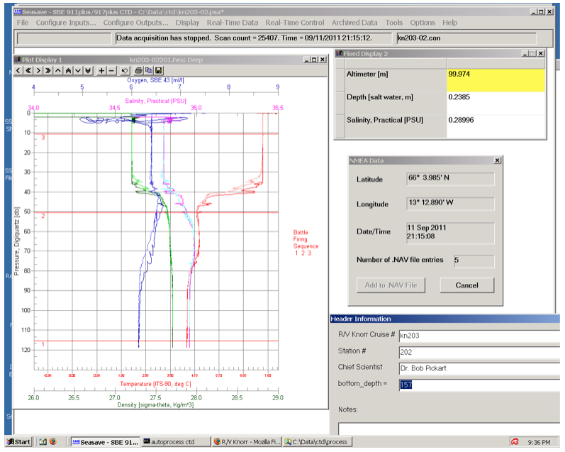
There are a couple of important things to note here. First, let’s go through the command windows on the right. The lowest one is general cruise information that goes into the header of the data file: Station number, cruise name, chief scientist, this kind of things.
The next window up is the position and time of that station. Important information for the header of the data file, not so crucial for the CTD operator to know.
But then the next window up is where it gets interesting. The yellow field shows the distance from the instrument to the sea floor, calculated from an echosounder-like instrument mounted on the CTD. The distance from the bottom is really important to know, since you will want to make sure that the CTD does not ever hit the bottom, and the depths in sea charts are not very reliable if you are in remote areas.
And then lastly, the most interesting window on the left. This is where data is displayed in real time as it is measured while the CTD is being lowered and hoisted up again. On the horizontal axis, the properties (temperature, salinity, density and oxygen) are displayed against depth on the vertical axis. You see water being warmer and fresher towards the surface than at depth, with higher oxygen concentrations near the surface. So far, so good.
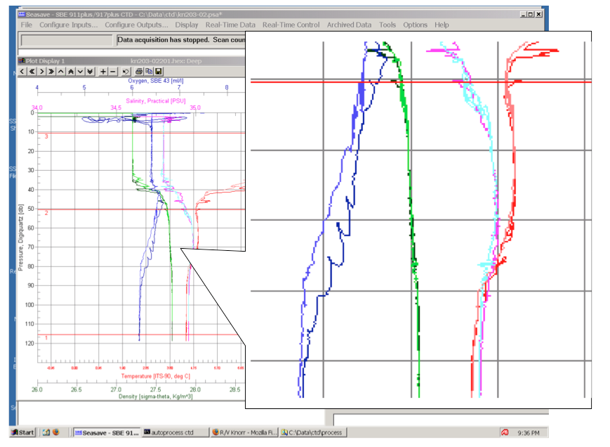
In the blow-up in the figure above you see several interesting features. But I want to focus on one in particular: The blue oxygen curve.
In the depth range displayed here, the downcast (measured when the CTD went down) and the upcast (measured when the CTD went up again) don’t agree very well. And while one of them is nice and smooth, the other one shows many wiggles. Why is that?
When sitting in front of the monitor on CTD watch, it is easy to forget that the vertical axis displays pressure. As you watch the graph build up, it seems like it might as well be time. The longer you watch, the further down the CTD sinks, until at some point it turns around and comes back up. When you’ve done a couple of CTD stations, you know very well how long any given station will take and you have optimized what point you need to get ready to step outside and help bringing the CTD back in in order to be there on time but not any earlier than necessary.
However, what is displayed on the vertical axis is depth. Or, if you want to be even more precise, pressure. Usually, pressure can be converted to depth fairly easily. For every 10 meter you go down in water, the pressure increases by 1 bar. This is, however, assuming that the water surface stays in the same place. In the station shown above, this was clearly not the case. All the wiggles you see in the profile? Yeah, waves. And if you look closely at the plot, you can estimate their amplitude. Yes, about 5 meters.
So this is why you want to always keep an eye on that number in the yellow field – the distance from the bottom. In case of this station we were lucky: We had a wave train coming through as the CTD was about half way down, but while we were close to the bottom the sea was relatively calm. But that was dumb luck. We have also been on station when the waves were highest while we were closest to the bottom. And that is when CTD operators get very nervous, especially on cruises where one of the main objectives is to measure as close to the bottom as possible. But as always: better safe than sorry; better lose some data close to the bottom than the whole CTD.